Statistical analyses in Excel can be complex and challenging, but with the right tools and methods, precise results can be achieved. Pivot tables allow you to analyze and visually represent extensive data effectively. In this guide, I will explain how to create a multidimensional data analysis as a pivot table to analyze a frequency distribution for the quality of your products and then visually represent it in a bar chart.
Main Insights
- Pivot tables help with data analysis and visualization.
- You will learn how to create frequency distributions and make differentiations.
- Graphically representing the results in bar charts facilitates understanding.
Step-by-Step Guide
1. Overview of the Task
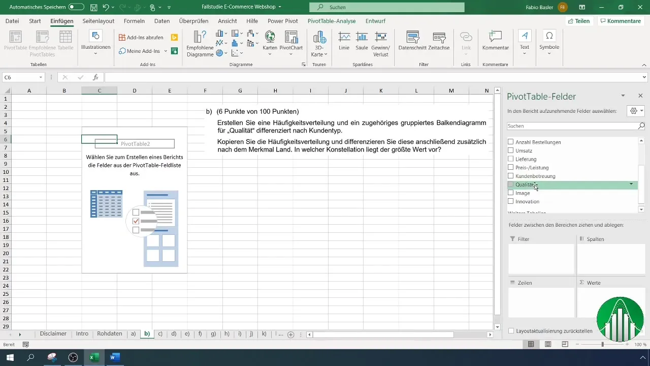
First, look at the task. It reads: "Create a frequency distribution and an associated grouped bar chart for quality differentiated by customer type." The goal is to analyze the quality ratings by Normal and Premium customers.

2. Overview of the Raw Data Set
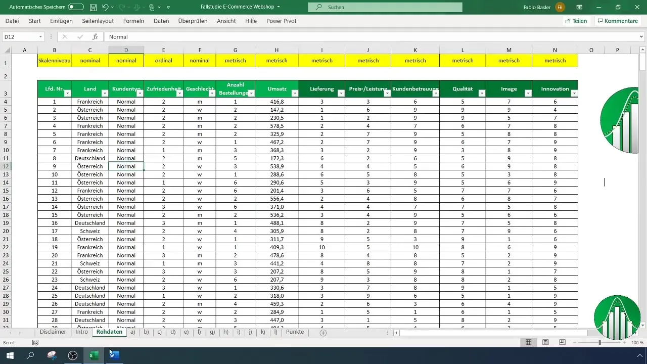
Examine the raw data set to check the available data. Ensure that the quality ratings from 1 to 10 have been captured by customers. Analyze if there are differences in the ratings between Normal and Premium customers.
3. Creating the Pivot Table
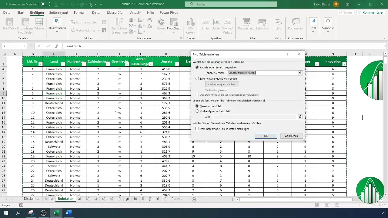
To start the analysis, open Excel and select the "Insert" option on the top bar menu, then choose "PivotTable". By clicking within the raw data range, the data range will be automatically recognized. Ensure that the headers are in the first row before creating the pivot table. Set the destination to worksheet B and confirm with "OK".
4. Defining the Metric
Define the metric to be analyzed. In this case, it is quality. Drag the quality rating into the values area of the pivot table to aggregate the data by customer types.
5. Multidimensional Analysis
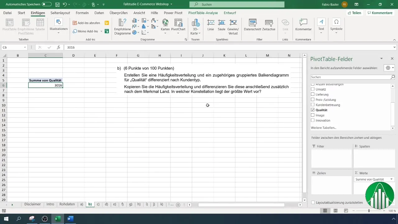
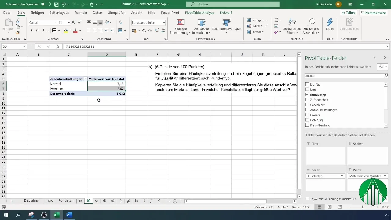
To perform multidimensional analyses, add the customer type as a row field in the pivot table. You can choose to display the count of ratings instead of the sum to represent the frequency of ratings for quality.
6. Calculating the Mean
If desired, you can calculate the arithmetic mean instead of the count of ratings. This will give you a more precise overview of the average quality rating by different customer types.
7. Creating the Chart
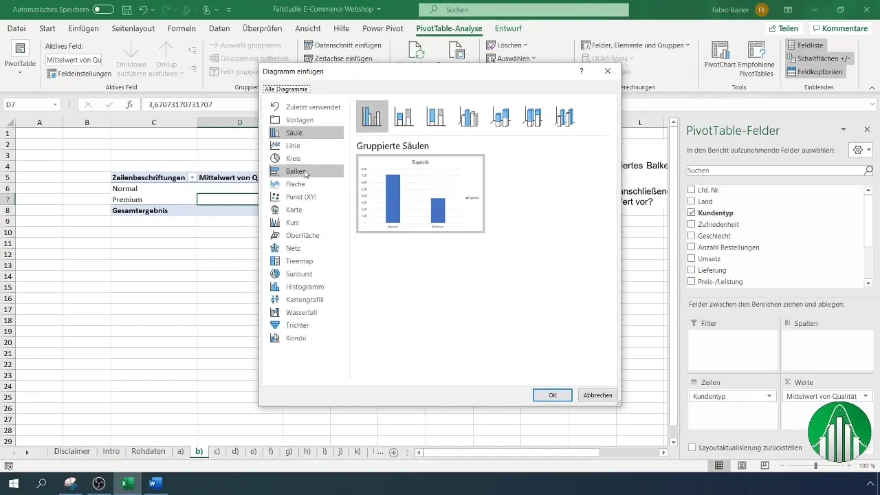
To visually represent the data, go back to the menu and select "Insert". Click on "PivotChart" and then choose a bar chart as the chart type. Confirm with "OK".
8. Customizing the Chart
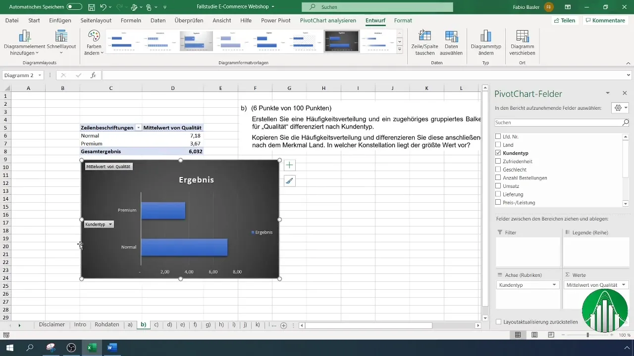
You can further customize the chart to provide an appealing representation. Choose a dark background, remove the legend, add a chart title, and label the data accordingly.
9. Adding Data Labels
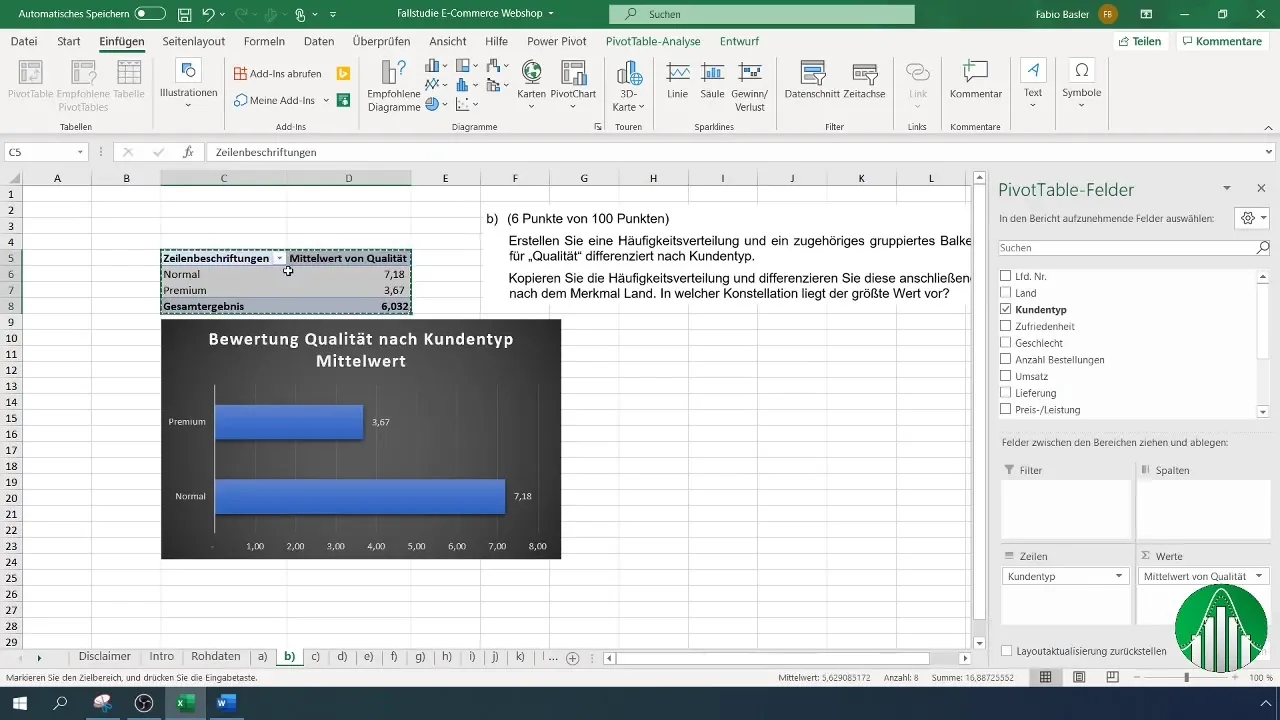
Right-click on the data series and select "Add Data Labels" to display the exact values in the chart. This allows for a better analysis of the ratings.
10. Copying and Further Processing the Analysis
To further differentiate the analysis, you can copy the pivot table and differentiate the data by additional features, such as the country. Add the country names as column fields in the pivot table.
11. Application of Conditional Formatting
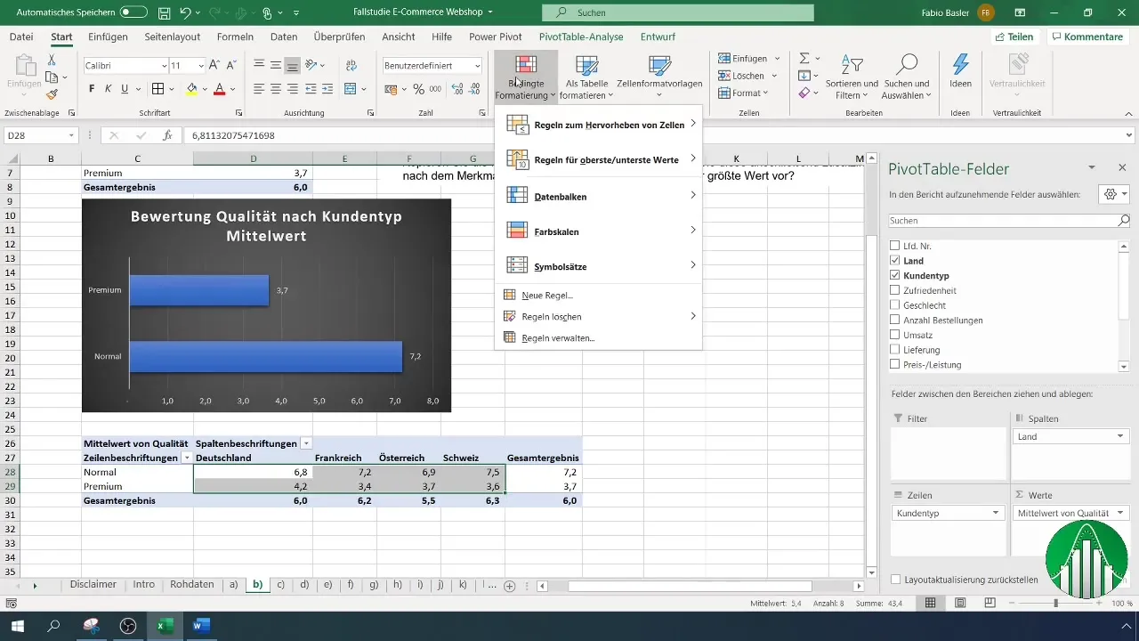
Use the "Conditional Formatting" function in the "Home" menu to assign a specific color scale to the highest and lowest ratings. This visual aid facilitates the quick containment of results.
12. Additional Visualizations
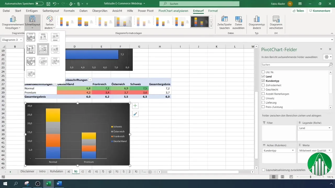
Dive deeper into the analysis by trying out other types of charts, such as stacked bar charts. These advanced representations allow you to present complex data even more clearly.
Summary
In this guide, you have learned how to conduct a comprehensive analysis of survey data using pivot tables. You now know how to evaluate the quality of your products by different customer types and create exciting visual representations in Excel.
Frequently Asked Questions
How do I create a pivot table in Excel?Click on "Insert" and select "PivotTable" to create a pivot table.
What data can I analyze?You can analyze any type of numerical or categorical data, such as customer reviews.
Can I customize the chart?Yes, you can customize the design and formatting of the chart to improve readability.
Do I need to know Excel to create a pivot table?A basic understanding of Excel is beneficial, but there are many resources for beginners.
Are there special functions for pivot tables?Yes, pivot tables offer many functions, including calculations, grouping, and data filtering.


