Creating organizational charts in Excel can be an excellent way to depict complex structures and processes. This guide will show you how to create an interactive organizational chart with Excel that is not only visually appealing but also functions meaningfully with calculation methods. You will learn how to insert formulas, adjust data, and design the layout attractively.
Key Takeaways
- You can create complex and interactive organizational charts with Excel.
- You will learn how to use formulas to display and calculate information such as salaries.
- The design can be tailored to your needs, with colors, line styles, and more.
Step-by-Step Guide
Step 1: Start with an Empty Excel Sheet
Open a blank Excel sheet to create space for your organizational chart. Begin by planning the different positions and their hierarchies. Consider how you want to structure the information.
Step 2: Create the Header
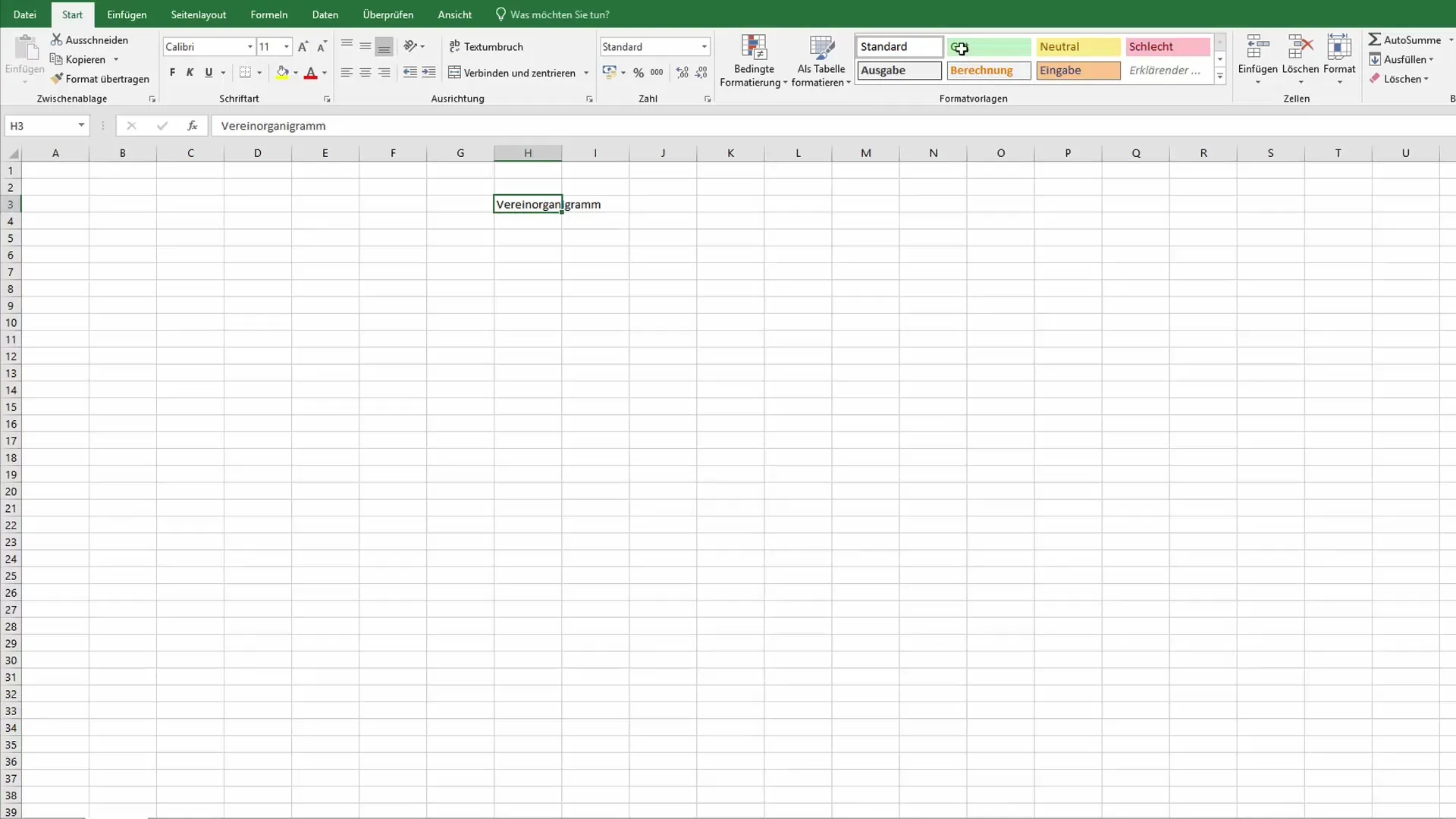
Design the top part of the table by entering a header for your organizational chart. For example: "Organization Chart". Customize the font and size to your liking.
Step 3: Enter the Positions
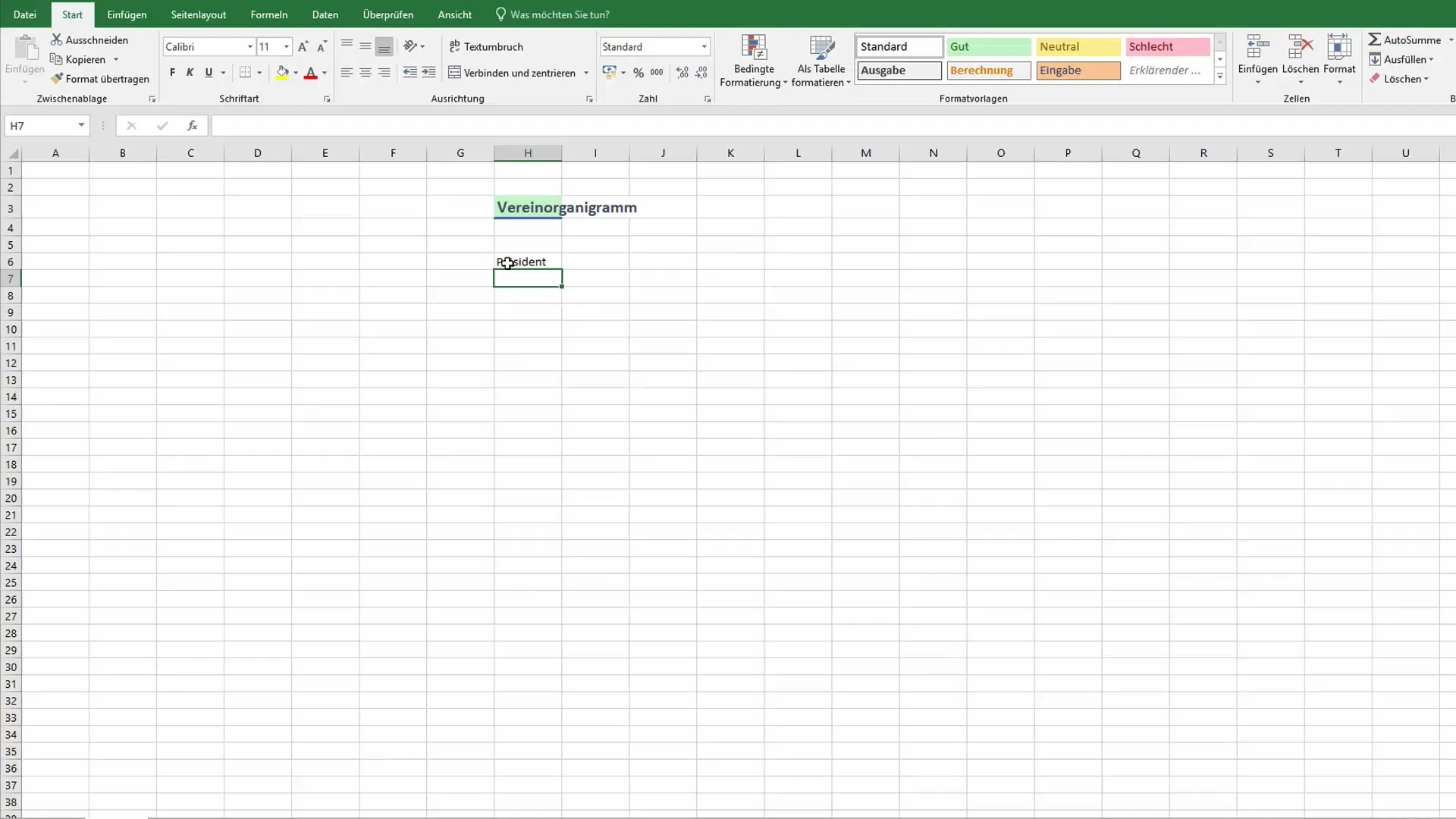
Start with the highest point of your hierarchy, such as the club president. Write down the name and perhaps the salary information next to the title. This is important for capturing all necessary information at a glance.
Step 4: Expand the Structure
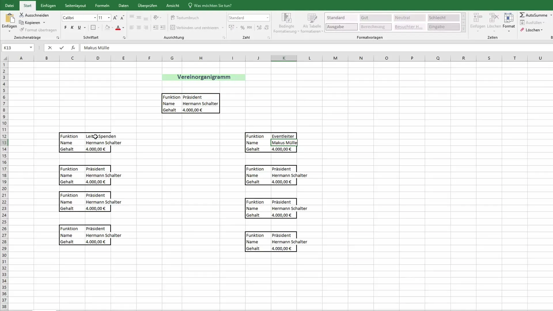
Now add the additional positions, such as event manager or fundraising manager. Ensure to clearly depict the hierarchy between the positions so that everyone can immediately see who reports to whom.
Step 5: Cell Formatting
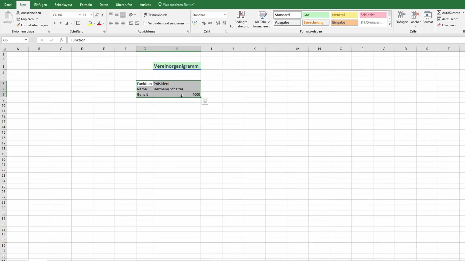
Make your organizational chart visually appealing by formatting the cells. A thick border around the key positions can help highlight them. Use different colors or backgrounds to visually separate the different areas.
Step 6: Drawing Connections
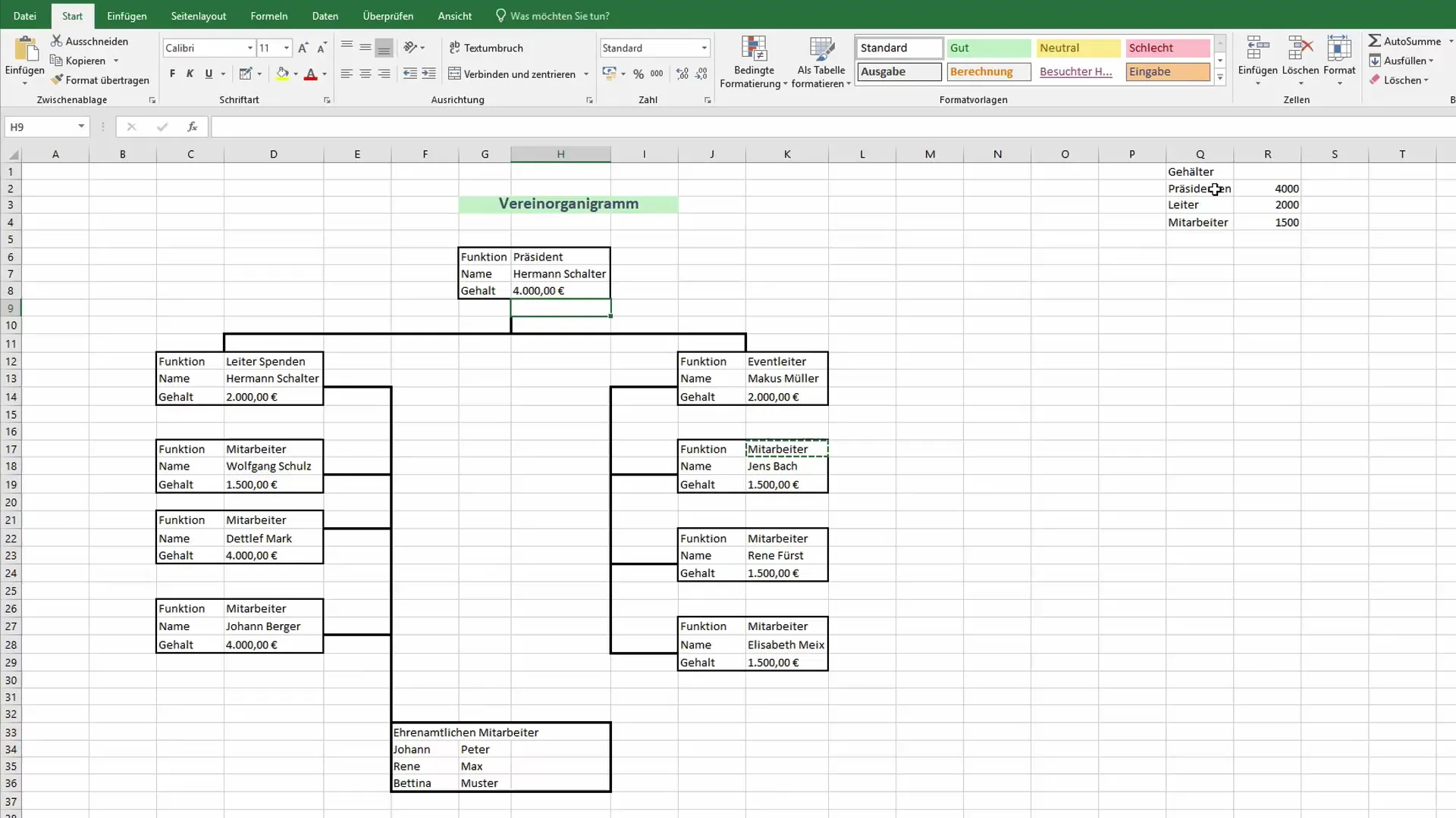
To complete your organizational chart, draw lines between the positions. Go to the Shapes tab and select Lines to draw the connections. This visualizes the dependencies between the individual positions.
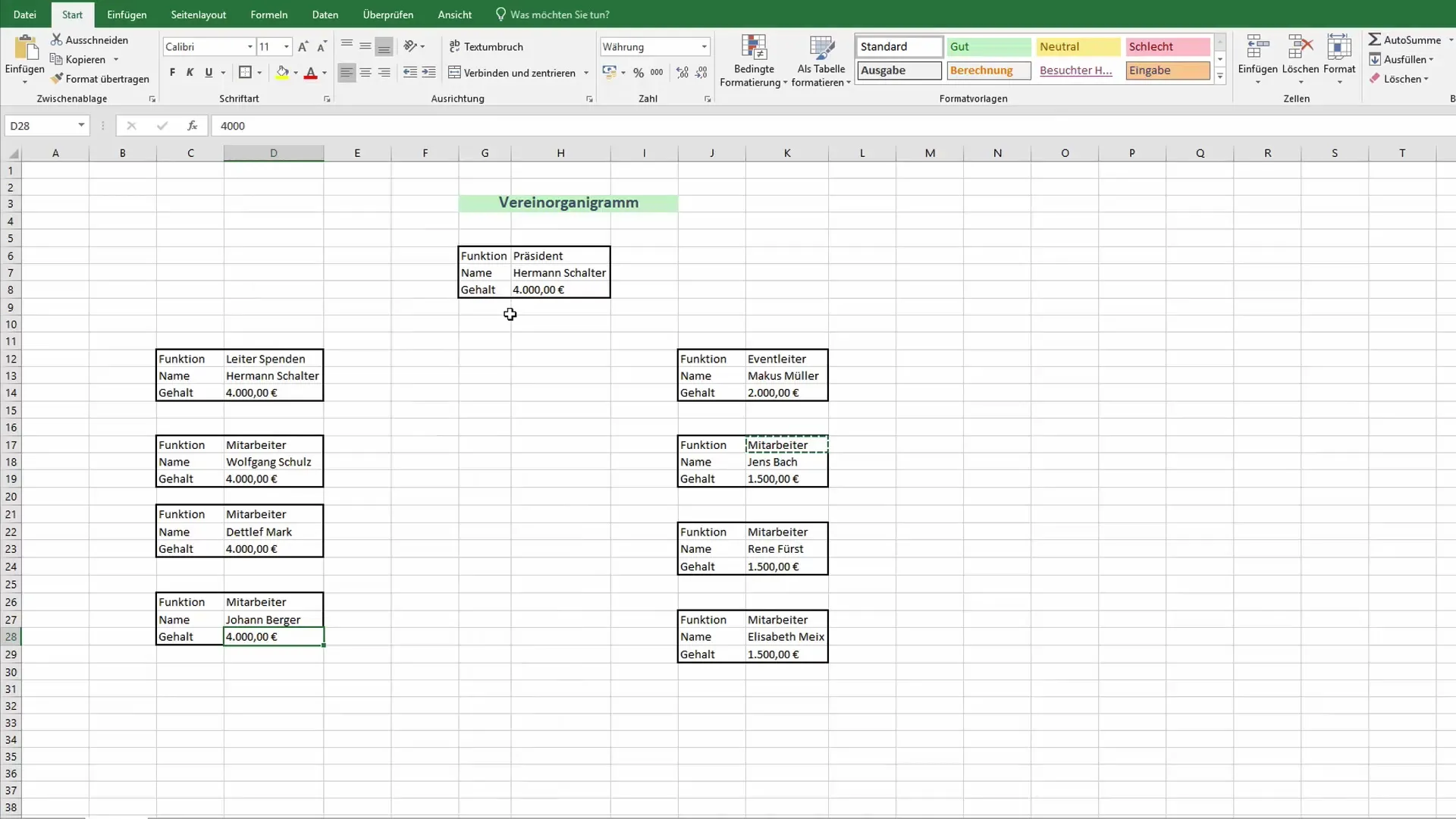
Step 7: Adjusting Salaries
For a transparent overview, list the salaries in a separate table and then insert this data into your organizational chart. For example, the president may earn 4000 euros, while team leaders earn 2000 euros.
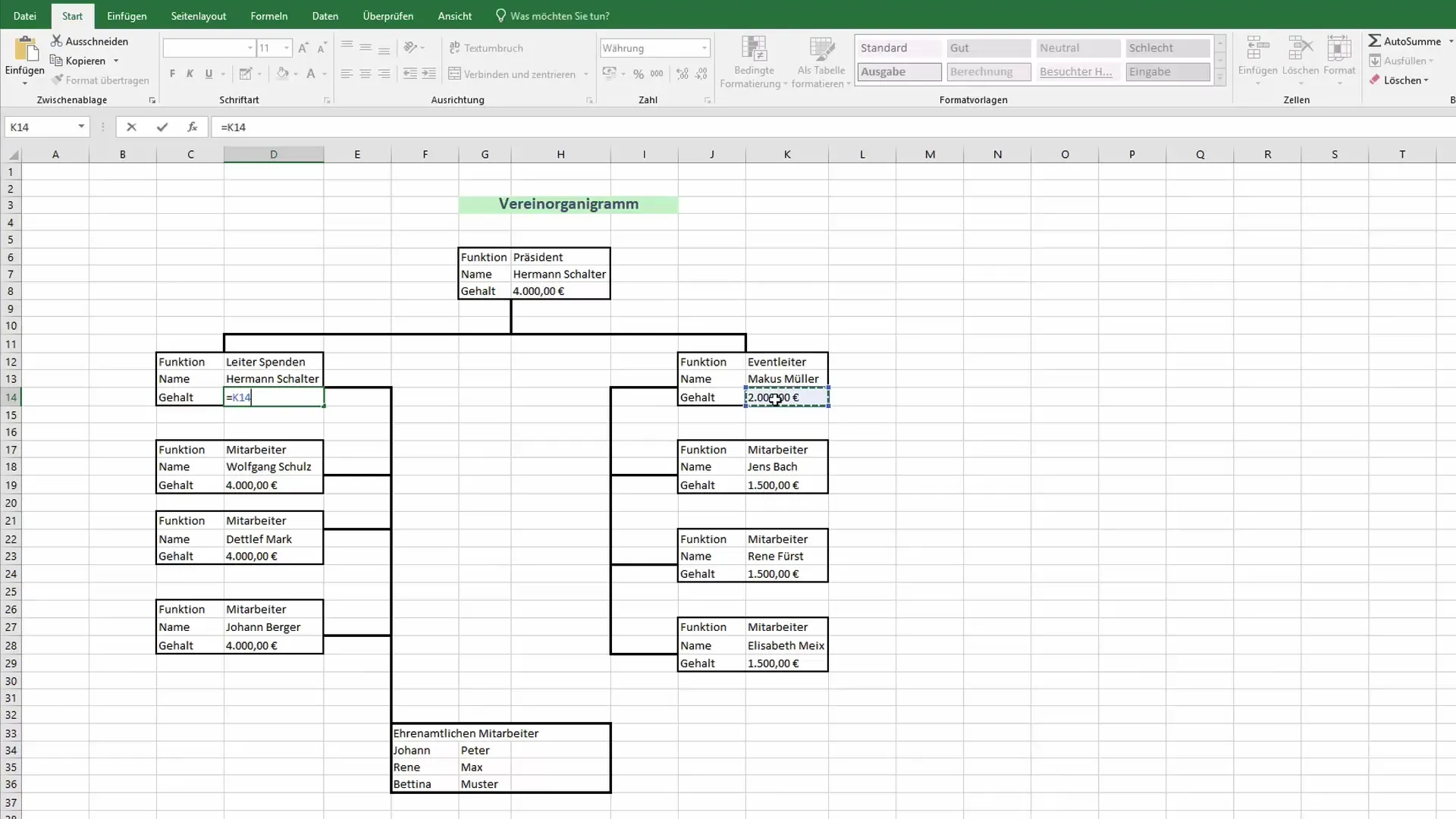
Step 8: Integrating Formulas
Now comes the interactive part: you can use formulas to automatically calculate salaries or other relevant data. Adjust fonts and formats to ensure they are properly visible.
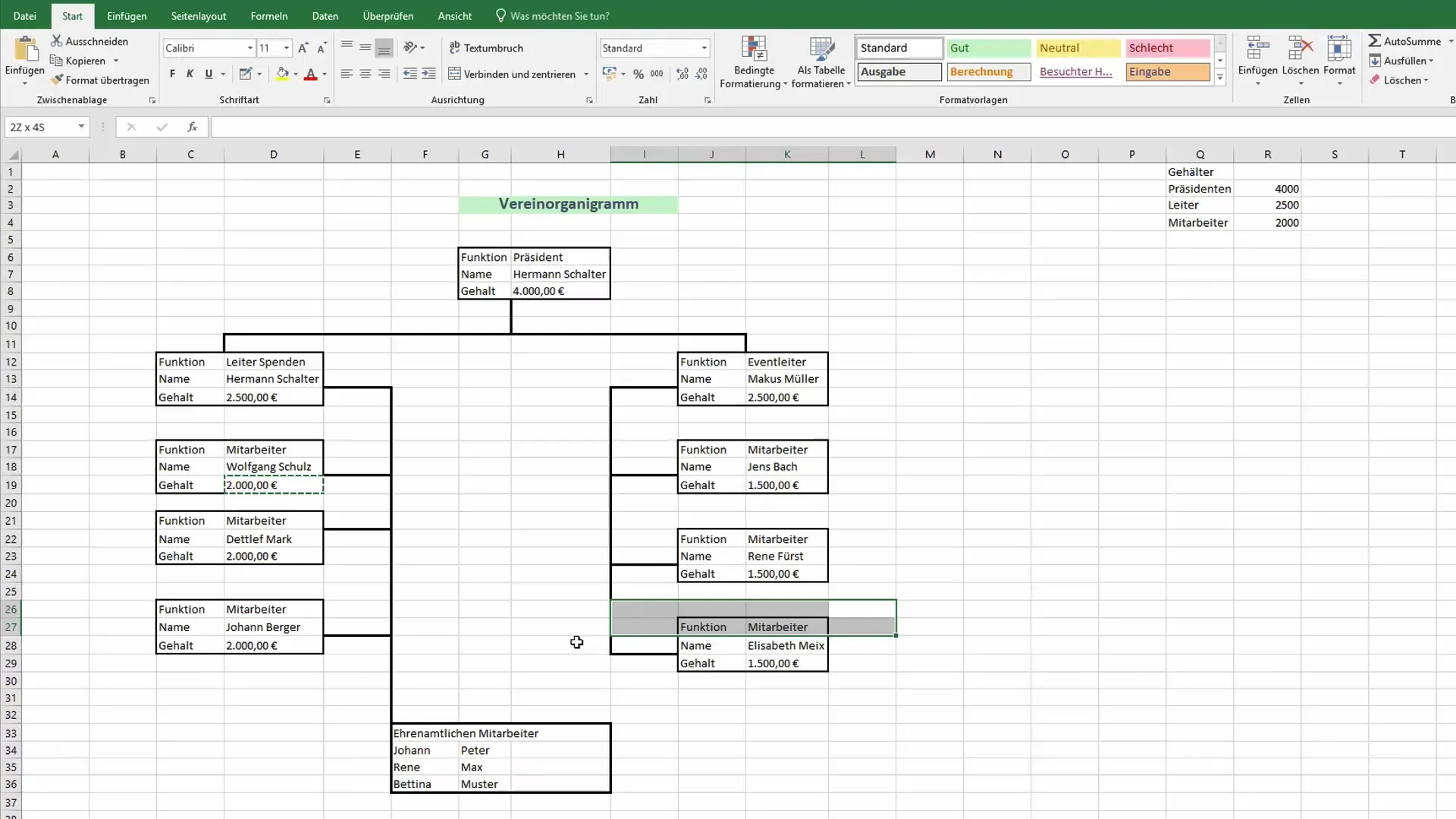
Step 9: Making Adjustments
If you need to make changes in the organizational chart, simply adjust the information in the cells, and the representation will be updated automatically. This provides flexibility and much less effort compared to traditional methods.
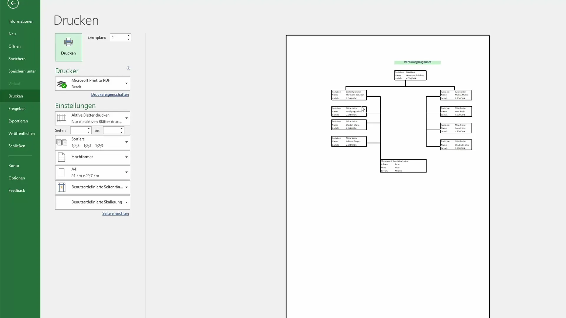
Step 10: Print Preparation and Layout
Before printing the organizational chart, go to the print settings and choose the layout that best presents the organizational chart. You may want to make adjustments to page breaks in the print preview to ensure that everything fits on the sheet.
Summary
You have now learned how to design an effective and customizable organizational chart in Excel. With the ability to link and visualize data dynamically, you are able to present complex structures understandably and clearly.
Frequently Asked Questions
How do I create an organizational chart in Excel?You start with a blank table, enter the positions, and draw lines to the respective positions.
Can I add calculations to my organizational chart?Yes, you can use formulas to dynamically display information such as salaries.
What design options do I have?You can freely choose fonts, colors, border lines, and backgrounds to make your organizational chart appealing.


