Hi guys, my name is Stefan. Are the seat belts still fastened? If you don't understand that now, you need to take a look at the first part of this training, because we're on to the second part. In the first part, we designed the two outer sides of our folding card for the new opening of the trendy hairdresser in the city. Here it is again - front and back. The format is still DIN long, that hasn't changed.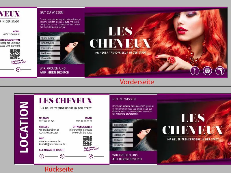
I'll show you what the back will look like on the original document. In all its glory, here are the left and right inside pages. I hope you'll join me on my journey, because I'll show you how to create this layout in InDesign CC.
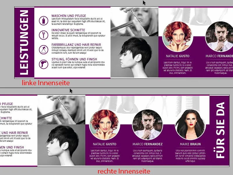
To do this, add a new page via the page control panel(click on 1). We've already created our grid on the sample page, so we already have it on our second page without having to worry that we'll move anything here with our confusing mouse commands. That's good. And now I want to know from you: Which page do we design first? Left or right?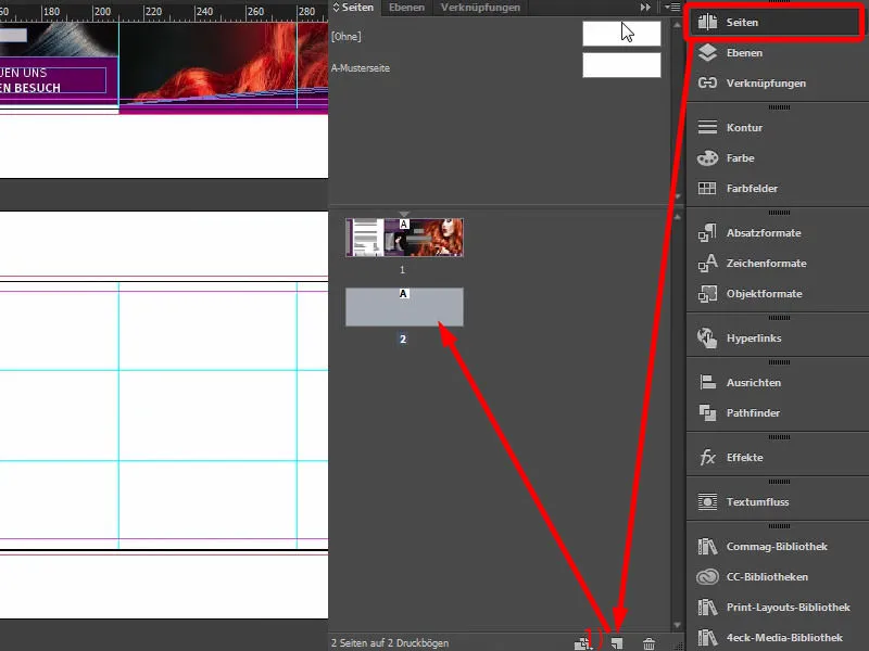
In terms of design, it's actually pretty irrelevant, but not in terms of viewing. I'd like to start with you on the right-hand side of the design, because I'm going to let you in on a secret. This is the kind of secret that isn't really a secret at all, because everyone is blabbing about it and many people already know about it, but I'd like to let you in on this whispering post too.
To wit: Imagine you have a DIN A4 brochure in front of you, a magazine for example ... Let's take a magazine, Vogue, Playboy or Brigitte, then you'll notice that when you flick through the pages, which one do you always look at first? The left-hand page or the right-hand page? Clearly - you always look at the right-hand page. It's automatic: we turn the page once and automatically look to the right. The essential content is always on the right or, funnily enough, the advertising in magazines. If you flip through your magazines, you'll see: You'll always find the right advertisement on the right, while the rather unimportant article is on the left. The advertisement on the right, the article on the left, because you look on the right first.
This is exactly the effect we want to exploit. We have a new hairdresser opening here. That's why I want to introduce the team on the right, because the team should be given the space to present itself, to develop. That's why this will happen here on the right, as already shown on our template. And the reason for this is simply that I want to create a personal connection between the viewer and the team. That's why the three pretty ladies are sitting on the right, oh, sorry, there's a guy there too. Okay, so that's why the two ladies and the guy are also sitting on the right. And that's what we're building now. Here we go.
Placing the first graphic elements
Of course, we'll use the shape principle of the outer sides. I will therefore copy our 3.5 mm border once (1) and move it down here and then draw it directly over the sides once. It fits like this. Make a copy of this, making sure that you are exactly at the break here. Likewise here, a copy downwards, and then to the left in the color white. Copy downwards.
In the picture: Place a rectangular copy at (2) and draw up to the corresponding auxiliary lines. At (3), place a rectangular copy in white and drag up to the corresponding guides (zoom in to align exactly with the guides).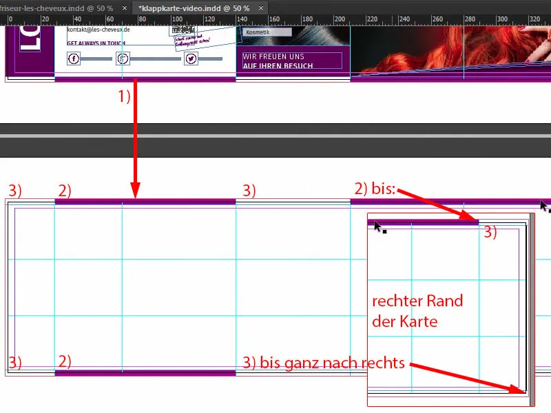
Then, of course, we have the same description on the left and right as on the outside: What is on this page? So I would like to simply title the right side "Here for you", here comes the team, and on the left I would like to title it: "These are the services".
So I take our text box from above again and move it to the bottom (1). We'll probably have to enlarge the text box a little (2), because we'll now write in here, still in Fira Sans Bold, 48 pt, in capitals, centered and white: "Services" (3).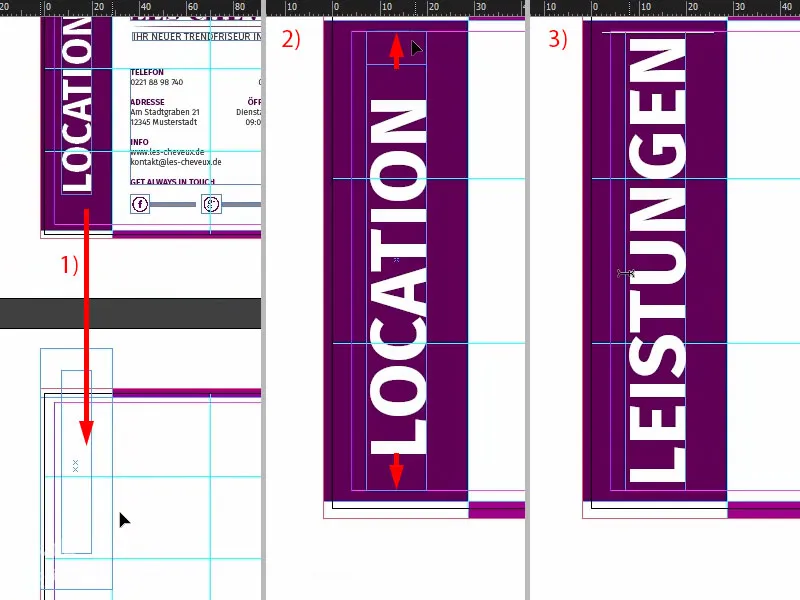
Then take these two elements, move them to the right and replace them with "For you" (1). That just sounds a bit more charming, that sounds friendlier than "Team", "Staff", "Employees" - no: "Heyer, we're here for you. We're here for you. We don't just make your hair beautiful here, but ...", yes?! What do you do at the hairdresser's, I don't know, maybe the women know better, but in any case: "Here for you".
Then I draw a large rectangle (2), 60 mm high (3), which is very important. I dock this at the bottom (4). Next, of course, we need an image in the background, and this is perfect for that (Ctrl+D, see 5).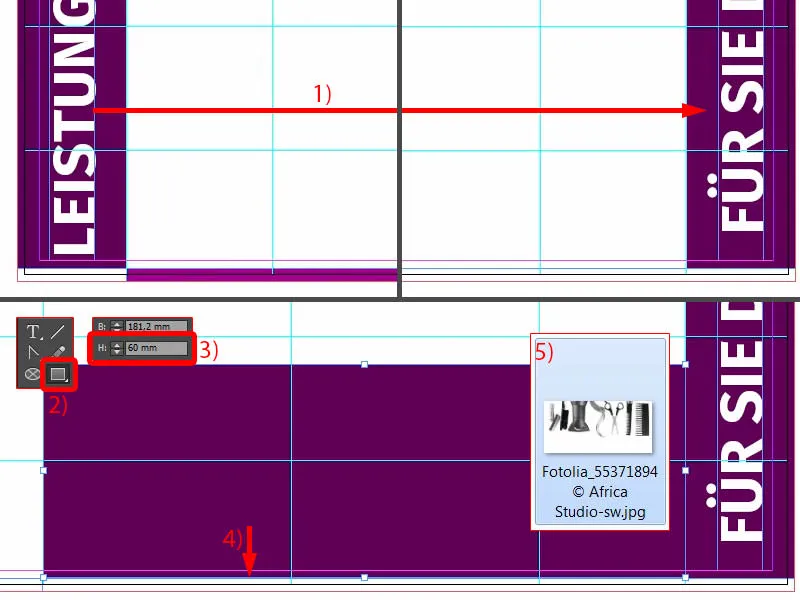
Placing the image
I also tried it once with full-surface color images, which somehow looks rather modest, I didn't like it that much. Then I saw this picture and thought to myself: "That actually fits like a glove. Perfect." I only made it in one color, i.e. black and white, because I don't want it to distract too much from the three characters we still have here (like in 1).
So I move it up to the line of the purple rectangle (2), ...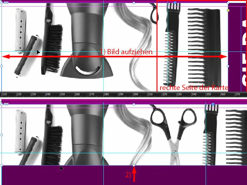
... and then, of course, I have to go to Adjust>Fill Frame Proportionally (1). But then I can move this whole image content a little bit further down, not too far, maybe, I think that's okay (2).
If we look at it, it already looks quite good. We could perhaps make it a little smaller. That's quite good, it's quite easy to do in this example, because the background is white anyway, so I'll use the Alt and Shift keysto reduce the size proportionally from the center (3). I would leave it like this for the time being. Let's see if we need to adjust it again later.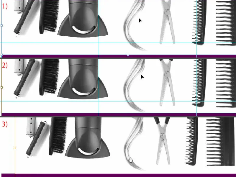
Preparing frames and texts for portraits
So that the hairdryer and that beautiful curl and the scissors and all the other stuff don't steal the show, we simply have to work with a trick so that it doesn't distract too much. So: very simple, trick 17 - reduce opacity to 20 percent (1). Now it's no longer so omnipresent, now it's no longer so powerful, now it's very discreet in the background, very smooth, so nothing can happen, completely harmless. So if you want something to come across as less obtrusive, just try reducing the opacity. Let's move on to the team. Do you actually know the abbreviation for "team"? What does that mean? Don't you know? - "Great, someone else is doing it." No?! - Okay, let's draw a circle with the ellipse frame. I can click once into the workspace (2). We enter a radius of 45.5 mm there, and the same at the bottom (3). And we fill the circle with the color black (4) so that we know exactly what we are doing. I'll add a white outline (5) with 2 pt (6). You can also choose the outline variant, for example, maybe you're really into Japanese dots. Or wavy lines ... I tend to be quite conservative, solid, that's my style. I make sure that the center of our circle is really exactly here on the upper edge of the purple rectangle (7).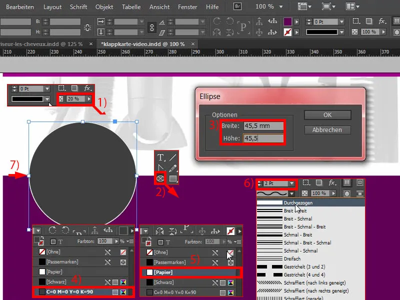
Then I move the whole thing once to the left (1) and then move it twice to the right using the Shift keyand the right arrow key (2).
Okay, what's next? What else do we need? Of course, we have to show some pretty face in this box, so Ctrl+D for the place dialog(3). She was the first ... Wow, nice nose, nice eyes (4), but we need more from you: Customize>Fill frame proportionally (5). I agree with that.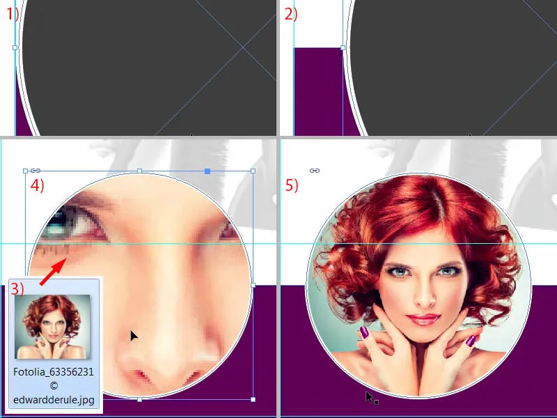
Now let's continue working: let's open a text field to give the good lady a name. I'll just drag this to (1). Make sure that the width on the left is the same as the width of the circle above it (2).
Then I'll format the whole thing in our house font that we used, Fira Sans. Let's start with the Light font , set to 14 pt with capital letters activated, white color and centered alignment (3).
Then I'll write in her name, I've christened her "Natalie Gusto". I want to emphasize "Gusto", so I use the same effect as on the outer pages by playing with the different font styles: simply set to medium (4). In this way, we not only give our layout a certain weighting, but we also play a little with design effects. It simply looks more harmonious.
Then I make a paragraph, reduce the font size to 9 pt, this time in Light again. And then I can easily throw in a text here via Font>Fill with placeholder text, but it's not quite right, because we're throwing out the capital letters (5). It's also a bit too much, let's make a line into a paragraph here. And in total, I imagine about five lines.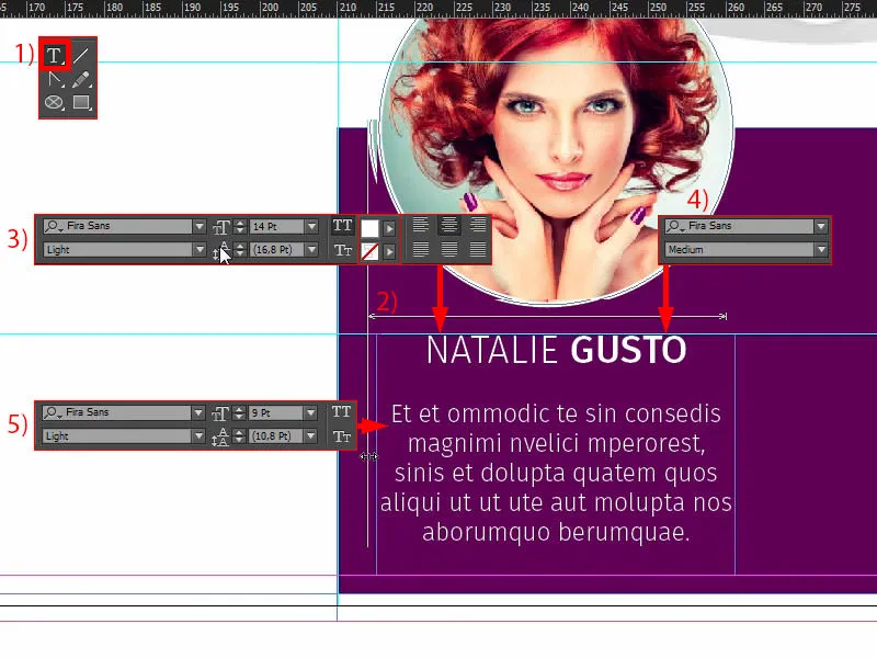
Last but not least, we want to add this line with the soft gradient edge (1), just like on page one, which I show you again above. So we keep picking up on the shape principles. So just draw a line (2). If it wiggles like a cow's tail, you can also put a stop to it by simply pressing the Shift key. Draw once (note width as with 3), set to white, 1 pt is a bit too thick ... Sometimes less is more, so I reduce the thickness to 0.5 pt (settings at 4). Now we have a very delicate line here, as you can see.
In the effects control panel(5), I now select the soft gradient edge (6) with Radial (7) and I move this color bucket on the left to about 54, 55 percent (8). You can do as you like.
Then I'll confirm that, and now take a look: Now we've got this cool effect here. It looks really hot, so I really like it (9).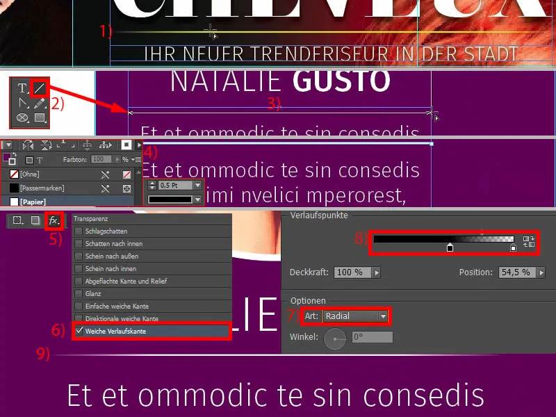
In InDesign, copy-and-paste is your friend, so we're going to make copies of the elements we just created. I'll now use Ctrl+L to lock the element from the background. Now we have a lock symbol here (1). If you want to unlock it again, you can click on the lock symbol or deactivate the lock in the layer control panelusing the lock symbol (2).
We need the Natalie Gusto two more times. First, I move the third person all the way to the right (3) and also move her twice to the left using Shift and the left arrow key (4). This gives me the same spacing. If I now make another copy (5), InDesign should tell me at some point that we have the same spacing - right now: Do you see the green guides at the bottom (6)? So I don't have to measure anything, InDesign is smart enough to help me a bit there.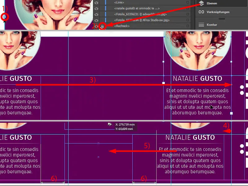
Now the circles also get a new face. I change the names and insert the images using Ctrl+D (1). I make Maik Braun a little bigger in the crop (2). Show the shoulder and the collarbone (3).
The third in the group (4) can also be adjusted by right-clicking, Adjust>Fill frame proportionally. I also make it bigger (5) and position it like this (6).
Now we have Natalie, Marco and Maik in the bunch, a speedy trio (1), and we are already finished with the right-hand side (2). That went really quickly.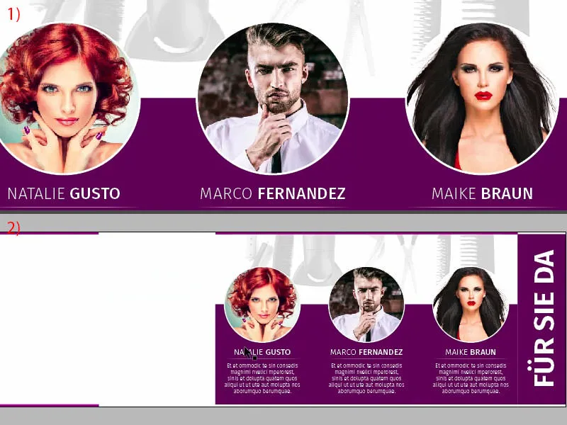
Left side: placing the pictures
On the left-hand side, we will place two images towards the waistband. Select the place dialogonce via Ctrl+D, select the first image (1). Then place it at the top (2) and drag it up to the waistband (3). Here, too, we are guided by the existing symmetry, which means I make the image slightly smaller (4) and change the section accordingly, because I don't want to lose the comb (5). It's an important stylistic element and should be included.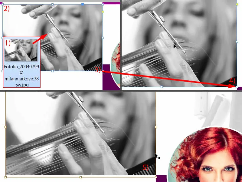
Then I can simply copy the picture (1). Then we've almost got the frame together (2). Then use Ctrl+D to select the next image and open it (3). The lady is still looking in the wrong direction, so simply set the reference point to the center (4) and Object>Transform>Flip Horizontal. I don't want to crop her hair at the top, but take a bit away from her shoulders (5). The great thing about this process is that we make the reference point of her neck disappear, and we've now made an incredibly long neck here. Can you see how incredibly long it is? It almost rivals any giraffe, so I'm very happy with it.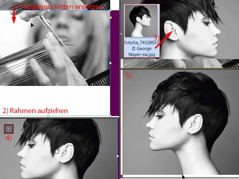
Inserting and formatting text
Now it's time for the text. All we need for this is a small guideline, which I pull out and set exactly to 54 mm (1). The text is placed to the right of this and the icon to the left.
I draw the text field and give it a width of 80 mm (2). Then we move it exactly to the guideline. We can also make it a little larger in height (at 1 on the guideline, see 2 for height).
The formatting: Fira Sans, font style Light, font size 14 pt, capital letters activated and color violet (settings at 3). Then it starts: "Wash and care". A paragraph, then reformatting (4): The font size is reduced to 9 pt, the capitals are deactivated and the color is changed to 90 percent black. Then we can fill this with a placeholder text (Font>Fill with placeholder text). Four lines are too long for me, I only want three (5). Then I can reduce the whole thing to the appropriate size (double-click on the handle at 6), dock once at the top (7) and then move down three times (8). Then we can create a copy of it, Alt and Shift... dock at the bottom (9), ...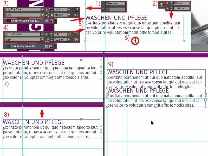
... twice with the Shift keyand the down arrow key. Adjust the text and then do the same twice more ...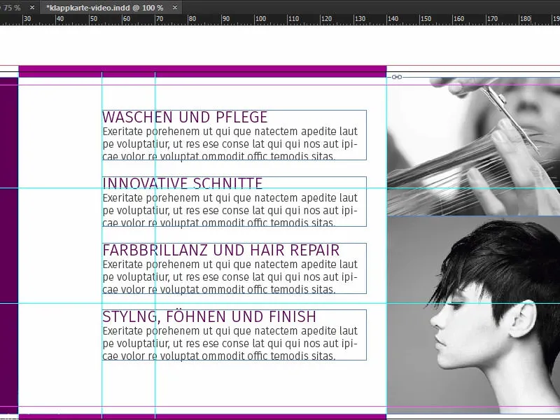
Insert icons
Then our icons are missing on the left-hand side. This is a very practical tip: if you want to convey a message, for example, you can of course use text, but you can also use icons, because they help you to understand what this is about as soon as you look at it.
Take a look at this: I have already selected four suitable icons. I'll put them in here (1). Then we have to adjust it a bit, but: We have a shampoo bottle in a circle here. The circle is nothing more than a 13.453 mm circle with a 2-Pt outline and an inner white colored area. Inside is the icon. And that already suggests to us: This is about washing (2). This is about scissors (3), which will probably have something to do with cutting hair. For color brilliance and hair repair, this thing fits quite well (4). Styling, blow-drying and finishing (5), the right icon has been chosen here too. So you can work with elements that suggest exactly what you are already using as a text message.
Now I align them all in the center (align all icons with the green guide line to the text field as in 6). Then I can take all four elements (7), move them to the right up to the guide line and then use Shift and the left arrow key to bounce twice to the left (8).
Then it would be good to align the whole thing to the center line. Now we have our guides again. I love these tools, it's so great ... saves so much time ... just let go and I know: the top is the same distance as the bottom - and it's done. This really is one of the best tools there is in InDesign. Please never do without it.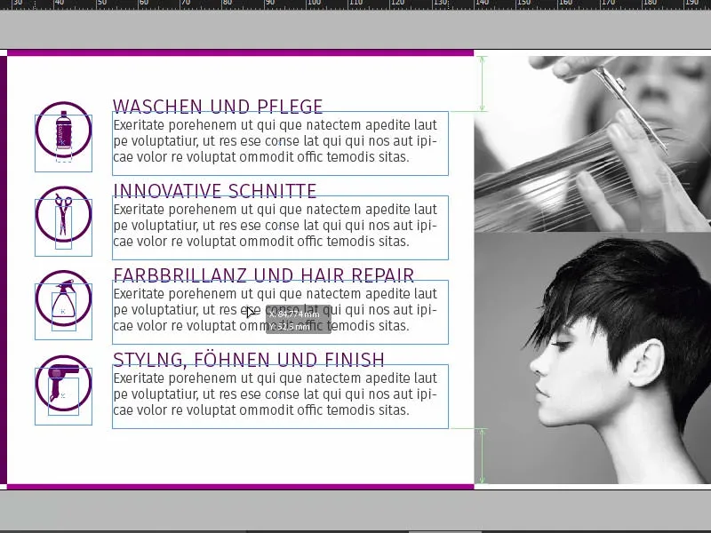
Overview, check color application, export
Ctrl+0... take a look at the bird's eye view. I think we're ready so far.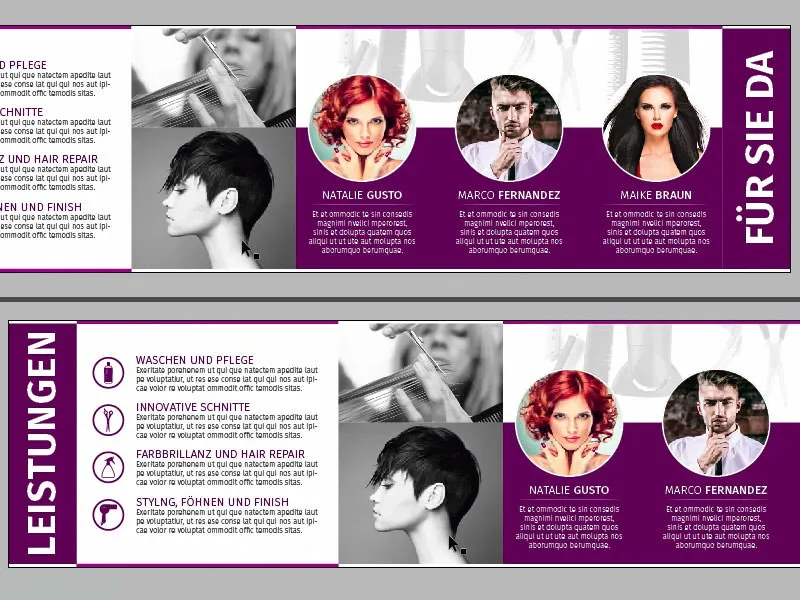
The front has already been designed and now we can simply export the whole thing.
Before exporting, pay attention to the color application, as already shown in the other trainings from the series, pay attention to the resolution (1) ... Here, for example, we now have 300 ppi original for this image, the large lead image, effectively 623 ppi (2), because we have scaled it smaller. Please pay attention to this. Always check that you have pulled out all the elements up to the bleed.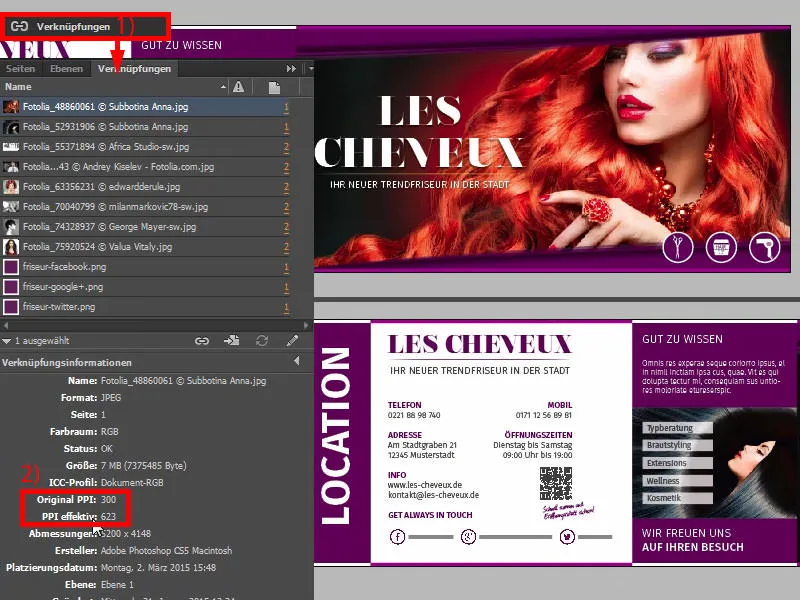
Once you're on the safe side and you've coordinated this with the requirements of your print shop, we can switch to Ctrl+E and save.
We then have ISO coated, PDF/X-3:2002 in Acrobat 4 (1). Compression: 300 and 450, I agree (2). Use document bleed settings, yes, let's do that (3). In the output: Please convert to target profile, this is the working color space ISO Coated v2 (ECI). I have already shown you where to get the profiles (4). And now it's just a matter of exporting (5) and then we get a nice PDF.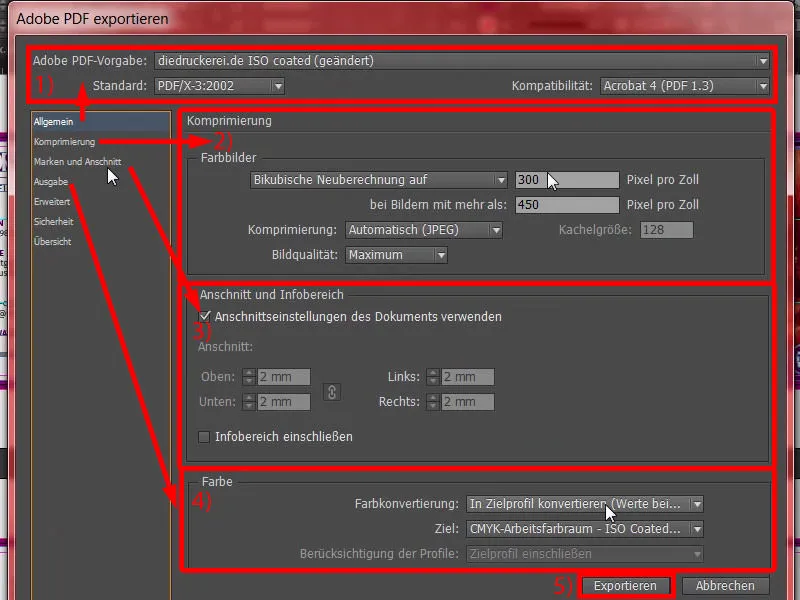
Here is our finished product, with wide margins (1) ... Why does it look so wide? - Sure, the bleed was included. It also looks good one page further down. And this document is now a printable template that we can send to our print shop. We do this in the next step so that we can select the right paper.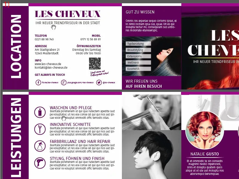
Handing over the folding card to the print shop
As you can see, I have already logged in with my customer account. Here we can already find folded cards and postcards (1) in the first line, so to speak in pole position. We select these, then folded cards (2), then DIN long in landscape format (3). Here you have all these tips again and also the finishing options (4). And that's incredibly exciting, I can only recommend it to you again, especially with our fantastic lead image with the beautiful red-haired lady, there definitely has to be some kind of finishing, because we won't leave it like that, on normal paper. We'll find something.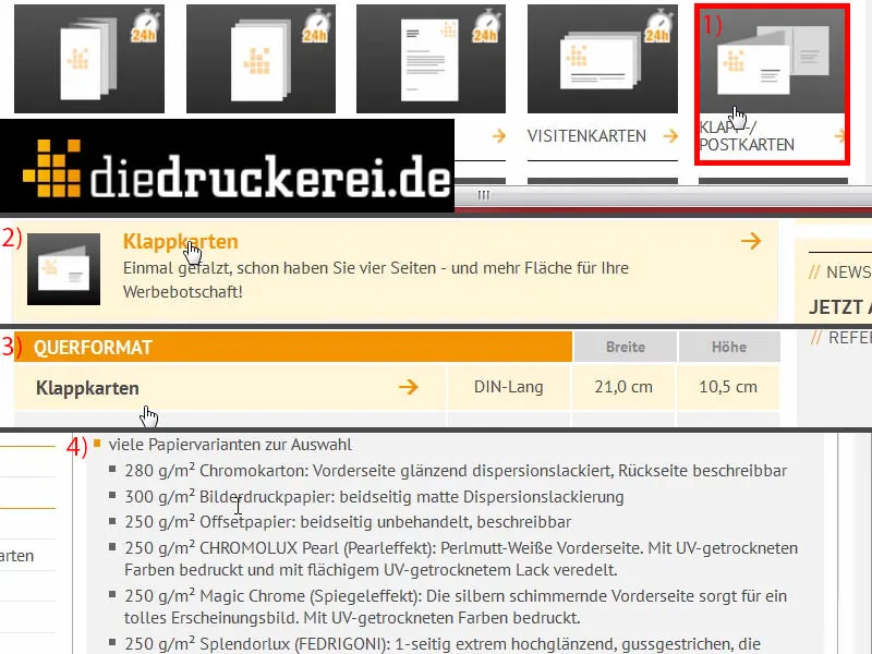
I scroll down, and there we have the 300 g/m² picture printing paper. The grammage is definitely a good choice. Let's take a look at what else is available here (1). The grammage can vary, I choose the chromo board with 280 g/m². But you've already seen above: You can really use a lot of other things, and the chromo cardboard already says: "front side glossy dispersion coated", so really for absolute color brilliance, "back side writable". Number of pages: 4, that's right (2). Folding: 1 fold, that's the one in the middle (3). Let's take a look at the other finishes (4): There we have, for example, cello matt or glossy. These are finishes with wafer-thin foil instead of varnish. You could say it's more like a lamination. This protects it and still gives it a high-quality touch. Just take a look at the paper sample book and you'll see exactly what the advantage is. Of course, there is also the glossy UV varnish. This is of course also a full-surface finish. It is environmentally friendly and also reduces the drying time. What can we say about it all in all? It is simply a coating process that creates a high-quality look and feel - and that is also my choice in this case (5). Further processing, creasing, that's okay (6). Perforation would be the alternative. You know perforations from tear-off coupons or reply cards, for example, which you can then simply tear off. But we use creasing. We also take the data check with us (7). We don't need neutral envelopes (8). And then it's on to the order (9).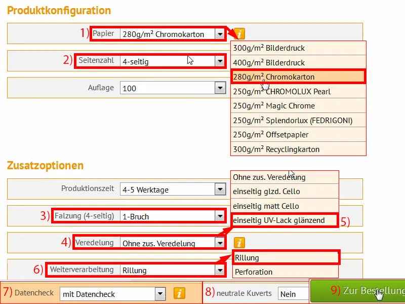
We can actually confirm everything, as I've just entered it (1). Check again ... and we want to stay up to date (2 and 3). Payment, I choose prepayment ... Continue (4 and 5).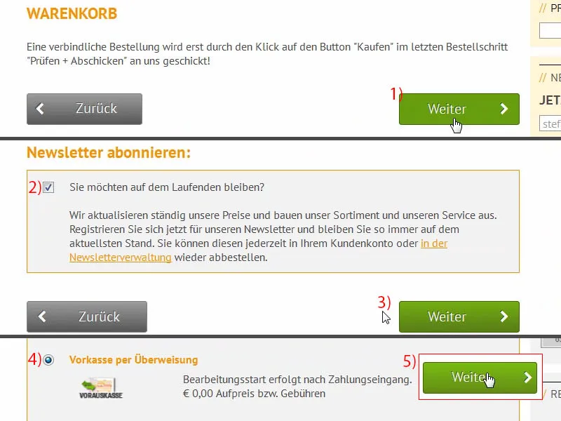
Of course we accept the terms and conditions (1). Scroll all the way down and then it's time to buy (2). Now we have the option of uploading the PDF once (3). I'll do that right now. And now we simply drop our printable file into this upload manager. I use the drag-and-drop option (4).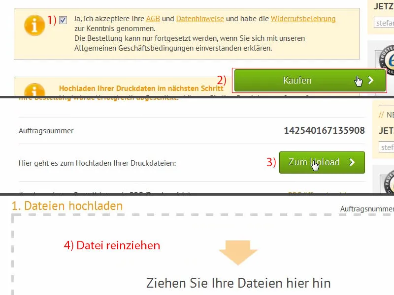
If we scroll down, we can now see our document here. We select All in one document (1), but you could also select Outer page(s ) and Inner page(s ) if you have exported it separately. Confirm the whole thing. The preflight tool checks everything quickly and agrees with our result (2). We confirm the order (3 and 4). Now it's time for unboxing - I'm excited ... let's take a look at what we've created here.
Unboxing the printed folding card
It's unboxing time ... Dear friends, do you actually know the difference between a DHL delivery and a parcel delivery by UPS? No? Let me help you out, because I've got something for you that will make you laugh: This parcel has been delivered by DHL (1). Sure. So everything looks clean, I'll put it to one side.
And now ... this victim of a grenade attack has actually been delivered by UPS (2). Well, you'd think this good box had survived Normandy in 1944. This is from UPS. That's how they deliver. It looks a bit battered, I'd say, but I think for unboxing ... well, what can I do! I promised you that I would show you this. And if the box has now been damaged, not by me but by the delivery person, then that's just the way it is ... We'll unpack the box now and see if there's anything left alive inside ...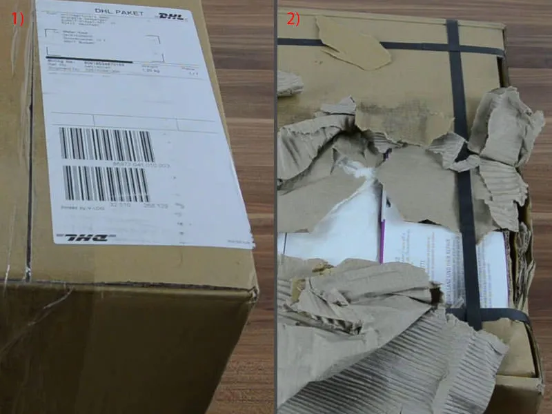
I'll cut the box open ... Here - can you look through it?! I really have to laugh, that's a really funny anecdote for this training, I think I'll save it. So ...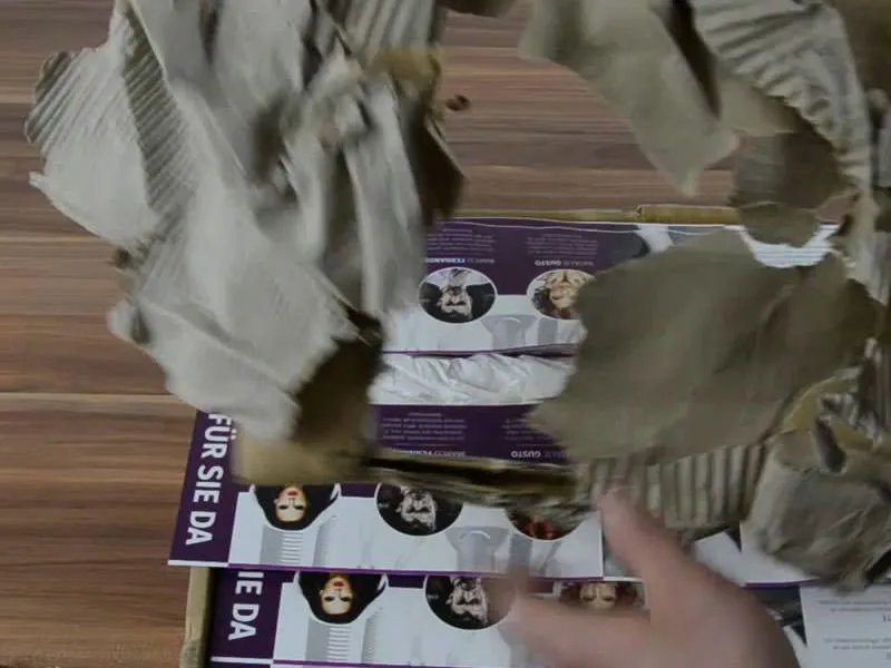
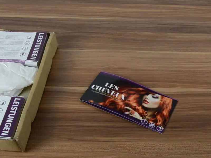
It's all taken a battering, but I think we'll find one here in the middle that looks good, and that's exactly what it is. Take a look at it: Here we finally have our hairdresser's card ...
It looks quite good in and of itself, but there's something here that I really have to point out to you ... Let's take a look at the outside first (1): The finishing looks really fantastic. It feels really good, you can run your fingers over it. You have to be careful of course, fingerprints get on it pretty quickly, but it looks really great and feels really good. I can't say anything about the external effect.
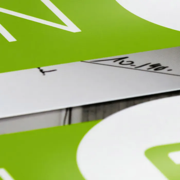
But what I did notice is our bleed here: at the bottom here, can you see that (2)? It should actually be similar to the top. What did we have there? 1.5 or 2 mm, I can't remember, but it's definitely too little at the bottom. That's an important tip for you if you're working with something like this. Maybe it's almost good that it's shown like this, because it really gives you an idea of how important it is to keep enough distance. And in this example, we didn't quite manage it. We can see that this white and purple border has simply been cut off, even here at the bottom.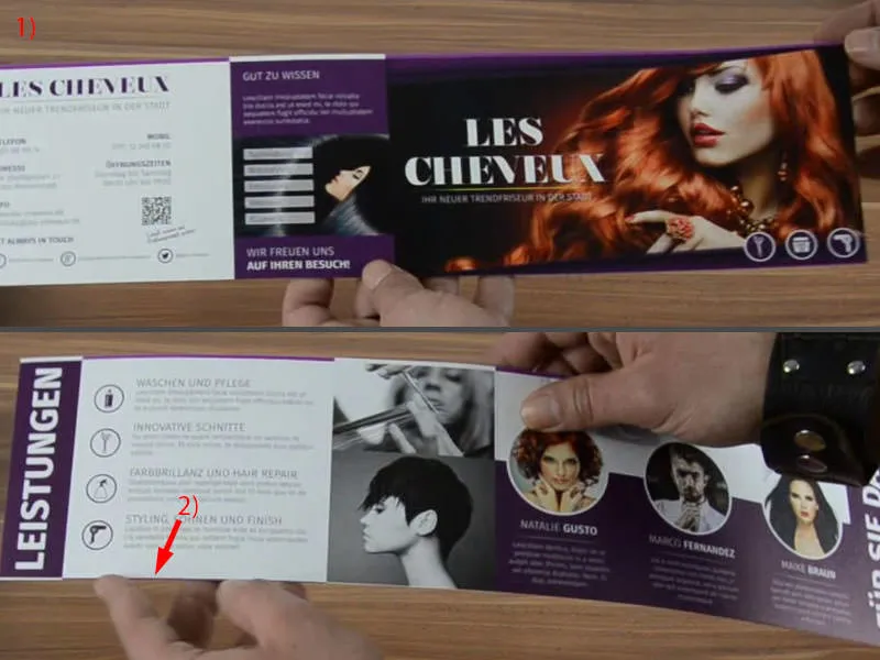
Let me take another one, this one here ...
It looks a bit wavy, but you can still see it here at the bottom. So please be careful with it. But I'll have to put it away again quickly, I don't like this curl at all.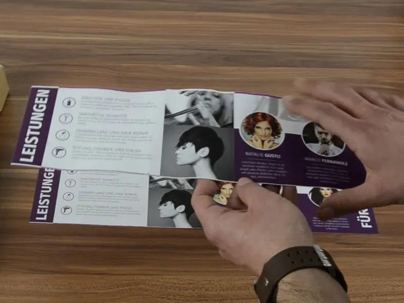
But this is what it looks like. The color brilliance also comes out very, very well here. So here's our fiery red lady, which has a really cool look and style. I like it, but as I said: please pay attention to the bleed. Otherwise, I can absolutely recommend this type of finishing. It is also pre-folded, which means we can simply fold it once and lay it out like this.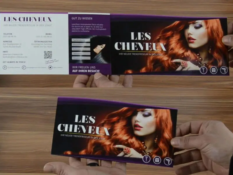
The font size is also perfectly fine. You can still see it clearly.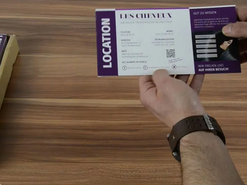
This unboxing has a very special added value for you. So I think you were able to take something away with you today. I'm off for now, have fun. Until then, Stefan