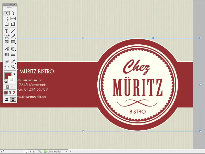
In this tutorial, I would like to show you how easy it can be to create a professional menu card yourself in InDesign.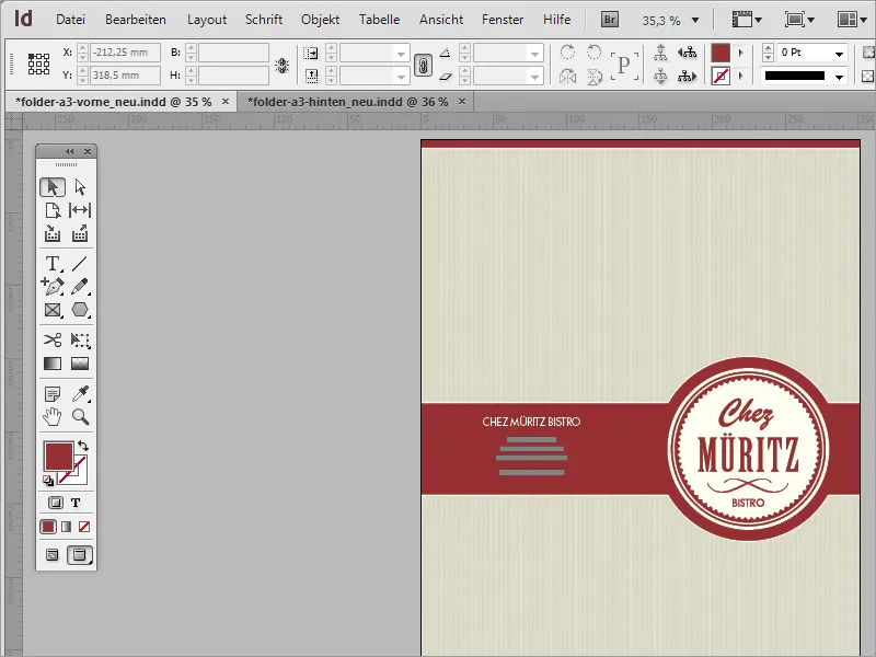
The cover page shines with a few details that make the difference compared to careless productions.
As this is a folding card, the reverse has also been designed accordingly. In the following steps, I will explain the best way to approach such a project.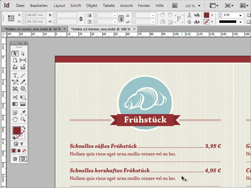
To begin with, you will need a new document. You can get help from your trusted print provider, for example www.Flyerpilot.de. They often provide specific recommendations for creating documents.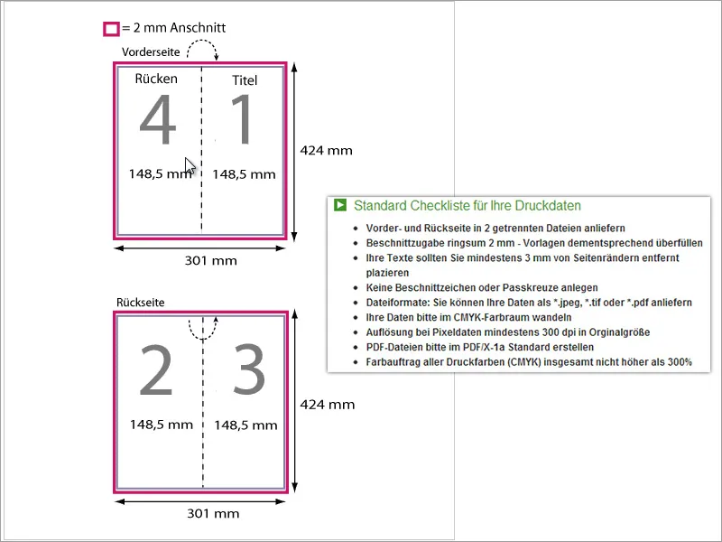
Now that it is clear how such a document should be created, you can also make these settings in InDesign for the new document. A bleed of 2 mm has already been taken into account in the specified document dimensions, which is why you do not necessarily have to set your own bleed.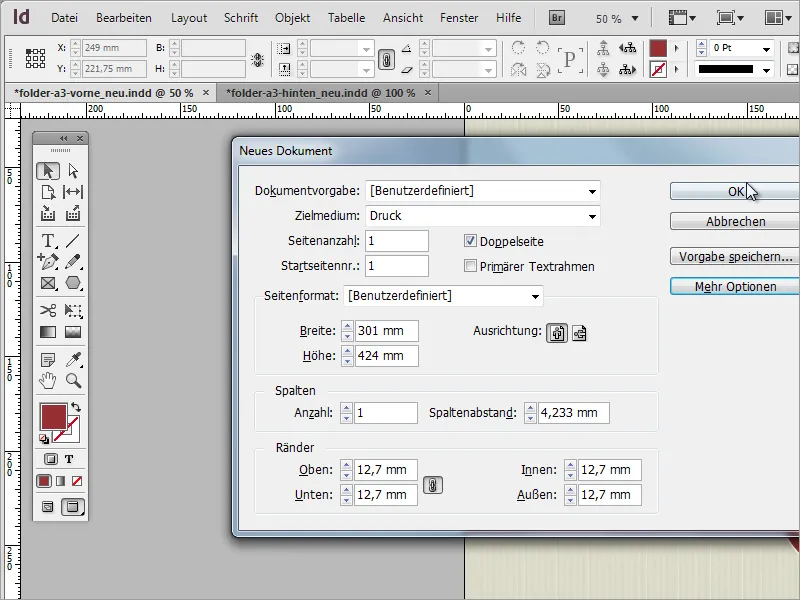
Now you should split the document along the subsequent fold. To do this, you need a dividing line in the middle of the document. This can be a simple line or an auxiliary line. The guides automatically snap to the center point, which is why this type of visual separation is recommended. Here, the vertical guideline that you draw from the ruler into the document snaps into place at the X value of 150.5 mm.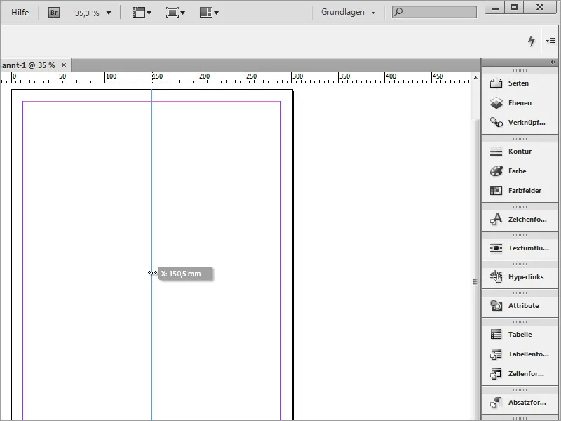
Before you start filling the document, you should make a few preliminary settings. These include defining the colors. The brownish house color, for example, will play a major role. It consists of 50 % cyan, 100 % magenta and 100 % yellow. Define this color in the color fields palette and rename it if necessary.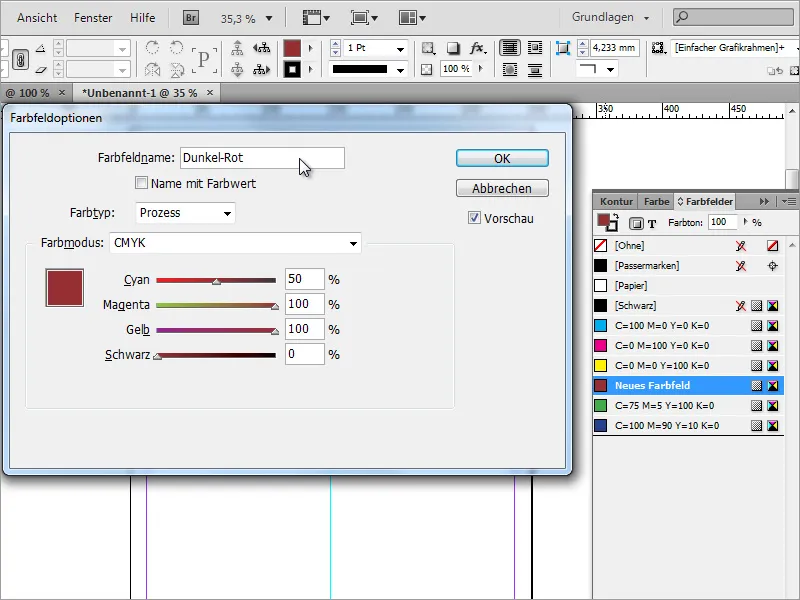
Another color will also play a major role for contouring. A soft yellow/beige with only 5 % coverage has been preset here.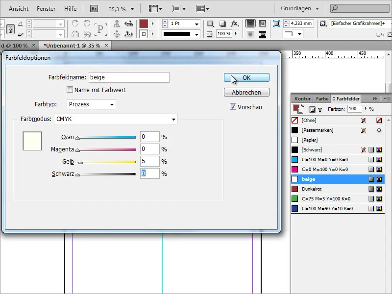
Now you can start creating the content. At the top, a dark color area should provide a visual separation from the edge of the document. To do this, simply use the rectangle tool and draw a rectangle that completely covers this area. It can also extend over the edge of the document, as this will be cut off later anyway. The beige color with a 3 pt thickness should be used as the outline.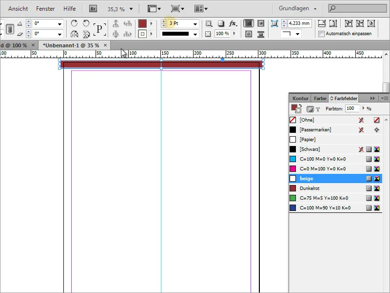
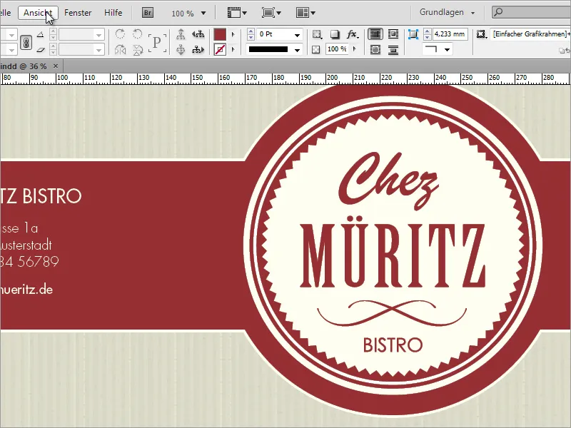
Once this first graphic has been placed in the document, turn your attention to the eye-catcher, the middle graphic. It is more than just a decorative element and consists of a rectangular graphic in combination with a circle. To do this, you first need a rectangular graphic without an outline.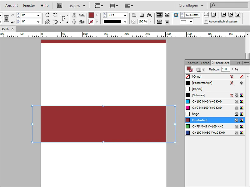
A circle is added to this graphic. Draw this circle evenly with the ellipse tool using the Shift and Alt keys. To draw the circle from the center axis of the rectangle, you must first place the mouse pointer in the center. On contact with the center point, this changes the appearance to a crosshair with a small black triangle.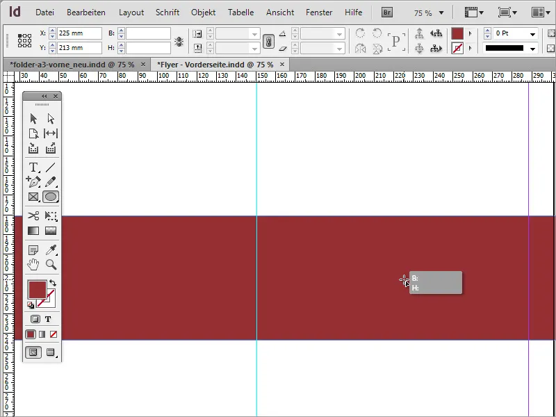
Then you can draw the circle evenly with Shift+Alt.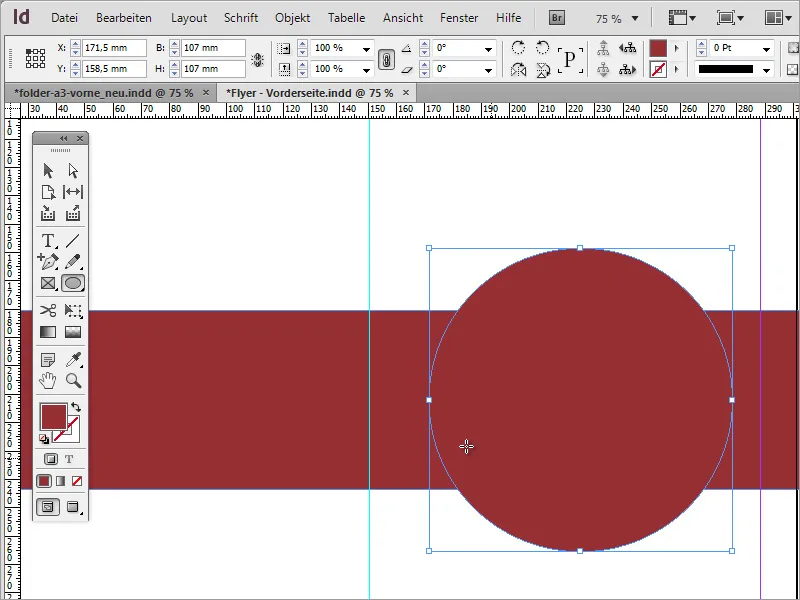
Subsequent enlargement of the circle is also no problem. However, you will need to use the Shift+Alt keys again, as otherwise the circle will only be enlarged on one side.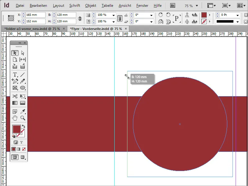
Visually, this looks quite good. However, you need a single shape consisting of these two segments. If you add an outline of 3 pt to the two shapes, one shape will always place this outline over the other. To make this more visible, I spontaneously dipped the background in a green color.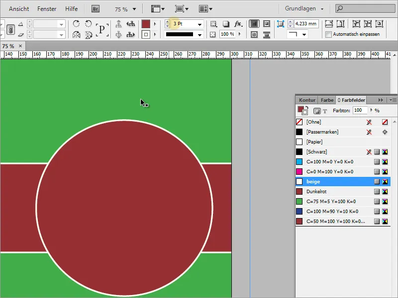
However, to turn these two individual shapes into one large, coherent shape, all you have to do is combine them. Use the selection tool and hold down the Shift key to select both shapes.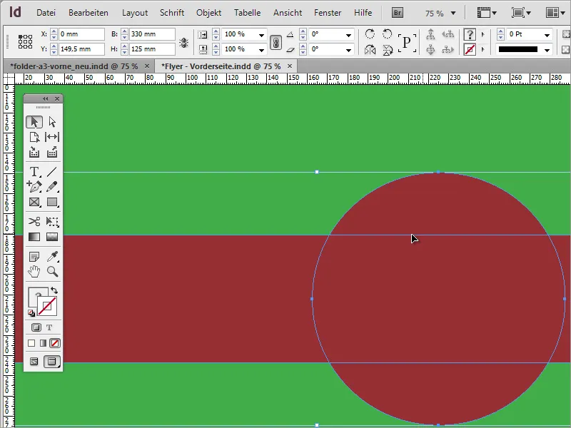
Now you need a special function that you can call up under Window>Object and Layout>Pathfinder.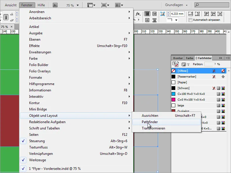
In the Pathfinder, select the Add option. In other layout programs, this is often referred to as merging and includes the function of creating a new, coherent shape from both individual objects.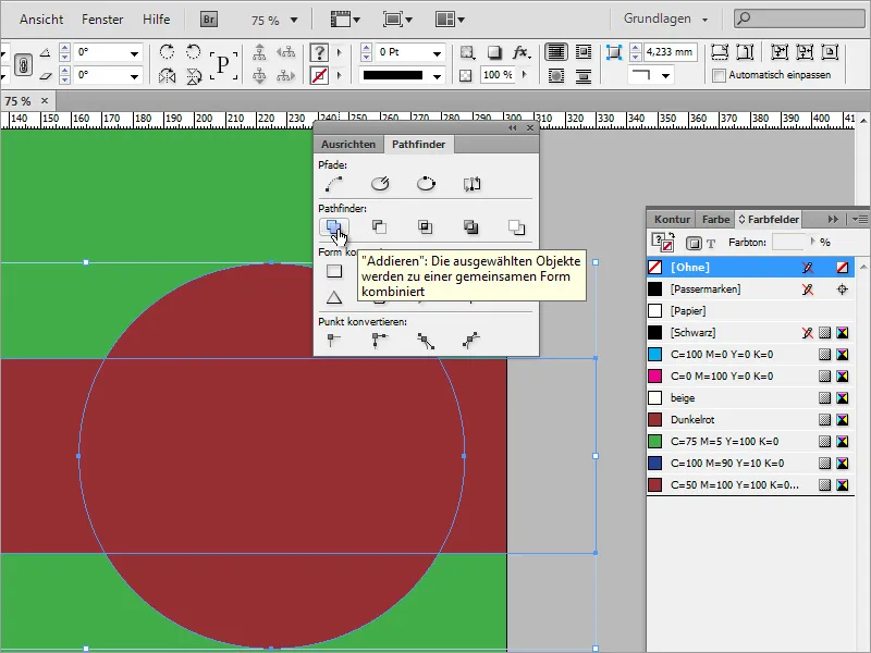
After clicking on Add, a combination of both objects is created. Now you can assign a uniform outline of 3 pt to this shape.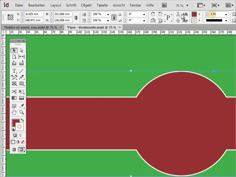
Let's take a look at the logo. Of course, this also had to be created first. I will show you how in the following steps in part 2 of the tutorial series.