Transparent glass text is one of the most popular text style effects in Photoshop, giving designs an elegant, modern, and professional touch. Whether it's for logos, header graphics, or creative projects – this effect impresses with its realistic depiction of glass that captures light and shadows. In this tutorial, I will show you step by step how to create a transparent glass text effect using Photoshop. We will use simple tools like layer styles, gradients, and effects to achieve a compelling result. Let's get started and make your text shine!
1. The Background
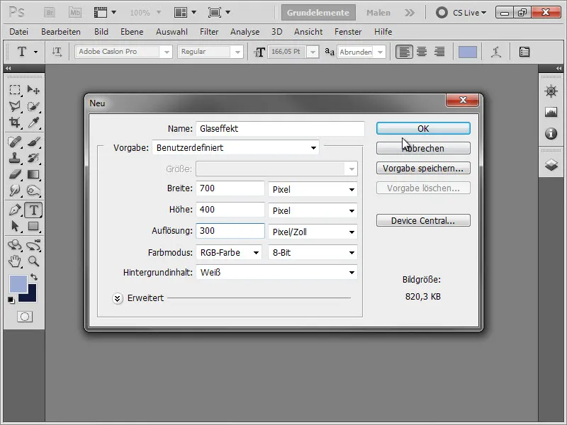
We create a new document with dimensions of 700 x 400 pixels. And for those who also like to print it later: A resolution of 300 ppi.
First, we create a beautiful background gradient. Most gradients consist of two colors. However, in Photoshop, we have the ability to create gradients with more colors, leading to more complex gradients.
Therefore, we create a radial gradient: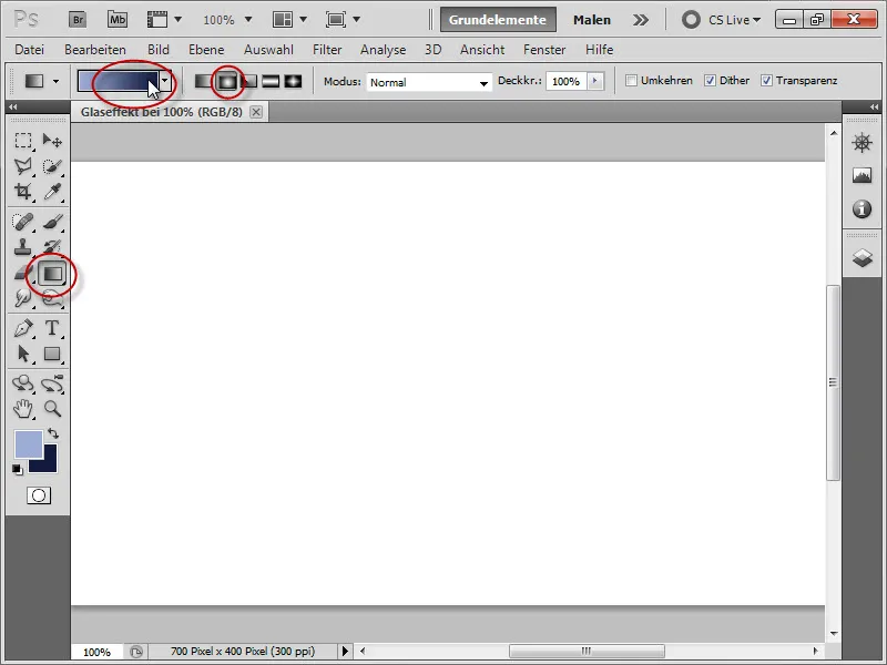
For the first slider, we choose the color: #790d3c, click in the middle of the color bar, and select the color: #4a0823. For the last one: #2c0414.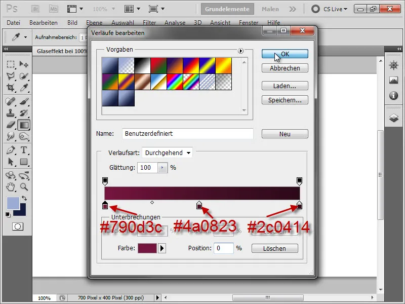
Then we drag the gradient from the bottom right to the top left, creating a light cone at the bottom right.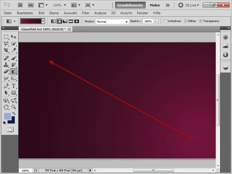
2. The Text
Next, we select the Text tool. Here, I have chosen the font "Adobe Caslon Pro" which comes with the Creative Suite. The font size in this example is 75.92pt. Now, we just need the right color. We assign it by clicking on the color field in the top right.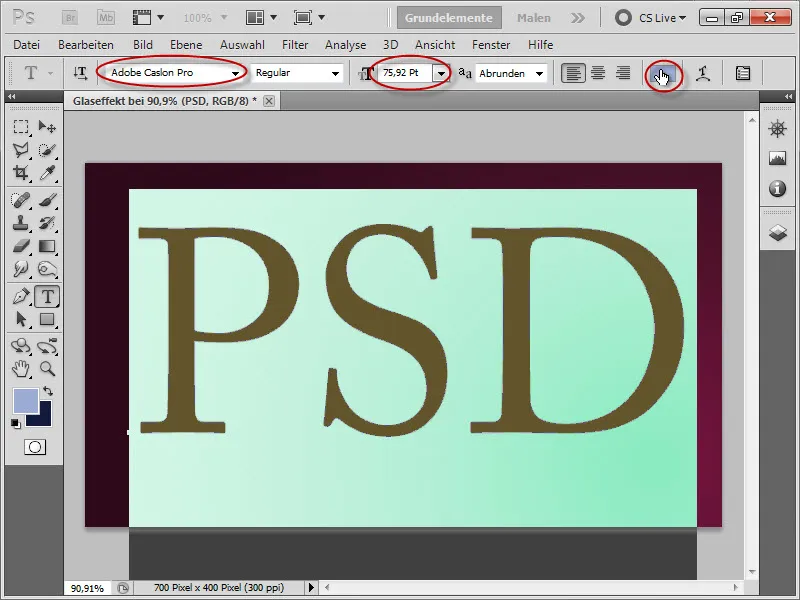
There, we enter the following value: #a9419c.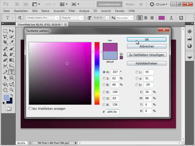
For our intermediate result: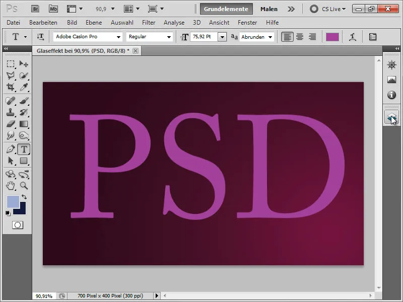
We set the opacity of the layer to 28%, making our text appear transparent for now.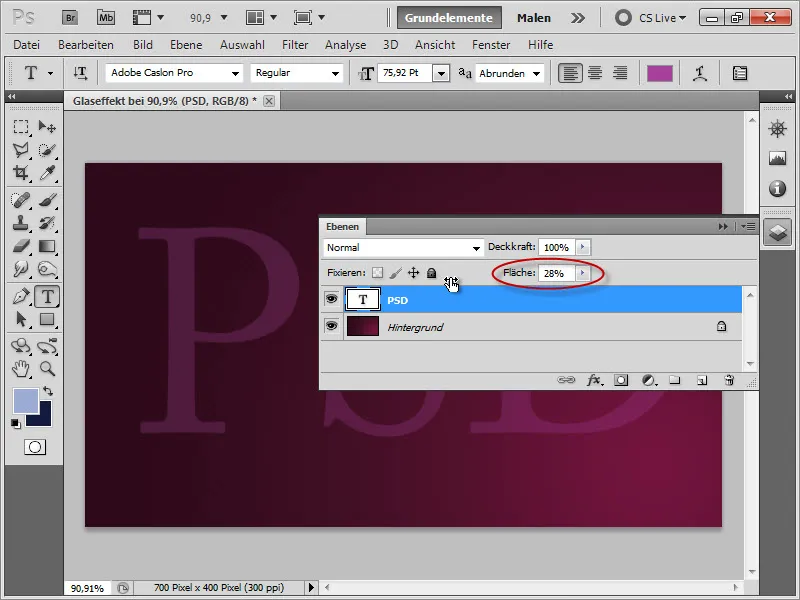
Then double click on the "PSD" layer or click on the fx button at the bottom of the layer panel to open the Layer Styles. First, we check the box for Drop Shadow. The values can be found below: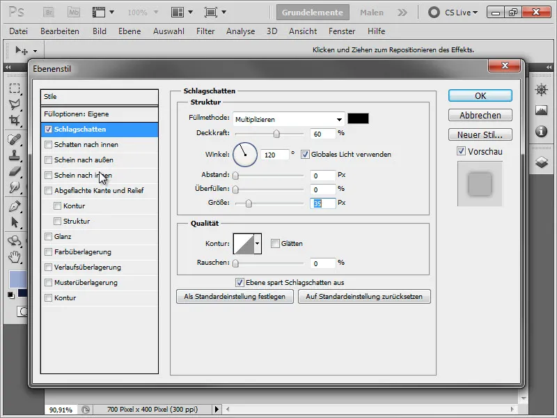
We receive the following result: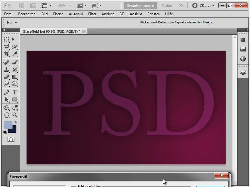
Next, we go to Inner Shadow and apply the following values: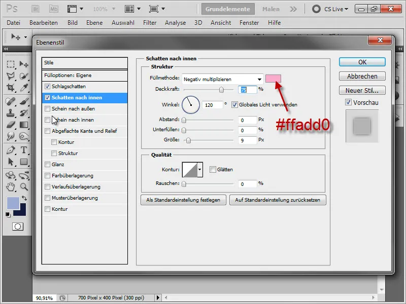
And receive the following result: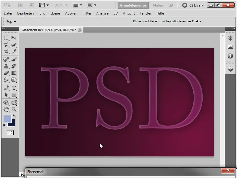
• Outer Glow: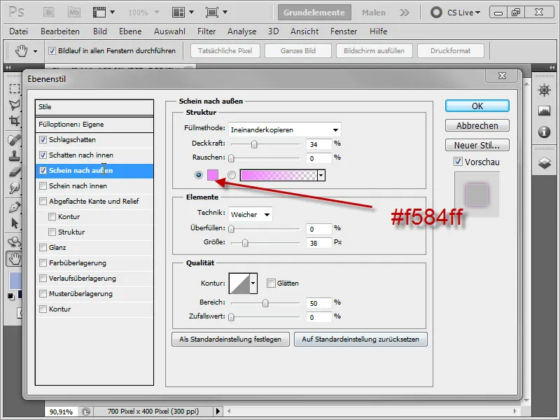
Intermediate result: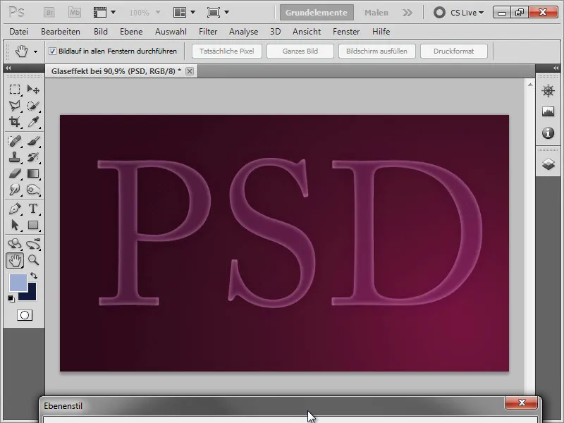
• Inner Glow: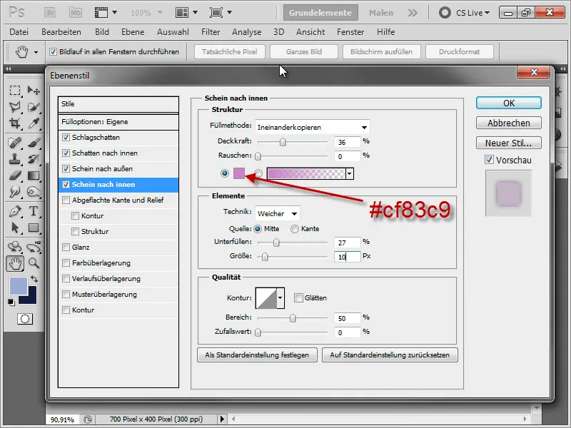
• Bevel and Emboss: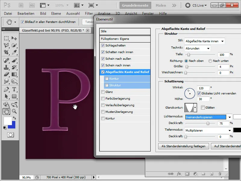
• Contour: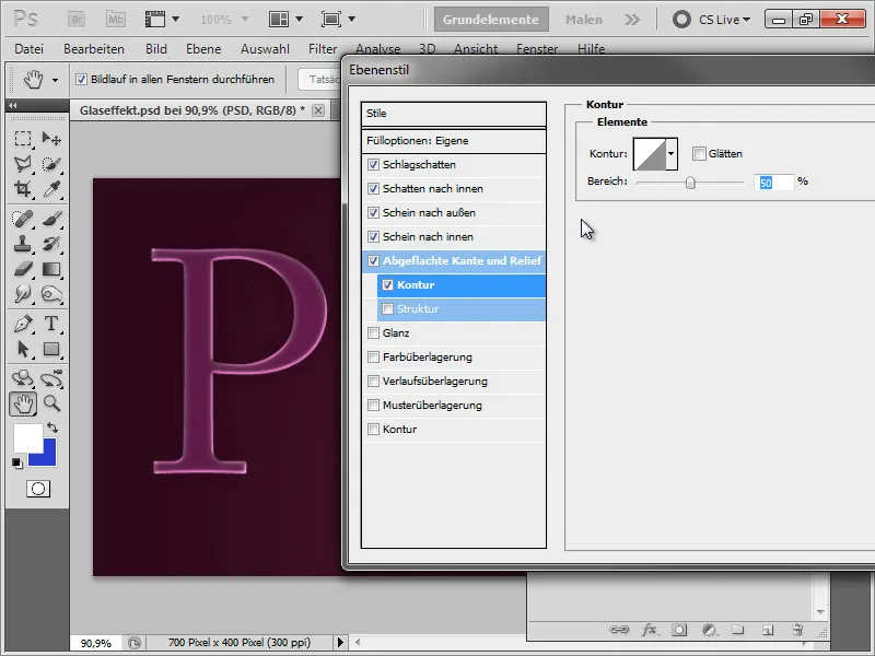
Intermediate result: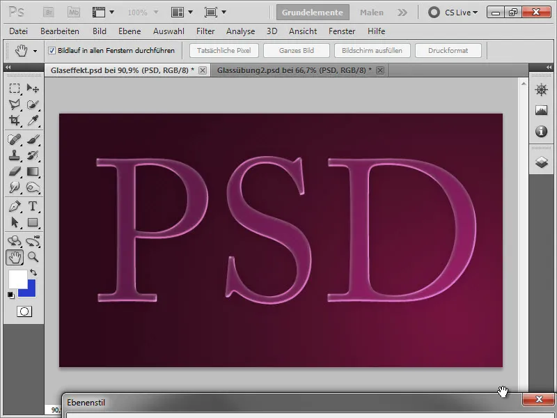
• Gradient Overlay: To choose the color for the blending mode, simply click once with the eyedropper on the dark background next to our "P".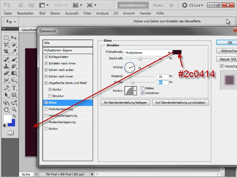
Intermediate result: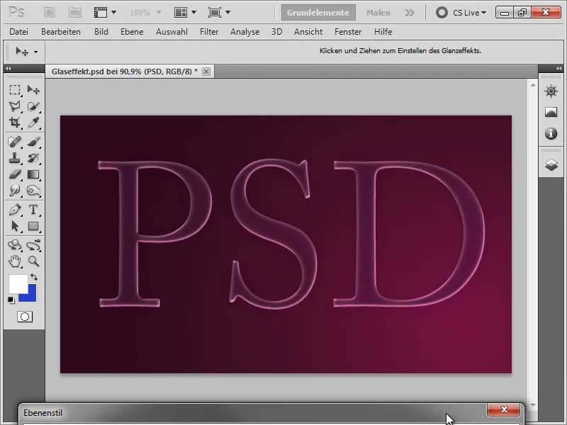
• Stroke: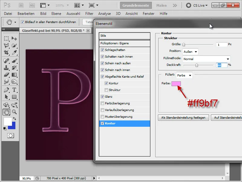
Intermediate result: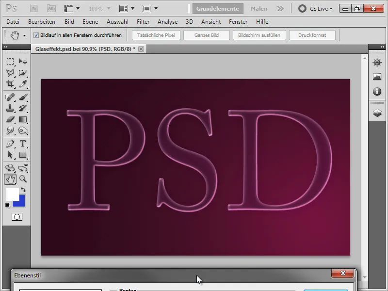
3. Creating Reflections
Now we are creating a small reflection at the bottom of the "D". To do this, we select our entire text by holding down the Ctrl key and clicking on our layer thumbnail.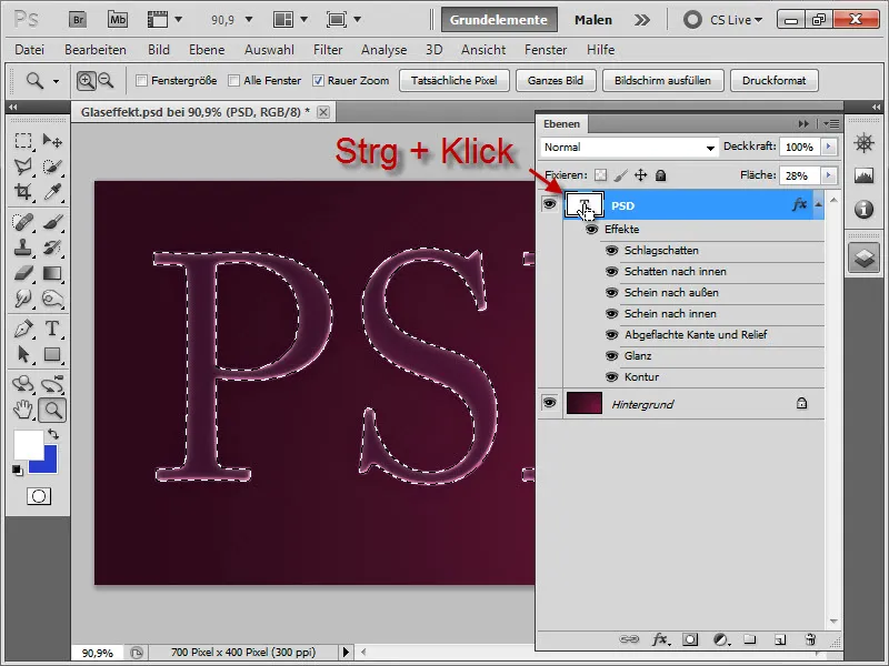
A new layer is created above that.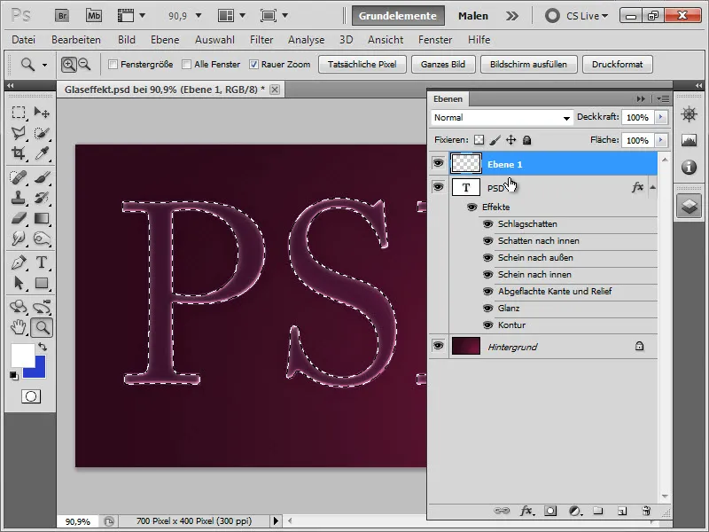
Next, we select the Gradient tool and choose a White to Transparent gradient. We make sure that the field for Radial Gradient is still active …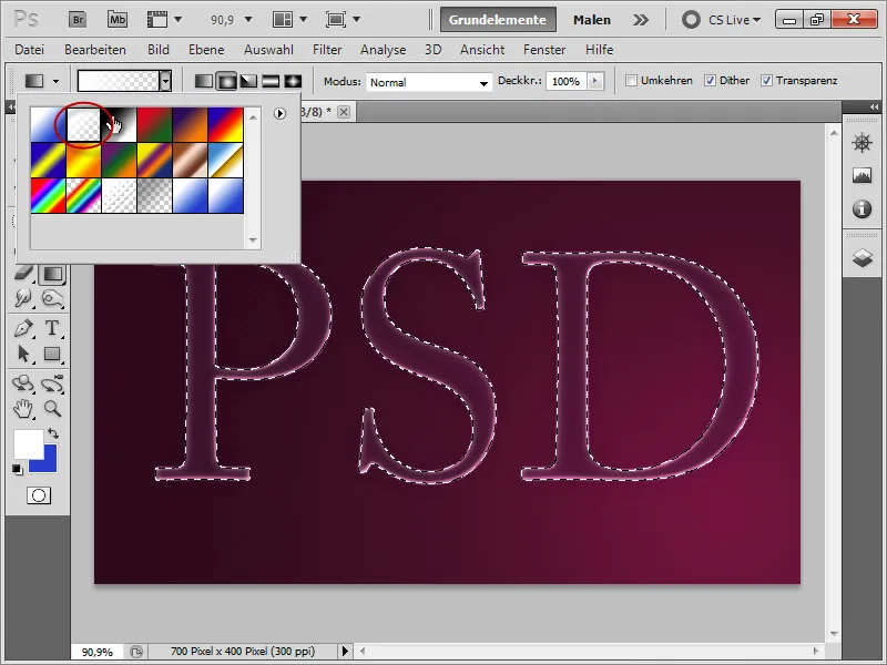
… and drag the gradient as shown in the image below.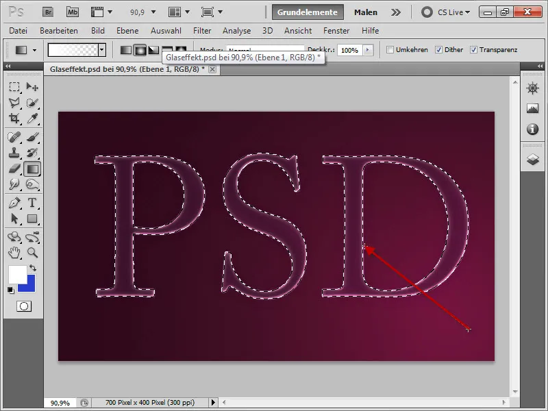
Result: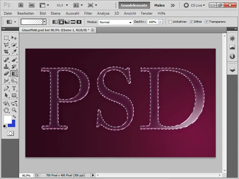
We can also hide the selection with Ctrl+H. This allows us to better assess the result immediately when applying a second gradient.
Therefore, we apply another gradient as shown in the image below to enhance the effect further.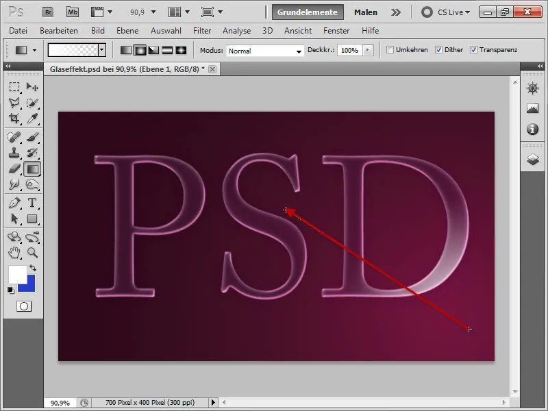
Then we press Ctrl+D to deselect the hidden selection. We then rename our top layer to "Shine below". To ensure that our gradient now nicely blends into our text, we select the blend mode: Screen.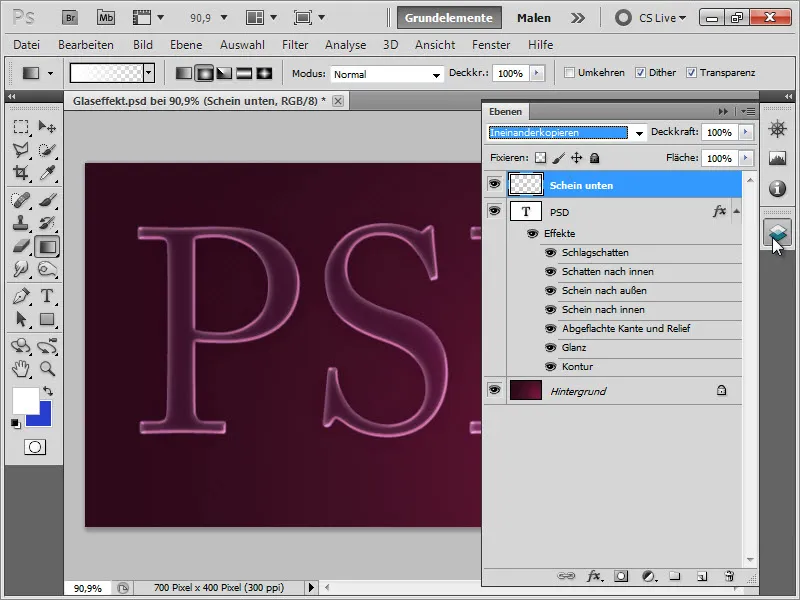
This gives us the following intermediate result: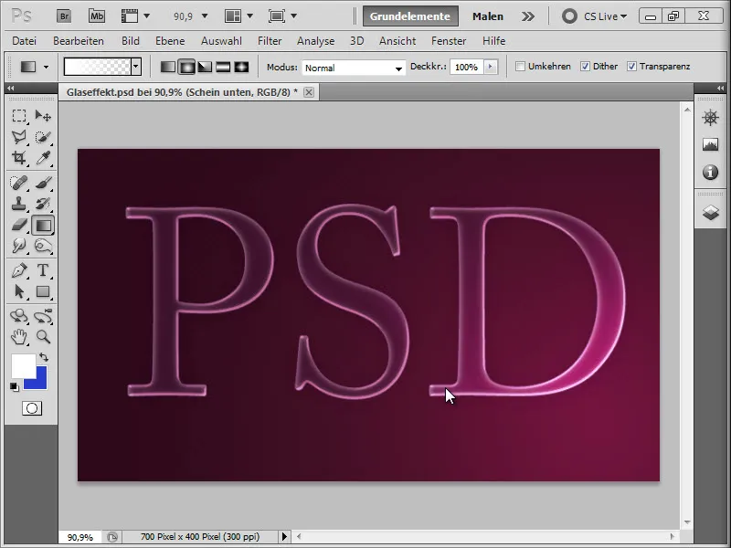
We now do the same with the upper left corner: We select the text with the Ctrl key held down on the layer thumbnail.
We create a new layer, naming it "Shine above" …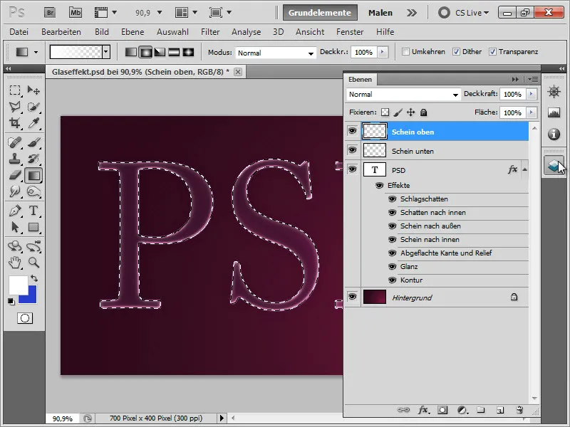
… and apply, using the White-to-Transparent Radial Gradient tool, another gradient as shown below…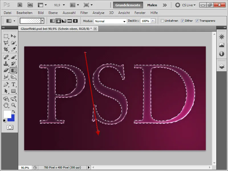
Intermediate result: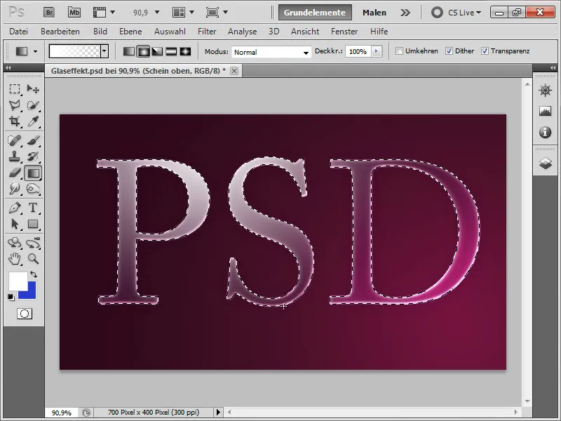
We then deselect the selection with Ctrl+D …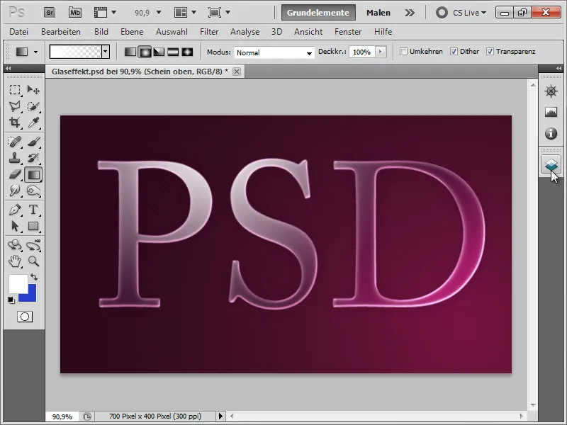
… and change the opacity to 30%.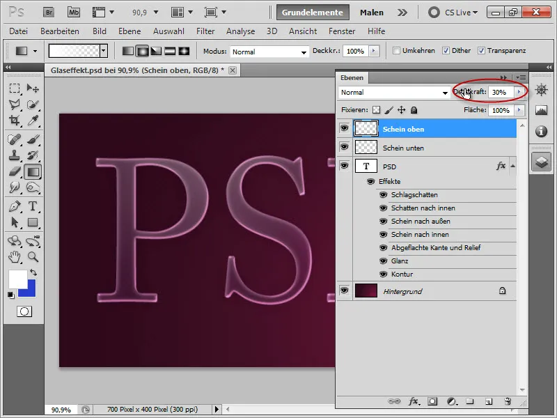
Intermediate result:
For a stronger reflection, we first create an elliptical selection over the top half of our text … (to move the ellipse while creating it, hold down the space bar).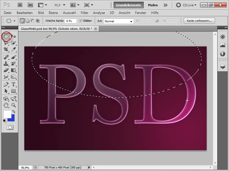
We then invert this selection by pressing Ctrl+Shift+I, …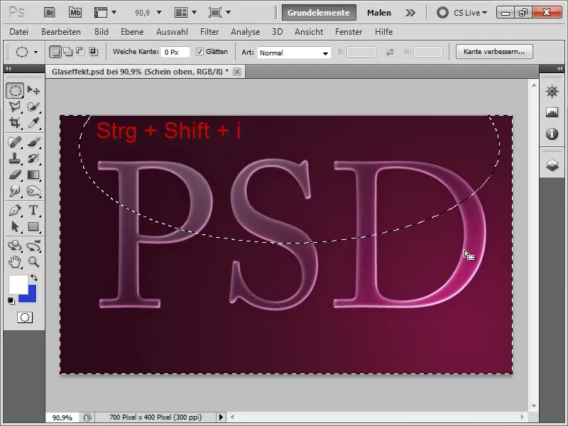
… and delete the rest of the gradient with the Delete key, creating a sharp edge to the reflection.
4. Creating the Highlights (2 Variants)
To create an even more luminous effect, we create small highlights. There are several variations to do this. I will explain 2 of them to you. One using polygon stars and the other using flares.
Variant 1: Polygon Stars
We start with the polygon stars. To do this, we create a new layer and name it "Stars".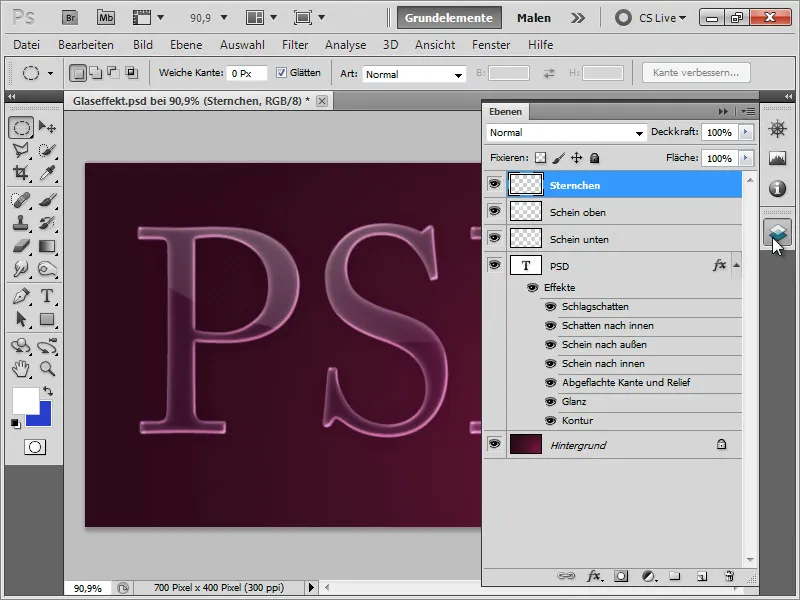
Next, we select the Polygon tool …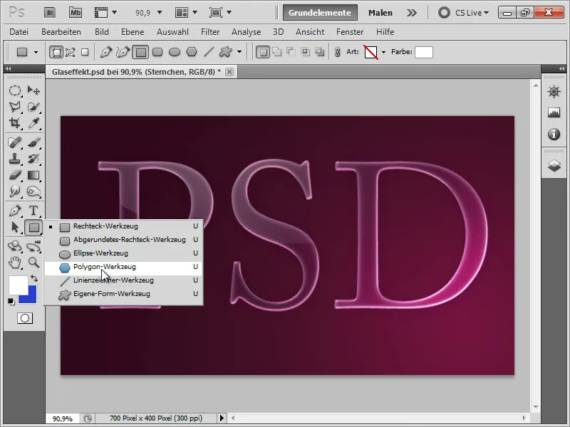
... click on the small down arrow in the control bar and...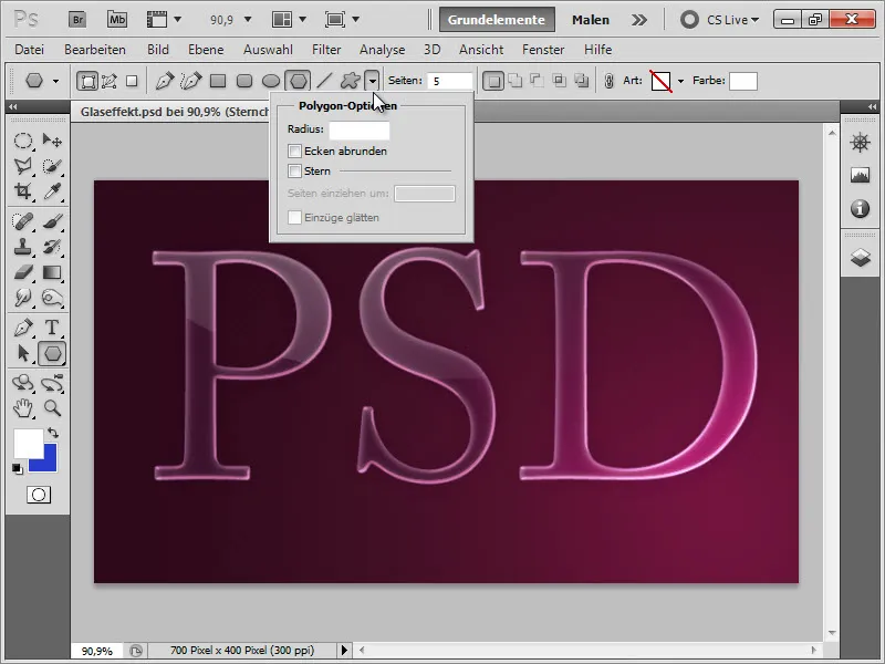
... click on the Star option there.
• Set Pages turn in to 98% to get really sharp tips. Then enter 5 in Pages to get 5 tips per star.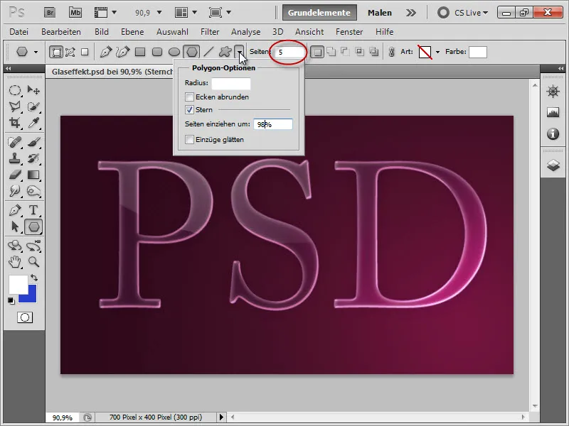
It is important here that we have set the foreground color to white. We then place the stars on the brightest lit areas...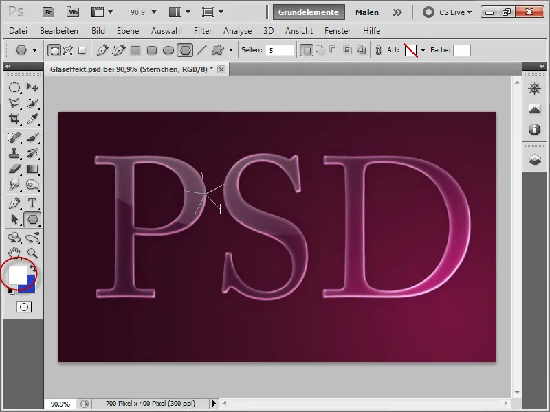
This is how beautiful it can look.:)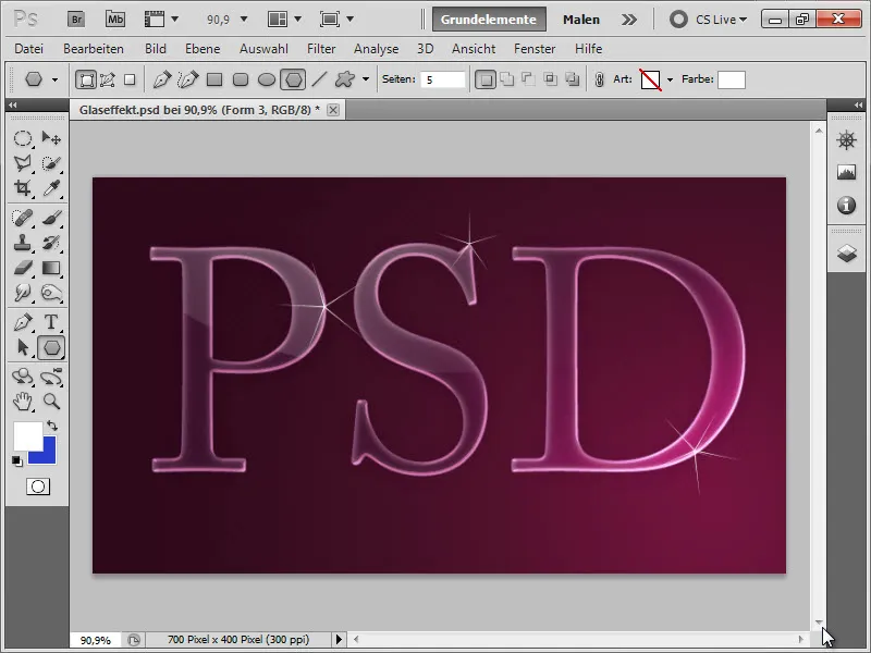
Now let's focus on the second variant. But before that, let's tidy up our layers palette by grouping our polygon layers together (by selecting the corresponding layers and pressing Ctrl+G). Then we can hide them with a click. We can name the group "Little Stars."
Variant 2: Creating Flares as Brushes
Here, I want to show you a very efficient way to quickly and easily place flares. To do this, we first need a new document with a workspace of 2000 x 2000 pixels (we will need this because the flares will also be immensely large in a small state;)).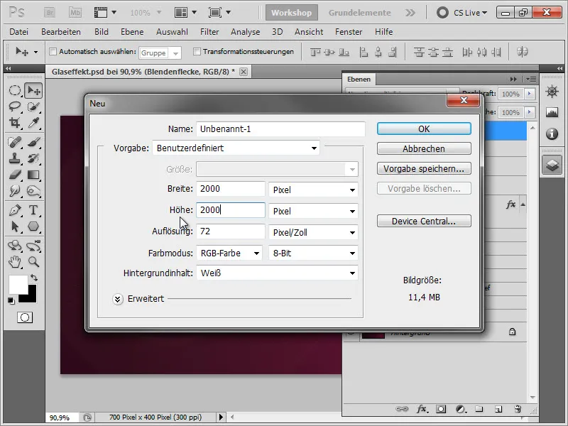
We fill the background with black...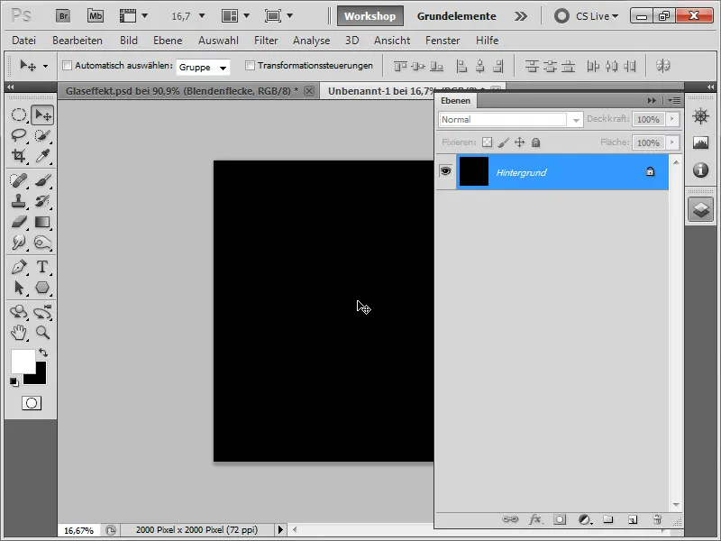
... and call up our flares.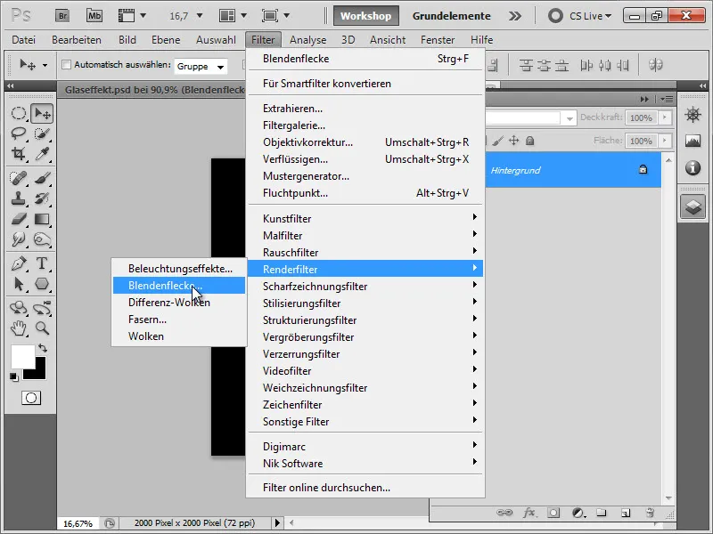
Now we need to make sure to place the flare as centrally as possible so that we also get the glow around it uncut onto our workspace.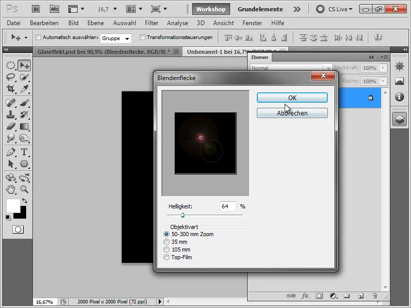
For those who look closely or view their monitor from the top angle, you can see that our flare almost touches the upper edge very closely.;)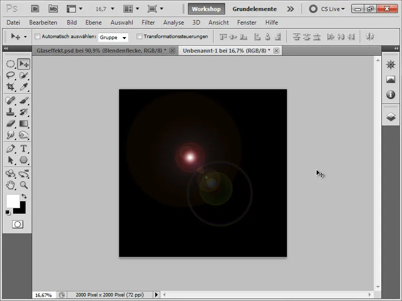
But luckily we still caught it completely. So now we press Ctrl+ I to invert our layer.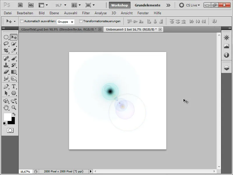
Then, we select the entire layer by using the keyboard shortcut Ctrl+A, go to Edit>Define Brush Preset...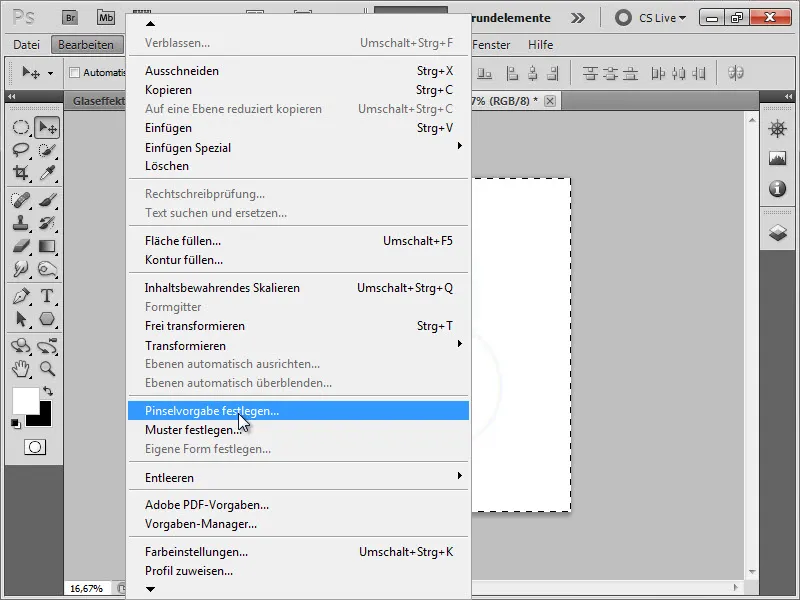
... and save our flare as a brush.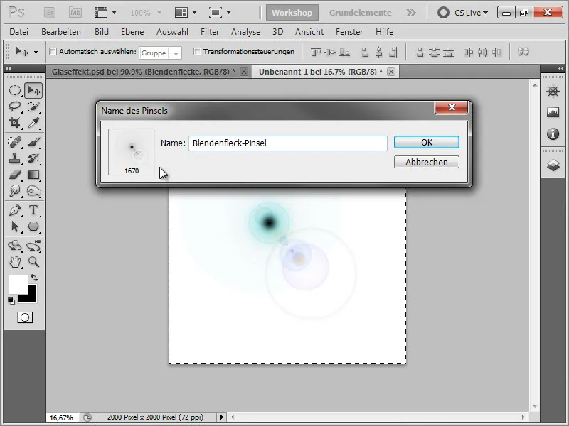
Back to our document, let's first create a new layer and name it "Flares."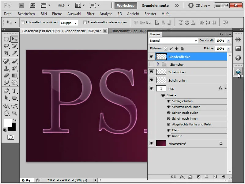
Now we can call up the newly created brush in the brush palette.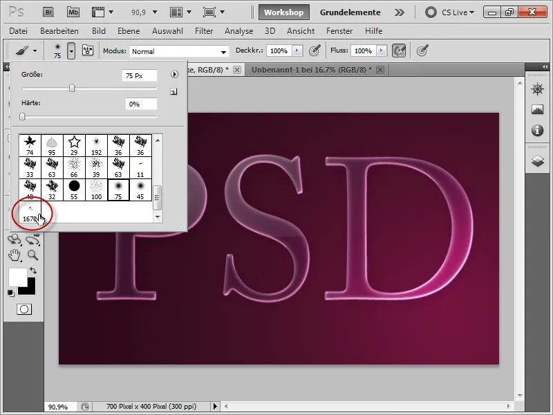
Beforehand, we make sure that our brush is not too big. Also, the foreground color should be white.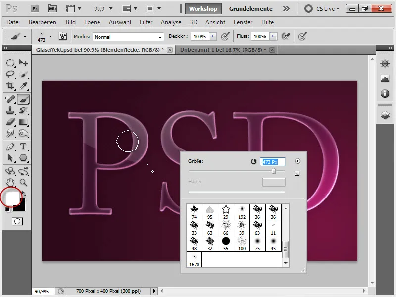
It's best to create a new layer for each flare (in order to move it around as desired) and place them on the reflected areas in our image.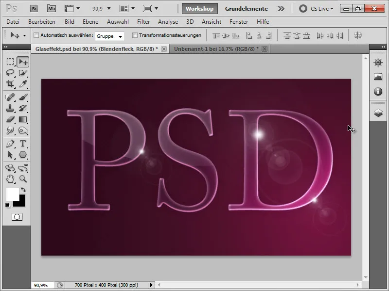
5. Creating a Reflection
As is the case with most highly reflective objects, they usually leave a reflection. And that's exactly what we will do with our text now.
First of all, we need a duplicate layer of our entire text with the reflections. To do this, we select the layers "PSD," "Glow below," and "Glow above" and drag them with the mouse held down to the lower sheet to create a duplicate layer of all three layers.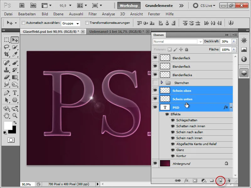
Then press Ctrl+E to merge these duplicates into one layer.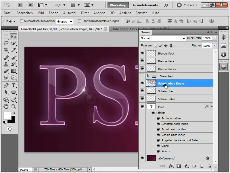
Then press Ctrl+T to transform the layer. Right-click on the transformation layer and choose Flip Vertical.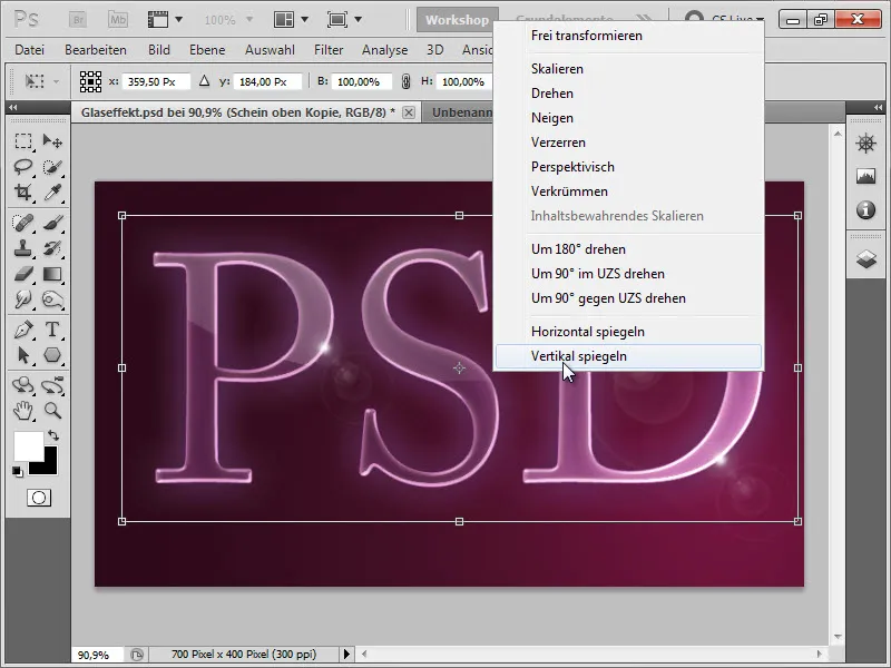
Then we move the layer down using the arrow keys until the layer edges touch. This is only the case with the "S". The other two we still have to adjust.
Therefore, we select the Rectangle Selection Tool and start by selecting the "P".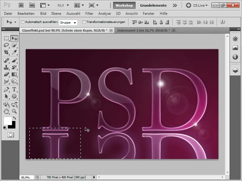
If we now press "V," we have our Move Tool ready. With this, we can move the "P" up using the arrow keys until it touches the lower edge. If we then press Ctrl+H, we hide the selection edge and can therefore assess the position better. This really helps with moving.
It doesn't matter that the lower edge of the "P" is being cut off, as it will be hidden later anyway.
We repeat the same process with the "D".
Next, we create a Layer Mask on this layer …
…select the Gradient Tool and choose a Black and White Gradient or a Black to Transparent Gradient. Make sure that the Linear Gradient option is enabled.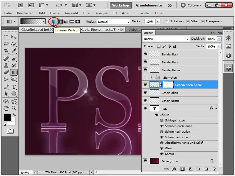
We start the tool at the bottom edge and drag it up as shown in the illustration. We can also hold down the Shift key to ensure our gradient is very straight.
And we get the following intermediate result: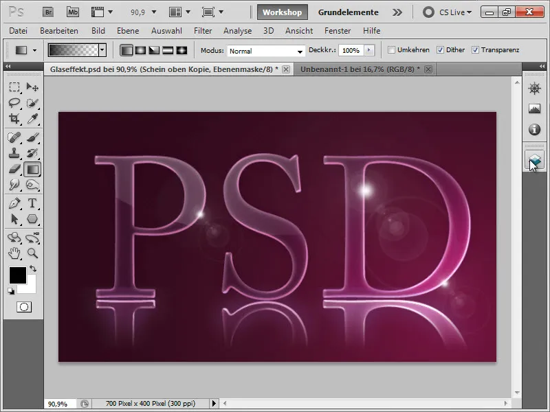
As with many reflections, the reflection is usually very faint. So, we adjust the Opacity of this layer down a bit (44%) to achieve a relatively realistic reflection.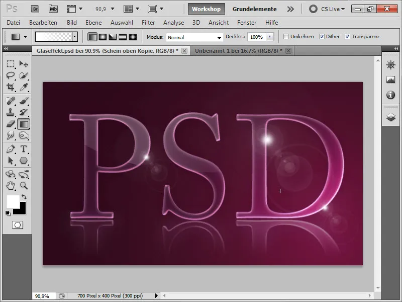
This gives our text a bit more space because the reflection reveals a floor. To emphasize this space a bit more, we will create a floor.
Before that, let's organize our layers a bit. We rename the layer we just created to "Reflection". Since a reflection goes under the text, we move this "Reflection" layer under the "PSD" layer. Then we group the text along with the reflection and reflections into a group called "PSD". And we also group the three lens flare layers into a lens flare group. So, our layer structure consists of the background layer, the "PSD" group, the "Star" group, and the "Lens Flares" group.
Under the "PSD" group, we now create a folder named "Floor," where we will create our final graphic.
6. Creating a Floor
In the layer group "Floor," we create a new layer, which we also name "Floor." Then, we select our Gradient Tool.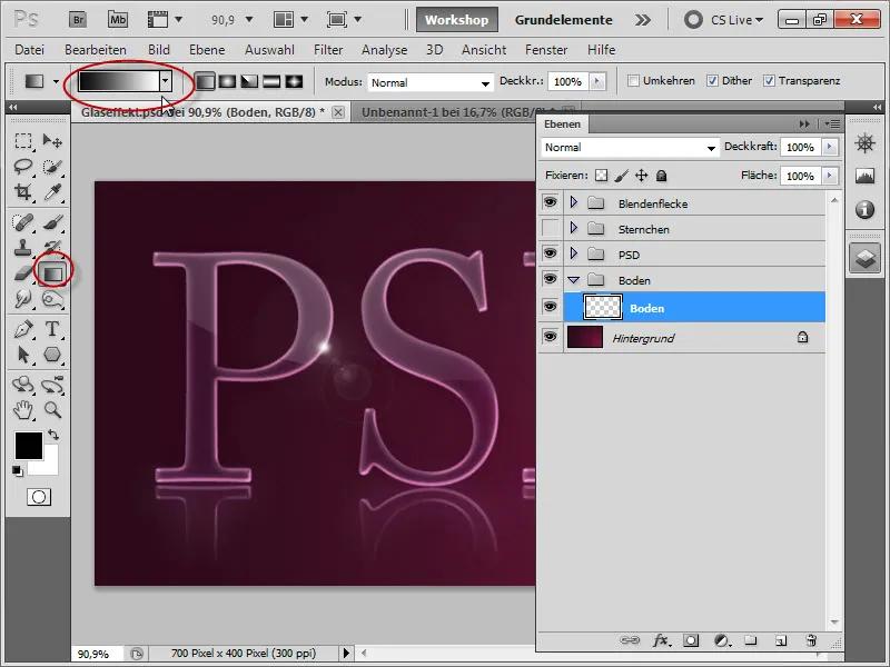
We set the following color values: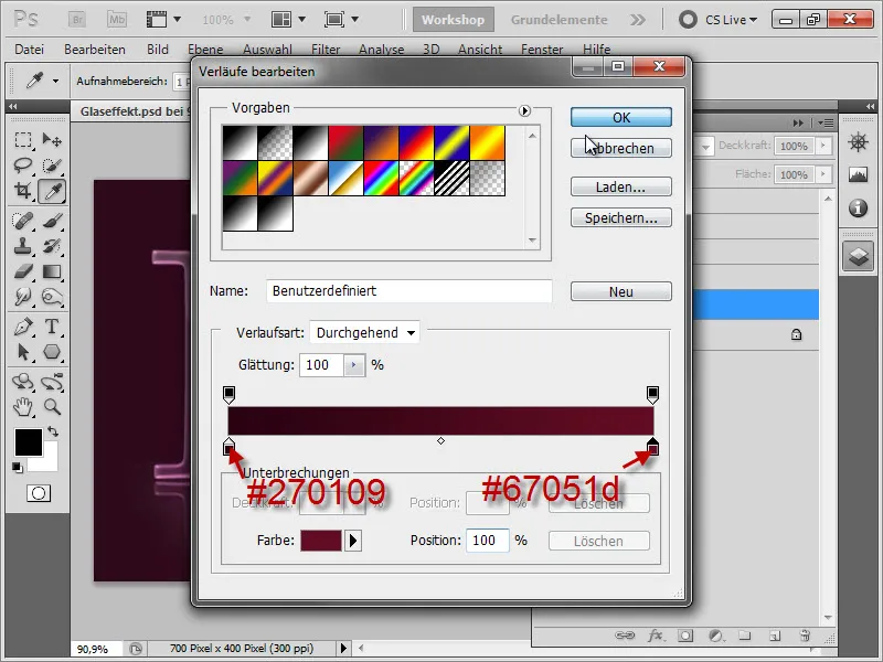
Then, with the Shift key held, we draw a nice gradient from top to bottom.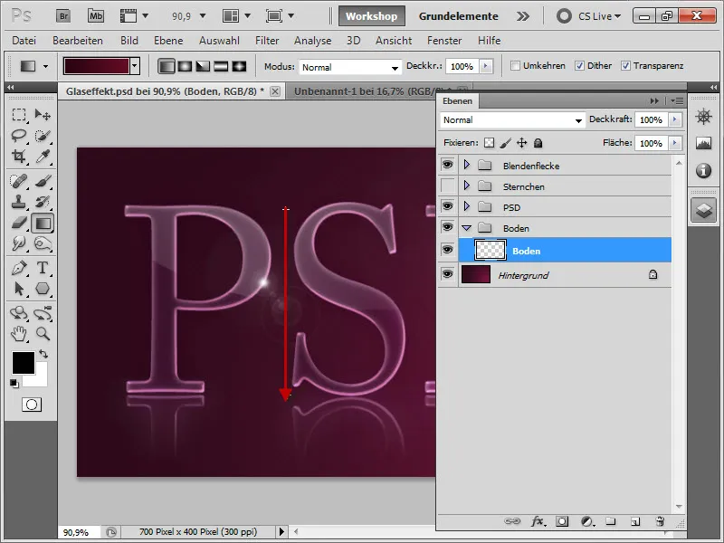
Intermediate result: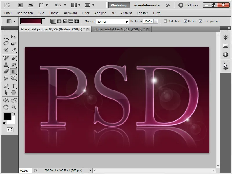
Although it already looks nice, it is meant to be our floor. So we now press Ctrl+T and drag the layer down from the top middle handle until it extends slightly over the reflection. This way, the text doesn't align with the back edge of the "room," but more towards the middle.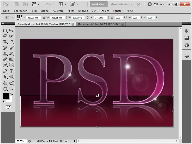
Intermediate result: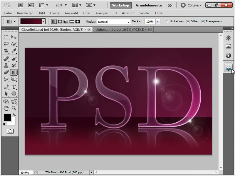
So we have our virtual floor. However, it is not quite convincing yet as it does not cast a shadow. Therefore, we create a new layer for the shadow and move it below our "Floor" layer.
We name this layer "Shadow" right away. Then select a soft round black Brush …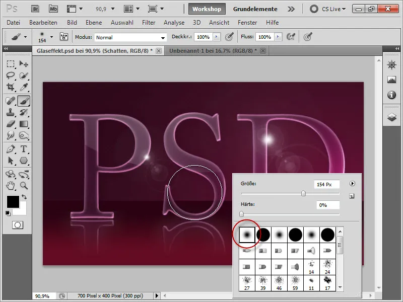
… and drag it slightly outside the document while holding down the Shift key along the edge of the floor.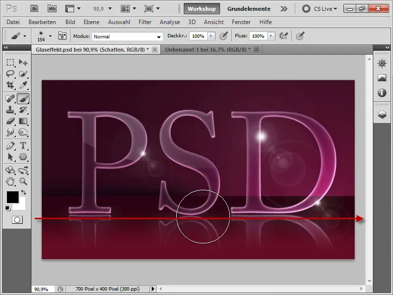
Intermediate result: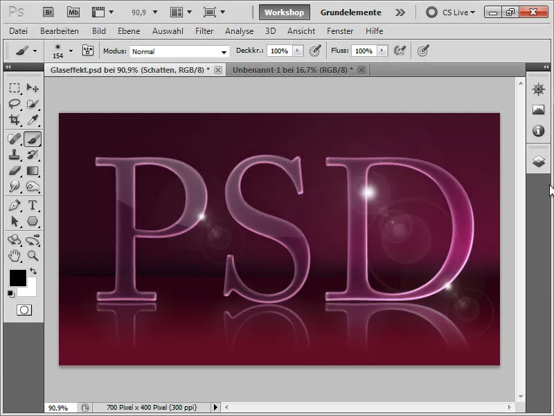
Now our shadow is still a bit too strong. But that's okay, because we can move it down a bit with the Move tool and the arrow keys. Or we can press Ctrl+T again and move the lower middle handle up a bit to make our shadow a bit harder still.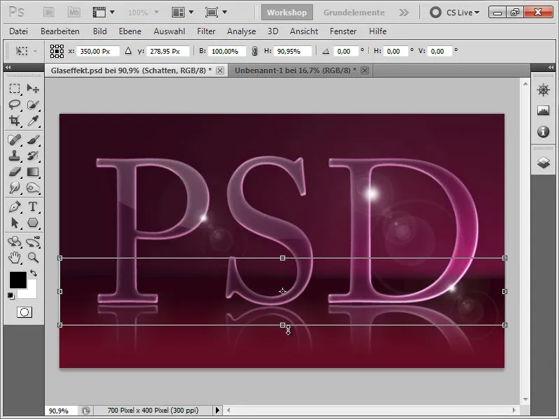
Then we can adjust the opacity of the shadow slightly (to 60%).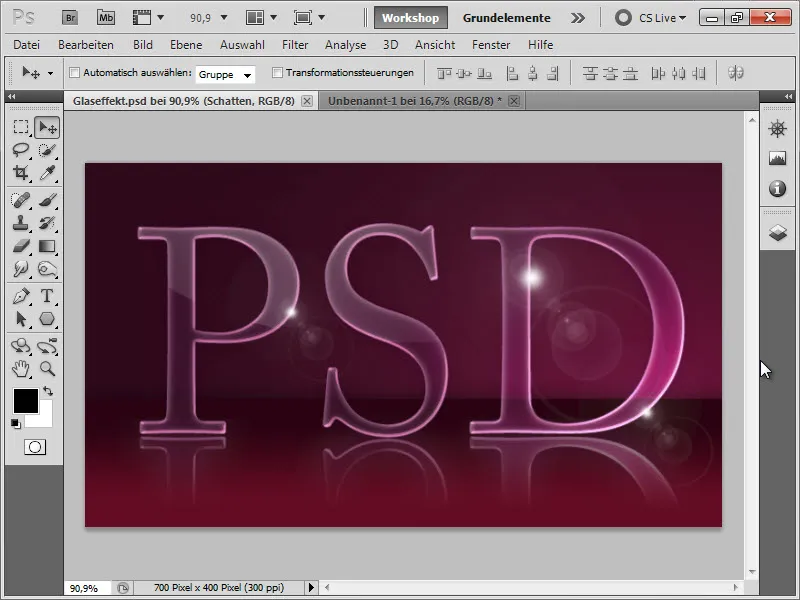
And finally, we have reached our goal.:)
I hope you enjoyed this tutorial, and I look forward to every comment.:)