Once this graphic element has been completed, you should align it on the page or using the guide line.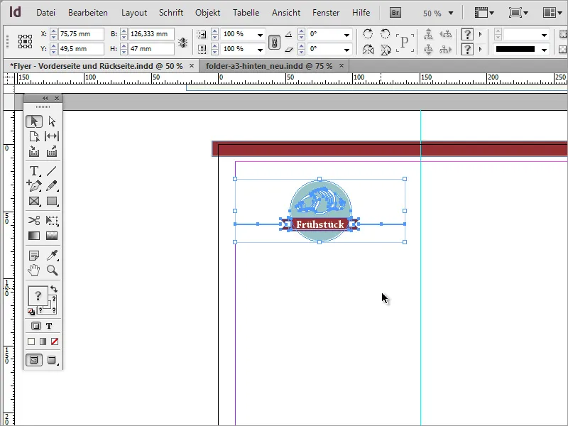
The distance between the center fold and the edge should be the same. To check the spacing, you can again draw an auxiliary object in the form of a rectangle. This should fit exactly into the spaces to the left and right of the fold or the side margin.
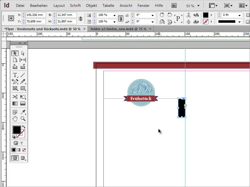
Once the object has been aligned, you can add a separate guide for the other elements and assign it a different color using the guide options so that it stands out from the other guides. You can find the guide options in the context menu as soon as you have right-clicked on the guide. Switch to the Guides entry there.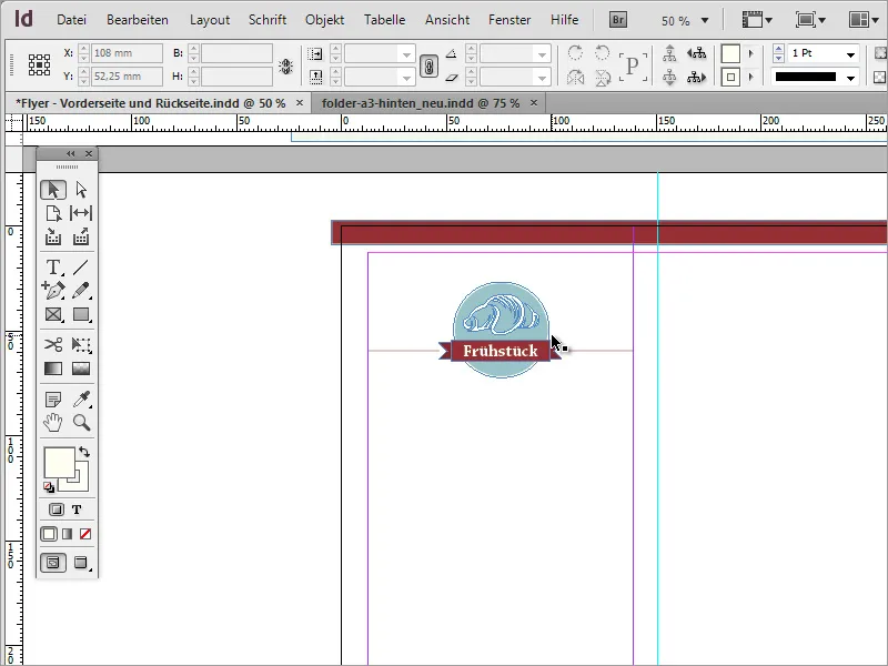
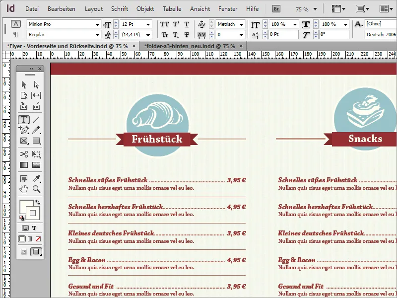
The actual offer for the customer must now be added. To do this, you first need a text frame that you draw within the selected border area. Write the food offer in this text frame or copy it from another source.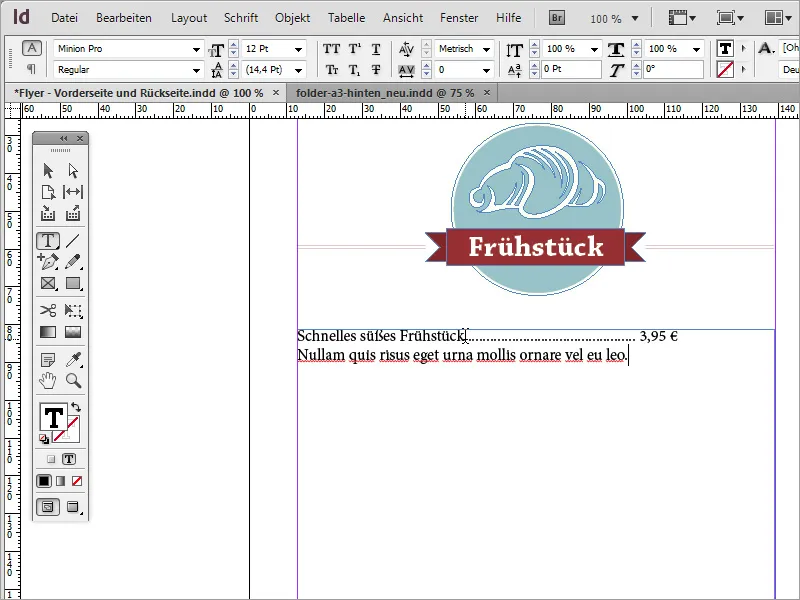
The text should now be formatted. Chaparral Pro in Bold Italic was again used for the breakfast offer and the price information; the additional text below the offer was created in Regular font. The entire text is in the striking red tone.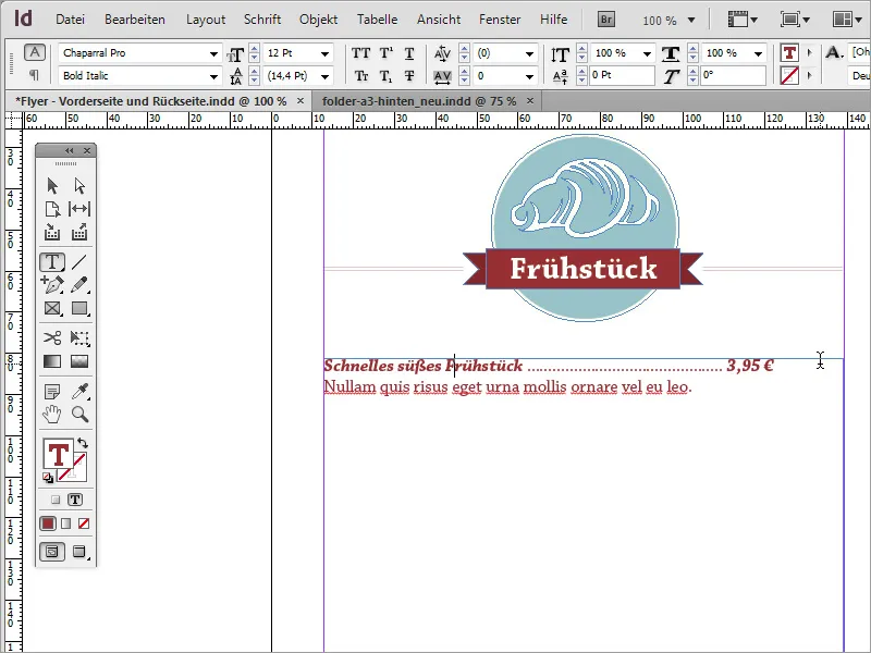
If you want to format the text, you may be faced with the problem of not being able to align the price as desired. This is a very simple matter. The first option is to use justified text. However, this has the disadvantage that the text is visually unattractively stretched. In addition, to eliminate this stretching, a large number of dots would have to be added individually for the space between each line of text.
A classic alternative and a simple way is to apply a specific text option to these lines. To do this, navigate to the menu item Font>Insert special characters>Other>Tabulator for right alignment.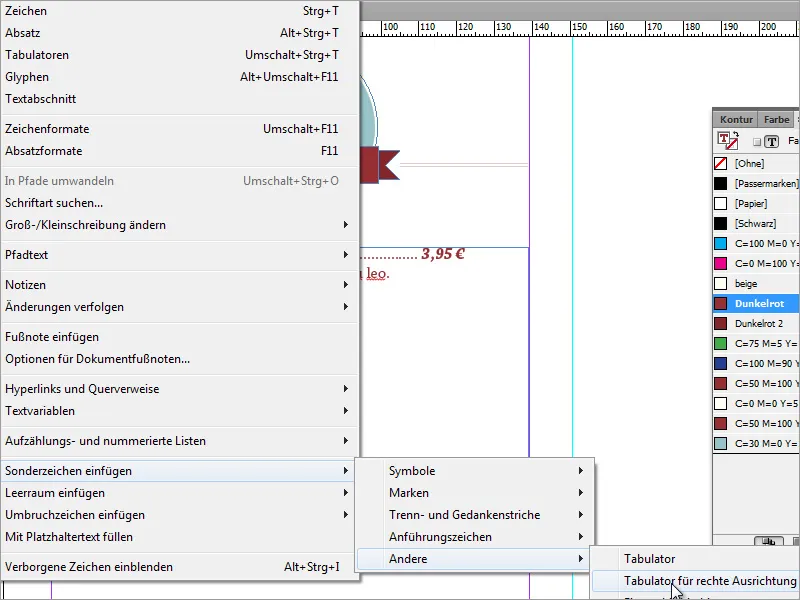
Once this has been selected, the text on the right will also be right-aligned. Tip: Please pay attention to where you insert this option in the text. If you do not place the cursor directly in front of the price before selecting this option, everything behind it will be aligned to the right, including the intermediate points.
The space in between can then be filled in manually with the missing dots. However, if you change the font size, there is a risk that the price will also move to the back. The breakfast offer and the price should be created in 14 point font size instead of 12 point.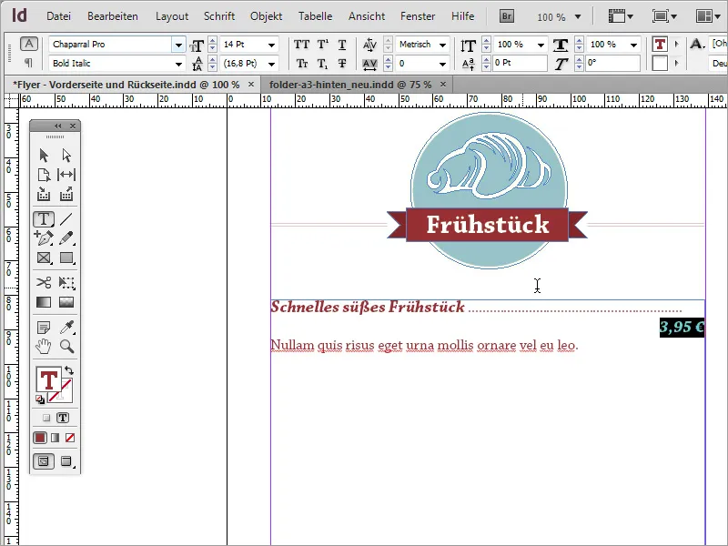
A visual separator is used below the respective offer. This can be a simple line or another graphic, for example. Such a line is quickly drawn and formatted with the line tool. Use the same red color again and set the line thickness to approx. 1 point.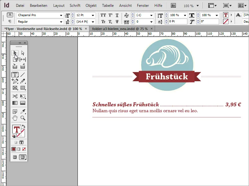
You can mark these text passages and auxiliary lines and insert them again as duplicates. To ensure that the text is not too close together, you should enlarge the space between the lines where the dividing line is located. To do this, simply double-click in this line and increase the space to approx. 21 points.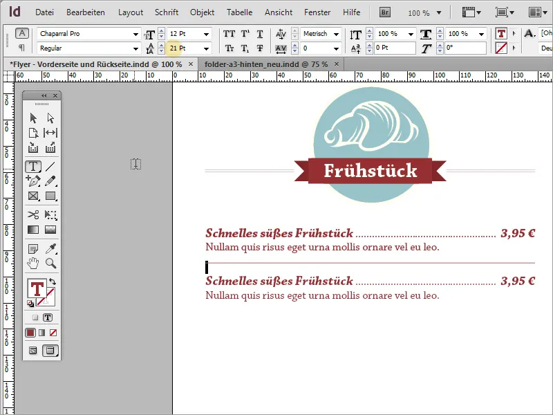
You can also use individual text boxes for this type of copy, which can then be copied, created and distributed. However, this is not absolutely necessary; a single text box is also sufficient for this purpose.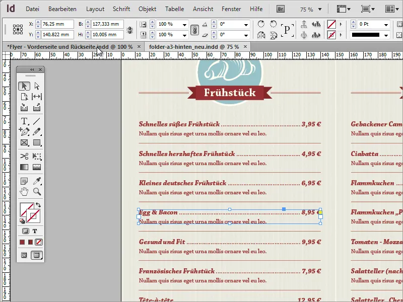
With these simple steps, the entire remaining area can be filled with information. You only need to replace the small symbols and the text content. The duplication process can begin by replacing the category with another one. To do this, first select the upper graphic area and drag a duplicate of it down using the Alt key.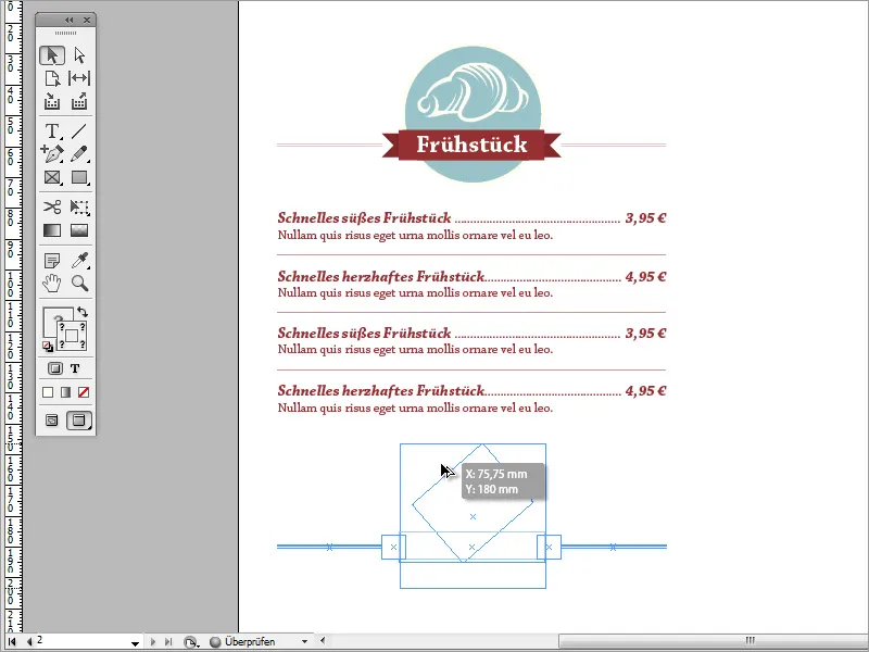
Now you can replace the graphic with another one. To do this, simply switch to the Adobe Illustrator program and copy a suitable graphic to the clipboard using Ctrl+C.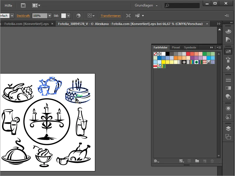
Use Ctrl+V to paste it into the document. You can remove the old graphic and drag and scale the new one into the circle area as a replacement. As the pasted graphic is black, you should deactivate the outline and use beige again as the fill color for the area. You should also adjust the name.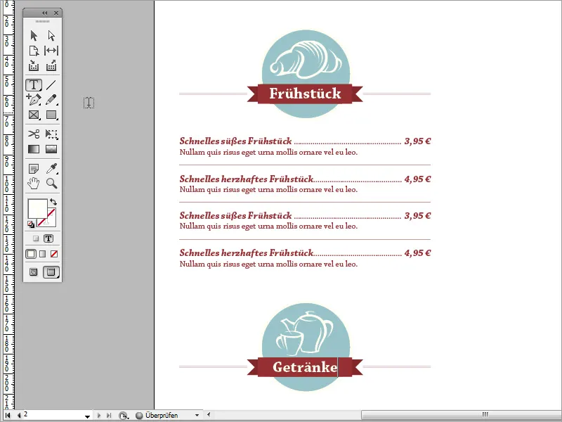
This will allow you to adapt the content of the entire map in the same way. Towards the end, you can also reactivate the background graphic for a better overview and control.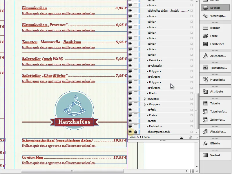
Also check whether texts and graphics have a uniform height or are offset from each other. The human eye recognizes irregularities in fractions of a second. Such offset content also detracts from the professional impression.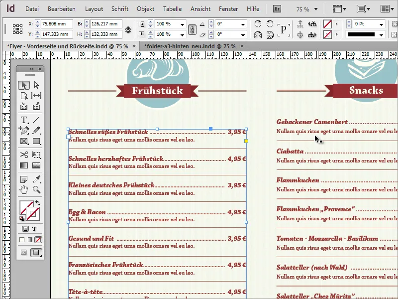
Therefore, always try to keep an eye on these things. If you have problems aligning two text areas, for example because one consists of individual text boxes and the other of a single area, try to agree on a variant and, if necessary, work with a copy of the preferred format. The text and graphics are quickly replaced.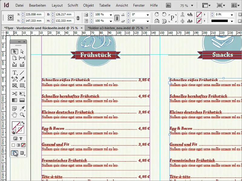
In the end, such a card is a very simple undertaking and can become a convincing print product with the targeted use of a few stylistic elements.