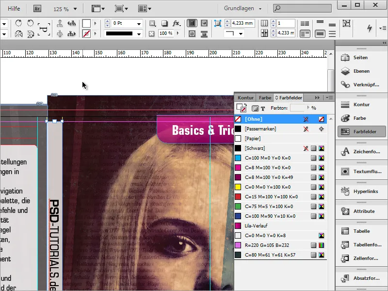
Using the selection tool and holding down the Shift+Alt key, you can now select the object and scale it proportionally if it is still a little too large or too small.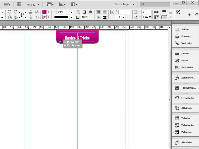
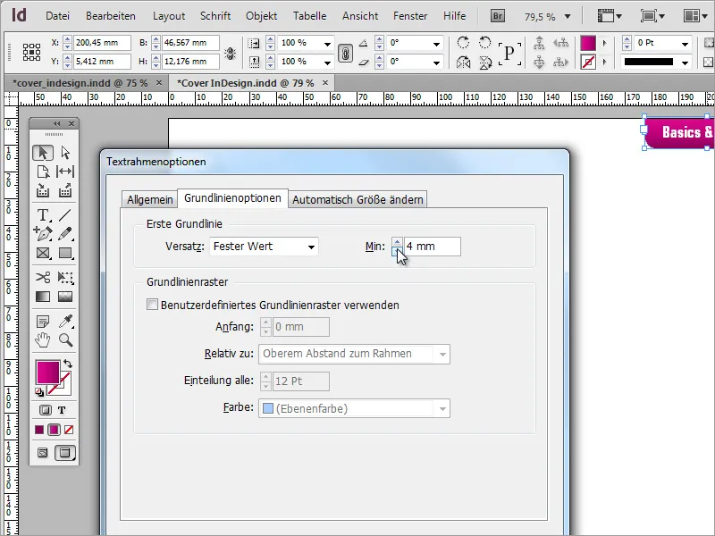
The text must then be set a little higher. To do this, simply use the text frame options again.
Next, you can go back to the graphic you have just created and create a copy of it using the Alt key by simply moving the selected object downwards.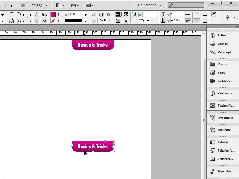
This time, however, the frame should be reshaped again. To do this, you will need the corner options again, which you can access via the Object menu. Activate the chain symbol in the dialog box and set a radius of approx. 5 mm and rounded corners.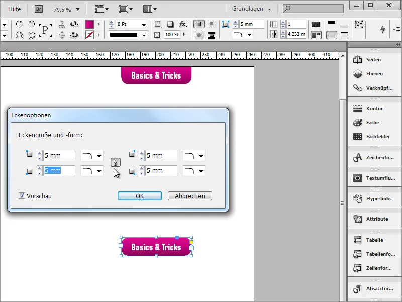
The object can now be enlarged and rotated by 9 degrees. The size can be adjusted more precisely to the text content at any time.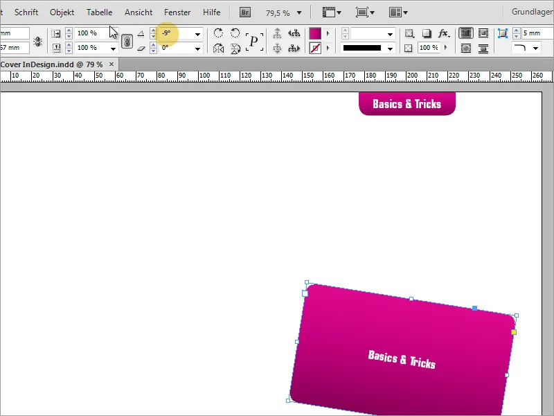
Once the object has been given the approximate size and position, the text must be edited. To do this, simply write or copy the relevant information into the text area.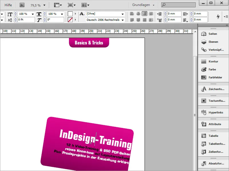
To ensure that the text is centered in the box, you can call up the text frame options via the context menu and change the value for the width specification according to your graphic box dimensions.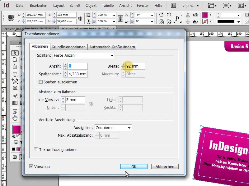
Depending on what the cover is about and whether it is to be used commercially at a later date, a legal statement must be made on the cover. In our case, this is the reference to the educational program in accordance with § 14 JuSchG.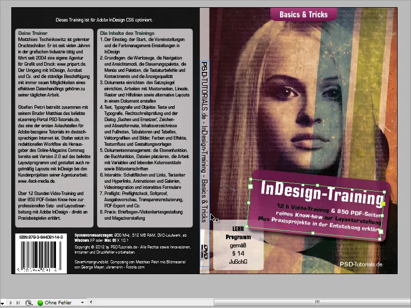
All you have to do is draw another area with rounded corners and enter this information as text. So that you can see this box better on the white background, you should temporarily color it a light gray. Also center the text in the vertical direction.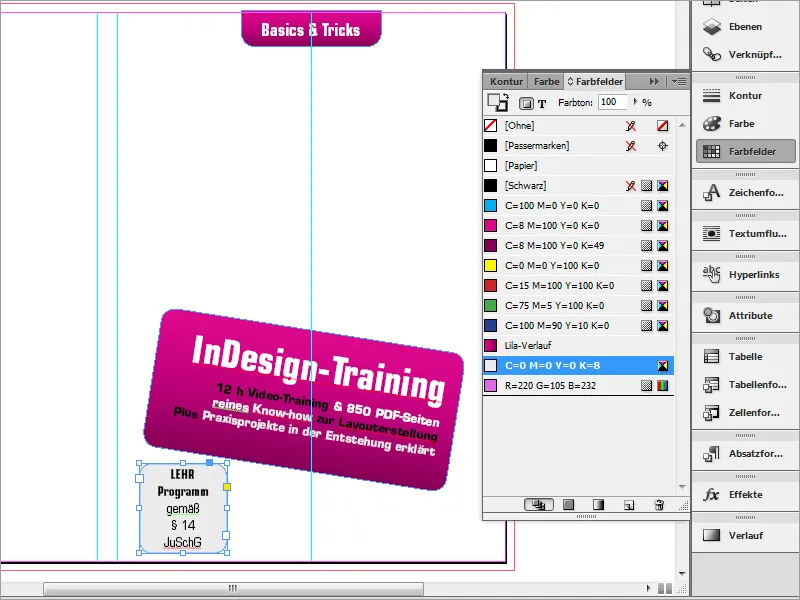
No outline is required for this area. Therefore, deactivate the outline via the color fields palette.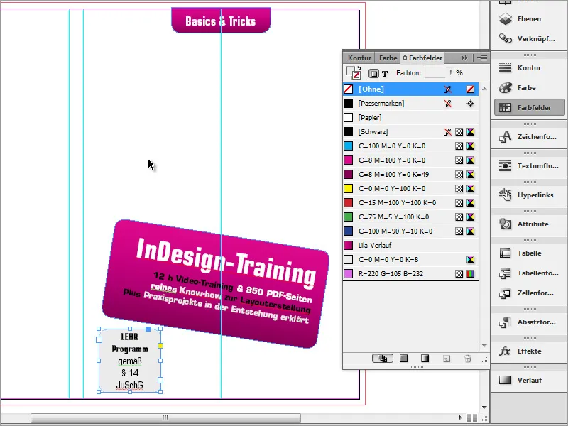
A cover without any images looks a little boring. Therefore, a graphic should now be placed. You now need the image that you initially prepared and saved in the graphics program. Press Ctrl+D to open the Place dialog. Now use the file explorer to find the graphic file.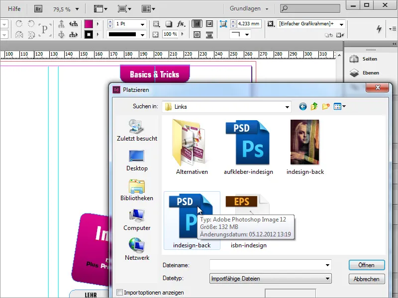
Once the graphic has been found, it can be easily placed in the document. Hold down the left mouse button and drag the document to fit. There is a small special feature at this point: the graphic will also be part of the cover spine. For this reason, it is best to start dragging at the middle left auxiliary line.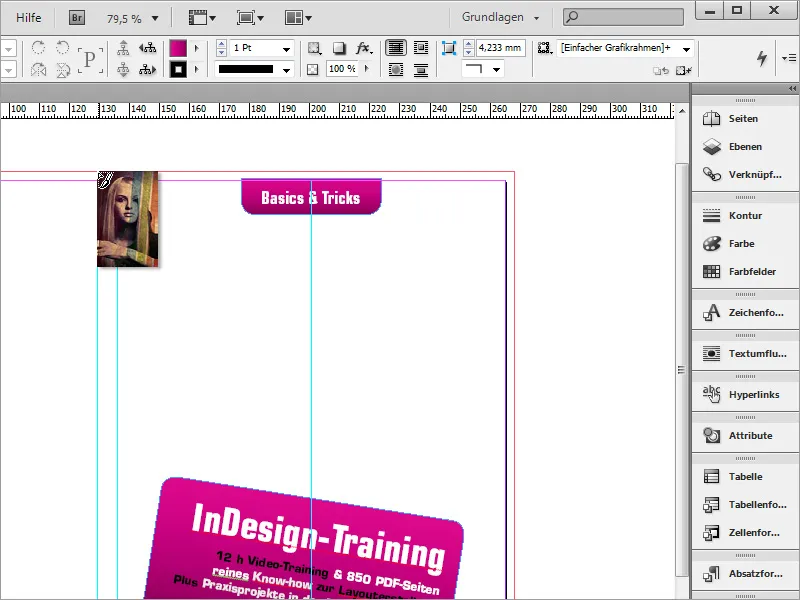
The graphic may not have been created in the same proportions as the DVD cover and may protrude slightly at the top and bottom of the document. These areas are then omitted during export. It is only important that this graphic extends all the way to the bleed and that the main motif is located where it should later appear in printed form. Use Ctrl+Ö to move this graphic to the background.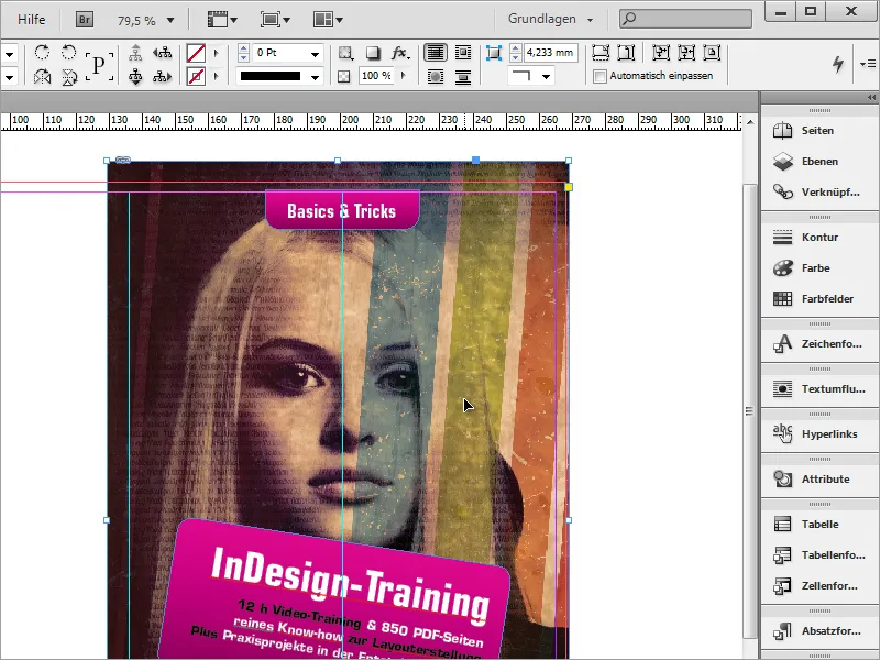
The title information on the DVD is currently literally blending in and should be reduced in terms of opacity. However, if you only set the opacity via the options bar, the opacity of the font will also be reduced.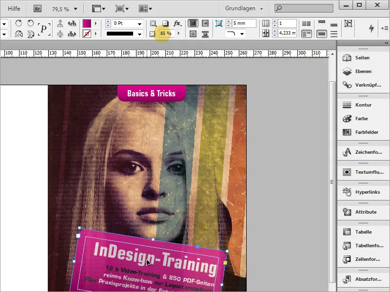
This should be avoided. To ensure that the gradient area still loses opacity and the font remains intact, you must use the effects control panel. First select the object to be changed.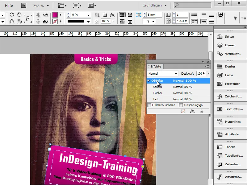
Double-click on the object entry and a dialog box for the effect settings will open. In the drop-down selection field, select the object area for which the following settings are to be made. As the surface is treated, it makes sense to select this as well.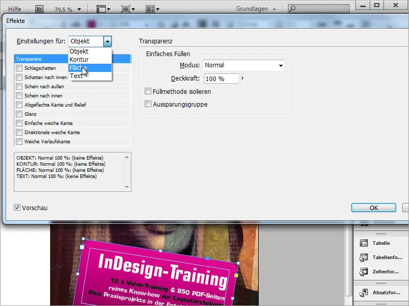
Then reduce the opacity of the area to a value of around 85 %. This will give you a translucent effect. Repeat these steps for the other gradient area above.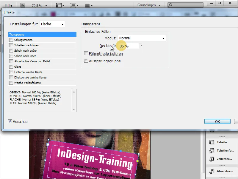
If the gradient does not yet meet your requirements in terms of coloring, you can also adjust the colors it contains later. Double-click on the color to be changed in the color fields palette and change the color value of the color. The gradient automatically adopts this new information if you have activated the preview. This is particularly helpful if, for example, you need completely different colors for a new product.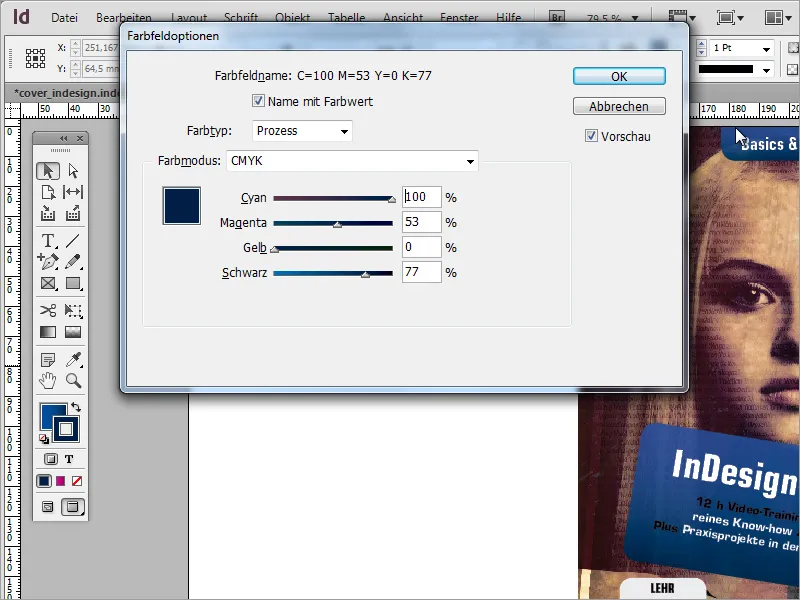
The reference to the teaching program should also be displayed transparently. To do this, go to the effects again and set the desired transparency effect with approx. 80 percent opacity. In addition, color the object from grey to white using the color swatches palette.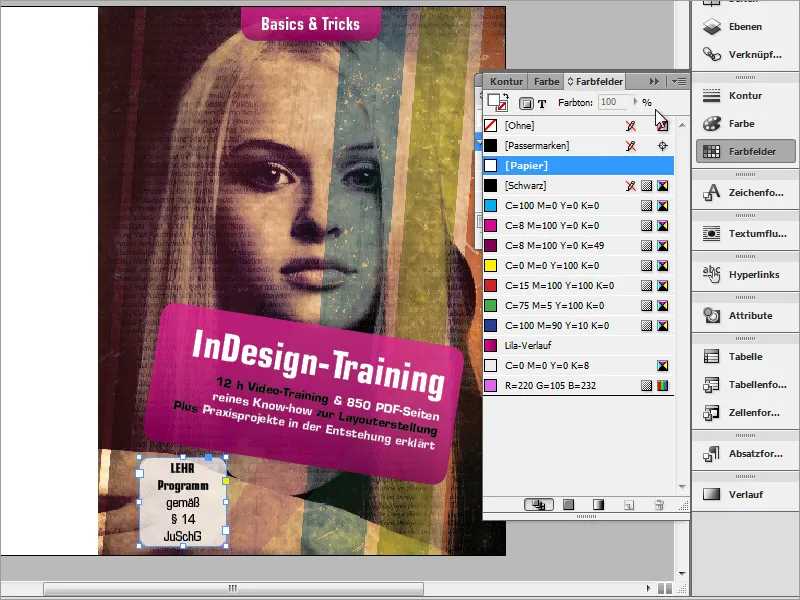
Now adjust the display of the objects. First of all, the two objects are brought closer together. Use Ctrl+E to bring the title information to the foreground so that it slightly covers the reference to the teaching program. Note that this only works if the object is also selected.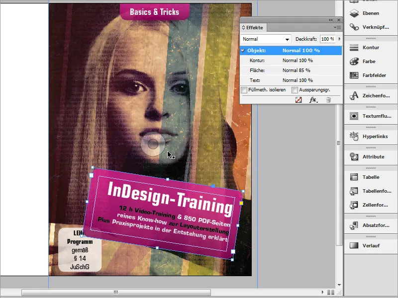
Another effect is also assigned to the title boxes. They should stand out better from the background thanks to a drop shadow. To do this, go to the effects and set a drop shadow with the desired values for the area.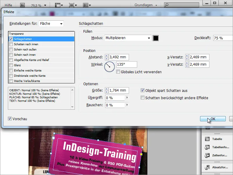
Each cover should clearly show the author of the work at the front. Therefore, add this information to the DVD inlay. It is sufficient to use normal text for this. Therefore, draw a small area with the text tool and enter the author information there.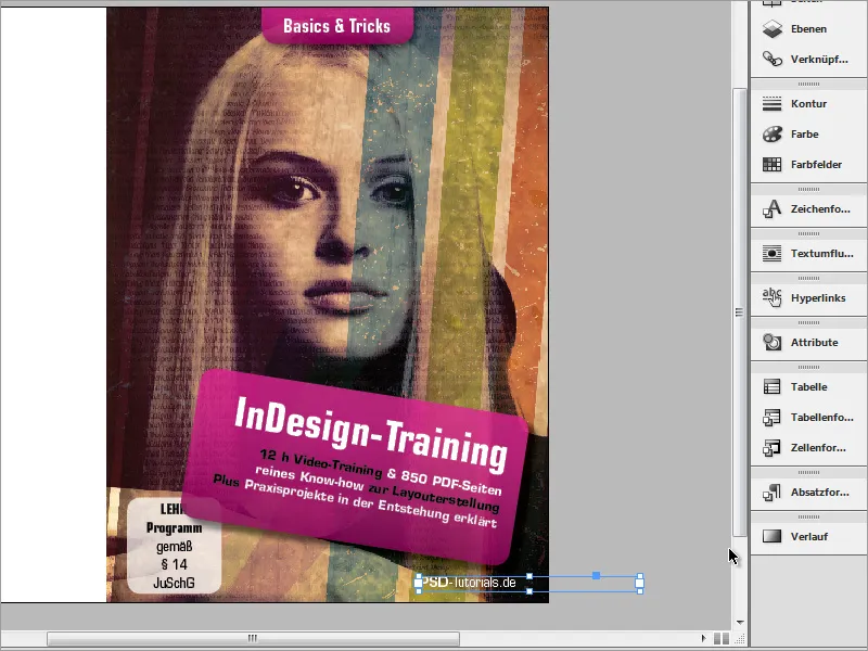
The cover is now complete.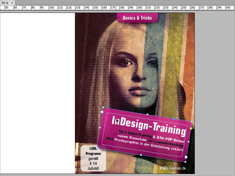
Let's turn our attention to the back of the cover. This is kept quite simple, consisting of a black background and a few text areas as well as a barcode.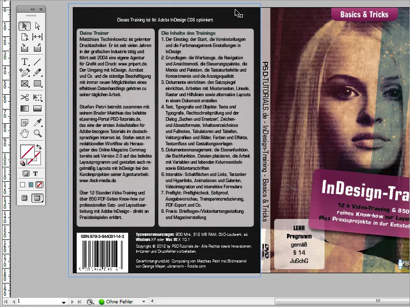
You can start by coloring the background black. It is best to create a new layer for this area in the Layers panel. Then use the rectangle tool to draw a rectangle object and color it black. Make sure that this object extends all the way to the bleed.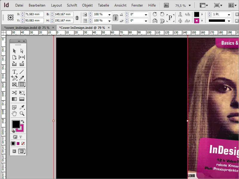
For text input, you should preset appropriate margins on this page so that they fit homogeneously into the document page. To do this, call up the margin settings via the Layout>Margins and columns menu item.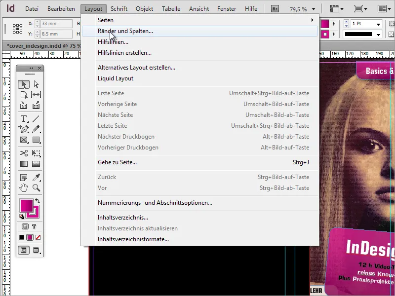
In this dialog box, you can set both margins and columns, if desired. In our example, the margin settings of 2 mm are initially sufficient. We will do without a column setting for the time being.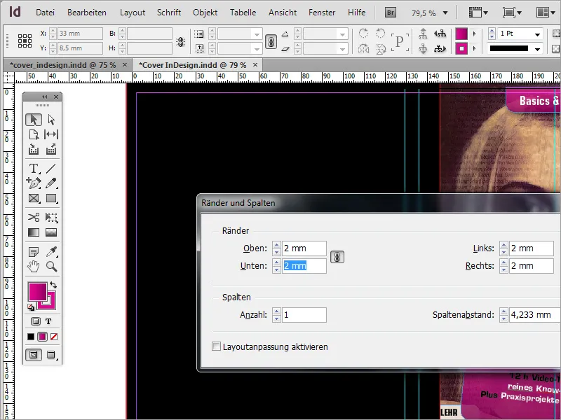
Then draw a first text box starting from the left auxiliary line. However, this text box will not be drawn all the way to the right auxiliary line. To ensure that the other objects are also flush right with this text box later on, it is best to draw another guideline from the left-hand ruler and arrange it on the right-hand edge of the text box.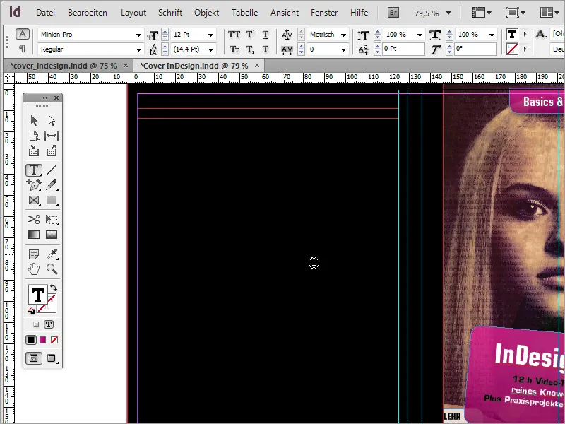
So many guidelines can be a little confusing and make orientation difficult. Therefore, assign a different color to the guides that mark the DVD spine. To do this, click on the relevant guides and select Guides from the context menu.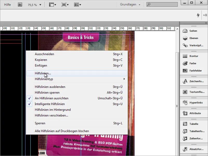
You can assign a different color to the guide in the dialog box.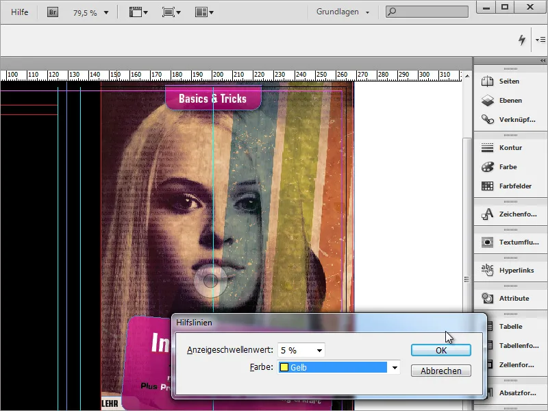
Once this assignment has been made clearer, you can start filling the text box with information. The font type is again Eurostile LT Std in Condensed with a 9 pt font size.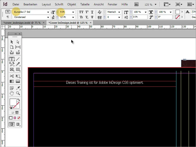
The text boxes below follow. Use the rectangle tool to draw these text areas. Color this area with a white color and deactivate the outline. Then use the corner options, which you can find under the Object menu item, to set rounded corners for the object again.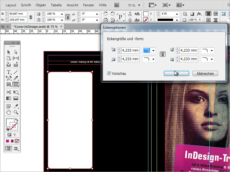
Right next to the opacity slider is the FX button for the effect control. You can also reduce the opacity of the rectangle there. In contrast to the normal opacity reduction - as shown in the image - the text to be inserted remains completely visible via the effect control.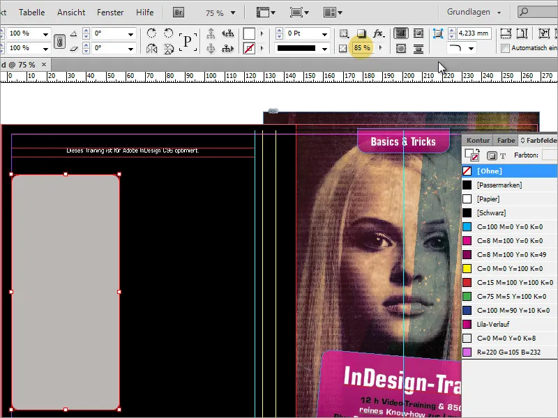
The text can then be written or copied in using the text tool. If this text does not yet fit in completely, it is necessary to enlarge the text box slightly. You can also call up the text frame options via the context menu. In this dialog box, set a suitable distance to the frame of approx. 2 mm.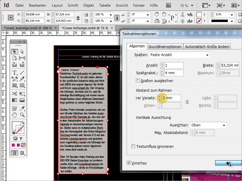
You will now notice that the text is indented in the first line due to the rounding of the frame.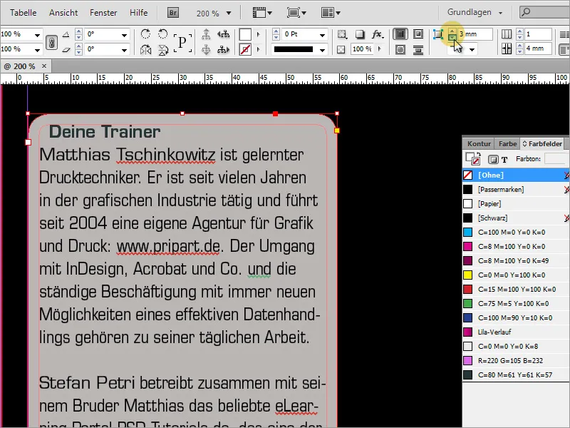
Therefore, change the rounding of the frame and reduce the radius to 2 mm. This moves the first line back to the left edge.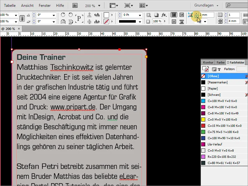
Now this text box can simply be copied by holding down the Alt key, as a second box is required directly next to it.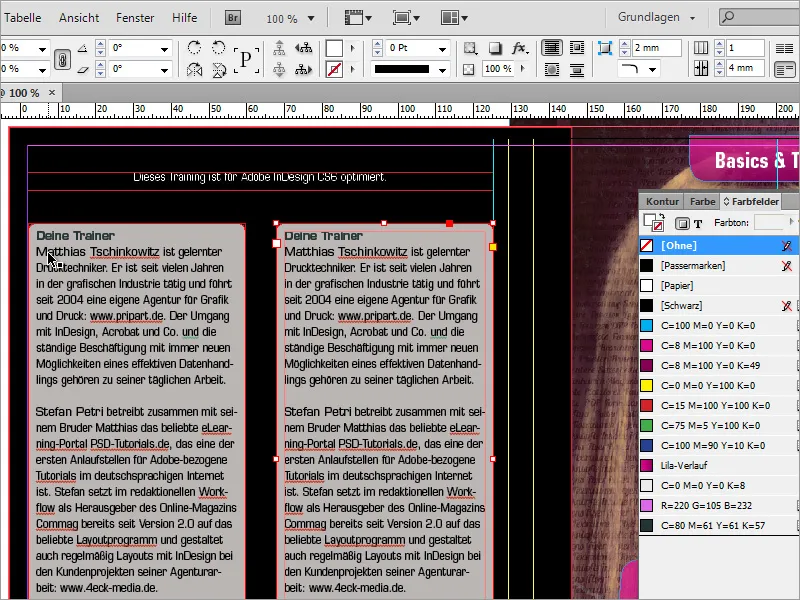
The second text box is also filled with text. As this may not fit in completely or the space at the bottom is too small, you can also enlarge these boxes together. Select both boxes while holding down the Shift key and extend them slightly downwards.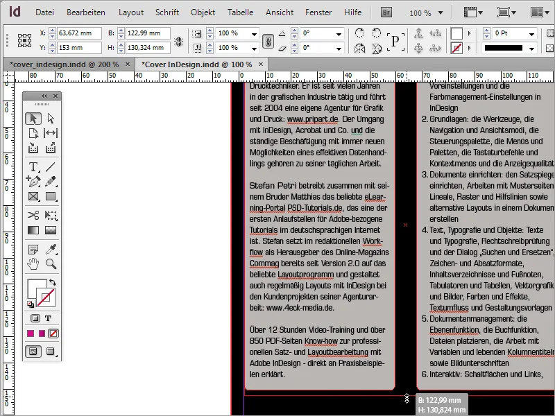
The right-hand box can be widened due to the more extensive text content. This will save you some length.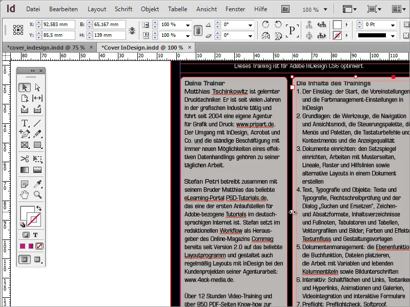
Each DVD contains basic information on the system requirements or multimedia standards used. This information should of course also be included on this page. To do this, use the text tool again to draw a text frame below the two text areas and fill it with the necessary information. The Eurostile LT Std font in 8 pt font size was used here again.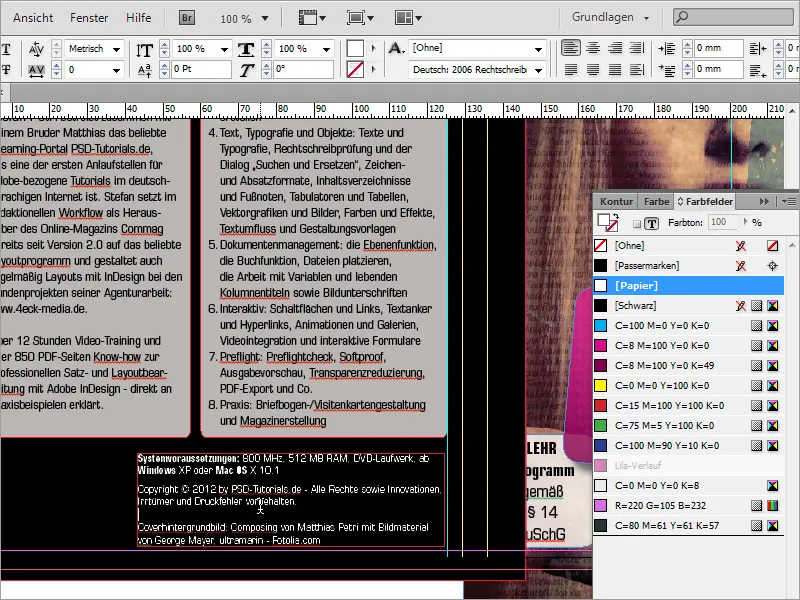
You usually need an ISBN number for such a product. Such a number can be generated on the www.german-isbn.de website, for example.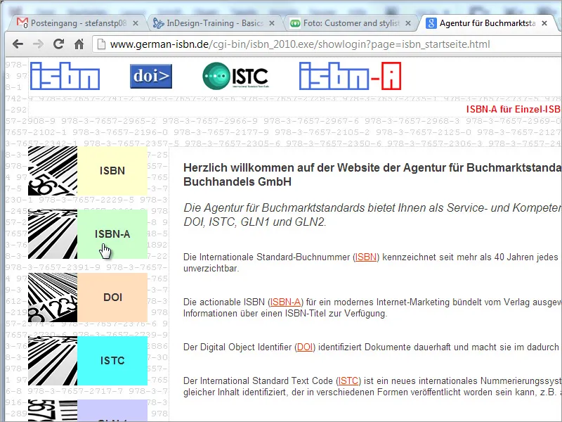
As this website is quite useful for applying for an ISBN number, but the creation of a graphic file is associated with not inconsiderable extra costs, you can have a corresponding graphic generated via another Internet resource such as www.terryburton.co.uk. As a rule, such portals also offer the option of saving these graphics in print resolution, for example as EPS.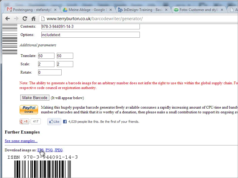
Once this graphic has been successfully created and saved, you can now place it in your document.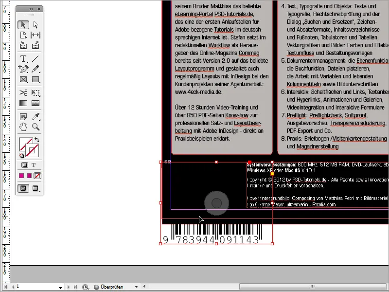
Scale it so that it fits into the available white space. Also assign a white background for this graphic in the color fields palette for the area so that the barcode is also visible. Then enlarge the picture frame.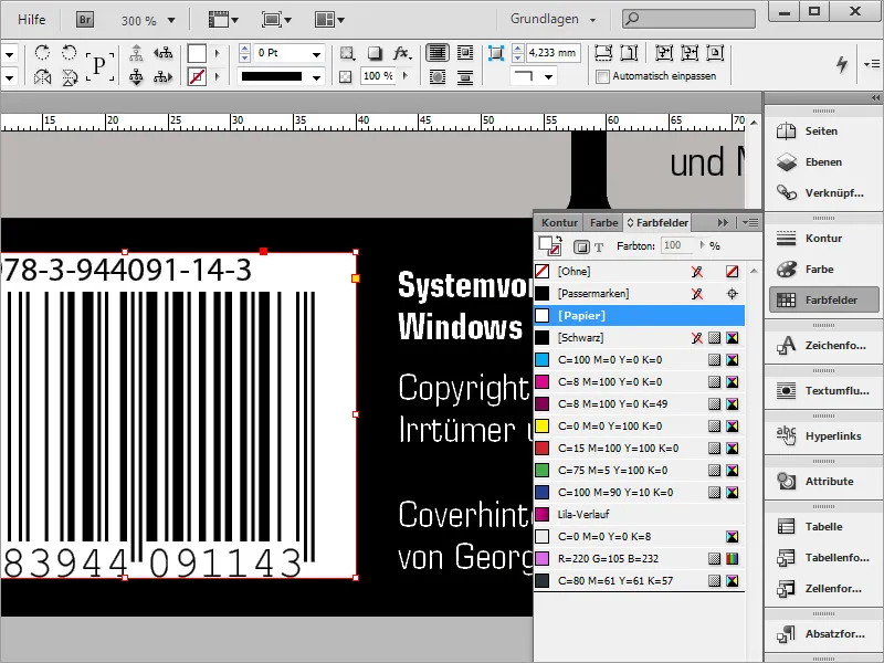
Now align the two adjacent elements with each other. To do this, draw a guide line from the top of the ruler and move these two areas towards each other so that they are flush.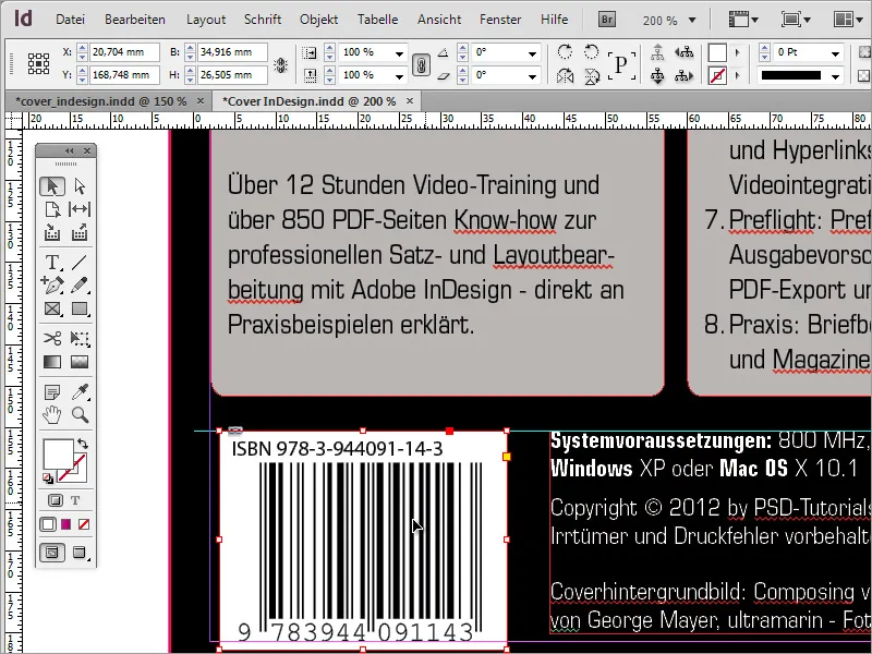
As a decoration or as an alternative to the black background, you could also copy the cover photo using the Alt key. First remove the black background of the back cover and replace it with this cover image.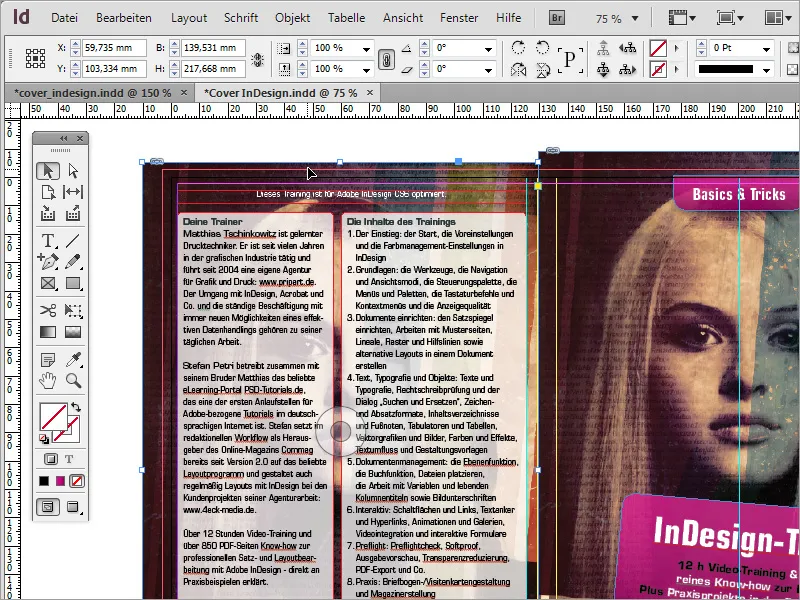
Then reverse the direction of the image using the context menu item Transform>Flip Horizontal.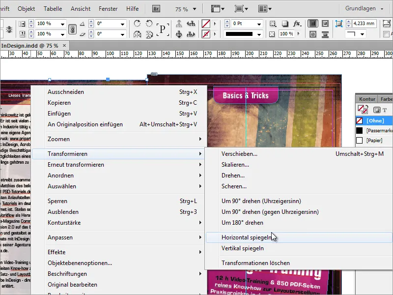
The opacity can also be reduced. A value of around 50 percent is quite acceptable.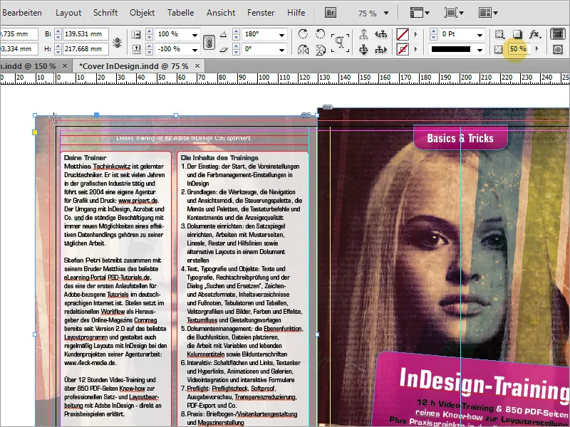
However, as it looks a little too pale under these circumstances, you can draw another black rectangle over it and set the opacity to 50 percent. This will darken the background image slightly.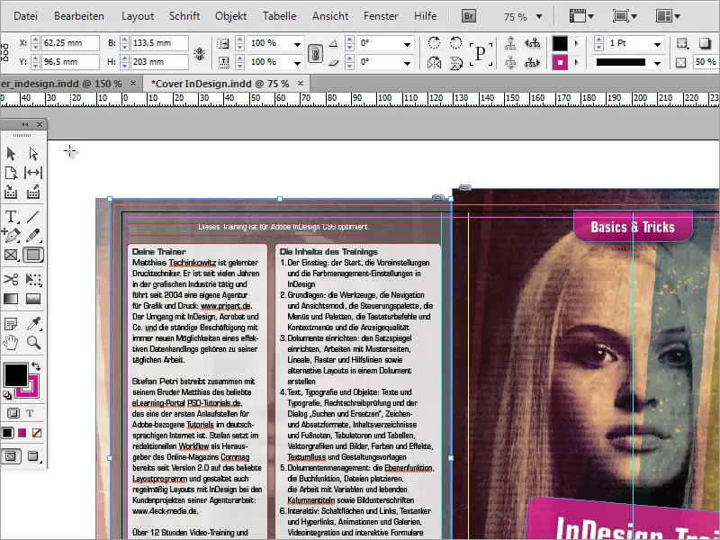
Now you have to make sure that the back of the DVD cover is also shown to its best advantage. To do this, you will again need a text box with the DVD title text in white. This text box is rotated by -90 degrees using the Shift key.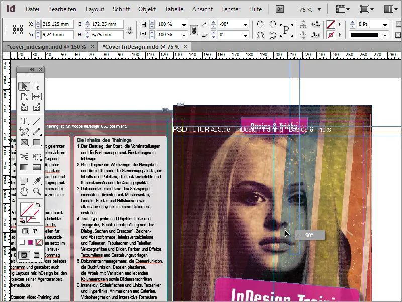
Then move this text area so that it is inside the back marker. Enlarge the text frame so that it is flush with the guide lines.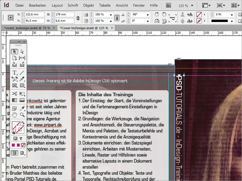
Align the text vertically and horizontally centered, color the text area white, the font black and reduce the opacity again to approx. 85 % using the effects.