Foreword
In order to create advertising posters, the designer must have a certain amount of knowledge, skills and abilities that are required during the creation process, from the initial task, through brainstorming and design work, to realization. This includes knowledge of: Form, composition, color, photography, typography, idea development and implementation, etc.
.webp?tutkfid=76853)
Basics
Step 1: The client
Posters are a means of communication between the client and the public. This is why a project begins with a briefing in which all information and specifications are recorded. Which product is being advertised, which target group should the new product appeal to? Which colors should be used for the poster, because the choice of colors is very important! Size and format, where the poster will be used, as indoor or outdoor advertising, prices and dates, etc. There are many questions that need to be answered. The more specific the briefing, the fewer misunderstandings and the better the result.
The poster is about a fictitious client, because this was a freelance job.
Our client is the owner of a relaxation studio that is furnished in a light Asian style. The studio offers various courses such as yoga, meditation as well as wellness massages, relaxation baths, etc. The studio also offers products for sale. A Japanese tea with lotus is added to the range. The owner wants to make a nice presentation in the studio with an advertising poster. A set-up is created with a small water fountain, water lilies and relaxing music. The poster should match the surroundings and the set-up.
Step 2: Finding ideas
I'll show you how I design my advertising posters. All my posters consist of the three most important elements
1. main character (figure)
The main element in the advertising posters is always what is being advertised, in our case it is tea with lotus.
2. action
Drinking tea, cooking, pouring, smelling, inviting guests to tea, pouring tea, etc.
3. an additional element
Anything can be used as an additional element. The surroundings, blanket, teacup, couch, kitchen, people, animals, etc.
Now I'll summarize my idea. I want the poster to show a woman in a meditative pose, calmly and relaxedly enjoying her tea. Why in such a pose? Because it's about a relaxation studio and that should be clearly shown again. I want the teapot with the lotus in the foreground because it's the main element on the poster.
I want to design the surroundings with water, stones and lotus. If we remember the set-up in the studio: a water fountain with lotus flowers is made and the poster should match it.
Step 3: Image material
So the concept is set, now we have to think about how we can realize it. As I've already written, it depends on what you can do.
I have thought about it: What visuals can I create myself and if not, where can I get them? I have a camera and a studio with flashes, and I know a young, slim woman who was willing to be photographed. So that's for sure, I'll photograph the woman myself. At the time of year when I took the picture, there were no water lilies that I could photograph and there were no large rocks in my area, so I looked for suitable pictures at Fotostock.
There is a large selection of panoramic skies at http://www.cgtextures.com/. I can create water myself using filters in Photoshop. That leaves the teapot, which I could photograph myself, but I would have to buy one first and it would have to match my ideas. Or I could buy it from Fotostock.
As I work with a 3D artist, I took the opportunity to draw my ideas and explain how I wanted the teapot to look and how the light should be so that it would fit in with my concept. I am always involved in rendering the objects.
Step 4: Photography
The model was photographed on a white background with three light sources. The large main light source came slightly from the left, flash head from Aurora Fusion 300 with an Octabox 170 cm, the power was set to 120. The other two light sources came from behind on the right and left. These were two Walimex 150 flash heads set to half power. This softly diffused light illuminated the body perfectly without any hard or deep shadows. The photos were taken with a Canon EOS 5D Mark II camera, ISO:100, Blender F/14, exposure time 1/100 sec.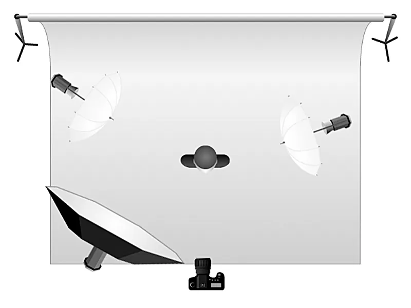
I selected image no. 2 from the pictures taken. The shot was exactly what I wanted. The young woman's pose is relaxed and serene, the closed eyes emphasize this feeling of meditation.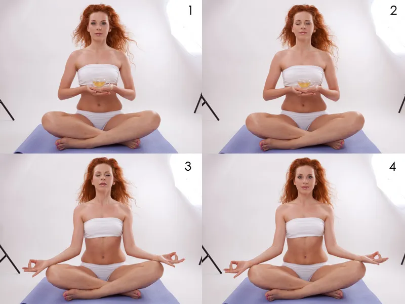
Step 5: Sketch
Format
Every design assignment raises the question of the work surface. It is specified by the client or you are given the opportunity to choose a format yourself. I chose a landscape format for my poster. The effect of this format is generally considered to be calm, stable and passive.
Dividing the image
Once the format has been selected, I divide my working area into three equal parts up and across. These guide lines help me to build up the composition correctly. The ratios are:
- Upper part 2/3 gives us a feeling of lightness, freedom, etc.
- Lower part 1/3 has the opposite effect: heaviness, constraint, stability, etc.
Composition
One of the most important moments is the direction of reading. When we look at a picture, we look from left to right or from top to bottom. So we have to make it clear in the composition where a main element is and where a secondary element is. The top left is the beginning, that's what we see first, and that's the woman. In my composition, I have placed her on the left and more in the upper part, which makes her stand out again and gives her additional lightness.
Our gaze moves from the woman to the bottom right to the teapot with the lotus. With a composition like this, I have led the viewer's gaze from the secondary element of the woman to the main element of the teapot. In every composition, it is important to know what you want to achieve and where your message is. If you look at the advertising posters for various products, you will notice that very often the advertised product or company logo is at the bottom right. If you design your advertising posters according to such a scheme, you will get harmonious and attractive results.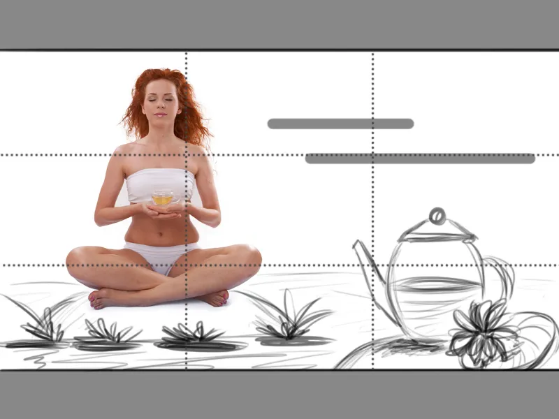
Step 6: Color
Now I come to an important point in the design, the color! Color can trigger positive and negative feelings in us, such as joy, calm, hunger, envy, freshness, cleanliness, etc. and gives our composition a mood. I want my painting to radiate calm, lightness, balance, closeness to nature and warmth.
- Blue, white - calm, lightness, balance, purity
- Green, pink - closeness to nature
- Beige, orange - warmth
This is what my color palette looks like. There are two ways to work with Adobe Kuler and use the colors.
1st option
On the page https://kuler.adobe.com/ you can put together the desired color palette or choose a suitable one from the large variety. At the top right I can enter a name and save it.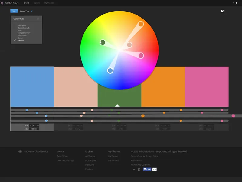
At the bottom I go to My Themes and am then on the page with my saved color palettes. If I move the cursor over a palette, I can use various options such as change colors, download or delete. Since I want to download the palette, I select Download. A dialog box opens, which I confirm with OK. When I have saved it, I get an ASE format.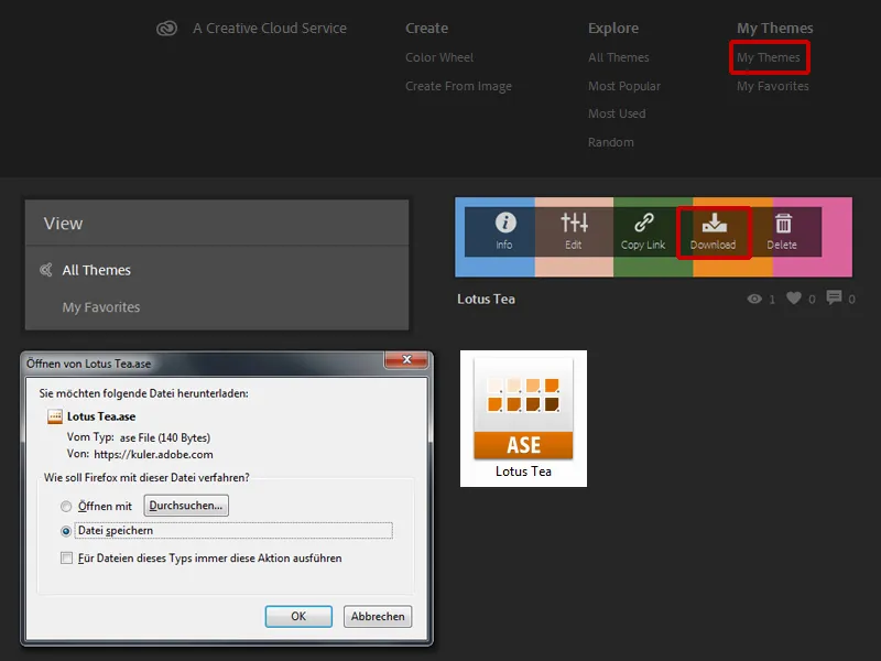
I open Photoshop and in the Color Field window I upload the saved color palette, which then appears in my color palette.
2nd option
I can also create my color palette directly in Photoshop with Adobe Kuler. To transfer these colors to my color field, I click on the icon below. And the palette appears in my color field.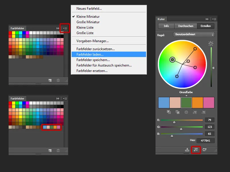
Step 7: Choosing the right image
The quality of your image depends on the quality of the images you select. The following must always be observed:
- When choosing images, you have to pay attention to the light and the direction of the light, whether it is direct or diffused light.
- The perspective.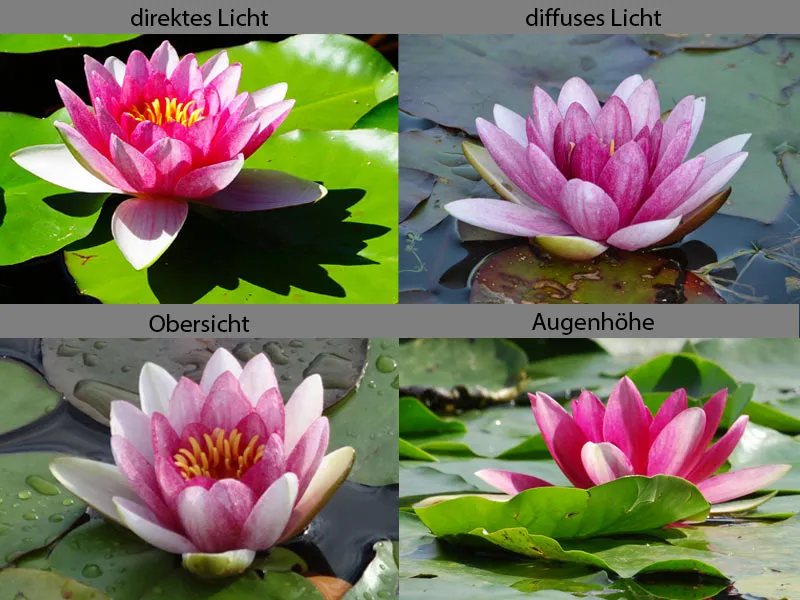
- Objects in the foreground are always sharper and more contrasty than objects in the background.
- The size and image quality, the poorer the image quality, the more work you have to do.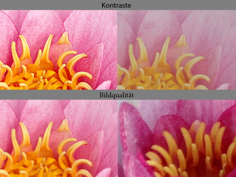
The perspective in my image composition is eye level, so all my images have to have the same perspective. I have opted for a soft, diffuse light. The direction of the light comes from the right-hand side, so the objects must also be lit from the side, or the light must be drawn during image processing.
