The only thing missing is a small additional graphic to make it clear which medium it is. You must obtain the icon for the DVD in advance. The placement works as usual.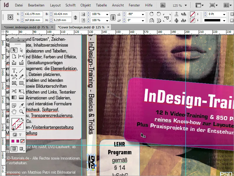
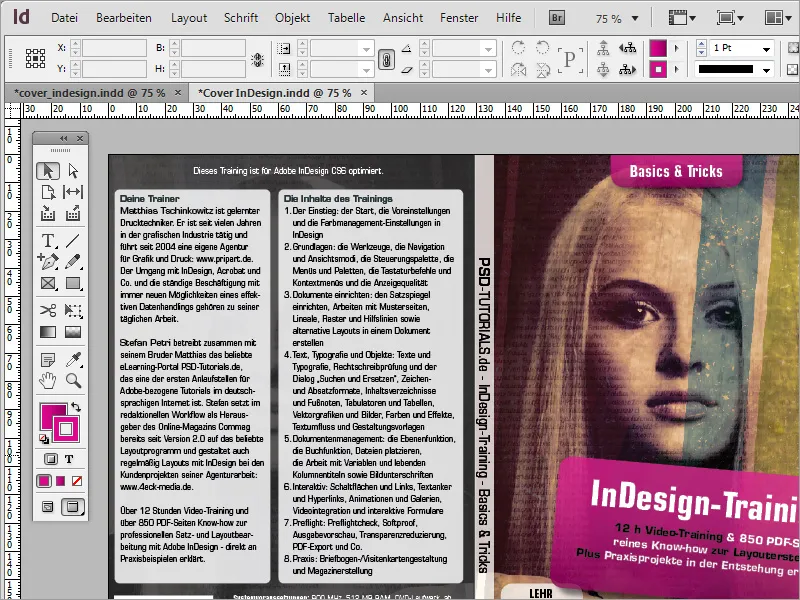
Once you have taken a final look at the cover and aligned the elements to each other, this task is complete.
The cover can now be exported for professional printing. To do this, go to the File>Export menu item and select Adobe PDF (print) as the file format in the dialog box.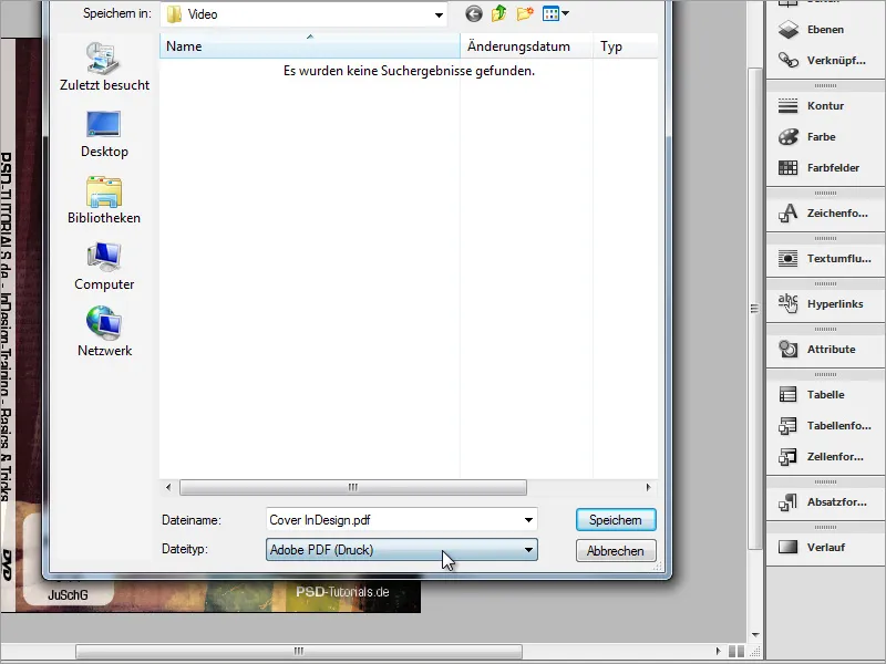
In the following dialog box, you can load a corresponding profile from various presets. You can also create a profile yourself if you require recurring settings. Once you have made all the settings, simply click on the Save buttonat the bottom left. You can then select the profile you have created yourself from this list in future.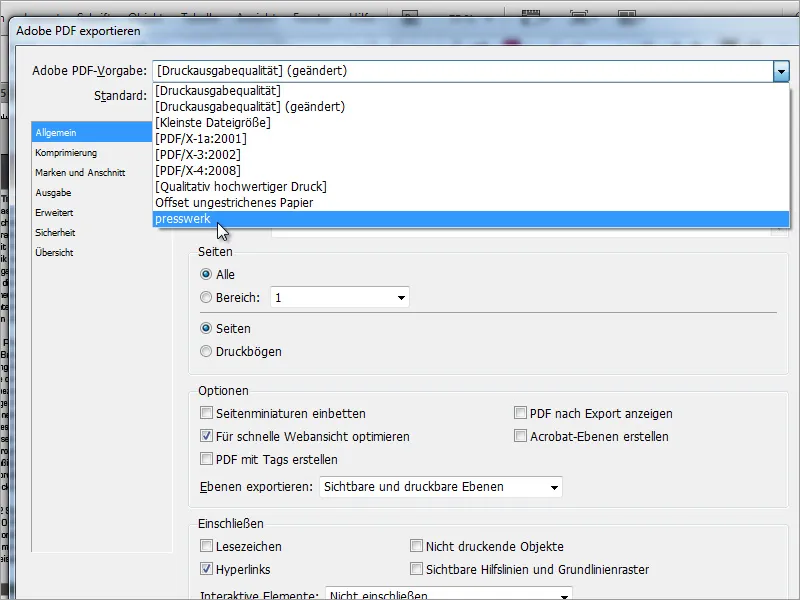
In the Compression section, you should select the highest possible image quality so that the image and text can be printed very cleanly.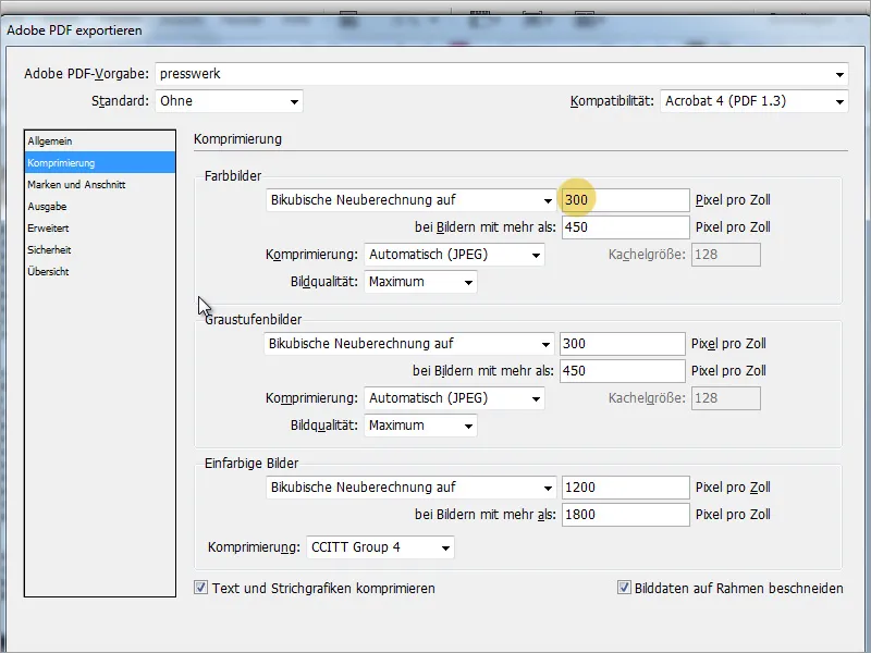
Under Marks and bleed, set the bleed settings for the document, if these have not already been created with the document itself. If these were already taken into account when the document was created, you can check the Use document ble ed settings box.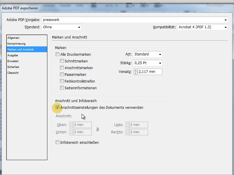
Next, the Output area determines which color information should be output with this file. An incorrect color space can lead to incorrect printing. However, the print shop usually checks the data again before printing.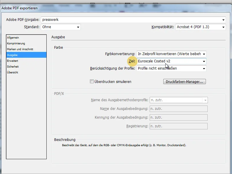
Under advanced settings, you can specify how InDesign should export graphics with transparencies, for example drop shadow objects. Very high quality should be the requirement here.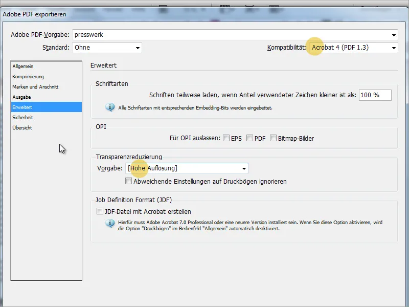
The InDesign template can then be exported. The result can be checked again in Adobe Acrobat. Fine lines are visible in some graphics. This is not an export error, but a special function in Acrobat that helps to make the individual objects visible.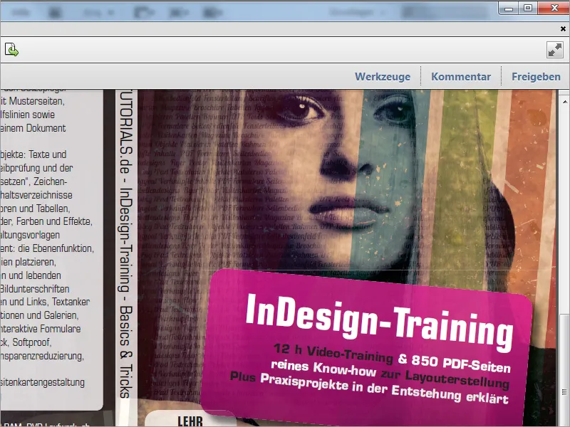
Two optional check marks can be removed from the page display in Acrobat's preferences so that these errors are no longer visible. Remove the check marks for Smooth vector graphics and Use 2D graphics acceleration. These fine lines will then disappear.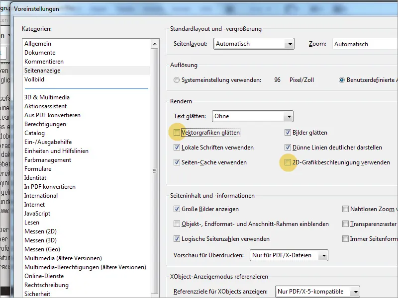
Under Tools>Preflight in Adobe Acrobat, you can also check all elements for correct color output.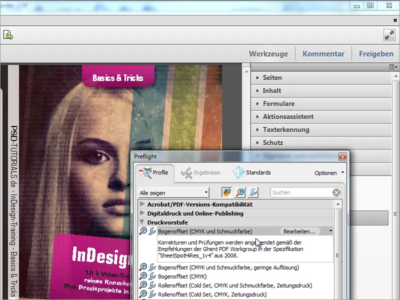
You can also use the output preview to check the color application required for the document or individual areas. You can specify a maximum value for the total color application. All areas in the document that exceed this value are then marked in red.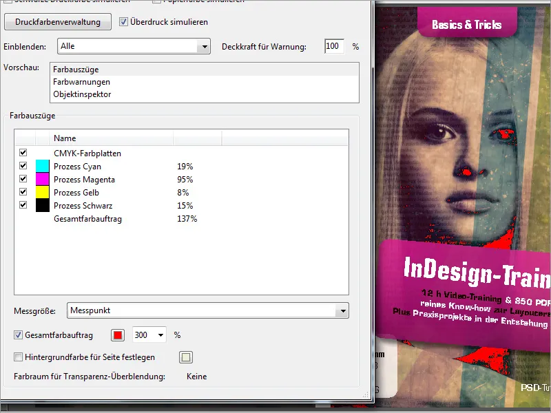
As with this cover, the technique can also be applied to other cover variants. The creation process for this cover alone was preceded by various preliminary versions. Including a minimalist design by Matthias.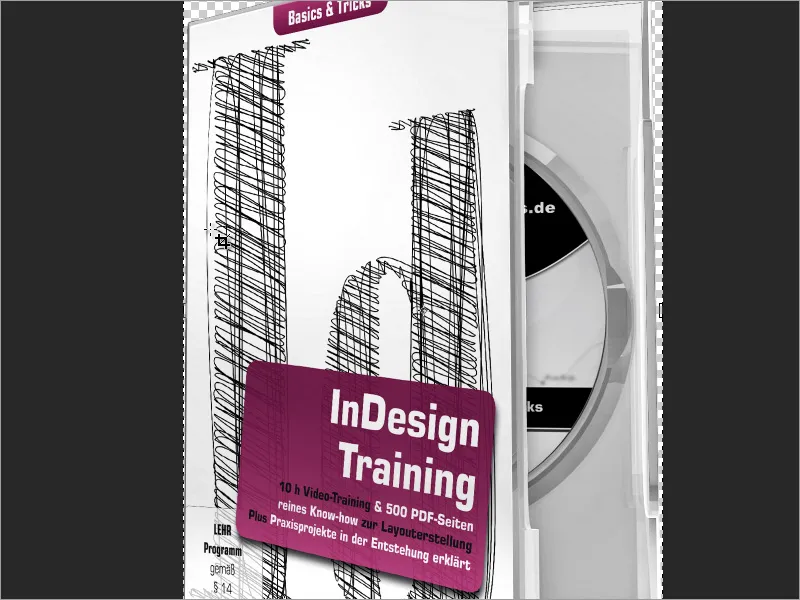
Now you may also need a suitable label for the blank DVD. This graphic can be created in Adobe Photoshop.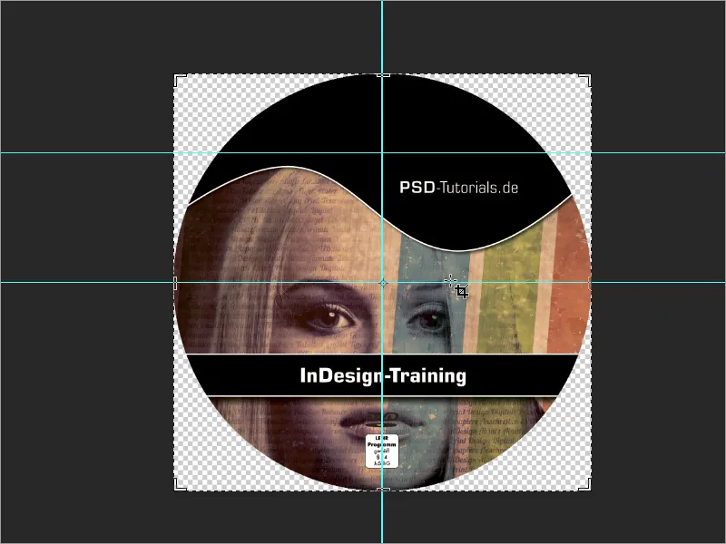
You can start by creating this label in Adobe Photoshop with a new document. To do this, create a new working file with the dimensions 11.7 cm in width and height and a resolution of 300 pixels/inch. The color mode can already be preset to CMYK, with the risk that some filters will no longer be available in Photoshop. If you use such filters, it is advisable to leave the RGB mode here and only convert the document to CMYK before exporting.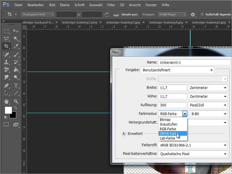
To make the DVD shape stand out better, it is best to create a circle at this point using the ellipse tool.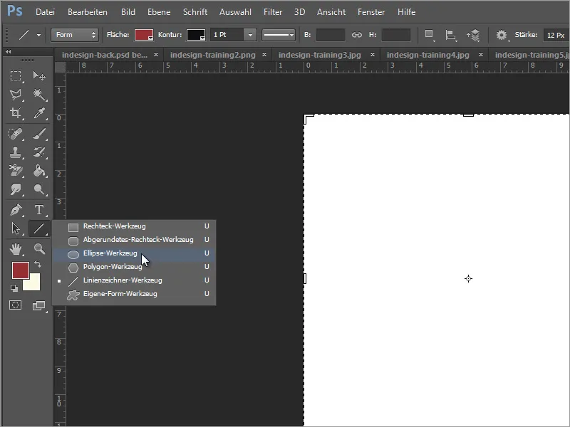
Set the area color in the options bar to black. Now you can draw a round circle with the ellipse tool. Use the Shift key while drawing the circle and start at an outer corner.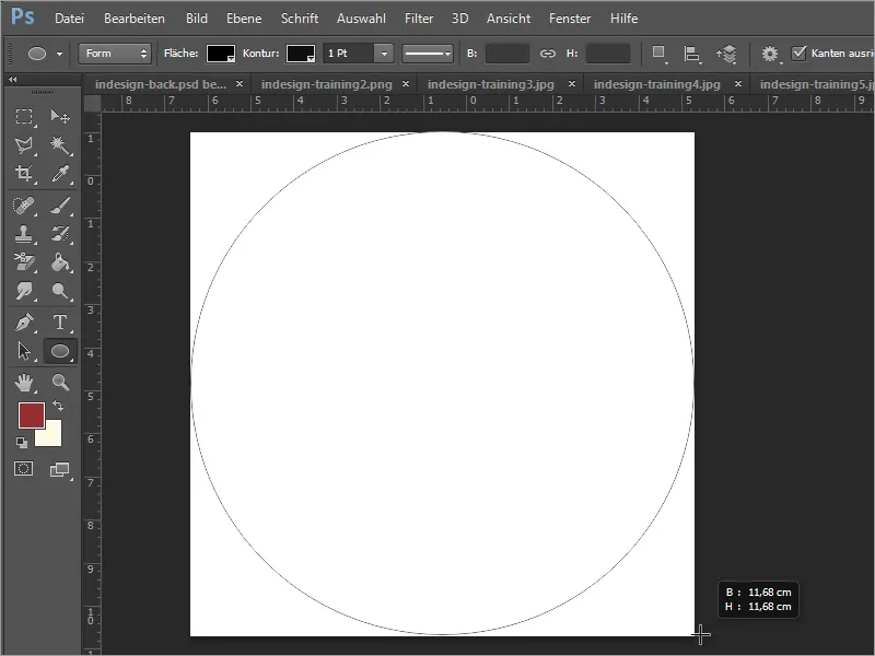
Now enter the first lettering, for example "PSD-Tutorials.de". Use the text tool for this. If you now click inside the circle, Adobe Photoshop may make this circle available as a path for the text. To prevent this from happening, simply draw a text box - starting in the white area. You can use the space bar to move this text box while dragging it.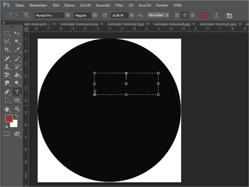
You can then enter the text in white. In our example, the Eurostile font was used in 13 pt and the abbreviation PSD was given a bolder font style.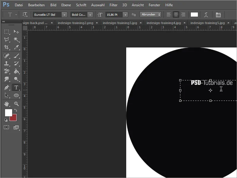
Now I would like to draw a curved arc below the lettering as a border. I use the pen tool for this.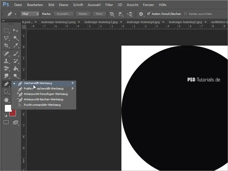
You can start by making a single click on the left edge of the circle. This marks the start of the path using a node. A little further to the right, click again with the left mouse button to set another node. However, do not release the mouse button now, but hold it down and drag the anchor points out of this node point to form a curve from the straight line.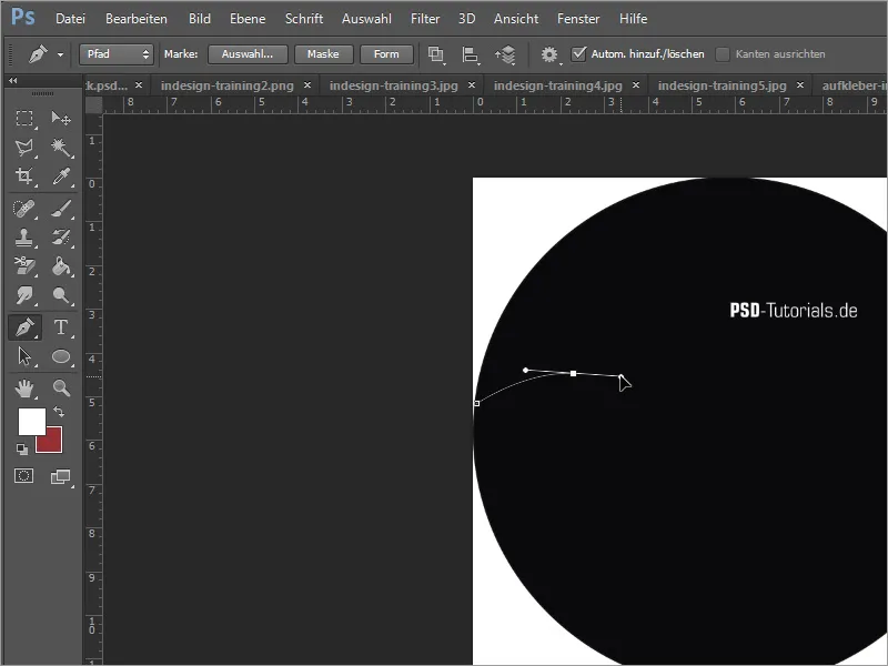
Then repeat this step by adding another node further to the right and a little further down. The end of this path is marked by a final point on the opposite edge of the circle.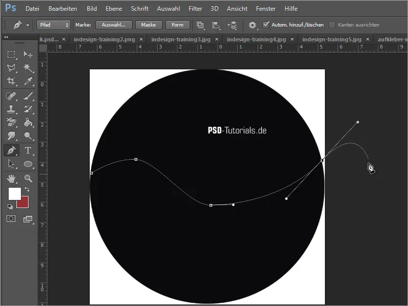
Now close this path by moving it back to the left outside the circle and placing the last click on the starting node. In our example, we have gone around the bottom.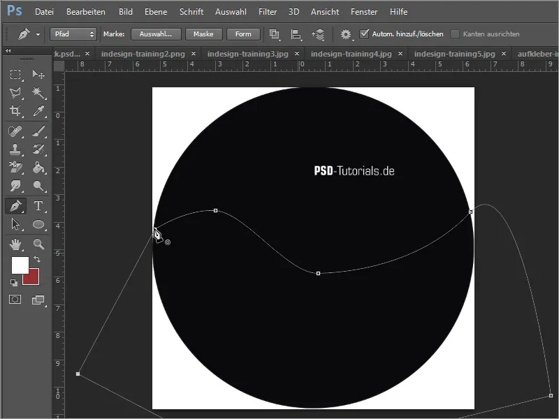
So far, this line is a pure working path. However, it would be nicer if you had a shape. You can either change the path option from path to shape in the options bar before setting the first node or convert this path to a selection afterwards. To do this, you need the Paths window. Use the Ctrl key and click on the path thumbnail to create a selection from the working path.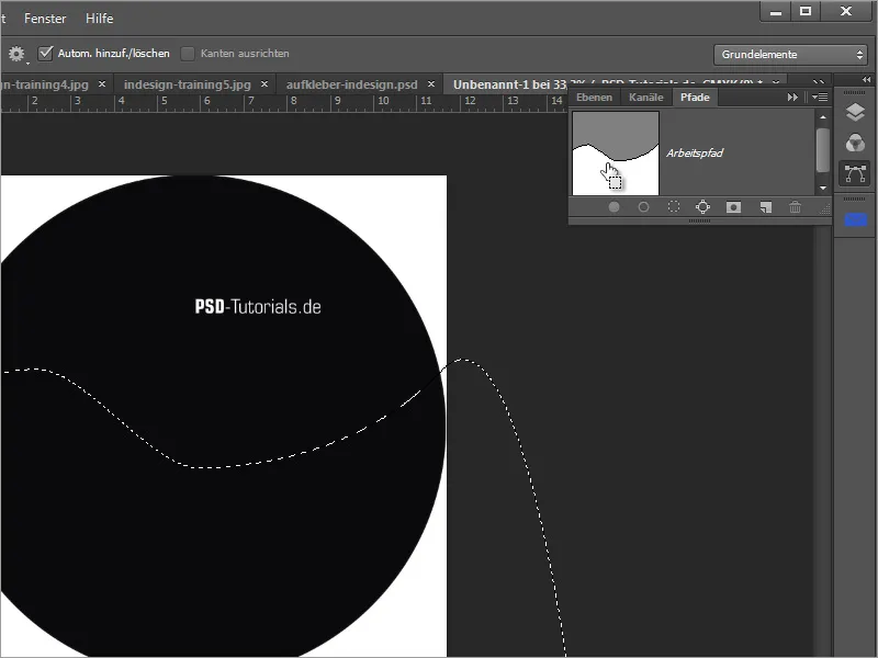
This selection should now be filled with a color. To prevent this from happening on the active layer, you need a new layer in the layer palette. To do this, click on the new layer thumbnail.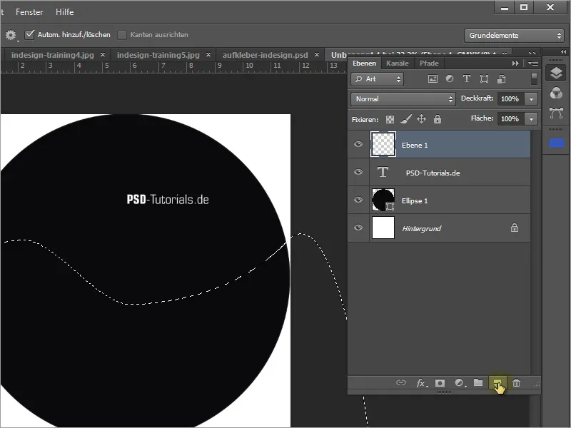
You can fill this selection with a color by pressing Alt+Backspace or using the paint bucket. In our example, we have used black, which was previously set as the foreground color.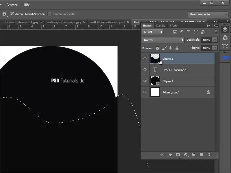
The layer that has just been filled is placed further down in the layer palette. To do this, simply take the active layer and drag it below the ellipse layer.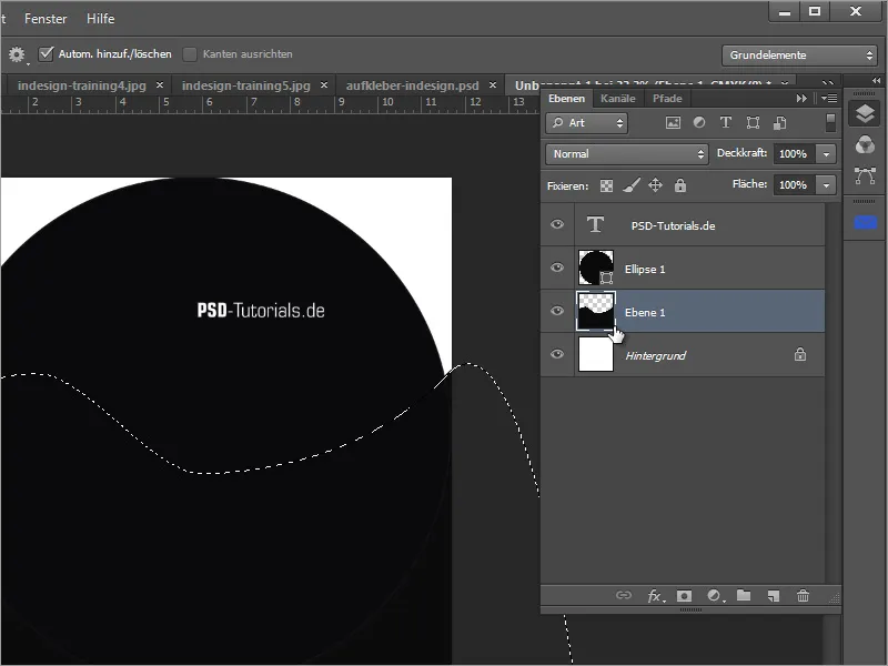
Now I create a group. I want to make sure that only the circle shape remains at the end and is printed. To do this, you can click on the folder icon in the layer palette and a new, empty folder will be created. Position this folder at the top of the layer pal ette.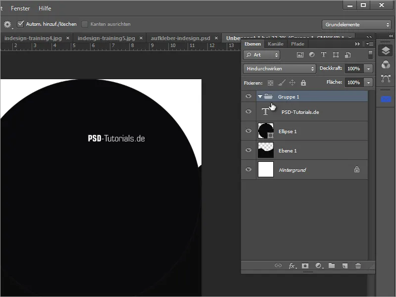
You can influence the visibility of what this folder contains by defining which areas should be visible and which should be invisible. To do this, you need a shaping layer mask that is created from a selection. You create this selection from the ellipse shape by clicking on the thumbnail with the left mouse button while holding down the Ctrl key.
Now you have to make sure that the folder layer is actually selected and you can then create a layer mask based on this selection. To do this, simply click on the layer mask thumbnail in the layer palette.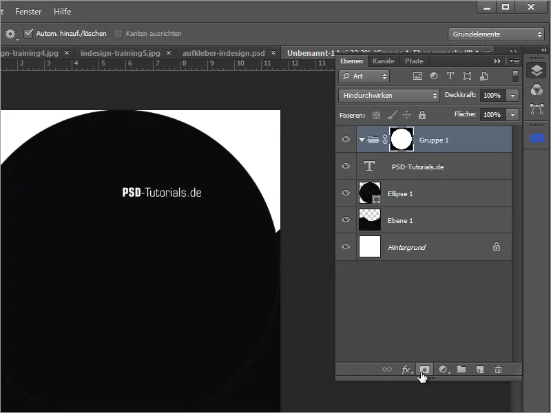
Then you need to create the elements that this folder should contain and exclude. To do this, move the previously created layers into this folder. Now you can also see how this layer mask works.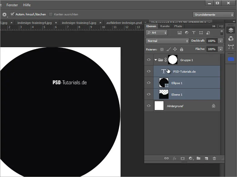
You can recolor layer 1 with Ctrl+U so that it stands out better from the rest. Simply move the brightness slider slightly to the right.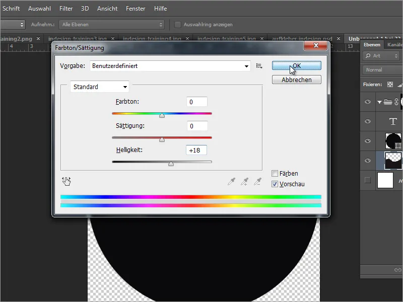
Now you just have to move this layer over the ellipse layer so that it is not covered by the ellipse layer. You can then insert the photo via File>Place.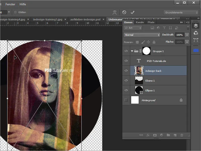
Hold down the Shift key to scale and move the image.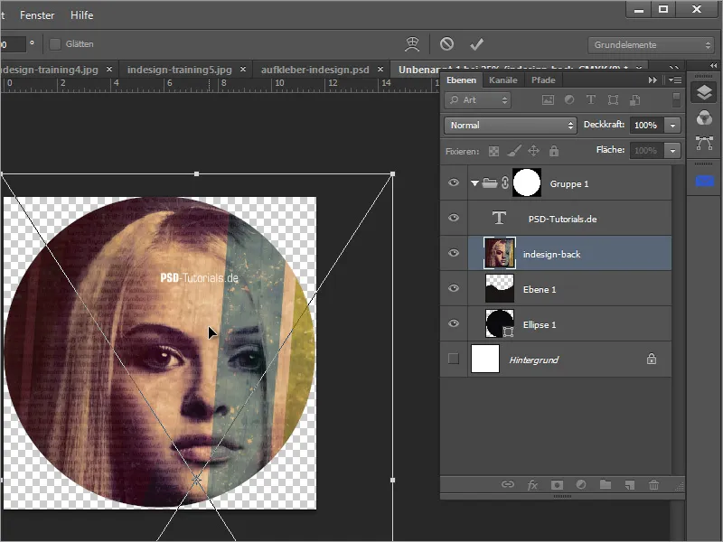
Move this layer below layer 1 and you will notice that although the image itself looks quite good, it is actually displayed upside down. The aim was to make the image visible at the bottom and leave a black area at the top.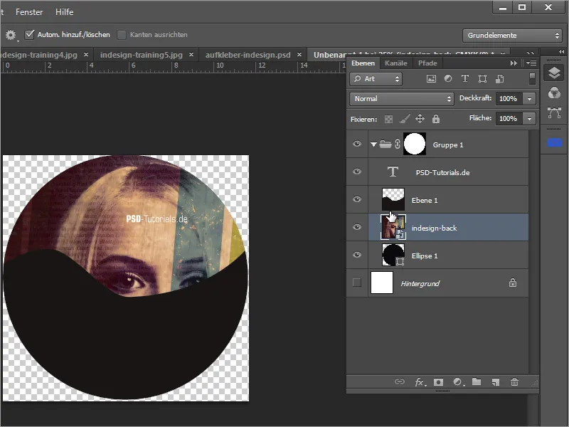
However, this can be fixed very quickly by first creating a selection of layer 1.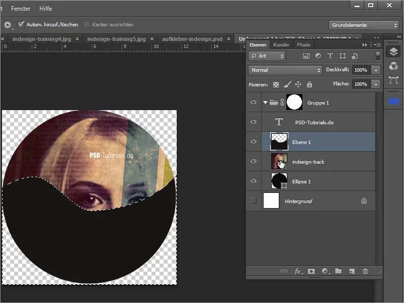
Then change the layer and activate the image layer with the photo. If this is active, you can click on the mask thumbnail at the bottom of the layer palette to create a layer mask from this selection for the image area.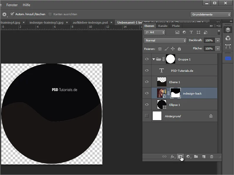
Layer 1 can be hidden. However, as the image section is not particularly successful as it is, you can move it later. However, it is important that you deactivate the chain symbol that connects the image and the layer mask. To do this, simply click on the chain.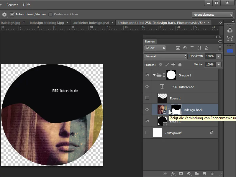
Now you can move the mask. To do this, select the mask thumbnail and use the Move tool to achieve a better image section. You can also transform the mask with Ctrl+T to adjust the size.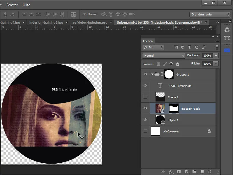
If the curve shape does not yet meet your expectations, you can click on the mask with the Alt key to make it visible and edit it with the pen tool or brush if necessary.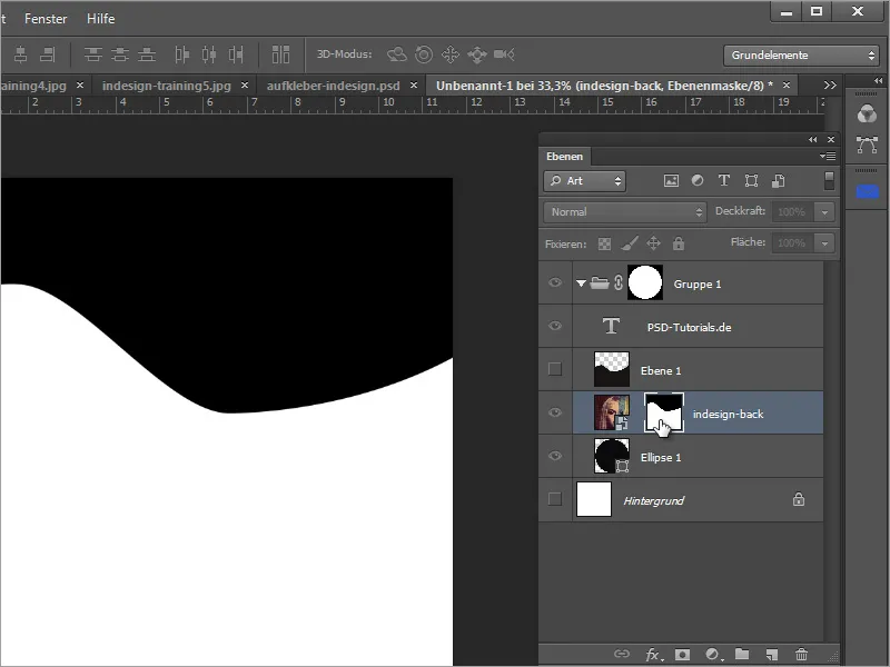
However, it would have been better to create this as a shape layer right from the start. I will therefore show you how to create the shape in the following steps. Select the pen tool again and change the mode to Shape in the option button.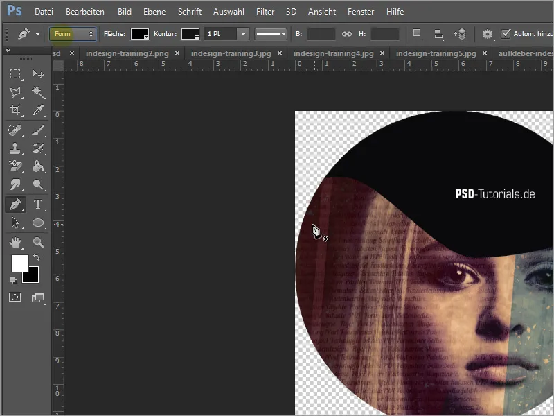
Then draw the shape in the same way as you did a few steps earlier. Start again at the left-hand circle shape, set the subsequent points and drag the handles out of the nodes to create a curve. Close the path by drawing it around the outside of the circle back to the starting point.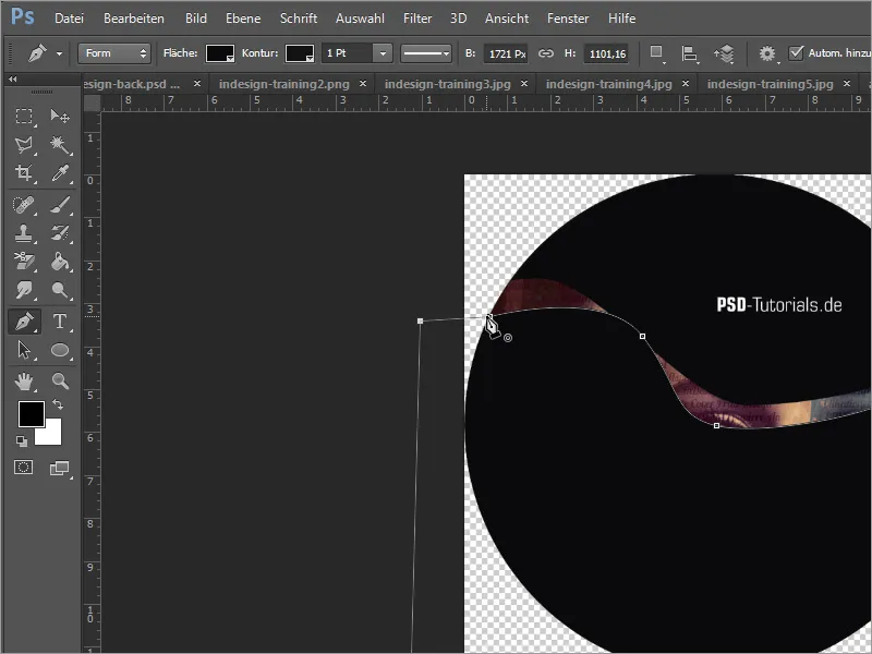
With a shape like this, you can use the direct selection tool to touch and edit all nodes afterwards. Therefore, in such cases, the shape layer is the better choice than a filled pixel layer.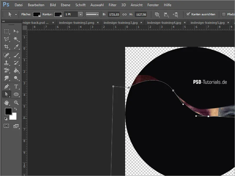
Now you can use this new shape layer as a shaping element. First delete layer 1 by dragging it to the trash can icon in the layer palette. Then Blender out the layer mask of the image layer by holding down the Shift key and clicking on the mask thumbnail.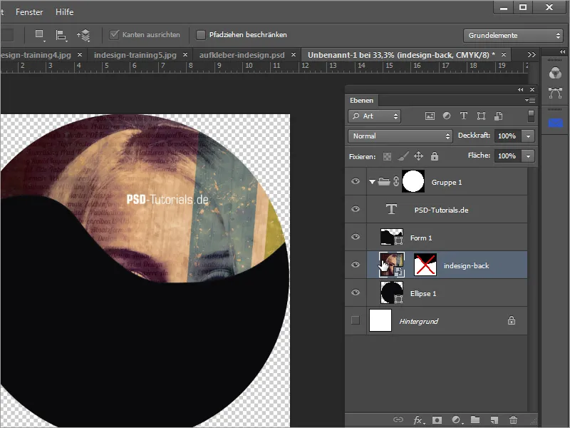
Drag the image layer over the shape layer you just created and click on the dividing line between the two layers while holding down the Alt key to create a clipping mask.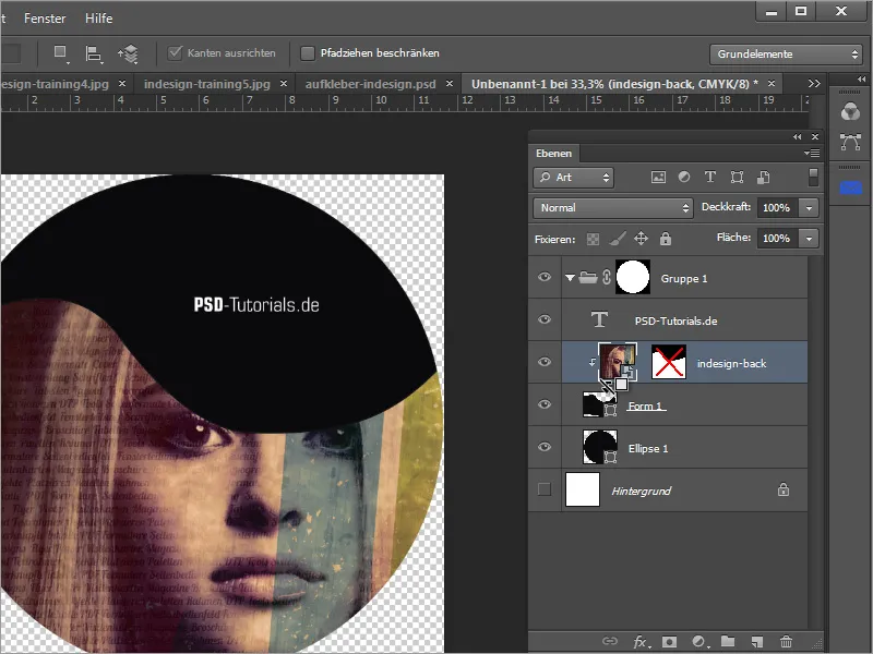
You can now work on the shape of the layer at any time. Before doing so, however, you can delete the mask on the image layer by dragging it to the trash can icon, as it is no longer needed.
Once this layer has been edited so that the shape meets your requirements, you can assign a fill option to the shape layer. To do this, right-click on the layer thumbnail of the shape layer and select the Fill options entry.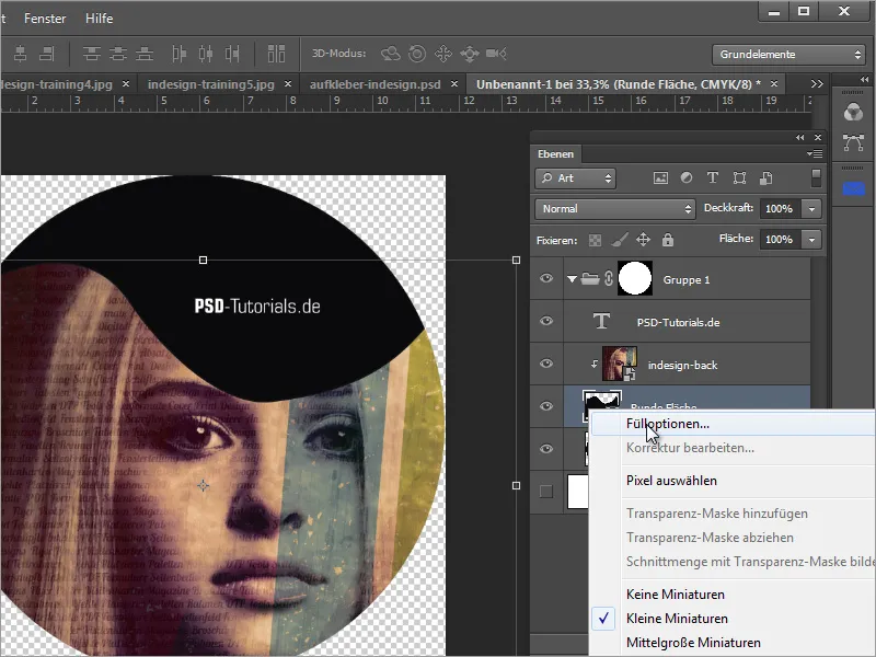
In the fill options, you can assign an outline to the object. The setting can be made, for example, at 6 pixels in size, on the inside with 100 percent opacity in white.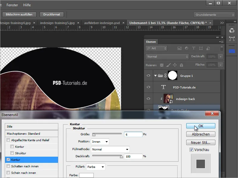
The image section of the woman or the cover image can be moved or scaled at any time. All you have to do is move the image layer with the Move tool.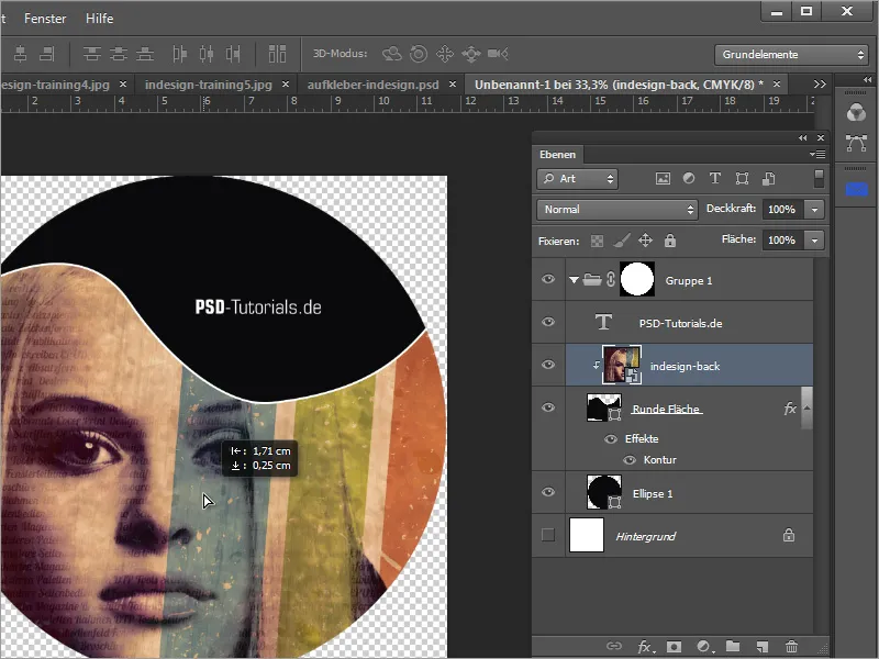
The name of the DVD must now be inserted. To do this, you can draw a simple rectangular shape on a new layer above the image layer.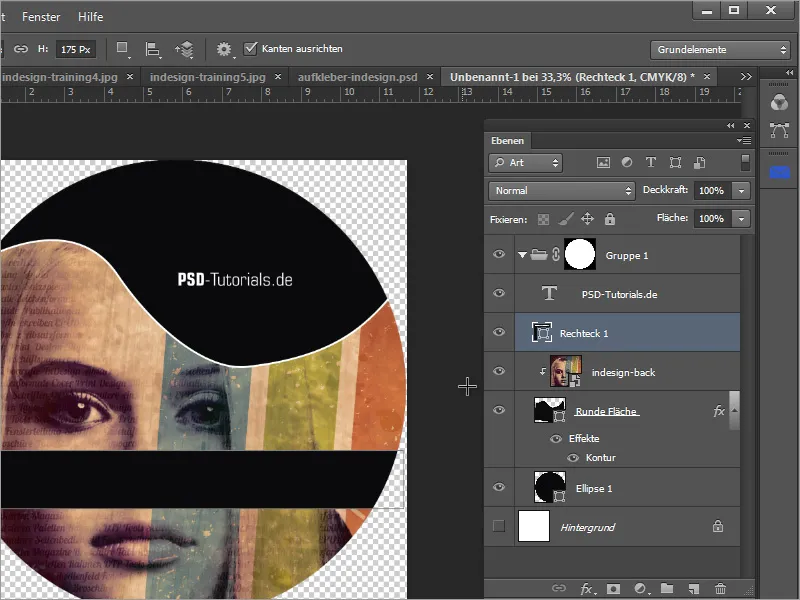
The outline can easily be copied from the shape layer. To do this, simply hold down the Alt key and drag the layer effects from the "Round area" layer onto the rectangular area.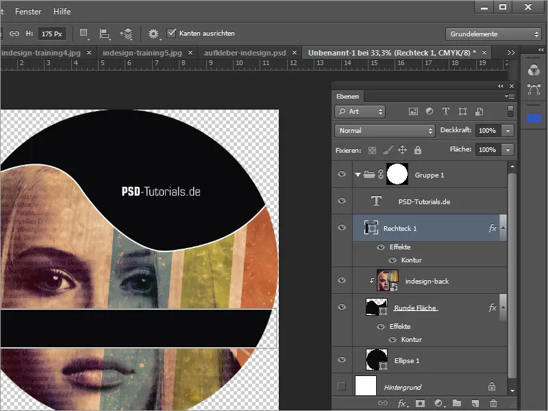
Now all you have to do is enter the DVD name in text form. However, as the text is slightly too high, you can adjust the text spacing options in the drawing control panel.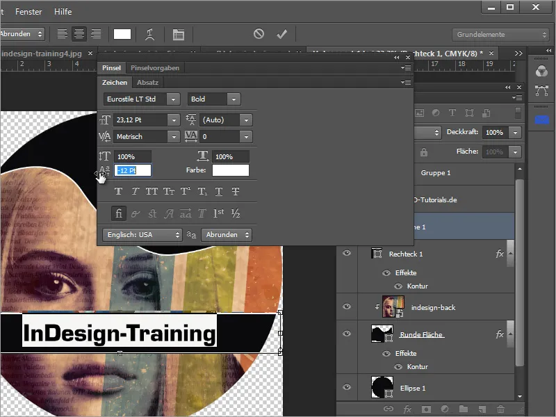
You can then check the work again and, if necessary, edit images and shapes and adjust the font sections. You can also link important layers that are dependent on each other by selecting them and clicking on the link layer symbol in the layer palette. In the end, the sticker template could look like this.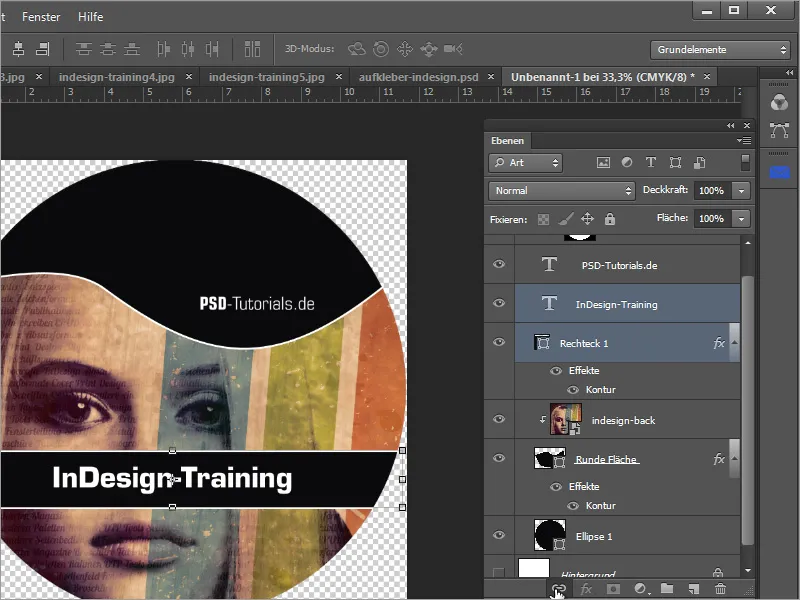
A logo may still be missing. This can also be easily placed and adjusted.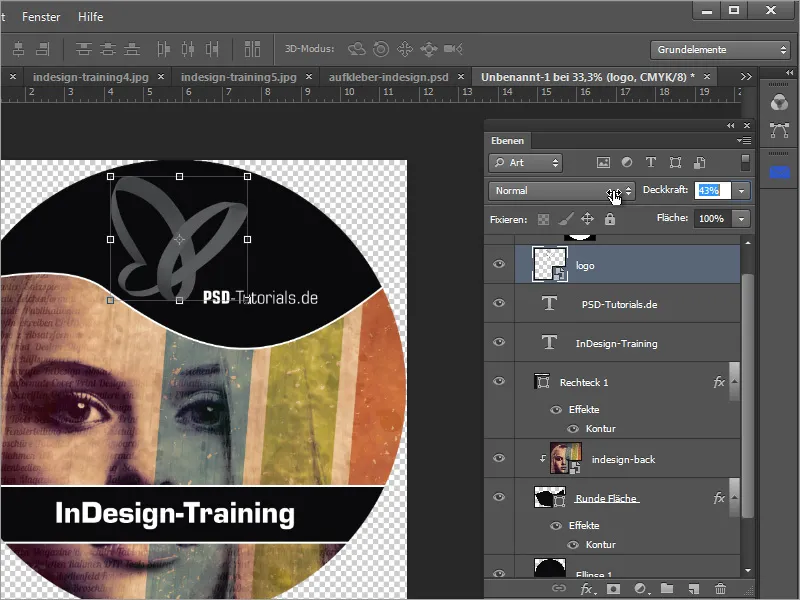
Important tip: A DVD sticker always has a central opening in the shape of a circle. Please make sure that no important elements are located there. The font and logo should have a certain distance from the center so that nothing is cut off.
Please also ensure that the image has not been fitted unfavorably and is not cut off unfavorably. Using the guide lines that snap into the center, you can determine the center point and draw such a circle shape on it with Alt+Shift. The hole size must be requested from the manufacturer in advance.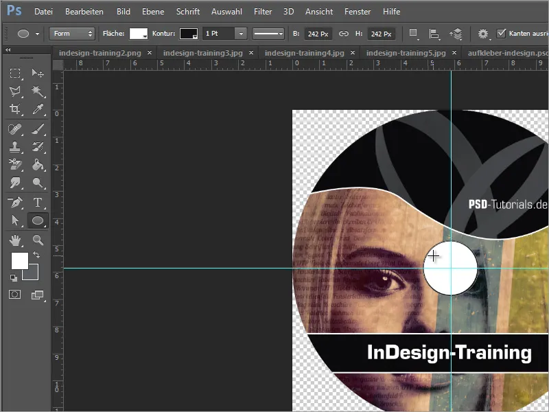
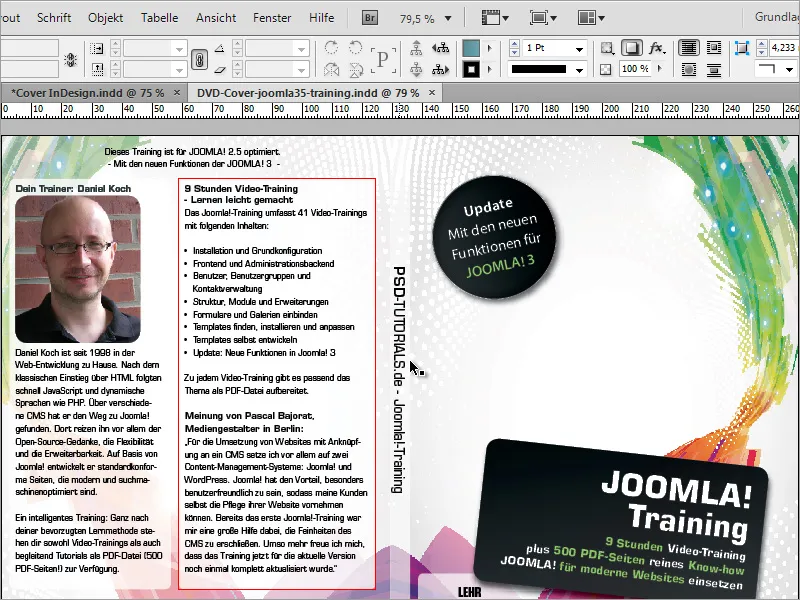
Once you have created such a template, you can use it for many different scenarios. The example of the Joomla DVD shows the versatility of such a template. Here, only an additional note in the form of a circle has been added to the cover.