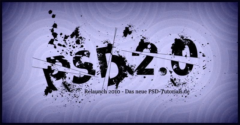
The Break Effect is an exciting technique to give your texts and layouts a dynamic and shattered look. This effect is perfect for modern designs, posters, or creative projects that aim to grab attention. In this tutorial, I will show you how to create a realistic Break Effect step by step using Photoshop – with shattered elements and broken details. Let's start and break down your designs into stylish fragments!
In this tutorial, I want to show how the following Break Effect is created: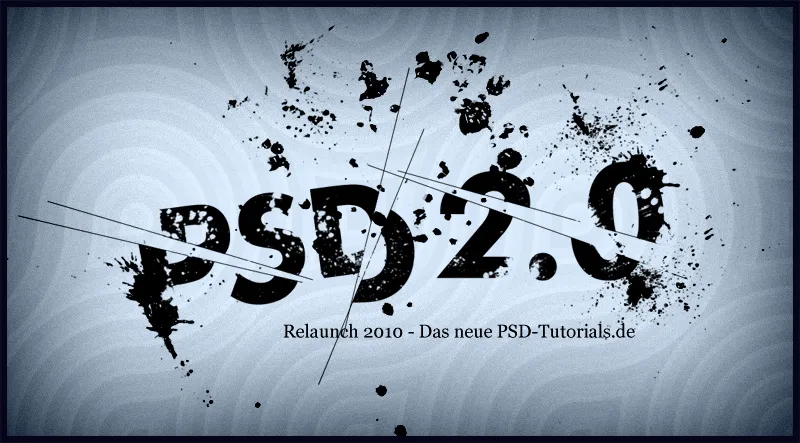
Step 1: Create a New Document
I create a new document sized 1150x600 pixels. The document size is not crucial and can be adjusted as needed.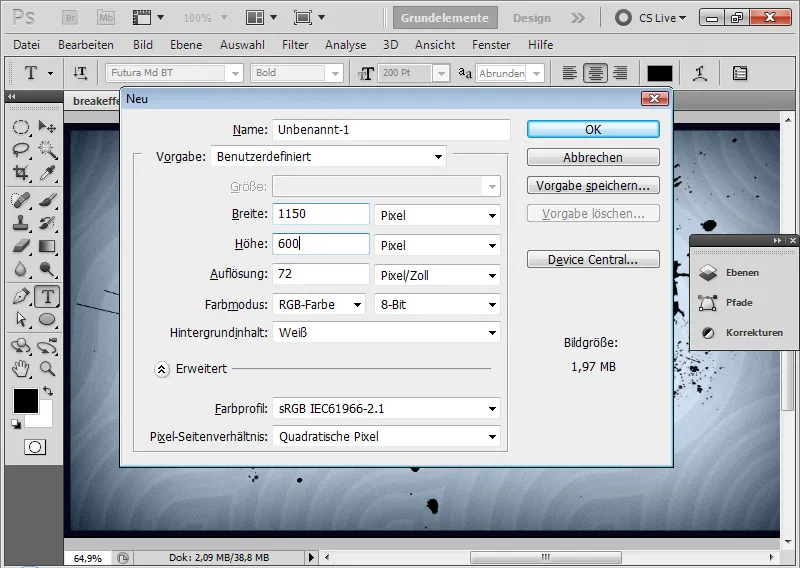
Step 2: Background Color Selection
In the Color Picker, I choose a very light blue to be used for the background.
By pressing Alt+Backspace, I can fill using the selected foreground color.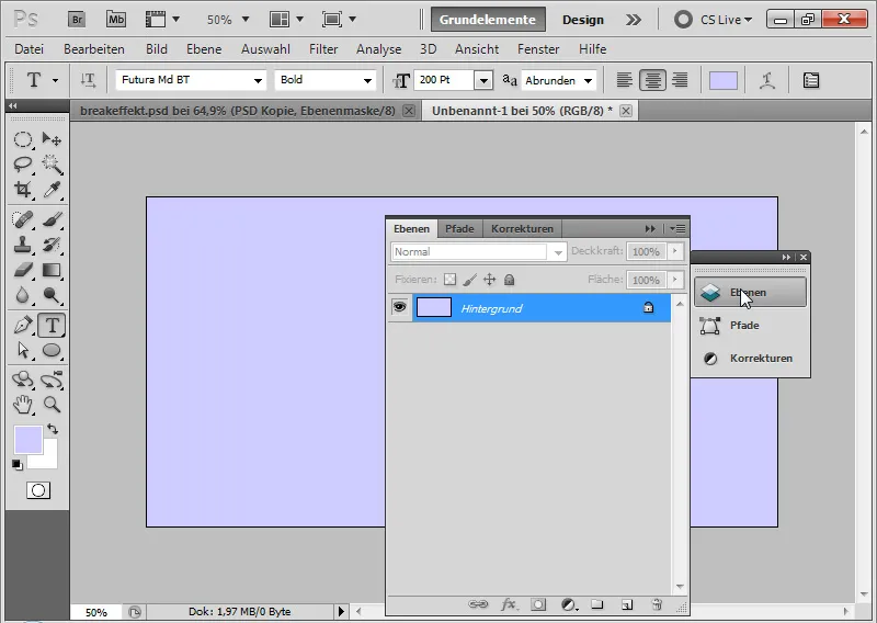
Step 3: Placing Text
I select a bold font; in this image, it's the Futura Md BT at a size of 200 pt. The text color is black.
Using the Text Tool, I write "PSD" on the document.
In another text layer, I write the additional "2.0".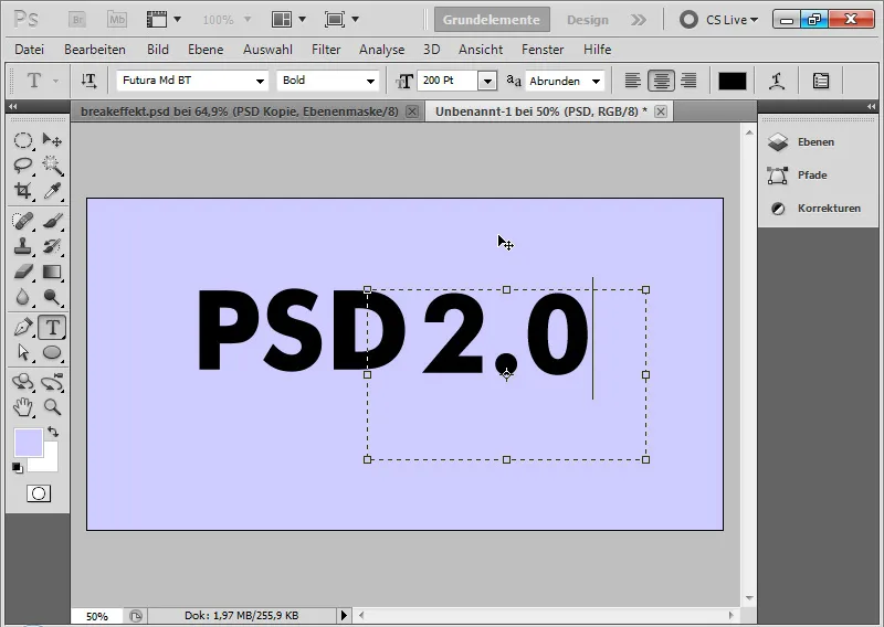
Step 4: Rotating Text
I rotate the first text layer with "PSD" about 7.5 degrees counterclockwise.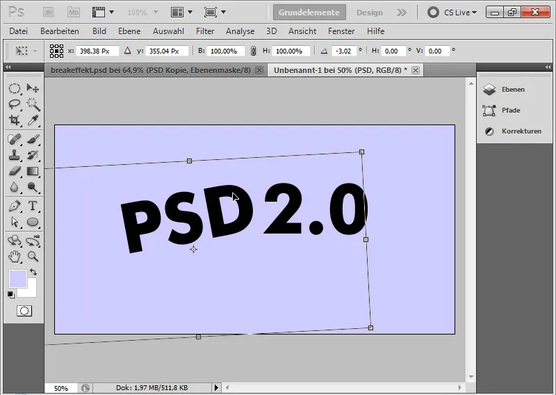
Step 5: Breaking Text
Using the Selection Tool, I choose a part of the first text. By right-clicking and selecting "Transform Selection", I can further rotate my selection so that I can break a piece of text in a suitable way.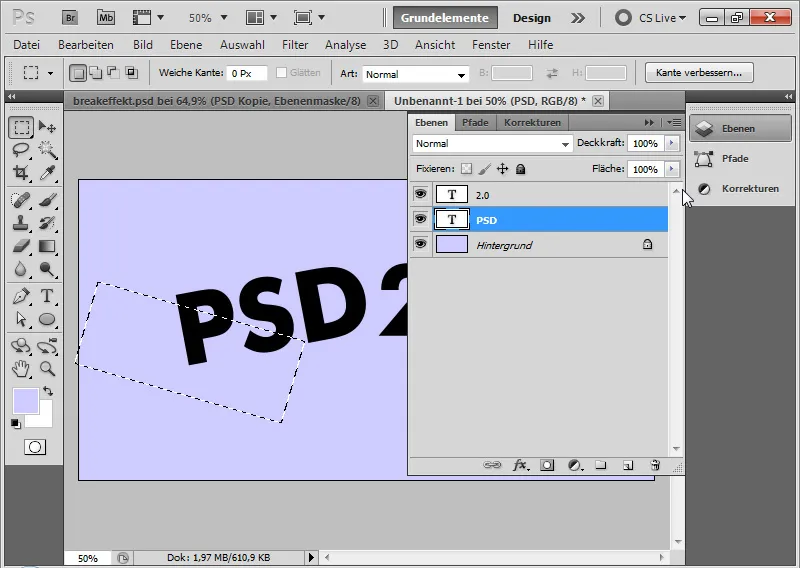
After copying the text selection with Ctrl+C and pasting it with Ctrl+V into a new layer.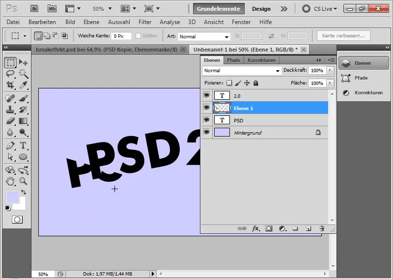
Step 6: Concealing Break Point
Next, I choose from the menu Select>Reselect.
With Alt, I click on the text layer at the Add Layer Mask icon. Now, the part taken as a piece from the text is masked in the text layer.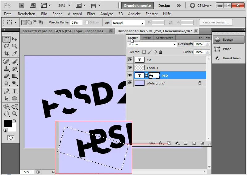
Step 7: Breaking Additional Text Pieces
Following the steps described in the last two steps, I continue with breaking the remaining letters to achieve multiple broken pieces of text.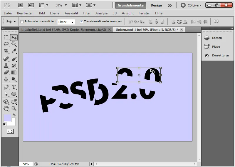
Step 8: Rotating Text Fragments
I can rotate my text fragments slightly to accentuate the effect. With the Move Tool active, I go to the corner points of the text fragment layers via the Transformation handles. The double arrow appears, allowing me to rotate the frame.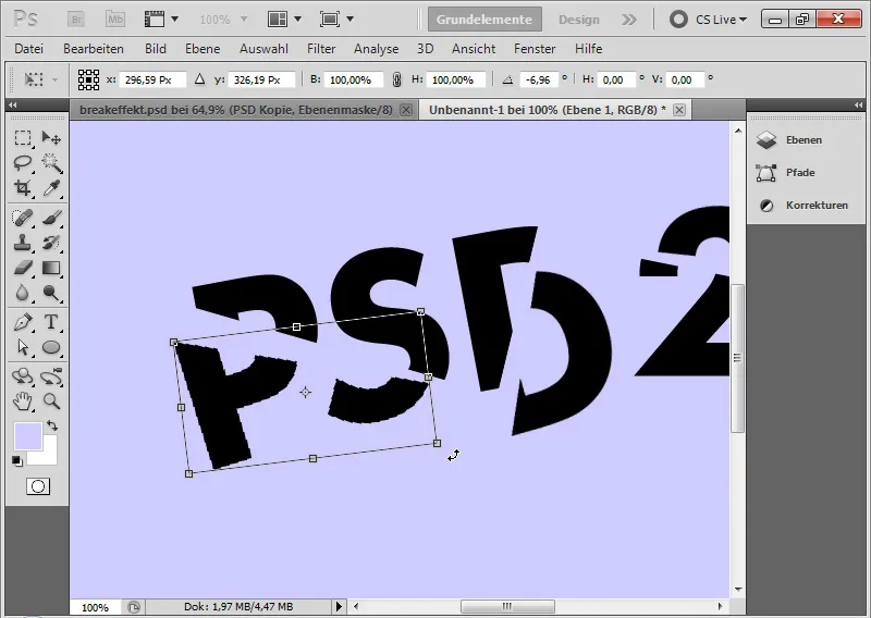
Step 9: Varying a Text Fragment
If I want to vary the text a bit more, I can shrink a part of the text. To do this, I simply duplicate my first text layer and hide the original. In the duplicate, I change the text size from 200 to 180 pt.
This contrasts well with the existing text pieces.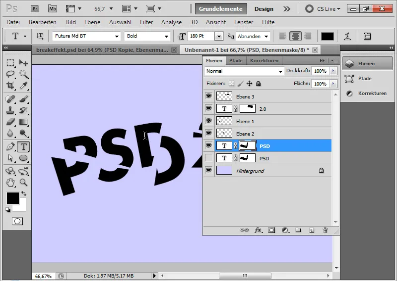
Step 10: Adding Break Lines
Using the Line Tool at a thickness of 1 px, I draw a black line in the image, placed exactly at a break point. Using Ctrl+T, I can rotate the lines as needed.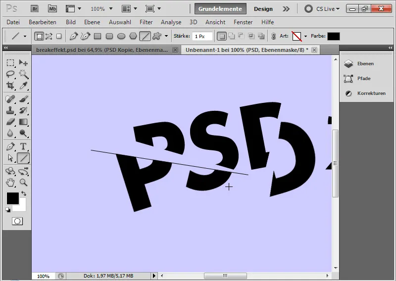
Step 11: Duplicating Break Lines
By pressing Ctrl+J, I duplicate the first break line. Then, I place it at another break point. If necessary, I rotate the duplicated line until it fits optimally. I repeat these steps until I have my six break lines in the image.
If a duplicated line is too long, I add a Layer Mask, where I mask the unnecessary areas. Adjusting the size using Scaling is not advisable as it changes the line's thickness partially.
My advice: Shorten using the Layer Mask, draw a new line to lengthen.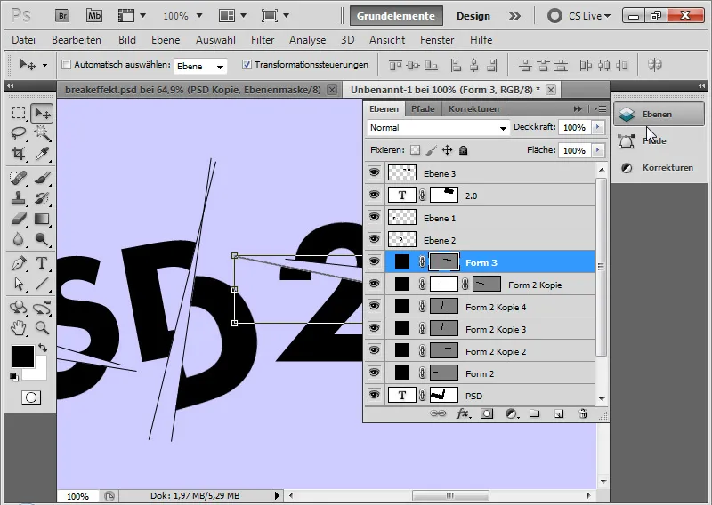
Step 12: Adding a line of text
Using a 26-point Georgia font in black color, I write as a subline to my fractured text "RELAUNCH 2010 - THE NEW PSD-TUTORIALS.DE".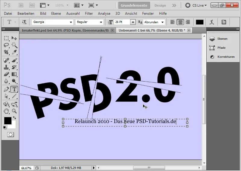
Step 13: Inserting splatter brushes
The brush set consists of brush tips that apply splatter effects. I download these and load them into my Brush Presets Manager to access the brush tips. Alternatively, I can also use other brushes that simulate splatters. Blood brushes, splatter brushes, and sometimes grunge brushes are also suitable.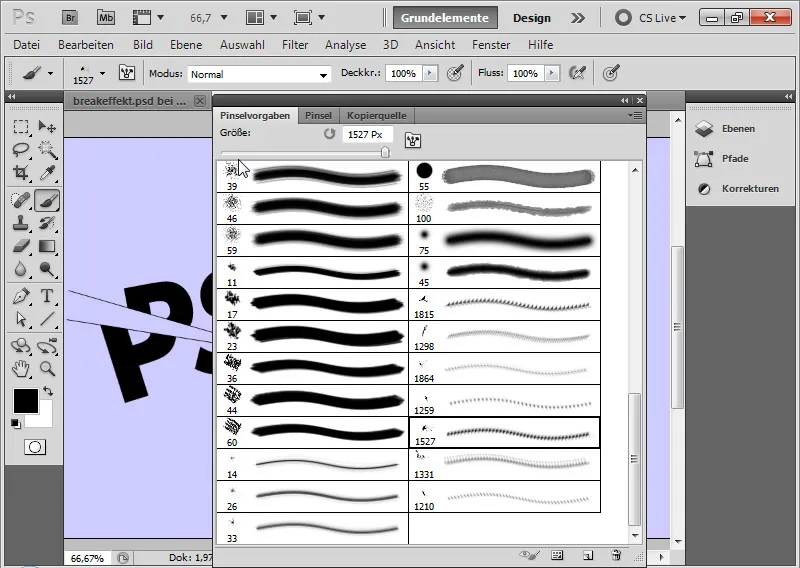
In the Brush Presets Panel, I can now choose the appropriate brush tips from the splatter brush set and apply different brushes with black color on a newly created layer one by one.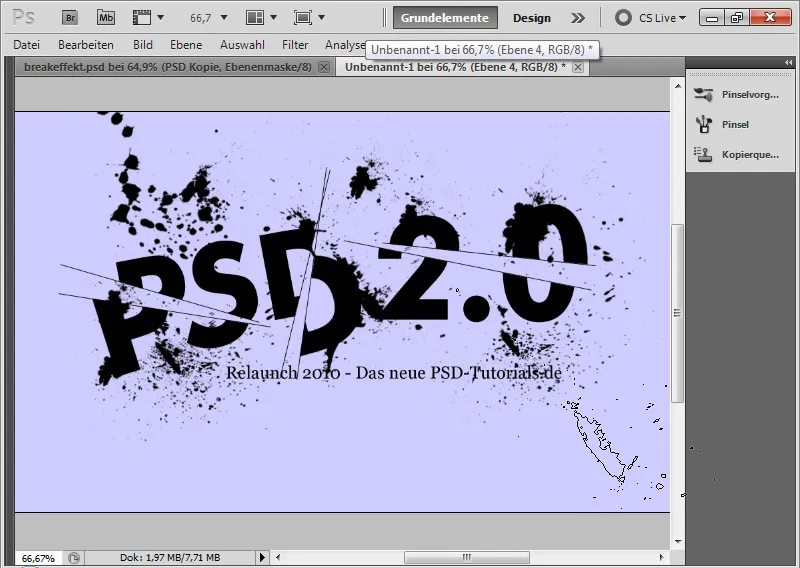
Step 14: Duplicate text fragments reduced to one layer
In the Layers Panel, I select all layers containing text fragments while holding the Shift key.
With the Alt key held down, I duplicate them in the Layers Panel. Then I select the shortcut Ctrl+E to reduce them to one layer.
The original text fragment layers can be hidden. Duplicating serves the purpose of preserving the originals because in the next step, the splatters are added. This way, I always have access to the originals.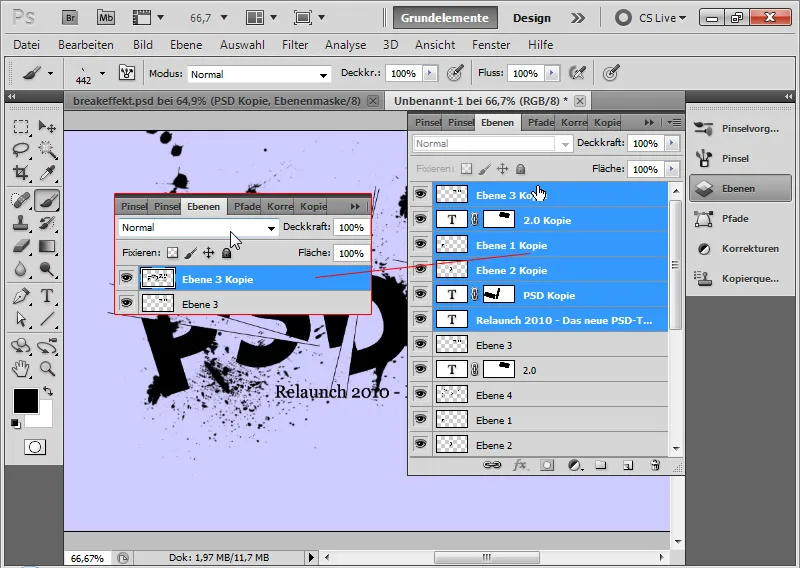
Step 15: Splatters on the text
I add a Layer Mask to the duplicated layer containing the text fragments.
In the Layer Mask, I brush directly onto the text with my splatter brush tips so that splatter effects also appear on the text, seemingly erasing the text in those areas.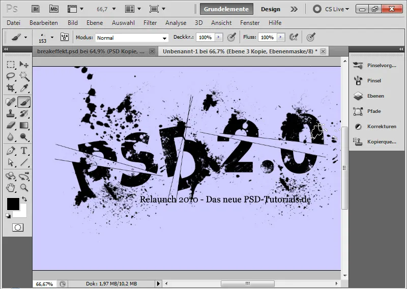
Step 16: Inserting background texture
To liven up the image a bit, I place a texture into the image.
This texture is taken from the Texture DVD by PSD-Tutorials.de from the Pattern category.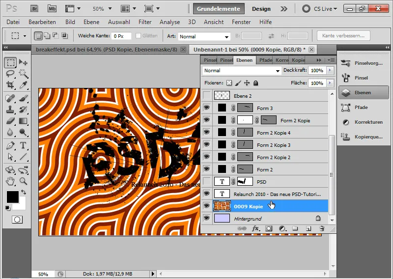
The texture has only a minimal Opacity of 5 percent. The layer mode is Luminosity.
The Luminosity mode ensures that only the brightness information flows into the document. This way, I can leave the original colors untouched and simply keep the retro texture structure in the image.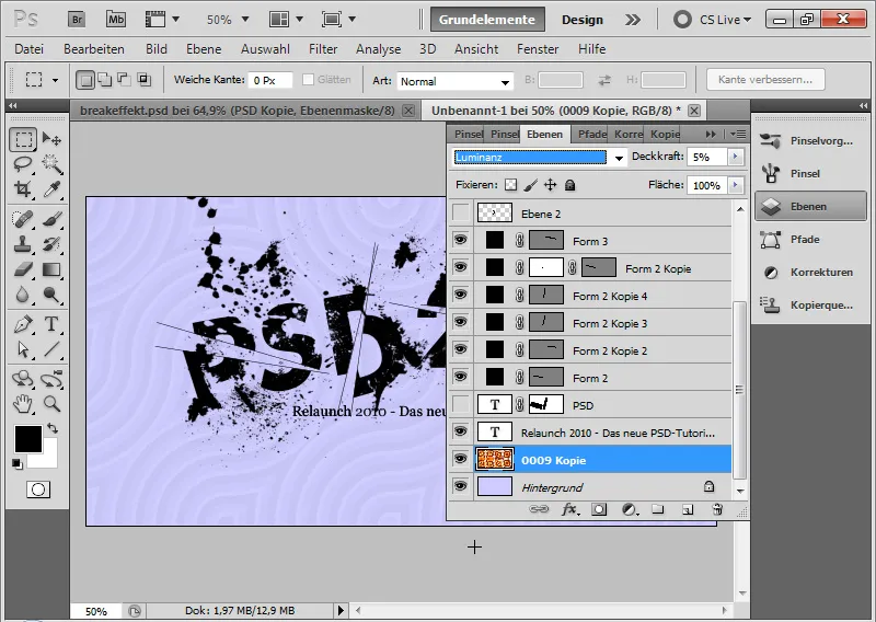
Step 17: Final touch with contour and inner glow
I create a new layer, fill it with any color, and set the Fill slider to 0 percent. This hides the layer contents; applied Layer Styles remain visible. I now adjust them using the Fill Options:
• Contour:
• Size: 10 pixels
• Position: Inside
• Color: Black or Deep Blue
• Opacity: 100 percent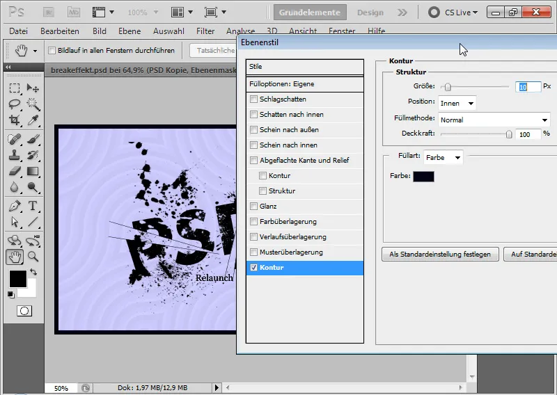
• Inner Glow:
• Blend Mode: Linear Dodge
• Opacity: 100 percent
• Size: 0 pixels
• Choke: 5 percent
• Range: 250 pixels
• Linear Countour with 3 percent Noise (Noise creates the grain effect)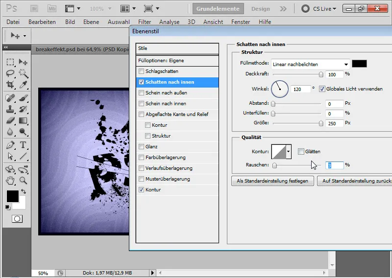
My Breakeffect is now complete and is perfect for creative typography arrangements in flyers and wallpapers. The working files for this tutorial include the texture file and the PSD file of this effect.