When working with Elementor, the correct positioning of your elements is crucial for the successful layout of your website. In this tutorial, you will learn how to effectively control the positioning of elements and ensure an appealing display on various devices. Let's dive into the different aspects of positioning and learn the best practices.
Key Insights:
- The width of elements can be set variably: full width, inline, or custom.
- Avoid absolute positioning to ensure user experience on mobile devices.
- Regular positioning offers a minimalist predefined design that remains visually appealing.
Step-by-Step Guide
Step 1: Accessing the Positioning
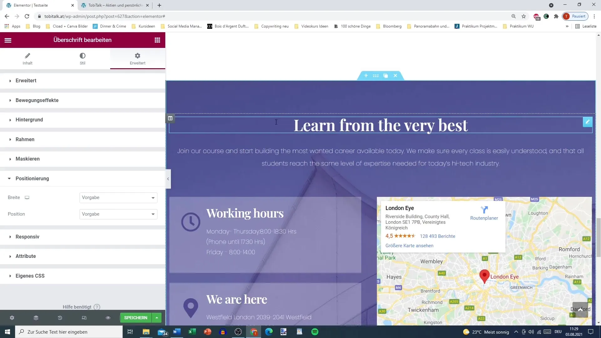
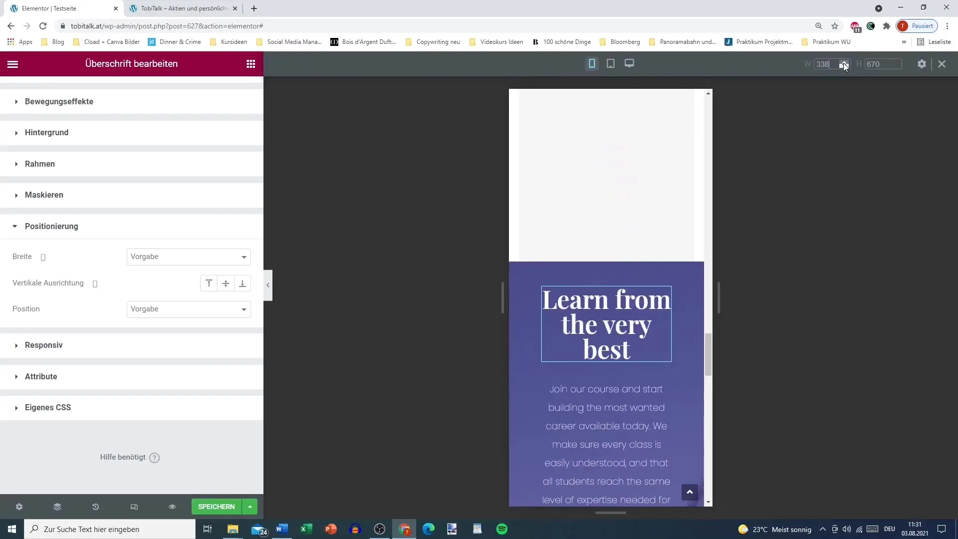
To adjust the positioning of elements in Elementor, you first need to select the desired element. Click on it to open the editing menu and navigate to the positioning settings.

Step 2: Setting the Width of the Element
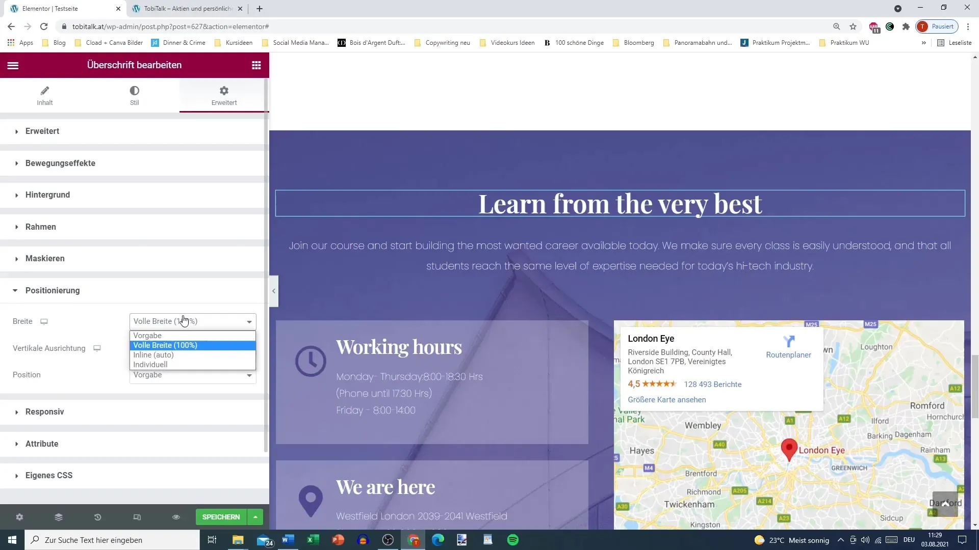
Now you have the option to configure the width of the element. By default, an element takes the width of the entire section. However, you can also choose the "full width" option to ensure it fills the entire available space. Alternatively, you can set the setting to "inline," which means the element is only as wide as the text contained within it.
Step 3: Determining Vertical Positioning
It is also important to consider the vertical position. When you choose a custom width, you can further adjust the element and move it within its container. This flexibility allows you to determine the exact position of the element.
Step 4: Pay Attention to Position Settings
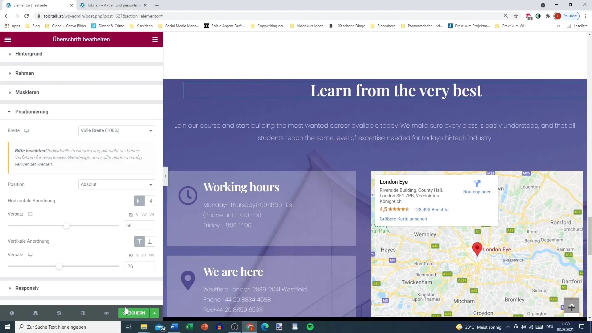
Here, you should be aware of position settings. The default option is regular positioning. You can also choose absolute positioning, but it is not recommended as this often leads to unexpected layouts that do not look good on mobile devices.
Step 5: Checking the Display on Different Devices
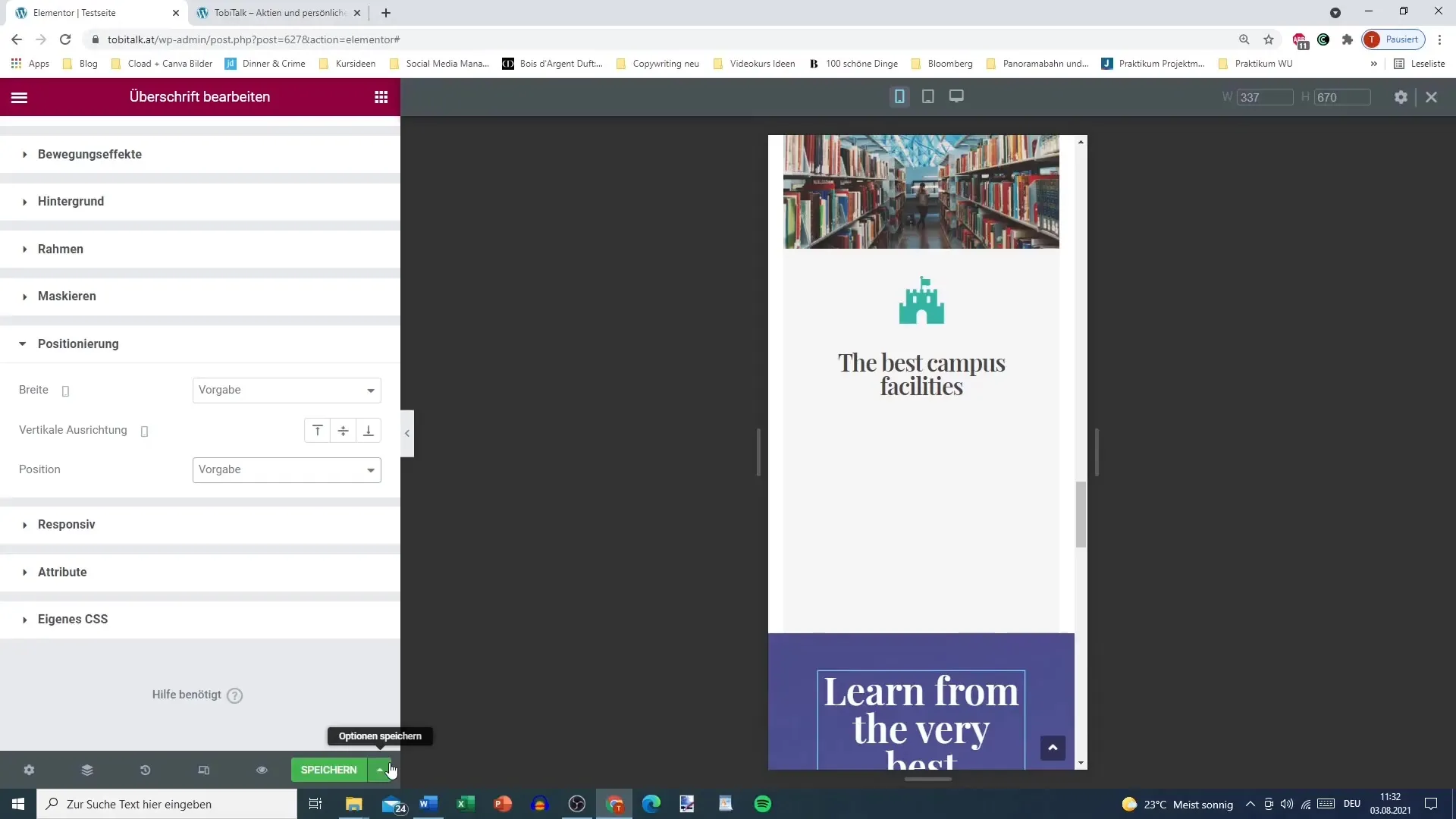
To ensure everything looks flawless, test your layout on different devices. Absolute positioning can cause elements to appear in the wrong places, especially on smartphones where space is limited. Switch back to regular positioning to ensure a harmonious layout for all screen sizes.
Step 6: Avoiding Issues with Absolute Positioning
A common issue with absolute positioning is that it can cause chaos in the layout and negatively impact typical user experiences. Ensure to maintain a clear structure so that your blog or website looks good and remains user-friendly on all devices.
Step 7: Fine-Tuning and Final Adjustments
Finally, adjust the size of the elements to ensure they look good on both large screens and mobile devices. Experiment with the settings to find the optimal balance between design freedom and the need for responsive display.
Summary
Positioning in Elementor is a key element for a successful layout. By correctly adjusting width, vertical positioning, and choosing between regular and absolute positioning, you can create an appealing design that looks optimal on all devices. Pay special attention to how your layout appears on mobile devices and always keep user experience in mind. With these tips, you are on the right track to creating an attractive and functional layout.
Frequently Asked Questions
How can I change the width of an element in Elementor?Go to the element's settings and adjust the width to full width, inline, or custom.
Why should I avoid absolute positioning?Absolute positioning can lead to problematic situations on different screen sizes and make the layout confusing.
How do I test the layout on different devices?Use the preview functions in Elementor to see how your page looks on computers and mobile devices.
What factors should I consider in vertical positioning?Vertical positioning can influence the appearance of your design, ensure it remains pleasant and clear.
Why is responsive design important?Responsive design ensures your website looks flawless on all devices, significantly improving user experience.


