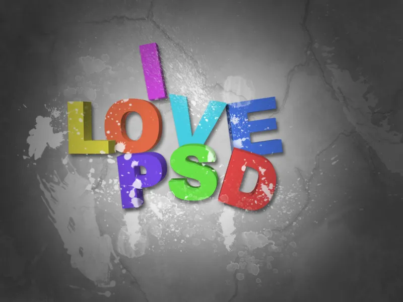
A 3D typo splatter effect gives your design dynamism and energy by combining the depth of a 3D text with the liveliness of color or liquid splatters. This effect is ideal for modern and eye-catching projects such as posters, album covers, or social media designs. In this tutorial, I will show you step by step how to create an impressive 3D typo splatter effect in Photoshop - with plastic depth and wild splatter elements that make your text unique. Let's get creative!
Step 1:
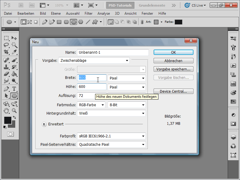
First, I create a new document; the size doesn't matter. I choose a very small size of 800x600 pixels. If you want to print this effect, the unit should be changed from pixels to cm, and the resolution from 72 to 300 pixels/inch.
Step 2:
Next, I insert a sentence of my choice with nice thick letters. I choose Arial Black as the font and increase the character spacing in the Character Panel to ensure that the letters are nicely spaced apart.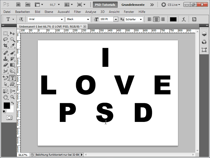
Step 3:
Now, I go to the menu 3D>Repoussé>Text Layer.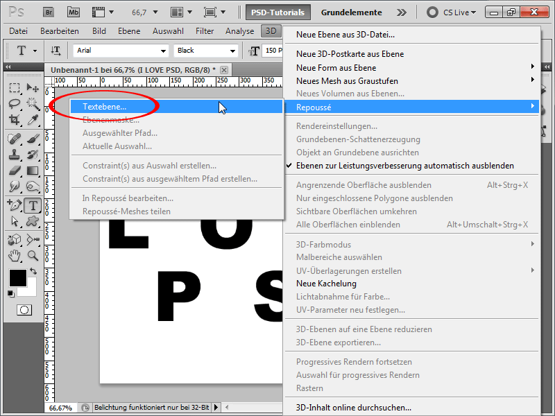
Step 4:
In the Material Menu, I activate the template without texture. This way, the color of my 3D text is already adjusted.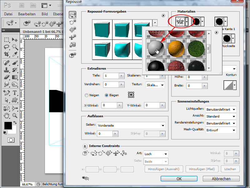
Step 5:
For the Extrusion, I change the value to 0.1 to ensure that the extruded 3D part is not too large.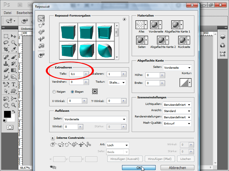
Step 6:
Because my 3D text still looks quite modest in the design view, I now open my 3D Panel and click on Quality and select Raytracing - final. This will take about 1-5 minutes.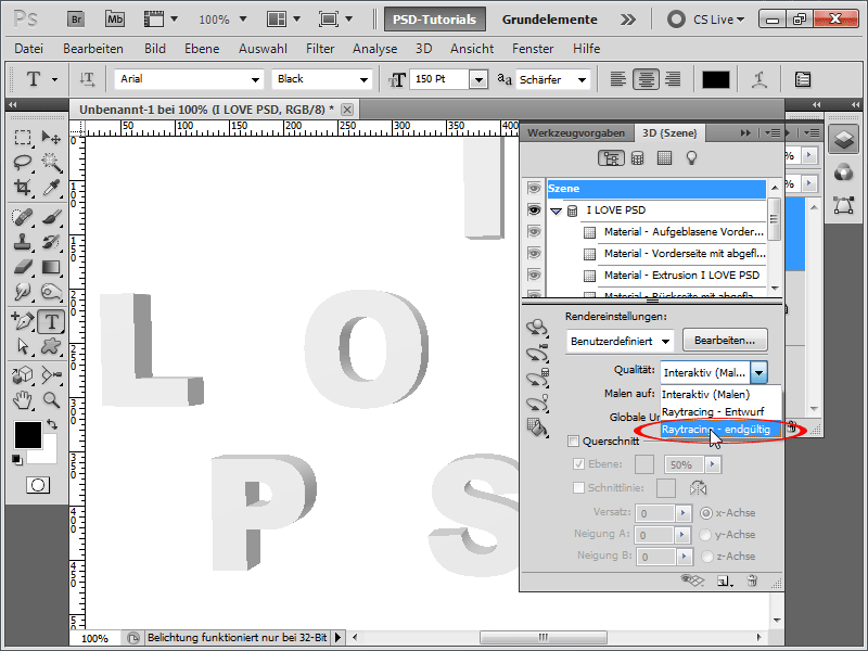
Step 7:
That looks much better now.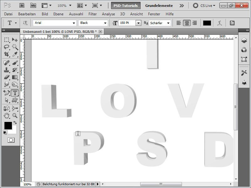
Step 8:
So that I can now arrange the letters as I like, I right-click on my 3D object in the Layers Panel and rasterize it.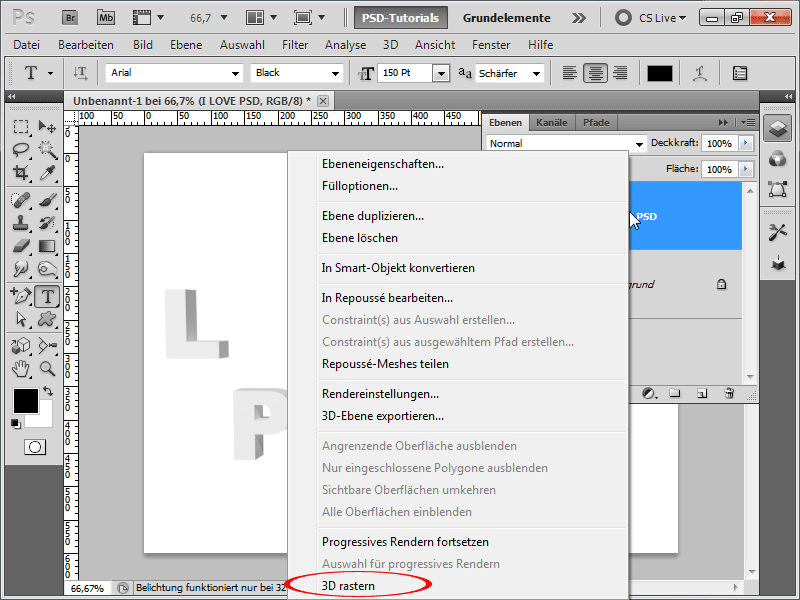
Step 9:
Next, I select a letter with the Rectangular Marquee Tool, cut it with Ctrl+X, paste it back as a new layer with Ctrl+V. Then I can rotate or move it slightly with Ctrl+T.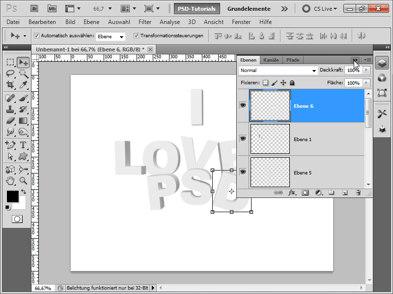
Step 10:
Now I select all layers except the background layer while holding the Shift key, and click on the folder icon in the Layers Panel to group all layers together. Then I add a Hue/Saturation Adjustment Layer at the top of my group.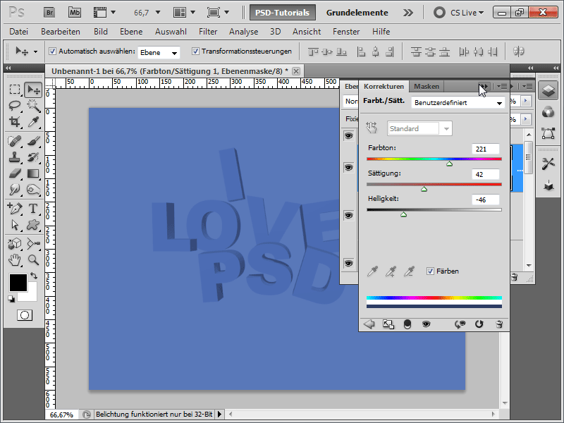
Step 11:
The problem now is that everything is blue. But I only want the text to be blue. To do this, I just need to change the fill method of my group from Pass Through to Normal.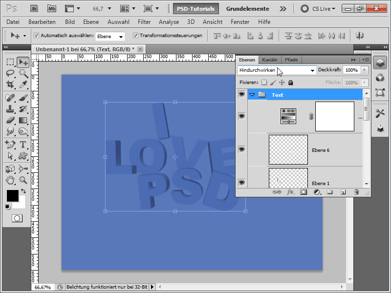
Step 12:
And now only my text is affected by the Hue/Saturation Adjustment Layer.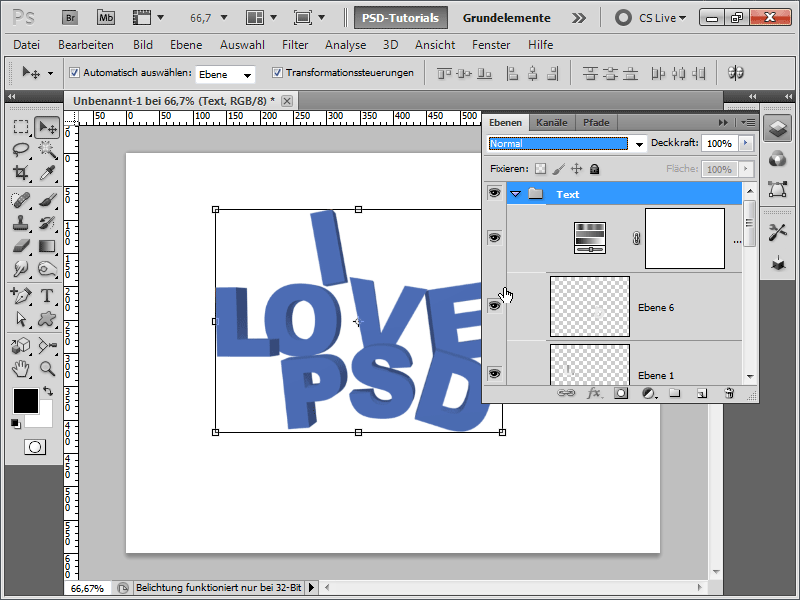
Step 13:
Now it's time to treat my background to something nice: I add a texture, found among others on our Textures DVD, above my background layer.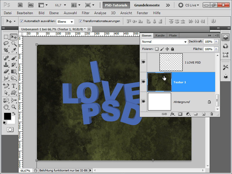
Step 14:
Because I don't really like the color, I adjust the fill options in my texture for color overlay as follows: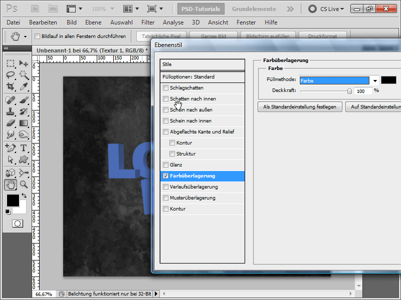
Step 15:
Then I add another texture and change the fill method to luminosity. I have set the opacity of both texture layers to about 40%.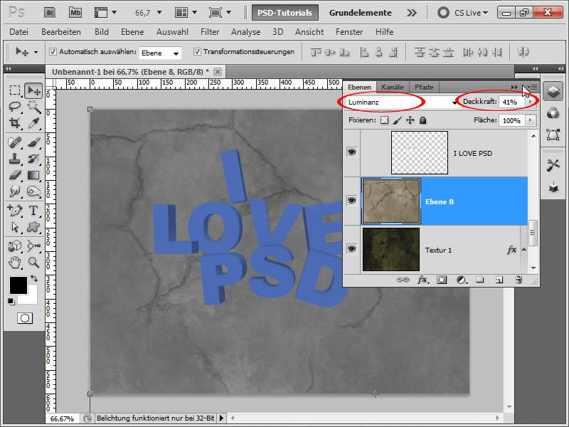
Step 16:
Now I add a drop shadow to each letter. Holding the Alt key, I can quickly transfer the effect to the next letter in the layers panel.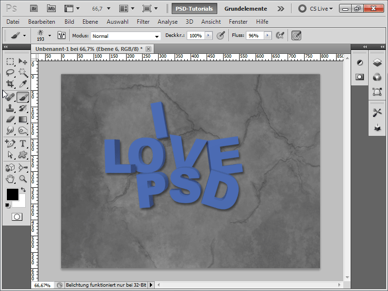
Step 17:
Next, I create a layer above my adjustment layer so that it is not affected by the coloring.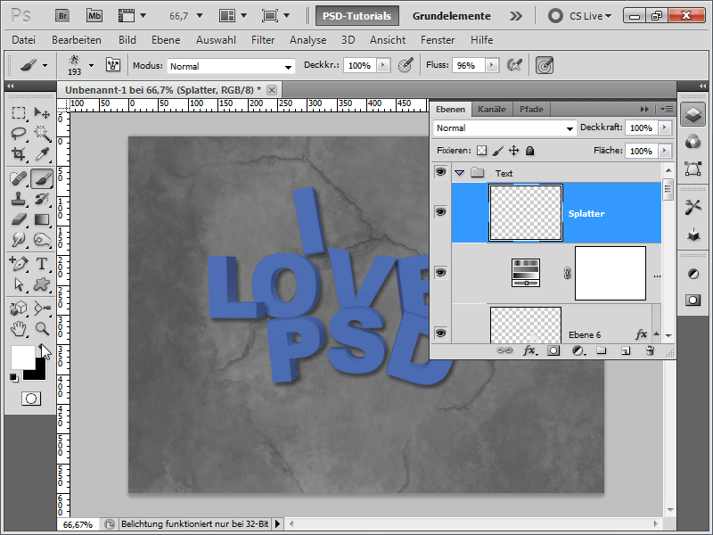
Step 18:
Now I download some splatter brushes from PSD-Tutorials.de (simply search for "splatter"). Then, I activate a brush with white color.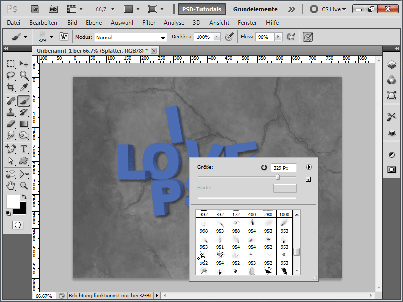
Step 19:
I decrease the brush size because otherwise the splatters would be too large in my case.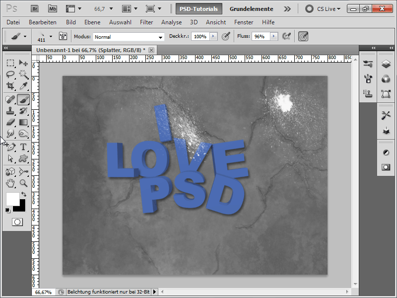
Step 20:
I also constantly choose new splatter brushes so that the same brush strokes are not constantly visible. I also adjust the opacity individually.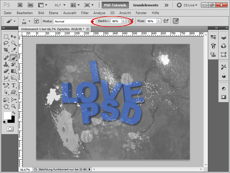
Step 21:
If I want only my letters to be affected by the brush, I can select all the letters in the layers panel by pressing Ctrl+Shift.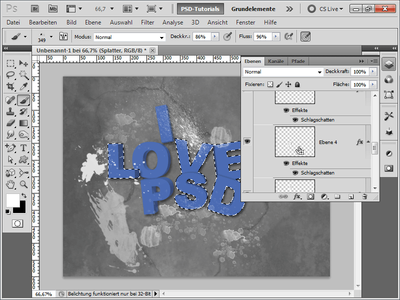
Step 22:
By occasionally clicking with a splatter brush now, the result looks like this: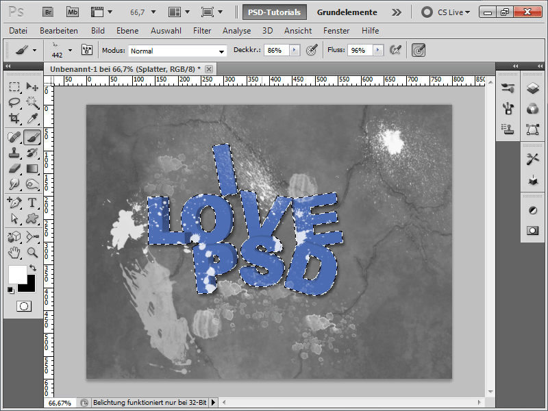
Step 23:
Now, I create a layer below the letters (but still within the group) to add a few blue splatter strokes.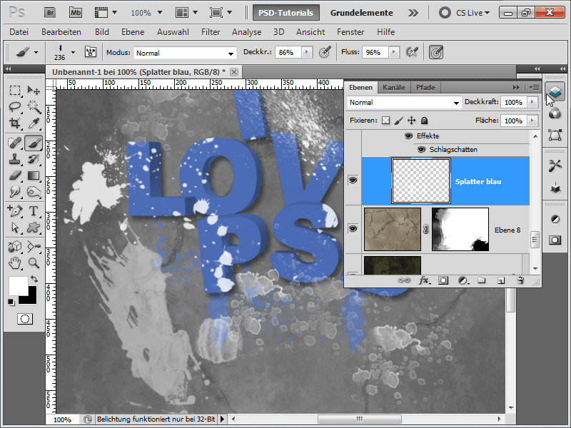
Step 24:
It's already looking pretty good.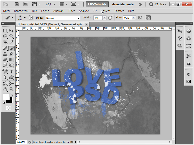
Step 25:
If I want to add a vignette, I can simply create a new layer at the top in the layers panel with a gray-to-white gradient in a radial form and change the fill method to multiply. To lighten the background, I have added a radial gradient from white to black on my bottommost texture layer. This allows the white background layer to show slightly through, although it is not completely visible as it is covered by the second texture.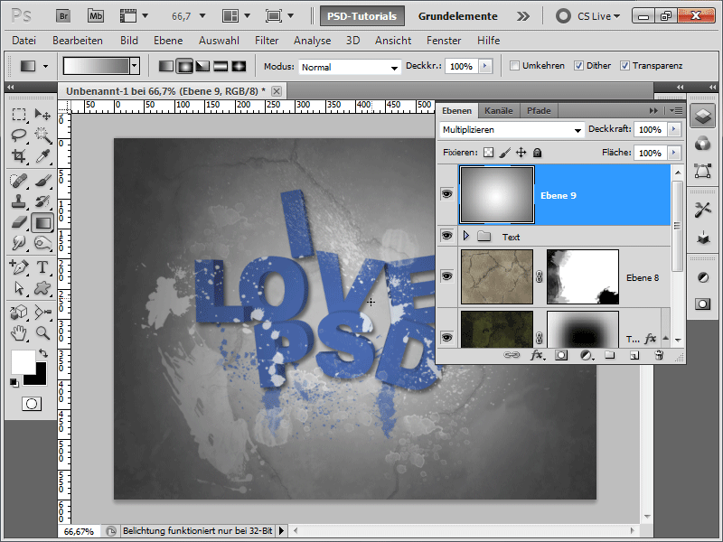
Step 26:
The result looks like this: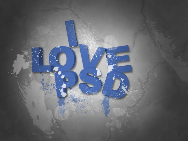
Step 27:
However, upon closer inspection, the color is on top of the shadow for the letter D; that cannot be right. Therefore, I either change the fill method to color dodge or, for example, screen, which then creates a different interesting color effect.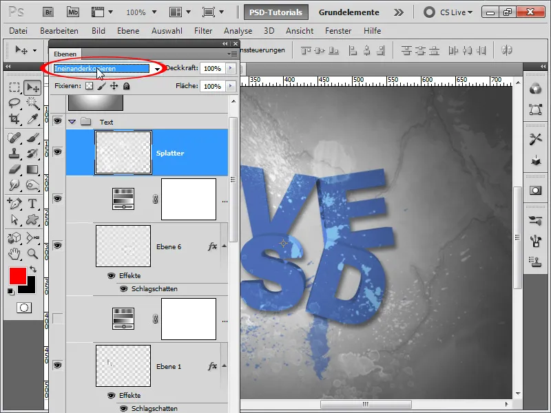
Step 28:
Or I change the fill method back to normal, add a layer mask, and then use a brush with lower opacity to lightly exclude the areas of the shadows or edges on it.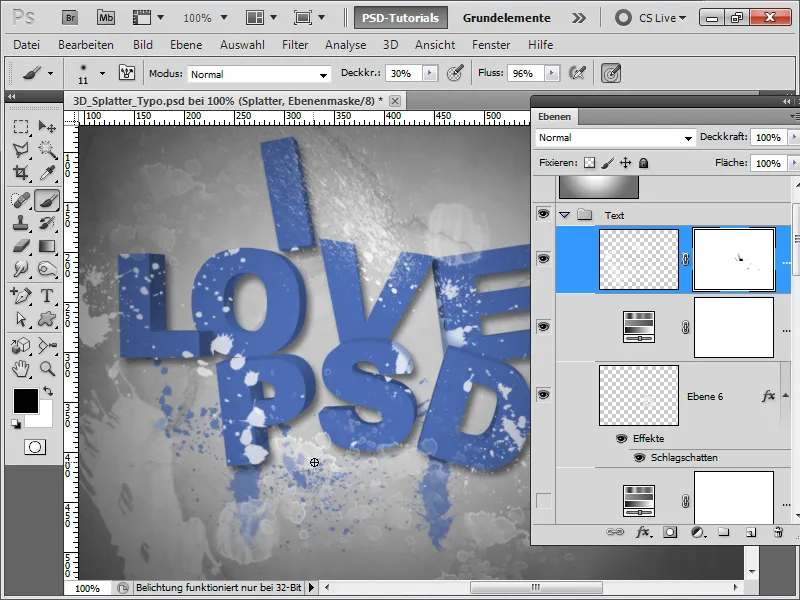
Step 29:
If I want to add a little color to the mix, I can also hide the hue/saturation adjustment layer and instead create a gradient adjustment layer, changing the fill method to multiply, selecting all the letters (shift+ctrl), and then inverting the mask with ctrl+i with the selection deselected.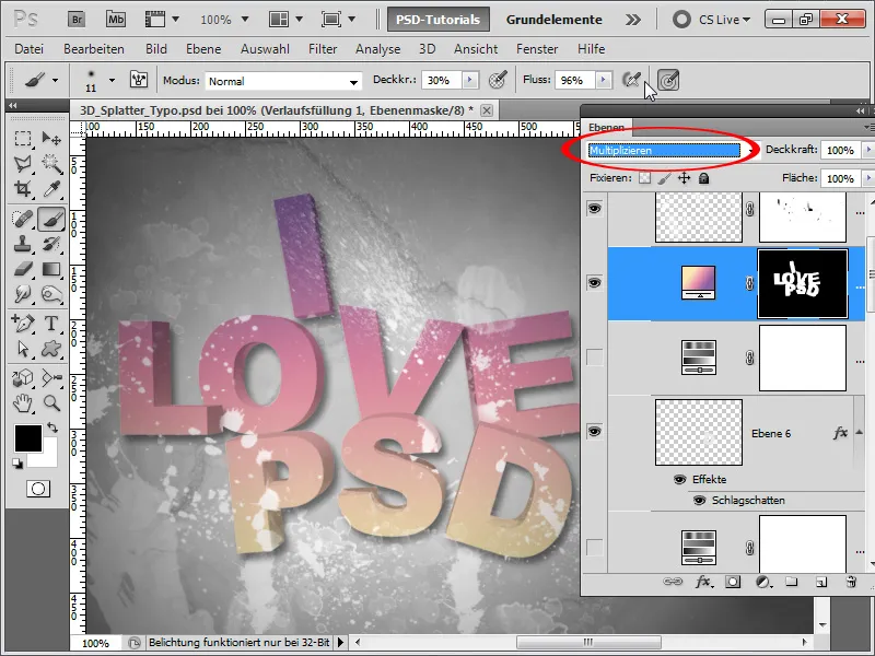
Step 30:
If each letter should have a different color now, I hide the adjustment layer and instead add a color overlay of a different color to each letter using the multiply blending mode.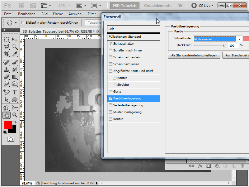
Step 31:
The result will then look like this: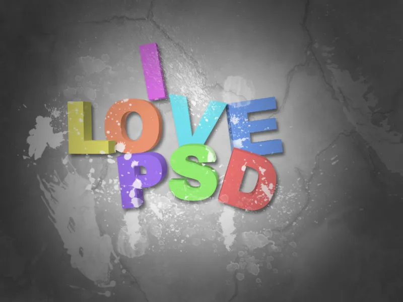
Step 32:
If the colors need to be more vibrant, I don't have to readjust every color overlay, but can simply add a curves adjustment layer and gently drag the curve down.