- Working with sample pages
- Quickly create your own airplane runway
- Cleverly position the airplane differently on each side
- Flipbook
- Preflight - how to quickly find and repair errors (missing fonts, graphics)
- Inserting anchored images
- Dealing with color management
- Be careful when printing black and white pages ... not everything that looks black and white is really pure black
- Final check with Acrobat
In this tutorial, I'll look at practical tips and tricks to help you get more out of your InDesign work. For example, let's take the image below in the footer of the bachelor thesis. The special feature is that this airplane moves from page to page - in other words, it is not a static image.
Tip 1: Apparent movement
How is something like this inserted?
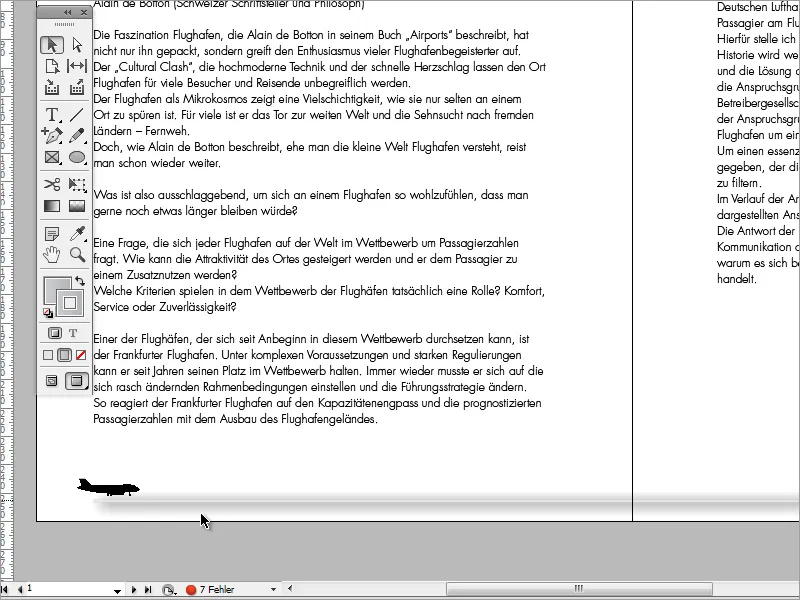
First of all, you need to call up the sample templates in the page control panel. Double-click on the page thumbnail to access the pattern templates.
There are only a few elements on these pages, including the page number. You can easily insert these by going to the Font menu and selecting Insert special characters>Marks>Current page number.
The runway in the document, on the other hand, is something special, but it's not magic. First of all, you need the Line Drawer tool. Use this tool to draw a line of the desired length. If you hold the Shift key while doing so, this line will also be drawn horizontally or at an angle depending on the angle preset.
To make this line easier to see, you can increase the line thickness in the options bar.
The line I used is based on additional effects that you can set via the effects control panel.
Double-click on the object entry to access the effects settings menu.
A first effect can, for example, be to give the object an outward glow. In this part of the dialog box, you can set the color as well as the opacity, size and uniformity. This is how the road is created.
Another small intermediate tip I would like to give you is that you can create pages in your document based on more than just the master page. For example, if you want to insert a loose, unformatted intermediate page, you can simply add a blank page to the document in the page control panel.
Sample templates can be recognized by the designation "A" in the page thumbnail of the page control panel, whereby the "A" only symbolizes the first sample template. If there are several templates, the designation would then continue in alphabetical order.
Back to the airplane and the start sequence. Uncharacteristically, this was only inserted at the very end, when the document was practically finished.
If I enlarge the graphic frame, you can see that the original image is not limited to one airplane model, but that there are several views of the model in this file. I have simply changed the visible area of the image so that only one model is visible.
So I position the first object on the left-hand side and initially only on the left-hand sides. Now I want to position a copy of the object on the next page. So I copy the object from page 1 with Ctrl+C, switch to the next (left) page of the document, i.e. page 3, and press Ctrl+V to paste.
As you can see, the object is not inserted at the same position in the document, but at a random position. You can counteract this by using the Paste to original position function, which you can find under the Edit menu item.
I then used the combination Shift+right arrow key to move the airplane copy(s) 3 steps to the right. It is important that the object you have just pasted is always copied after the move and pasted on the next page.
Now I also want the airplane to take off. To do this, I have simply rotated the graphic a little.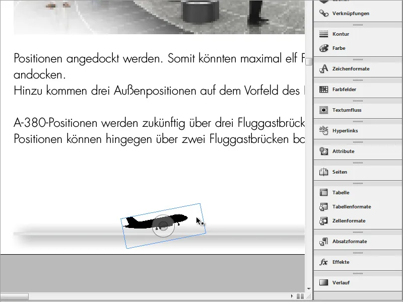
I have made several copies, but the airplane always looked the same. However, as I had access to a graphic that contained several images of the plane, all I had to do was move the image in the graphic frame to get a different perspective.
This work then extended over all the pages, with all the odd-numbered pages being fitted with the graphic first and only then the even-numbered pages. You only have to be careful with the middle of the document, as it is held together there. Otherwise the airplane would not be visible there or would only be cut off. The inner web can therefore have a slightly larger gap.
The airplane has landed again at the end of the document.
Tip 2: Troubleshooting
The next InDesign tip revolves around the preflight menu. This provides users with additional document information, for example in the event of errors in the document. Ideally, the display should always be green.
Double-click on this area to open the preflight control panel. All information relating to the document and error sources is summarized in this control panel.
If you open these drop-down lists, you can view the respective errors. Double-clicking on one of these error messages takes you directly to the corresponding location in the document.
Images may be included in the document for preview purposes but have not been embedded for export. The Links dialog box also indicates this with a warning triangle.
The buttons at the bottom of this dialog box allow you to re-create the links or update them. The source data is synchronized again. In most cases, this corrects the error.
If, contrary to expectations, the link is not found, you can use the Relink button to select the source again. This will open a dialog box with a file manager that will help you to find the corresponding file on the hard drive.
In addition to files and images, fonts are a common source of errors. Nothing is more fatal than finishing formatting a document and then forgetting to embed the font or save the document in a display-neutral format. The dialog box therefore also provides information about such font errors.
In the extended view, such errors can remain undetected. Only when you switch to the editing view will InDesign display the affected text areas with a colored background. Once again, double-clicking on the error message will take you to the corresponding document page with the affected text area.
If you click on the detailed error message in the drop-down menu, the corresponding text is highlighted. You can now correct such an error by setting an alternative font in the options bar at the top.
If the error message occurs too frequently and always affects the same font, you can also correct it in another way. Simply go to the menu item Font>Find font.
Then select the font to be replaced in the following dialog box and set the new font to replace it in the dialog box below. Finally, click the Change all button to initiate the replacement process.
The errors in the document have now all been corrected.
Tip 3: Quick text changes
You are not always satisfied with the text layout straight away or are still undecided. Should it be one font or the other? InDesign allows you to reformat entire text areas using the paragraph styles. Simply go to the paragraph formats and select the format you want to change.
Double-click to open the editing window where you can change numerous settings.
Simply enter a new font to replace the current one. As soon as you switch to one of the other input fields, the font in the document will be adapted to the new settings.
The same works for bulleted lists. Here you can change the settings for the created paragraph format and give all bulleted lists a new appearance with this format.
Tip 4: Images
You can import images into a document in different ways. One convenient option is the Place function, which can be found under the File menu item.
In the dialog box that opens, select the image to be imported into the document.
The inserted image may cover text areas. In this case, it is advisable to set the text wrap. There is a new control panel for this in version CS6. This can be found in earlier versions under the name Contour guide.
This dialog box contains various buttons that influence whether the image should displace the text and, if so, how this is done. To make this easier to see, I first move the image to the background. To do this, I right-click on the image and select Arrange>Into background from the context menu.
Now the text is above the image.
This doesn't look very good. In order for the image to have the property of displacing the text, it must be in front of the text. I therefore change the arrangement again so that the image is in front of the text. I can then specify in the control panel which outflow variant should apply. For a rectangular image, it is sufficient for the outflow to take up the dimensions of the image box.
You can also define the text distance to the image more precisely. As long as the chain symbol in the middle of the dialog box is active, the distances to all sides change evenly.
However, this type of image placement also harbors another problem. As soon as you move the text, it retains its position - without following the new text position.
The first way to solve this problem is to first cut out the image using Ctrl+X. Then go to the position in the text box where the image is to be inserted and insert it there again with Ctrl+V.
It may then have to be positioned again more precisely. If the Enter key is pressed above the image to create a text wrap, the image inserted in this way will move with the wrapped text.
You can also add an image to the document by first placing the cursor at the position where the image is to be inserted. Then go to the menu item Object>Anchored object>Insert.
In the following dialog box, you can specify which object is to be inserted with which object format and define its position and size in advance.
InDesign now inserts a graphic frame. With the right mouse button and the context menu entry Paste into selection, you can place the image from the clipboard into this graphic frame and adjust the frame if necessary.
However, it is even easier to place the text cursor at the text position where an image is to be inserted. Then go to the File>Place menu item.
In the following dialog box, select the image file. You can also check the Show import options box.
The image import options contain a few more setting options that may be useful under certain circumstances. Once the settings have been made, confirm them by clicking on OK.
The object is then inserted into the document. However, this is sometimes far too large.
You can now use Ctrl+Shift to reduce and position the image.
The image can be moved relative to the insertion position. To do this, use the context menu to go to the Anchored object>Options entry.
In the following dialog box, you can specify which position the anchored object should take. Under the user-defined specifications, you can set which offset to the insertion position should be maintained and which reference point should be taken into account.
Additional attributes such as contour or contour color can also be assigned to each image. The corresponding options can be found in the properties bar.
Tip 5: Color or black and white
The expected printing costs often determine whether a document should be printed in color or black and white. Even if a document appears to consist only of black and white pixels, for example in the case of pure written documents, it does not necessarily have to be a black and white document. A special module that you can access via Window>Output>Separation preview can provide information on this.
All available colors can be displayed in this window. If you now position the mouse over a graphic, the color components are displayed in this window in real time and with percentages.
If you Blender out all supposedly unnecessary colors, for example to simulate a grayscale document, you will quickly notice that even inconspicuous details such as the world map in the background are eliminated.
If an additional color channel is added - for example for a 2-color print - considerably more details can be reproduced. The more colors I need to put a document on paper, the higher the printing costs.
Basically, you could also print the document or the text pages in black and white. However, the experiment with the airplane also has its disadvantages. This graphic is not simply black, although it appears to be. If I Blender all colors and deactivate the black, the elements that are printed with a color application always remain visible on the pages.
In order for such graphics to actually be considered black and white variants, they must first be created as such. To do this, you can edit the graphic from within InDesign using suitable software. Simply right-click on the relevant link, select the Edit with entry and select the software you trust from the list that appears.
You can now edit the image in the image editing program - in this case Adobe Illustrator. The problem is that the graphic was created as an RGB graphic. If you now try to recolor the object, it will inevitably be filled with a black RGB mixed color. Double-click on a black field in the color fields palette. If you change the color mode in the color field options from RGB to CMYK, which is used for the print output, you will see that black is not the same as black, but that yellow, magenta and cyan components together represent this dark color.
The solution may be to set all color controls in CMYK mode to 0, with the exception of the value for the K channel. However, it is essential to change the document color space to a CMYK profile first. You can do this in Illustrator via the menu File>Document color mode>CMYK or RGB. Only the black value, which is marked with K (for black), must be set to 100 percent.
In Adobe Illustrator, you have additional image options that you can access via the menu Effects>Document Raster Effect Settings. In the dialog box that opens, you can change the resolution to a printable size.
After saving the modified document, Adobe Illustrator can be closed again. In InDesign, however, these changes are not yet visible. However, InDesign will display an exclamation mark in the link window to indicate that the image files have been changed.
You can now update the links in the document using the small button in the link window. As soon as this process is complete, the warning triangle disappears. But our graphic is also no longer visible because it no longer consists of a mixed color, but of pure black, which we have hidden in the document.
If I scroll further down in the document, I'm in for another little surprise. The airplane is still shown - at least partially. How can that be?
So I take another look at this graphic in Adobe Illustrator. And lo and behold: the cause is quickly found. The object has an outline. However, this outline is again an RGB mixed color, which is why it looks black, but was mixed together from the other basic colors.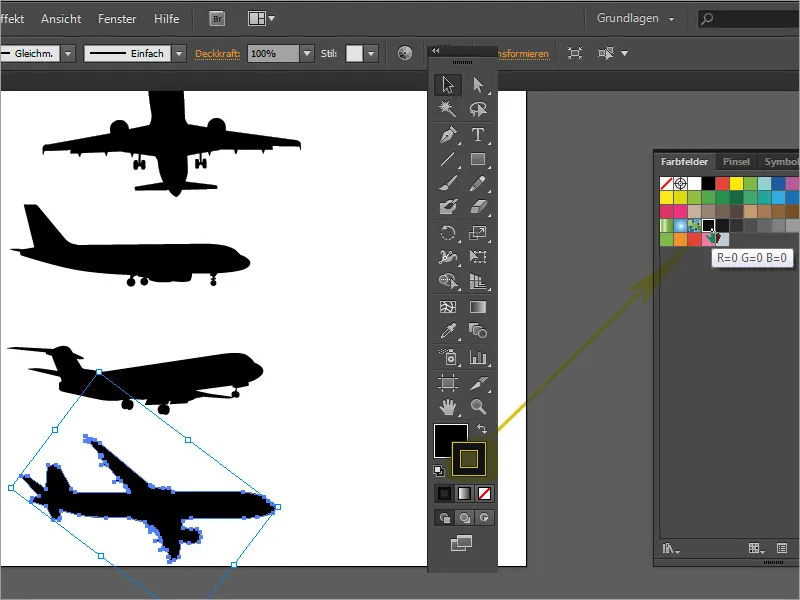
Either remove the object outline or recolor this outline with a CMYK black color.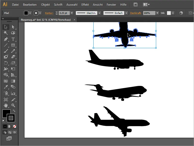
After updating the InDesign document, this graphic is now hidden as expected. The separation preview helps you to check your document again before printing and to recognize such errors at an early stage. It does not necessarily only have to affect graphics. Text can also be displayed in color.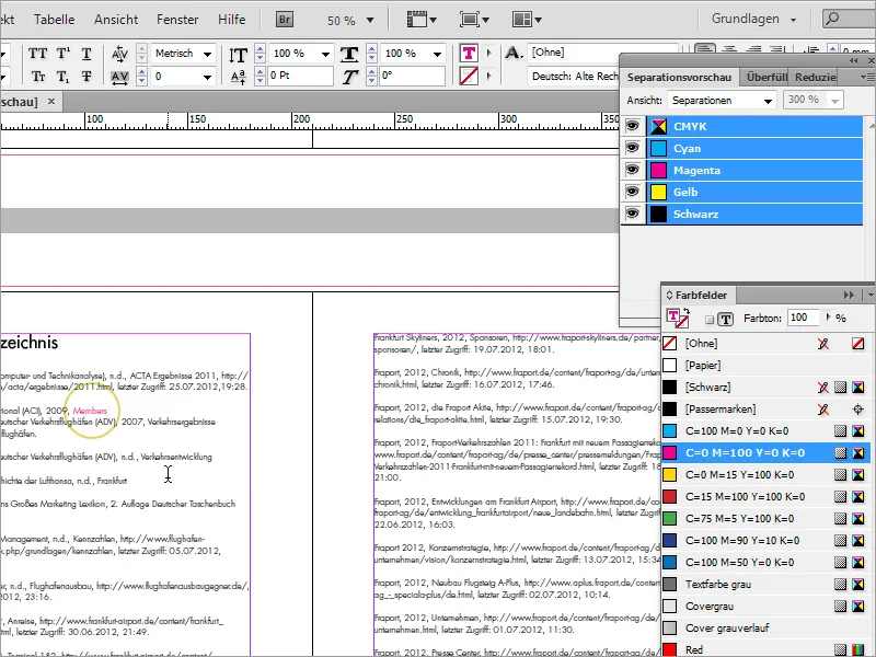
A magenta-colored text would not be able to be displayed in black and white printing and would have to be printed as a color page at a much higher price.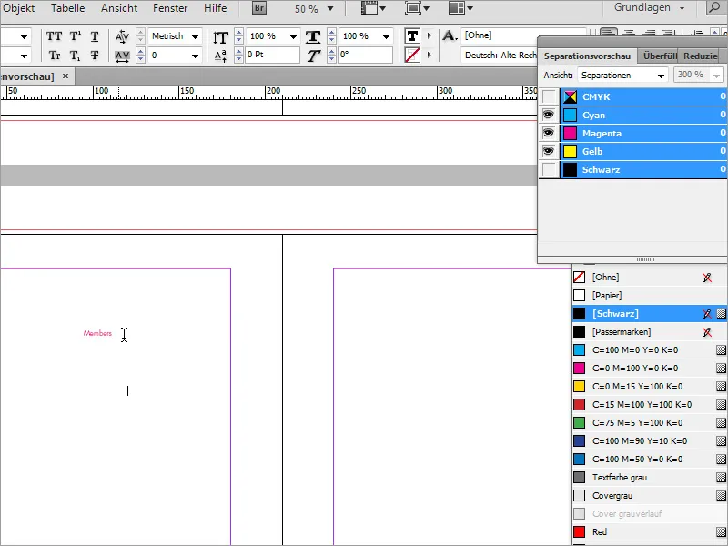
Tip 6: The export
Finally, all that remains to be said is that such documents must of course also be exported correctly so that all the effort pays off and there are no problems in the copy store. You can prepare the document for export via File>Export.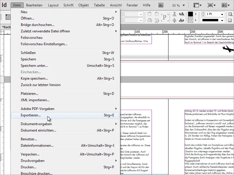
Adobe PDF has proven to be the best export format..webp)
A few settings need to be made in the following dialog box. In the Marks and bleed submenu, make sure that the document's bleed settings are used. The document was created with a bleed of 3 mm on each side. These specifications should always be checked with your trusted print shop in advance.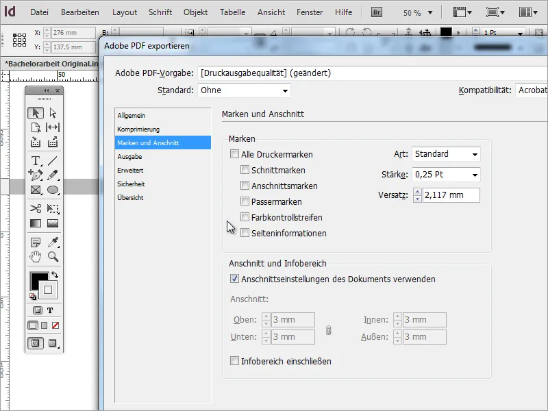
In the output dialog box, it is essential to ensure that the correct output profile for professional 4-colour printing and not an RGB profile is specified here. It is best to ask the print shop for the appropriate color profile.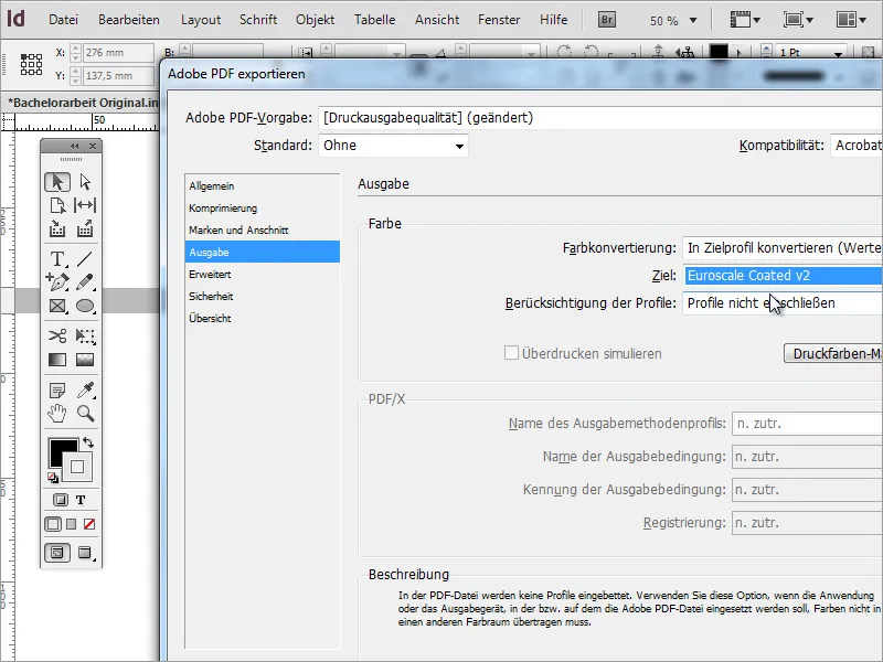
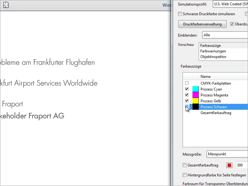
Users of Adobe Acrobat (not Reader) can also check the document in this program. It contains some useful tools for this purpose. The separation can also be displayed in this program. To do this, you must call up the Print production>Output preview area.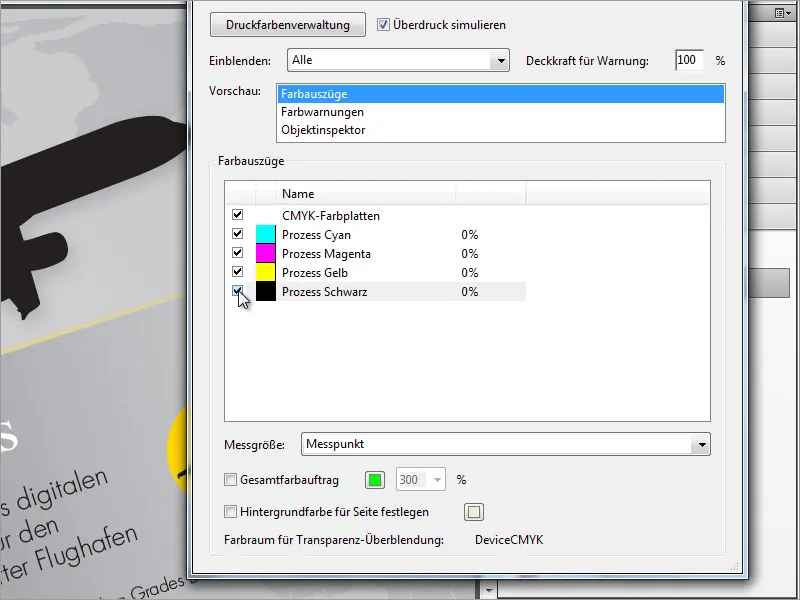
Using another example, I would like to take another look at the total color application. This can also be read out in Acrobat Pro and should not exceed 300%. There is a small checkbox at the bottom where you can set the maximum value and a signal color to indicate the areas in the document that are close to this maximum value. This ensures that the colors do not run into each other during the printing process.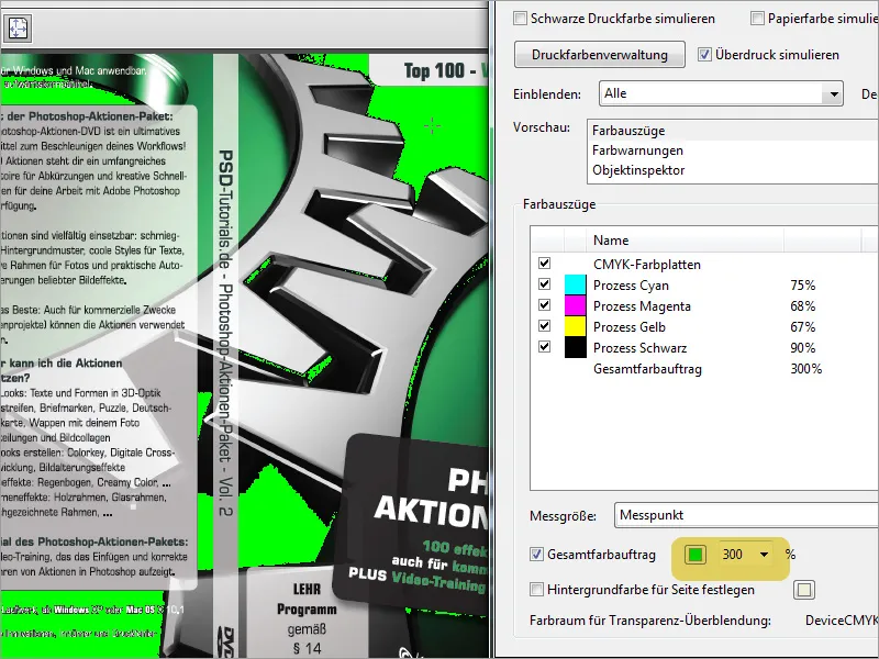
If you export the document in the wrong color space, this can have a negative impact on the printout. That is why I am now deliberately exporting our document to an unsuitable color space.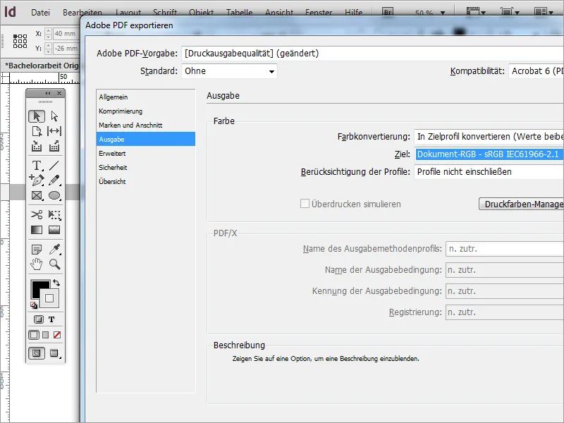
The exported file can be printed out in principle, but not in a cost-saving way, as all four colors are used for the output. In addition, the text image cannot necessarily be displayed cleanly, as the high color application tends to run.