A 3D type composing combines impressive text effects with creative design elements and takes your typography to a whole new level. Whether you want to create futuristic, abstract, or theme-based looks - with Photoshop, you can create a customized 3D type composing that enhances your message visually. In this tutorial, I will show you step by step how to showcase your 3D typography with textures, light effects, and other design elements. Let's get started and turn your typo into a piece of art!
Step 1:
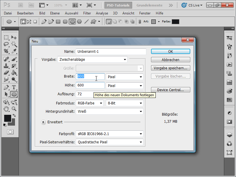
First, I create a new document; the size does not matter. Here, I choose a very small size of 800x600 pixels. If you want to print this effect, the unit should be changed from pixels to cm, and the resolution should be changed from 72 to 300 pixels/inch.
Step 2:
Now I create a text layer with one letter. Then I click on 3D>Repousse>Text Layer in the menu.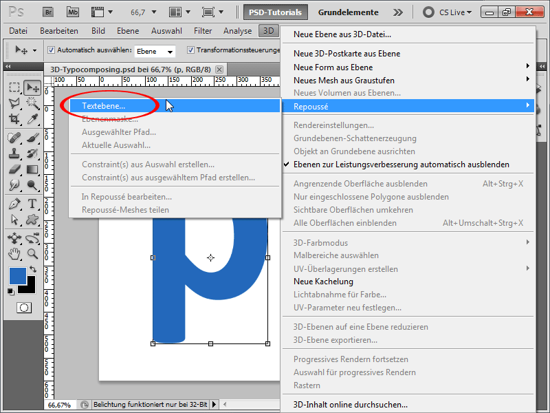
Step 3:
I make the following settings (for materials, I use the template for No Texture for All):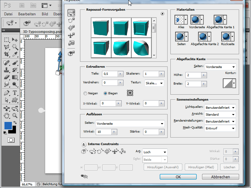
Step 4:
Now I open the 3D panel under Window and change the extrusion color. To do this, I click on the gray color in Diffuse.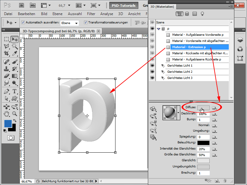
Step 5:
So, the color is good as it is. However, I want to create a texture for the foreground of the letter.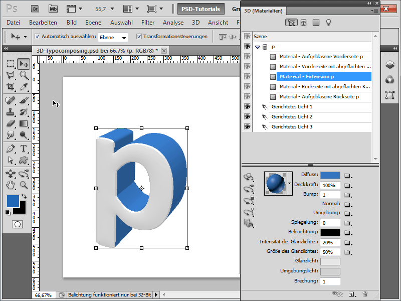
Step 6:
For the new texture, I create a new document with a size of 200 x 1 pixel. Then I double-click on the background layer and delete the content with the Delete key. Now I can create a selection that covers half of the document and fill it with blue. Then I select everything again and save it under Menu>Edit>Define Pattern.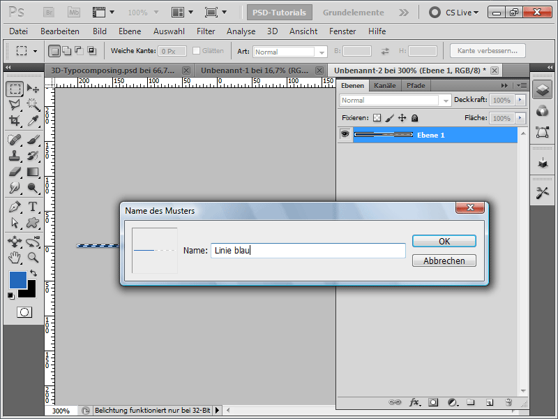
Step 7:
So, the pattern is saved, and I create a new document with 2000x2000 pixels. Then I insert a new layer and fill it with a color (the color doesn't matter because I set the Fill Opacity to 0%). Now it's time for the Layer Styles, and I activate my new Pattern there. After that, I save the texture as a PSD file on my hard drive.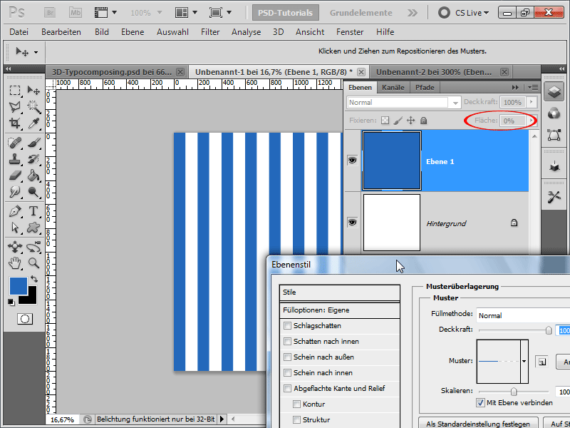
Step 8:
Now I go back to my document and open my new texture on the Material - Front Inflation.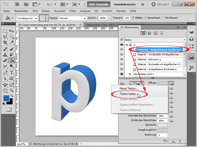
Step 9:
The result looks like this (I am not completely satisfied with the lines and therefore I open my texture again).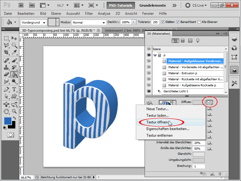
Step 10:
So I like it much better now.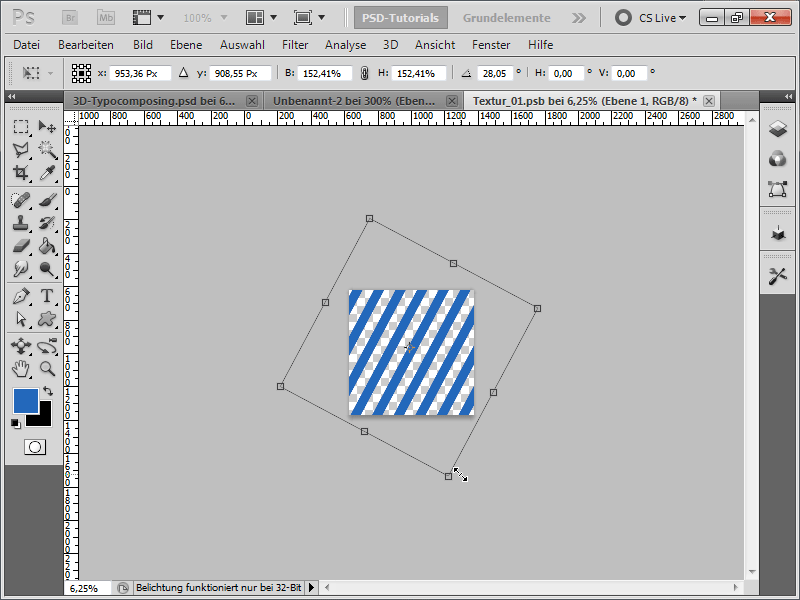
Step 11:
As the lines are too broad for me, I open the texture again, go into my Smart Object, and then scale the Pattern Overlay.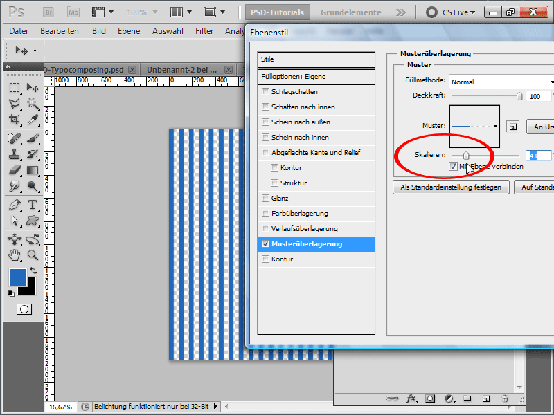
Step 12:
To be able to rotate my pattern, I convert the layer into a Smart Object. Now the Pattern applied as a Fill Option can be rotated.
Step 13:
To make the background more spectacular, I add a Gradient to the background layer.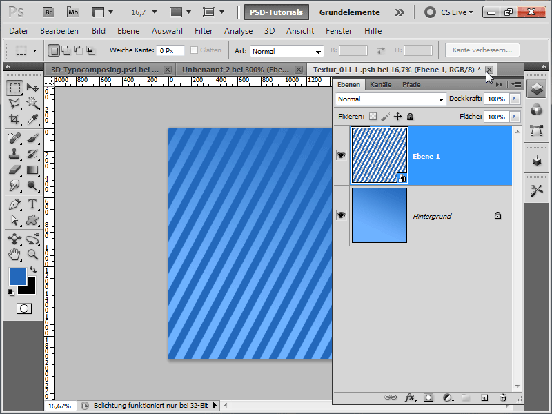
Step 14:
At the same time, I also give my Flattened Edge a blue tone. The result then looks as follows: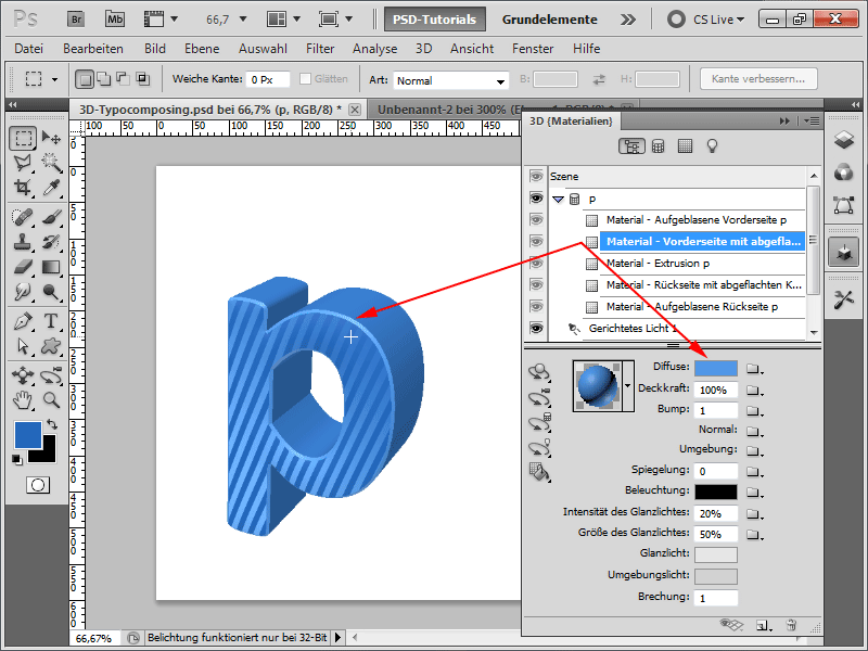
Step 15:
In order to better see the light sources, I display them at the bottom of the 3D panel.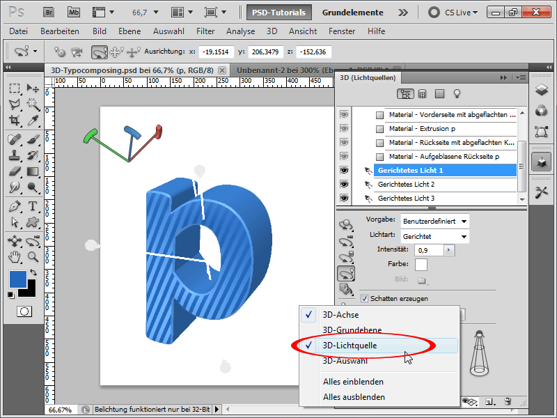
Step 16:
Additionally, I color the background layer gray so I can see the white light streaks. I change the Light Type for my first light from Directional to Spot.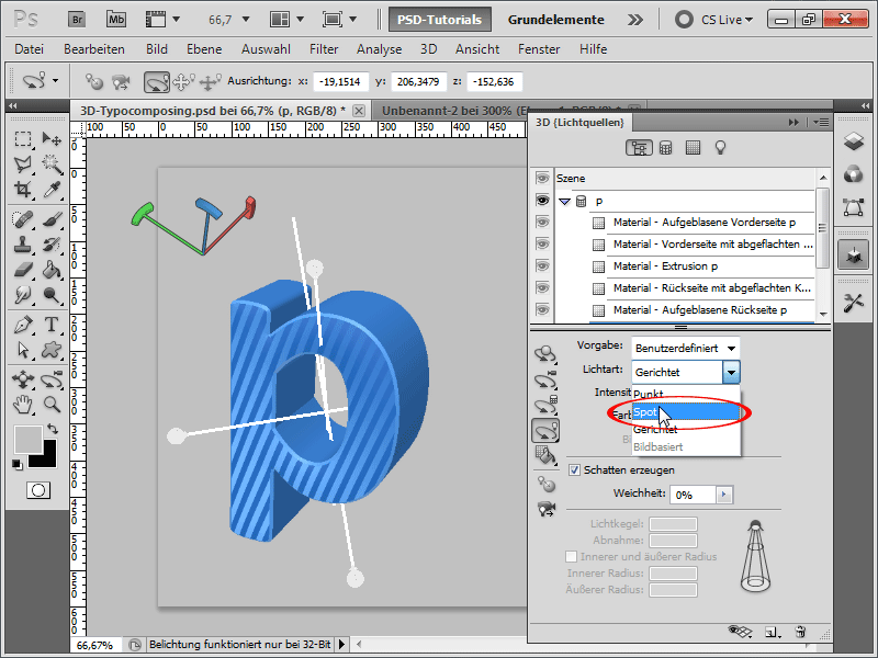
Step 17:
Now, I move the light and immediately see how my object reacts accordingly.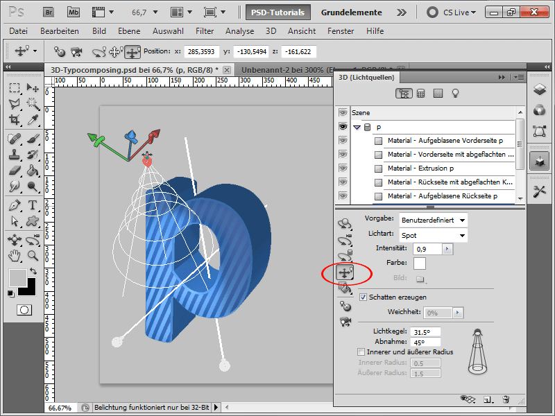
Step 18:
I also change the next light source to Spot and increase the Intensity of the light to 1.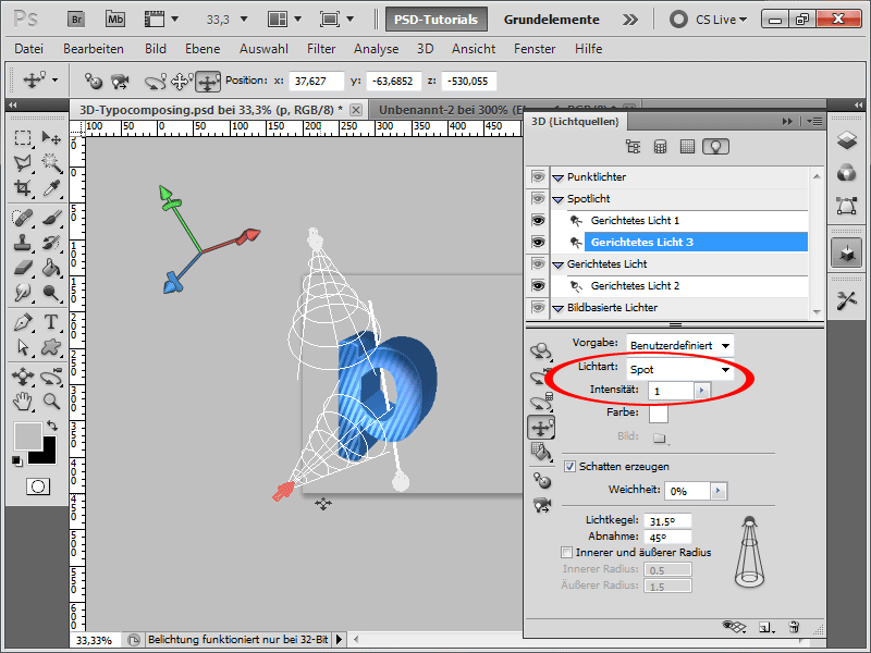
Step 19:
Since rendering the whole object can be very time-consuming, I can make a selection and then go to Selection for progressive rendering in the Options menu of the 3D panel. 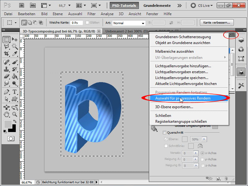
Step 20:
The result looks very good. I can also render my entire object by clicking the scene at the top of the 3D panel and then selecting Raytracing - Draft or Raytracing - Final (takes the longest) under Quality. Tip: If I need to make any changes to the object again, be sure to set the setting back to Interactive (Painting), otherwise the computer will immediately re-render everything and you will have to wait forever.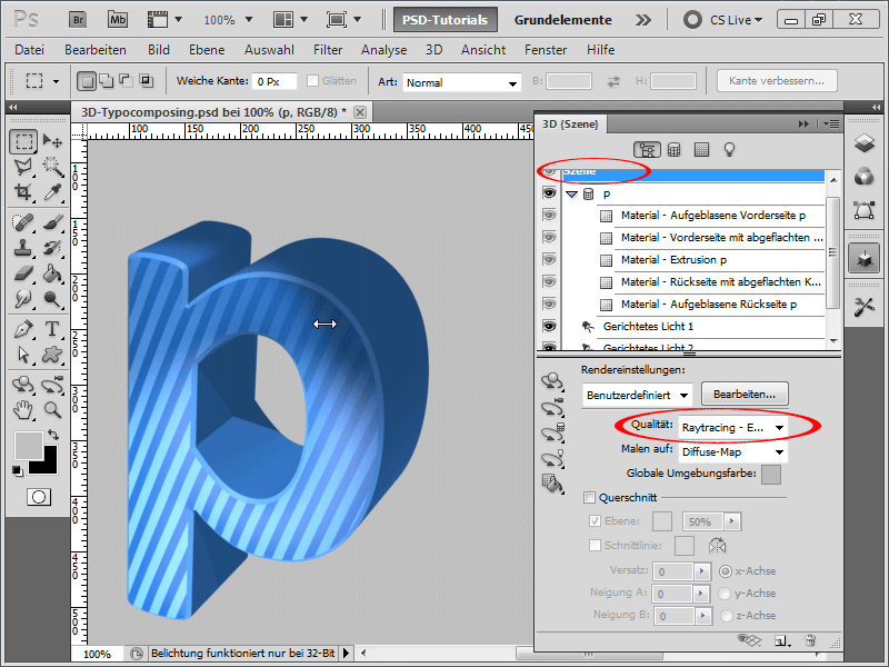
Step 21:
After completing the first letter, I generate the next one using the same settings and approach. Here too, I load the previously saved texture.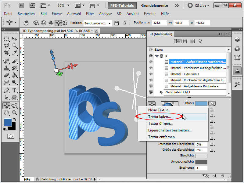
Step 22:
Since the stripes are too wide for me, I can either edit them directly in the texture or simply go to Diffuse and select Edit Properties.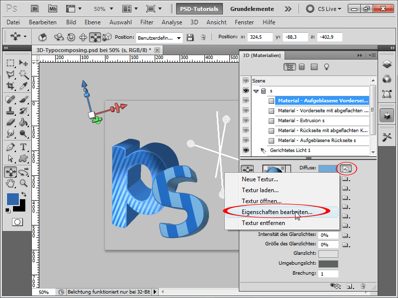
Step 23:
If I increase the value for U-Scale, my lines will become smaller. Sometimes the lines may break oddly, which is probably a bug in Photoshop or a display graphics driver error.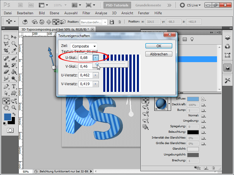
Step 24:
After rendering the scene, my S-letter looks like this: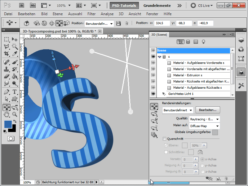
Step 25:
Here too, I move all the light sources and also change some to Spot. I can even click on the New symbol to create additional light sources.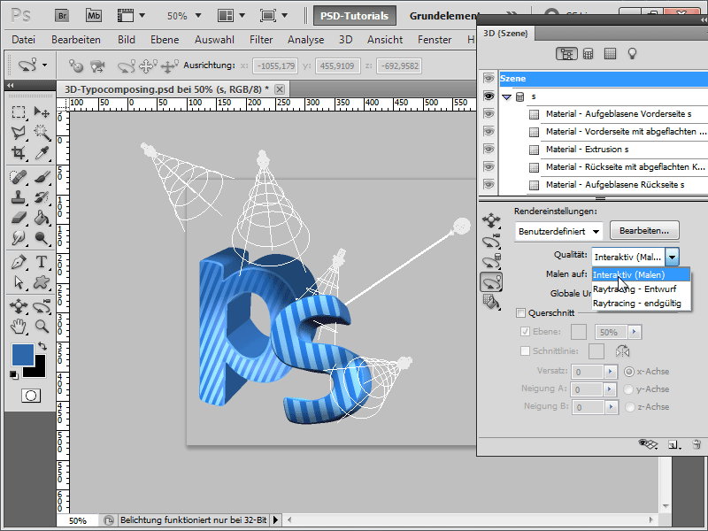
Step 26:
Since the lines are too wide for me, I go into the texture, then into the Smart Object, and then into the Pattern Overlay, where I scale the size a bit smaller. However, there is a strange double line in the S-letter; so I go back to the Texture Properties and adjust the U-Scale value until it fits.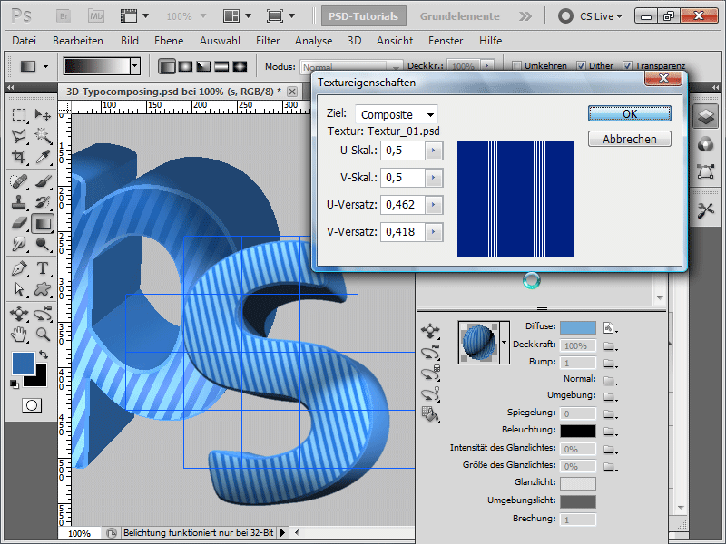
Step 27:
Next, I create the last letter. I place this in the layer hierarchy under the S-letter.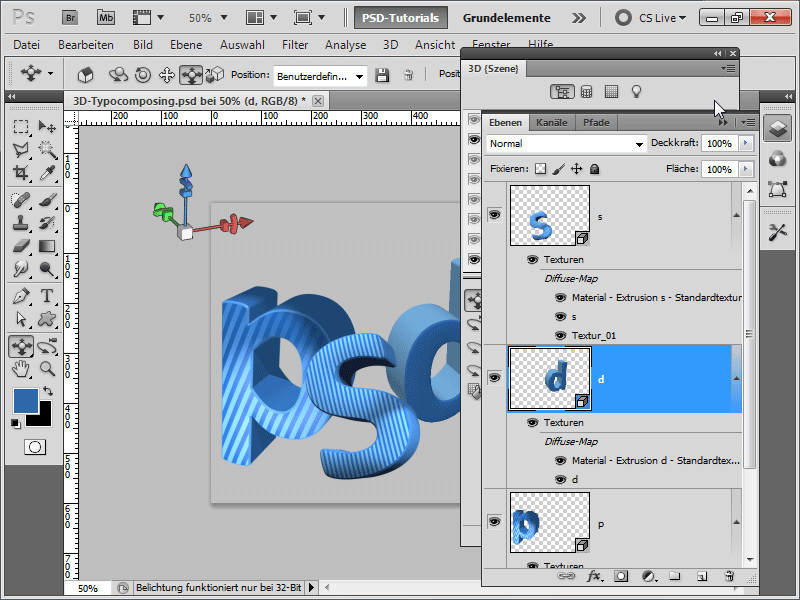
Step 28:
For my d-letter, I have come up with something very special: The letter should receive a floral pattern. For this, I download a floral brush from PSD-Tutorials.de, insert it into a 2000x2000 px document with a transparent background, and save it as a PSD file.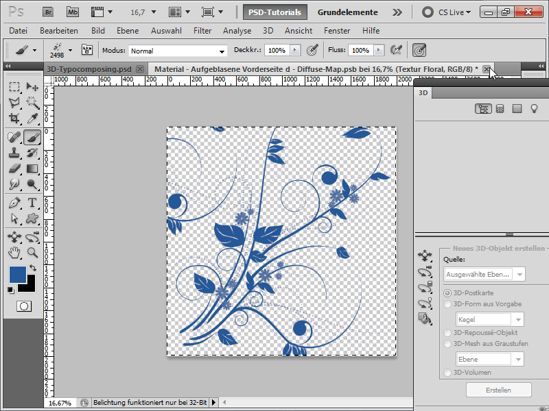
Step 29:
Among the texture properties, I move the pattern accordingly.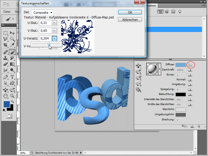
Step 30:
So, now I adjust the lighting again, and then my letter doesn't look too bad: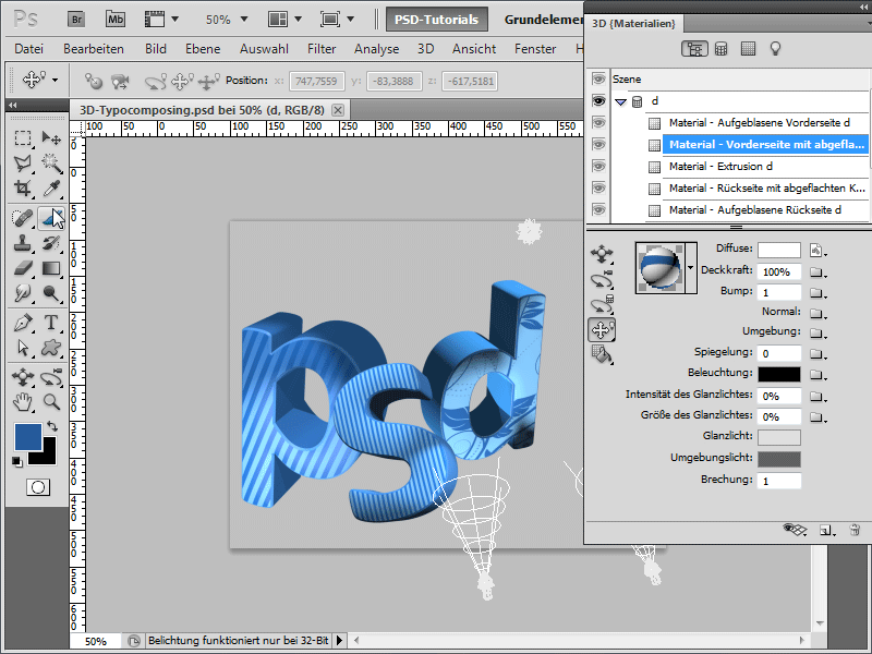
Step 31:
Next, I create a new layer and add some smaller elements with white color using my floral brush.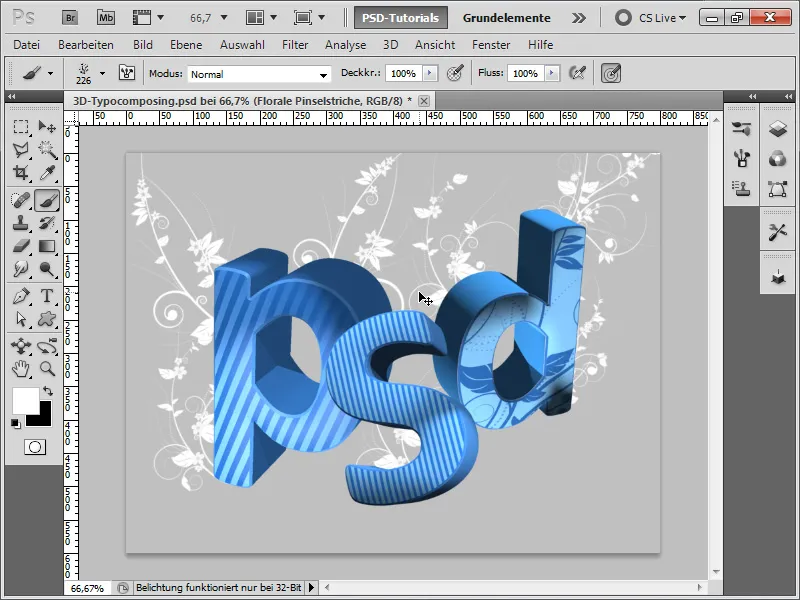
Step 32:
Now it's time for a fancy background. I grab the Custom Shapes Tool and load the following shape, which comes with Photoshop by default (if it's not displayed, simply press the small arrow at the top right to load the library).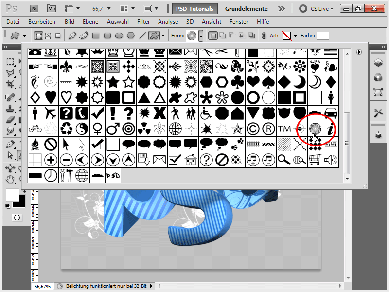
Step 33:
After drawing the shape, I slightly reduce the opacity, add a layer mask, and fill it with a radial black-and-white gradient.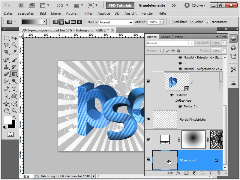
Step 34:
I can further optimize the stripes by, for example, reducing the fill opacity, and then in the Fill Options, adding a slight outer glow with white color. Then I apply a nice radial blue-dark blue gradient.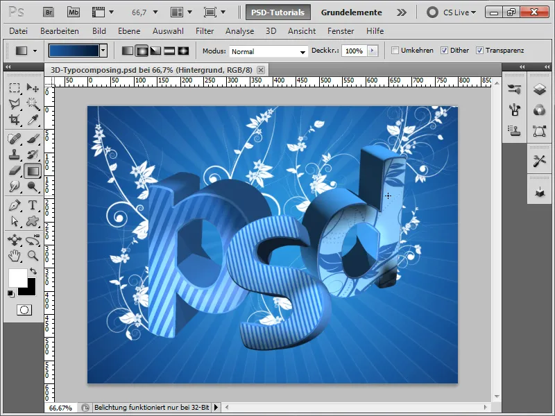
Step 35:
To make it shine more in the center, I could either adjust the gradient accordingly, or I simply modify it with a very soft, large brush. Then I slightly decrease the layer's opacity.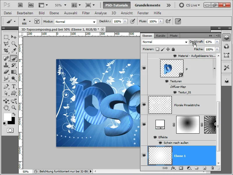
Step 36:
I find the floral brushstrokes too dominant somehow. So I will recreate them, but this time with an even smaller brush. The result will then look like this:
Step 37:
With a Hue/Saturation adjustment layer, I can quickly change the background color as well: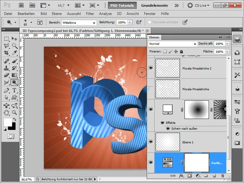
Step 38:
If I prefer to change the color of the letters instead of the background, I can also go to the fill options of an individual letter and set an overlay color with the color fill method. Then I copy the layer effect while holding the Alt key for each additional letter.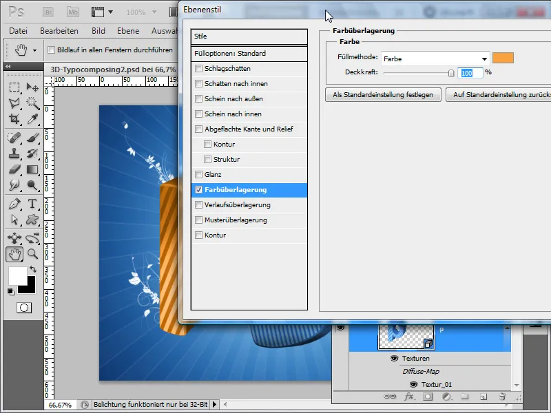
Step 39:
However, it's easier if I have my letters in a group folder and then add a Hue/Saturation adjustment layer on top. And - very important: I change the fill method of my group folder from Pass Through to Normal. This way, the adjustment layer only affects the contents of the folder.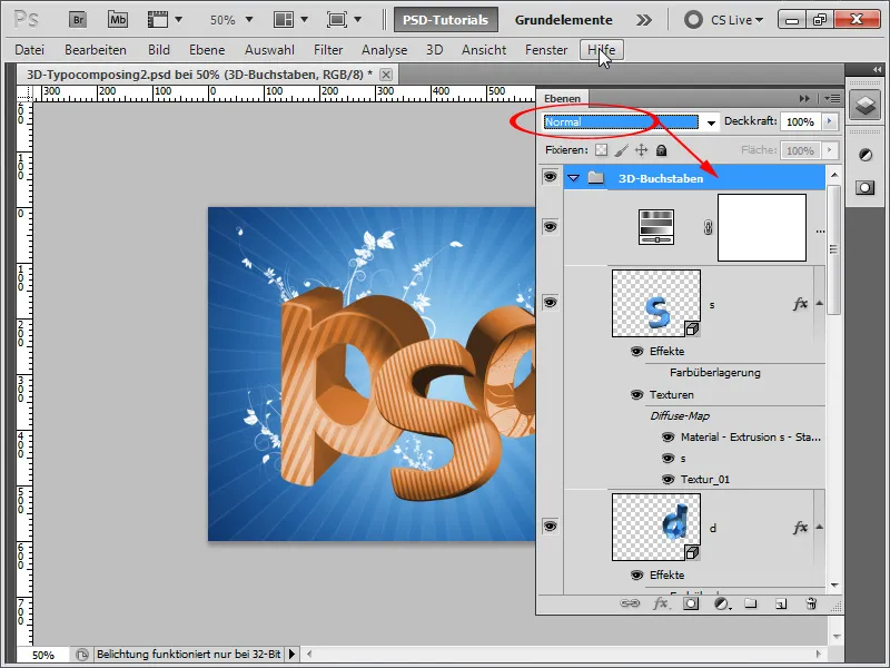
Step 40:
A little trick at the end of the workshop: I duplicate my 3D letters and then rasterize my copy with right-click.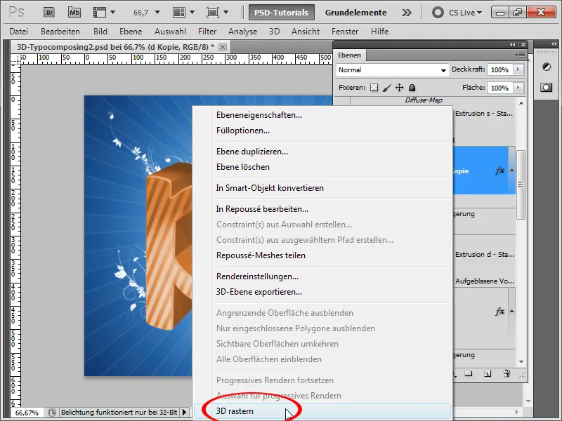
Step 41:
Now I have several options: Either I color the entire letter white, or I just add a white overlay color to it. Now, I add a mask, and then I can further enhance certain highlights myself with a soft brush, for example. In my case, I enhanced the light on top of the 'd' letter and darkened the shadows with another layer of black overlay color.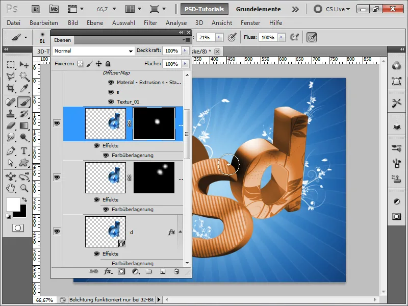
Step 42:
Afterwards, my result looks like this: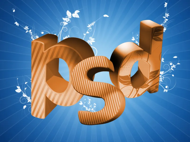
I hope I could provide many tips on working with 3D in Photoshop. As you can see, it's not that difficult.
