Microsoft Excel offers you numerous add-ins that can make your work more efficient. One of these add-ins is the Visio Data Visualizer, which establishes a seamless connection between Excel and Microsoft Visio. With this tool, you can generate attractive and professional diagrams, such as flowcharts and organizational charts, directly from your Excel data. In this guide, you will learn step by step how to use the Visio Data Visualizer in Excel to visually represent complex data structures.
Key Insights
- The Visio Data Visualizer enables the creation of professional diagrams in Excel.
- You can view the licensing terms in the Office Add-In Store before adding the add-in.
- The application offers various diagram categories that are easily customizable.
- Linking with Excel data enables dynamic updating of the diagrams.
Step-by-Step Guide
To effectively utilize the Visio Data Visualizer, follow these steps:
1. Open Excel and the Add-In
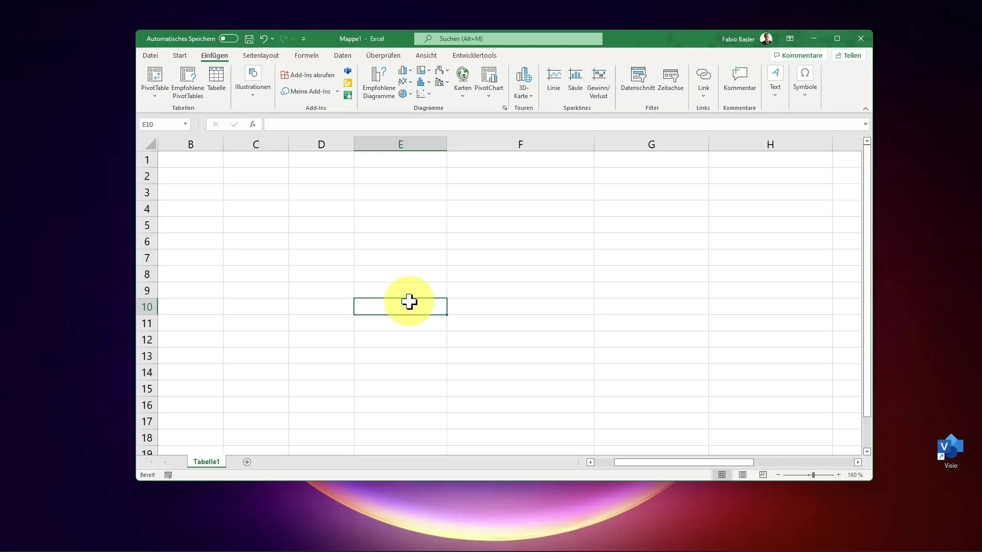
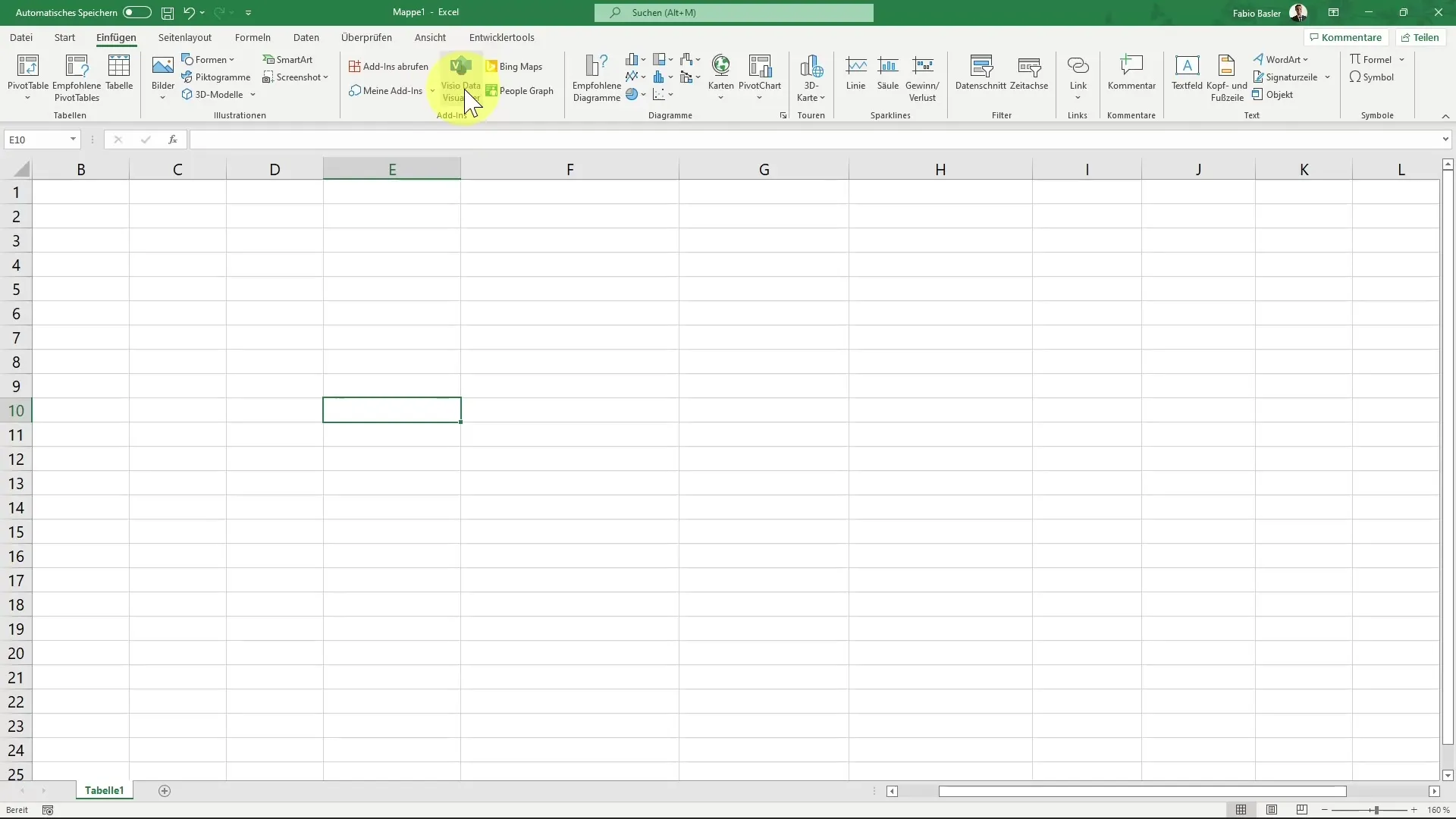
Start by opening Microsoft Excel. Go to the "Insert" tab and look for the "Add-ins" command group. There you will find the option for the Visio Data Visualizer.
2. Add the Add-In
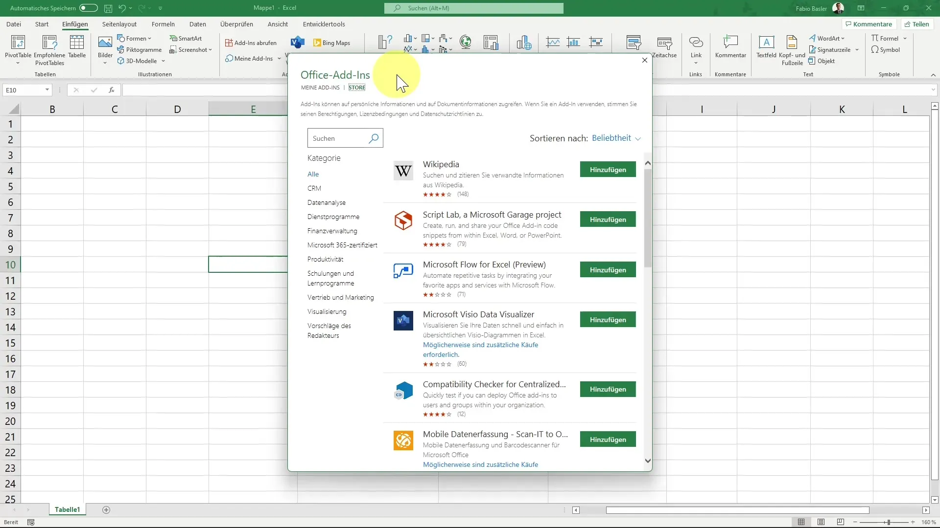
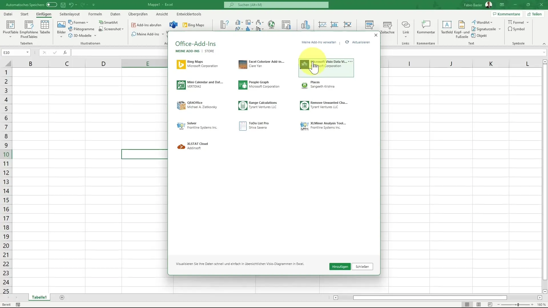
Click on the option for the Visio Data Visualizer to open the Office Add-In Store. You can either search directly for "Visio" or find the add-in from the provided list. Read through the licensing terms before adding the add-in.
3. Sign-in to the Data Visualizer
Once the add-in has been added, the application will open. You need to sign in to access all features. If you don't have a business account, you can also use the preview without signing in. Use your personal account to try out the basic functions.
4. Create the Diagram
The Data Visualizer displays various diagram categories, such as standard flowchart, cross-functional flowcharts, and organizational charts. For example, choose the standard flowchart to get started.
5. Customize the Diagram
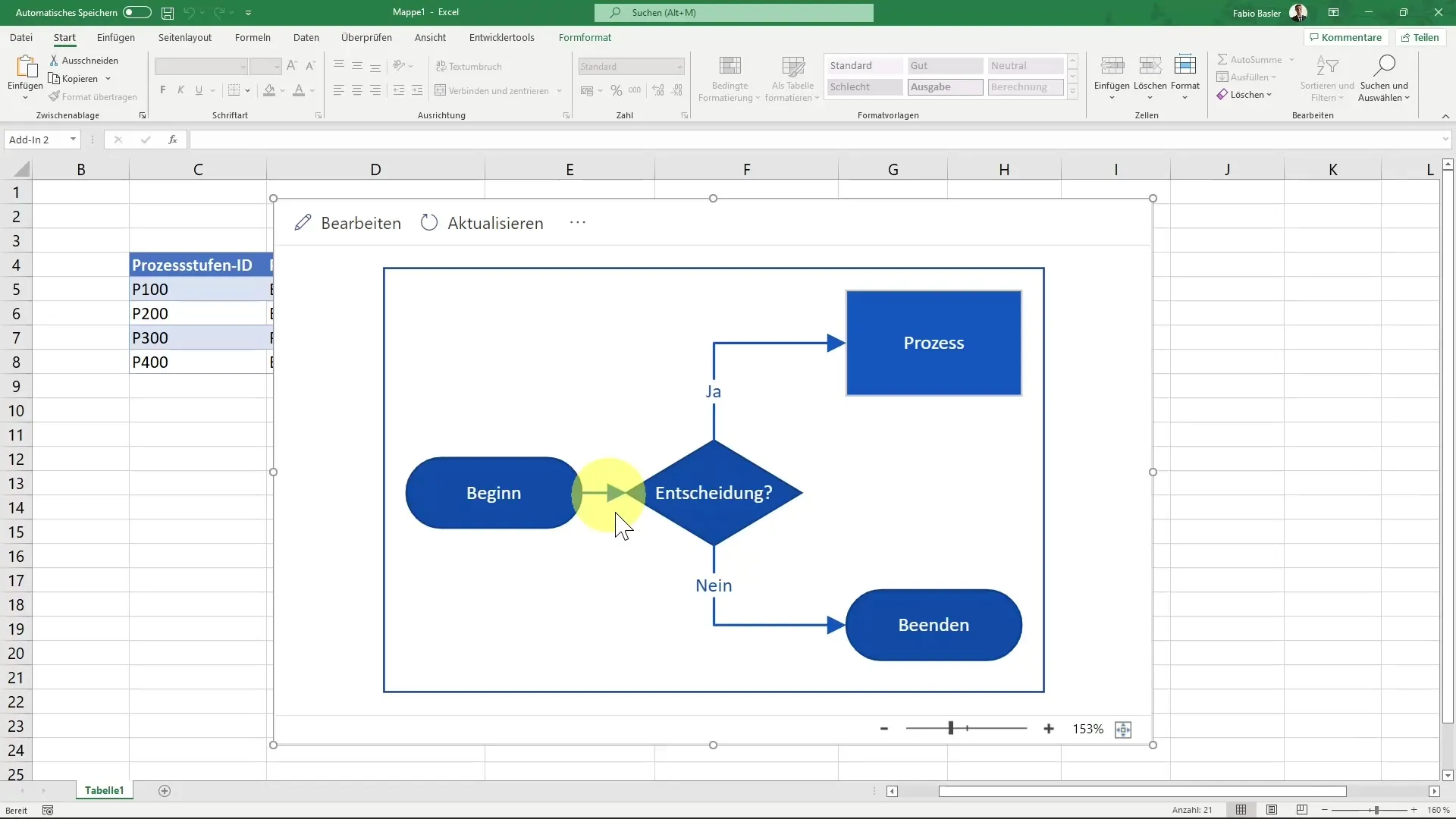
After selecting the diagram, a sample diagram is generated. If you have the necessary license, you can click on "Edit" to customize the diagram.
6. Establish Data Linkage
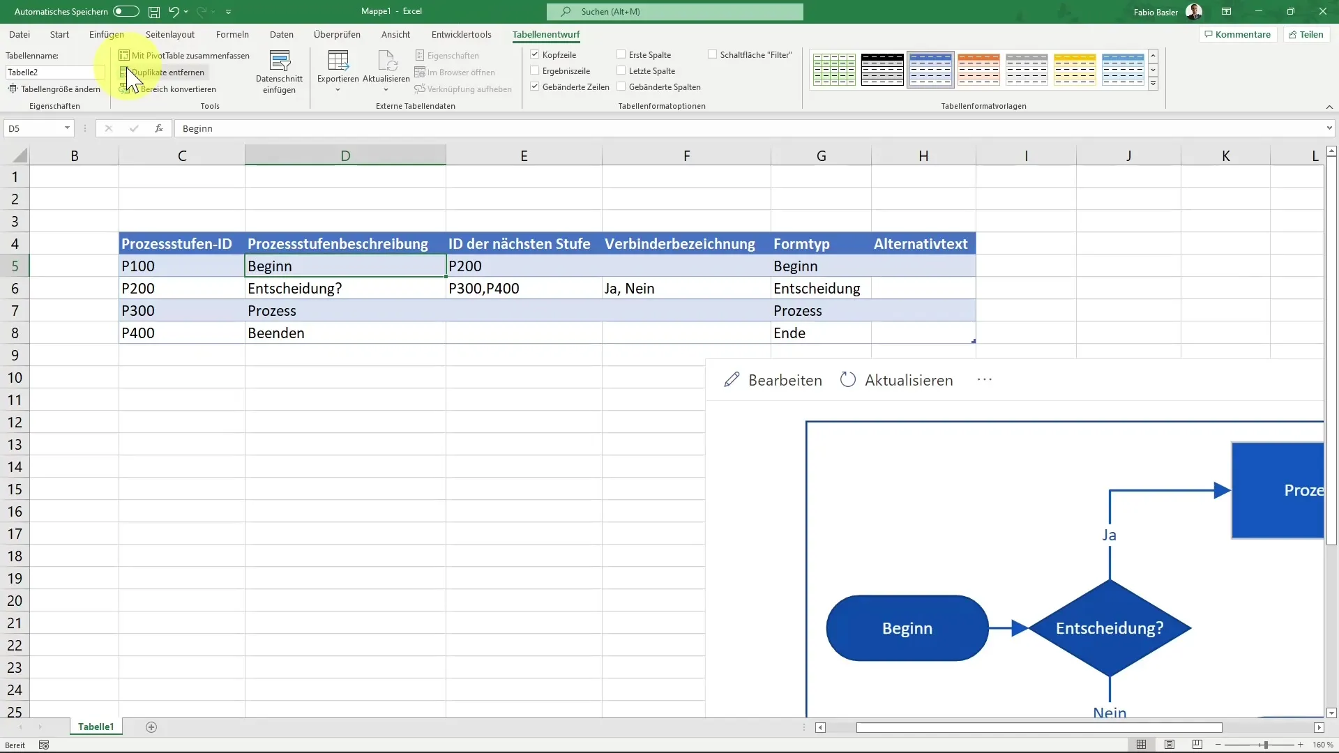
Note that the diagram is connected to an intelligent table in the background. This table refers to the content you previously entered in Excel. This means that changes to the data will also be updated in your diagram.
7. Customize Cells and Processes
You can click on and modify the individual components of the diagram. For example, if you want to adjust a process, click on the relevant element and adjust the values.
8. Update and Export the Diagram
The beauty of using the Visio Data Visualizer is that you can update the diagram at any time. Use the slider at the bottom to zoom in and out for a better view of your diagram. Additionally, you can open the diagram on the web to share it with others.
Summary
In this guide, you have learned how to effectively use the Visio Data Visualizer in Excel to visually represent complex data. From installation to creating and customizing diagrams to updating them, you have gone through all the necessary steps to unleash the full potential of this tool.
