In this tutorial, I'll show you how to design a modern, sleek application in a minimalist style in InDesign.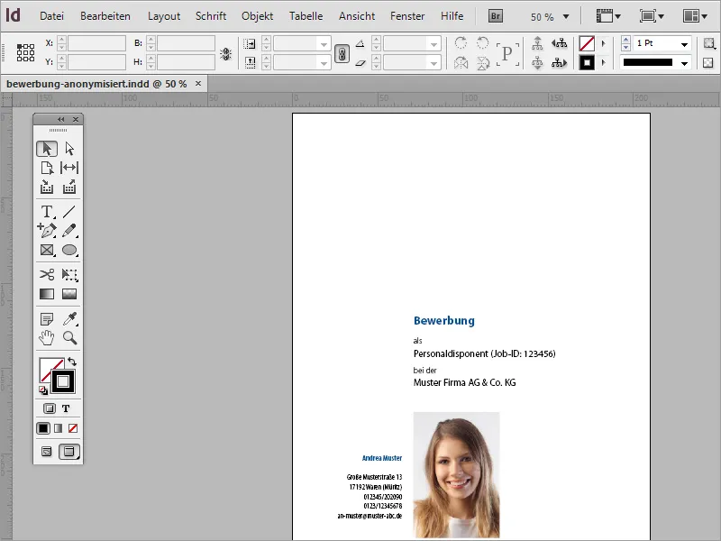
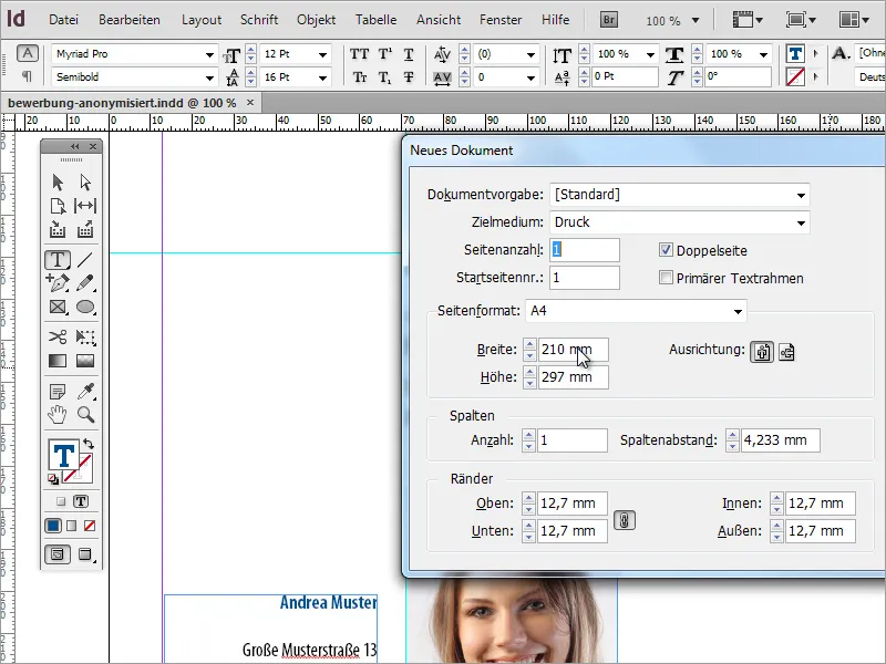
First of all, you need a new document. You can create this via File>New or by pressing Ctrl+N. In the dialog box, you can specify which document format this application should have. Make sure that the margin settings contain enough space for filing later.
As an application is a very special and, above all, memorable document, special attention should be paid to the choice of font. There are numerous resources on the Internet that clearly list suitable fonts. A good source of inspiration is the website www.100besteschriften.de. You can find more (mostly free) fonts in this overview.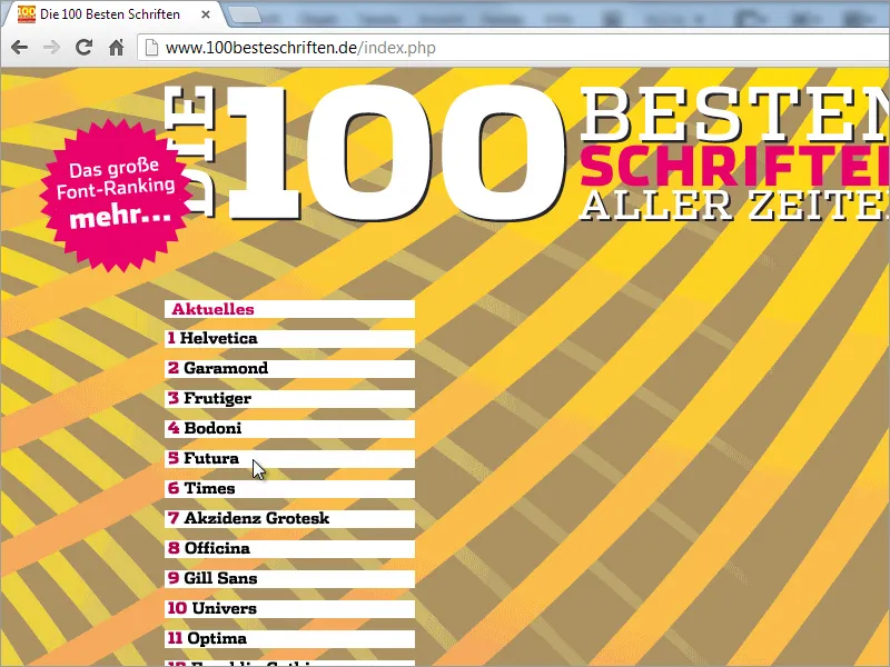
I like to start creating the application by setting a guideline. I simply draw this from the left-hand ruler onto the document. A good value for the position on the x-axis is around 70 mm.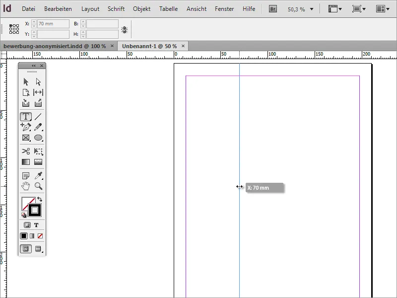
This line visually divides the document into 2 sections. The applicant's address area is shown on the left and the application content is shown to the right of the guideline. It is also best to draw another guide line from above at a value of 120 mm on the Y-axis. The content of the cover sheet will later be created below this line.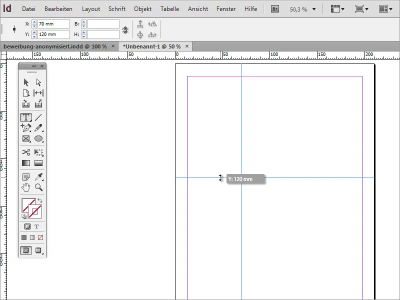
Next, you need a text box. Using the text tool, you can draw this starting from the intersection of the two guides. The shape of the box is of secondary importance.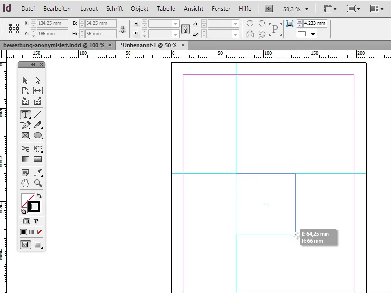
The first text is now written in this text area. As this is an application, it makes sense to name it as such. The font is then formatted a little. Here you can decide on the font, the font style and the font size.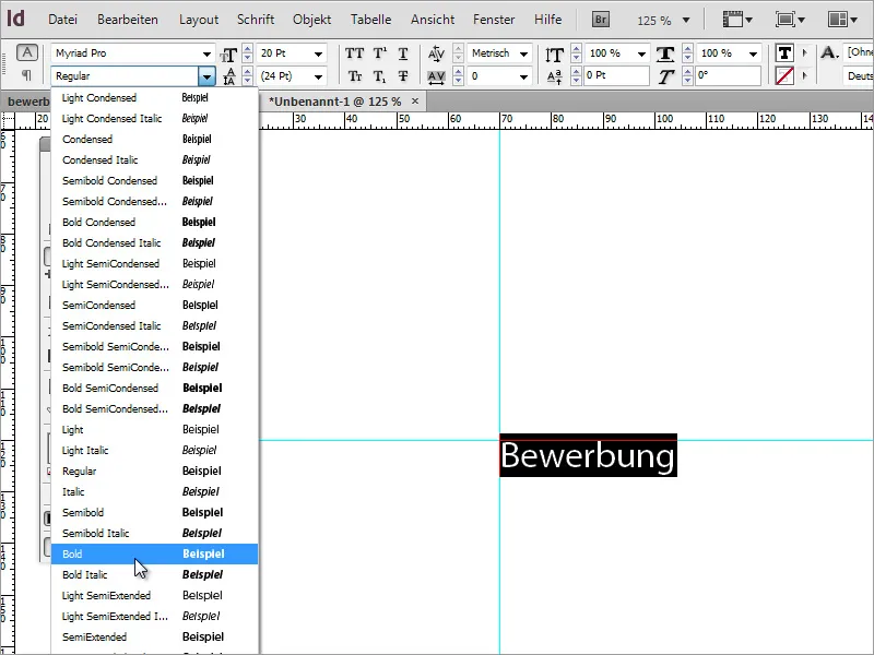
Once the font has been selected and set, you can also change the color scheme. You can either create a color for this or select a suitable text color from the available color palette.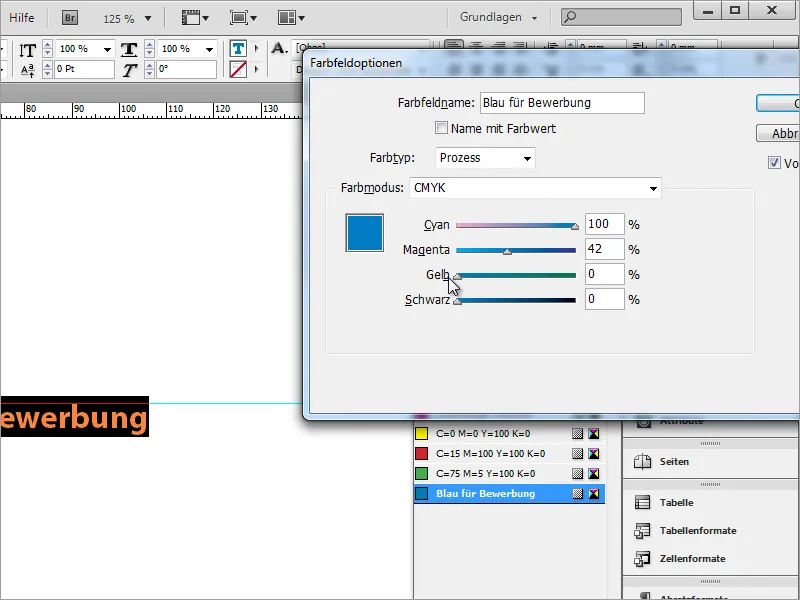
The advantage of such a paragraph format is that not only the font, size and font style can be assigned to a text, but also the corresponding color information. If you now change one of the attributes in this paragraph format, all text areas in the document that are based on this paragraph format are immediately provided with the changed properties.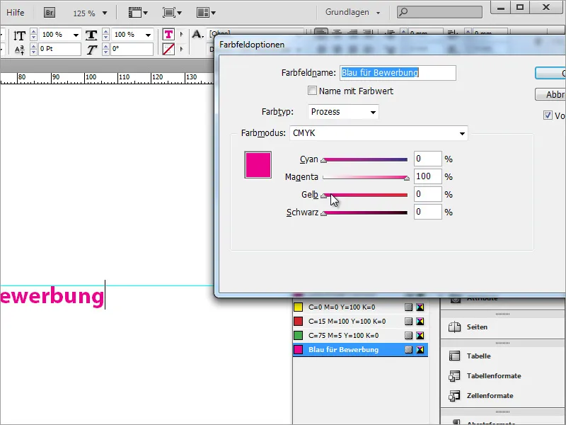
However, for this to work, you should create the colors in the Color Fields panel and not simply change the color of the selected text using the Color panel. This would only have a one-off effect on the currently selected text and subsequent changes to the Color Fields panel would not be taken into account for this text.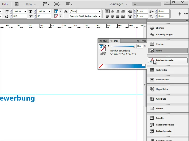
Further information can now be added to the designation. However, it does not look very good in this form.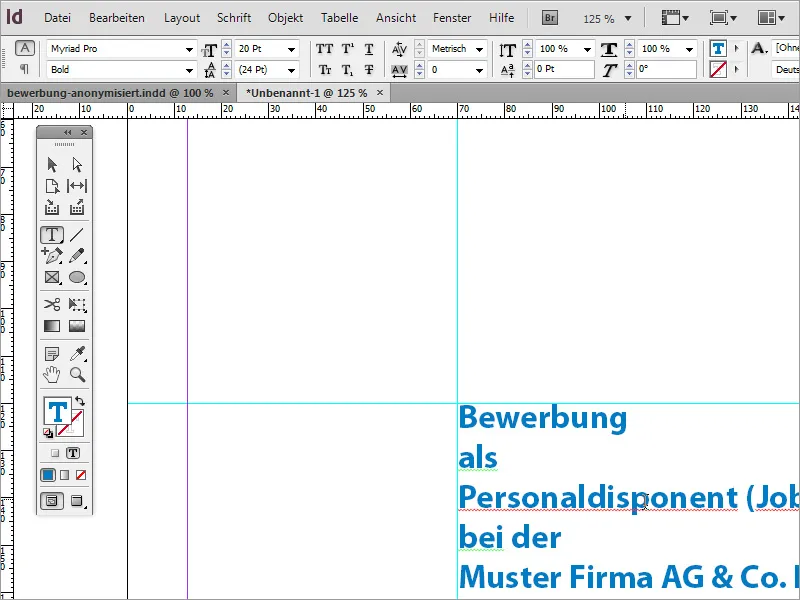
You can, for example, recolor the "less important" information, which is of secondary importance, and change the font properties.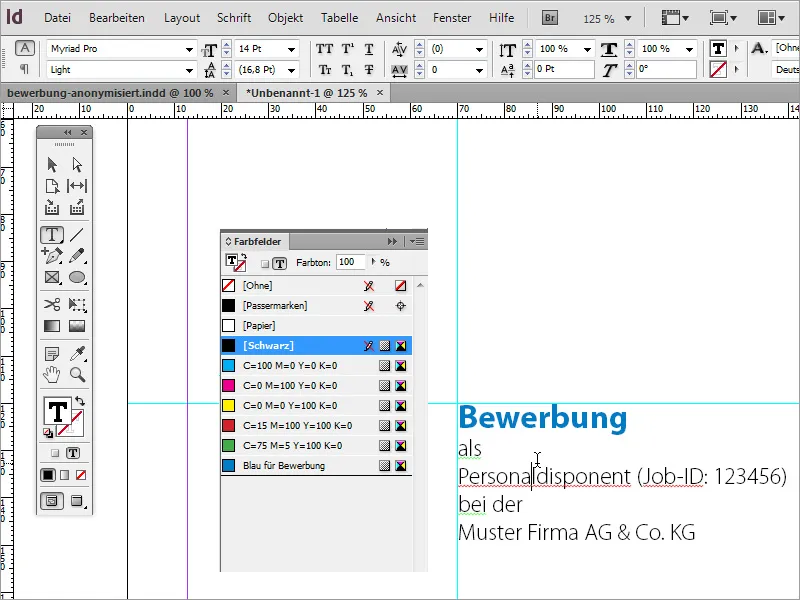
However, make sure that important information, such as the job title, remains clearly recognizable. You can therefore highlight this information separately by adjusting the font. In the example, the font size for the job title and company name has been increased to 16 pt and the font style Myriad Pro Regular has been set.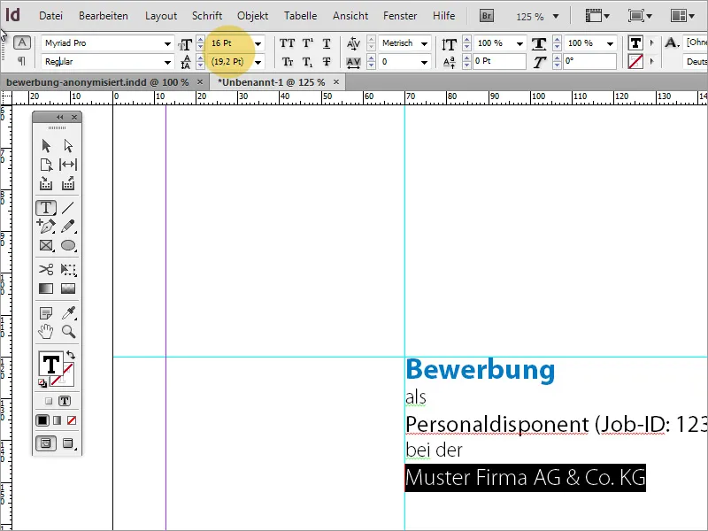
You can also make sure that the line spacing is even. Each change in font size results in a small shift in the line spacing if it is not permanently assigned. For this reason, a value of around 13 pt and an additional blank line between the 1st and 2nd line has been set.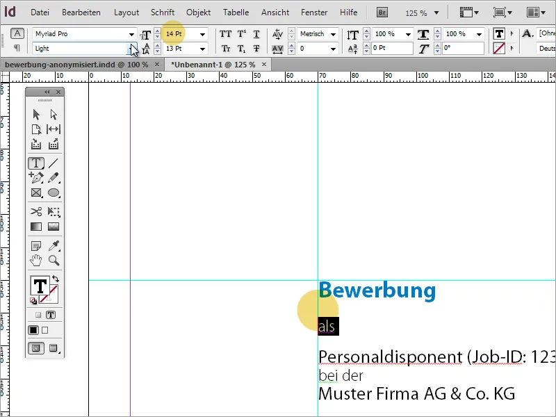
The highlighted lines have a line spacing of 22 pt, while the penultimate line has a spacing of 24 pt. It always depends on which font has been used. The manual line spacing serves to create a more harmonious overall picture.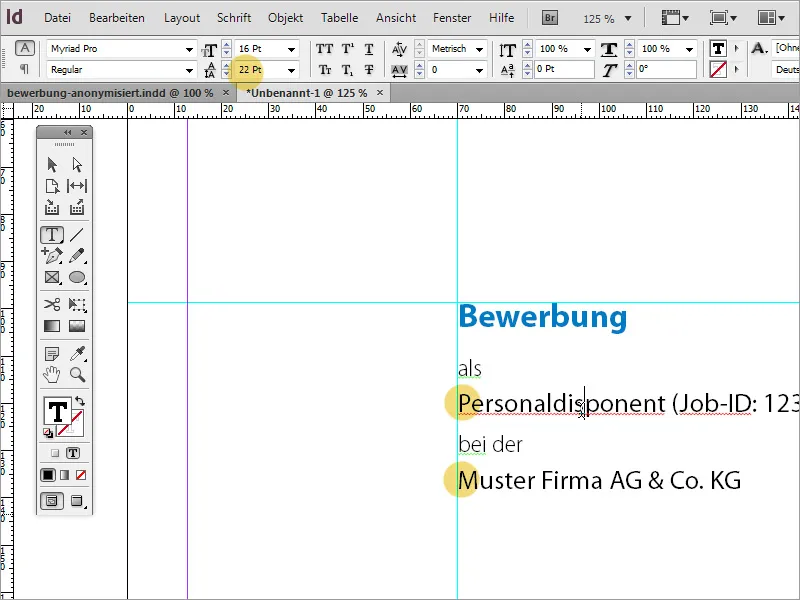
Now you need to add a photo of the applicant to the cover page. You can insert a photo into the document via the File>Place menu or by using drag & drop. Please make sure it is of good quality.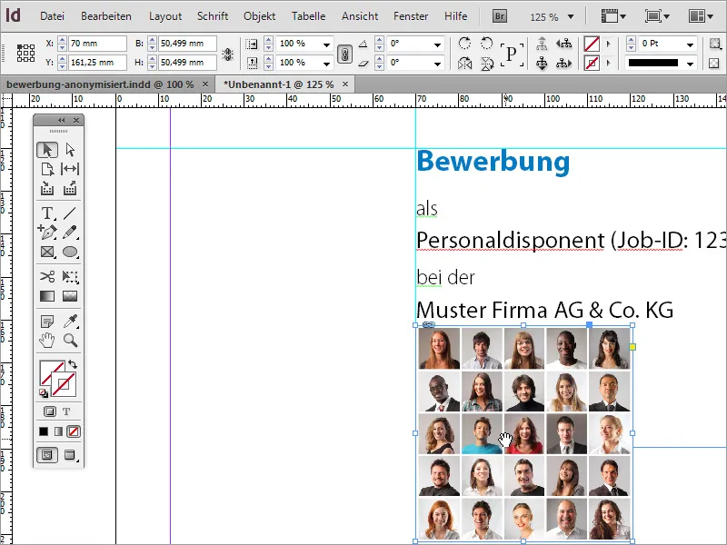
The correct image section still needs to be defined. As no actual application photo was inserted in the example, but a collection of faces, the visible part of the image had to be moved so that only our applicant is in the visible image area.
However, the image is still far too close to the introductory text. Therefore, you can simply move the image in such a case. You can move the image step by step with Shift+Arrow down.
Now the applicant's address is still missing. Therefore, use the text tool again to draw a text frame to the left of the photo, into which this information should then flow.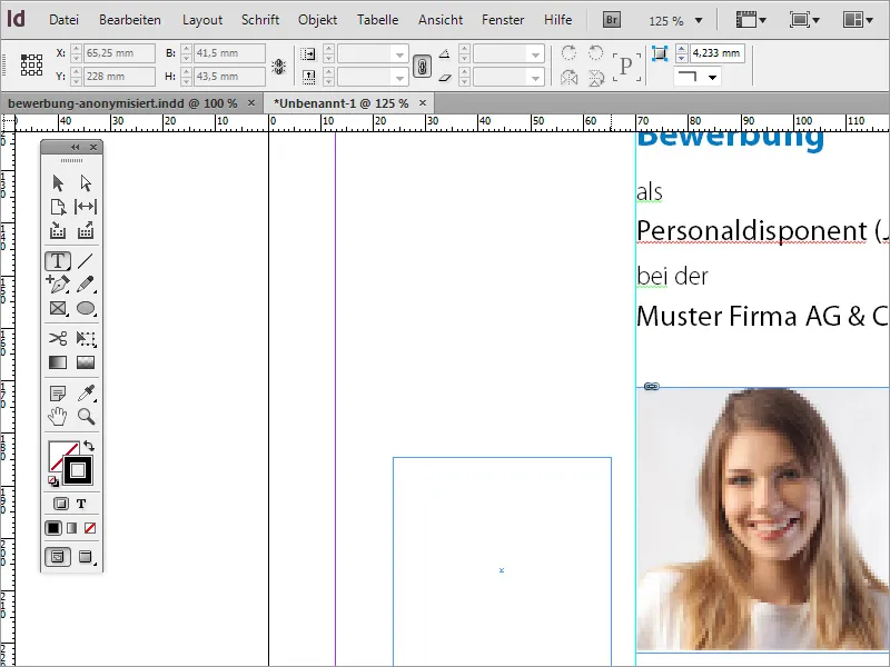
The address details can then be written into this field or imported from the clipboard.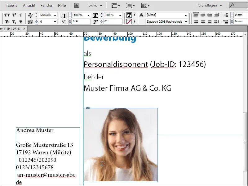
First of all, you should make sure that this text also has the same basic font, in our case Myriad Pro, as the previously created text. To do this, simply select the entire text in the text box and set the basic font accordingly in the options bar at the top.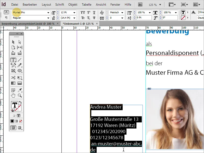
As the name of the applicant is something special, it is assigned a separate formatting. The font is therefore set slightly larger and in Bold Condensed font style and given the blue color that you have already used for the "Application" lettering.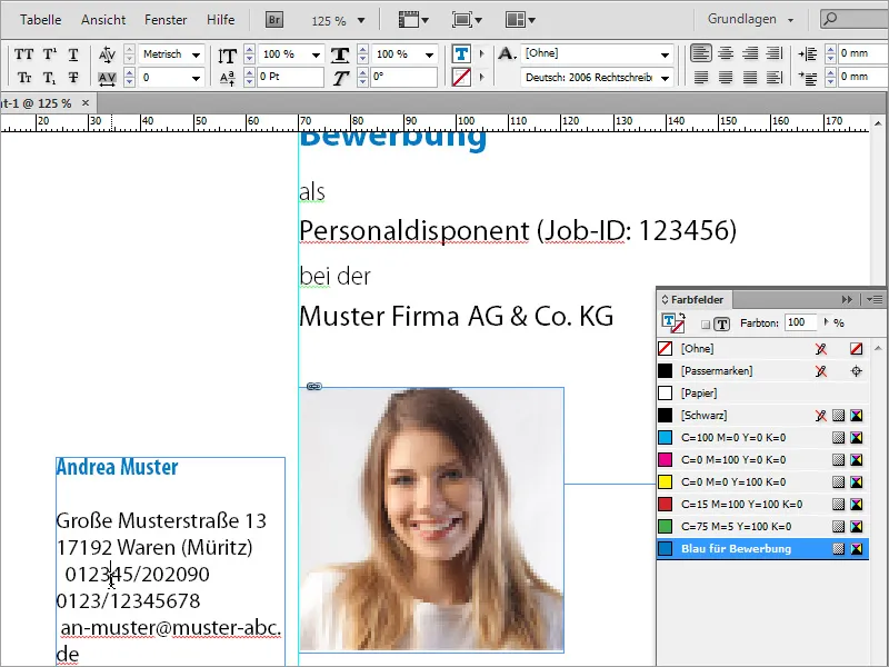
The remaining text is also formatted in Condensed font with a font size of 13 pt and aligned to the right.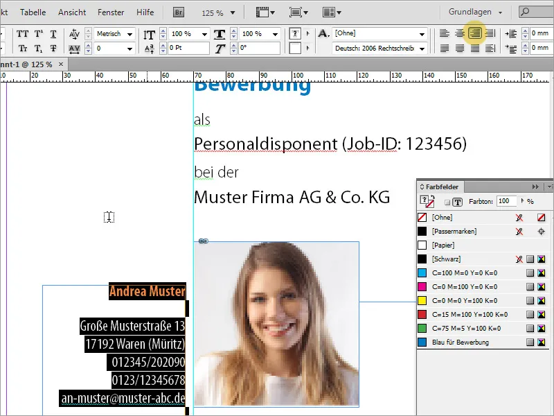
However, the photo should be slightly larger on closer inspection. Please make sure that you use a suitable source image. Simple scaling may impair the image quality.
So that you can better assess the quality, you should increase the display performance under View.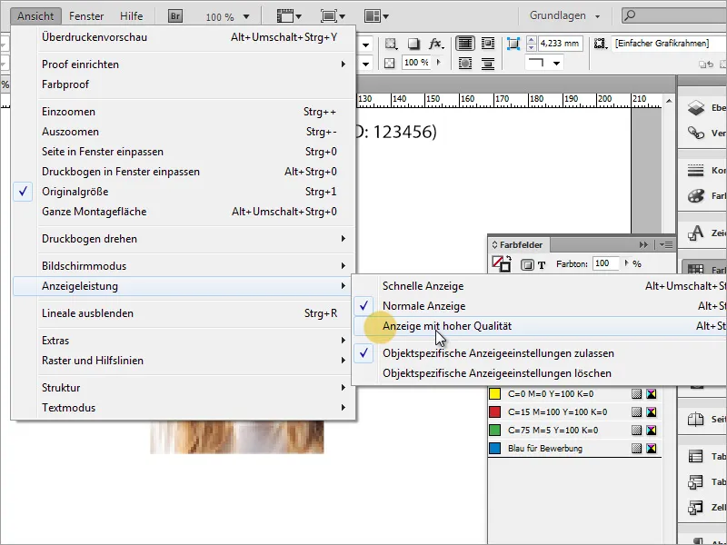
Now the whole thing looks much better.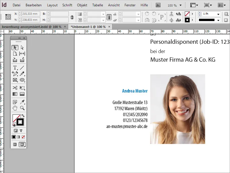
You may need to align the address block if it is too close to or unfavorable to the photo.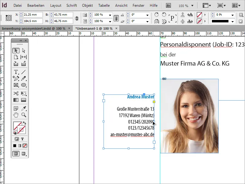
Zoom out of the image to get an overall impression. If lines of text are too close together, for example, you can correct the line spacing afterwards.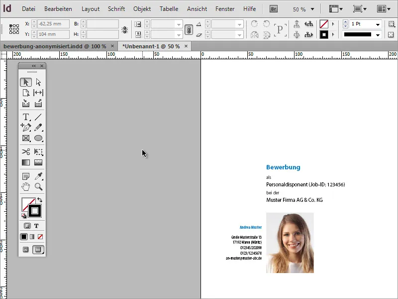
Once the cover page is complete, you will need additional pages for the cover letter and CV. You can add more pages to the document using the page control panel. Now something happens that is typical for a document design: InDesign has inserted a new page, but has attached it to the document as a double page.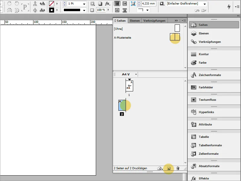
The reason for this is that when the new document was created, no attention was paid to whether it should contain double pages or single pages. You can change this by accessing the document settings. To do this, simply go to the menu item File>Document setup.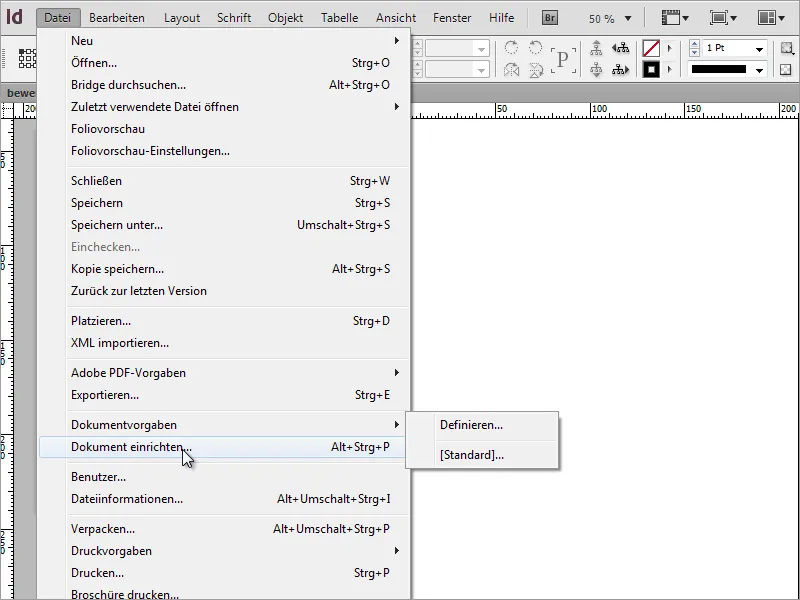
In the dialog box, uncheck the Double page box .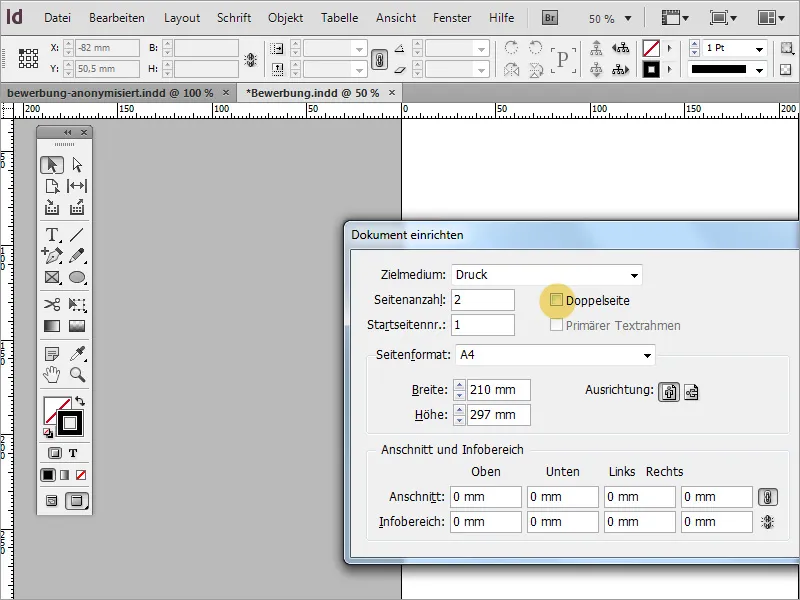
As the guides are not copied when you create a new page, a simple step helps by simply dragging the page you have already created onto the New icon in the Page palette. This not only copies the page, but also the guidelines. The content can then simply be selected and removed.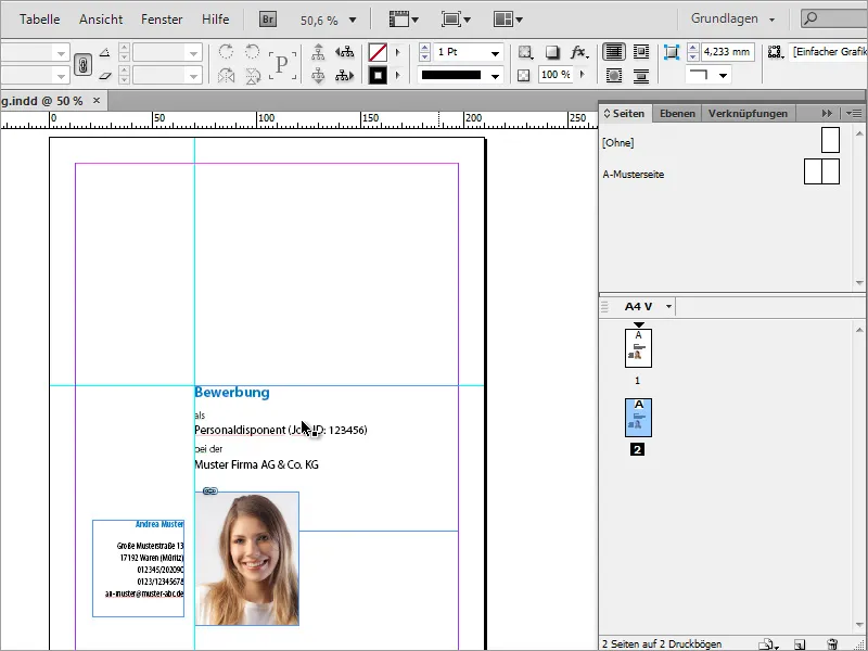
The horizontal guideline is no longer needed and can be removed from the document, leaving only the vertical guideline.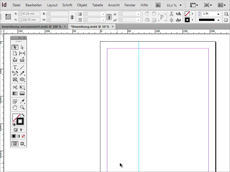
Now you can ensure, for example, that the applicant's address can actually be found on every page of the document. This has the advantage that it is always present, even in a partial printout. To do this, simply go to the cover page and copy the address block to the clipboard with Ctrl+C.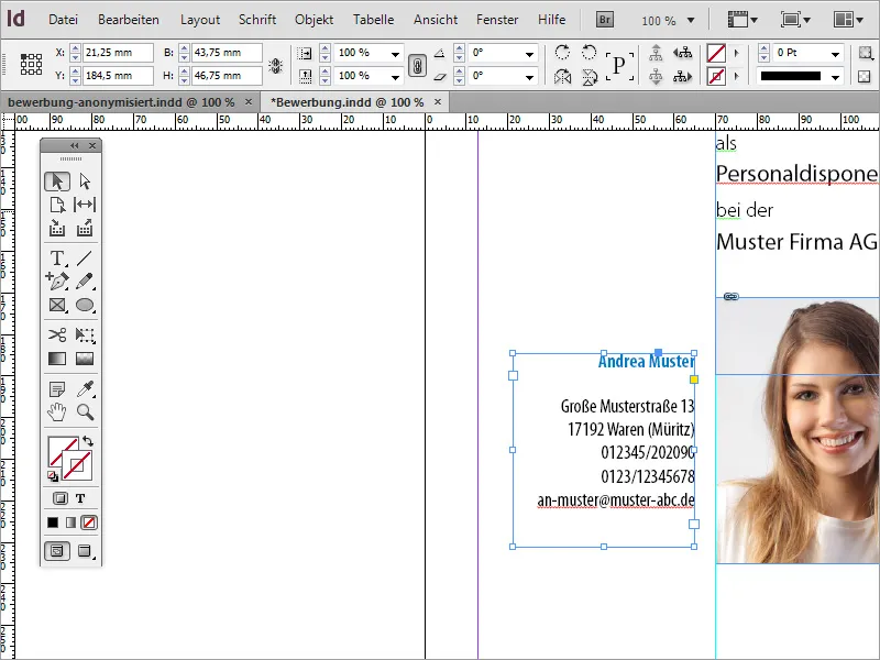
Now switch to the blank page and use the menu item Edit>Paste to original position to paste the copied part onto the new page.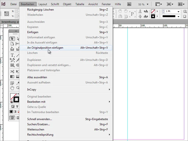
Now the content of the application is still missing. You should start by creating the letter of motivation. To do this, you need a text frame that covers the entire right-hand area up to the margin guidelines.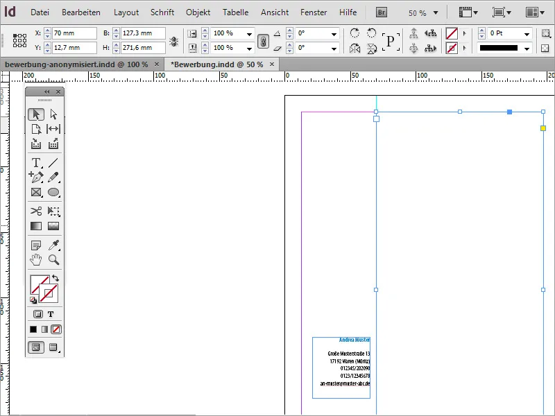
The date and recipient details are usually placed at the top of this letter. To do this, you first write this data in this area or copy it from a template.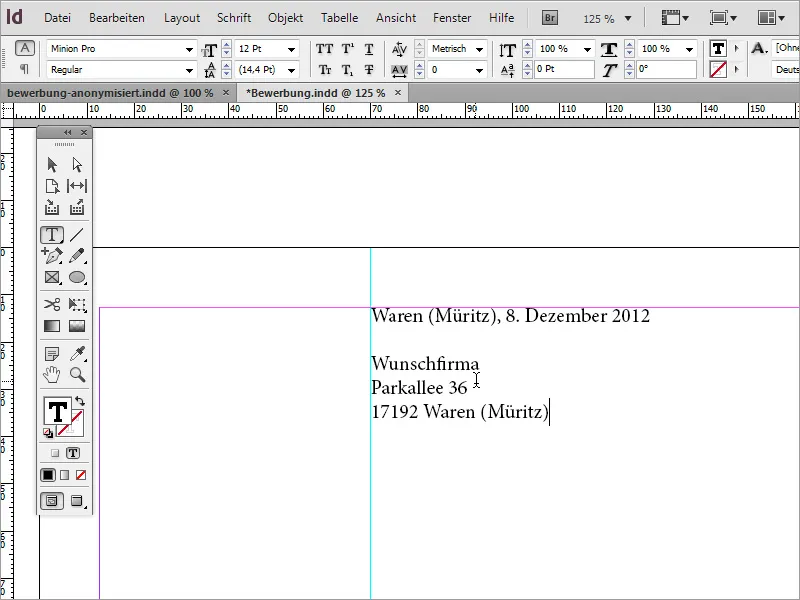
This text block is then adapted. The font must be adjusted and the font style changed. For the example, the font was also created in Myriad Pro and given the Condensed font style. In addition, the location and the date have been recolored in the application blue.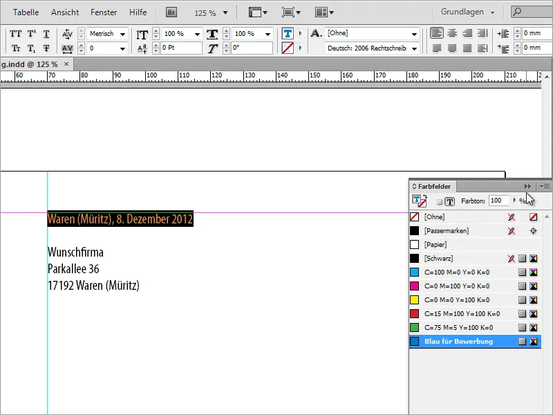
The line spacing and font size may still need to be adjusted. Therefore, check the line spacing at this point by selecting the text and readjust it if necessary. A spacing of 16 pt was used for the example. The font size is 13 pt.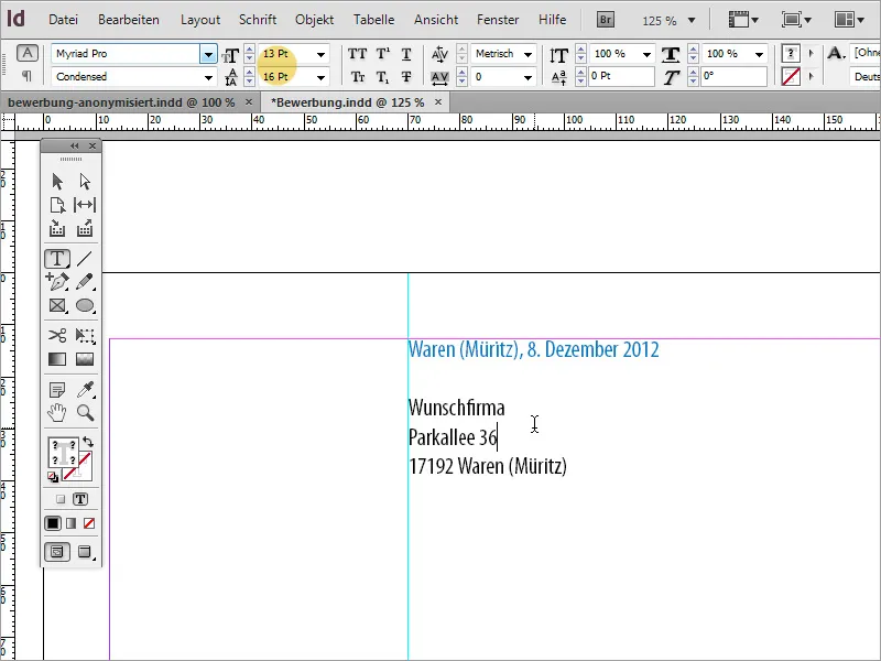
The application text can either be rewritten by hand or, if available, copied and pasted from another source. When pasting the text, it is possible that InDesign will then set it to the same text format that you have just set for the recipient block.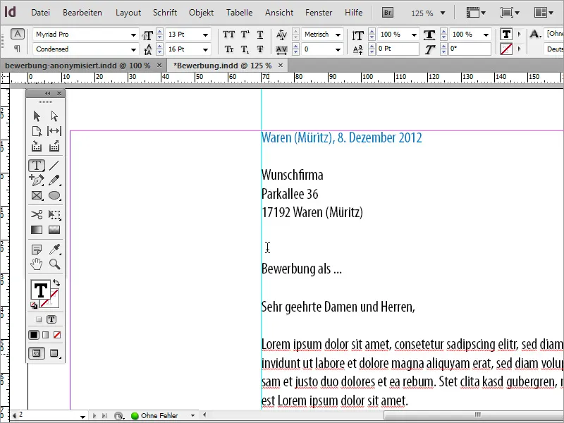
However, this text should stand out from the upper text block and is therefore reformatted. To do this, simply select the relevant text passages and use a paragraph format for the first time. This is advantageous because more text will be added to the application and this should be displayed consistently on all pages. To do this, first create a new paragraph format.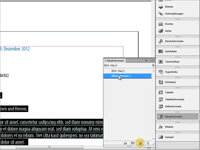
Double-click to access the paragraph format options. Here you can assign a unique name to the format and set the character format and character color.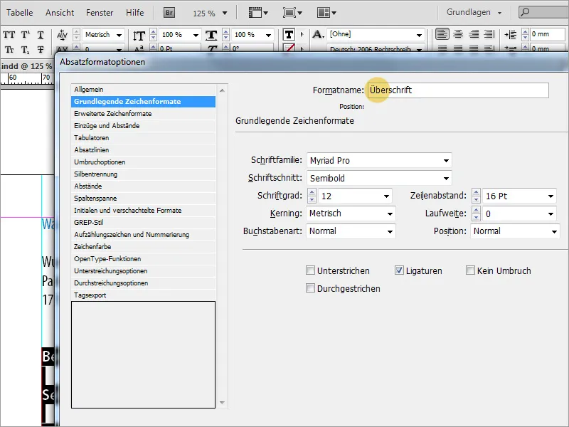
Once the format has been set, the entire selected text is displayed in this format. However, to ensure that the bulk text can also be provided with suitable formatting, simply duplicate the paragraph format that has just been created.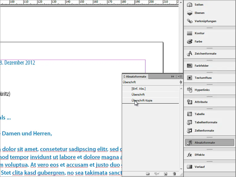
This is adjusted again by double-clicking. This includes a new, unique name for the paragraph format and new text properties.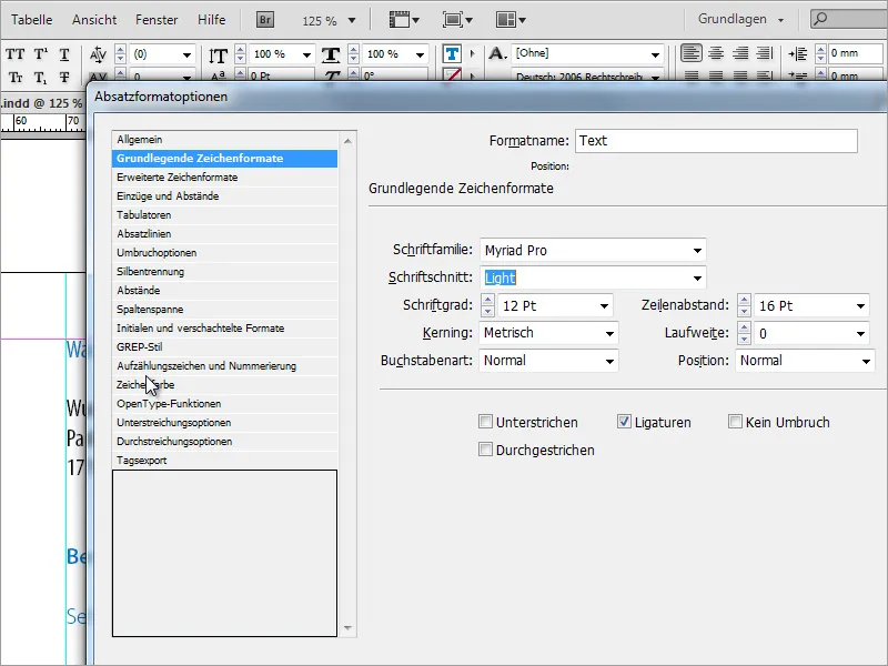
The set text can then be provided with these new text properties.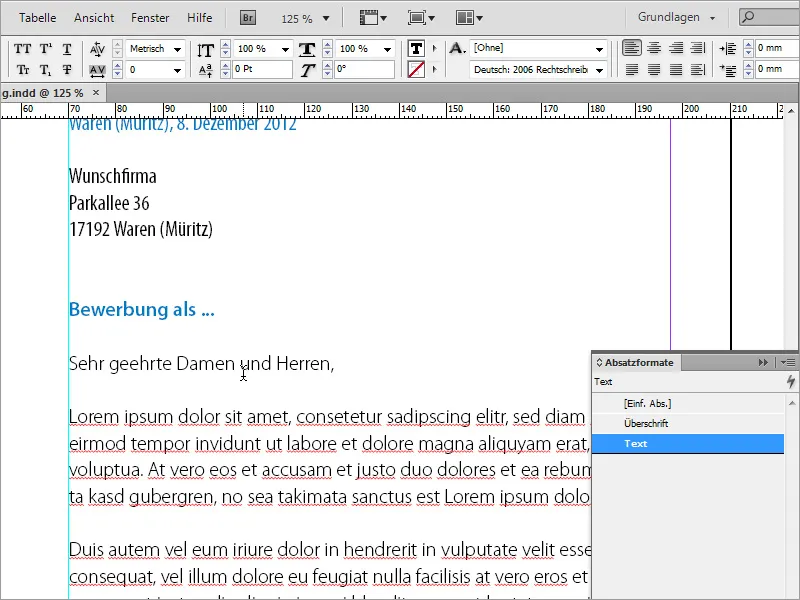
One of the formatting tasks is to ensure that the texts are aligned. Layout programs such as InDesign have functions for aligning text on a baseline. You can either use these functions or move text areas manually.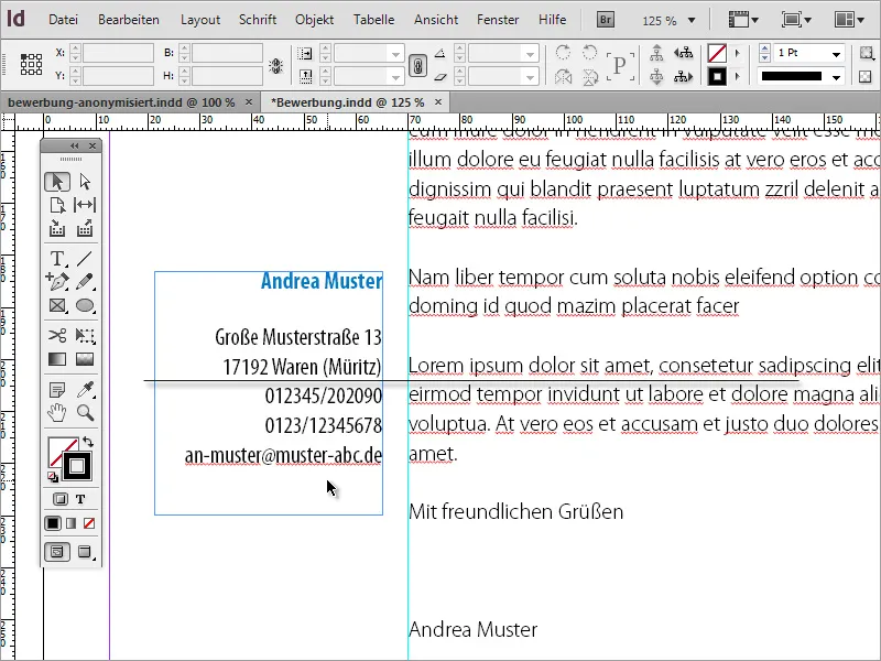
You can use Ctrl+K to set up a grid in the default settings. Determine where the baseline grid should start and with which line spacing it should be set up.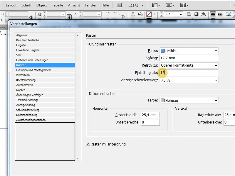
Once the baseline grid has been set up successfully, all you have to do is select the text to be aligned and click on the Align button in the options bar. If this button is not visible, you may first have to change the view of the property bar.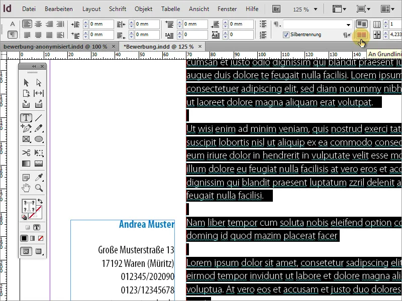
Now you need another page. To do this, copy an existing page again - this time, however, page 2, because the text and address are already aligned there.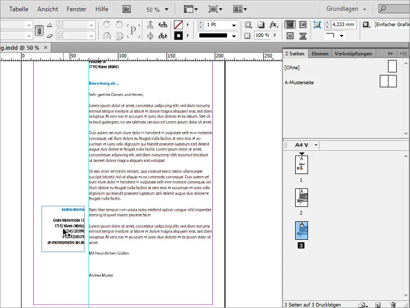
In the address box, for example, you can add an additional text describing what can be seen on this page. In our case, this would be the CV on page 1/2, and the text on this line is also colored in the application blue.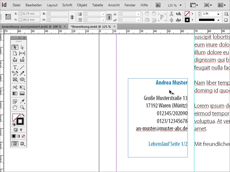
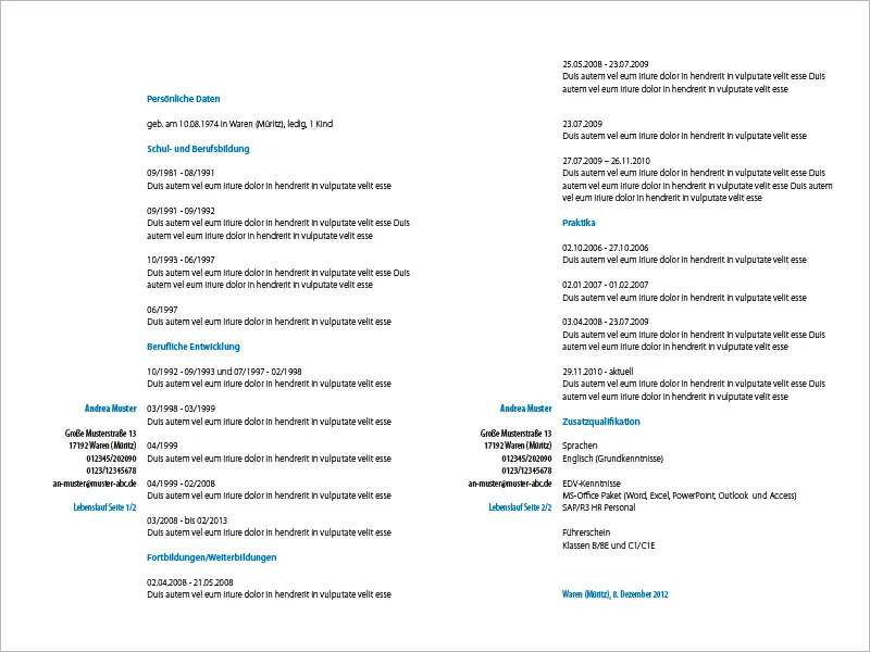
This is followed by the CV details. A prescribed text is also inserted here. Of course, you are welcome to intervene manually in the document at this point and enter the information.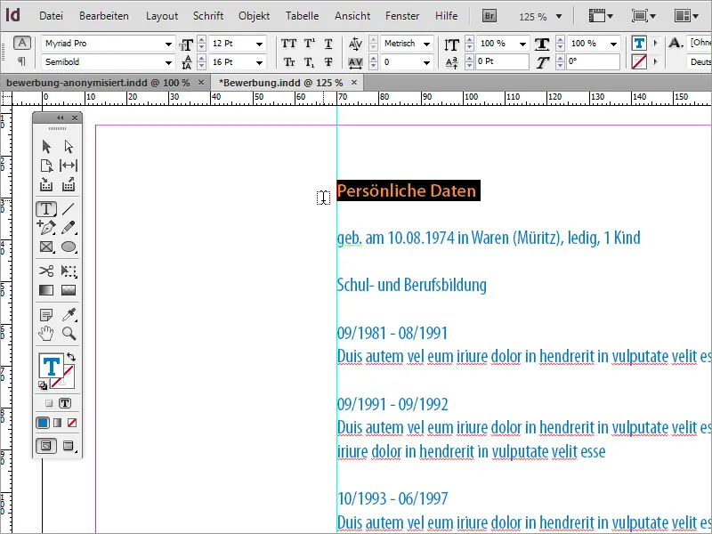
The inserted text will not have the correct formatting. This is where we benefit from the fact that we have already defined suitable paragraph formats. These now allow us to quickly format the text passages correctly. To do this, select a heading and assign it the paragraph format Heading. The corresponding content text is formatted with the Text paragraph format.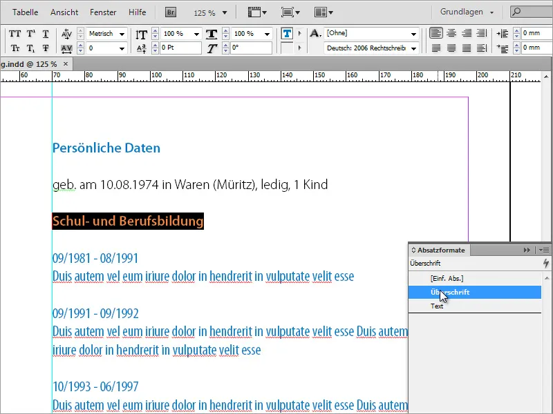
By inserting the text, you may take on so much text that it can no longer be displayed on a page. InDesign therefore activates a small symbol at the bottom right-hand edge of the text box.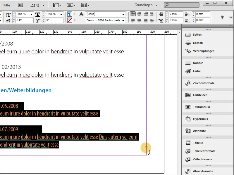
Simply copy page 3 - the first page of the CV - and use it to create a fourth page in the document. Select the text it contains and delete it. Go to page 3 again and click on the small red plus sign. The mouse pointer changes to a new symbol.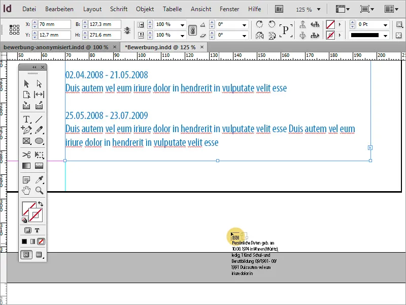
In the next step, simply use this mouse pointer to click on the empty text frame on page 4. The overset text will now be continued there because you have linked the text frames with this function. The inserted text changes the text frame of page 4. Scale this frame manually so that it reaches the vertical guideline again.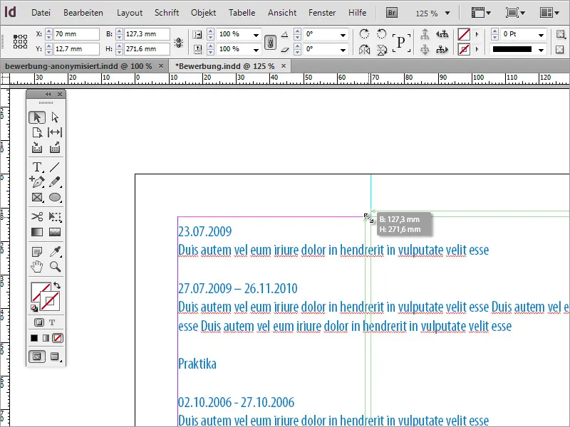
This text must also be brought into the correct format. Use the paragraph formats again to adjust the text.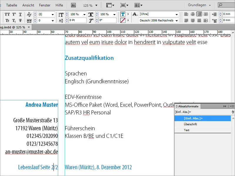
When inserting and formatting, make sure that the dates and the corresponding content are displayed in blocks and that the date does not appear at the end of a page and the corresponding text only on the following page.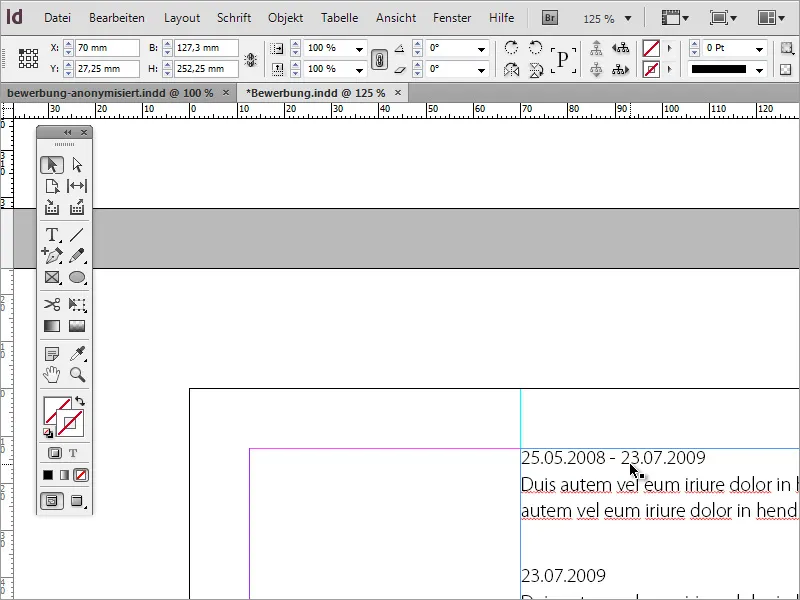
To ensure that page 1 and page 2 of the CV have the same appearance, you should also make sure that the text starts at the same height on both pages. Click on the text frame of page 3 (page 1 CV) and copy the Y value to the clipboard using Ctrl+C. Then paste this value for the text frame of page 2 of the CV in the same field.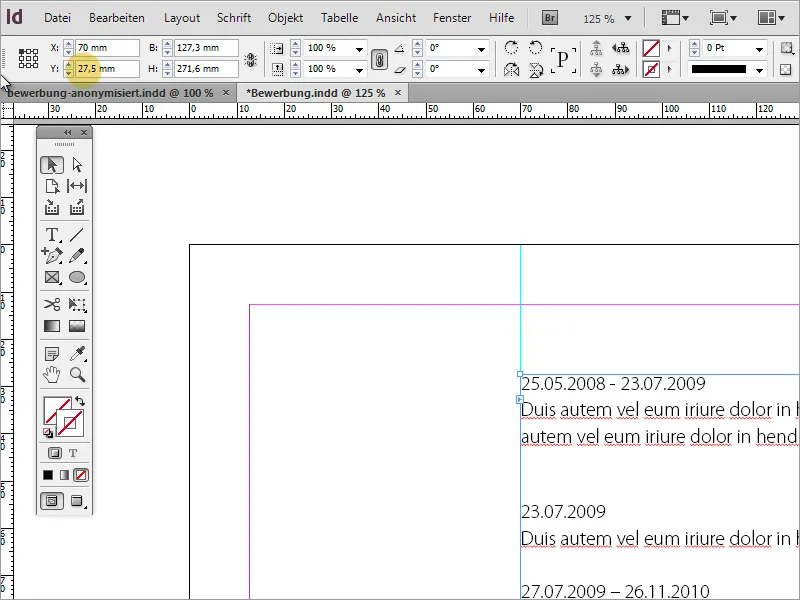
Now that the application or letter of motivation and the CV have been completed, further mandatory information such as certificates or proof of internships that the HR office is interested in follows. First create another blank page.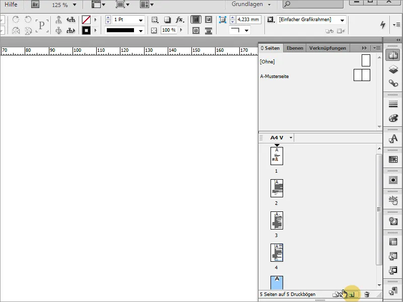
The required documents may need to be scanned in first. You should make sure that the scan is as straight as possible and in a high resolution of 300 dpi.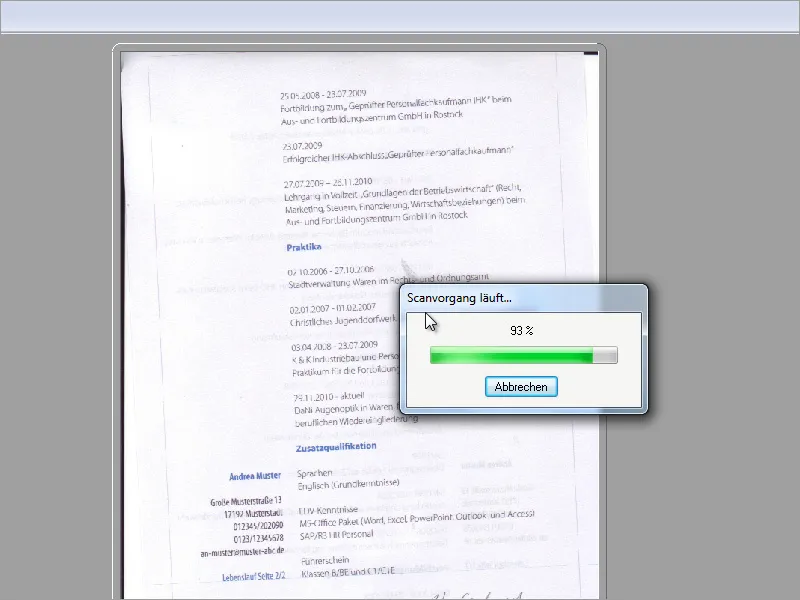
The document has been scanned in a graphics program. It can be further prepared there for use in InDesign. There are several tools available in Adobe Photoshop, including the Crop tool, which are suitable for performing such tasks. Use it to select the entire document and rotate it in the desired direction so that the text is as straight as possible. The background color should already be set to white in advance so that no unwanted edges appear on the document edges after rotation. Of course, you can also rotate an image directly in InDesign.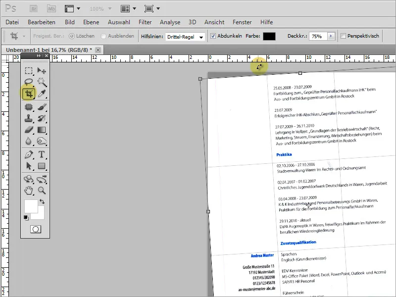
Once the image has been prepared, it can be saved for import into InDesign. To save file size, you can also save the document as .gif instead of .jpg if there are only a few colors. This image can now be placed in InDesign.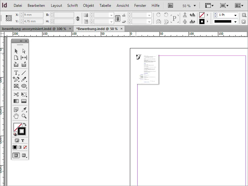
Simply drag the image onto the workspace with the mouse while holding down the left mouse button.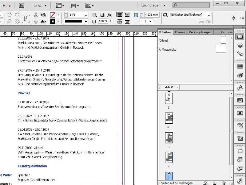
Now the edges of the document scan are still visible in the image. Fortunately, the bounding box for the image can be changed in InDesign. This makes it very easy to simply hide the unwanted parts of the image. Simply drag the bounding box into the image until these unsightly edges fall out of the visible area.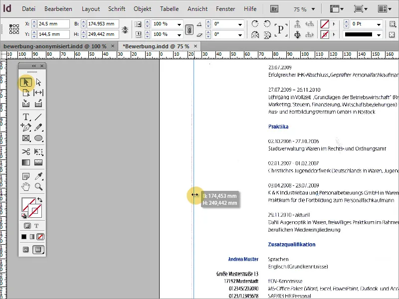
When zooming, it sometimes turns out that there is an image distortion. If possible, such image distortions should be removed in a suitable image editing program before importing into InDesign.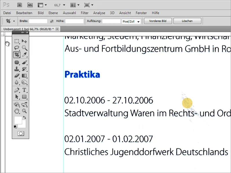
You can paint over these image defects in Adobe Photoshop, for example, or use other repair tools.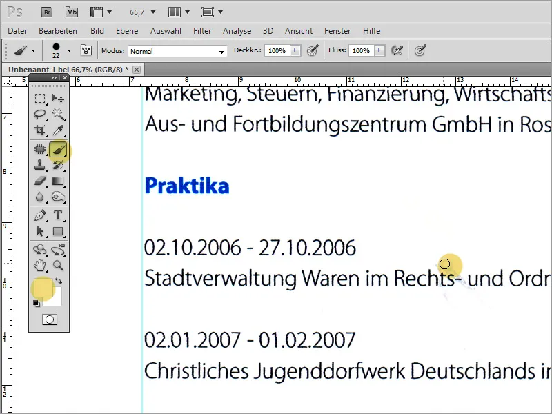
Finally, the file is exported as a PDF. Care should be taken here to ensure that the export is of high quality. For this reason, an export function for print output should be selected if possible.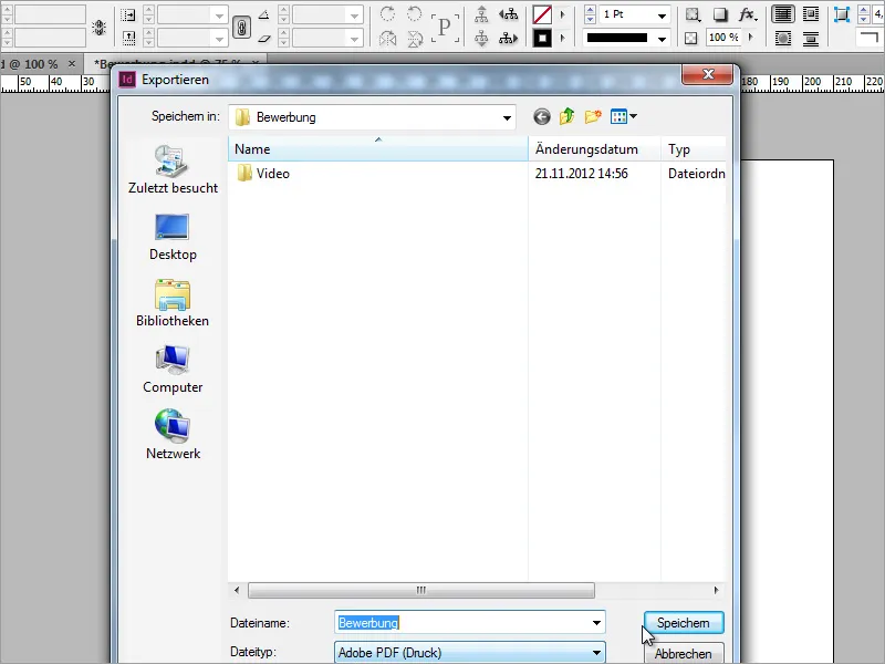
The image resolution can be set in the subsequent dialog. Pay attention to the characteristic size of the image resolution, which should ideally be 300 pixels per inch, and the highest possible image quality. Sometimes you have to strike a balance between file size and quality, as an application should not be too large, even as an attachment.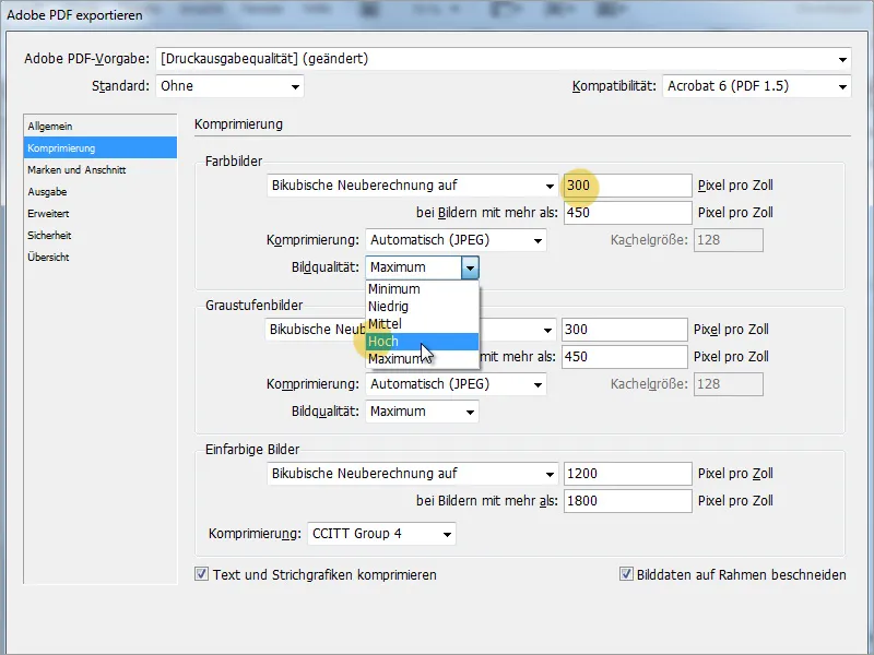
In the security dialog, you can assign a password for the file if you wish. This is ultimately for security, but can also deter the recruiter. Compatibility, on the other hand, is an important specification. If possible, set an older Acrobat version here to ensure that older systems can open this application without any problems.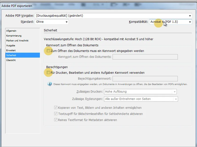
An application can be used for many different applications. It is more individual if certain things can be customized in such an application. This includes both colors and fonts. Let's assume the applicant would like to apply to a large German bank. Then it would be nice if you could show in the application that the applicant has researched the company in advance. One possibility would be, for example, to adapt the colors of the headings to the new situation using the paragraph formats.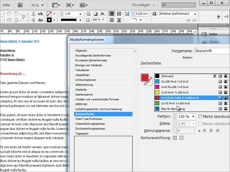
The typeface can also be changed in the same way.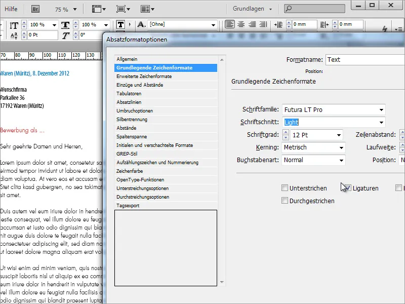
Our result could then look like this, for example: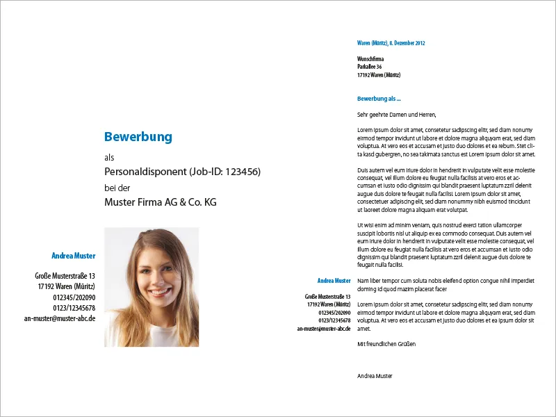
And the following pages: