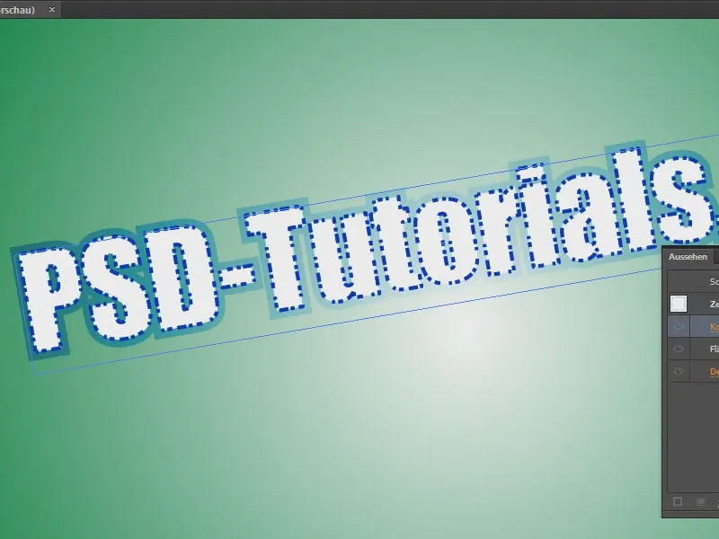
In this tutorial, I want to show you how to create a really cool text effect that looks a bit cut out. It's really easy - if you know how.
I create a text field and write "PSD-Tutorials.de" in it, for example. Here I change the font.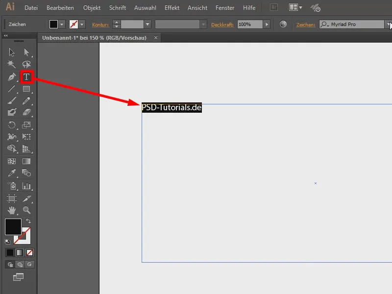
I can access the default settings with Ctrl+K. For font (1) I can first say that the preview should be large (2).
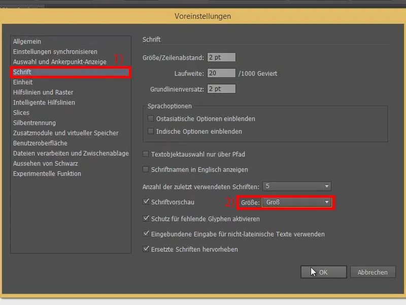
This gives me a slightly larger preview of the fonts. Then I choose a nice font, for example this one here (1). I make it larger by holding down the Shift keyand increasing it in steps of 10 (2).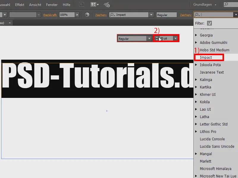
I could now rotate the whole thing. The problem is that when I do this, only the text box itself is rotated, but not the text.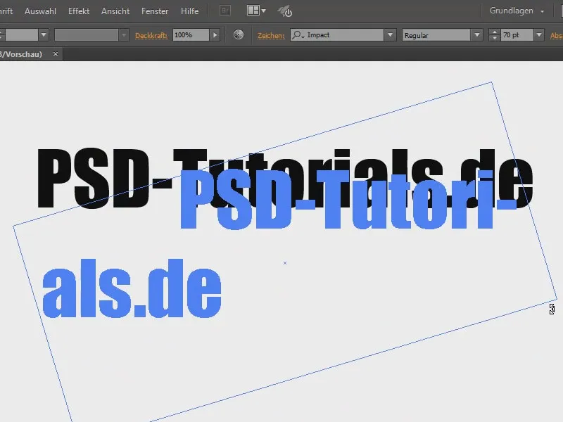
That's why I use the rotate tool(1). Here (2) I can make the text box a little smaller by double-clicking on it.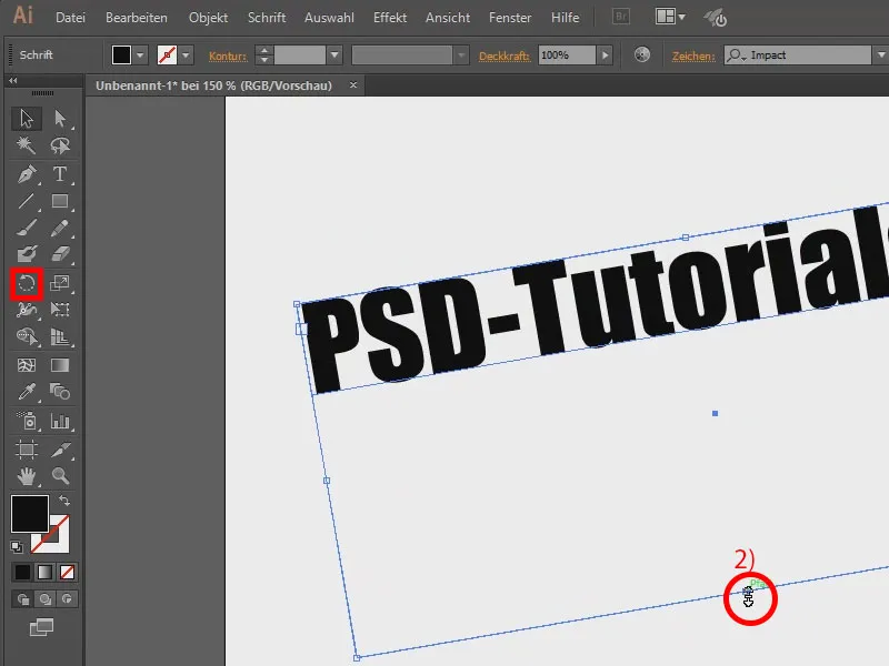
About the color: I fill the text with white (1) and set the outline to blue (2).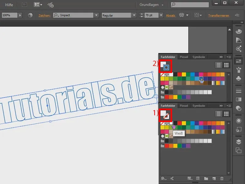
The outline should now be dashed. To do this, I go into the outline control panel(1). There's not much to see, so I go to Show options (2). That's better.
Here I can now also select the dashed line (3). It doesn't look so nice yet, but if I set it to 2 pt (4), for example, it gets better. At 1 pt it looks even finer (5). I'll leave it like this. I make the lines a little stronger and set them to 2 pt (6).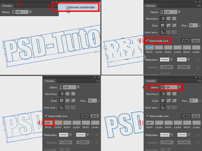
To make this look even bolder, I want a double outline. To do this, I go to my Appearance panel(1) and click on Add new outline (2). I give it more width (3) and set the color to gray (4). The problem is now: The gray outline covers my dashed outline (5).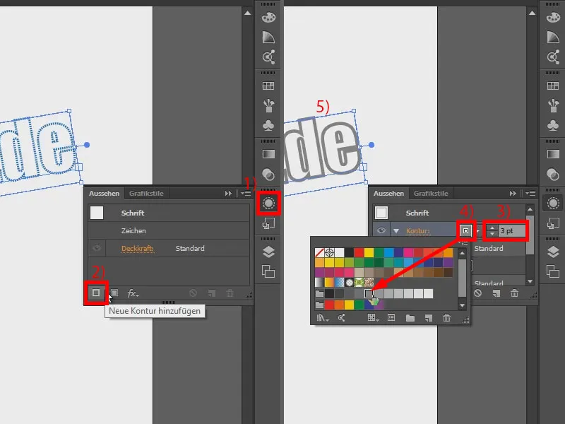
I change this by going into my transparency control paneland setting the whole thing to Overlay. I'll zoom in a bit so you can see it even better. Of course, you can also try other fill methods, soft light, difference... But I think copying one into the other works quite well.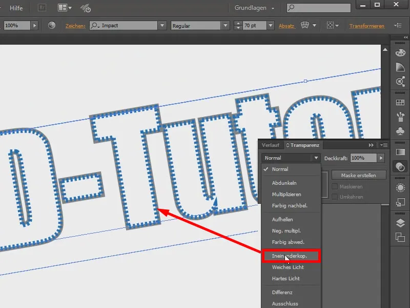
Now I'll add a little more contour.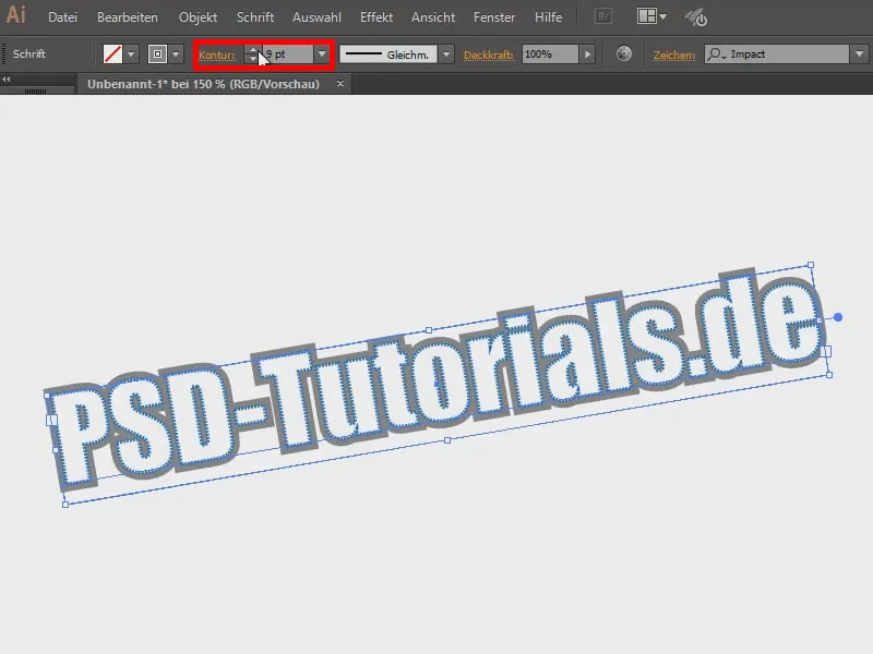
Now I'd like to have a background. I create an area (1) with a gradient. I'll go to the Gradient panel(2), select Circular and then drag here to make it look a bit prettier (activate 3 and adjust with 4). Now click with the right mouse button and arrange in the background via Arrange.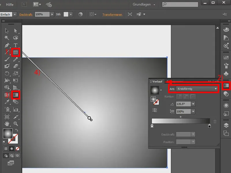
The effect is now actually finished. However, you can hardly see the gray outline because the background is already gray (1). I could recolor it by double-clicking here (2) and using a nice green gradient, for example (3). However, the outline is still blurred, ...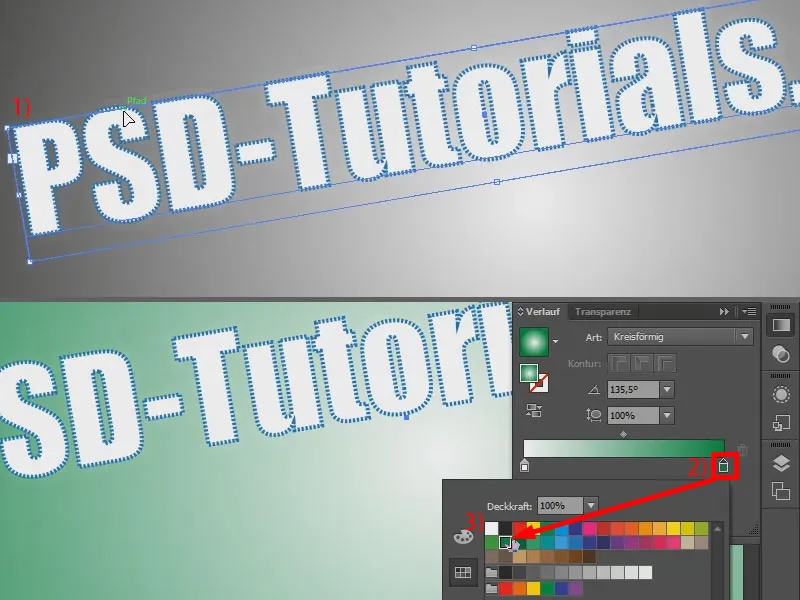
... so you could also use a different color here, for example a blue.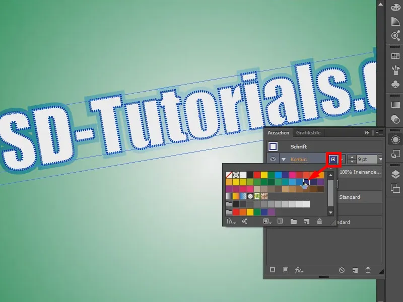
You could add even more effects. For example: I'm going to click on the fx symbol(1) and under the stylization filters on Scribble (2). Then it looks a bit painted. So - you can combine great things to create cool text effects.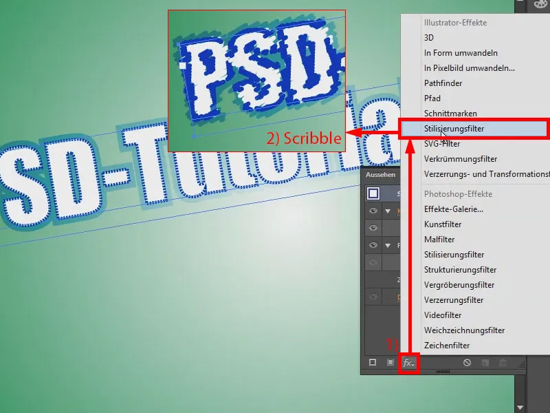
Another little tip: When I zoom in, there are places where it doesn't look really nice (1). That's why I go for characters here (2), ...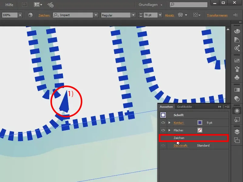
... and in the contour control panel(1) I say that I want rounded corners (2).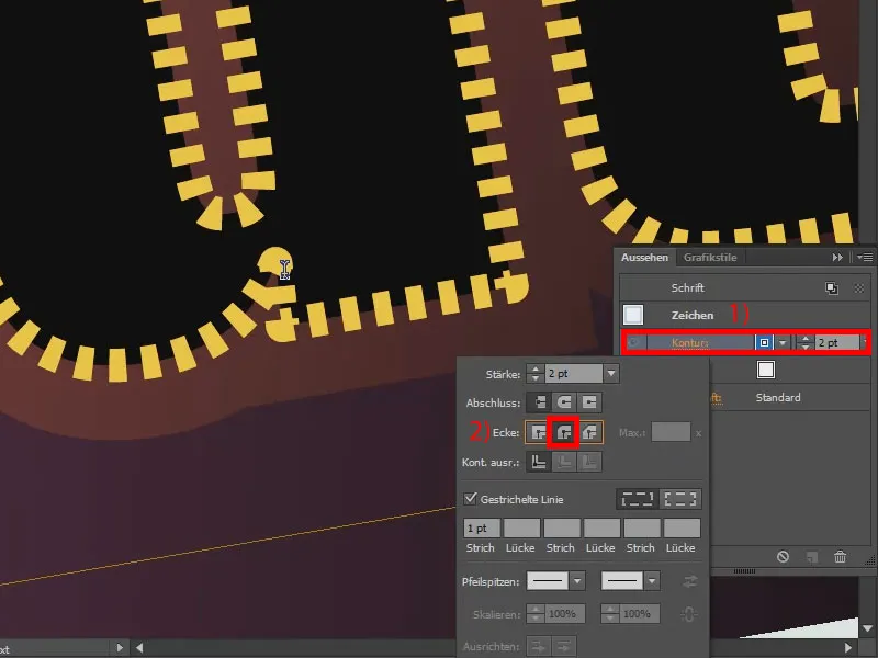
Or I can use the flattened edge, which makes the transition even easier to see.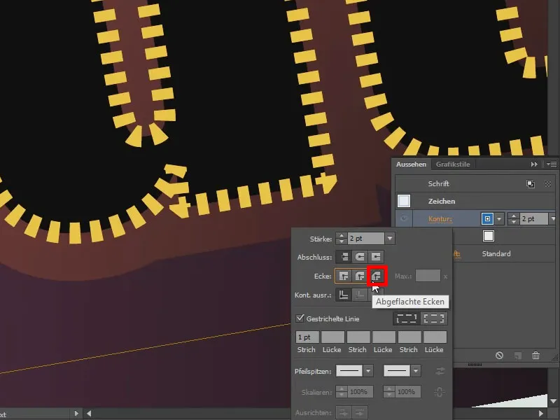
Of course, I can also play around with the parameters for stroke and gap until I like it. It all works.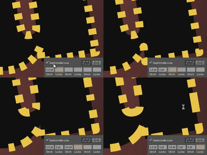
So try it out. You can do really great things with it.