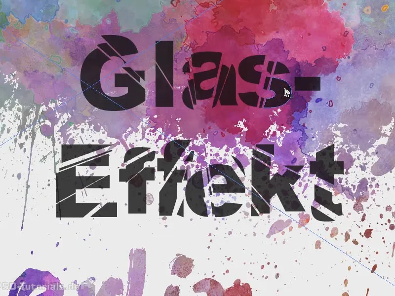
The topic of this training is: shattered glass. I first draw up a text layer and write "glass effect" in it. I make it a little thicker and larger. I use Arial Black and increase the font size. I make the frame a little bigger and then center the whole thing.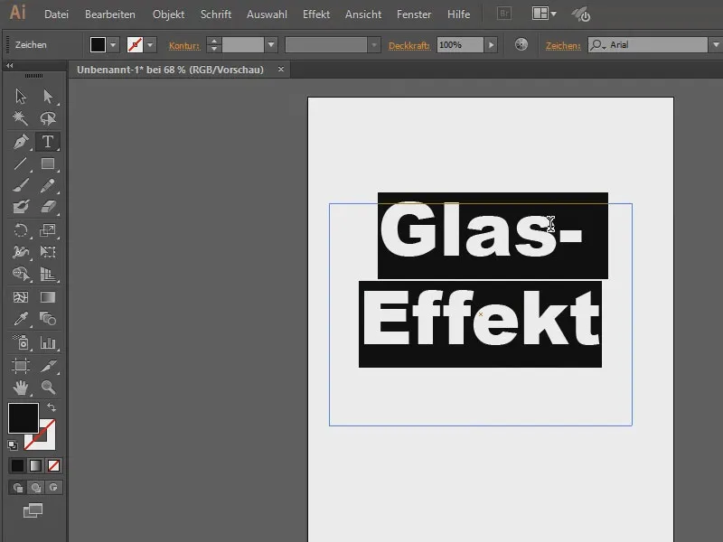
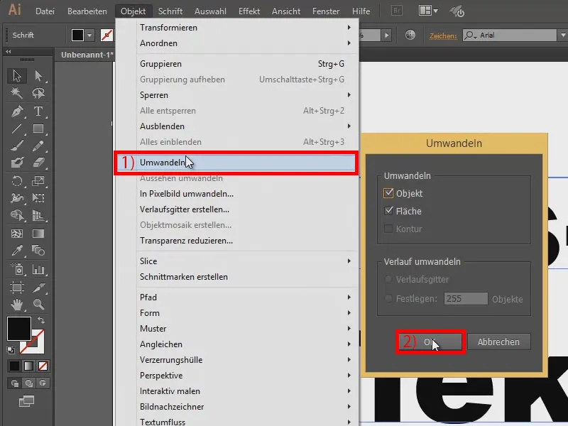
What do I need to make this look chopped up? First, I convert it into a path. So I go to Object>Convert... (1) and press OK (2). Unfortunately, the text can no longer be changed - the only disadvantage, but never mind.
Next, I'll draw in a few splinters with my pen tool...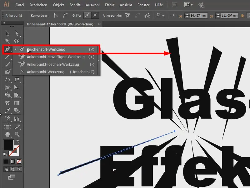
Now I click on any area (1) and go to Object>Path>Split underlying objects (2).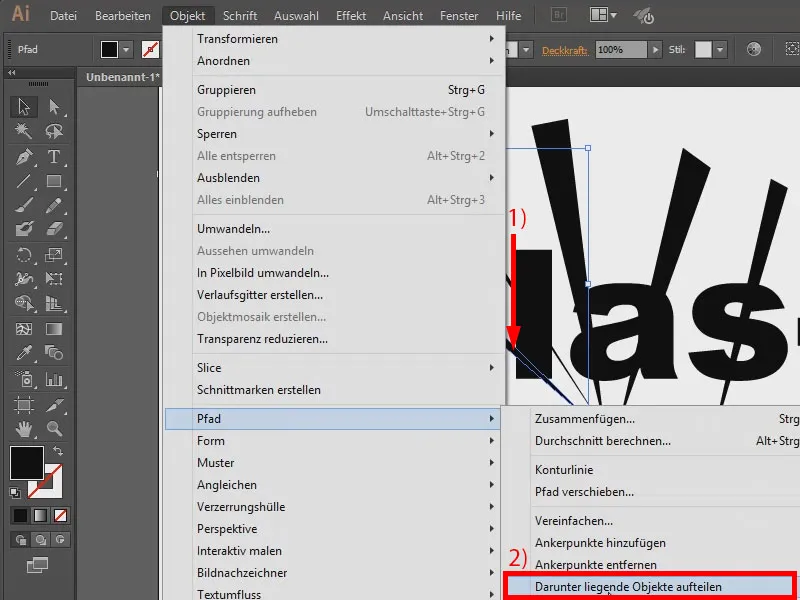
You can't see anything yet, but if you move the mouse pointer over it, you can see where the object has been cut open.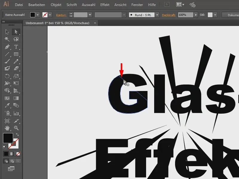
This means that I can now click on it and move it with the arrow keys...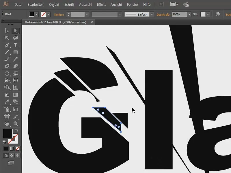
I'm now doing the same with the others. Unfortunately, you can't do this with all of them at the same time, you really have to click on each one individually, which is a bit annoying, but well, there's only so much time.
All in all, it looks like this. Now, of course, it would be cool to have a different background. Of course, I've already prepared one ...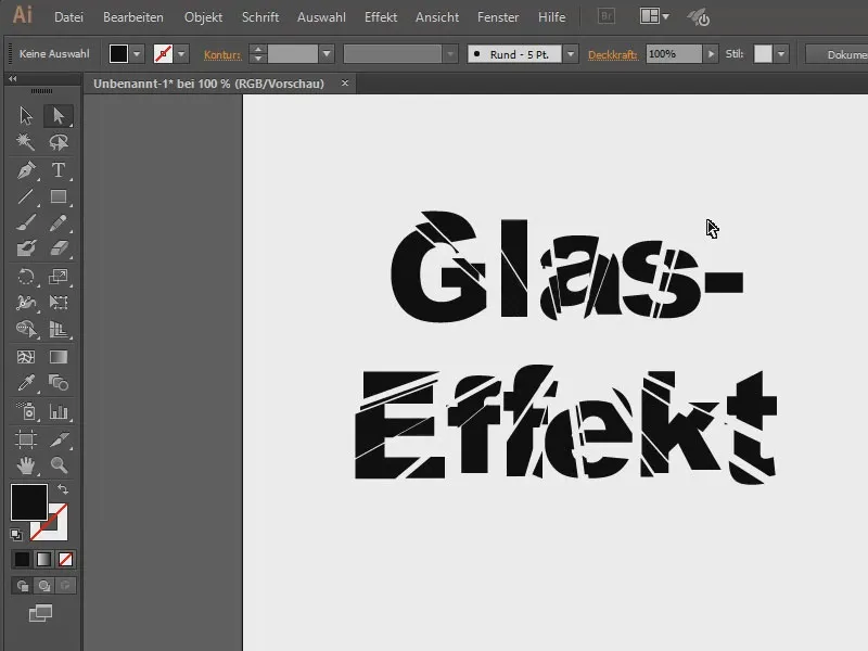
It looks much more valuable this way.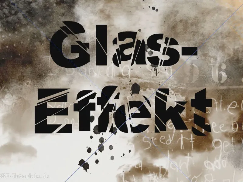
If I give the text a different opacity, for example 80%, then it shows through a bit. That looks a bit cooler.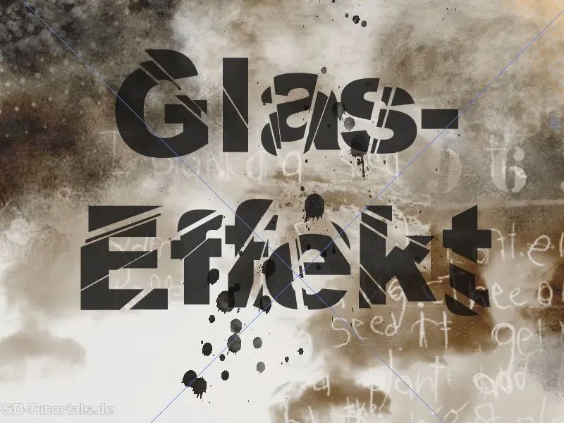
Here's another picture, with a few splashes of blood ...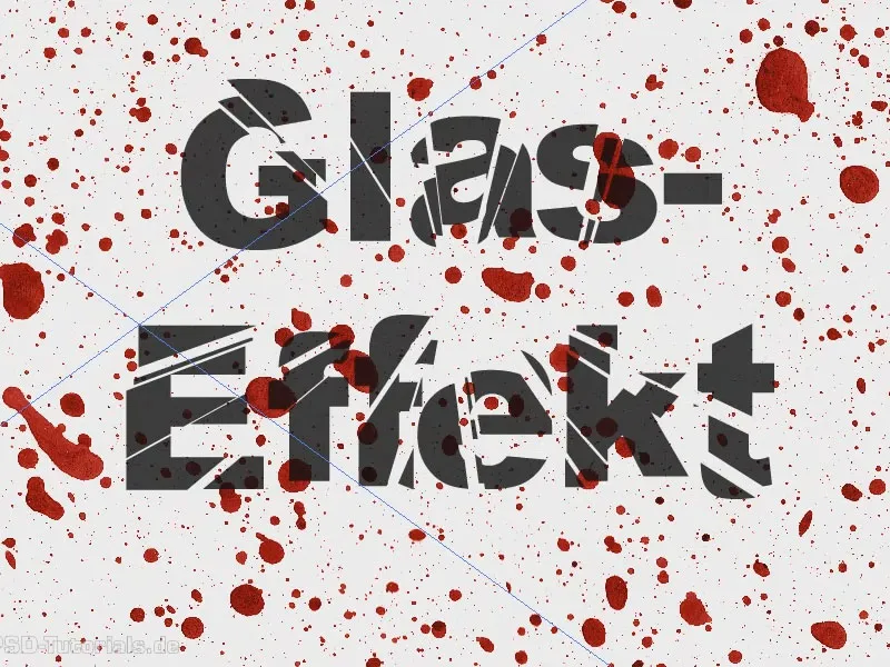
Or this one. I hope you've been able to learn a few things now.