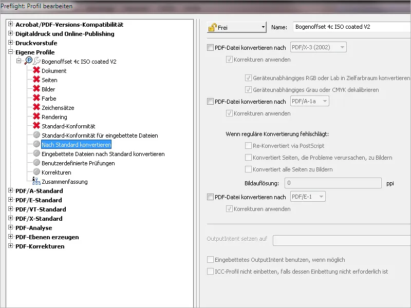
Acrobat already comes with a whole range of different checking profiles for different output conditions, but on closer inspection these still need to be adapted. As an alternative to such customization, you can also create your own profiles that contain exactly the checking rules you require.
To do this, open the preflight control paneland click on the Create new preflight profile entry in the context menu of the options.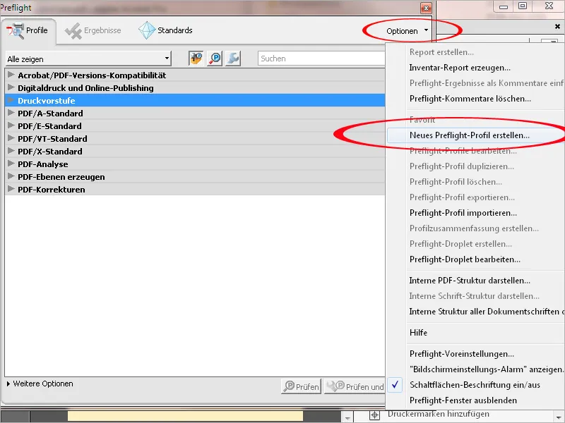
To make it easier to distinguish these self-created profiles from the supplied ones, it is best to first create a new "Custom profiles" group. To do this, click on the arrow to expand the Group pull-down list and then on the New group entry. Give this new category a name and then click OK.
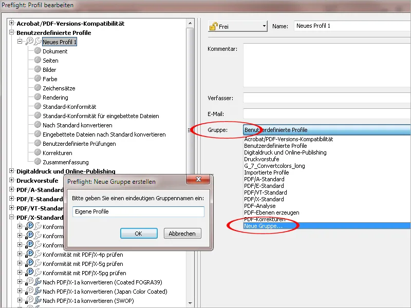
You will now find this new category on the left-hand side in the list of standard categories. Now name the new profile as clearly as possible. For a more precise description, you can enter a text in the Comment field.
Then click on the Document tab on the left-hand side.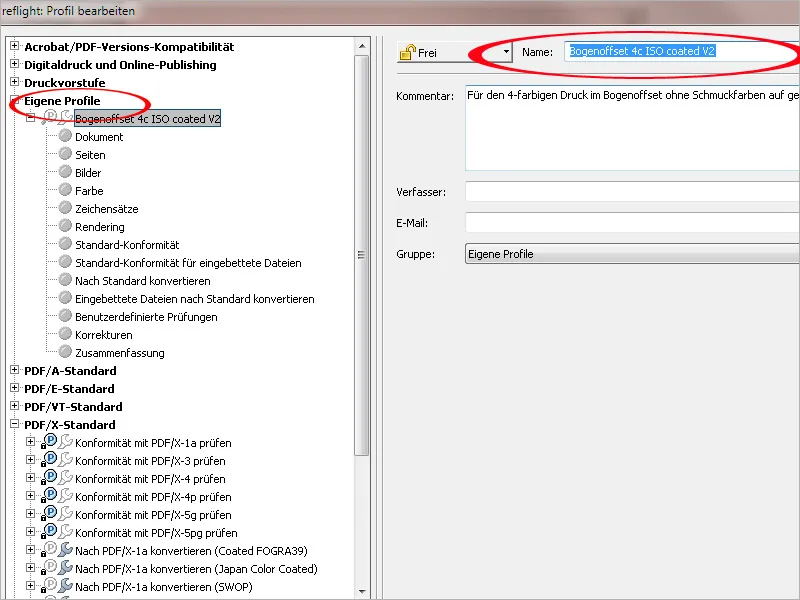
Each tab contains various topic-related check rules. These are initially inactive and must be set after clicking on the arrow in front of them by selecting the desired message in the context menu. For the first check rule with the query of the required PDF version, it is best to set PDF 1.4 in conjunction with an error message. This version is required when using transparencies, which can, however, lead to problems in a PostScript-based workflow during exposure in the print shop. Transparencies should therefore be reduced beforehand (preferably during PDF export) or otherwise signaled as an error. If your print shop's workflow is already equipped with version 2 of the Adobe PDF Print Engine (APPE), the PostScript successor, transparencies contained in the print file would no longer be a problem; however, it is best to discuss this in advance.
The document must not be encrypted under any circumstances, otherwise the imagesetter would cancel the job. The file is already checked for damage when it is opened in Acrobat, which is why a new check is actually superfluous; a warning message is always worth it.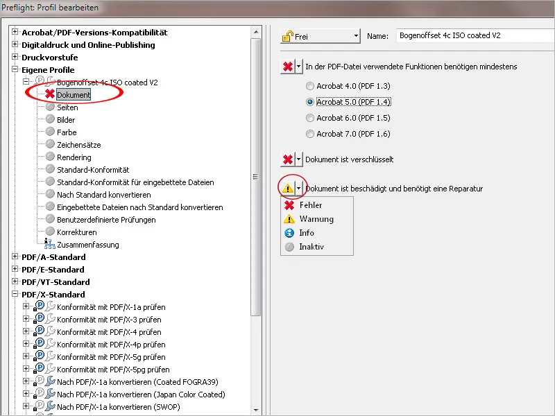
On the Pages tab, you should set an error message in the event that the individual pages in the document are different sizes, as these must generally always have the same format when printed (there are of course exceptions).
In order to be able to apply the check profile to documents with different formats, it is better to leave the check rule for querying a defined page size inactive, as well as the rule for identifying blank pages, as books in particular often contain blank pages.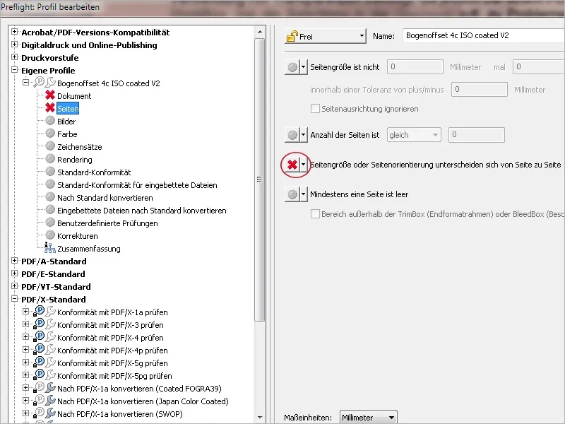
The Images tab deals with the resolution of the halftone or line images used in the document. A warning is always displayed if a certain resolution is exceeded or not reached. For color or grayscale images, the minimum resolution should be 300 ppi for perfect reproduction in a 60 raster. Practice shows, however, that image files with a lower resolution are often inevitably used (because there are no alternatives), which is why I take a more generous approach and set the value at 200 ppi, which still achieves acceptable print reproduction. Below that, it usually becomes unacceptable. An image does not have to have a resolution greater than 450 ppi. This brings no quality advantage and only increases the file size unnecessarily. For line images, you are on the safe side with values between 1200 and 2400 ppi.
OPI (Open Prepress Interface) no longer plays a role today. This was used in the past and refers to a technology in which the high-resolution image data (HighRes) was saved separately in the interest of a smoother workflow and only a preview image and the link to the high-res data were embedded in the layout file. During print output, this LowRes data was exchanged by the OPI server for the high-res data. Such a setting should always be marked as an error.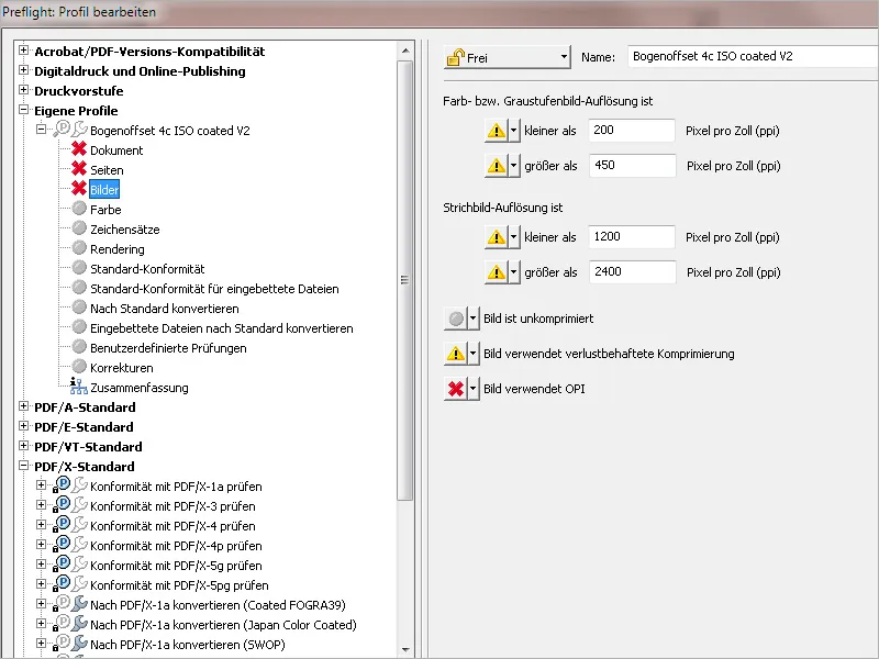
An error message is initially set on the Color tab if pages in the document generate more than zero (0) spot color separations during separation, as this check profile is intended for Euroscale four-color printing. For profiles for printing with spot colors (usually HKS or Pantone colors), the value must be adjusted accordingly. In this case (i.e. if 5 or 6 colors are to be printed), the rule at the bottom Naming of spot colors is inconsistent must be activated, as it often happens in practice that the same color is accidentally named differently (e.g. due to upper and lower case) and two or even more color separations are generated for one color as a result.
With a correctly set RGB workflow, objects from this color space are no longer a problem, but you can set information about this to be on the safe side.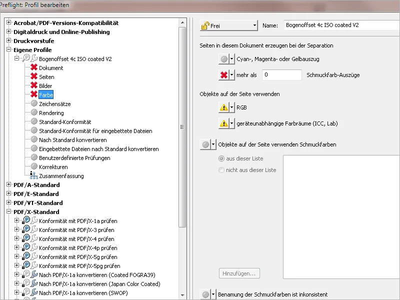
An error should always be set on the Fonts tab if these have not been embedded in the document. Information about fully embedded fonts can also be displayed. If required, information or error messages can also be defined when using certain fonts such as Type 1, True Type or CID. If only very specific fonts are to be used in the document, the fonts can be selected from this list using the Add button with the check rule A character set used is ... not. During a check, fonts that deviate from this are reported as errors.
All check rules named on the Rendering tab should be marked as errors for this profile. A line width of less than 0.2 points indicates hairlines and therefore problems with the exposure.
If you want to ensure that the print file corresponds to a specific exchange standard (e.g. PDF/X-1 or X-3), activate the corresponding checkbox.
If the file contains a PDF/X output profile for RGB printing conditions, this should also be marked as an error for our purposes.
If a specific output profile is to be embedded (in this case ISO Coated V2), you can select it from a list via Add and display an error or warning message if it does not match.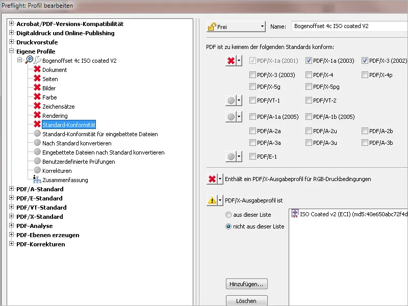
On the Convert to standard tab, you can specify that a file is automatically converted to a specific exchange standard format such as PDF/X-1 or X-3. However, in the interest of better control, I would recommend making these settings manually and then saving the file.