This is what the splash text will look like (Figure 01):
But enough talk now. Have fun and happy learning on the following pages ...
Step 1: Create a background
Before we can start creating a suitable background for our splash text, you need to create a new workspace. To do this, go to File>New and select a format of 330x210mm. Then confirm with OK.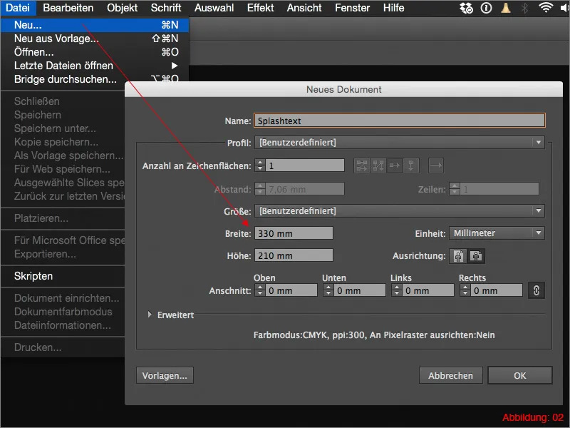
Once you have created your workspace, we can finally start with the actual work.
Grab the rectangle tool and create a rectangle that covers the entire workspace.
You then need to fill this rectangle with a gradient. You will need the gradient palette for this. If you have not yet shown it, you can easily find it via Window>Gradient. (Figure 03).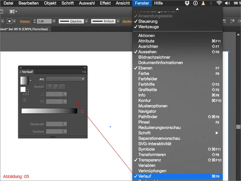
Click on the default black/white gradient in the gradient palette and change the gradient type from Linear to Circular. (See Figure 04).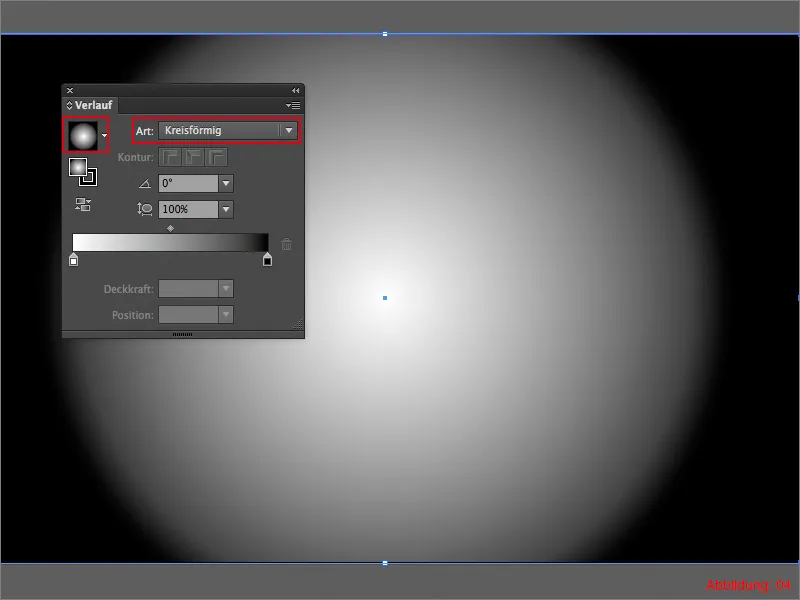
In this case, the circular gradient is a good starting point, but it is still a little too round at the moment. But here, too, the gradient palette offers a very nice function. You can also control the roundness of your gradient here. A value of 60% should be suitable for our purposes. (See Figure 05).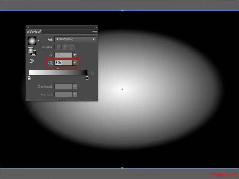
Next, it's time to color the gradient appropriately, as the black and white gradient looks a bit boring. I have chosen two CMYK color values for this tutorial.
- light blue: CMYK - 90/30/4/10
- dark blue: CMYK - 93/48/28/63
Double-click on one of the two gradient color fields to assign the two CMYK values to the gradient. The whole thing should then look something like this. (Figure 06).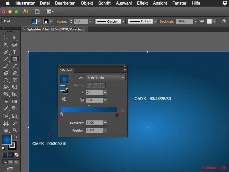
As the gradient still doesn't look quite the way I want it to, grab the gradient tool from the tool palette. A kind of line will appear that we can change in length. (Figure 07).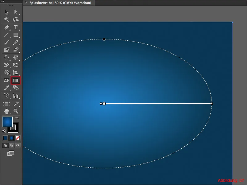
Grab this line at the right-hand point and pull it out of the image approximately as far as shown in Figure 08.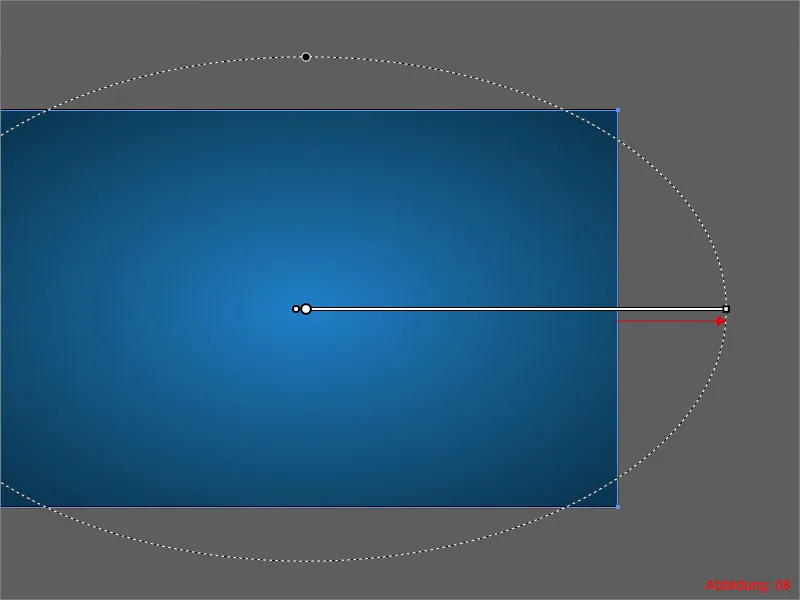
So that nothing can happen to the background, I recommend that you secure these layers with a lock ... (see Figure 09). Your background is ready.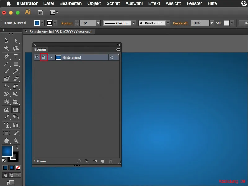
Step 2: Insert typography
To continue working, you now need to create a new layer. It is best to name it "Text", as we will be placing our text on this layer.
Now grab the text tool and click once on your workspace. In my case, I will write "psd-tutorials.de". For the font, I have chosen Helvetica Neue in the Thin font style. You can use a value of 140pt for this size. Set the spacing of the letters to -70.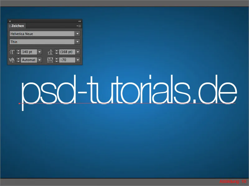
Place your lettering in the center of your work surface. The whole thing should then look something like this. (See figure 11).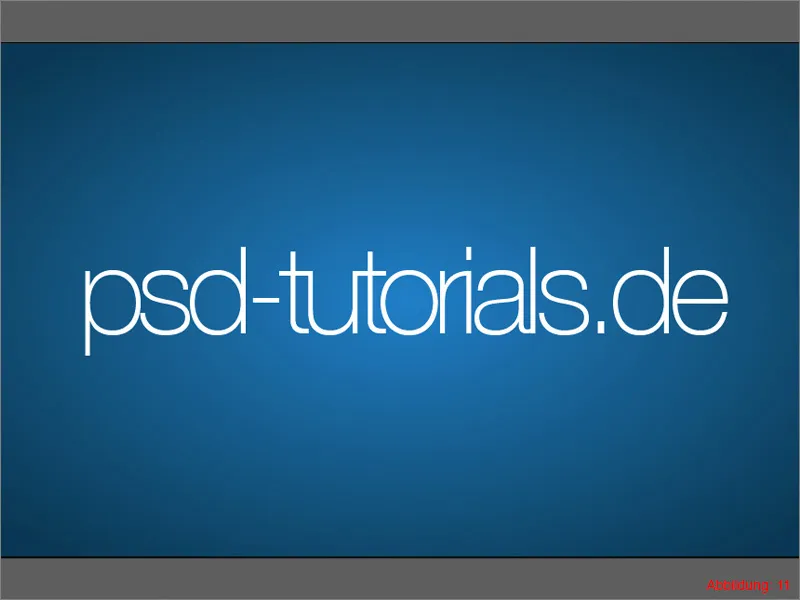
You must now convert this lettering into paths. To do this, go to Font>Convert to paths. Alternatively, you can simply use the shortcut Command/Ctrl+Shift+O.
Next, we will embellish our lettering with a gradient. I have prepared the following two CMYK color values for this tutorial.
- light green: CMYK - 50/0/100/0
- dark green: CMYK - 90/30/95/10
When creating the gradient, proceed in the same way as for the background. However, this time you can leave the type as Linear. Set the gradient angle to 90°. (See figure 12).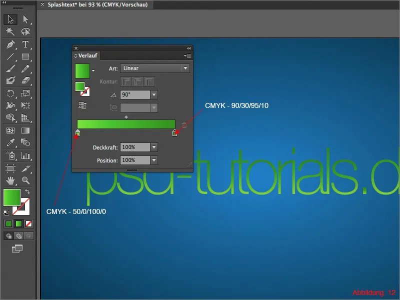
To emphasize the font a little more, we need to create a shadow. Take the Ellipse tool and draw a black ellipse under your lettering. (See figure 13).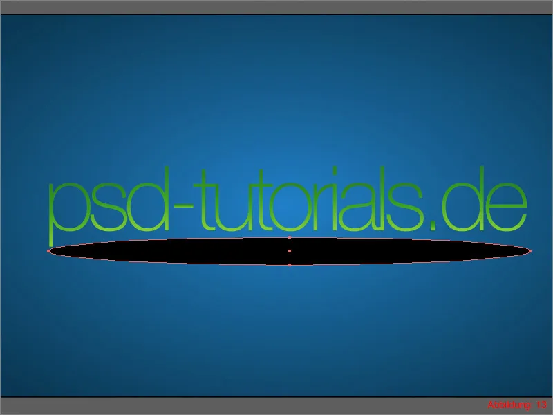
You need to set the fill method of the shadow to Multiply. You can do this via the transparency palette. If you have not yet shown it, you can find it via Window>Transparency. Set the opacity to approx. 40%.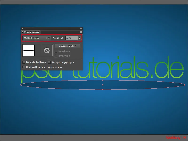
As the shadow is still extremely sharp at the edges, we need to blur it. To do this, go to Effect>Blur filter>Gaussian blur ... (see Figure 15).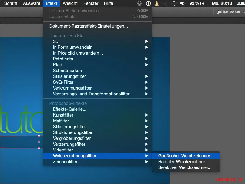
Enter a value of approx. 25 pixels in the following dialog box and confirm with OK.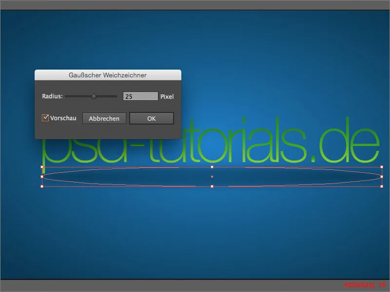
The whole thing should then look something like this. (See Figure 17).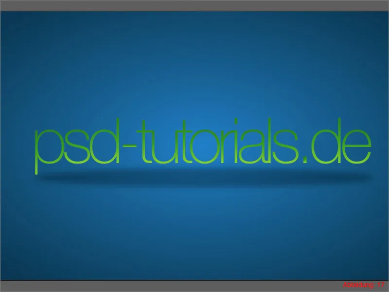
Step 3: Create light points
In this part of the tutorial, we will now deal with the small light particles that should be scattered wildly everywhere.
First, create another new layer and name it "Light particles". Then grab the ellipse tool and use it to create a 10x10mm ellipse. (Figure 18).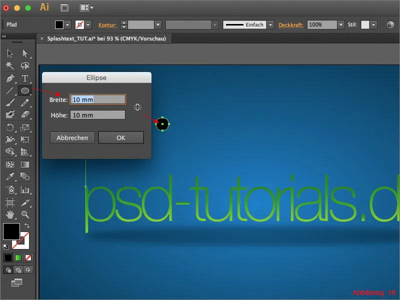
Immediately afterwards, go to Object>Path>Move Path ... (Figure 19).
In the following window, enter a value of 10mm and confirm with OK.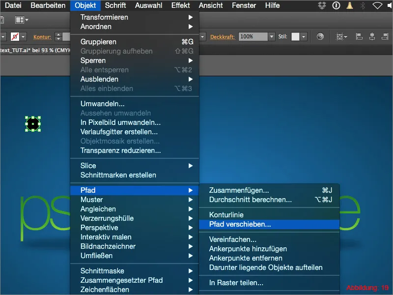
It should then look like this. (See Figure 20).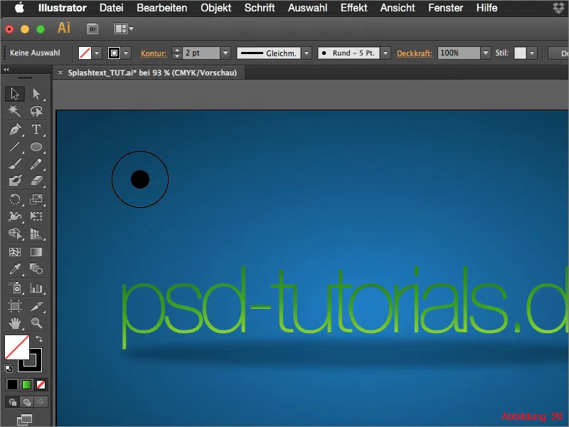
You must assign a yellow surface color to the inner ellipse. Color the outer ellipse in cyan. (Figure 21).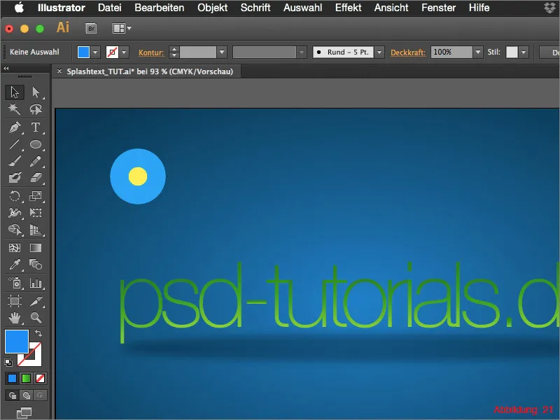
As the whole thing still looks rather sharp-edged for a light spot, set the opacity of the outer ellipse to 0% in the transparency palette. (See Figure 22).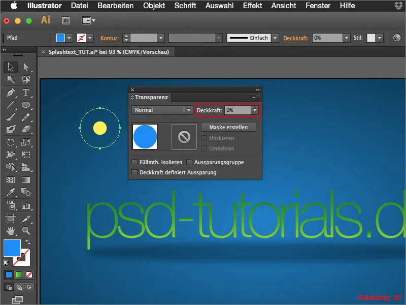
To create a smooth transition from the inner to the outer ellipse, you need to grab the blend tool from the tool palette. (See Figure 23).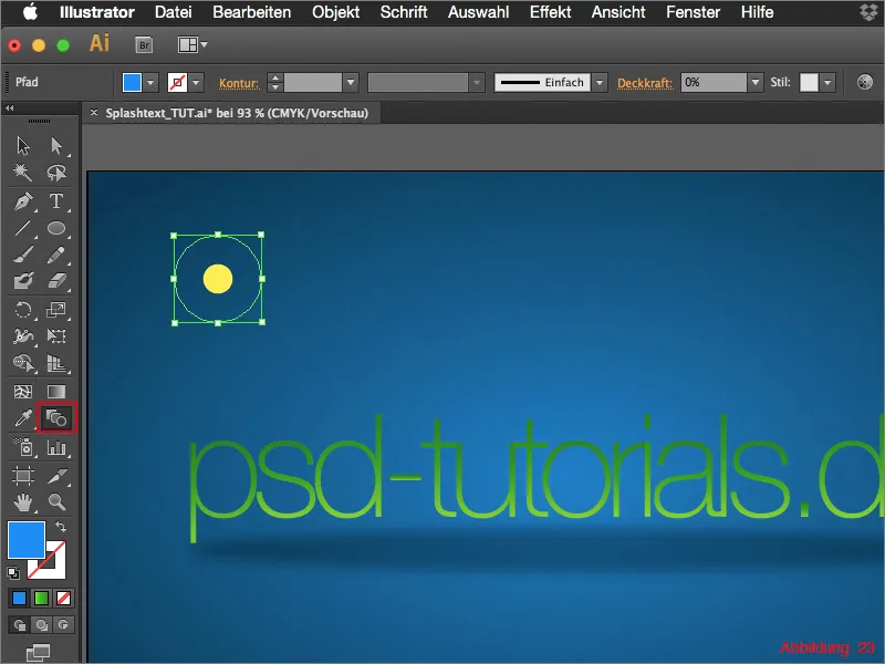
Use this tool to click once on the edge of the inner ellipse and then immediately on the edge of the outer ellipse. (Figure 24).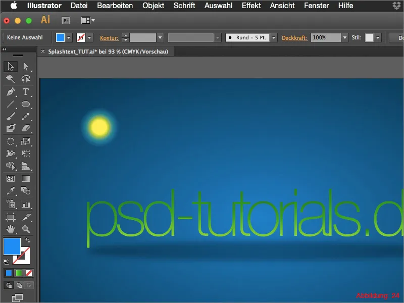
Because you have set the opacity of the outer ellipse to 0%, the blend tool will create a kind of gradient between the inside and outside.
The basic shape for our light spot is now complete. Theoretically, you could now copy this light spot again and again and insert it in different sizes. But it's also easier. In the following step, we will work with brush tips.
Call up the brush palette via Window>Brushes. Now select the light spot you have just created and then click on the small arrow in the top right-hand corner of the brush palette. This will open a small drop-down menu in which you can click on New brush. (See Figure 25).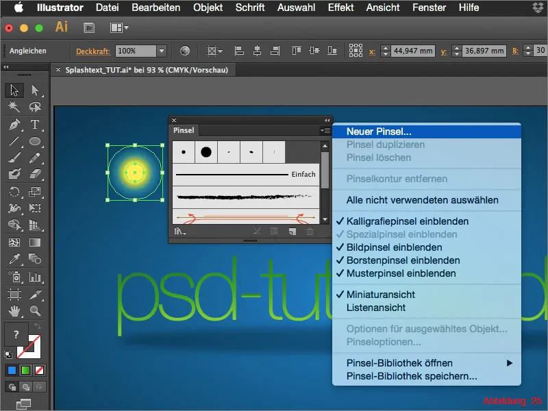
A new window will now appear in which you can set all possible parameters for your brush tip. I recommend that you simply play around a bit here to get a feel for the settings. The exact parameters for this tutorial can be found in Figure 26.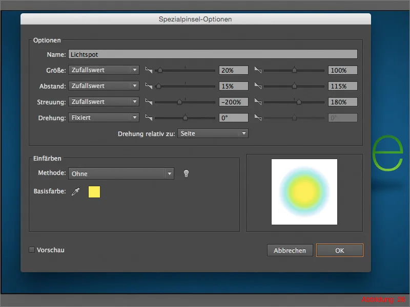
You can then confirm with OK and delete the original light spot from your workspace.
Now grab the brush from the tool palette and draw a kind of wavy line from left to right across your work surface. (Figure 27).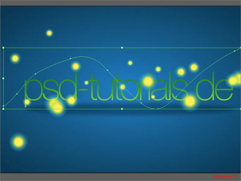
As a result, you should see lots of light spots of different sizes scattered wildly across your work surface. Do this several times until you think you have created enough light spots.
To make the whole thing blend in with the background, you need to select your drawn light spots and switch from Normal to Soft light in the Transparency palette. (See Figure 28).
Your light spots are ready.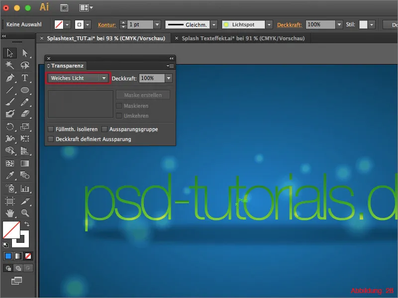
Step 3: Creating drops/splashes
In the last step of this tutorial, we will look at how to distribute drops of color around the font to make the whole thing look a little wilder and more random.
First of all, we need to create the basic shape for our drops, just as we did with the light spots. However, create a new layer first and call it "Splashes".
Use the ellipse tool and create an ellipse with the dimensions 5x5mm.
You will then need the direct selection tool. Use it to drag the topmost path point of the ellipse upwards a little and convert it into a corner point. (See Figure 29).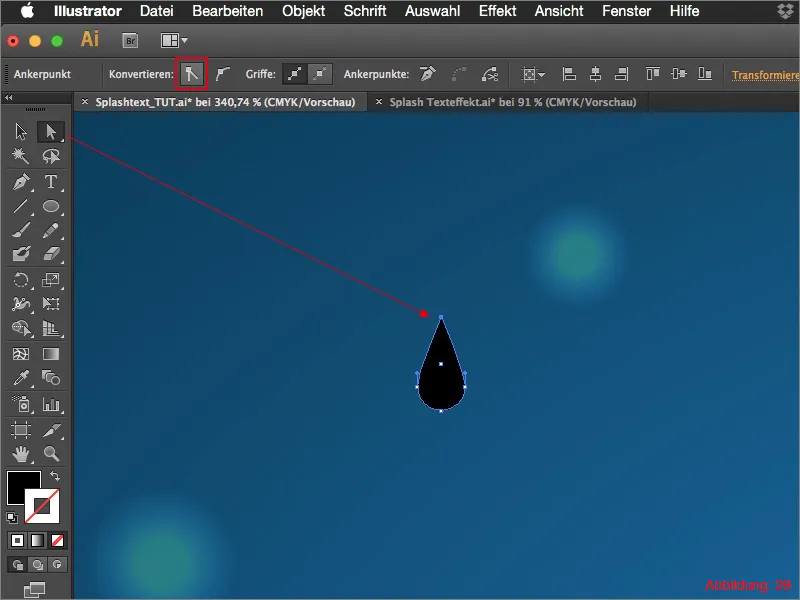
Now go back to the brush palette and create a new brush with the drop shape. This time, however, do not select Special Brush but Image Brush.
Once again, a new window will appear in which you have all kinds of options to customize your brush. You can find the appropriate parameters for our drop brush in Figure 30.
You can then confirm with OK. You can delete the original drop shape again this time.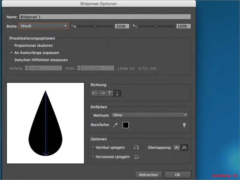
Now all you have to do is grab the brush and draw small drops around your lettering with the brush tip you have just created. (Figure 31).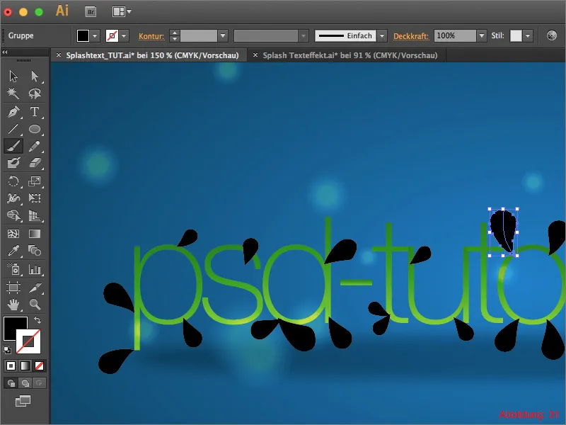
If one or two of the drops are a little misshapen, you can undo the whole thing with Command/Ctrl+Z and try again.
When you are satisfied, all you have to do is select all the drops and convert them into an object using Object>Convert Appearance .... You can then fill the drops with the same green gradient as for the lettering.
Finally, place the splashes layer behind the text layer. (Figure 32).
Your splash text is finished.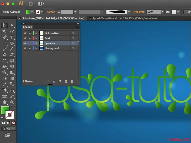
Final words:
Now we have come to the end of this tutorial. I hope you enjoyed it and were able to pick up a tip or two.
If you have any further questions on this topic, please feel free to write them in the comments below this tutorial. I will do my best to answer them as soon as possible.
In the working data for this tutorial you will find the Illustrator file with all the layers. If you get stuck at any point in the tutorial, you may find it helpful to take a look at the original file.
With this in mind ...
Stay creative
Your Julian
