A staggered line logo effect is a stylish way to give your design a modern and professional look. This background is perfect for flyers, posters, or digital presentations. With Photoshop, you can easily create this effect by combining line patterns and logo elements and arranging them slightly offset. In this tutorial, I will show you step-by-step how to achieve this impressive effect and give your designs a sophisticated touch. Let's get started!
Step 1:
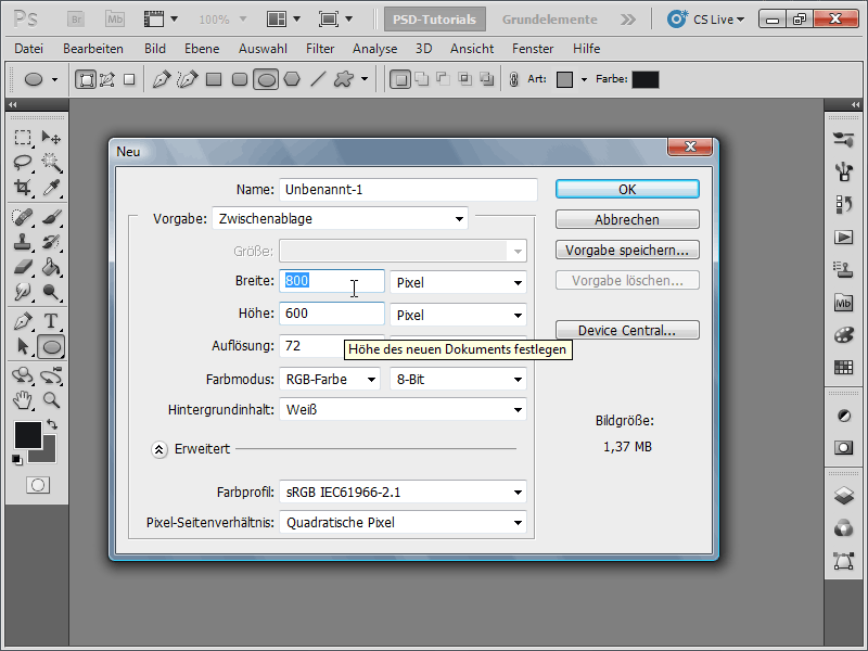
I create a document with the size of 800x600 pixels, although the size is actually irrelevant.
Step 2:
Next, I color the background layer with a very dark gray (not black).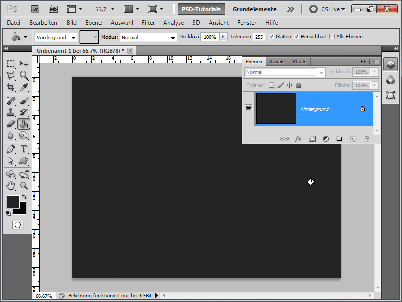
Step 3:
Now I want to add a line pattern to the background. I create this very easily myself by creating a new document with, for example, 1 pixel width and 5 pixels height.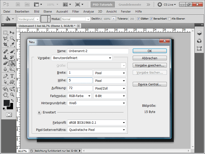
Step 4:
Now I double-click on the background layer to convert it to a normal layer. Next, I need to delete two pixels to make it transparent. Then, I select everything with Ctrl+A and save my layer as a pattern under Menu>Edit>Define Pattern.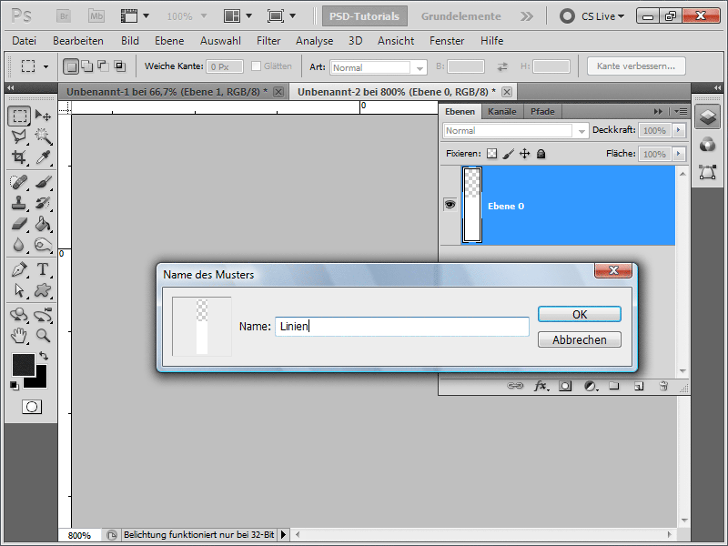
Step 5:
Now that I have done that, I need to apply my pattern to a new layer using the Fill Tool. I set the opacity of my layer to 4%.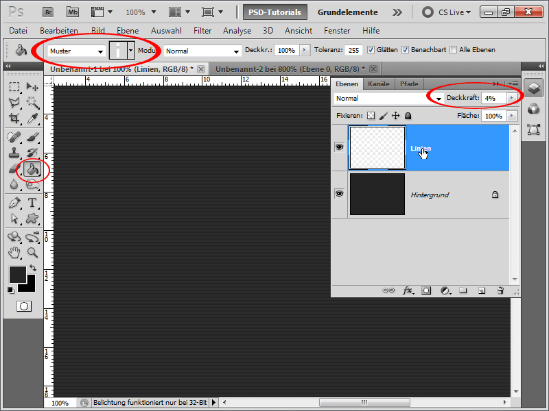
Step 6:
Next, I create a new layer (using Ctrl+Shift+Alt+N is the fastest way) and fill it with, for example, black. The color doesn't really matter because I set the layer opacity to 0%. Now I go to the Fill Options.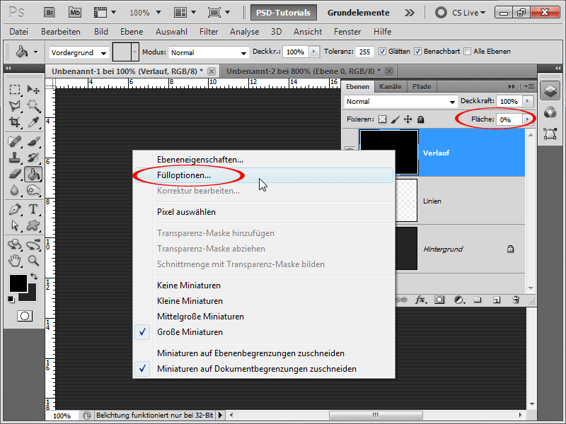
Step 7:
I activate the Gradient Overlay, set the fill method to Multiply, and apply a slightly darker colored gradient that is Linear.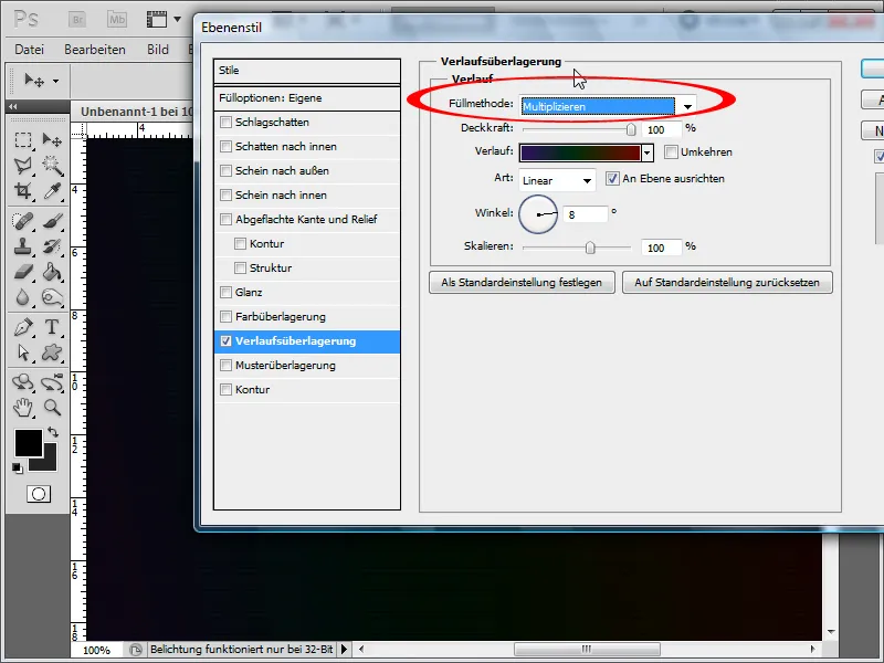
Step 8:
Next, I create a new layer again, apply the Clouds Filter with the standard colors black/white, and set the layer's fill method to Soft Light.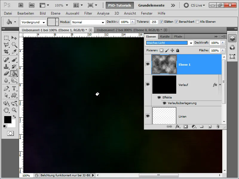
Step 9:
I can add a mask to the cloud layer so that the clouds are not visible everywhere, but if you like the clouds everywhere, you can skip the mask. Now it's time for me to create a group and set the fill method to Color Dodge.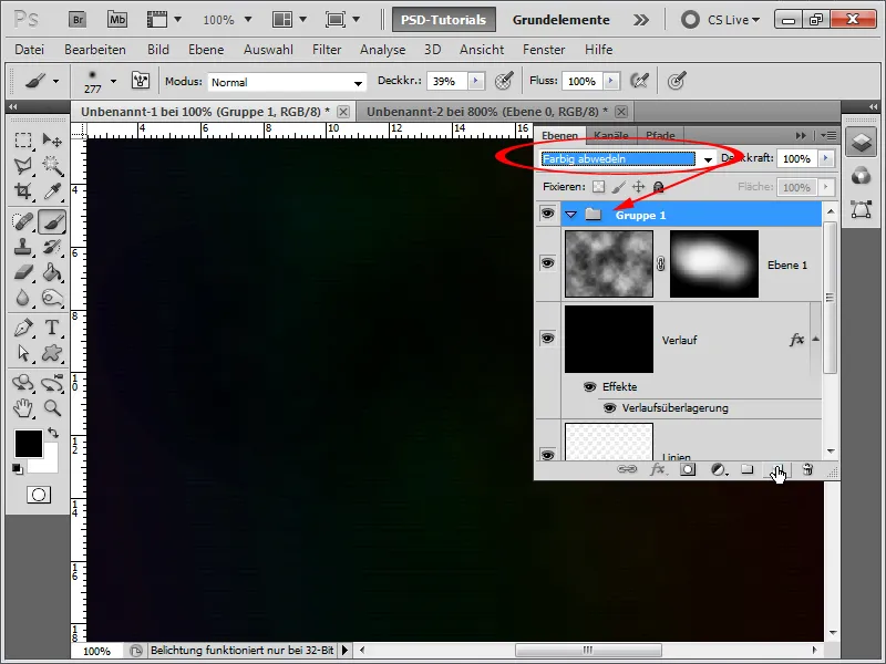
Step 10:
Within the group, I create a new layer and brush with a very soft and large brush with white color a few times, setting the opacity of the brush to about 40%. You can see that the background then stands out better.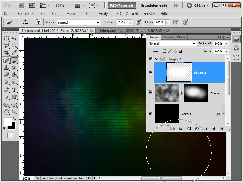
Step 11:
Now I insert the PSD-Tutorials.de logo. I then apply the Gaussian Blur with about a 4-pixel radius.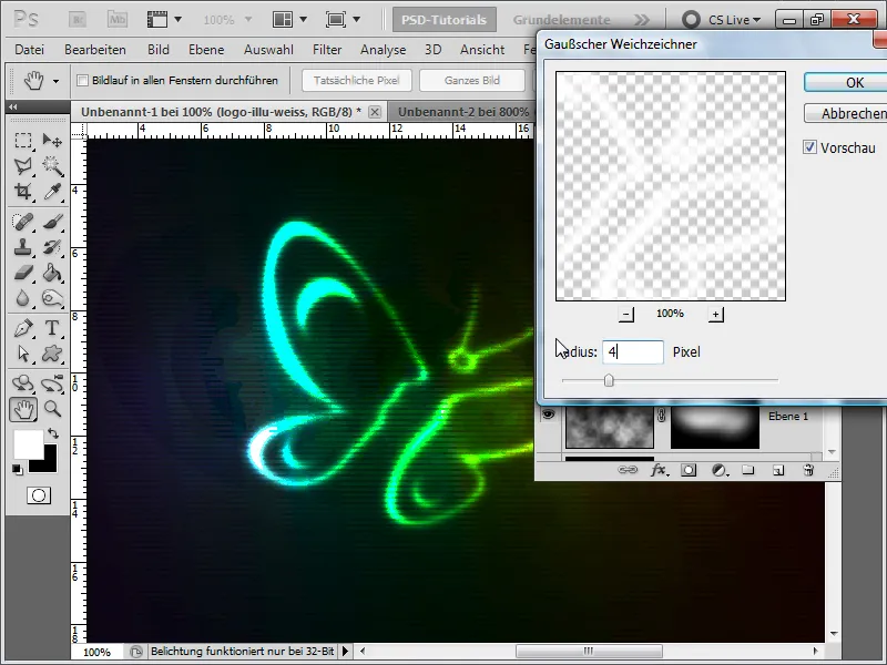
Step 12:
The result looks pretty good already, but I'm not quite happy with the gradient in the background. Why is that? By default, Photoshop works in 8-bit mode. However, this doesn't provide a wide range of colors.
Step 13:
That's why I now change the image to 16-bit channel mode under Image>Mode>16-Bit Channel, and now the gradient and colors look much better. Unfortunately, not all filters work in this mode.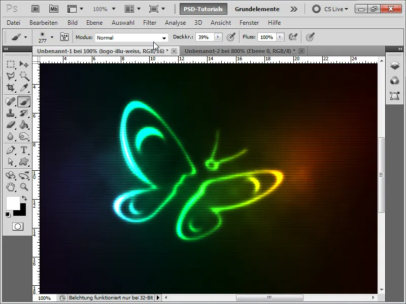
Step 14:
If I now write a text in white color, convert it into a Smart Object, and then simply duplicate the Gaussian Blur of the logo layer by holding down the Alt key, the result looks like this: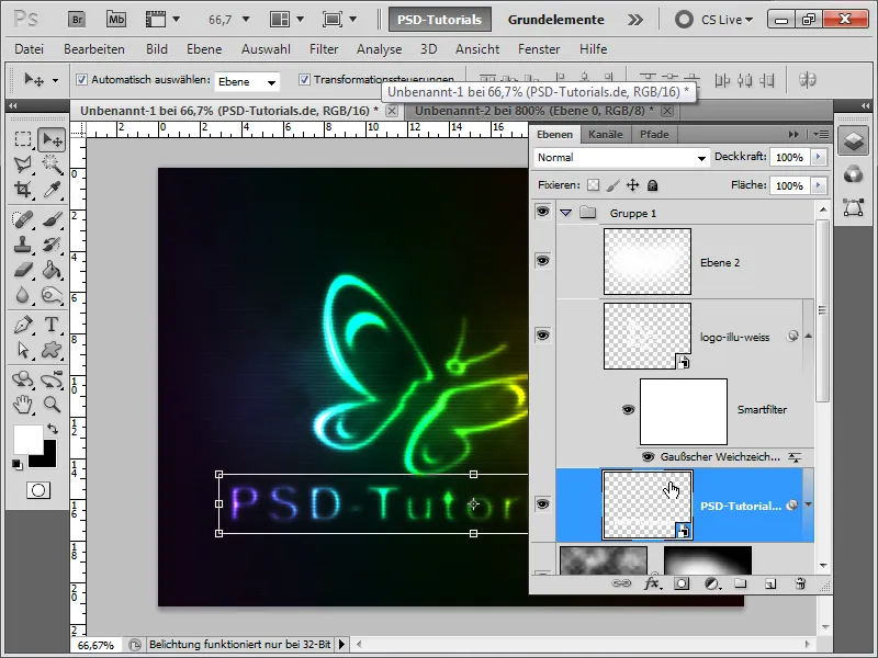
Step 15:
If I set the Gaussian Blur to e.g. 2 pixels Radius, more of the text can be seen.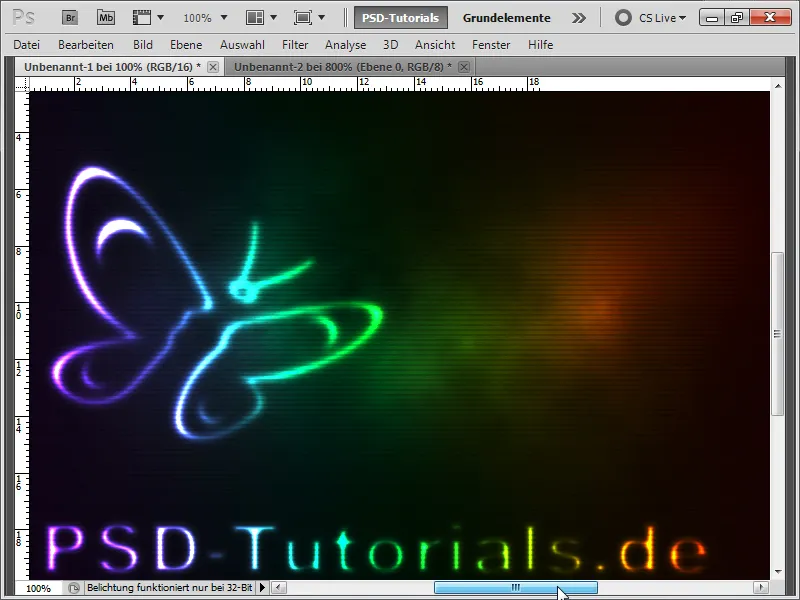
Step 16:
The brilliant thing is that I can change the Gradient Overlay at any time if I want to achieve a completely different color result.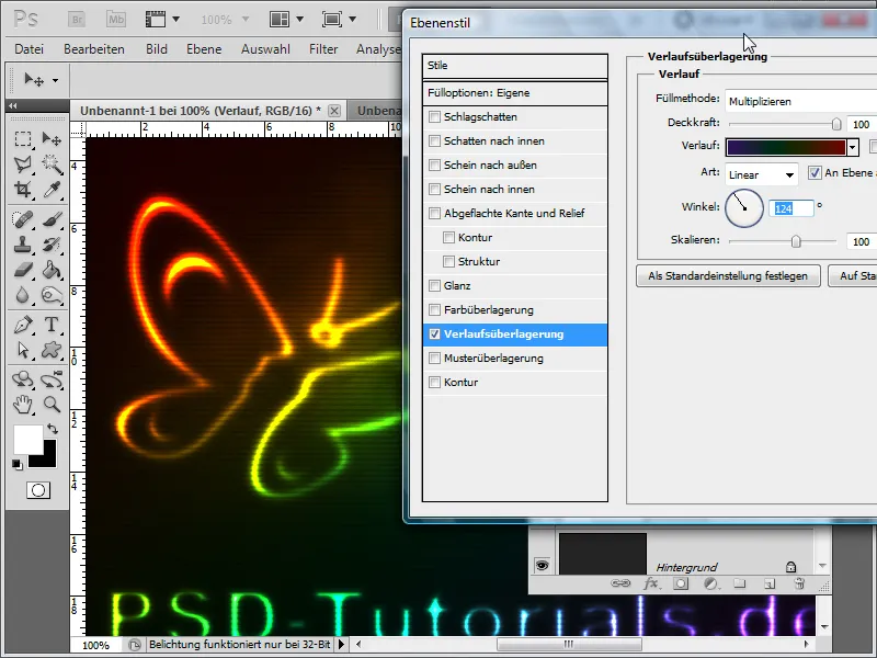
Step 17:
At the end of the workshop, I would like to explain how to change the lines so that they adapt to the logo. To do this, I have to switch back to 8-bit mode first. Now I simply duplicate my logo in the layers panel with the right mouse button, but as a new document. Then I will add a layer below, fill it with black, and finally reduce it to a background layer. Now all I have to do is save this document as a PSD file.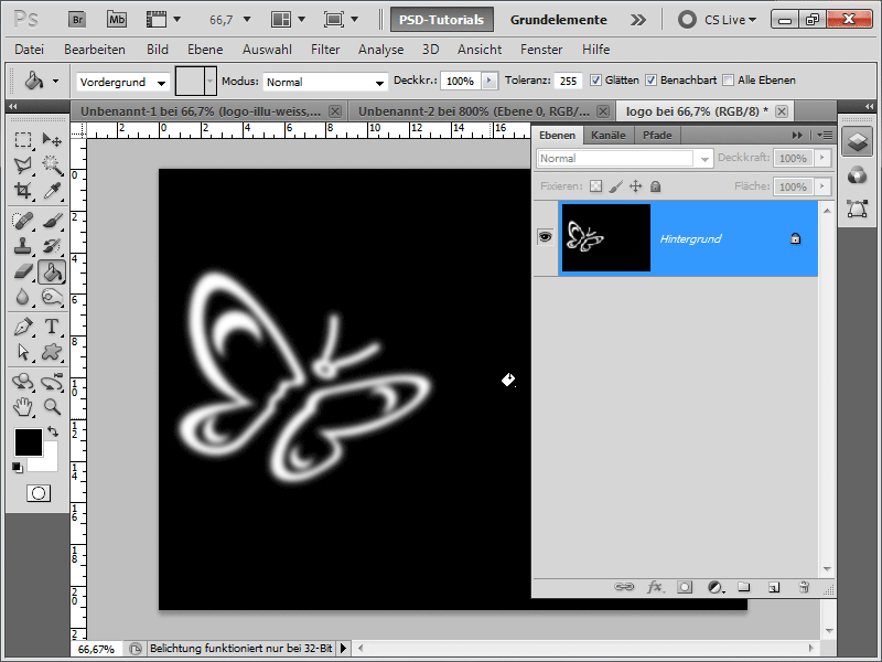
Step 18:
Now I go back and apply the Offset Filter on my lines layer (located in Menu>Filter>Distort>Offset). After confirming the values, a dialog to open a PSD file will appear. I choose the previously saved file.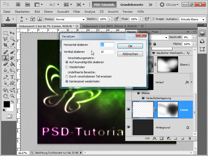
Step 19:
And I already have the following result after setting the mode back to 16 Bit.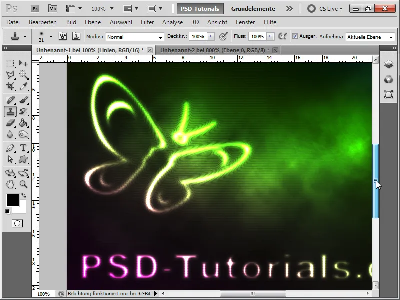
Step 20:
If I adjust the gradient again, my effect looks like this:
