Typography is the heart of every professional layout, and Adobe InDesign provides you with powerful tools to creatively and precisely design texts. From selecting suitable fonts to creating character and paragraph styles, as well as working with text wrap, tab stops, and typographic nuances - InDesign allows you to perfectly showcase your texts. In this guide, I'll show you the main features and tips for implementing professional typography in your projects. Let's get started and enhance your layouts with appealing typography!
1. Text Formatting
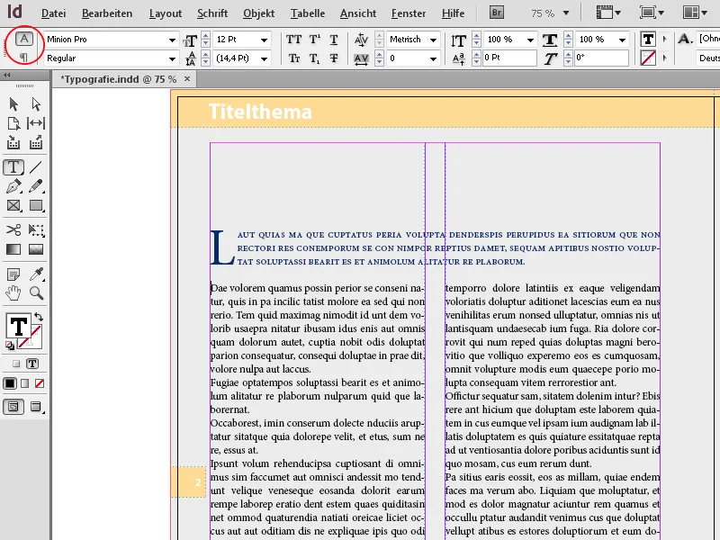
To enter text, start by drawing a frame with the text tool. You can then immediately start typing. The control palette displays the controls necessary for text formatting. On the left side, you can switch between character and paragraph formatting. On larger monitors, both areas will be displayed side by side.
By clicking on the small arrow in the fonts field, you can see the installed fonts and choose a different font for the selected text. Whenever possible, opt for OpenType fonts, which offer various advantages for typographic design such as cursive fonts, different number formats, and discretionary ligatures over TrueType fonts and can handle larger character sets thanks to Unicode.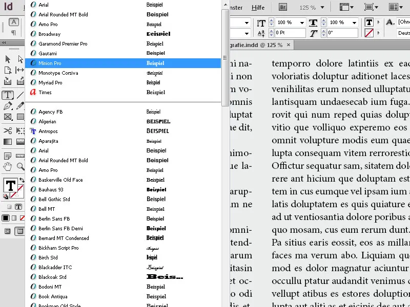
Beneath that, the font styles belonging to the font family like Light, Semibold, Condensed, etc. are listed.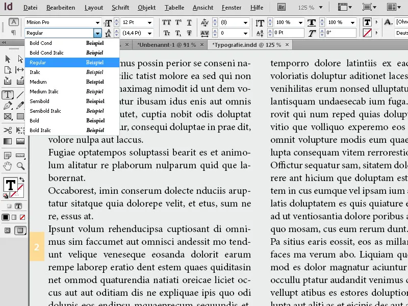
In addition to fields for font size and line spacing, where you can input custom values, even in different units (e.g., InDesign automatically converts a measurement in mm to points), there are buttons for formatting in uppercase or small caps, superscript or subscript, or underlining.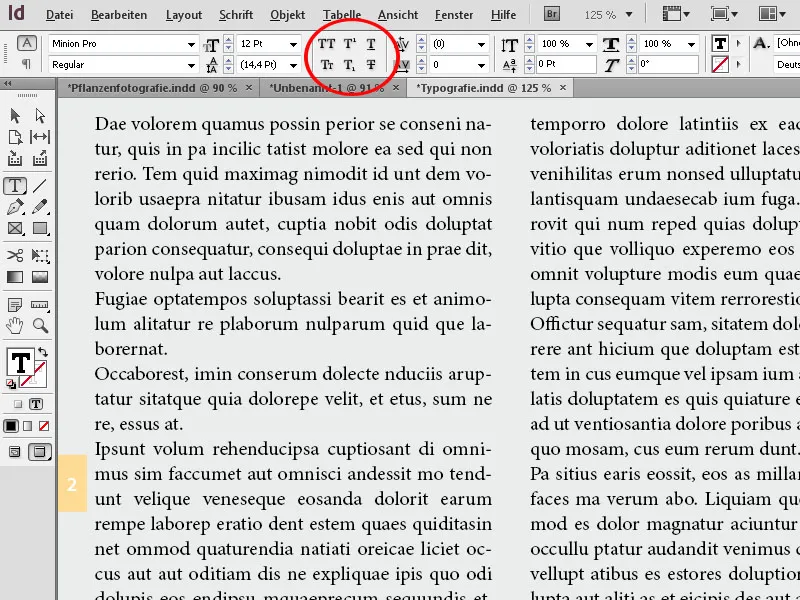
In the kerning field, you initially differentiate between optical and metric kerning. Metric kerning uses the spacings intended by the typographer between different letter pairs to achieve the best possible font appearance.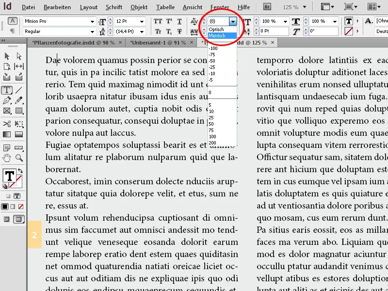
Optical kerning may yield better results when using different adjacent fonts.
On the other hand, tracking adjusts whole sentences or paragraphs to fit into a specific area. Assigning colors for the font and its outline can also be done directly in the control palette. Clicking on the corresponding buttons opens a list of color fields, from which you can select the desired color with a click, or create a new color using the button at the bottom of the palette.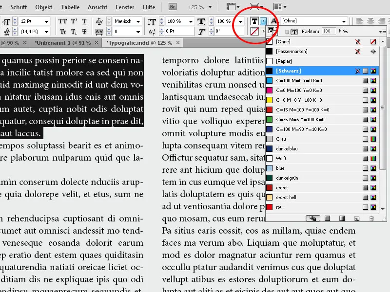
For spell checking, you can set the corresponding dictionary to the right. InDesign offers a wide range of languages from old German spelling to modern including intermediate steps through English and French.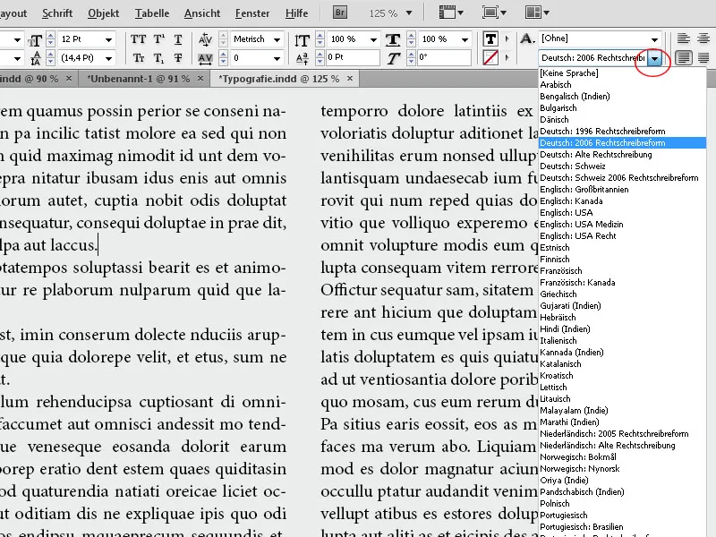
2. Paragraph Formatting
For formatting paragraphs, there is a button at the lower left corner of the control palette to switch to the view of relevant controls.
Here, you can adjust alignment such as left or right-justified, centered, or justified as well as along the spine, i.e., based on the position on a left or right page in a brochure. You can also set the indent from the left or right edge, the spacing before and after a paragraph, and the number of lines a drop cap should span.
In addition to the buttons for assigning bullet points, hyphenation can be turned on or off via checkbox.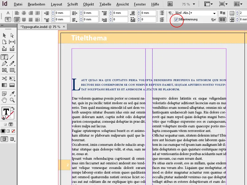
An important function for professional typesetting is the ability to align to the baseline grid. This ensures that lines on the front and back sides in print align precisely, enhancing readability.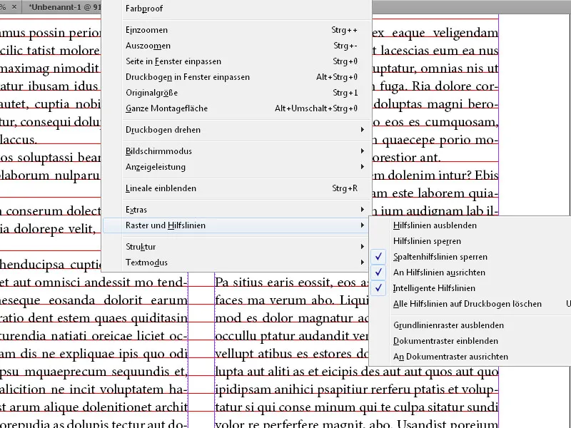
To do this, you need to make the baseline grid visible first via the menu View>Grids & Guides>Show Baseline Grid (or the shortcut Ctrl+Alt+ß). In the preferences, you can precisely specify the line spacing for the baseline grid. By clicking on the corresponding button in the control palette, the active paragraph will align or detach from it. Both the font size and line spacing play a role.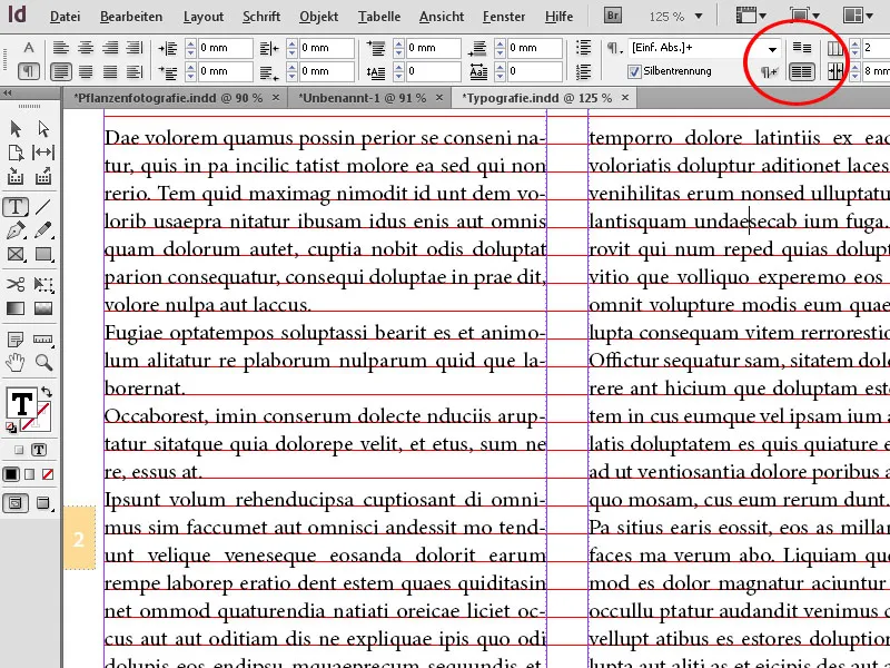
Lastly, you can adjust the number of columns for the text along with the associated spacing. From the drop-down list for the column span, you can choose whether the active paragraph should flow across two or more columns or all columns, which may be necessary for a heading, or whether it should be split within a single column.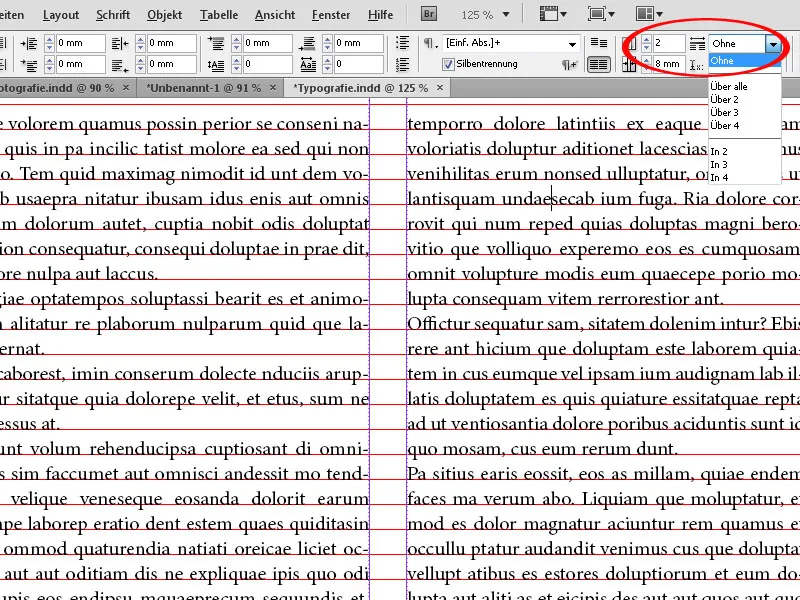
To align text within the text frame along the vertical axis (by default, alignment is at the top edge), you must select the frame itself using the Direct Selection tool.
The Control panel will now display context-specific input fields and buttons for aligning vertically at the top, bottom, or center. Even horizontal justification is possible, where the line spacing becomes so large that the text is evenly distributed over the entire height up to the top and bottom edges of the frame.
This type of formatting for characters and paragraphs is recommended only for smaller and manageable documents such as a flyer or poster. For larger files, it is more practical to create character and paragraph styles, which can then be uniformly formatted with a click for the relevant text passages.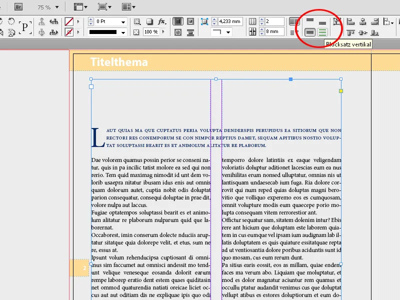
3. OpenType Font Attributes
If texts contain special characters, especially from other languages, or if ligatures or swash fonts are to be used for a more beautiful typography, for example in a heading, you can utilize the OpenType formatting options in InDesign. However, the chosen font must provide these features, which is not the case for all fonts. The Minion Pro font offers a wide range of possibilities.
Aside from a multitude of glyphs for displaying foreign characters, here you can also select swash characters with alternative uppercase letters and word-end marks under the Type Style Italic through the OpenType entry in the Control panel. The additional option of Conditional Ligatures creates interesting connections between individual letters.
It is worth mentioning the possibility of formatting numbers as Medieval Numbers for traditional text without uppercase letters.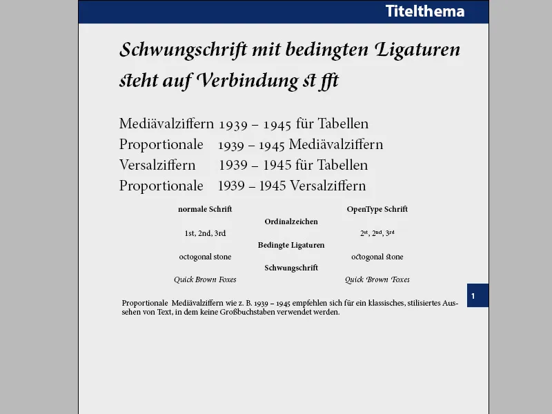
Assigning OpenType font attributes to the selected text is done through the menu in the Control panel, which you access via a small icon at its right edge.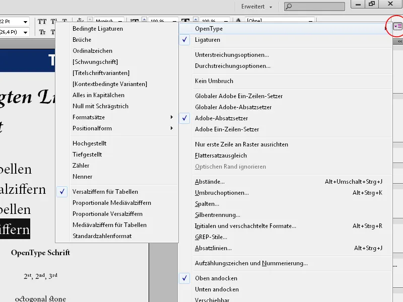
4. Text Frame Options
To align text within its frame, you bring up the dialog with the Text Frame Options by right-clicking or using the shortcut Ctrl+B.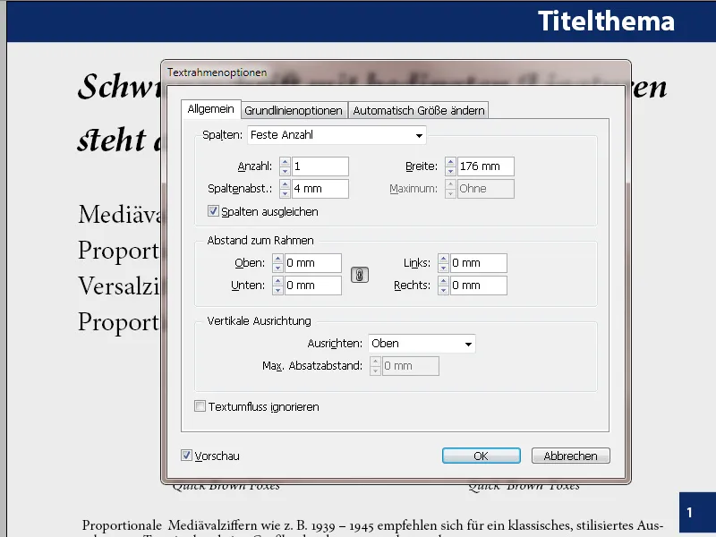
Here you can set the distance from the frame evenly or differently, adjust the number of columns and the size of the column gap, as well as the Vertical Alignment (top, bottom, or in vertical justification).
If you use columns, the Balance Columns option distributes the text evenly across the columns so that they have the same number of lines of text.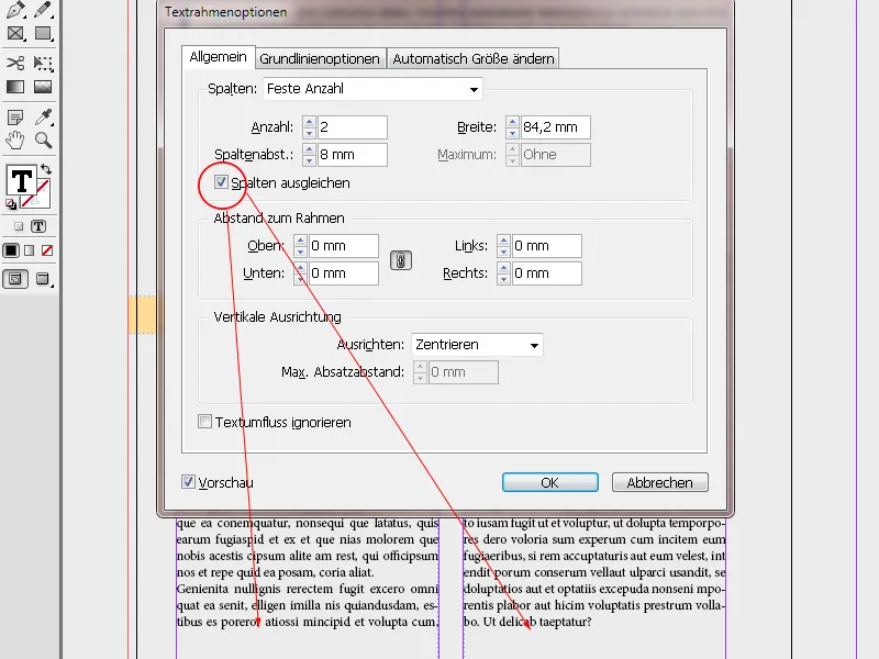
On the Baseline Options tab, you can set an offset distance to the baseline or to the upper text frame depending on the reference point such as Cap Height, Capital Height (uppercase letter height) or X-Height (the top edge of the letter x in a font touches the top offset of the frame). This can be especially useful for one-line text frames to create an optically centered impression in terms of height.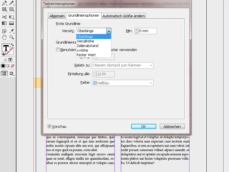
A new addition in InDesign CS6 is the Auto-Size tab. By selecting this helpful function, the text box adjusts according to the text amount settings.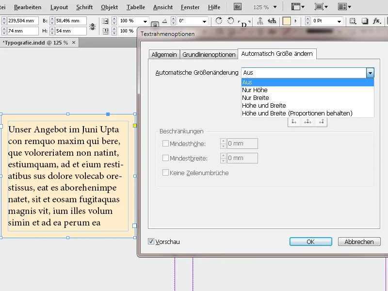
In the Auto-Sizing section, you determine whether only the height or width or both dimensions should adapt to the text. Below that, similar to the Control panel, you choose the reference point. Depending on the setting, you can also specify a Minimum Height or Width.
Now the text box adjusts to changes in text amount, preventing overflow text.
You can create an object style for these settings and apply them to the text boxes with a click (more on this in the tutorial "Applying Effects to Objects in InDesign").
A new feature in InDesign CS6 is the Place and Link under the Edit menu. This opens the Content Placing Tool. If you want to place a text box with the same content in different areas of the layout, this method is recommended. The advantage is that changes to the text in the original text box will also be shown in the other linked boxes with a small warning signal.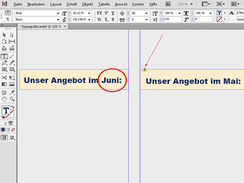
After clicking with the Selection tool on the text frame, the content updates.
Finally, you can set the shape of the corners of the text frame via the Object>Corner Options menu. The text frame must be selected with the Selection tool. Each corner can be adjusted separately; with preview activated, you can immediately evaluate the result.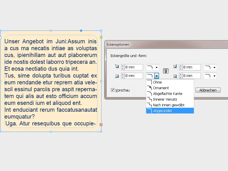
5. Path Text
With the Type on a Path tool, you can run text along self-created vector paths. You can create these paths using tools like the Ellipse tool or the Pen tool. The tool can be found in the Tools panel by clicking and holding the Type tool (Shortcut Shift+T).
Click on the created path and enter text. It will now run along the outline.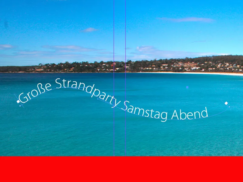
To align, you can use the paragraph formatting options in the control palette. However, you can also intuitively move the column boundary at the left and right end of the path text by holding down the mouse button using the direct selection tool (A).
You will find further adjustment options in the path text options of the context menu (select text>right-click>path text>options).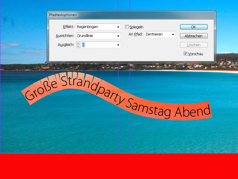
Here you can access various effects and influence the alignment of the text with the path.
To make the path itself, on which the text runs along, invisible, select it with the direct selection tool and set the outline thickness to 0 points in the control palette.


