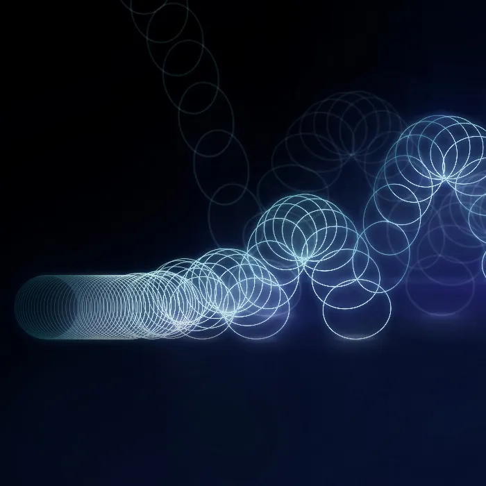
Swinging movements are very often in demand and very often needed. In every type of infographics, motion graphics or even character animation, there is always something with waving, swinging, falling etc..
What all actions have in common is that we have a trigger somewhere. In the case of the swinging arm, for example, our shoulder is the trigger and this swing is transmitted through the arm.
In the example, I have now created four folding signs that are attached to each other with chains. When I let go of the top one, I want the rest to swing nicely.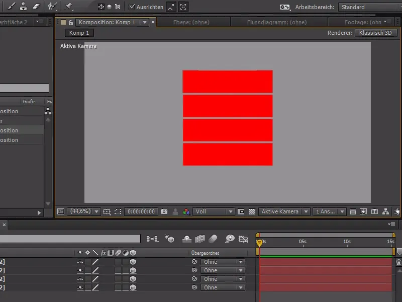
To do this, I hide all the red areas at the beginning, except for the top one, and start animating them. These are four 3D planes, so we can simply use the X rotation to make the whole thing swing nicely.
I start where you can hardly see anything of the plane - at +90°.
.webp?tutkfid=84365)
Then we go a little further with the Tim cursor and use the X rotation to go beyond the 0 degree limit at around -40°.
We repeat this with smaller values until the pendulum movement is over. At the end, we should also play with really small values so that the movement is perfect at the end.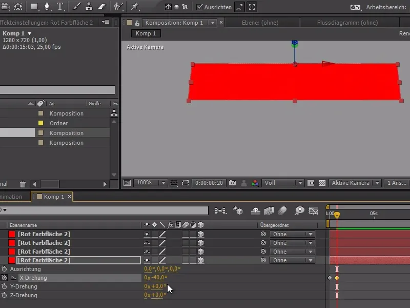
The curve should look something like this at the end: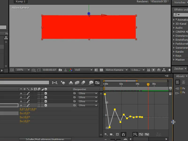
Now it's time to make the curve look nicer: We mark all the points and do an Easy Ease first to give the curves nicer curves. With a slow-in and slow-out - these are the Disney rules - we achieve the dynamic movement.
The movement is just a bit too slow for me now, so I "tighten" it up a bit and play the movement faster.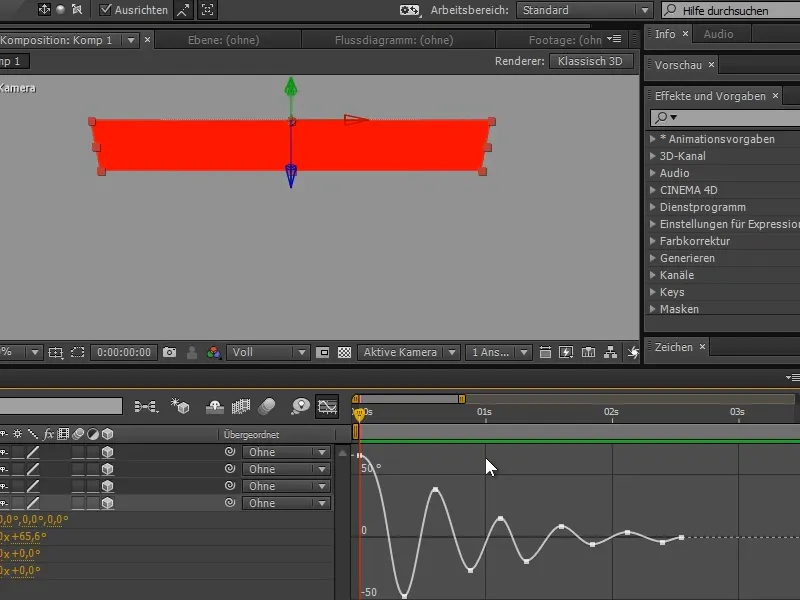
I can now show the other red areas again and "parent" them to the lower level.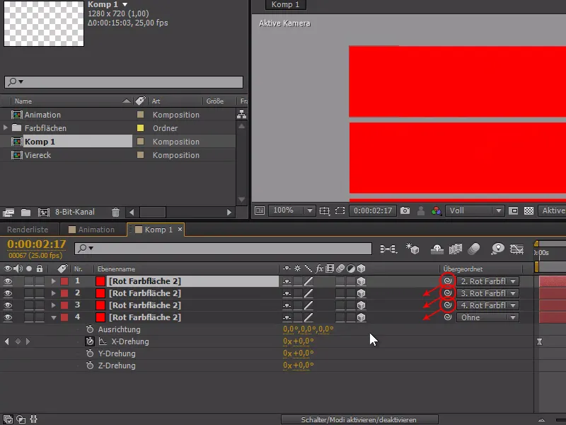
And now comes the real quick tip:
I copy the X rotation and paste it to the other colored areas. When I look at the preview: ... It oscillates, but the whole thing doesn't look very dynamic..webp?tutkfid=84370)
I can now use the U key to display the keyframes everywhere. This makes it a lot easier to select all the keyframes from one area and move them back a little. It certainly makes sense to load everything in beforehand.
This makes the pendulum movement much smoother.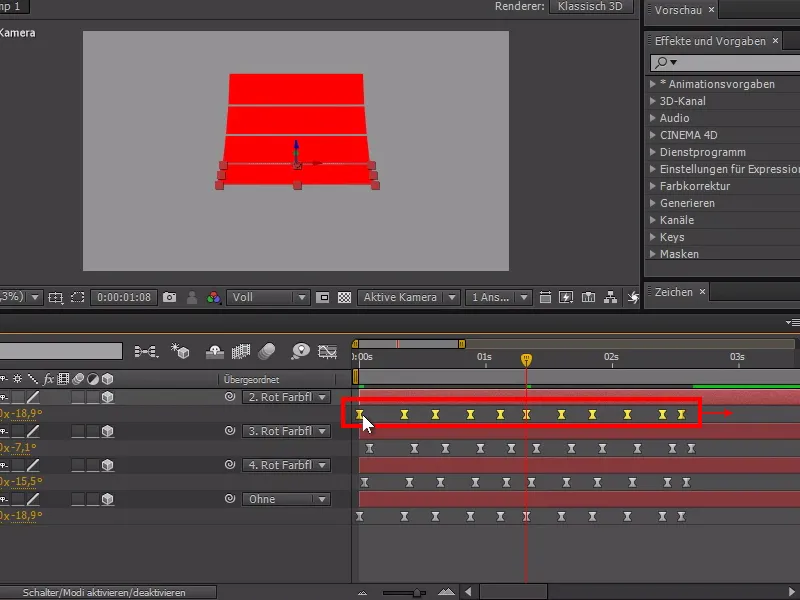
To make everything easier to see, we can now add a light source via Layer>New>Light....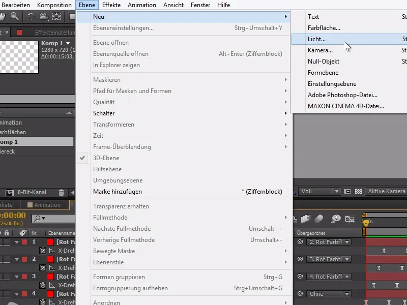
In the example, we opt for the parallel light type with an intensity of 100%.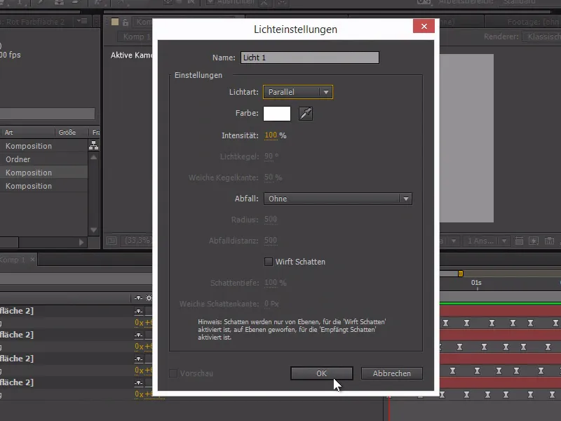
Now the pendulum looks much better and the movement is much easier to recognize.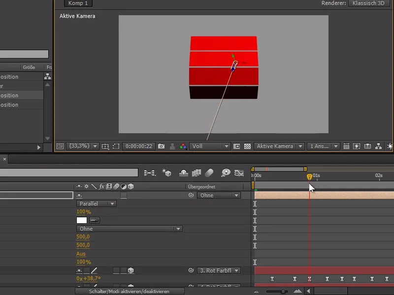
The main trick is to move the subordinate animations slightly in such a chain - this makes the animations appear much more dynamic.
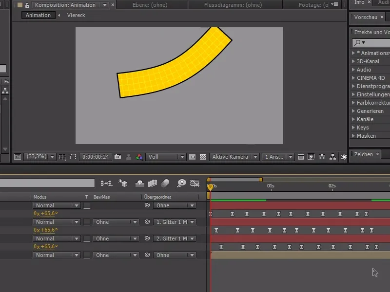
This also works very well with 2D objects. For example, if you add rotation to objects with the Puppet Tool and pinned null objects. If the keyframes of each point are also moved slightly here, the animation appears much more animated.
Again, I can recommend the video training to better understand the process.