In CSS, elements are always treated as rectangular boxes or strips. The following properties - which you are no doubt familiar with by now - are used to describe the boxes:
- width - the width of the element
- height - the height of the element
- left - distance to the left
- right - distance to the right
- top - distance to the top
- bottom - distance to the bottom
- margin - the outer margin
- border - the border around the element
- padding - the inner spacing, i.e. the distance from the frame to the element content
These properties have already been introduced.
The total width of an element is the sum of the width of the individual specifications. (The same also applies to the height).
Here is an example:
div#box { width: 100px; padding: 20px; /* each 20px left and right / border: 2px solid; / each 2px left and right / margin: 0 30px; / each 30px left and right */ }What is the width of this div area? Let's take a look at the individual values:
- 100 pixels
- 2 times 20 pixels
- 2 times 2 pixels
- 2 times 30 pixels
This results in a total width of the element of 204 pixels.
The width and height of elements are determined by width and height. If these specifications are not explicitly in the stylesheet, the following applies:
- If width is missing, the box is displayed as wide as the surrounding element.
- If height is missing, the element is displayed as high as its content.
An example:
<!DOCTYPE html> <html> <head> <meta charset="utf-8"> <title>PSD-Tutorials.de</title> <style> div#box { border: 1px solid; /* 2px left and right */ margin: 0 30px; /* 30px left and right */ background-color:#6600CC; } </style> </head> <body> <div id="box">PSD-Tutorials.en</div> </body> </html>
In the browser, it looks like this:
The parent element of the div element is body. Consequently, the element is actually displayed as wide as the body element. The height, however, is based on the content.
Everything to zero
Every browser has a built-in stylesheet. Some default values are defined in these stylesheets. This also applies to padding and margin, for example. And these default values unfortunately vary in different browsers. This aspect makes it difficult to achieve identical results in the respective browsers, e.g. in connection with the box model. It is therefore advisable to set the default browser margins to zero. This can be done as follows:
* { padding: 0; margin: 0; }
Insert this line at the beginning of your stylesheet. In this way, you can now start placing the boxes in the desired positions.
Box types
How an element is ultimately displayed and how it affects other elements depends on the type of element. In fact, the CSS specification distinguishes between block elements and inline elements. (There are other types, but these will be ignored here as they only play a subordinate role).
Block elements always create a new line. Subsequent elements also start in a new line. Typical block elements include p, div, h1, ul etc. The previously listed properties outer spacing, inner spacing, height, width and frame apply to these elements.
<h1>Digital Painting & Matte Painting: Defining image structure</h1> <p>Module 2 - Part 2: An image is always a whole. However, you always have to think about where the viewer should look first.</p> <p
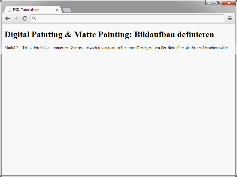
A look at the result in the browser shows that h1 and p each generate their own line.
Inline elements, on the other hand, do not create their own paragraph, but are displayed in the normal text flow. Typical inline elements are span, em, strong, img, br etc. No vertical spacing and no width and height specifications apply to inline elements.
<h1><em>Digital Painting & Matte Painting</em>: Defining image composition</h1> <p>Module 2 - Part two: <strong>An image is always a whole</strong>. However, you always have to think about where the viewer should look first</p>.
And here too, a look at the result:
You can now turn elements that are actually block elements into inline elements.
<!DOCTYPE html> <html> <head> <meta charset="utf-8"> <title>PSD-Tutorials.en</title> <style> h1 { background-color:#00CCFF; } </style> </head> <body> <h1>Digital Painting & Matte Painting</h1> <p>Module 2 - Part 2: <em>An image is always a whole</em>. However, you must always consider where the viewer should look first.</p> </body> </html>Look at the result in the browser.
The background color of the h1 heading indicates that the element spans the entire width. The width is based on the parent body element.
Now the display property comes into play.
<!DOCTYPE html> <html> <head> <meta charset="utf-8"> <title>PSD-Tutorials.en</title> <style> h1 { display:inline; background-color:#00CCFF; } </style> </head> <body> <h1>Digital Painting & Matte Painting</h1> <p>Module 2 - Part 2: <em>An image is always a whole</em>. However, you must always consider where the viewer should look first.</p> </body> </html>
The width of the element is changed by display: inline.
In fact, the element width now adapts to the existing content. Here is an overview of which values can still be assigned to display
- none - no display
- block - the element is displayed as a block element, i.e. creates a new line.
- inline - the element is displayed as an inline element, i.e. it appears in the current text flow.
- inline-block - creates an external block for which height, width and spacing can be specified. However, each element remains in the current text flow. It is therefore a combination of a block and an inline element.
- list-item - the element is displayed as a block element. However, it is also preceded by a bullet point.
- run-in - creates a block or inline element depending on the content.
- table - works like the table element known from HTML.
- inline-table - works like the HTML element table, but inline.
- table-row - the element contains child elements arranged next to each other. Works like the HTML element tr.
- table-cell - the element stands for a table cell and works like the two HTML elements th and td.
- table-row-group - the element contains an element group with several child elements arranged next to each other and has the same effect as the tbody HTML element.
- table-header-group - the element contains an element group with several child elements arranged next to each other and has the same effect as the thead HTML element.
- table-footer-group - the element contains an element group with several child elements arranged next to each other and has the same effect as the tfoot HTML element.
- table-column - this is used to describe the properties of the cells in a column. table-column works like the col element from HTML.
- table-column-group - this element contains a group of elements that are used to describe the properties of the cells in a column. It works like the HTML-colgroup element.
- table-caption - this is used to define the table caption. The property works like the HTML caption element.
CSS actually offers different display options for different element types. These play a decisive role in connection with the positioning of elements. More on this in the next tutorials.


