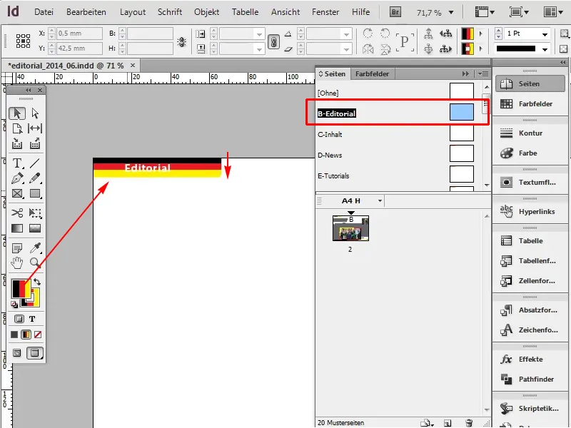
This trick is about using gradients that don't look like gradients at all. For example, I would prefer to have the editorial area in the German colors. So black, red, gold (yellow).
Here we go: Steps 1-12
Step 1
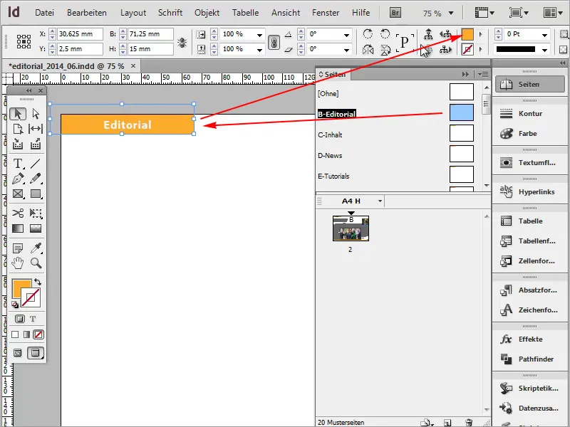
First, I go to my sample template to replace the current orange color.
Step 2
Next, I go to the gradients: Window>Color>Gradient.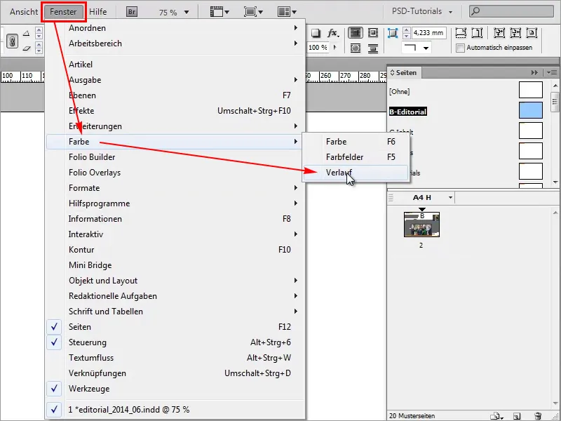
Step 3
Here I can create new gradients or influence them.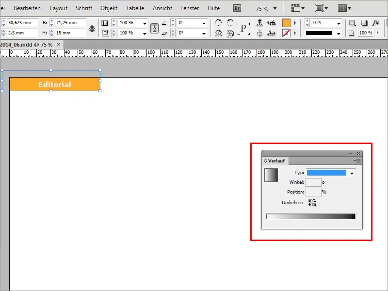
Step 4
The easiest way to do this is in my color swatches panel, where I can create a new gradient swatch.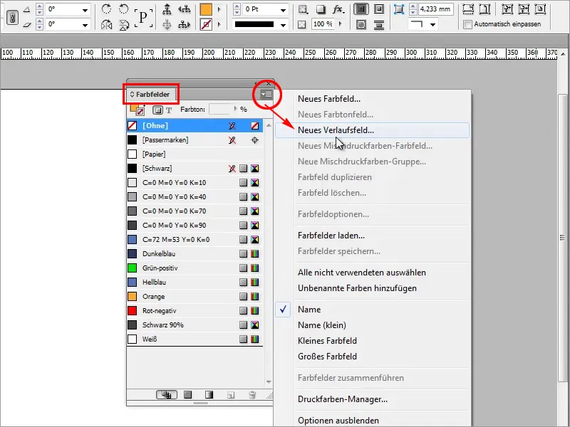
Step 5
I name the new grad ient field "Germany color" and start with black.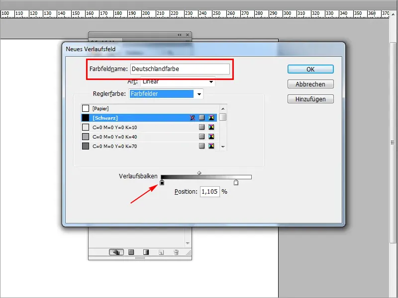
Step 6
Next, I need red. I can create this very quickly here. I create another color field by left-clicking below the gradient bar and then color it red.
- Cyan 0%
- Magenta 100%
- Yellow 100%
- Black 0%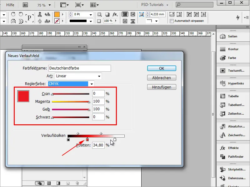
Step 7
Finally comes the color yellow.
- Cyan 0%
- Magenta 0%
- Yellow 100%
- Black 0%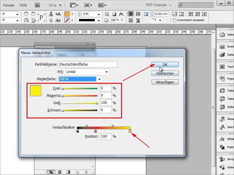
Step 8
I will apply the newly created gradient and now it already looks like a gradient.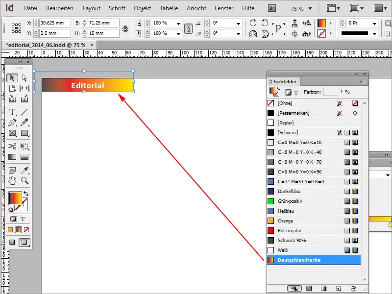
Step 9
But that's not what we want, because a Germany flag naturally doesn't look like a gradient. That's why we go back into the gradient and the trick here is to move the color buckets directly to the next bucket.
- Position: 34.25%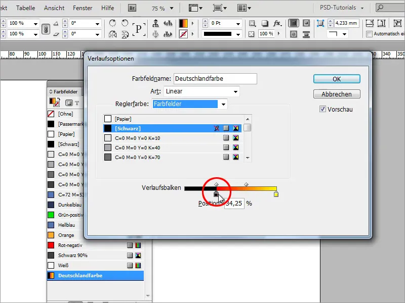
Step 10
I need the shade of red a second time and drag it to 66.29%.
- Position : 66.29%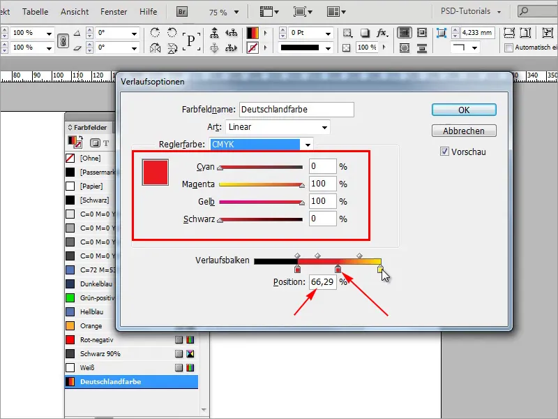
Step 11
I drag the yellow one right next to it.
- Position : 66.85%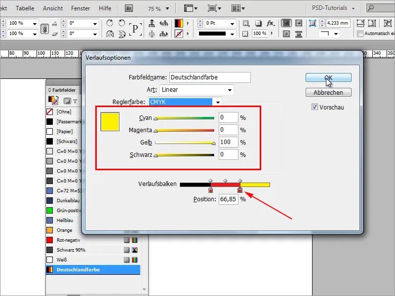
Step 12
I have now created my Germany flag in no time at all. If I now go back to my editorial page, I can see the Germany flag.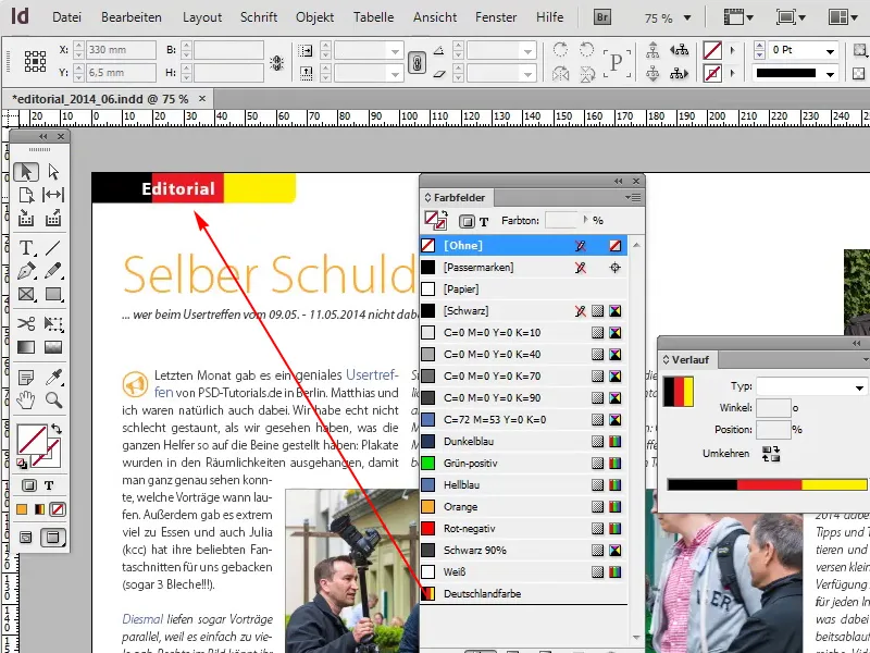
Steps 13-24
Step 13
I can also use this here below.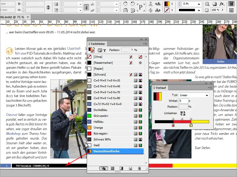
Step 14
But there's still a small gradient here, I didn't do a very clean job, I'll have to take another close look.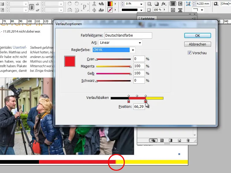
Step 15
Now it's perfect.
- Position: 67.40%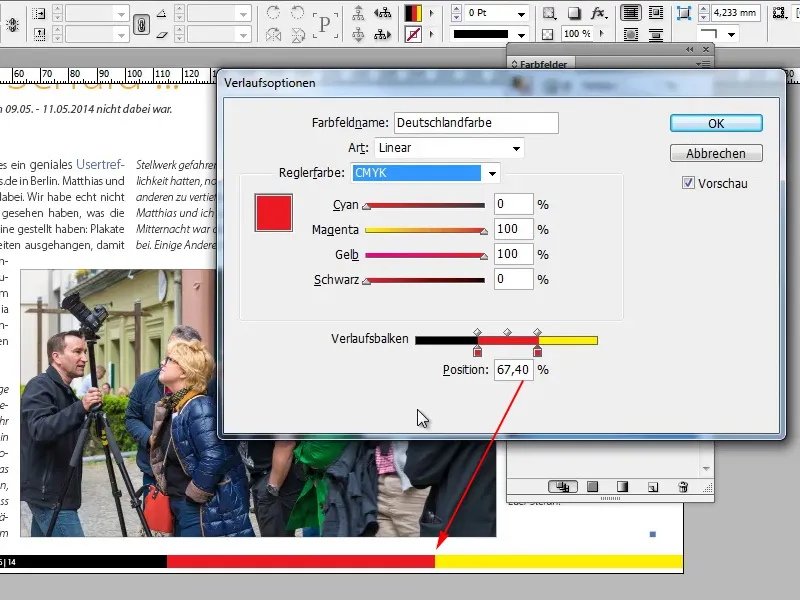
Step 16
I can now create areas with different colors very quickly with a gradient without having to draw three objects first. This helps immensely and saves a lot of work. It would be inconvenient if I had to draw an object on the pattern page first.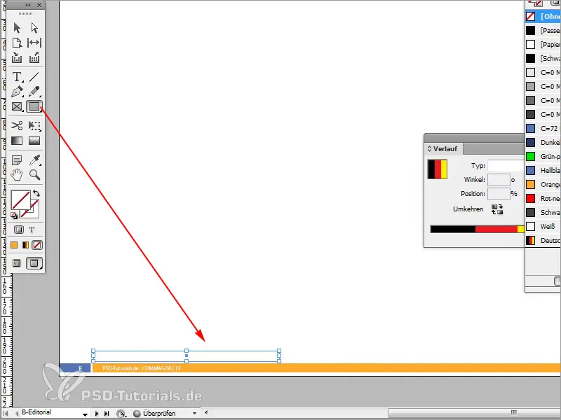
Step 17
Then I color it black accordingly. I can color the next object red by copying it with the Alt+key.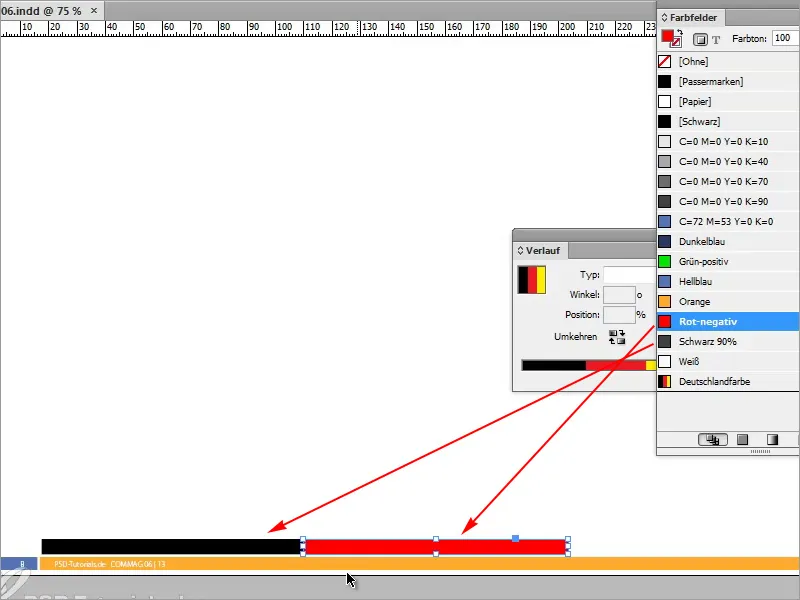
Step 18
I don't have yellow and have to create a new color first.
- Cyan 0%
- Magenta 0%
- Yellow 96.75%
- Black 0%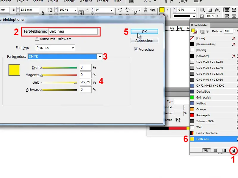
Step 19
Of course, we could also create the Germany flag in the same way. This method is very inflexible, because we would have to create new objects each time, and that is not the purpose of the whole thing.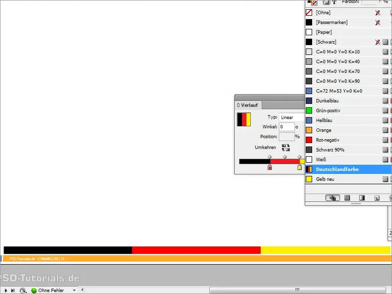
Step 20
So my tip: Simply create a gradient and use it with several colors. You can then use this gradient on contours, for example, if I have this picture and say I would like to have a contour of 9 pt on it.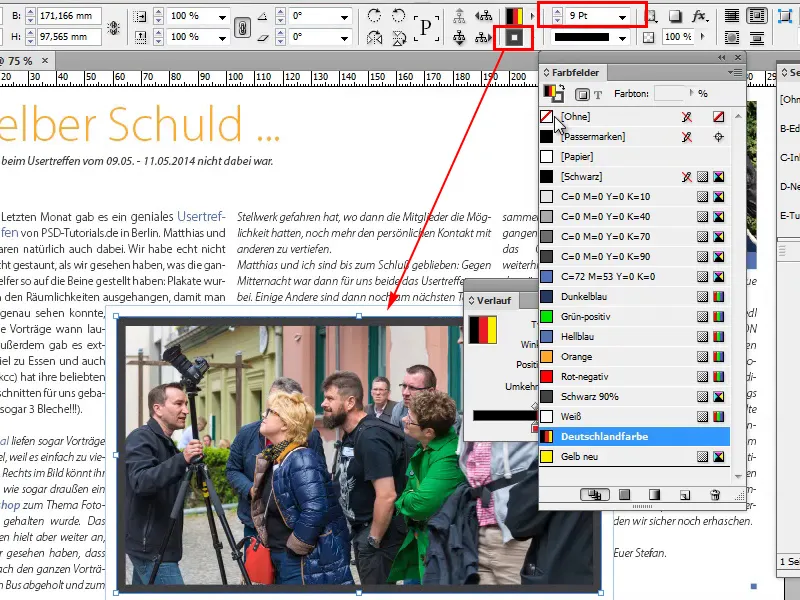
Step 21
If I now exchange the area and the outline with the small arrow, then I have the Germany color as an outline and that works really wonderfully with gradients.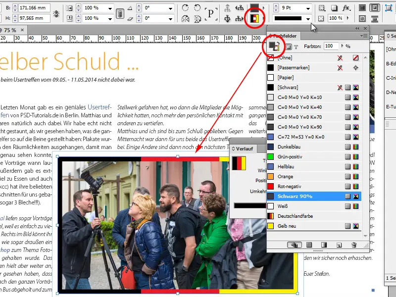
Step 22
This also applies to paragraph lines, format lines and so on and so forth. There are almost endless possibilities for using this gradient.
If you don't want the gradient to be so straight, you can use the gradient color field tool and influence it the way you want it.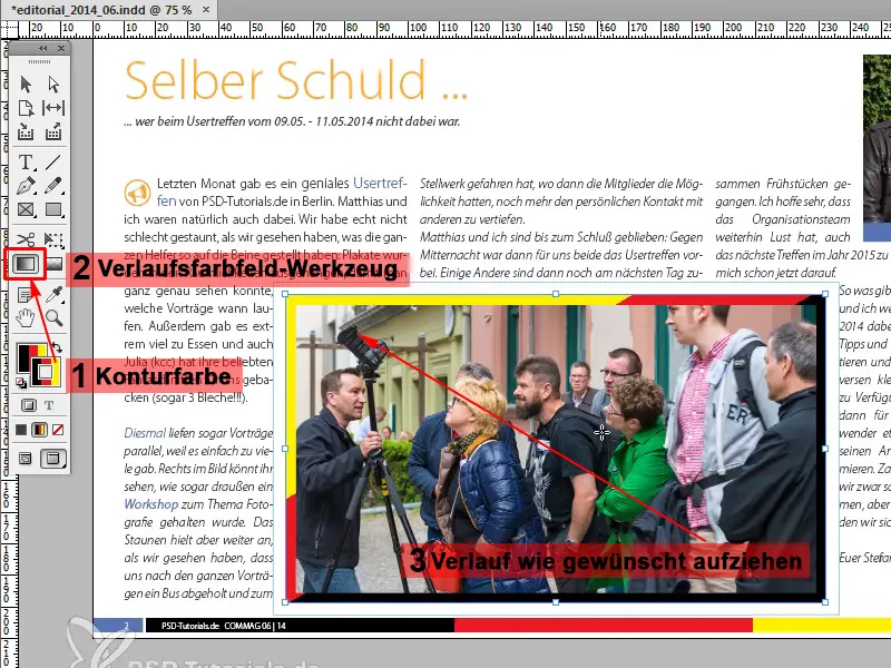
Step 23
The good thing about this is that they are very clean vector lines. To illustrate this, I zoomed into the image with the magnifying glass and saw smooth lines. Perfect!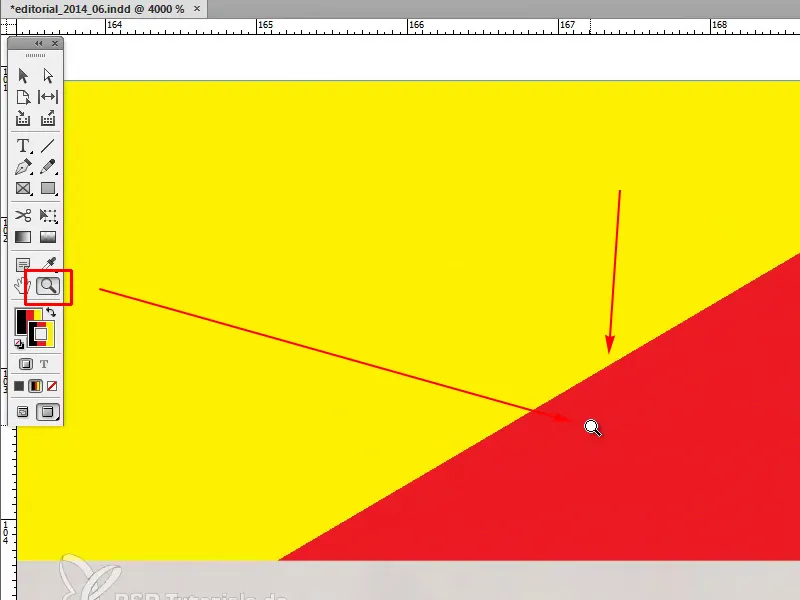
Step 24
But if you want to have the correct German flag in the editorial, then we have to go back to the sample page, click on the flag and drag the gradient from top to bottom with the gradient color field tool while holding down the Shift key. You have to try it out until it fits perfectly or you like it the way you want it.