Floating is one of the key CSS concepts. Without understanding this principle, websites cannot be created based on CSS. Floating can be translated as flowing, which gets to the heart of the matter. Ultimately, floating means that an element is positioned to the left or right of another element. (Normally, the element would be below another element).
A first example should clarify this aspect.
<p><img src="bild.jpg" /> This set contains 12 custom shapes that you can use in your flyers, backgrounds, etc. The shapes are divided into 18, 21 and 24 stripes as well as different beam widths. These presets are a good basis for beautiful effects in your layouts and images.
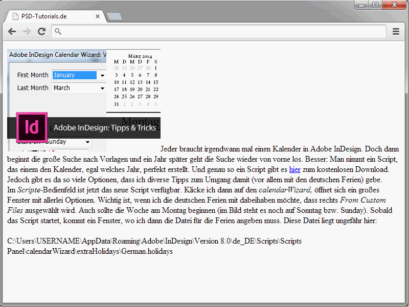
A paragraph has been defined here. Within this paragraph there is an image and normal text.

A look at the result shows that the image is in the text flow.
Now the float property comes into play.
img { float: left;}
Again, take a look at the result.
Here the image has been floated. The text flows around the image.
You can assign the values left and right to the float property to make the element "float" to the left(float: left) or right(float: right).
You can also apply float: right to the image.
In this case, three things happen:
- The graphic is taken out of the normal flow.
- It moves to the top of the p element.
- It is displayed as far to the right as possible.
A look at the results so far makes it clear that this doesn't look very pretty yet. In fact, the spacing between the image and the surrounding text is missing. Adjust the syntax as follows:
img { float: left; margin-right: 20px; }
A right margin of 20 pixels has been assigned to the image. This results in the following view:
Simply experiment a little with the margin spacing here.
End the floating
Back to the image example. I extend the syntax with an additional text paragraph.
<p><img src="bild.jpg" />This set contains 12 custom shapes that you can use in your flyers, backgrounds, etc. The shapes are divided into 18, 21 and 24 stripes as well as different beam widths. These presets are a good basis for beautiful effects in your layouts and images.</p> <p>In this set you will find 12 custom shapes that you can use in your flyers, backgrounds etc.. The shapes are divided into 18, 21 and 24 stripes as well as different beam widths. These presets are a good basis for creating beautiful effects in your layouts and images.</p> <p
The result looks like this:
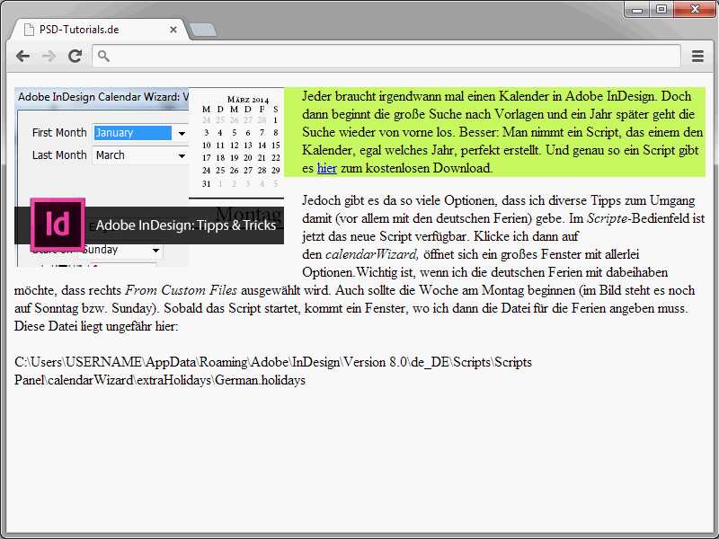
In fact, it's not just the first paragraph that flows around the graphic. The same applies to the second paragraph of text. This is simply because the graphic extends downwards beyond the first paragraph. For a better understanding, I will simply assign a background color to the paragraph containing the graphic.
If you look at the result, you will see that the graphic actually extends beyond the bottom of the paragraph. Of course, this is not always desirable in this form. This is where the clear property becomes interesting. This is because it can be used to stop floating. clear forces a subsequent element to actually start below a floated element and not next to it. The clear property has the following values:
- left - ends float : left
- right - ends float : right
- both - ends both float: right and float: left
In the following example, I assign clear: left to the second paragraph to end the float.
<!DOCTYPE html> <html lang="en"> <head> <title>PSD-Tutorials.en</title> <meta charset="UTF-8" /> <style> img { float: left; margin-right: 20px; } </style> </head> <body> <p style="background-color:#CCFF66;"><img src="image.jpg" />This set contains 12 custom shapes that you can use in your flyers, backgrounds, etc. The shapes are divided into 18, 21 and 24 stripes as well as different beam widths. These presets are a good basis for beautiful effects in your layouts and images.</p> <p style="clear:left;">This set contains 12 custom shapes that you can use in your flyers, backgrounds, etc. The shapes are divided into 18, 21 and 24 stripes as well as different beam widths. These presets are a good basis for beautiful effects in your layouts and images.</p> </body> </html>
With the syntax shown, the second paragraph is now actually displayed below the image.
In most cases, you can use clear: both instead of clear: left or clear: right. It is therefore advisable to simply create a corresponding class in your stylesheet, which you can then call up as required.
.clearing { clear: both; }
You can use this class whenever you want to stop floating an element.
<p class="clearing">Content ...</p>
What floating is good for
Of course, floating is not only needed for the text flow in connection with images. In fact, it forms the basic concept of CSS-based websites. Thanks to floating, multi-column layouts, for example, can be implemented very easily. Take a look at the following example:
<!DOCTYPE html> <html lang="en"> <head> <title>PSD-Tutorials.en</title> <meta charset="UTF-8" /> <style> #navi { float:left; width:12em; background-color:#99FFFF; } #content { margin-left: 14em; background-color: #FF3333; } </style> </head> <body> <div id="navi"> <ul> <li>Home page</li> <li>Contact</li> <li>Imprint</li> </ul> </div> <div id="content"> This is the content of the website.
 </div> </body> </html>
A two-column layout is created here. The special thing about this is that the columns are next to each other.
And this juxtaposition is realized via the floating concept. Detailed information on the structure of websites based on floating will follow in the rest of this series.


