This is what the finished wooden sign looks like: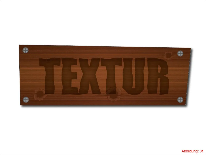
But enough talk ... Have fun with the tutorial ...
Step 1: Create a wooden board
Before we can start, you need to create a new work surface. You can do this via File>New in the top menu bar. If you've already read one or two of my tutorials, you'll know that I like to work with the landscape format A3 if there are no other specifications. So select DIN A3 in the following window and confirm with OK.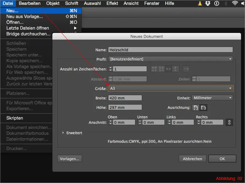
Now we can get started straight away.
Grab the pencil tool from the tool palette and draw the shape of a wooden board freehand. There are no limits to what you can do. You can keep it very simple by working with just four corner points (Figure 03).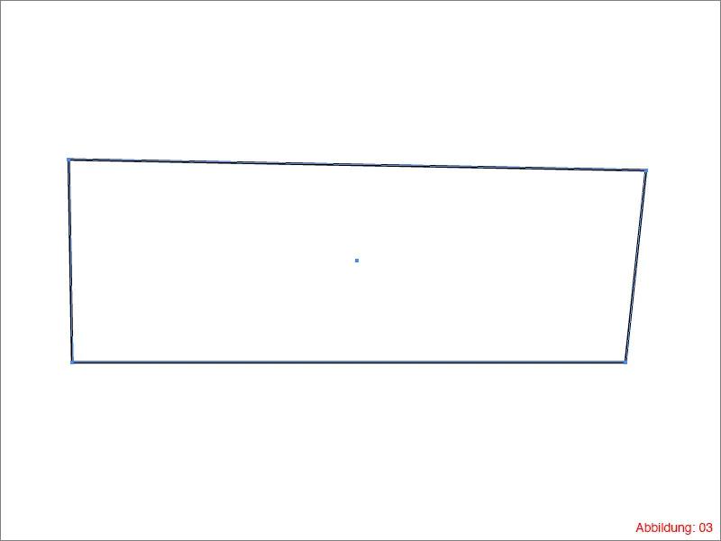
Or you can go the extra mile and make your board really frayed on the sides (Figure 04).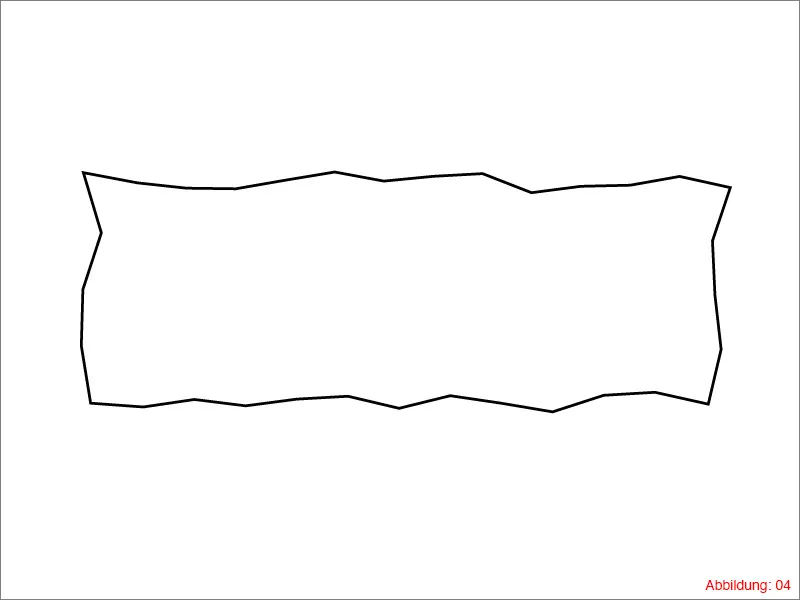
In the end, it's up to you which option you choose.
Next, you need to dye your wooden board a shade of brown. As such a wooden board does not usually have the same color everywhere, we will work with a linear gradient.
To create a gradient in Illustrator, you need the gradient palette. You can call this up via Window>Gradient (Figure 05).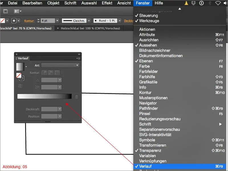
Once you have the gradient palette in front of you, click on the field with the default black/white gradient (Figure 06).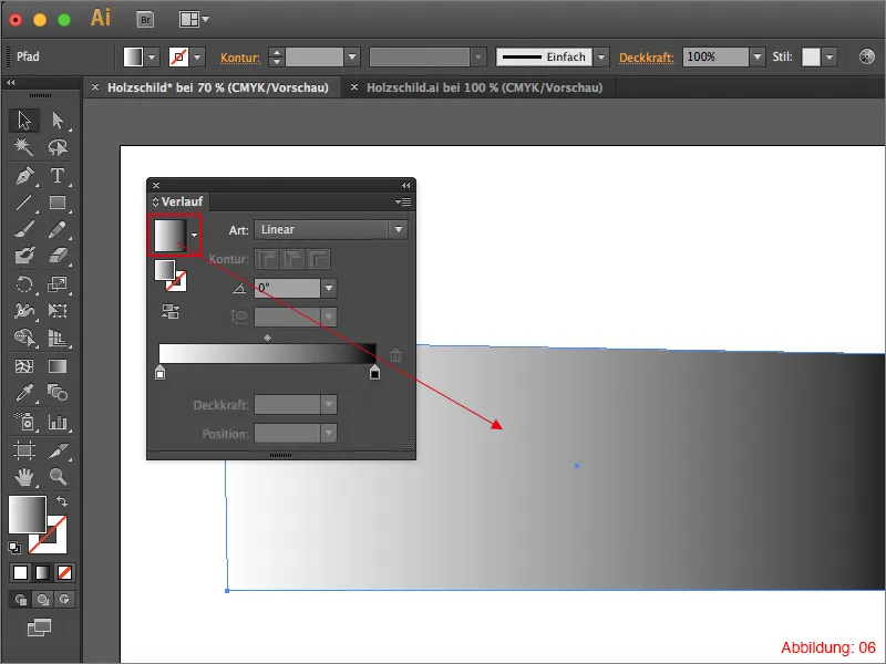
Next, you need to assign a third color to the gradient. To do this, simply click approximately in the middle under the gradient field (see marking in Figure 07).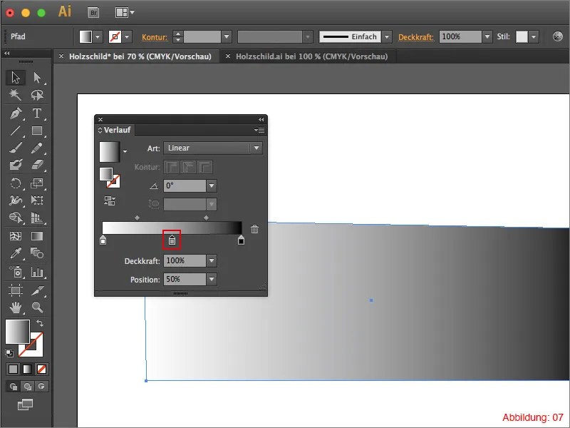
Now it's time to bring the color into play. For the gradient, you need a darker and a lighter shade of brown. As always, you are welcome to try out your own color variations. For all those who would like to use the same colors as here in the tutorial, I have the appropriate CMYK values here ...
- darker brown: CMYK - 14/73/95/50
- lighter brown: CMYK - 10/68/81/18
You can now assign these color values by double-clicking on the respective gradient color.
As the gradient should run from top to bottom, enter 90° for the angle (Figure 08).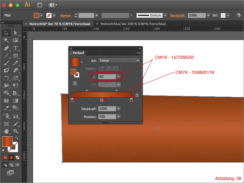
The whole thing should then look something like this (Figure 09):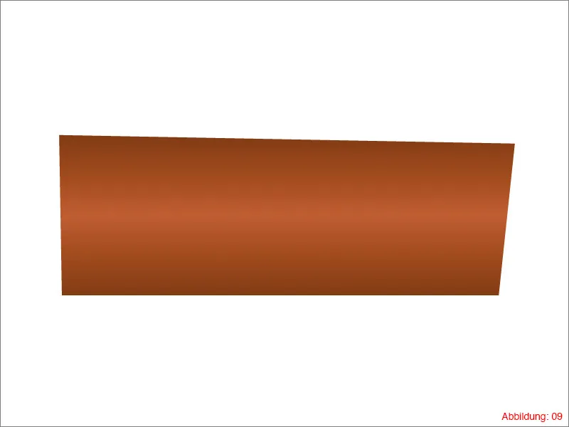
As a wooden board usually has a grain, our board doesn't really look like wood yet. Therefore, go to Effect>Structuring filter>Grain ... in the top menu bar (Figure 10).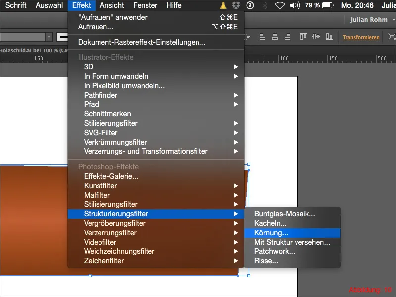
In the following window, set the Intensity to 20. Set the contrast to 5.
It is important that you select the Horizontal option for the grain type so that the grain really runs from left to right (see Figure 11).
Then confirm with OK.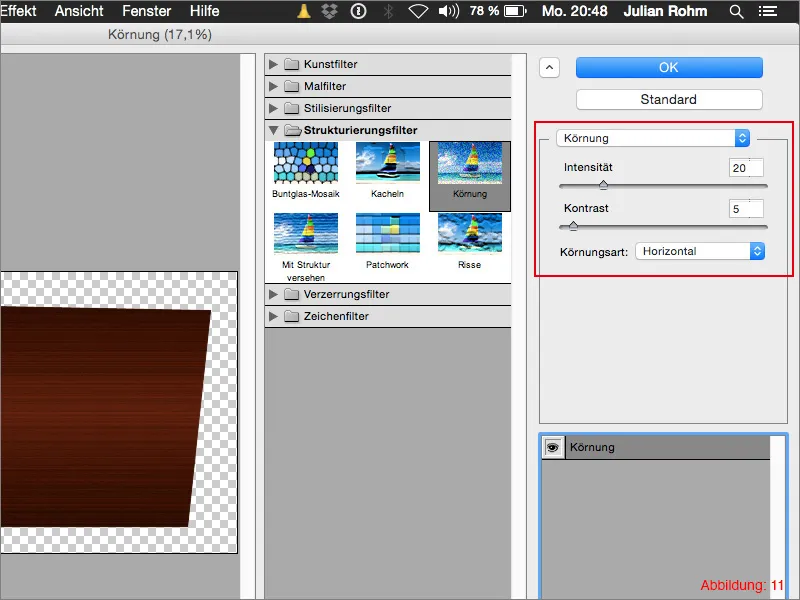
To give the whole thing a finishing touch, copy your wooden board with Command+C and paste it in the same place with Command+F (on the PC, use Ctrl+C and Ctrl+F).
As we do not need the grain effect for this copy, you can easily remove it using the Appearance palette (Figure 12).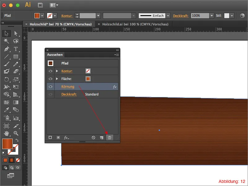
Set the gradient angle back to 0° and change the gradient colors back to black/white/black (Figure 13).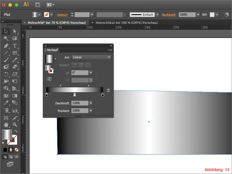
Next, you will need the transparency palette. If you have not yet shown it, you can find it via Window>Transparency.
Set your black/white/black gradient to the blend blend mode and reduce the opacity to 20%. This will darken your wooden sign slightly on the sides and lighten it in the middle. The whole thing then looks like a very subtle spot of light.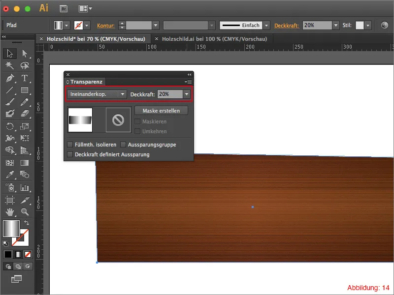
Step 2: Adding knotholes
To make your wooden board even more individual, we recommend adding a few knotholes.
To do this, use the ellipse tool and create an ellipse measuring 20x20mm.
Then go to Effect>Distortion and transformation filter>Roughen ... (Figure 15).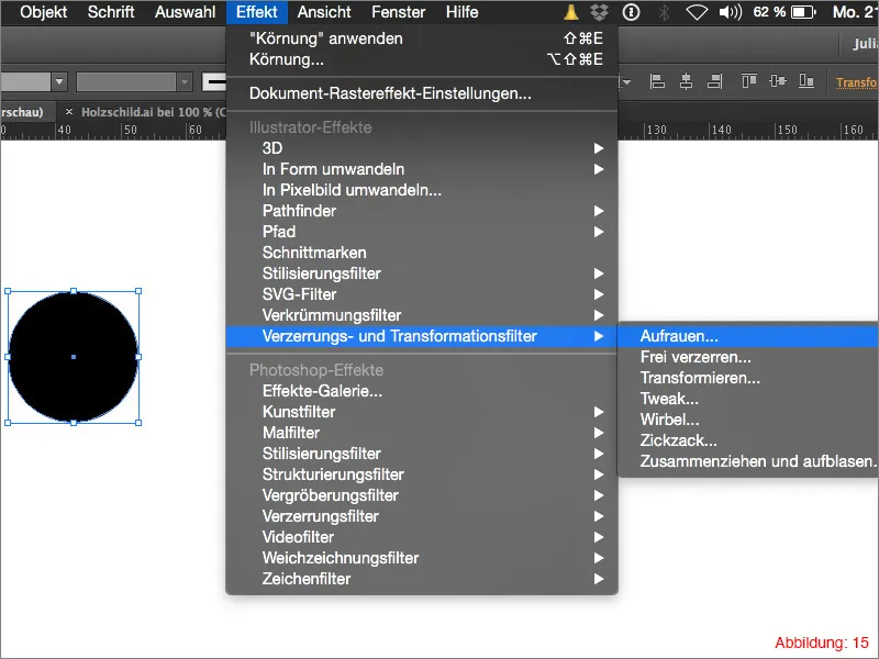
In the following window, you can set how much your ellipse should be roughened. In this case, select 10 for the size and a value of 15 for the details. Confirm with OK.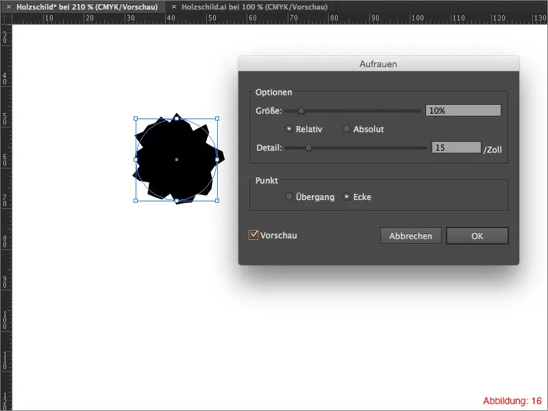
As the roughened ellipse is to be changed slightly, you must convert this effect into a path. To do this, go to Object>Convert appearance.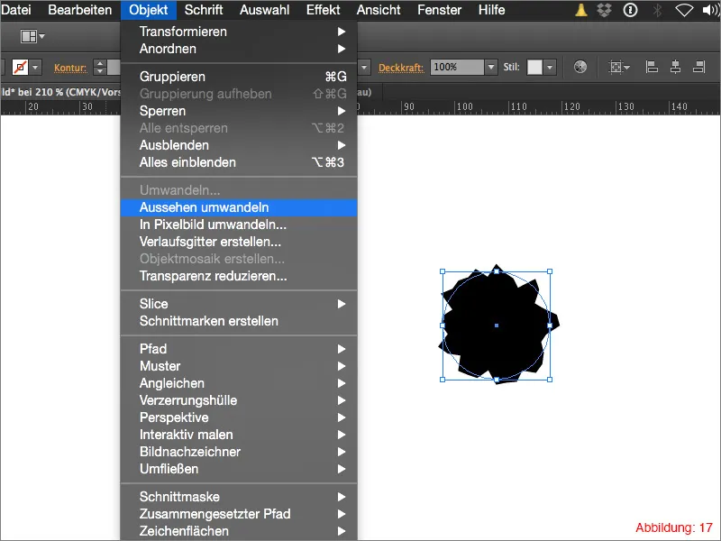
Now grab the direct selection tool and drag the two outer path points outwards as shown in Figure 18.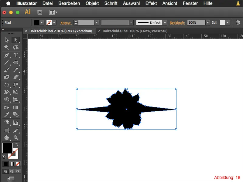
Fill your knothole with a light brown: CMYK - 15/73/96/50. Make a copy of it and paste it in the same place. (Command+C and Command+F). Reduce this copy a little and fill it with a slightly darker brown: CMYK - 21/74/94/59.
Now repeat the whole process and fill the last copy with a dark brown: CMYK - 39/75/89/73.
Your knothole should then look something like this (Figure 19):
Now select the three copies of your knothole and group them using the shortcut Command+G or Ctrl+G.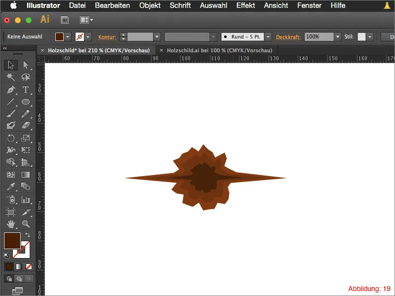
To give the knothole a certain depth, go to Effect>Stylize filter>Shine inwards ...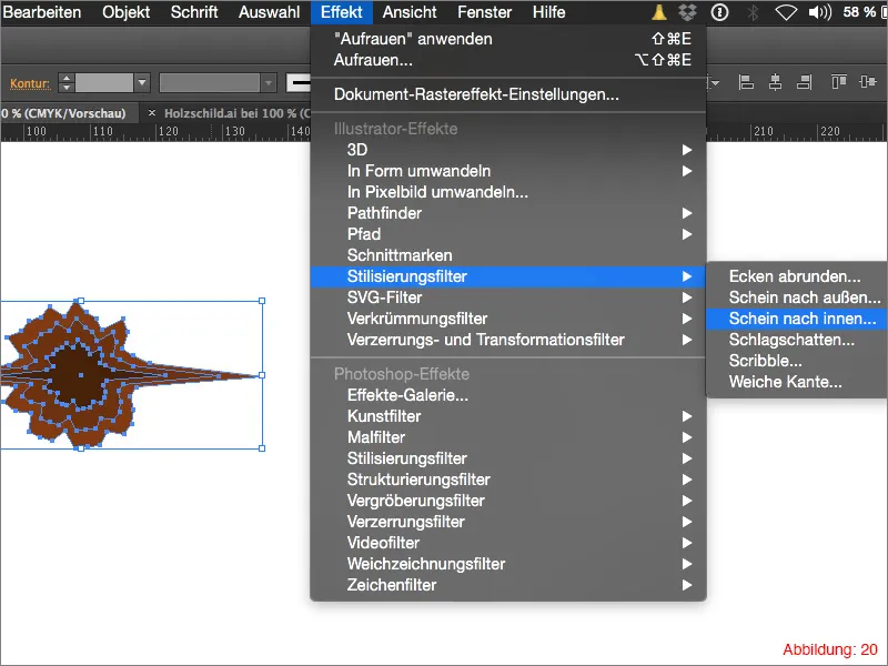
Set the blending mode in the following window to Multiply and set the color to black.
You can select a value of approx. 40% for the opacity. For the Blur setting, set a value between 0.5 - 1mm. Then confirm with OK.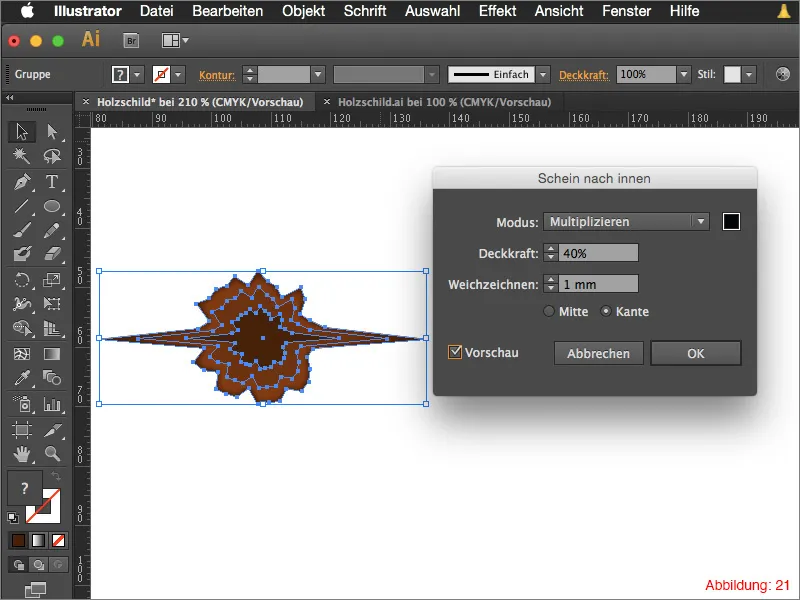
You can now copy this knothole as often as you like and paste it onto your wooden board in different sizes. To make the whole thing fit together even better, set the fill mode in the transparency palette to Luminance and reduce the opacity to 80%.
Your wooden board is ready (Figure 22).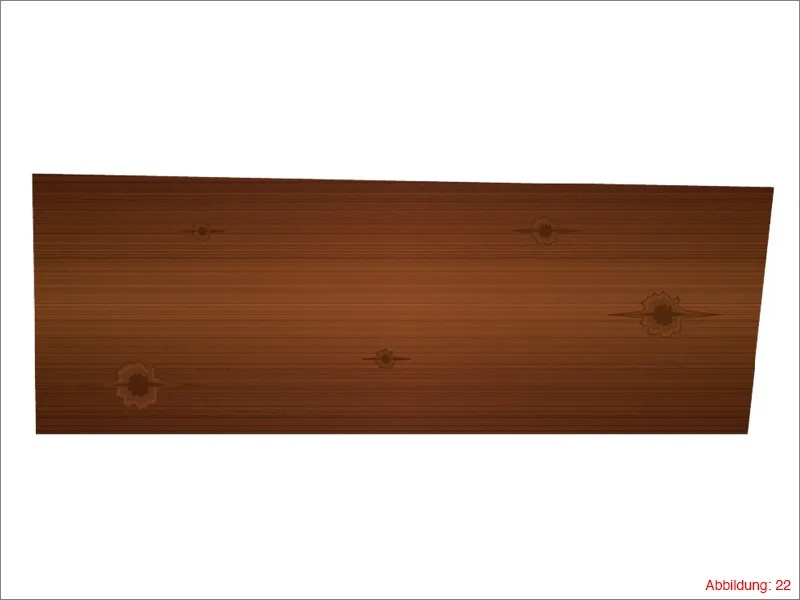
Step 3: Add typography
As the wooden board will of course be used as a sign, we now need to create the appropriate typography or lettering for it.
Grab the text tool from the tool palette and click once on your workspace. Enter a word of your choice. In my case, I write the word "Texture" in the Impact font with a font size of 240pt (Figure 23).
Mini tip:
For the lettering on the wooden board, I recommend that you use a slightly thicker and more stable font, as the following effects, which we will apply later, would not look particularly good with a fine and filigree font.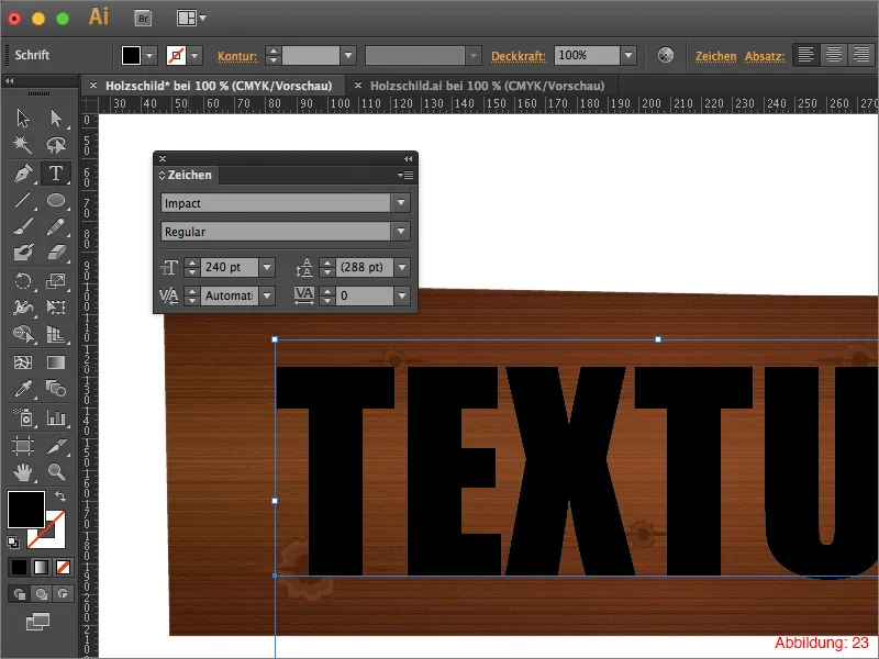
After you have created your lettering, go to Effect>Distortion and transformation filter>Roughen ...
In the following window, select a value of 3% for the size and 2 inches for the details.
Then confirm with OK.
Mini tip:
You do not need to convert your text into paths in order to apply effects to it. This has the advantage that you can still change the text as you wish later on in your work.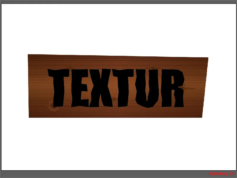
Next, go to Effect>Stylization filter>Shine inwards ...
In the following window, you can keep the default settings and simply confirm with OK (Figure 25).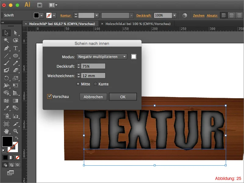
Finally, you only need to change the fill method to Multiply and reduce the opacity to 70%. Your lettering is finished (Figure 26).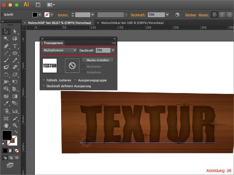
Step 4: Building the attachment for the wooden board
So far, you have added knotholes and lettering to the wooden board. That's all well and good, but you have to attach such a sign to a wall or something similar somehow. That's why we're going to add a few screws in the last step so that our sign can't fall down :-).
First, grab the ellipse tool from the tool palette and click once on your work surface. Give this ellipse a size of 11x11mm and confirm with OK.
You now need to assign a gradient to this ellipse again. However, this time we will not be working with a linear grad ient as usual, but with a radial gradient.
To do this, go to the Gradient palette and select the Circular option for the gradient type.
I have selected two different shades of gray for the gradient colors.
- light gray: CMYK - 0/0/0/50
- dark gray: CMYK - 0/0/0/80
See figure 27: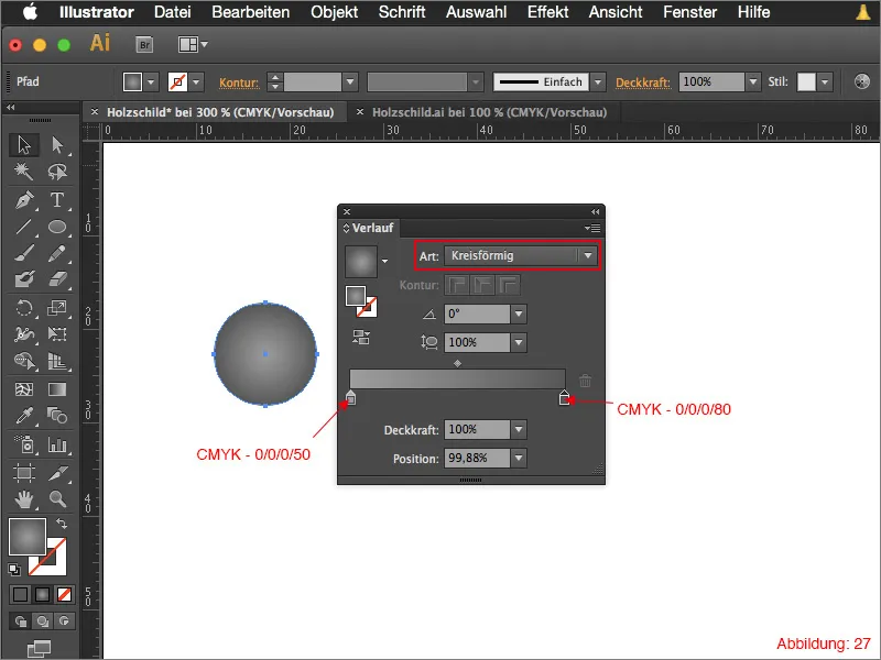
Next, you need to use the rectangle tool to create two rectangles measuring 10.8x1.5mm. Arrange them so that they cross exactly in the middle. Fill these two rectangles with a dark gray: CMYK - 0/0/0/80 (see Figure 28).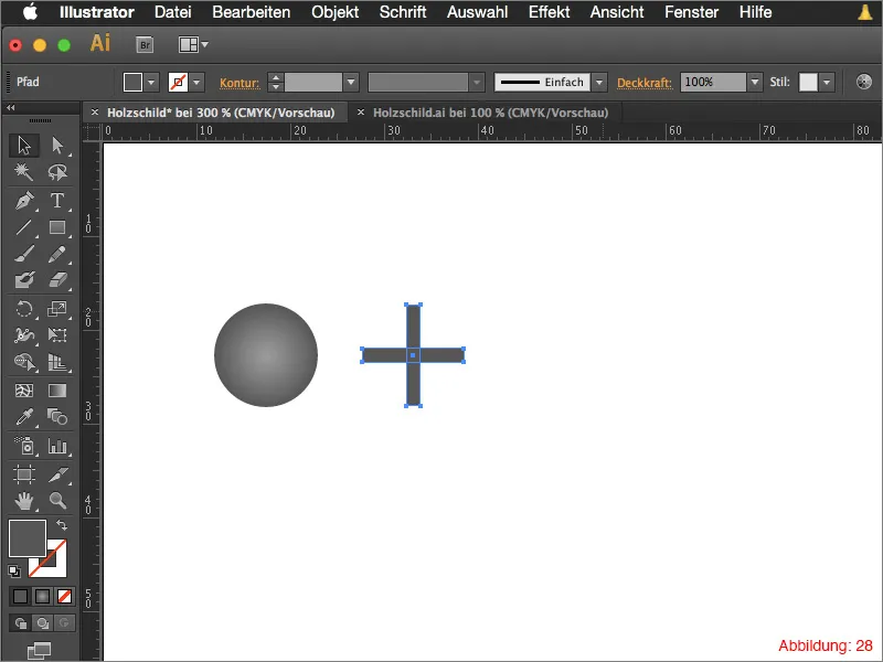
Select both rectangles and join them with the Pathfinder (Figure 29).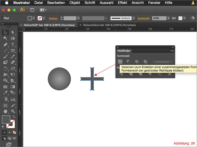
Place this cross in the center of the previously created ellipse and group the whole thing with Command+G or Ctrl+G.
Your screw is ready.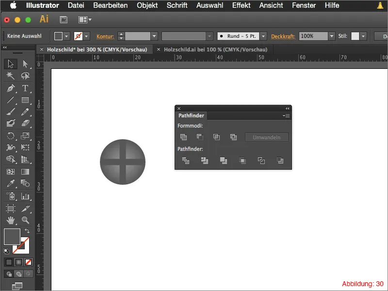
Copy this screw four times and place it in the corners of your wooden shield.
To add a little more variation to the screws, you can simply twist them in different directions to make the whole thing look more random (Figure 31).
Your wooden sign is finished.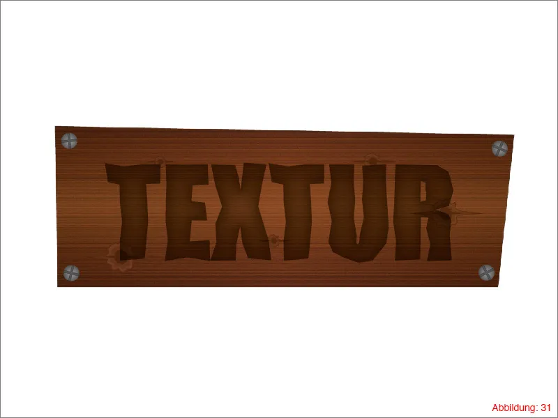
Final words:
We have now come to the end of this tutorial. I hope you have enjoyed it and have learned a thing or two. If you have any further questions on this topic, please feel free to post them as a comment below this tutorial. I will do my best to answer them as soon as possible.
Stay creative ...
Yours, Julian


