The management of colors in Adobe InDesign is crucial for creating consistent and professional designs. With features such as color swatches, color groups, and the selection of color modes (CMYK, RGB, Pantone), you can achieve precise and consistent results. In this guide, I will show you step by step how to create, save, adjust colors, and efficiently use them in your projects. Let's start mastering the basics of color management in InDesign!
Colors in InDesign are managed using the Swatches panel. You can open it quickly through the Control palette or through the Window>Color menu (Shortcut F5).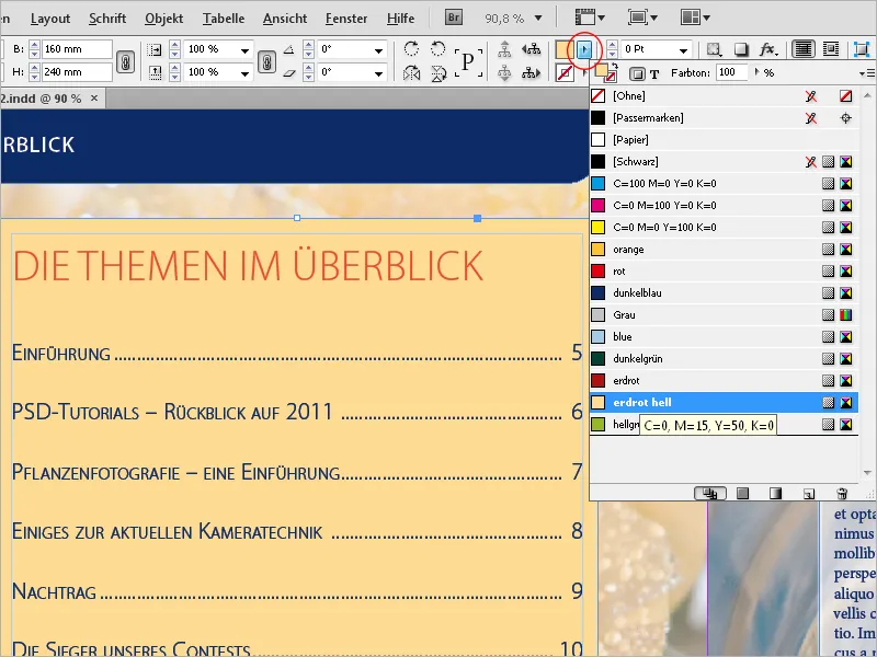
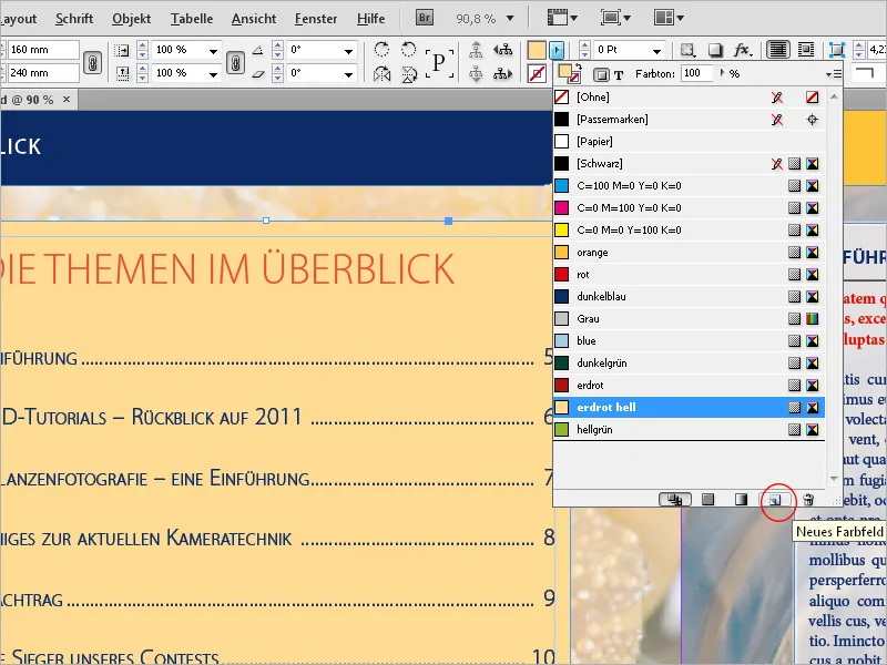
Here you can see some standard color swatches. To create a new color, click at the bottom of the Swatches panel on New Swatch. A color must always be selected because the button is otherwise inactive.
A copy of the currently selected swatch is then created.
Double-click on this copy to then open the Swatch Options, where you can make further adjustments.
When working with InDesign, it is important to differentiate between documents for screen output and those for later offset printing. The applicable color space depends on this distinction as well.
Screens display colors in the RGB mode based on additive color mixing. The colors red, green, and blue are mixed with 256 shades (8 bits) per channel, resulting in a theoretical total of 16.7 million color variations. Setting all values to 0 produces black, while setting all to 256 produces white.
For print output, white is achieved by subtracting color – hence the term subtractive color mixing.
The variations are achieved through the side-by-side printing of differently sized dots in the cyan (C), magenta (M), yellow (Y), and black color channels – the key color in print technology is referred to as the key color. Therefore, the shorthand for the color space is CMYK.
This color space is significantly smaller than the RGB color space visible on the monitor. Therefore, there may be disappointments when documents edited in the RGB color space are later output in four-color offset printing. However, this is the most cost-effective way to achieve a nearly realistic color reproduction in print and can be controlled with suitable color profiles.
However, there are situations where this color space does not meet the requirements of a client, for example, if the client has chosen corporate colors from a special color scale like HKS or Pantone, which cannot be accurately replicated in four-color printing. An example of this is orange, which always appears somewhat muddy in four-color printing. In this case, the color must simply be printed as an additional fifth spot color in offset printing (which of course incurs higher costs). The document then has five color channels.
Therefore, when adding a new color swatch in your InDesign document, the first decision to make is whether it should be a Process color or a Spot color. Next, you must decide if the new swatch should have its own name or simply use the color values as its name (in this case, you should check the checkbox).
In the Color Type field (as mentioned above), a distinction is made between Process color and Spot color.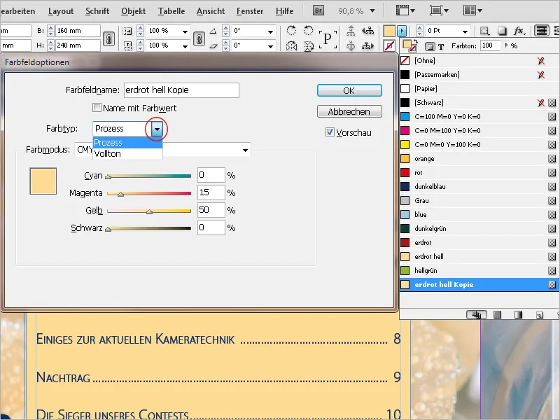
For both types, you can then choose between the RGB and CMYK color spaces in the Color Mode field below. Depending on your selection, you will have three or four color sliders below. With the Preview on, you can immediately see the effects on a selected object by dragging the sliders or entering specific values after pressing the Tab key.
In addition to the RGB and CMYK color spaces, there are also Color libraries available in the drop-down list in the Color Mode field. The most common ones for printing in Europe are the HKS (K for coated and N for uncoated paper) and the Pantone scale. These libraries have printed color guides with all hues on both coated and uncoated paper.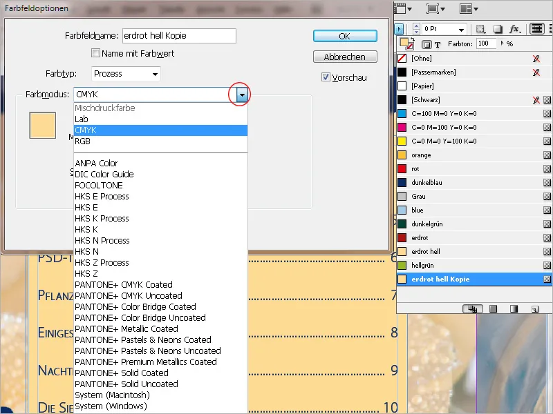
The colors are premixed and delivered to the print shop, printed with an additional printing plate in addition to the Euroscale colors. Therefore, if an additional spot color needs to be printed, the entry in the Color Type field will be Spot color, and the Color Mode field will show HKS or Pantone, with the corresponding color from the library below.
If a color from one of these libraries also works well for four-color printing (e.g., HKS 14), they are also available as process variants. You choose a color from the process library, which then gets converted into CMYK values spread across those four channels, without the need for an additional channel.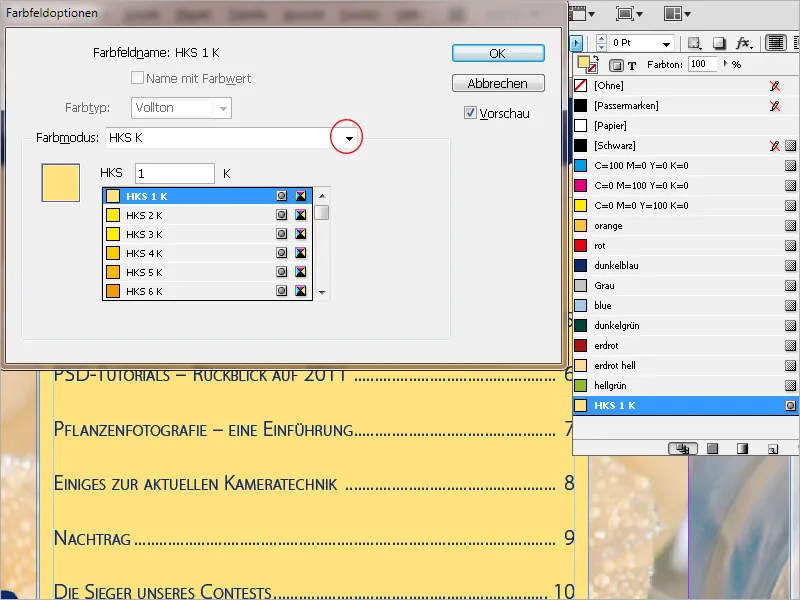
By clicking OK, a new color swatch is now available. To apply the color to the fill or stroke of a vector graphic or text, simply click on the swatch with the object selected.
The control panel contains a button for the fill and one for the stroke of an element, each accessing the color fields created in the document. If an object is already highlighted, it will be colored with that color.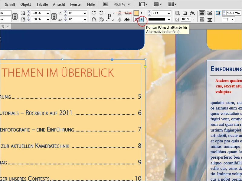
InDesign marks the color fields with a small icon for the color type (process or spot) and color space (RGB or CMYK).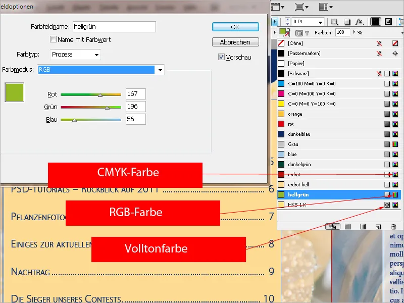
To intuitively mix a color, you can also use the Color Picker. It opens after a double click on the fields for fill and stroke in the control panel.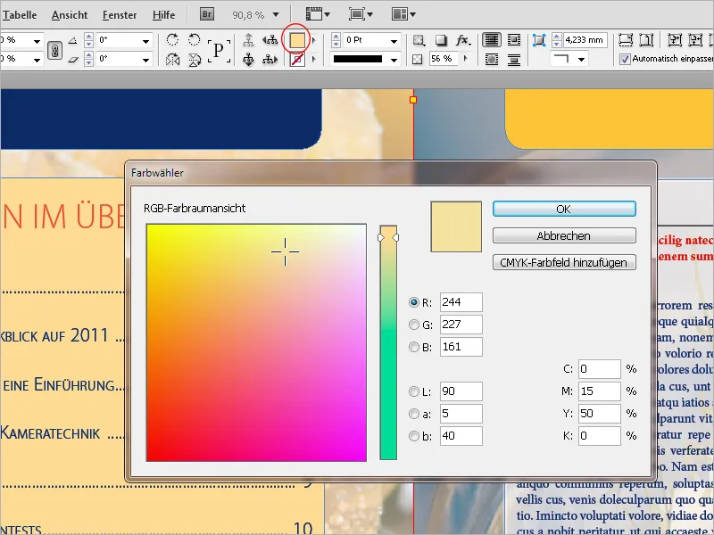
Here you can narrow down the color range by entering a value in the respective fields. Depending on the area where your cursor is located, you can then add an RGB, Lab, or CMYK color field to the palette by clicking on the button above.
Often, the applied colors should not be at 100%, but with a lower value. This is then referred to as a color tone. For this, there is in the Color Fields panel a field with the same name at the top. By clicking on the small arrow to the right of the percentage value, you can adjust it continuously with a slider.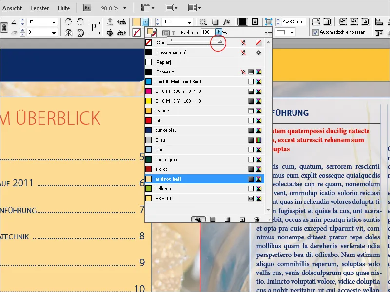
If this color tone needs to be applied to several objects, it is easier to create a separate color tone field for this purpose, rather than having to manually enter the value each time. Click on the Swatches menu in the top right and select the New Color Tone Field entry from the context menu.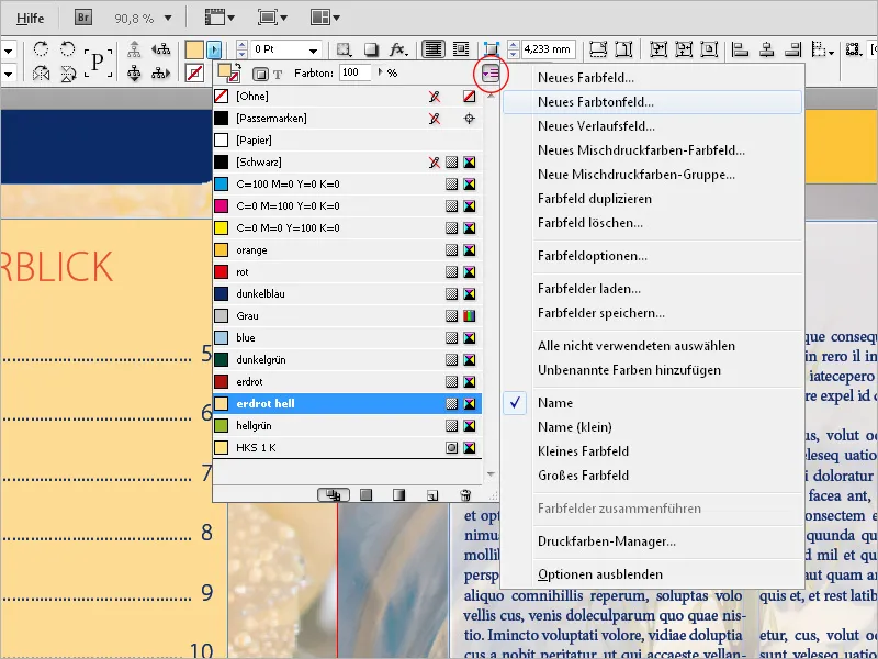
Here, you can now edit the percentage value under the grayed out values of the individual channels. Clicking OK will now add a new color tone field based on an existing color field.
If the values of this color field are later changed, they will change analogously in the associated color tone field.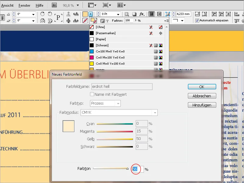
In addition to a color and a color tone, objects can also be marked with a gradient. Although there is the Gradient Color Field Tool, to give multiple objects the same appearance, it is more practical to create a separate gradient color field.
This is done through the Swatches menu in the Color Fields panel. Choose the New Gradient Field entry from the context menu.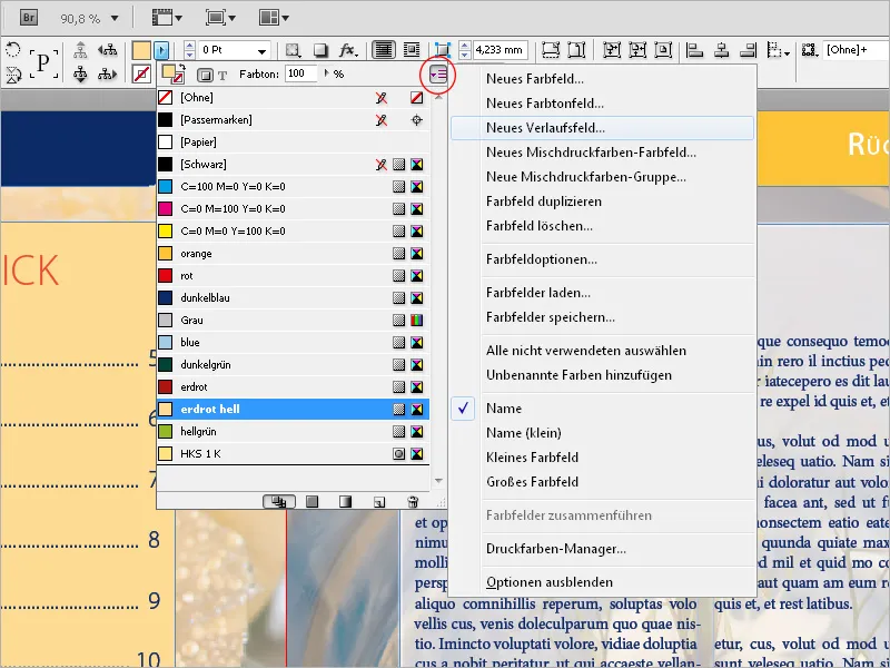
First, you give this field a meaningful name. Next, you can set in the Type field whether the gradient should be displayed as linear or radial.
The following fields can be adjusted only after clicking on the sliders of the gradient bar. Now you can set the color scheme for the Slider Color, either RGB or CMYK, or also access previously created color fields.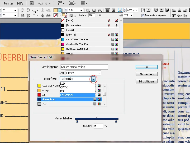
By clicking on the left slider of the gradient bar, you mark the starting point of the gradient and assign the desired color to it using the options above. That is, you replace the current standard white color for the starting point of the gradient with the newly chosen one. Similarly, the standard black color for the endpoint of the gradient must be replaced with the desired one.
For a simple gradient of a specific color from light to dark, the starting color is white and only the endpoint is assigned the desired color tone. With the left slider of the gradient bar, you can define when the gradient should start – if you set a value higher than 0, the area to the left of the slider will homogeneously receive the starting color; with the right slider, you set the endpoint of the gradient; a value lower than 100% confines it within the object contour. The area to the right of the slider will then also homogeneously receive the color tone up to the contour as defined for the endpoint. The gradient is thus compressed accordingly.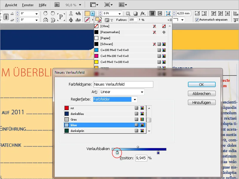
Clicking OK will now create the new gradient field. To later make adjustments regarding the type (linear or radial), the angle the linear gradient should have, or to set the start or end of the gradient, or reverse the gradient direction, open the Gradient panel (Menu Window>Color) and edit the settings.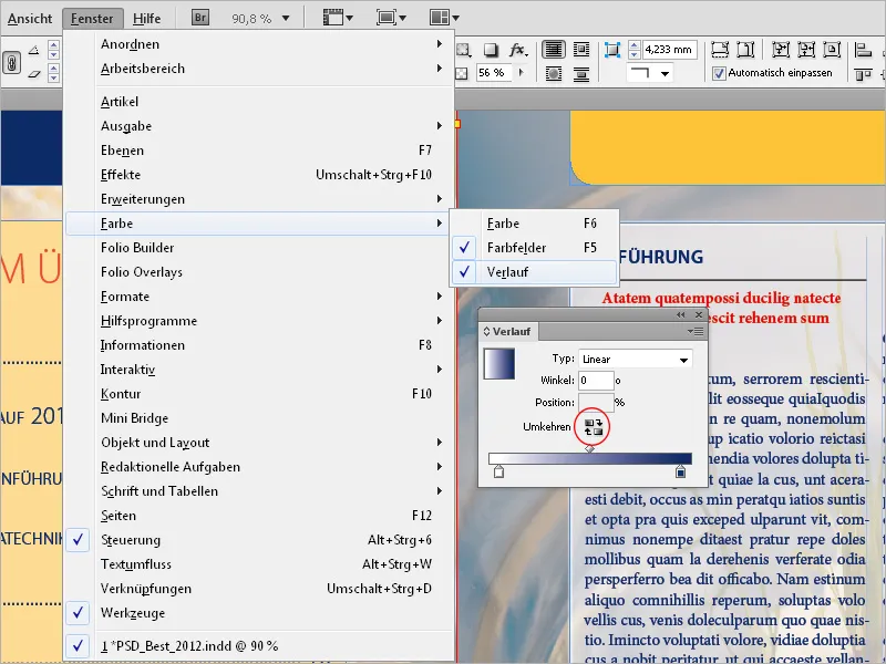
One more thing about maximum ink coverage: Black areas consisting only of 100% black appear rather flat when printed. Therefore, for a deep black, other colors are added. An optimal result is achieved with the following values:
• Black: 90%
• Cyan: 85%
• Magenta: 70%
• Yellow: 40%
The reason why Black receives only a value of 90% is due to printing reasons: This improves the color acceptance in the following printing processes. The total ink coverage should not exceed 300%, for urgent jobs where there is no time for the ink to dry, not more than 260%.
However, these values are only relevant for documents intended for printing. For those aimed at the screen, these restrictions do not apply. In this case, you can use the standard color Registration Marks as deep black, which consists of 100% CMYK.
Below is an example illustrating the difference: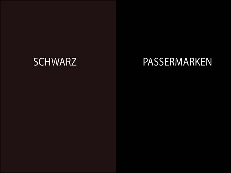
A quick check for the color application and the colors used is provided by InDesign with the Separations Preview. You can display the panel via the menu Window>Output or the shortcut Shift+F6. Switch there in the View field to Separations. Now your cursor becomes a measuring device because if you point it to an object, the values of the individual color channels and the total color application are displayed in the panel.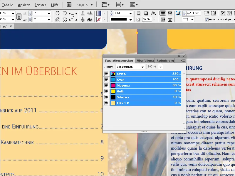
If you find that in a document created for printing besides the four color channels for the CMYK color model, there are additional colors appearing, InDesign provides another ingenious tool: the Ink Manager. You can access it directly via the Palettes menu of the Separations Preview panel or that of the Swatches.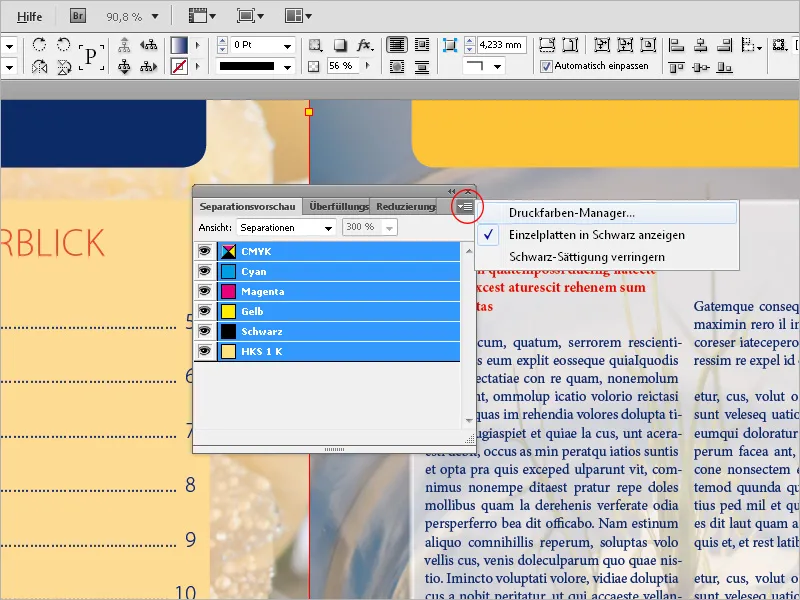
An additional spot color is preceded by a slightly different icon than the process colors. If it needs to be reproduced in four-color printing (in digital printing, for example, it is not possible otherwise), you can instruct InDesign to convert the color to the values of the process colors during output.
If there are other spot colors in the document, you can also check the checkbox Convert All Spot Colors to Process Colors. This ensures that nothing is forgotten. However, if a specific color may need to be printed as a spot color, you can simply select it.
The colors themselves remain unchanged in the color palette, they are simply converted during output.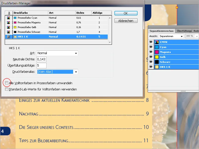
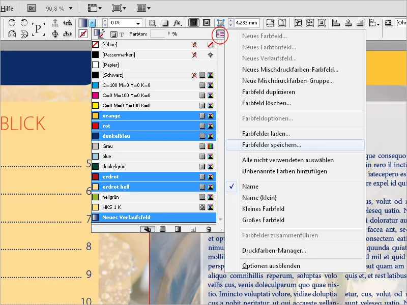
If you have created a series of colors in a document that should also be used in other documents later on, you can also save them as custom libraries. To do this, open the Swatches panel, select the relevant colors, and choose the entry Save Swatches from the Palettes menu.
Then search for a directory of your choice and assign a file name. The library will then be saved in Adobe Swatch Exchange format (*.ase) and will now be available in other documents after an import (via Load Swatches in the Palettes menu).