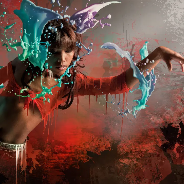
The composing "LIQUID PERFORMANCE" combines dynamic liquid effects with impressive photos to create an energetic and modern design. In the first part of this tutorial, I will show you how to build the basic structure of the composing, select suitable images, and work with layer masks to integrate the liquid elements into the image. Using Photoshop, we will create a base that reflects the dynamic and flowing character of the theme. Let's start and master the first steps towards your creative composing!
Step 1: The Shoot
An idea is born: a person emerges from liquids, not only consisting partially of them, but also surrounded by liquid and color. The pose seemed very suitable for this, as well as the lighting. Captured with a softbox from the side and a honeycomb attachment to direct the light more, the shadow areas on the opposite side were only used with a large bright Styrofoam board as a reflector. This resulted in strong light-shadow play that dramatically supported the unusual pose.
.webp?tutkfid=86418)
Step 2: Color Selection
First, I create a fill layer with a medium gray color, which is positioned under the model layer. Under Select > Color Range, the eyedropper symbol with the + is selected and multiple areas of a neutral gray tone in the background are clicked. By using the Tolerance slider, a rough black and white value can already be determined, which will later serve as a mask.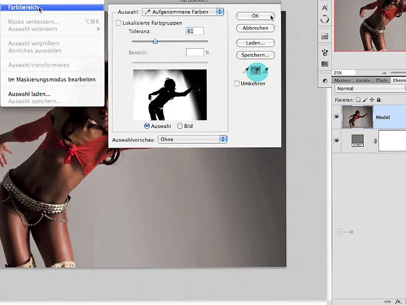
Step 3: Clipping in 3 Steps
3.0. Painting in the mask
By clicking on the mask symbol in the layers palette, a layer mask is immediately created, which now requires further editing steps. First, invert the mask with Ctrl+I. Using a white brush, you can paint in the mask, as shown by the arrow, to correct the semi-transparent areas within the figure.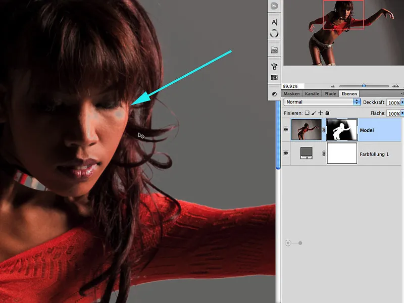
3.1. Dodge and Burn
For the edge areas and hair areas, lightening and darkening with the Dodge/Burn tool in the Midtones/Lights/Shadows areas is recommended here. By holding the Alt key in the Dodge tool, you automatically switch to the Burn tool. The exposure should vary and values should not exceed 30% to maintain control over the effect: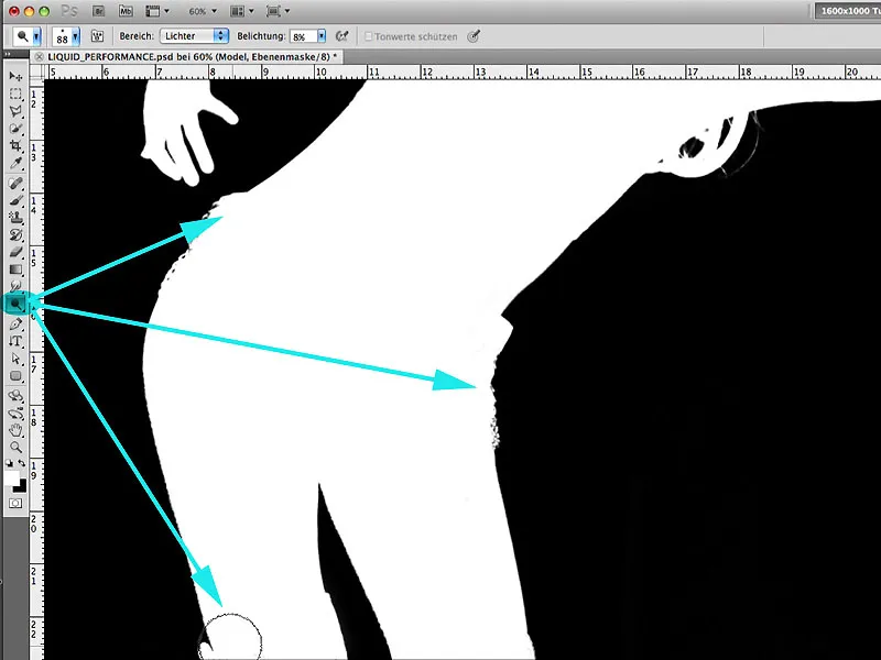
3.2. Path
With the Pen tool, the remaining area that has not been satisfactorily dealt with by the aforementioned methods can now be conveniently selected. After closing the path, this area of her hand will be provided with a selection, where painting with white inside and with black outside the selection:.webp?tutkfid=86422)
3.3 Enhancing the Mask
To achieve a homogeneous clipping, the Mask Edge dialog in the Masks window is opened and provided with the values visible here: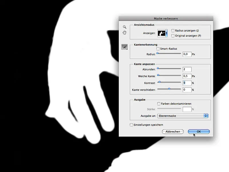
Step 4: Adding More Canvas
No, we are not at the butcher's counter or on display on the Reeperbahn; here the term used in advertising is adopted, meaning that additional workspace is added around the motif. In our case, it is the extension in the lower area to visually balance the image for the upcoming composing.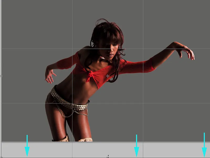
Step 5: Image Optimization
At this stage, the model can now be optimized for shape in terms of retouching. For this purpose, I create a quick selection of the area to be edited with the Lasso tool, and then call up the dialog under Filter > Liquify to edit the nose and mouth area. It is important to edit in small steps with not too big changes, which generally provides more control: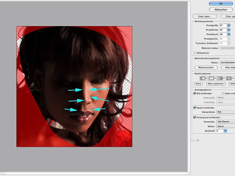
Step 6: Shadow Areas
To selectively brighten the shadow areas, open the Edit > Shadows/Highlights dialog and apply it to a copied layer of the model. Here, I focus exclusively on the effect in the shadow area: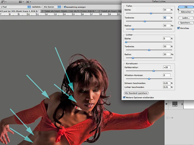
6.1 Mask Work
If the result of brightening the shadows is satisfactory, hide the effect completely with a black-filled mask and then bring the effect into the image by painting with white using a soft brush and low opacity for precise control: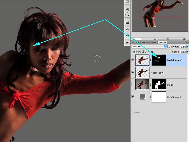
Step 7: Preparation for Creativity
I merge the previously edited layers as copies and group them as individual layers. This creates order and clarity right from the start.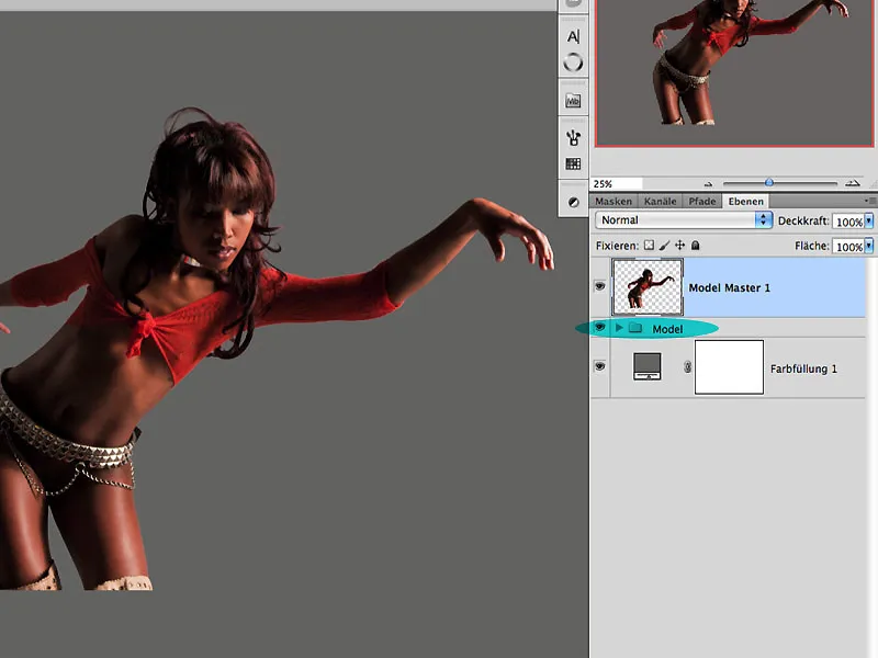
Step 8: Creative Brush Tips
In today's time, you can download an endless variety of brush tips from the internet. This poses no problem and often leads us into a certain convenience. In our example, I created some color splashes with black ink on various smooth papers, and pressed them with a second sheet in damp condition and then peeled off again. This often creates very attractive textures (frottage technique) that are excellent for use as brush tips. After opening the file "Ink2.jpg," under Edit>Define Brush Preset, this previously selected area is defined as the brush tip.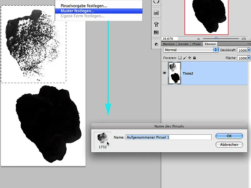
8.1 Individual Shape Behavior
Now, the window of Brush Presets is opened, and by experimenting directly with the presets, the specific behavior of the brush shape is determined. Here, you can also combine additional brush tips under the term Dual Brush or, as in the present case, the same brush tip with itself. Once satisfied with the behavior, you can now set the name of the new brush tip by clicking on the lower symbol in the brush presets.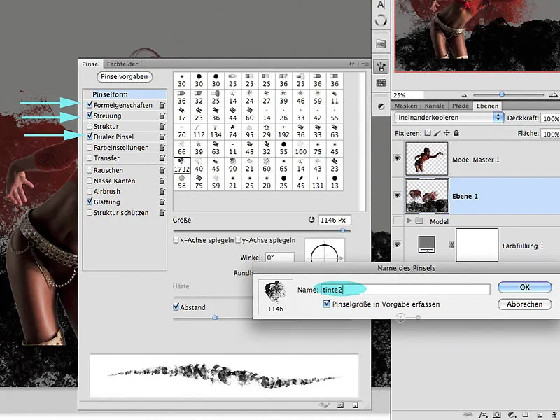
Step 9: The Application of Color
On an empty layer in the blending mode Color Dodge under the model layer, I can now paint with colors that are not only absorbed in the model's red blouson, but also in the background gray. Here, many mixed colors are quickly created, achieving a first depth in the image. Experimentation is encouraged with the Opacity settings and the Flow of the brush stroke. The arrows indicate the color uptake areas.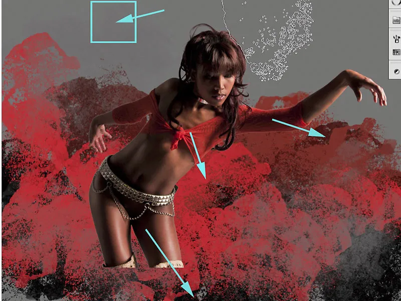
9.1 Additional Brushes
Now, additional brushes can be used as desired, such as the brush "Ink8.jpg."
Interesting effects occur when assigning not only a separate layer to a new brush but also a specific coloration.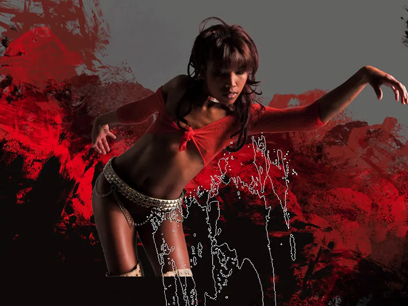
Step 10: Model and Background
Since a homogeneous background was present during the cutout of the model, some transitions become more visible in this phase and appear as unsightly and bright edges that require further adjustment. To achieve a credible composition, the impression must arise that the figure is emerging from the previously painted structures and splashes. A perfect transition should also be included.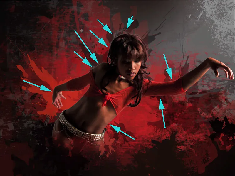
Step 11: Overlay
One initial way to better integrate the figure and background is to overlay the first painted layer "Layer 1" in the group BRUSH. Holding down the Alt key, I drag the layer over the model master layer. The Color Dodge mode is retained.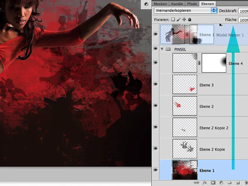
11.1 Editing the Edge Area
As the overlay effect benefits the entire background due to the increase in contrast and structure, only the model is masked out with the color black in the respective mask. The edge areas can and should slightly overlap because the color of the background - imagine there is bright color at play here - can also affect reflective hair and skin areas.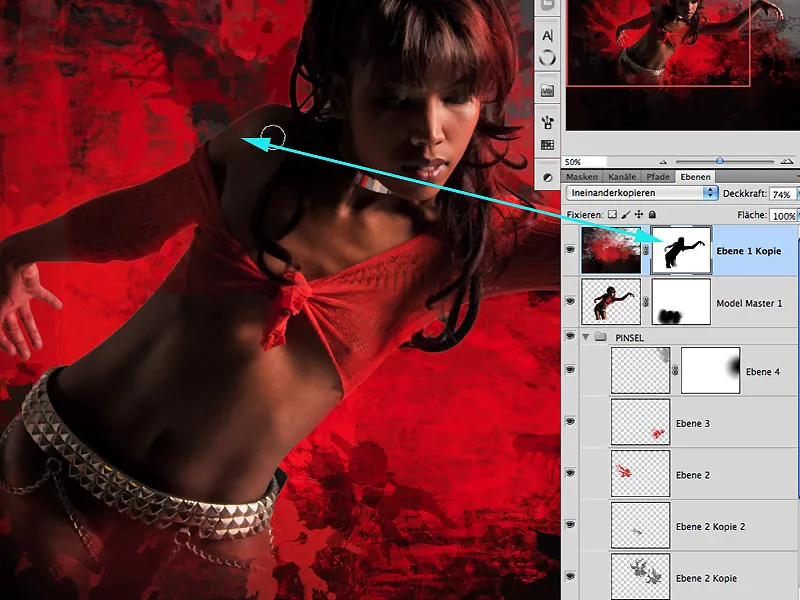
Step 12: Darkening Highlights
Soft flares around the hair can also be darkened very well with the Dodge Tool. The Highlights area should be selected, and working with a low exposure below 10%: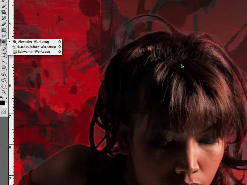
Current State
This is how the mask looks from step 11, where the effect of overlay with an Opacity of 74% can be seen very well. The effect should be less pronounced, especially in the edge area: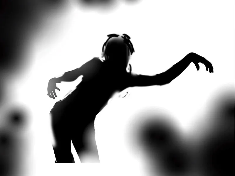
... and here is the image editing at the current stage: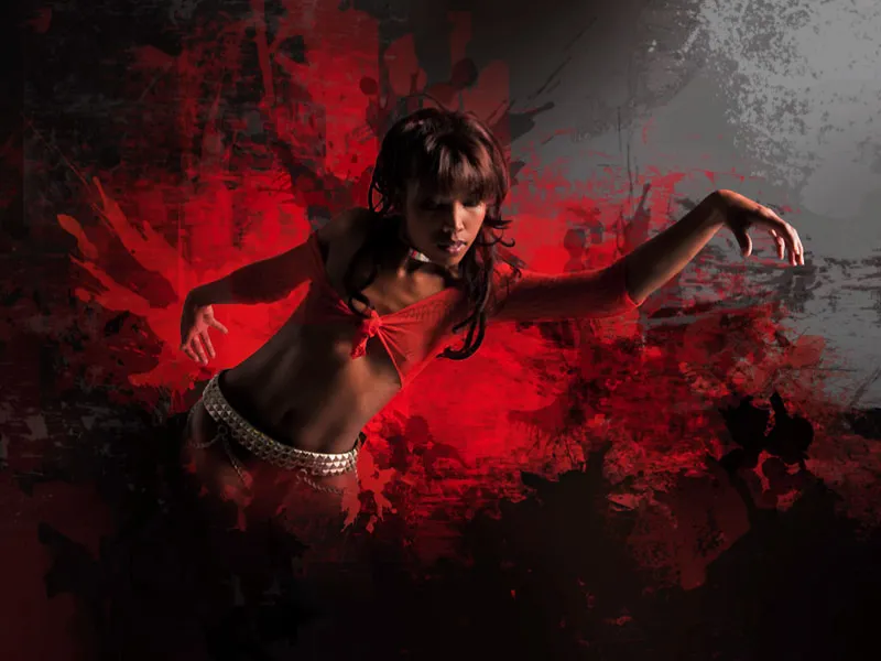
Step 13: Inner Shadows
Before proceeding creatively, let me briefly show another method to address the edge margins. This involves using the layer style Inner Shadow. With the settings depicted, the edge area of this figure can also be darkened very effectively.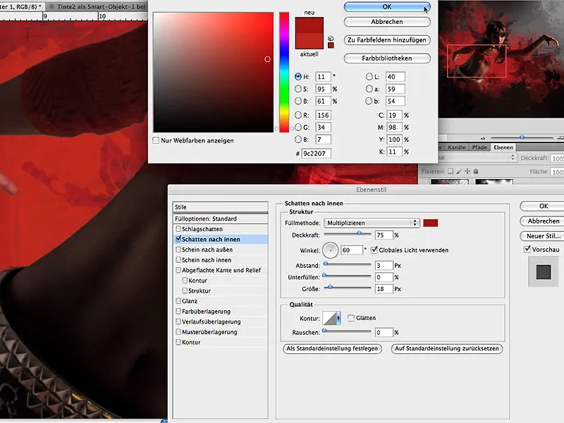
Especially with very colorful backgrounds, this method is advisable to ensure a realistic appearance.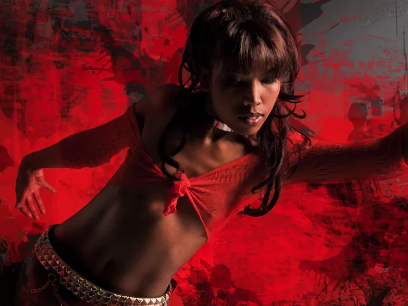
Step 14: Liquid Effects
To pick up the title theme again, I now focus on the character and aim to create the impression that her blouse is made of liquid paint and not textiles. For this, I choose the tool Mix Brush with the setting Very Wet, applied thinly with the settings shown in the image. To better assess the result, I deactivate all layers and draw vertical lines within and outside the figure with the Shift key held down, as well as some strokes to accentuate the shape.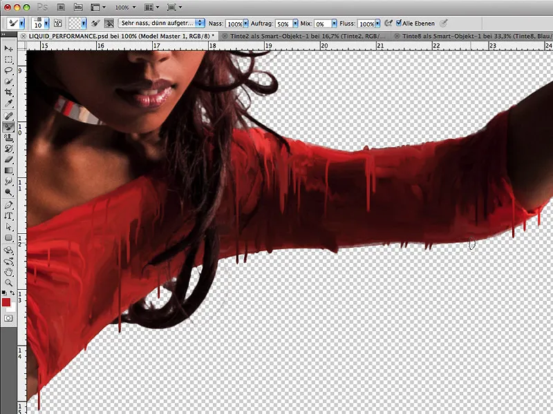
The vertical color lines are created on new, separate layers: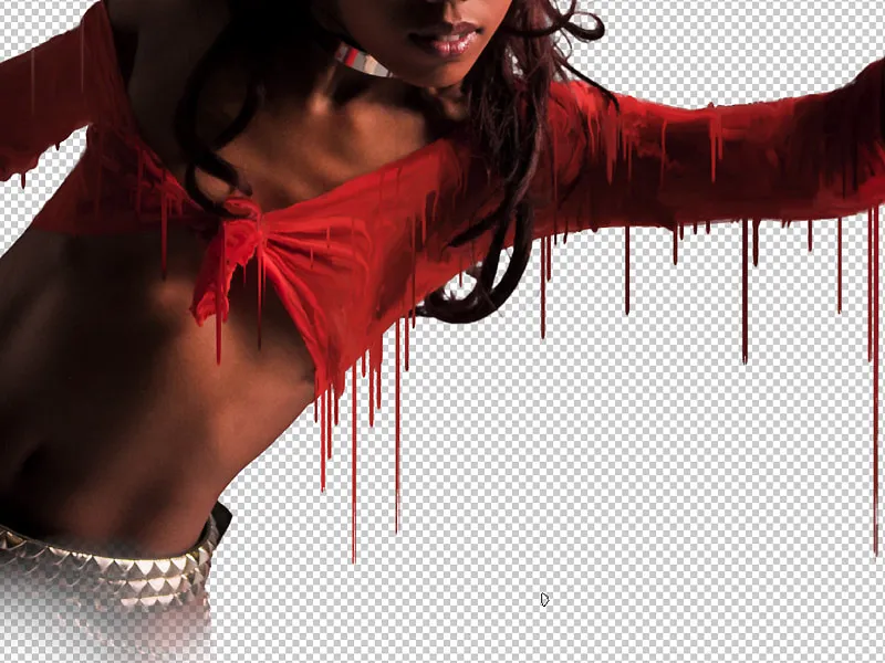
Step 15: Movement
Since the character leans forward in the image, the vertical color threads should also take on a slight curve. With Edit> Free Transform> Warp, the shape can now be slightly bent. This enhances the dynamics in the entire image and simulates the impression of moving forward: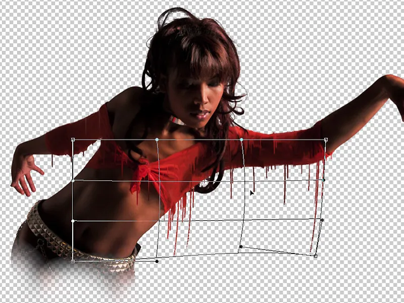
Step 16: Separate Character and Background
Some areas around the character should now be better separated from the background to make the three-dimensional appearance more distinct. For this purpose, a few radial gradients can be drawn on a separate layer, as shown in layer 7 of the image. Dark areas of the character now receive a lighter gradient for better visual separation from the background, and light areas receive a darker gradient.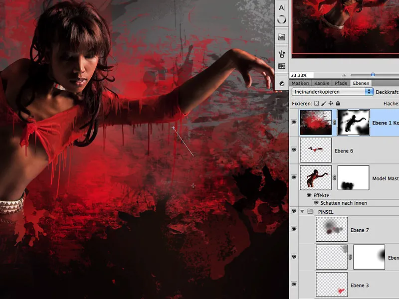
Also, in the mask of the top layer, this effect can now be slightly reinforced by painting with black in these areas. This is how the result looks so far: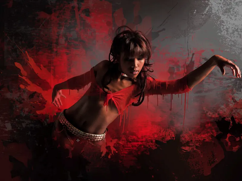
Step 17: Lights in Color
Color threads appear more three-dimensional when a bright reflection is visible in some areas. To achieve this, duplicate the layer with the color threads and set the fill method to Subtract. In the mask filled with black, paint a reflection in some areas with the color white and adjust the effect with the Layer Opacity: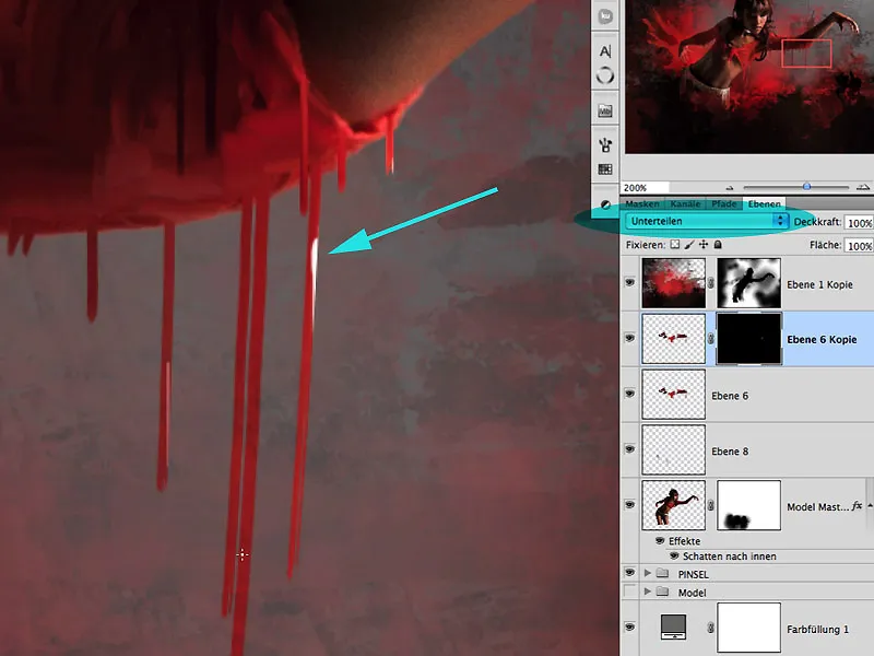
Step 18: Mirror, Mirror...
One cannot do it often enough during the working process: horizontal mirroring! To better assess the visual impact, this process is recommended very often. In the present example, I mirrored after I had "liquefied" the belt and necklace of the character in bright areas.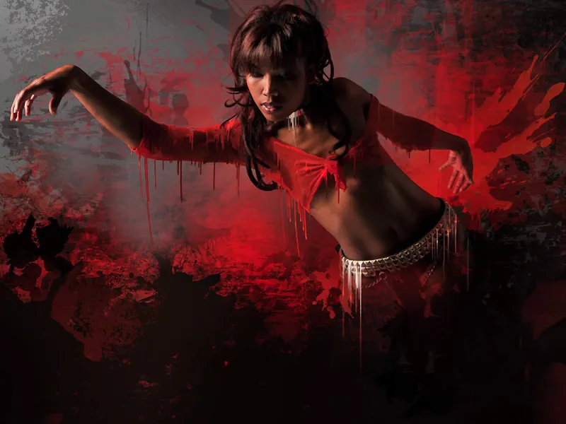
Step 19: Splash-Boom-Bang
Using milk colored with food coloring, slightly thickened with cottage cheese and cream, I photographed some splashes under sunlight. It is advisable to photograph with different throwing directions, various containers, and splash sizes to obtain a variety of results and bizarre shapes. It has been found that better freestyle results can be expected against a dark background: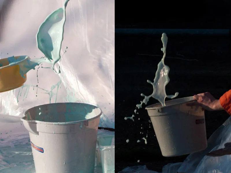
Step 20: Thick and Thin
During the milk shooting, the liquid was gradually diluted further, so in addition to the many bizarre shapes, different viscosities were also captured. Open the file "SPLASHES.psd" and work directly with the extracted shapes: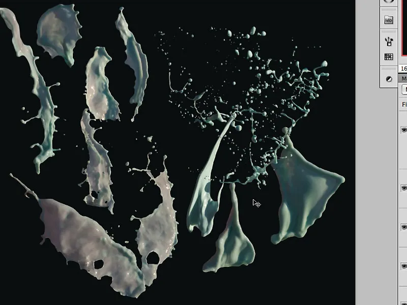
Step 21: Shaping Splashes Accordingly
By Drag & Drop, we now drag the individual liquid splashes into the image and can now place individual pins under Edit> Shape Grid to further distort the splash within itself. The impression should be created as if the person were breaking through a large color splash.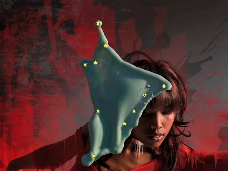
Under Edit> Transform> Warp, another deformation can also take place to adjust the splash to the figure: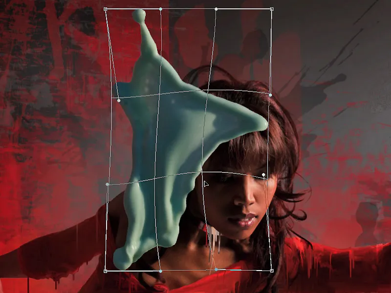
Step 22: Penetrating Splashes
The rear splash should now penetrate through the character's arm. For this purpose, a suitable mask is created, and using a brush and the color black, the area in the mask that is covered by the arm is painted: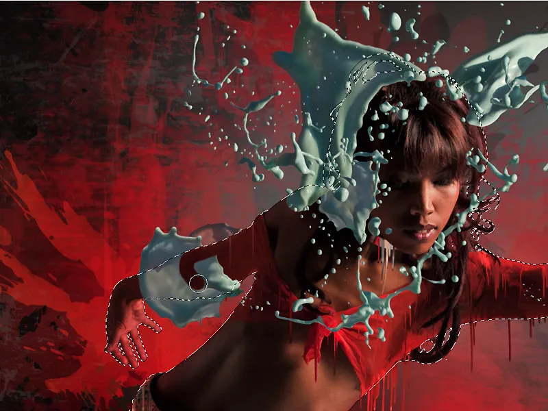
To make this penetration effect even more realistic, an adjustment layer with a Levels adjustment for this splash is created, and the effect of slight darkening is painted in the mask filled with black of this adjustment layer. Color splashes located in the shadow area of the figure and not directly exposed to light can also be softened in the highlights with this effect: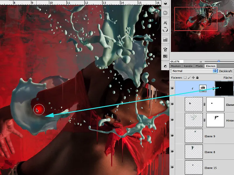
Step 23: Color determination
To determine a better color match, I use the keyboard shortcut Ctrl+Alt+Cmd and Click on the image to bring up the color wheel. Now, I can set the complementary colors to red/orange, namely turquoise to cyan. I want to achieve attention and a contrasting color harmony in the image using this color effect: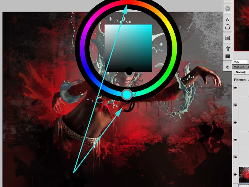
Step 24: Color through Splashes
There are many ways to colorize the liquid splashes. I opt for the effect of Gradient Overlay. The checkbox for Align on Layer should be deactivated so that the effect affects the entire layer surface and not just where the splash is located within the layer. I select the color range of the rainbow gradient that corresponds to the color scheme determined in step 23 with the Angle and Size: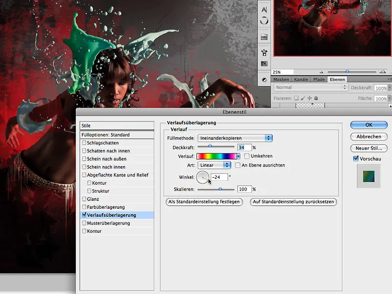
Step 24: More Atmosphere
To visually unite the splashes and figure as a composite, the colors of the splashes should also be reflected on the model. For this, a new layer is created above the model layer and filled with 50% gray using Edit>Fill Layer: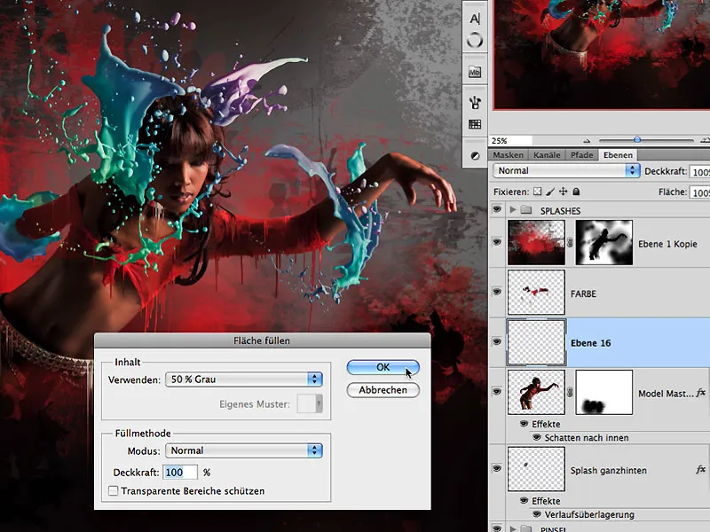
The fill method is changed from Normal to Overlay …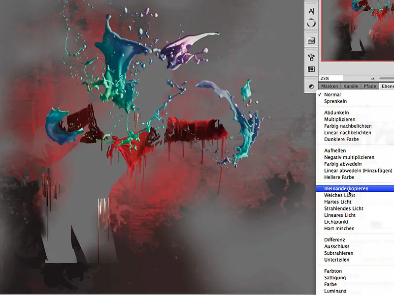
… and the previously applied and copied layer style of the splashes is reinserted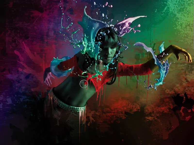
In the black-filled mask, this effect is now painted onto the shadow area of the figure: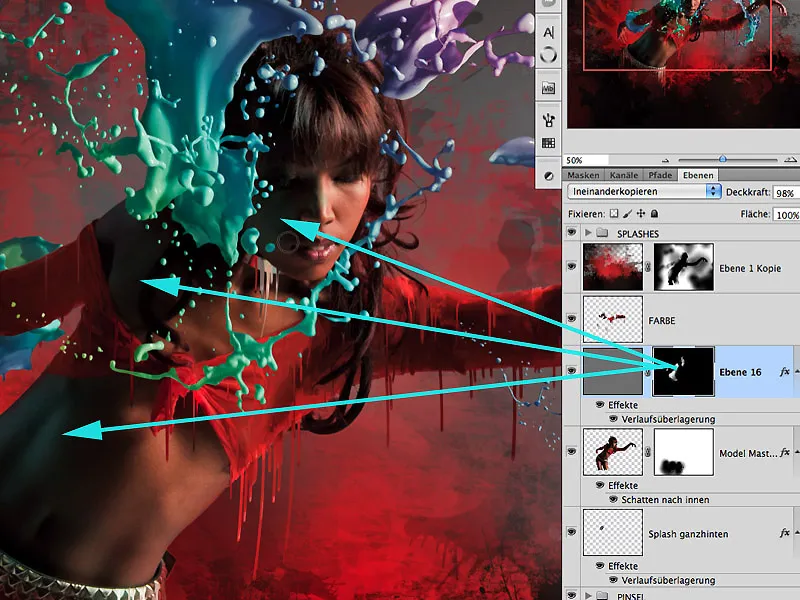
Step 25: More Light and Atmosphere
As the top layer, a white-filled layer is created using the Overlay fill method with an Opacity of around 59%. The Gradient Tool>Reflective Gradient can be used to create multiple light rays, starting from the upper right corner. Since this effect extends over the entire layer, it is easy to slightly reduce the effect around the figure with a Radial Gradient in black, resulting in a more realistic outcome.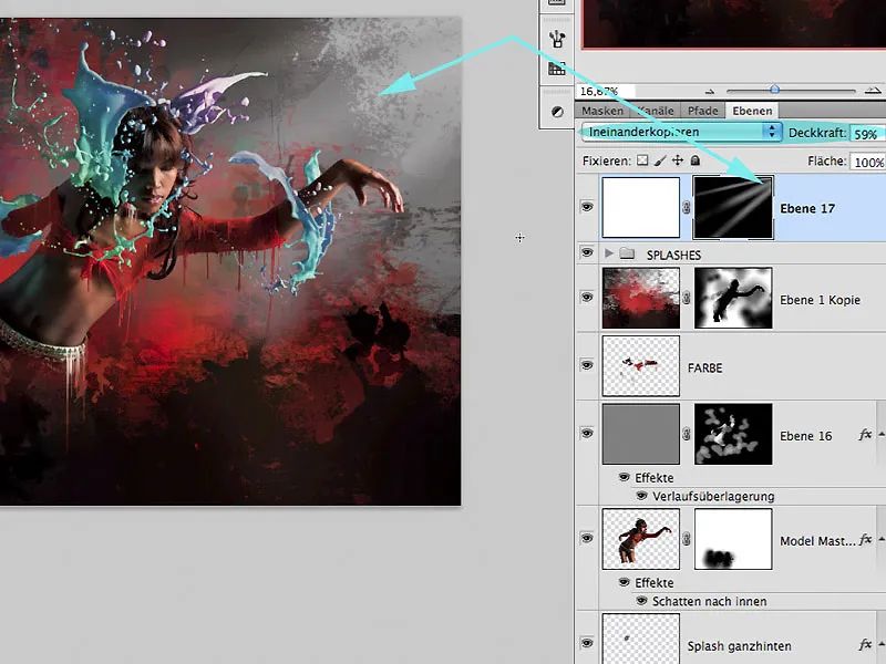
Another excellent way to create atmosphere with light in an image is to apply the Render filter>Lens Flare on another layer filled with 50% gray. Annoying lens flares in certain areas of the image are almost invisible again with the Gaussian Blur filter set to around 33%. The fill method of this layer is Soft Light, with the layer opacity set at around 60% to subtly enhance the effect.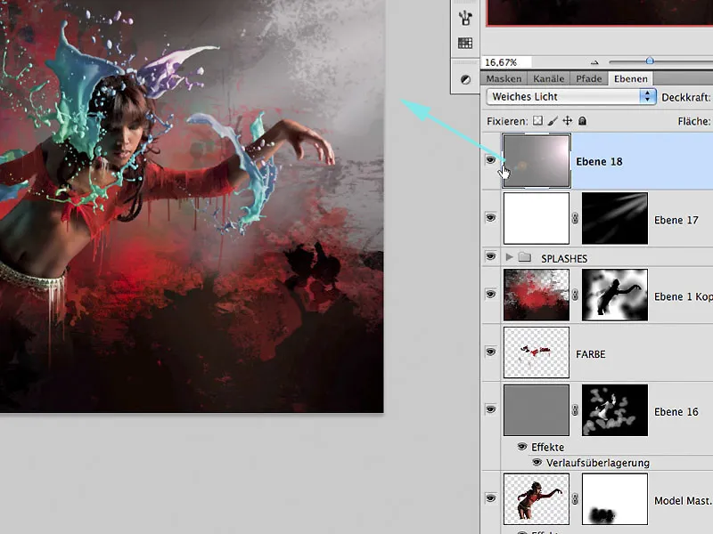
Step 26: Finishing Touches and Final
After adding further fine-tuning such as color filling, smaller structures, and distortion, the work is complete:
LIQUID PERFORMANCE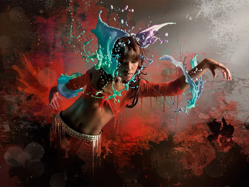
Enjoy recreating it,
Tom Krieger
