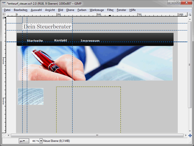
The current state of the layout should look something like this:
So far, a logo and the top menu have been added. We will continue with a slightly larger graphic, which should be visible directly below the navigation.
The principle of creating new layers has already been described in the previous tutorial. I would therefore like to show you something else at this point. A larger image is to be displayed directly below the top menu. The result will look like this:

The image should - when you insert it - have the correct dimensions. So edit it beforehand if necessary. Then go to File>Open and select the image. The selected image will then be displayed in a new window. Press Ctrl+C to copy the image to the clipboard. So that you can now paste the image as a layer that is also the right size, select Edit>Paste as>New layer. The new layer will automatically have the dimensions of the image and you can then simply move the layer to the right place. In this way, all the images you want to insert can now be transferred to the layout and placed there.
Then insert the texts in the places where they should actually be visible later. In the design phase, so-called dummy text is normally used for this.
Before you sit down and wildly write "test, test, test", I recommend you visit http://www.blindtextgenerator.de/.
There you can have dummy texts - of different types, by the way - generated automatically. The texts can then be easily copied and pasted into the design draft. In this context, we also recommend the website http://dummyimage.com/. Dummy images of any size can be generated on this page. You can then use these dummy images as placeholders for original graphics that have not yet been created in your layouts, for example.
The problem with transparent layers
If you insert texts, these will consist of several elements such as headings, text paragraphs etc.. You should therefore group texts that belong together in separate layers. This way you can always move these texts in one piece. To do this, call up Layers>New layer. Then assign the desired size and background color to the layer. In most cases, however, you will set/need a transparent background. The problem is that it is difficult to move the transparent layers. You often end up with a subordinate layer. This problem can be easily avoided. The settings in the Toolbox window are crucial for this. Activate the Move tool. Then activate the Move active layer option at the bottom of the window.
This allows you to move transparent layers to any position.
Cut out elements
Once you are satisfied with the layout, it's time for the practical implementation as an HTML website. This is where slicing comes into play. Slicing is nothing more than cutting the layout into individual parts, which are later reassembled using HTML and CSS. You have to slice all the elements that are to be displayed individually later. Of course, this does not include all the image elements, which are available individually anyway. I would first like to show you how you can cut out elements. To do this, draw guidelines around the element in question. The guide lines ultimately form the cut edges. So make sure you set them correctly.
Now select the desired area and press the key combination Ctrl+Shift+C. (Incidentally, this applies equally to GIMP and Photoshop). Then create a new file. In Photoshop, this will then be the correct size. Unfortunately, this is not so easy with GIMP. Here you simply create a file with sufficient dimensions. Use Ctrl+V to paste the content from the clipboard.
Now the cropping tool comes into play. Use it to define the area to be cut out and then press the Return key. The image is then cropped to the desired area. You can save the image via File>Save as.
An important stylistic element for many websites is a color gradient. The example layout shown here also features such a color gradient. To slice a color gradient, select a narrow area of the corresponding gradient. It is actually sufficient if you set an area with a width of one pixel. The height, on the other hand, must correspond to the actual height of the element. Using CSS, you can later ensure that this graphic is repeated horizontally until the entire element is filled. Of course, you could also use a wider image section. However, this would reduce the performance of the page. Therefore, select one pixel as the width for color gradients.
Use Ctrl+Shift+C to copy the one pixel wide graphic to the clipboard and paste it as a new image. You then save the new image after it has been brought to the relevant section.
This should make the basic principle of slicing clear. You cut out all the things from the layout that later belong to the website. If you already have individual page elements that do not need to be cut out first, take these directly, i.e. without any slicing detours.
The result should now look like this: You have all the graphics that you want to use later in the website. This includes, for example, the logo, backgrounds, color gradients, etc. While we're on the subject of color gradients: I am of course well aware that color gradients can be easily created using CSS3. The problem, however, is that not all browsers support this yet. And since slicing can be shown very nicely using a color gradient, I have used a graphic for the implementation of color gradients in this tutorial.


