You should first make the necessary preparations for setting up the website. Create the desired directory structure. This could look like the following, for example:
steuerberater
---images
---css
This is a typical directory structure. Put the HTML pages on the main level. The CSS files go into the css directory, while all images are stored in the images directory. Insert all the images that you have previously cut out of the layout into the images directory.
Set up the basic structure
Create a new CSS file within the css directory. You then integrate this into your HTML file. (In my example, the HTML file will have the name index.html ). This file will be the focal point of the following tutorials.
First of all, insert the basic HTML structure you are already familiar with into index.html.
<!DOCTYPE html> <html> <head> <meta charset="UTF-8"> <title>Your tax consultant</title> <link href="css/styles.css" rel="stylesheet" type="text/css"> </head> <body> </body> </html>
Also make sure that you include the stylesheet file at the same time. And now you're ready to go.
The outer element is a div container.
<div class="main-container"> </div>
You can also format this container using CSS syntax.
.main-container { width: 100%; float: left; }
The main container is given a width of 100 percent and floats to the left. Advantage of the width set to 100 percent: You can, for example, insert a background image with a color gradient. This background would then run across the entire width of the screen.
I create two more div elements within the main container.
<div class="main-container"> <div class="container"> <div class="page"> </div> </div> </div> </div>
These elements are also formatted. The actual content area is given a width of 1000 pixels. By specifying margin: 0px auto;, a horizontal centering of the element is also achieved.
.container { width: 1000px; margin: 0px auto; }
We continue with the formatting of the Pages element.
.page { width: 1000px; float: left; padding: 40px 0px 0px 0px 0px; }
This element is the actual content area of the page. All other elements are placed here. This element also has a fixed width of 1000 pixels. The padding specification defines the inner spacing. The upper inner spacing is set to 40 pixels and the other margins to 0 pixels.
We have now already implemented the (very) rough structure of the layout.
Now it's time to fill this structure with content. The page is first divided into three lines.
- Header
- content
- Footer
Three further div areas are defined for this.
<div class="top"> </div> <div class="content"> </div> <div class="bottom"> </div>
Of course, these three areas are also formatted using CSS.
.top { background-color: #f6f7f7; width: 980px; float: left; padding: 0px 10px 10px 10px; } .content { width: 980px; float: left; padding-top: 8px; } .bottom { text-align: center; width: 1000px; height: 110px; float: left; }
Now the individual areas can be designed further.
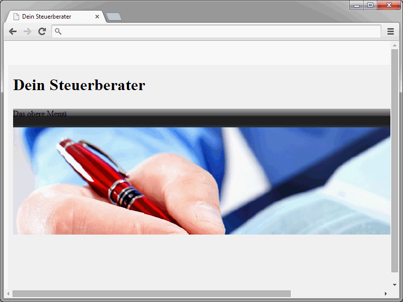
Let's start with the header area of the page. This in turn consists of several elements:
- Logo/title
- top menu
- large image
These three elements are defined within top.
<div class="top"> <div class="header"> <div class="header-top"> <h1>Your tax advisor</h1> </div> <div class="topmenu"> The top menu </div> <div class="header-img"> </div> </div>
This is the basic structure of the page header. Of course, this is also formatted using CSS.
.header { width: 980px; float: left; } .header-top { width: 980px; height: 87px; float: left; } .topmenu { background-image: url(../images/menue.jpg); background-repeat: repeat-x; width: 978px; height: 37px; float: left; } .header-img { background-image: url(../images/header.jpg); background-repeat: no-repeat; background-position: left top; width: 980px; height: 213px; float: left; }
The syntax contains two "special features". First, take a look at the content of the topmenu class. Here you will notice two details about the background image.
background-image: url(../images/menue.jpg); background-repeat: repeat-x;
The one-pixel graphic menue.jpg is integrated. This shows the familiar color gradient in the top menu. By specifying background-repeat: repeat-x;, the graphic is repeated horizontally until the element is completely filled.
Splitting the content area
We continue with the area of the page in which the content is ultimately displayed. This takes place within the div element content. This area is divided into various elements. First of all, there is a small teaser image and a welcome message.
The corresponding HTML syntax looks like this:
<div class="content-left"> <div class="content-image"> <div class="img"><img src="images/img.jpg" alt="" height="100" width="160"></div> <div class="slogan"> <h1 class="title">Welcome to our website</h1> <p>Here follows a welcome text</p> </div> </div>
This area is also divided into two parts. The image is displayed on the left and the welcome message on the right. The content-image class is decisive here.
.content-image { width: 739px; float: left; padding-bottom: 10px; margin-bottom: 10px; border-bottom-width: 1px; border-bottom-style: solid; border-bottom-color: #eee; }
This class encloses the image and the greeting. Within content-image there are two further areas.
<div class="img"><img src="images/teaser.jpg" alt="" height="101" width="157"></div> <div class="slogan">Welcome</div>
If you only want to display a large image or something else instead of such a split, combine these two areas into one div element. The CSS syntax for the two-element variant looks like this:
.img { float: left; } .slogan { width: 560px; float: right; }The result should now look like this in the browser:
We continue with three other elements:
- a left text box,
- a right text box,
- the right menu.
The HTML syntax in this case is as follows:
<div class="teaser"> <div class="left"> Container for text on the left </div> <div class="right"> Container for text on the right </div> </div> </div> <div class="content-right"> The right menu </div> </div>
And here again, of course, the CSS syntax:
.teaser { width: 737px; height: 216px; float: left; border: solid 1px #eee; } .left { width: 330px; height: 180px; float: left; padding: 20px; } .right { width: 327px; height: 180px; float: left; padding: 20px; } .content-right { width: 210px; float: right; padding-right: 20px; margin-top: 20px; border: 1px solid #eee; }At the end of this tutorial, we have the basic structure of our website.
Of course, this basic structure still needs to be filled with the appropriate content. This will be done in the next tutorial.


