Today's tutorial is the last in my little Illustrator series for the time being. But who knows ... maybe there will be one or two more in the future.
A little warning to all Illustrator professionals who might be reading along here. I have structured this tutorial in such a way that even absolute beginners will get something out of it. So don't be surprised if I have written in great detail in some places.
Part 1: Working with a workspace (overview)
What actually is a workspace ? When we talk about a workspace in a computer program, we are certainly not referring to the room in which the computer is set up.
Rather, the workspace refers to the area in which everything takes place. Roughly speaking, the buttons and the drawing area that you need to be able to work properly with Illustrator. All well and good, but why do you need to go into this in a tutorial? The question is easy to answer. If you work with Word, for example, you have no choice but to work with the program's default layout.
However, if you work with software such as Adobe Illustrator, you can freely decide how you want to arrange which buttons on your monitor. This has the advantage that you can place frequently used commands right at your fingertips, while buttons that you rarely or never use can simply be minimized or hidden.
Let's take a closer look at this in practice:
When you open Illustrator for the very first time, it will probably look like this (Figure 01):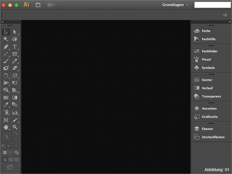
This basic layout is not bad at all to start with. Everything is actually there:
- 1. toolbar
- 2. layer palette
- 3. appearance palette
and a few other buttons that are certainly useful (see Figure 02):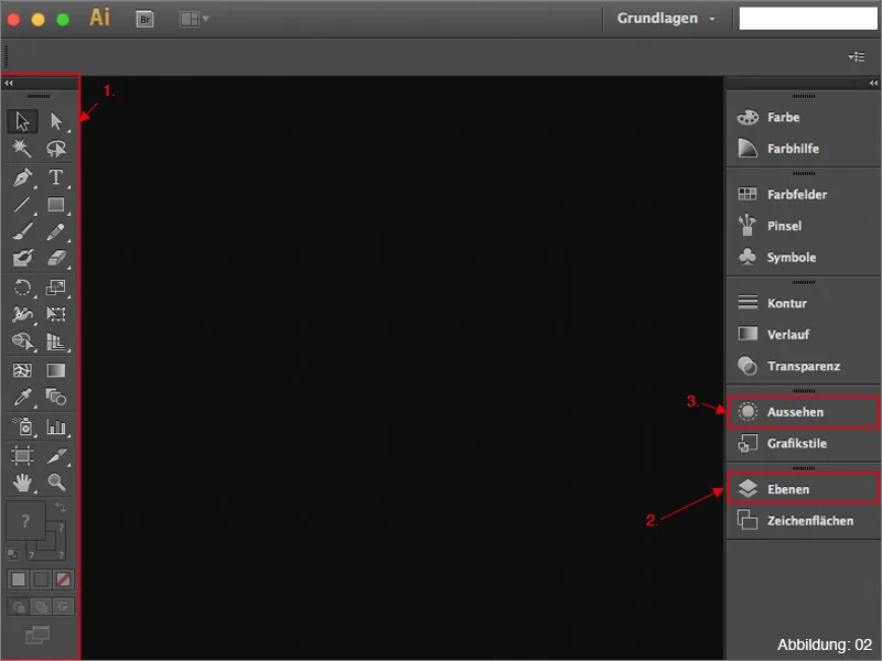
In the top right-hand area of Illustrator (whether Windows or Mac OSX) there is a rather inconspicuous button labeled Basics (see Figure 03):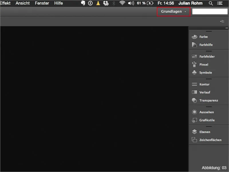
Hidden behind this button is a drop-down menu containing various workspaces preconfigured by Adobe. If you work a lot with fonts and typography, for example, it is advisable to switch from the Basic workspace to Typography (see Figure 04):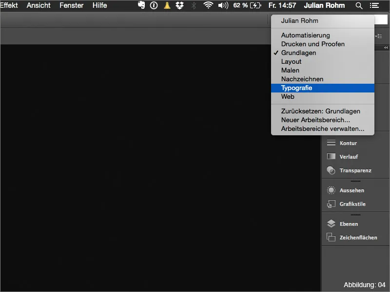
This has the great advantage that all the tools you need for typography editing are now displayed (see Figure 05):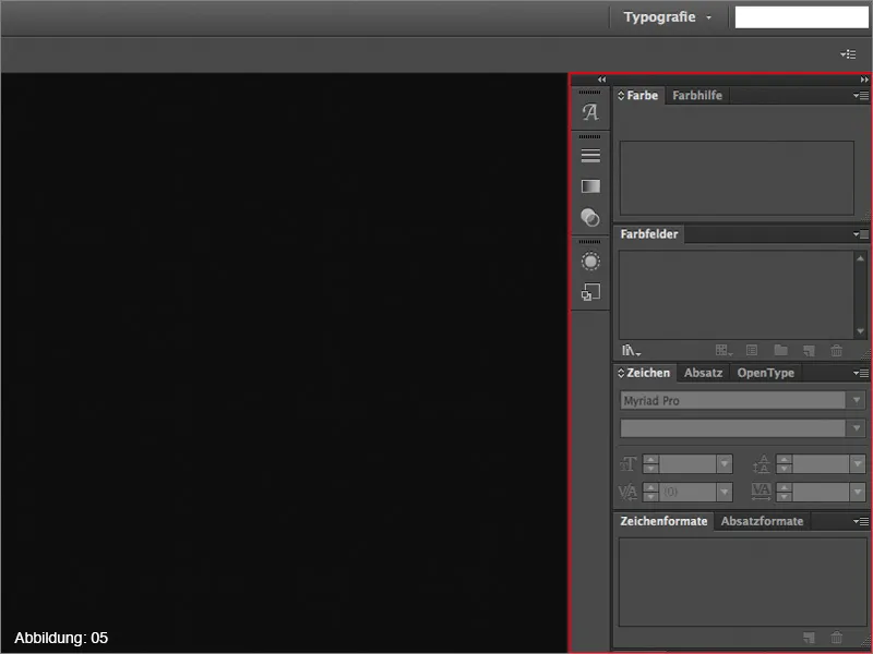
In addition to the Basics and Typography workspace, there are of course also some other ready-made layouts. You should simply open them all one after the other to see exactly what is hidden behind them.
Your own workspaces?
Since Adobe has probably figured that you can never please the real professionals, you also have the option of building your own workspace and then saving it so that you only ever have the elements displayed that you really need.
Those of you who have already moved a tool palette in Illustrator will certainly have noticed that it is still in the same place after restarting the software.
So why create a separate workspace if Illustrator remembers the position of the tool palettes anyway?
This question is also fairly easy to answer. Especially in everyday agency work, it is not uncommon to have to share a computer with another employee from time to time.
However, this employee usually works with a different workflow and has positioned all their tool palettes differently.
To avoid arguments between colleagues in this regard, it is an advantage if each user creates their own workspace. Then all you have to do is select your workspace before you start working and everything will be as you are used to.
What should a decent workspace look like?
There is no general answer to the question of what a workspace should look like, as every user has their own preferences. It starts with whether you are left-handed or right-handed ...
To give you an idea of what such a workspace CAN look like, I have included my own workspace here (see Figure 06). (Due to the screenshot size, the whole thing looks a bit cramped, but on a 13" display you can work quite well with it).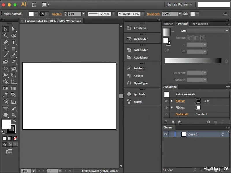
In the following list, I would like to briefly introduce you to the tool palettes that I personally consider to be recommendable and should be part of the basic equipment of your own workspace.
- 1. layer pal ette - everything you create in Illustrator is collected here
- 2. appearance pal ette - important when working with effects
- 3. contour pal ette - all properties of a contour can be set here
- 4. gradient pal ette - Control of gradients
- 5. transparency pal ette - Here you can work with masks, transparencies and fill methods.
(Figure 07):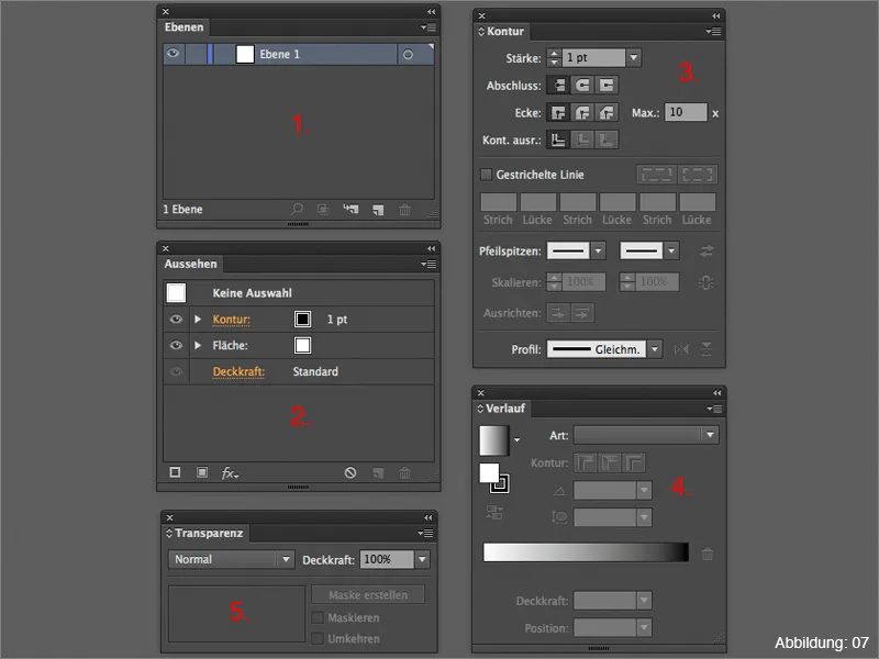
How can you save your own workspace?
Once you have created your own workspace to your satisfaction, you will naturally want to save it. To do this, you need to open the drop-down menu in the top right-hand corner of Illustrator. Quite far down you can then click on New workspace (Figure 08):
You can then assign your own name for the workspace (Figure 09):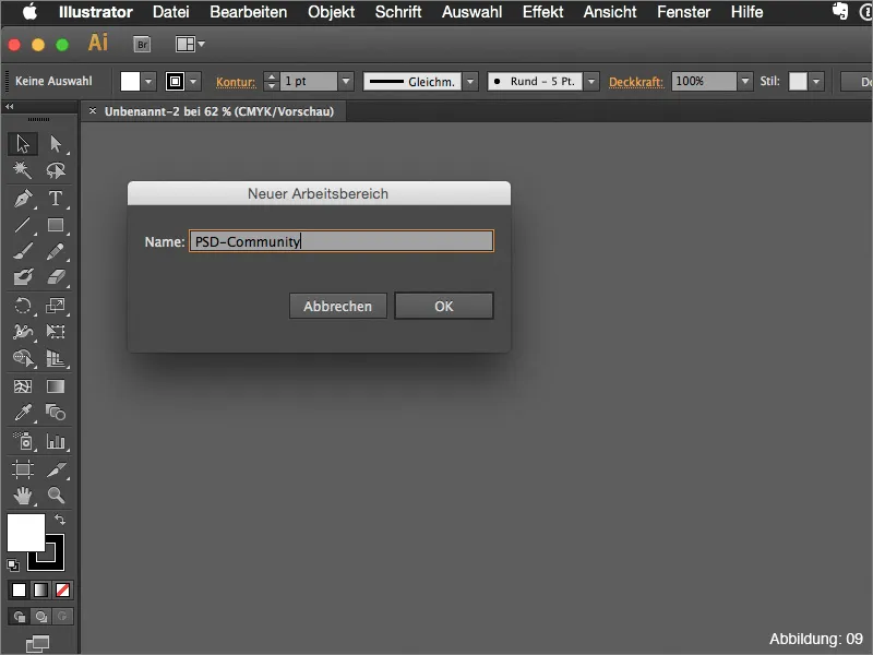
The new workspace is now available in the drop-down menu (see Figure 10):
Part 2: My favorites
Now that you have a brief overview of the topic of workspaces in Illustrator, I would like to introduce you to my two absolute tool palette favoritesin part 2 of this tutorial and go into them in more detail.
The Attributes palette
The almost inconspicuous Attributes palette has more to offer than you might think at first glance. Using a small practical example, I would like to briefly explain the purposes for which I use this palette most frequently.
Let's assume that we have a red greetings card (see Figure 11) that we want to print with white lettering afterwards. Well ... Normally this is not possible, as a normal printer can only print with the colors cyan, magenta, yellow and black. So how can you print something white on a red background?
Some print shops have special digital printing machines that can print with a fifth spot color, e.g. white. However, as these machines cannot automatically know exactly when, how and where to print the white color, we have to specify this in the file. And this is exactly where the attributes palette comes into play.
Assuming we want to print the words "Best wishes" in white on our red greeting card (see Figure 12), it is important that we create a so-called spot color.
To do this, the first thing you need to do is create a new color field in the color fields palette (Figure 13):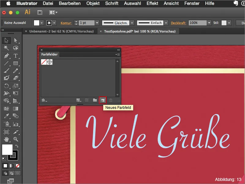
The color is basically irrelevant at first. I usually choose a value of 30% cyan and leave the rest at 0%.
However, it is important that you change the color type from process color to solid color.
I always name the color field " Spot1". (However, you should consult the respective printing company again here, as not all printing machines react to this name in the same way). (Figure 14):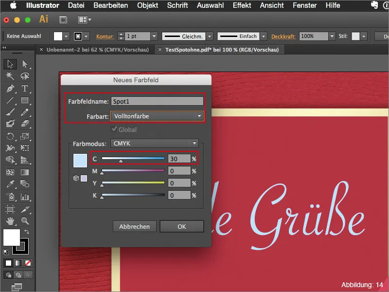
If you now save this file with the spot color created, the printing machine will still not know where to print white.
You must first check the Overprint area box in the Attributes palette. Only then will your font be recognized as a spot color (see Figure 15):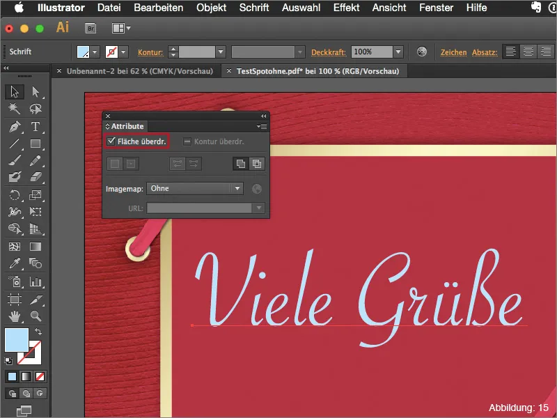
You can then also check this in Adobe Acrobat by opening your print PDF and then calling up the output preview via Advanced>Print production>Output preview ....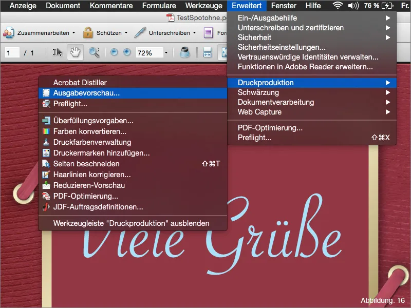
A fifth color with the name "Spot1" should then appear here (see Figure 17):
So if you ever find yourself in a situation where you need to create a spot color like this, remember that you need the Attributes pal ette for the whole thing to work smoothly.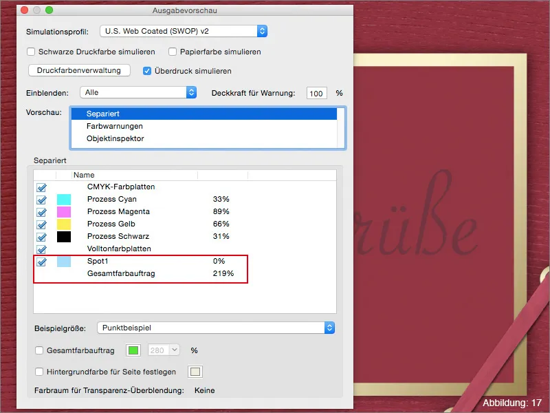
The Appearance palette
Another absolute Illustrator favorite of mine is the Appearance palette. This palette becomes interesting when you start working with effects.
As a small practical example, I have created a lettering here (see Figure 18):
If you now assign a drop shadow to this lettering via Effect>Styling Filter> Drop Shadow ... (Figure 19), this effect will appear in the Appearance palette.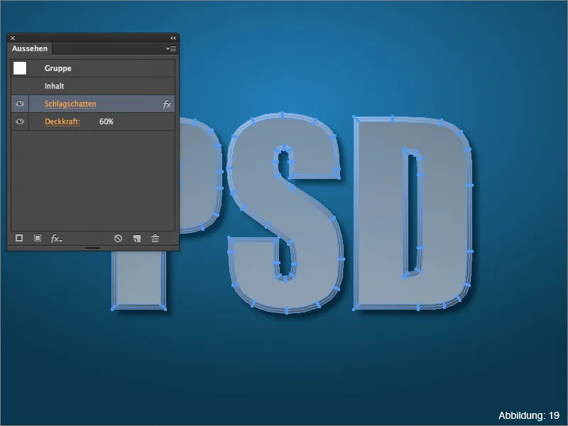
If you realize later that you want to change the drop shadow again, you can easily adjust the drop shadow settings again via the Appearance palette (see Figure 20):
Incidentally, this applies to all effects that Illustrator has to offer.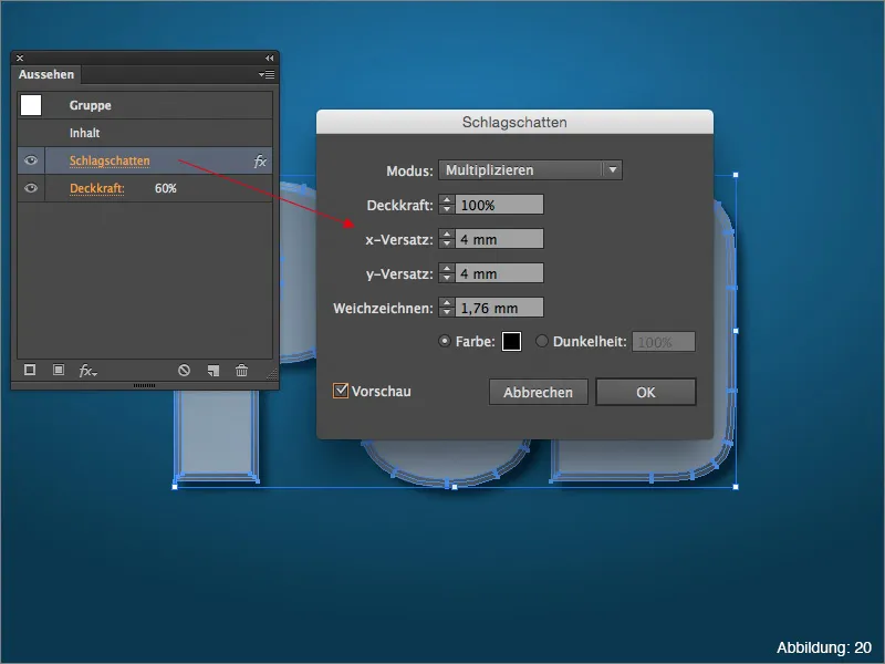
If you want to see the Appearance palette in action, I recommend my tutorial The power of the Appearance palette, which you can also find here on PSD-Tutorials.de.
Final words:
Now we've come to the end of this tutorial. I hope you enjoyed it and were able to pick up a tip or two.
If you have any further questions on this topic, please feel free to write them in the comments below this tutorial. I will do my best to answer them as soon as possible.
By the way ... In the enclosed working files you will find my own Illustrator workspace. If you would like to have a look and use it, please feel free to do so.
With this in mind ...
Stay creative
Your Julian :-):


