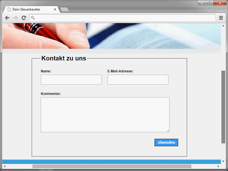
Let's start with the send button. The current CSS status should look like this:
input[type="submit"] { background-color: #3399FF; color: #fff; cursor: pointer; font: bold 1em/1.2 Georgia, "Times New Roman ", serif; border: 1px solid #000; padding: 5px 10px; width: auto; }This syntax leads to the following result:

This is a normal button. It doesn't have a particularly exciting design, but it certainly serves its purpose. Nevertheless, it should be spiced up a little. The end result will look like this:
There is also a hover effect. This means that the button will change color when the mouse pointer is moved over it.
If you take a closer look at the button, you will notice the rounded corners. This is certainly one of the CSS innovations that web designers have been waiting a long time for. Because "in the past" there was no such option. (With the exception of button elements, of course, where you could work with images).
Now round corners can be applied not only to normal page elements, but also to buttons.
The CSS3 working draft contains the border-radius property for this purpose. Mozilla and WebKit browsers offer alternative spellings for experimental support of this property.-moz-border-radius-webkit-border-radius
However, all modern browsers now support round corners.
Based on this knowledge, a border-radius definition could now look like this:
-webkit-border-radius: 17px; -moz-border-radius: 17px; border-radius: 17px;
However, there is something else that stands out on closer inspection. In fact, the button has also been assigned a color gradient.
Something like this can finally be implemented with CSS on-board tools. The various gradient properties are used for this. These are assigned to the background property as a value. Incidentally, there are now numerous tools that can be used to generate color gradients.
You can find one of these, for example, on the page http://www.css3factory.com/linear-gradients/. In the following syntax, a color gradient and the familiar round corners have been defined.
In the current example, the syntax for the button is as follows:
input[type="submit"] { border-top: 1px solid #96d1f8; background: #65a9d7; background: -webkit-gradient(linear, left top, left bottom, from(#3e779d), to(#65a9d7)); background: -webkit-linear-gradient(top, #3e779d, #65a9d7); background: -moz-linear-gradient(top, #3e779d, #65a9d7); background: -ms-linear-gradient(top, #3e779d, #65a9d7); background: -o-linear-gradient(top, #3e779d, #65a9d7); background: -linear-gradient(top, #3e779d, #65a9d7); padding: 10px 20px; -webkit-border-radius: 17px; -moz-border-radius: 17px; border-radius: 17px; -webkit-box-shadow: rgba(0,0,0,1) 0 1px 0; -moz-box-shadow: rgba(0,0,0,1) 0 1px 0; box-shadow: rgba(0,0,0,1) 0 1px 0; text-shadow: rgba(0,0,0,.4) 0 1px 0; color: white; font-size: 21px; font-family: 'Lucida Grande', Helvetica, Arial, Sans-Serif; text-decoration: none; vertical-align: middle; width: auto; }
I have already indicated that the buttons should react when the mouse pointer is moved over them. The familiar :hover is used for this.
#submit:hover { border-top-color: #28597a; background: #28597a; color: #ccc; }The button will react to another event. The pseudo class :active is used for this. This can be used to react when the button is clicked.
#submit:active { border-top-color: #1b435e; background: #1b435e; }
In the current example, the color of the top border and the background color of the button change when the button is clicked.
Round corners for the fields
The so-called round corners can of course not only be applied to the button, but also to the input fields. The result could look like this:
And here is the corresponding syntax:
input[type="text"], input[type="email"], textarea { border: 1px solid #bebebe; -moz-border-radius: 9px; -webkit-border-radius: 9px; border-radius: 9px; }
You already know the properties required to define such round corners.
Form validation using CSS3
At the moment, visitors can enter whatever they want in the input fields. The values entered are not checked. This is about to change. The fields are checked for the following criteria:
- The name field must be filled in.
- The e-mail field must contain a syntactically correct e-mail address.
- The multi-line input field must also be completed.
Only when these criteria have been met can the form actually be sent.
To mark a field as a mandatory field, assign the required attribute to it. A field marked with this attribute must be filled in, i.e. it must not be empty.
A corresponding application would look like this
<form> <input type="text" name="name" id="name" value="" required/> </form>
Here, the browser would check whether the field has been filled in. If the field is empty and an attempt is still made to submit the form, the browser should display an error message.
Incidentally, things go a little further with email fields. These are assigned type="email" and the required attribute. Now not only a value, but actually a correct e-mail address must be entered in the field, otherwise there will also be an error message when the form is sent.
The form could now look like this:
<ol> <li> <label for="name">Name:</label> <input type="text" name="name" id="name" value="" required/> </li> <li> <label for="email">Email address:</label> <input type="email" name="email" id="email" value="" required/> </li> <li> <label for="comment">Comment:</label> <textarea cols="32" rows="7" name="content" id="content" required></textarea> </li> <li class="button"> <input type="submit" name="submit" id="submit" value="Submit" /> </li> </ol>
Especially in more extensive forms, there may of course be mandatory fields, but also fields that should not necessarily be filled in. In such cases, you can mark the mandatory fields separately. Mandatory fields can be accessed in CSS via:required.
:required { background-color: #ff0000; }This syntax gives the mandatory fields a red background color.
Another variant to draw attention to mandatory fields is the following syntax:
input:required:focus { border: 1px solid red; outline: none; }
If an attempt is made to submit the form here, the first field that has not been filled in or does not meet the validation requirements is given a red border and the focus.
If a user then fills in this field correctly, but there is another field that has not been filled in, this will also be given focus and a red frame after the next submit visit.


