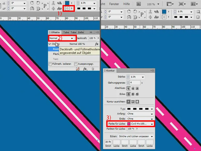
In this training, I would like to show you how to create a street like this. It's all a bit easier in Illustrator, but it should also work in InDesign.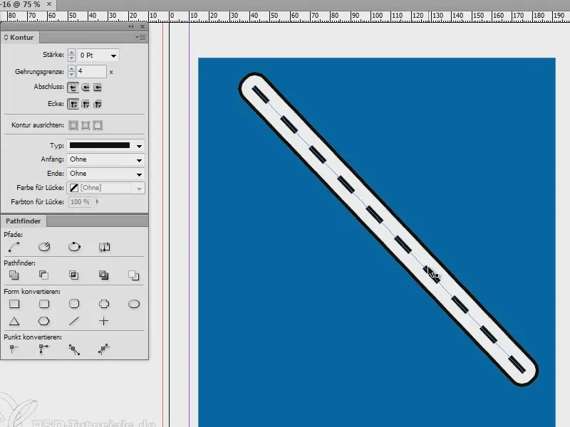
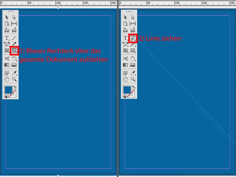
I create a new document and color it completely blue (1). Then I draw a line (2), ...
... I set the outline to 3 pt (1) and the color to black (2). And then move the line to the foreground: right mouse button, Arrange>Foreground. Then I turn it into a dashed line (3).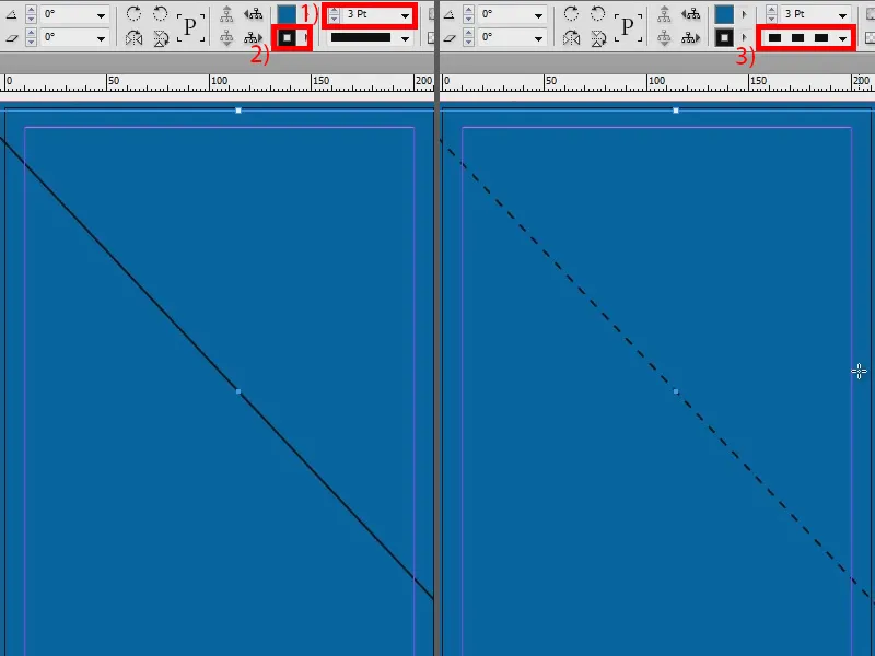
Perhaps it should be a little thicker - 7 pt (1). And to make it a little less, I'll set it to Dashed (3 and 2) (2).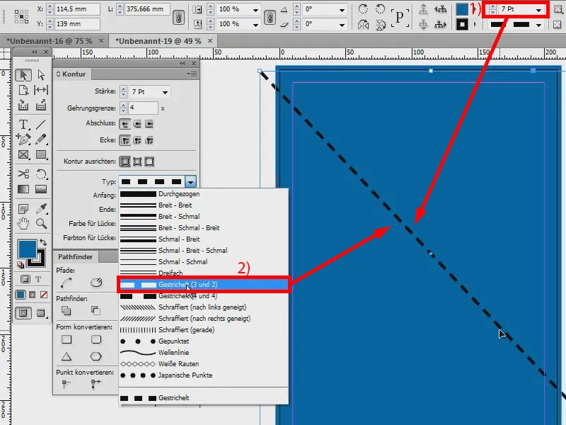
Now I'll go to my Effects paneland create a drop shadow with the following options: Normal blend mode, Opacity 100%, Offset 0 mm. I set the size to 2 mm. And to make everything nice and bold, I set an overlap of 100 %.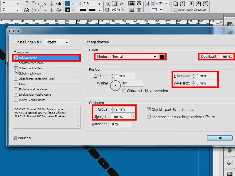
Next, I take a bill to the outside. I set this to Normal again , opacity 100 % and set the size to 5 mm. The overlap is set to 100 %. That already looks pretty good.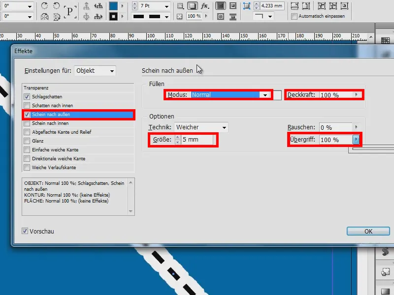
And I set the drop shadow (1) to: Shadow takes other effects into account (2). Then you can already see the black line on the outside (3). I'll confirm the effects.
But now it looks more like a chain. Therefore, I should now enter [Paper] for Color for Gap (4) and I have a straight line (5). To see this (6), I set the display performance to high quality (Alt + Ctrl + H).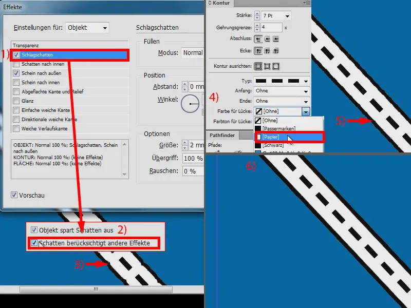
So this is my street (1). It couldn't be easier. I can now change the contour thickness (2).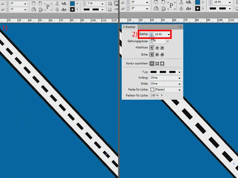
I'll set the thickness to 6 pt again (1). And if the strokes are too many, you can of course also define this, if I now say Dashed (2) here, I have the option of setting (3) that there should always be a stroke every 30 pt (4). Pretty Schick, I think.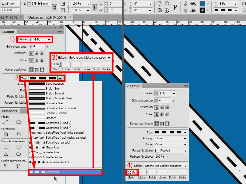
If you want to change the color of the road, just go to the effects (1) and change the glow to the outside (2), for example to pink (3 and 4).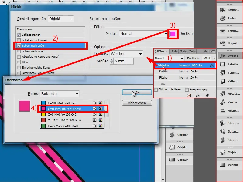
Now there is still the white in between (1). Click on Contour and simply change the fill method to Multiply. Done (2).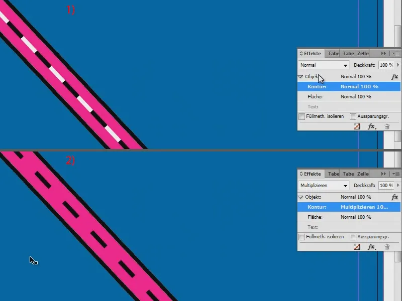
As you can see, it's not that difficult to create roads in InDesign. And if you now want to change the color of the dashed line, simply set it to white here (1), but then use Normal instead of Multiply (2) - and then use exactly the same pink for Color for Gap (3).