You want to effectively engage with Google Data Studio and understand the basic concepts and terminology? In this guide, we clarify the central elements so you can use the tool effortlessly.
Main Insights
- The report is the central point in Google Data Studio where all the data is visualized and prepared.
- The connector is the link between Google Data Studio and various data sources like Google Ads and Google Analytics.
- Dimensions help categorize and sort data, which is crucial for meaningful analysis.
Understanding Basic Concepts
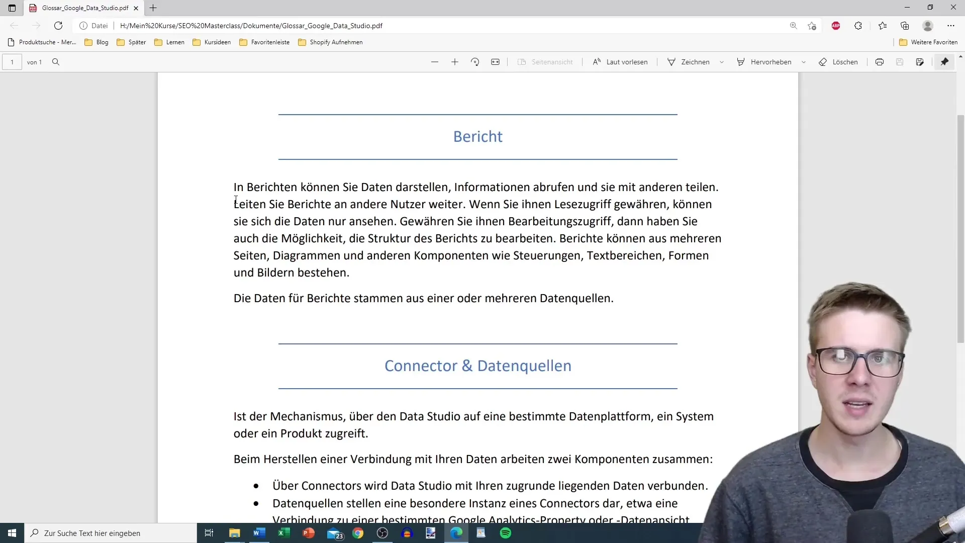
Let's start with the first term: the report. The report represents a collection of data.
In Google Data Studio, you have the ability to visually represent data. You can retrieve information, prepare it, share it, and even download it. The report is the central component where you can visualize your data as you wish.
Within a report, you can grant users read access. You decide whether they can simply view the information or make changes as well. On the user interface, you have the options to insert text areas, shapes, images, and charts. The chosen connectors determine which data sources you can use and which filters affect the data.

The second term we need to clarify is the connector. It is the mechanism through which you access data from platforms like Google Ads or Google Analytics in Google Data Studio. When connecting your data, two components always work together: the connector and the data source.
A connector links Google Data Studio to the specific data source you need. For example, this could be a connection to a particular Google Analytics account or a specific Google Ads campaign. While the connector enables communication between Data Studio and your data, the data source provides the actual data you want to use in your report.
Now, let's talk about dimensions. Dimensions are essentially categories of information that group values. These values are typically specific attributes like names or descriptions. When creating a report on your website's traffic, dimensions could include the browser or the landing page, for instance.
The values within these dimensions can have different entries, such as "Chrome" for the browser or "Summer Sale" for a specific campaign. Understanding the interplay between dimensions and values is important for creating meaningful reports.
An example of dimensions in the geographic area are continent, country, latitude, and longitude. In this case, "country" would be a dimension with values like Russia, USA, Germany, and other countries. Such dimensions help you structure and visualize data geographically.
Summary
This guide has explained the essential concepts around Google Data Studio. You've learned that reports play a central role in data usage, while connectors enable access to different data sources. In addition, dimensions help organize and analyze data effectively.
Frequently Asked Questions
How do I create a report in Google Data Studio?You can create a report by selecting your connector and then adding desired data sources.
What are connectors in Google Data Studio?Connectors are links that connect Data Studio with data platforms like Google Ads or Analytics.
How do dimensions work in Google Data Studio?Dimensions categorize information and help display data grouped together.
How can I share my reports with other users?You can grant read access by adjusting user management in your report.


