An initial - what is it?
A popular marker at the beginning of articles in editorial design is a larger letter, which is called an initial.
The letter usually builds up from the top of the line downwards over three or more lines. An initial does not usually have to consist of just one character, but can contain an entire word.
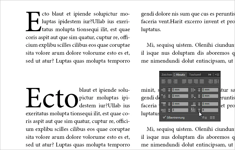
The following image shows a modest initial with one character over three lines. The setting values can be seen in the paragraph control panel.
The classic initial is also referred to as a modest initial because it is used solely to mark the beginning of a paragraph. There are also hanging and decorative initials, whereby hanging initials are often also decorative initials.
The hanging initial can be placed partially or completely outside the line width.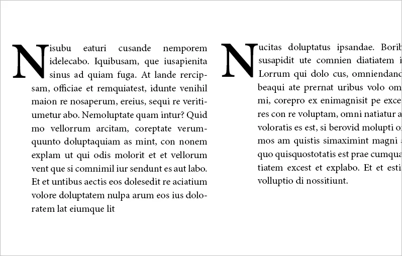
Decorative initials are often hanging, protrude beyond three lines and are occasionally decorated with ornaments etc. The decorative initials of the Gutenberg Bible are famous. Here is an image under the CC by-nc-sa 3.0 license from the website: http://bav.bodleian.ox.ac.uk/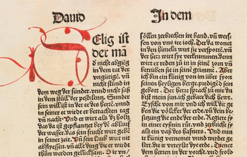
What should I bear in mind when using initials?
Typographically, initials are pleasant for marking new articles, but not for each new paragraph of an article. The initial should always be set in the same font - possibly with a bold typeface. However, depending on the context, there are also exceptions where a variation of font, style and color can achieve a pleasant effect.
From a layout point of view, the paragraph should always be at least twice as long as the height of the initial. The effect of an initial can be enhanced by using a bolder font.
Initials are not only used in editorial design, but can also be used in a flyer or invitation card, depending on the occasion. Depending on the context, it is advisable to keep the font of the initial special, for example by using a cursive font. In this case, the initial should also be semi-hanging and extend far beyond the standardized three lines.
Initials can also be combined with indents. This is particularly useful for texts with many paragraphs. For example, the beginning of the text can be marked with an initial, while the other paragraph beginnings contain indents.
Creating an initial
There are several ways to create initials: 1. via the control palette, 2. via your paragraph control panel, 3. via the dialog Initials and nested formats. You also have the option of calling up the Initials and Nested Formats tab via Paragraph Formats.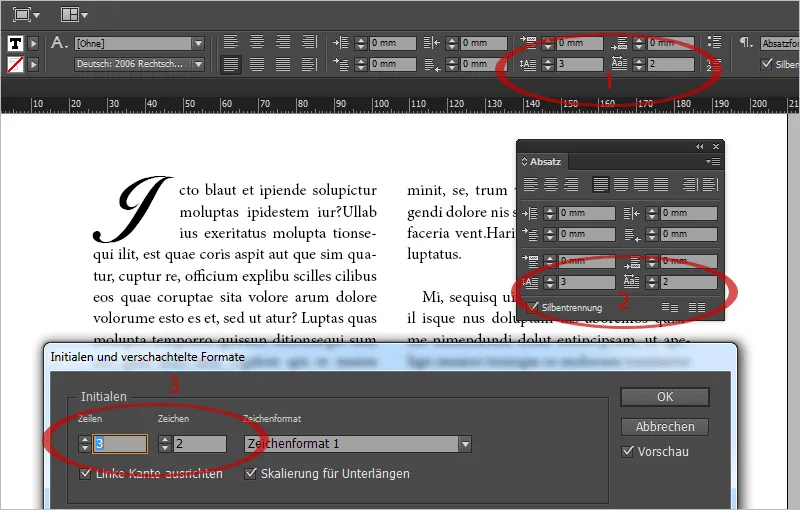
In InDesign, there are two icons for initials at the top of the control palette, which you can use to control the number of characters and the height of the initial via the number of lines. If your monitor resolution is too small and the icons are therefore hidden, you can also call up the dialog for initials and nested formats via the context menu of the control palette. The quickest way to do this is with the shortcut Ctrl+Alt+R.
You can assign initials to a character format and thus create initials in your work with one click that have a different font to the rest of the paragraph, for example. Initials can also be assigned as a nested paragraph format.
Typographically, it is convenient to align the character to the left edge so that the white space at the edge is removed or minimized. This is activated by default. Scaling for descenders is also recommended so that characters do not protrude into the following lines, which can happen with some fonts and letters (J, Q, ...).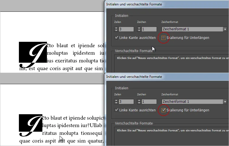
If the white space is not sufficient due to the alignment to the left edge, you can insert a space before the initial (e.g. eighth quarter with Ctrl+Alt+Shift+M). Now define two characters for your initial, one of which is your space. There will be a kerning and with the kerning settings you can fine-tune the left alignment to the edge.
You can do the same if your character - like the J in the image above - extends too far to the right and protrudes into the text. Insert a space (eighth fourth) behind the initial, increase the initial characters to two and use the spacing settings to push the text outwards with the space marked so that it fits again visually.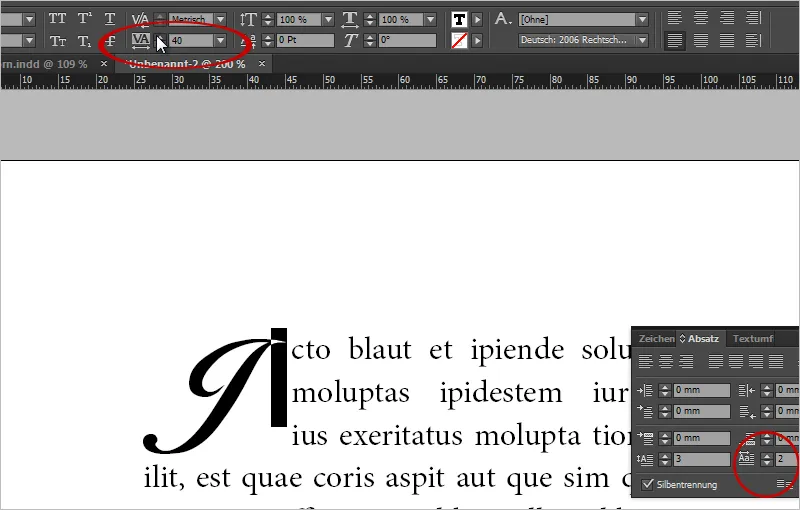
Initials can be easily removed again. Simply set the characters for initials to 0.
The hanging initial in front of the column
To place a hanging initial half or completely in front of the text column, you can use a space again. For example, insert an eighth of an eighth before the first character, increase the initial value to 2. Now select the space and reduce the run width.
At -500, you have an initial half-hanging in front of the column in the Minion Pro 12 point with an initial over three lines.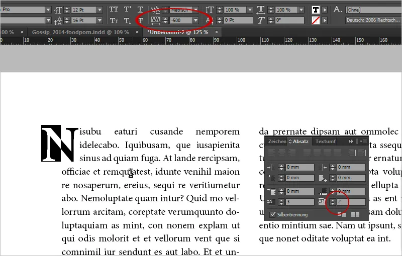
At -1000 it is directly in front of the column. This can also be a nice distinction in your layout.
The decorative initial with visualized text wrap effect
Typographic ornaments can be used as decorative initials. You can buy them as graphics from Fotolia, for example.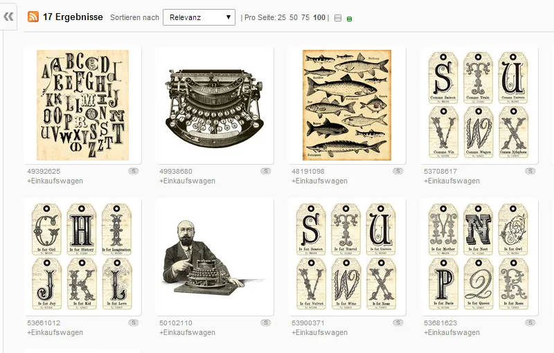
However, it is also a good idea to choose a letter from a beautiful script font, convert it into paths and place it as an object with text flow.
In this case, I choose the font Orphiel Demo, draw a new text frame and write "D" in it. You can convert the text object into a vector object via the Font>Convert to Paths menu (Ctrl+Shift+O).
Then activate the text wrap in the wrap mode of the object shape and extend the text wrap by 3 mm.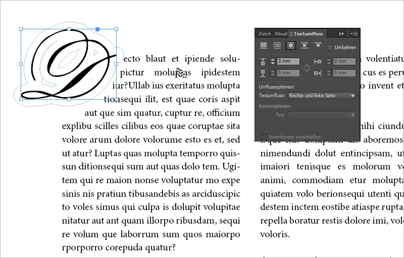
Tip: You can also control the text outflow in detail by clicking on the "D" object with the direct selection tool. The text wrap points appear. Now you can move individual text wrap points and, for example, taper the bottom text wrap so that the bottom line still slides upwards.
A graphic as an initial
You can achieve a classy look in the layout by placing an image as an initial instead of a normal character.
To do this, simply insert your image and control the view using the text wrap options. An example of this is our logo as an image initial.
The problem here is that if text sections move, your image remains in place. It is therefore static.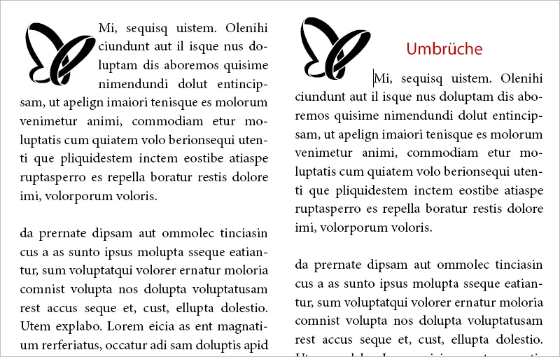
It becomes dynamic when you anchor your image with the text. This means that your image initial moves with the text. To do this, move the mouse over the blue field in your object frame. A message from InDesign will appear. Simply drag your object to the desired text position where it should be anchored.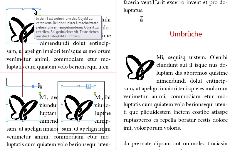
Now your image will run with the text if you have breaks in the preceding text.
A logo exported as a font as an initial thanks to scripting
For single-color illustrations or logos, there is another trick for actually integrating objects as an initial.
The IndyFont script converts graphics into a font file. You can then use the character output with your graphic as an initial via the character formats.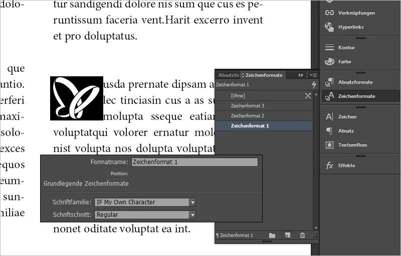
The advantage of this method is that you can control the line height very easily via the initial icons instead of having to manually fiddle with the object frame for objects.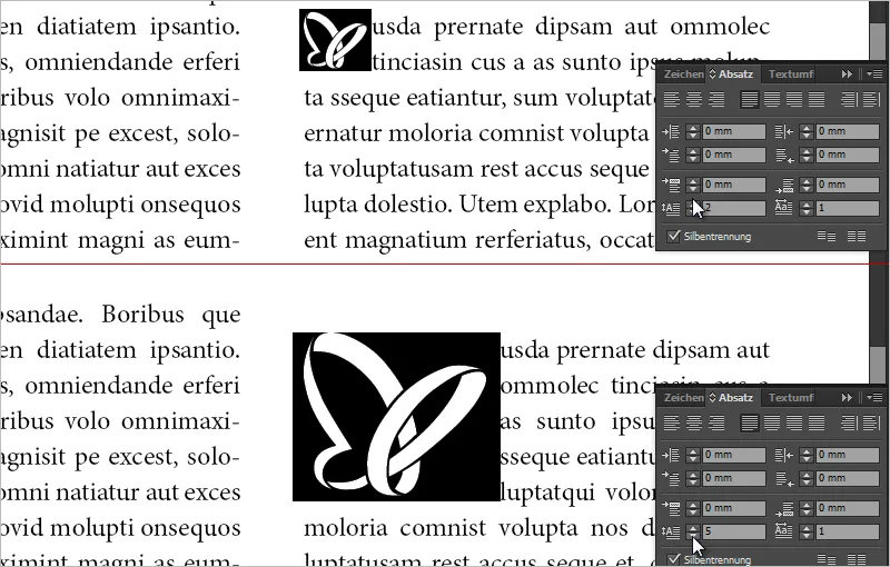
In addition, objects can also be set as individual listing characters. A great thing.


