Normally, I create background graphics in Photoshop, place them in an InDesign document, and layout the flyer until the PDF export in InDesign. Flyers created in vector style can sometimes even be completely created in InDesign without any preliminary work in Photoshop or Illustrator. Since not everyone has access to InDesign, here I will show the editing exclusively in Photoshop - even if that should not always be the preferred way.
Create a New Document
First, I create a new document. Since it is supposed to be an A4 flyer, I can select the DIN-A4 format right away.
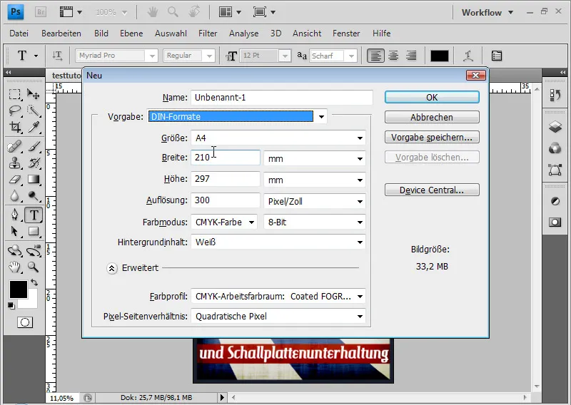
Usually, printing houses require a bleed of 2-3 mm, so that the flyer can be trimmed cleanly without leaving any white paper remnants.
Therefore, I add 2 mm to each side to the standard measurement of 210x297 mm, resulting in the following dimensions: 214 x 301 mm. By scrolling with the mouse wheel, I can change the values in increments of 0. Maintaining the Shift key allows me to adjust the values in whole steps.
The resolution is 300 pixels per inch. Important: The color mode is CMYK.
The Ruler is set to centimeters. If I prefer a millimeter setting, I can adjust this in the preferences. To do this, I select Ctrl+K and Ctrl+7.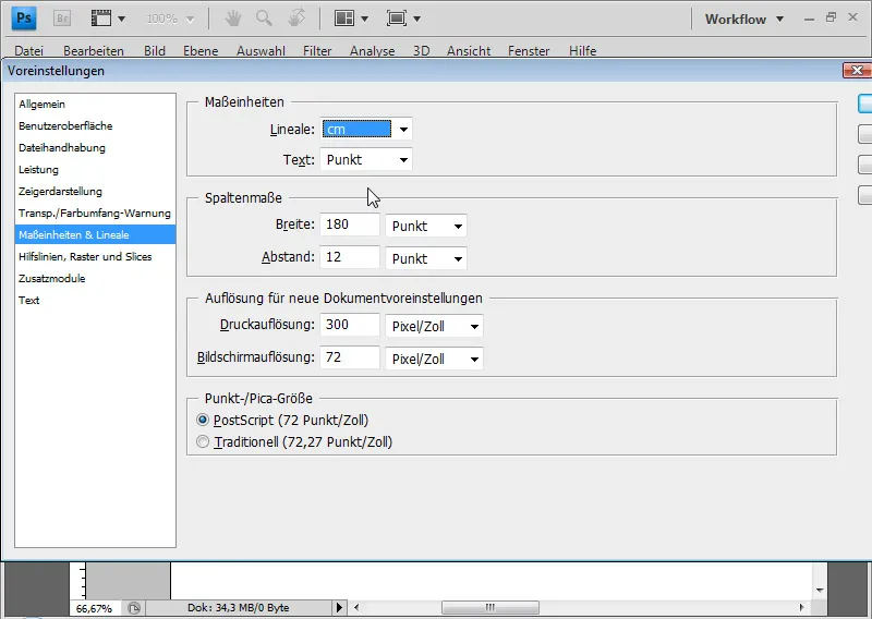
I now set up the area of the bleed on the Ruler with the help of guides, so that I can always assess how my flyer will look at the edges.
If the Ruler is not displayed, I can show it by pressing Ctrl+R. Now, using the Mouse, I drag a guide from the Ruler and place it 2 mm from the edge. Holding down the Shift key, I can position the guide very precisely in millimeter increments. I do this for all sides.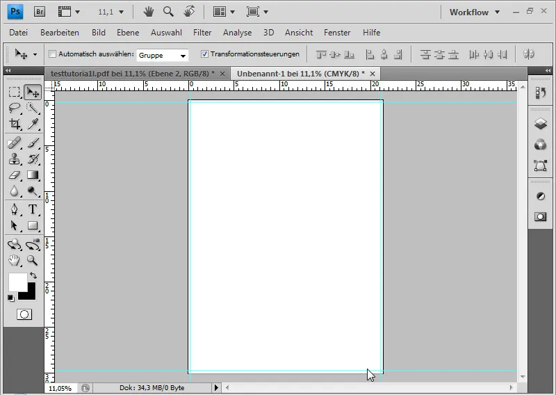
If the guides interfere with the flyer assessment, I can hide them with Ctrl+H. However, this also hides transformation controls, selections, etc.
Create Background Graphic
For the background color, I use a gray with 90% brightness: e5e5e5. With Alt+Ctrl, I can fill the background layer with the foreground color chosen in the Color Picker.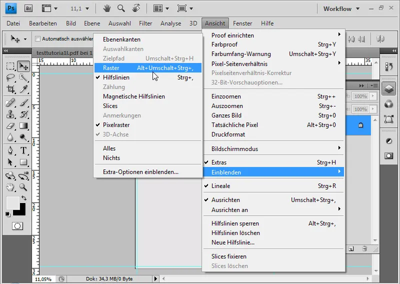
I display the grid and draw narrow rectangle strips from top to bottom using the Rectangle Tool. Once the image is covered with rectangle strips, I can reduce them to one layer.
To do this, I select the respective layers and use the command Ctrl+E. Now, I select the distort filter Polar Coordinates in the setting Rectangle>Polar. This will create rays running towards each other from the strips.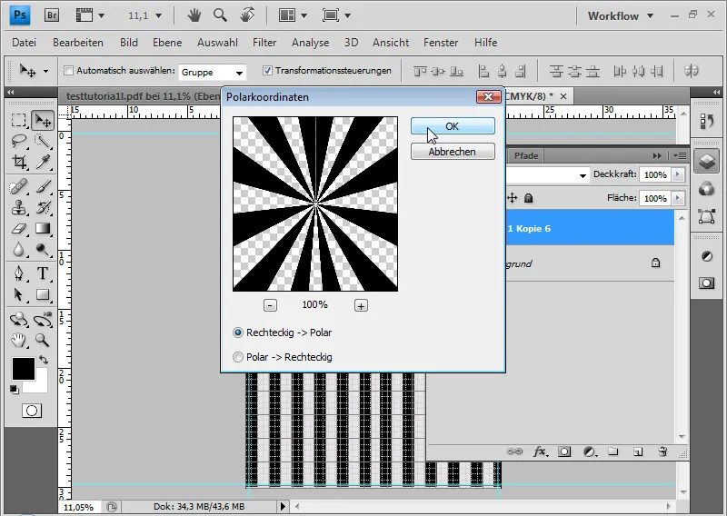
I want the rays to have a slightly curved shape, so I select the distortion filter Twirl for the layer and twirl the rays by 50 degrees.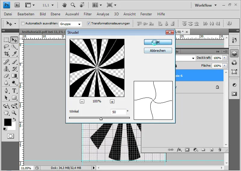
I create a new layer filled with blue color: 627aaf.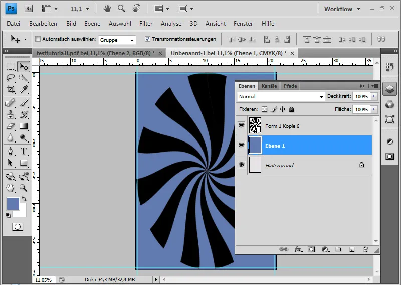
By Clicking and Ctrl on the layer thumbnail of the ray layer, I select the pixels of the layer. In the Paths Panel, I create a working path from the selection.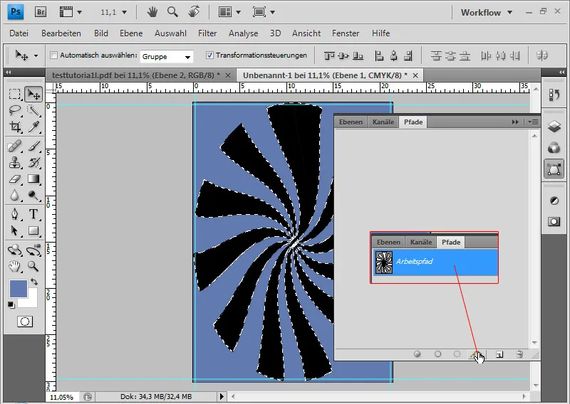
Now, I can create a vector mask for the blue layer from the working path in the mask panel. I have created a Custom Shape this way.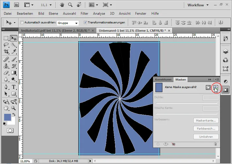
Using the Path Selection Tool, I delete the upper rays because I don't need them.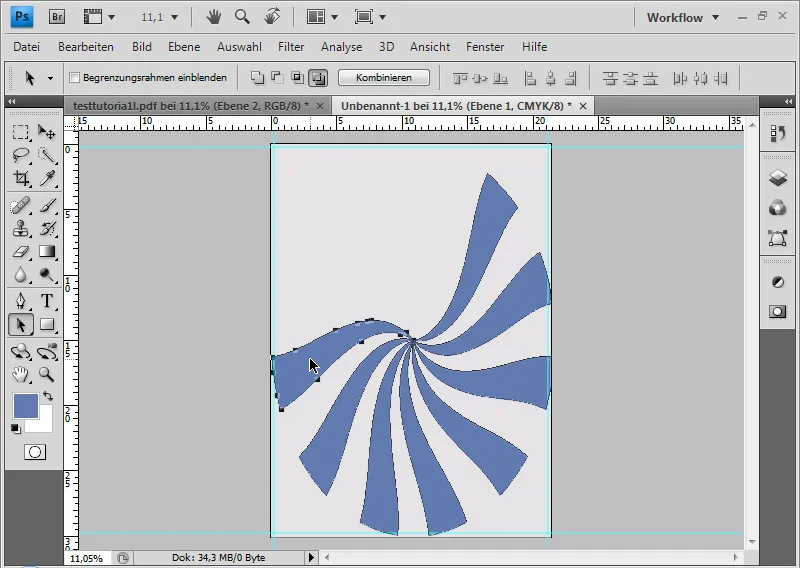
With Ctrl+T, I can transform my vector mask. I move the remaining rays upwards so that the original center is located to the left above the document and four to five rays sweep from top left to bottom right inside the document. To add more curvature, I can also distort the vector mask using Ctrl+T.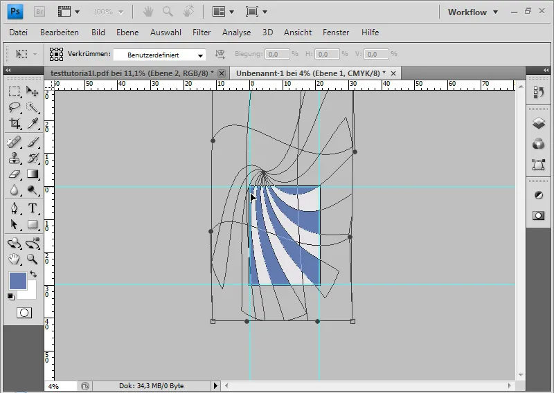
Pro tip: Those who frequently use this type of shape should save it as a Custom Shape Preset. Simply click on the vector mask and save the shape via the menu Edit>Define Custom Shape. The saved preset will then be available for future applications in the Custom Shape Tool presets.
To achieve a grungy effect in the image, I place a suitable texture via the menu File>Place. The texture can be downloaded here:
http://www.psd-tutorials.de/downloads-file-3268-texturen-sonstiges_grunge-1.html.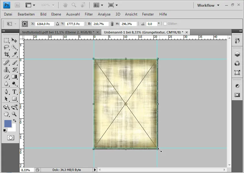
I set the layer mode to Color Dodge. Color Dodge increases the contrast of the color channels and enhances saturation. The original colors darken. White has no effect.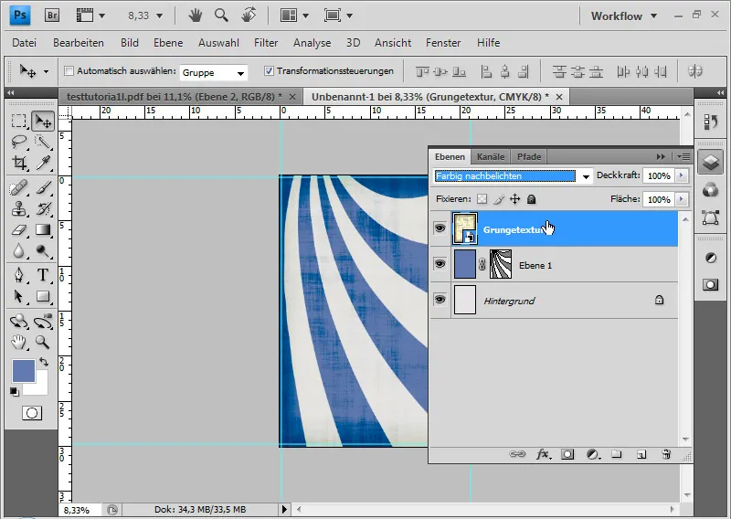
Other blending modes such as Screen and Soft Light are also suitable.
To add a shadow effect to the edge, I choose the fill option Inner Glow with a dark color in Multiply mode at about 160px distance. The Opacity is about 60 percent.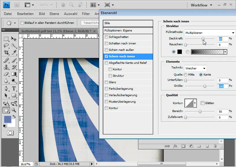
An adjustment layer Curves as a Clipping Mask further enhances the contrast. I drag the curve from the middle upwards to the left.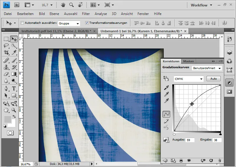
The flyer background is now complete.
Placing Foreground Elements
Another eye-catching element is needed to visually represent the main theme. Through the menu File>Place, I insert a vector file into the document. It shows a Flower-Power VW Beetle. The Beetle is slightly resized and finally placed on the left. Image source VW Beetle: Tetastock - Fotolia.com.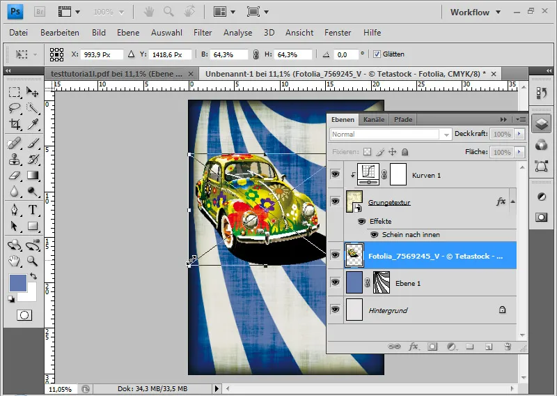
The yellow color of the Beetle needs some adjustment. I could adjust this in Adobe Illustrator via the Smart Object original, but I can also do all the steps in Photoshop. For this, I create an adjustment layer Hue/Saturation as a Clipping Mask and shift the Hue slider to the left when yellows are selected until an orange tone is achieved.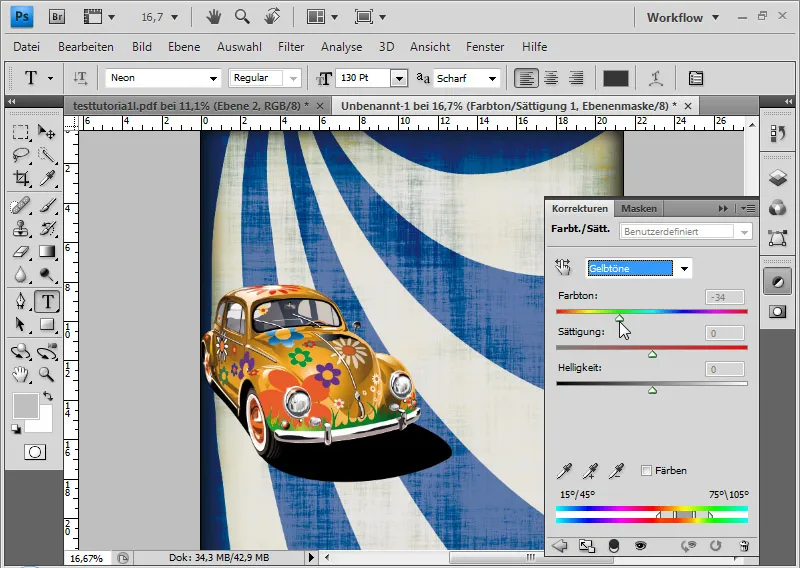
Next are the texts – for this flyer, just as examples! First, I create a catchy headline. Using the Text tool, I draw a frame and write "Oldtimer Flower" at a font size of 130. The font is Neon. The text color is chestnut brown: 5d1f12.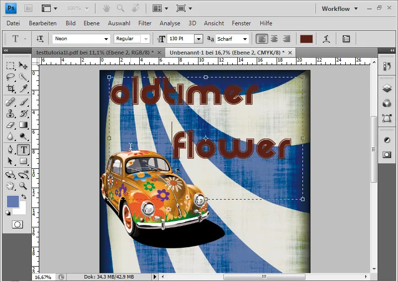
In the Layer Styles, I set the following for accentuating the headline:
Drop Shadow with 75% Opacity in Multiply mode, with a 20px Distance, 20% Spread, 50px Size. The Contour for the Drop Shadow is a curve from the bottom left to the top right.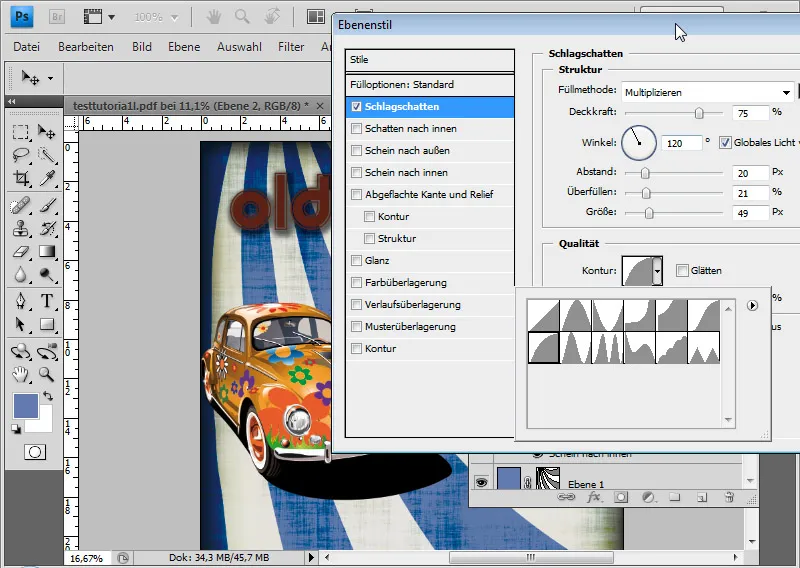
Contour: White color with a 20-pixel Size.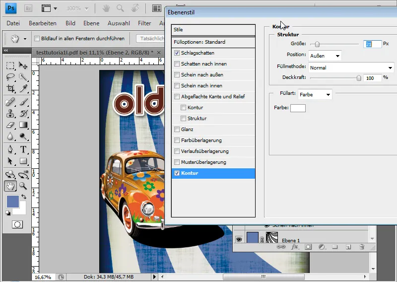
I place additional flyer texts below the Beetle graphic. I draw another text frame and write using the HamburgerHeaven font some features of the Flower-Power Oldtimer meeting. The Font size is 52pt and the Line spacing is 80pt.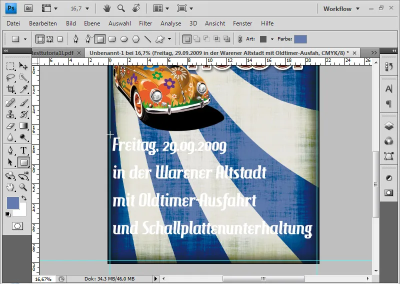
The white text color makes the text quite hard to read. Therefore, I place colored rectangles behind the text – framed by the grunge texture.
Using the Rectangle tool, draw a rectangle in reddish color: b03434. Adjust this to fit the text proportions exactly; then duplicate it with Ctrl+J and place the duplicates behind each respective line of text. While moving, holding the Shift key will keep the left boundary exact.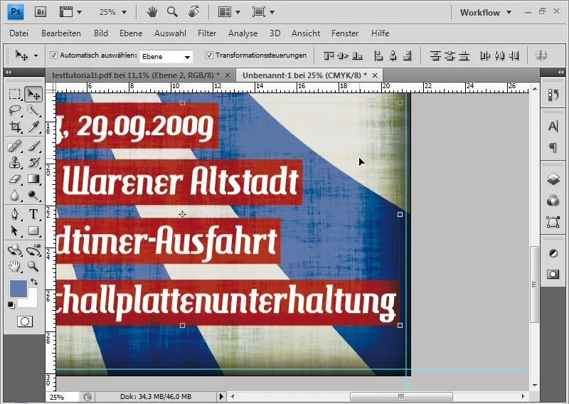
Lastly, I create a layer placed at the top, fill it with any color and add a dark Stroke of about 45px using the Layer Styles. Reduce the Fill slider to 0%, so only the layer styles are visible.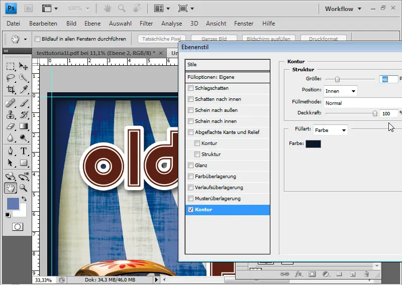
The wide stroke is placed to extend into the bleed area. After cropping, I will have a fine dark stroke around the flyer content, framing it beautifully.
Preparing for Printing
Now, I go to Save As, select the PDF format, and give the file a name.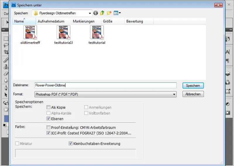
For printing, it is advisable to export the file as a PDF in the standard PDF/X-4 format.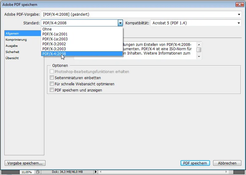
Many printing companies also provide guidance on what to watch out for in the print files. For example, Flyerpilot.de as an online printer offers an overview as a checklist of what to consider when exporting: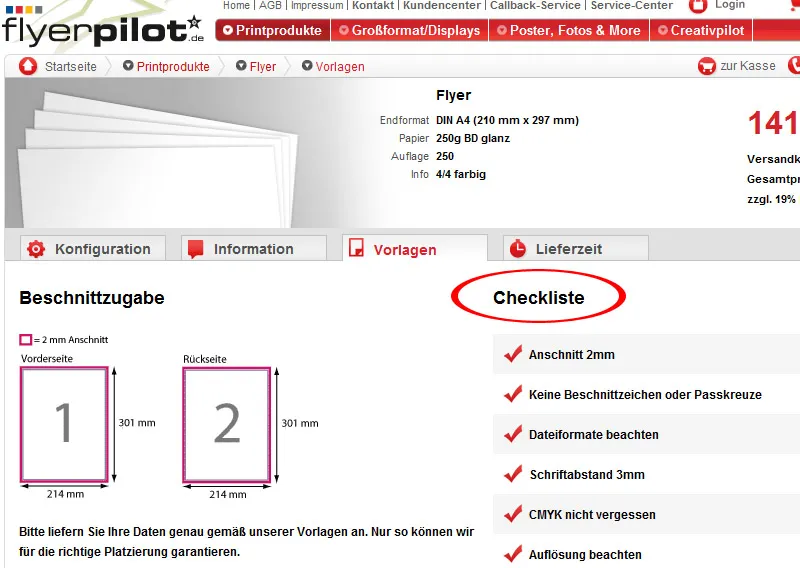
It is advisable to inquire whether the printer has issues with transparencies. This is especially important for vector graphics and fonts with effects (drop shadows).
The advantage of online printers such as Flyerpilot.de is that I have real-time calculation with changing inputs (paper/quantity etc.). The payment options even include PayPal!
Upon request, I can also have a proof of the file carried out to make sure everything is in order.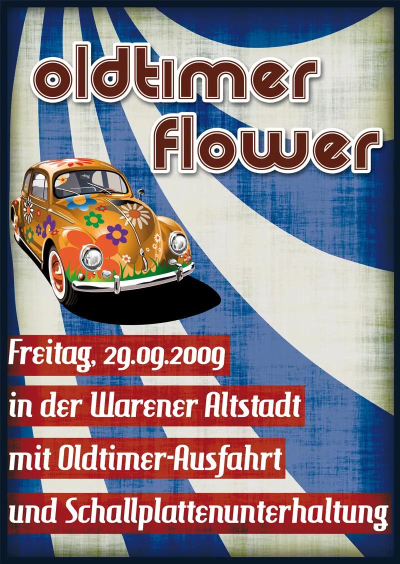
Now I can submit my file to my trusted printer or even better: upload it directly from home to Flyerpilot.de.
