I admit, justified text doesn't sound particularly exciting at first. But the devil is in the detail. This tutorial is intended to give you an insight into the possibilities and background of justification so that you can use it to create typographically appealing layouts. So let's get started together:
Justification is one of the most commonly used forms of text alignment. In justified text, all lines within a text field are the same length. They start flush left and end flush right. We often encounter this variant in books, magazines, daily newspapers or other reference works.
As justified text creates a calm, coherent, even static appearance, you should always be careful where you use it. With just a few lines (e.g. a three-liner), it quickly becomes apparent that justified text looks rather unattractive. It is then better to switch to justification. Justification is therefore ideal for longer text passages and loves to be presented in sufficiently wide columns.
The problem and the reason for this tutorial
We recently came across an unsightly presentation in Commag - our online magazine for image editing, web design & co. It was about the presentation of our new Contao training with the corresponding trainer. To get to the point: The set text in combination with the image looks "needy". We have justification in one line, which is far too small. Large holes are also included and many hyphenations make the reading flow difficult. You could also have thought about positioning the DVD in a completely different place. So let's get on with it, because surely there's a better way.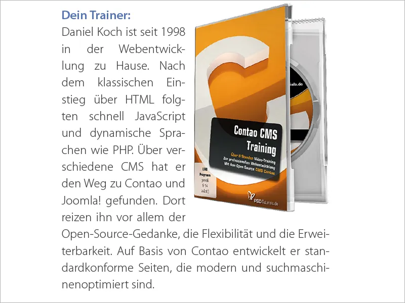
Adjusting the justification
But before I go into the solution to the problem, I would like to take you a few steps back to the core of this tutorial. If all lines should be the same length in justified text, how can InDesign fill the length of a line without creating a jumble of fictitious words?
This question gives rise to three variables that need to be adjusted.
- We change the word spacing
- We change the character spacing
- We change the character width
Let's take a brief leap into the past: in the days of lead typesetting, many slices were laboriously inserted between the lead letters as spaces between words to achieve precisely this effect. Today, fortunately, our DTP software does this automatically, but this does not relieve the trained typesetter of the task of taking a critical look at the typeset text afterwards.
We therefore have three options for fine-tuning the justification. Let's take a step-by-step look at the individual points (in reverse order).
What is the character width?
The character width describes the actual dimensions of a character (called glyph scaling in InDesign CS6). Changing the character width is a technique that is listed here for the sake of completeness, but is rather borderline and critical in terms of optimal readability.
It is not advisable to change the character width if you bear in mind that experienced typographers have worked meticulously to give each letter the optimum width in order to create a harmonious interplay of all letters to produce a typeface that is as balanced as possible. Of course, as everywhere, there are exceptions.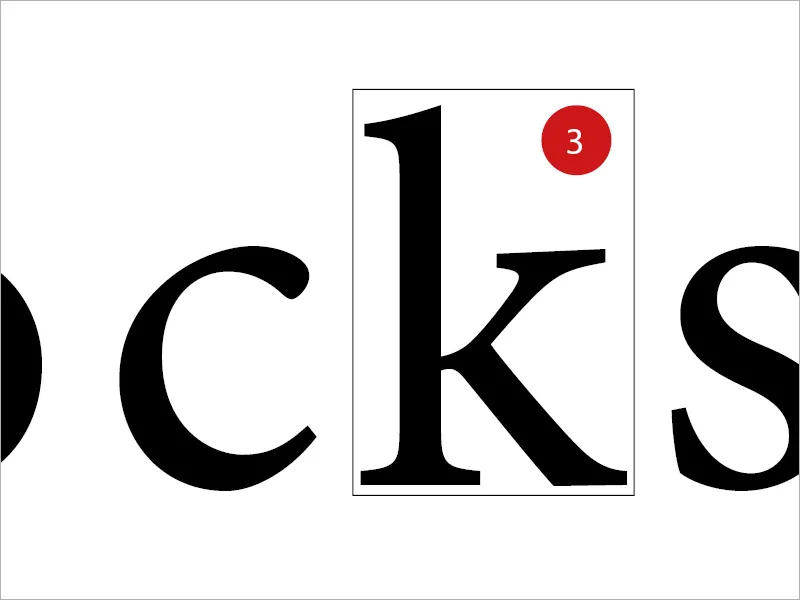
What is character spacing?
Character spacing is the space between the individual letters or numbers. By changing the character spacing, however, you have a lasting effect on the legibility of a text. The distance between the letters is known as the spacing. In technical jargon, there are two other terms that are important: Undercutting is the reduction of spacing, whereas blocking is the increase of spacing.
What should always be in the foreground is the so-called gray value. The gray value describes the relationship between printed and unprinted areas and between light and dark areas. Every change in the text automatically has an effect on the gray value.
What is word spacing?
The term is actually self-explanatory. It refers to the white spaces between the individual words. If something in the appearance of the text does not fit, the simple adjustment of the spaces between the words is a very popular method.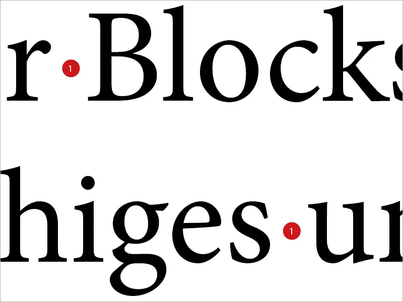
The "airports"
However, this approach can quickly backfire, as you can see in the example below. If you only adjust the word spacing, you sometimes end up with oversized spaces between words, which are also charmingly called "airports".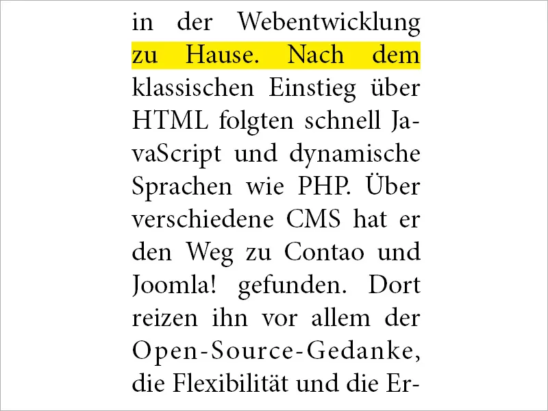
The adjustment in InDesign
To be able to intervene properly in this area, select the relevant paragraph format in InDesign and look for the Spacing tab on the left.
Here, InDesign provides the user with three values for all three methods described: Minimum, Optimal and Maximum.
The solution: A combination of the variables Character spacing and Word spac ing should be the first and preferred technique for driving out a line.
The Optimal value determines what the unchanged word spacing should look like. Minimum defines how far the word spacing may be reduced by InDesign. If this value is set to 75%, this means that the spacing can be reduced by up to 25%. Maximum defines by how much the space between words may be widened. 135% therefore allows an additional space of 35% of the word spacing. The same principle also applies to character spacing.
As already explained, the third line of glyph scaling causes a change in character width. Something that was not possible in lead typesetting, and even today many typographers view this possibility rather skeptically and as unpredictable.
As a guide, I recommend entering the following values:
- Word spacing 75% - 100% - 135%
- Character spacing -10% - 0% - 10%
- Glyph scaling 0% - 0% - 0%.webp?tutkfid=88941)
A comparison
What has now happened can be observed very precisely in a direct comparison between the two identical texts. You can see straight away that in the right-hand box (where we made the change) the reading flow and appearance are much more attractive, coherent and "calmer". In the left-hand box, justification was selected in the classic way, without setting the parameters more precisely. The holes are distracting.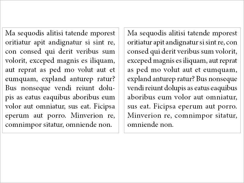
In our case
If we apply the same principle to the problem I described at the beginning, we can see an impressive difference between the left and right. While we have unsightly airfields between the words on the left, where an Airbus could land, figuratively speaking, we find an almost even typeface on the right. As you can see, it's worth taking a look at the settings.
The justification space in justified text (all lines)
InDesign offers a total of three options for justification. Justification, last line left-aligned, probably the most frequently used technique. Justified, last line centered and justified (all lines). The last option only makes sense under certain circumstances. So: What do you do if you are using justified text and want to set an author abbreviation or a reference to the following page flush right at the end of the text, provided that the last line of text remains flush left? The image is intended to visualize the scenario: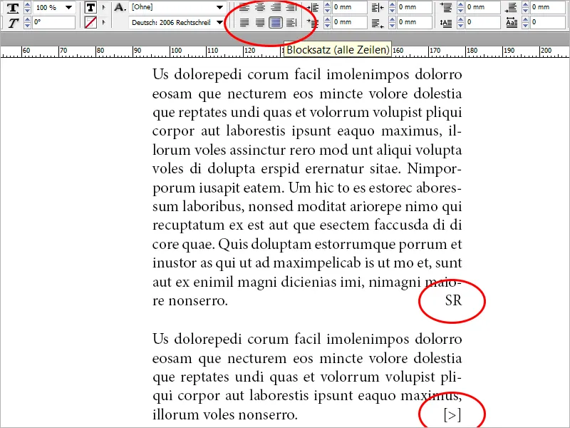
So we set the text to justified (all lines) and notice that compared to justified, last line left-aligned would result in large holes. At the end of the article, we add an author abbreviation. Now we select the space between the last word of the text and the author abbreviation (or reference to the following page) and select Font>Insert Space>Leveled Space from the menu. The last line will now be left-aligned, while our character will look good right-aligned.
The procedure described can also be used several times within a line. This technique also works well for footers in letters. I have integrated three groups of words within a text field and formatted them all with justification (all lines). I then inserted the equalizing space between each of the word groups (marked in yellow). See picture: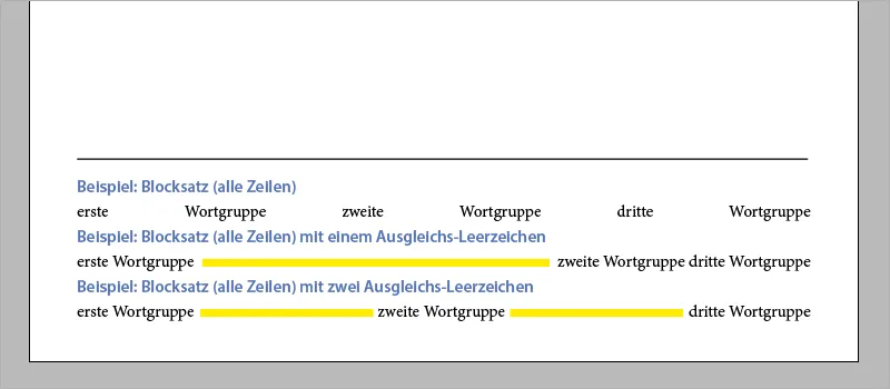
Finally, a note. If you would like to use an author abbreviation or want to quickly apply example number 2 from the footer, you can also use the shortcut Shift+Tab.
With this in mind, good luck with your exciting work with texts, justification and typography in general.


