This training is about formatting prices correctly. You've all seen the charming smiles on the price displays, but of course these prices also need to be formatted. And I'll show you how to do this in InDesign, i.e. how to achieve different types of presentation, as in my three examples here. This is done very elegantly using the paragraph and character formats, which means that we don't have to format anything manually here, but simply set up a few rules and then the thing runs all by itself.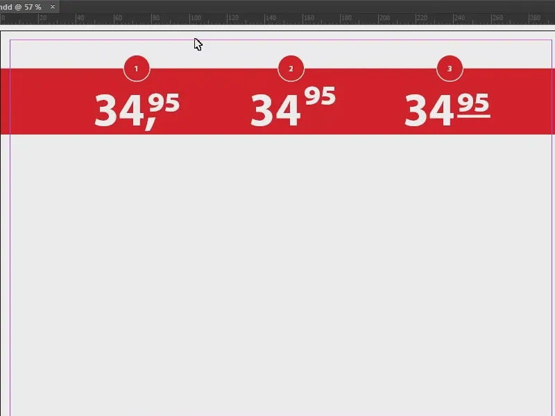
Preparing the price tag
First, I use the polygon tool (1) to draw a star (2), without an outline and in the color red (3).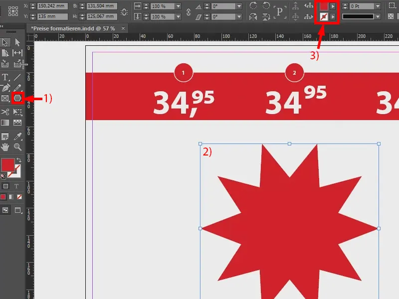
In the next step, I apply the text tool (1) and define a price here, let's say 29.90. I set the whole thing in my favorite font, Myriad Pro, and here in Bold Condensed (2). I set the font size to 80 pt (3), the color is white (4). This is what it looks like when you type it in the usual way.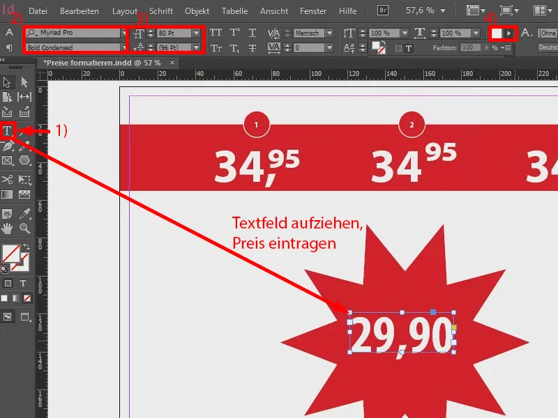
Variant 1
Now for the formatting: I select the text field and go to New paragraph format... (3) via Paragraph formats (1 and 2). I call this "Price indication" (4) and confirm it.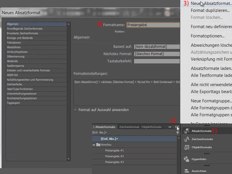
Now we need character formats: What changes to the price? Exactly two formats are needed that can be used at the end, namely the comma and the superscript cent (1). I therefore create two new character formats (2, 3, 4, then enter names for 5, confirm with 6): One I call "cent specification", the other "comma specification".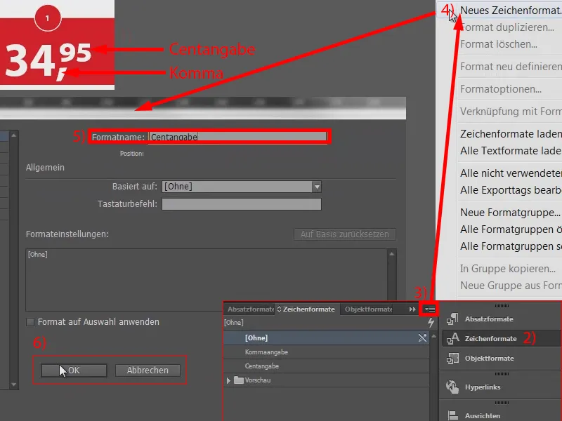
I now have two character formats (1) and one paragraph format (2). Although I have not yet defined a single parameter, it is now important that we build these formats on each other. So I return to my "Price indication" (2 double-click).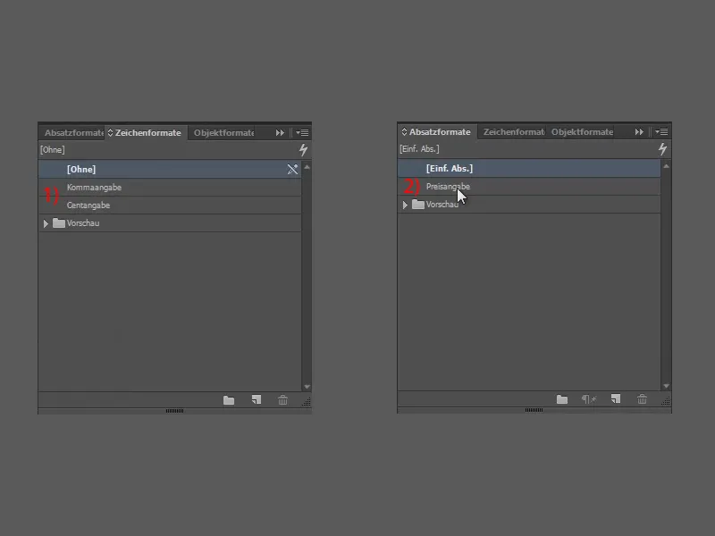
I now create a structure under the Initials and nested formats tab. So I create a new n ested format.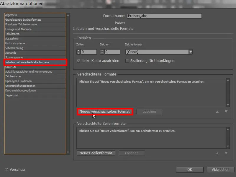
I am not yet defining a character format (1) here, but first select to (2), the "1" (3) and of course the comma (3).
So the point now is: With this line we define that the "34" in this example remains completely untouched at the front (5). It simply remains untouched. And something should only happen after the comma. So that is the purpose of this nested format.
Next step: We need to define a character format. So click once on New nested character format (6).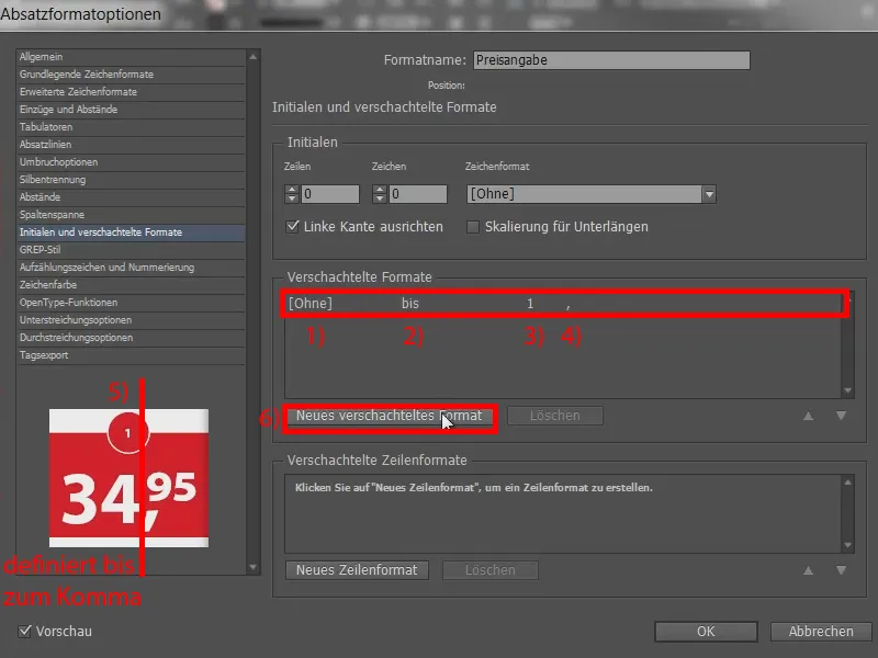
First the comma, so we take our "comma" (1), over is fine (2), "1" is also fine (3), but the comma is not a word, but a character. That's why I also select the character here (4). So we have defined the whole thing up to after the comma (5). And we continue with another nested format (6).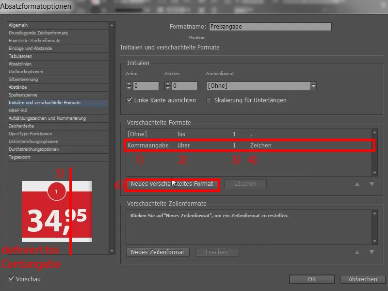
We take the "cent" (1), again above (2) and also "1" (3), but this time it's words (4).
This structure is necessary so that InDesign can check when which format should be applied and how. I confirm this with OK (5).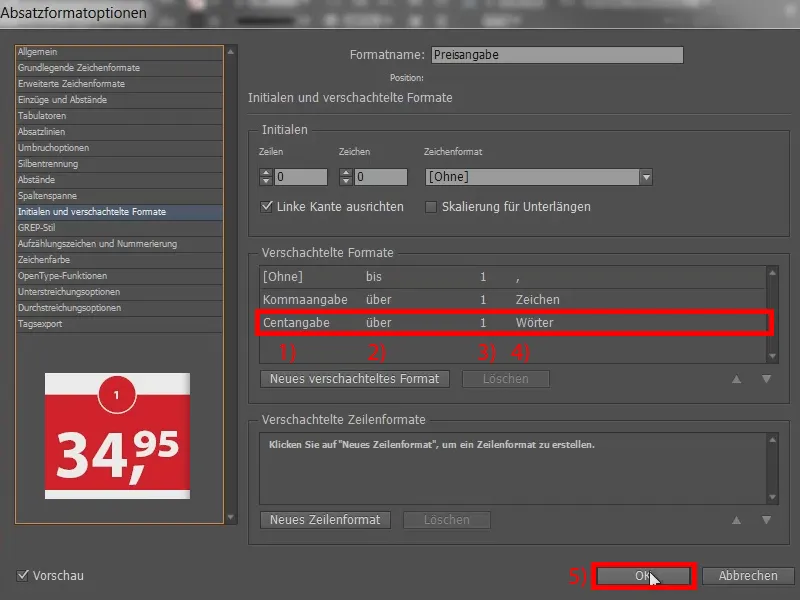
I now define the marked field (1) with the "Price" (2). Nothing should happen there yet. And now we make various adjustments in the character formats. First, let's recreate example number one: So I go into the "Cent indication" (double-click on 3) ...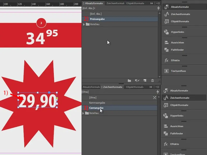
... and go to Basic character formats (1). Here I select the position OptenType superscript (2). Something is already happening.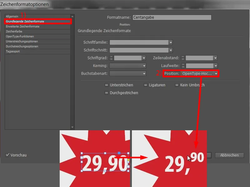
However, the "90" hangs a little over it, so we turn another adjusting screw under Advanced character formats (1). Here we adjust the baseline offset. At 10 pt, the "90" jumps upwards ... (2) The wrong direction. So I reduce the value (with Shift and the down arrow key ) to -10 pt (3). And that's about the height I want. It can certainly be adjusted a little more finely, but it's fine for my needs and I confirm this (4).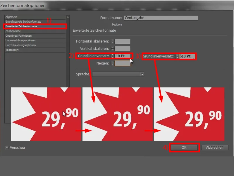
Now let's take a look at the middle section: How does the "90" get onto the decimal point? Quite simple: You go to "Decimal point" (double-click on 1) and enter a range adjustment. To do this, go to Basic character formats (2) and enter an appropriate value under Range. At -100 it looks like this (3): The text jumps a little closer. The -100 is too little here, so I set it to -200 (4) and now we actually have the price exactly as we wanted it. Done (5).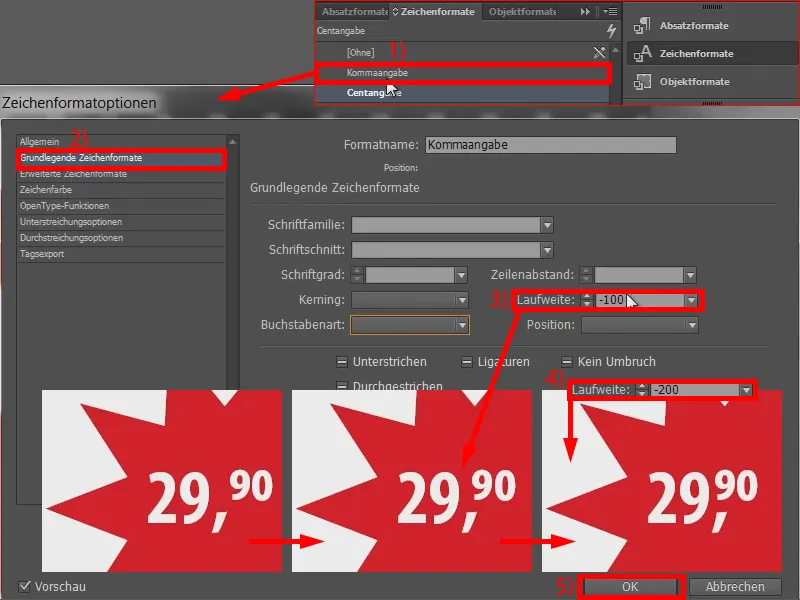
Variant 2
Now to the second example: Here the comma disappears and the "95" bounces up a bit.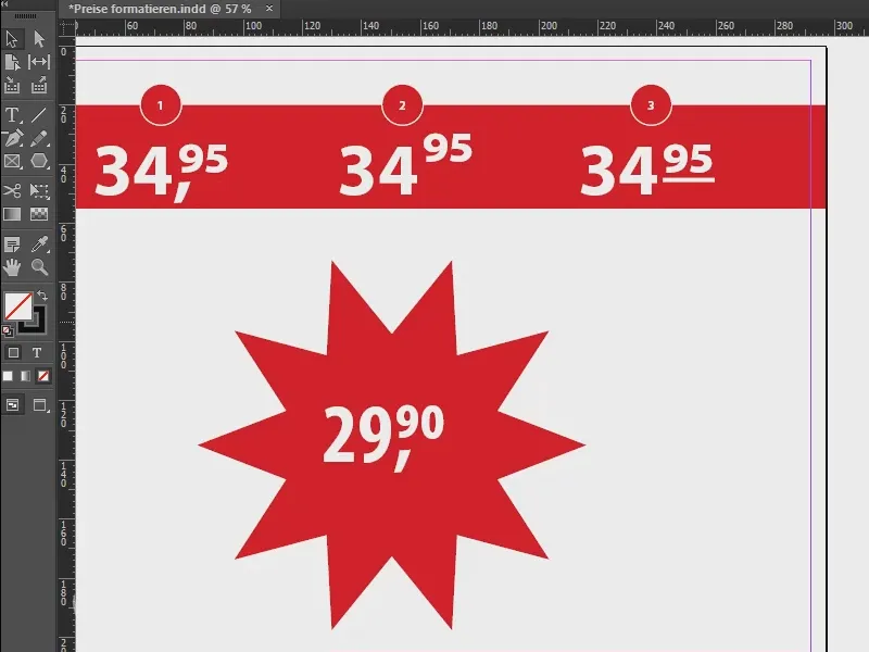
To do this, we open the "Cents" again. In Advanced character formats (1) we delete the baseline offset again (2). Then the "90" jumps upwards. We confirm this (3).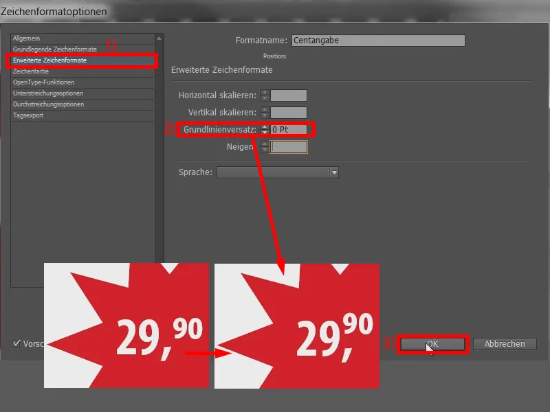
And now we take care of the comma and call up the "comma specification". Here we simply set the character color (1) from white to [None] (2). Confirm (3). It has now disappeared.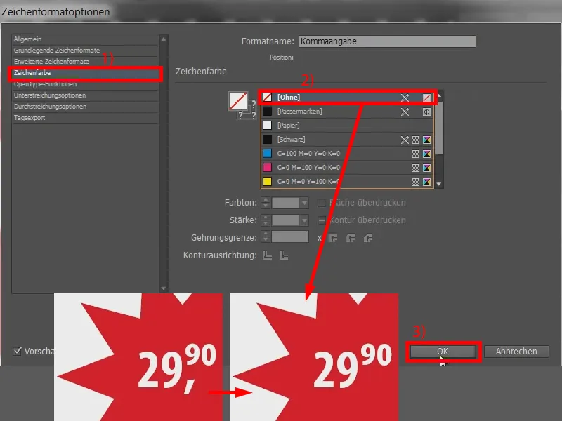
Variant 3
Now the third example with an underscore ...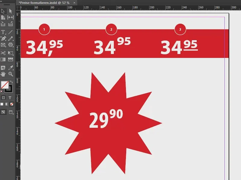
We go back to the "cents", add the baseline offset of -10 again (1 and 2), so that the text jumps down a level again.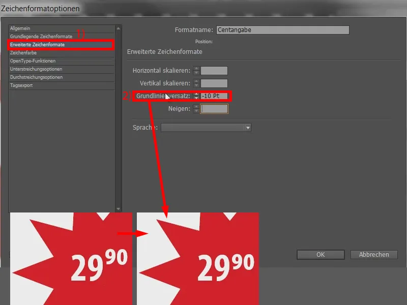
And now we call up the underlining options (1). Here we activate the checkbox (2) so that the line is already attached to the base. So we adjust the thickness a little to 4 pt (3) and move the line further to "90" using the offset, for example with -24 pt (4). Done (5).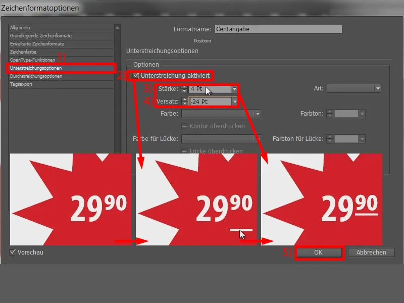
Summary
Quite simple, you are welcome to try it out. If I now draw a new text field without formatting and enter a value (1), I can easily select this text field and apply the "price" (2). The text is ready.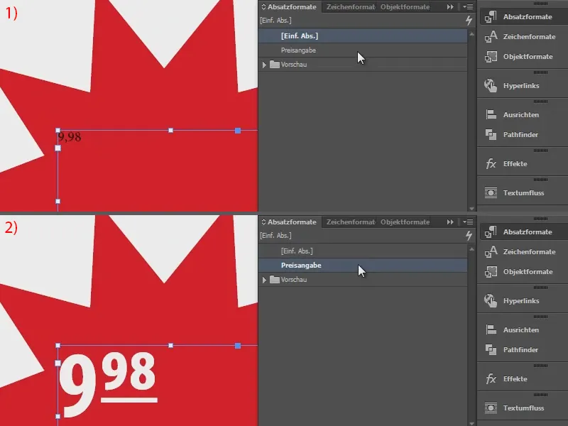
It can be that simple. I hope you can use this for yourselves - it's really not rocket science and super easy to copy.
Yours, Stefan


