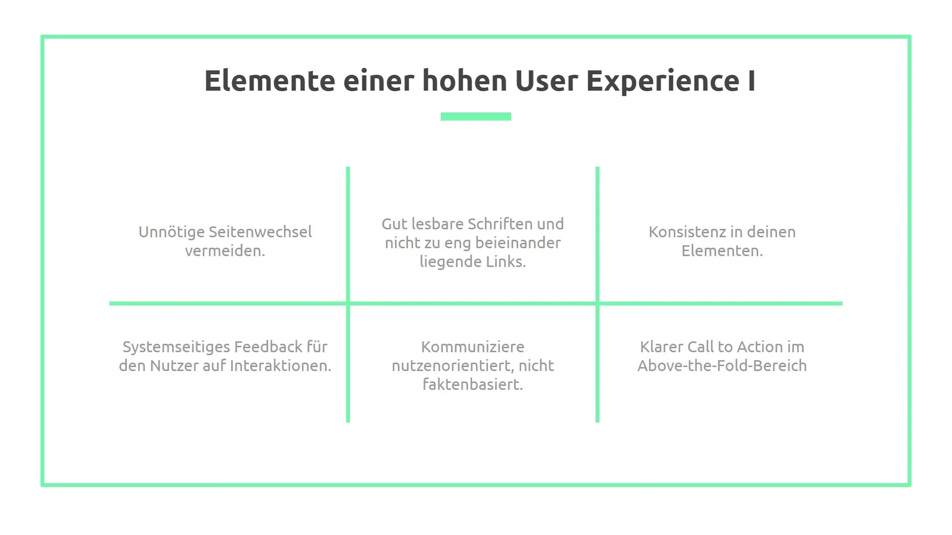
The design of buttons and call-to-action elements on your website has a crucial impact on the user experience. Your users must intuitively understand what to expect when clicking on a button or link. An unclear Call-to-Action (CTA) can lead to confusion and ultimately to a loss of potential customers. Here you will learn what to pay attention to in order to design effective and understandable buttons.
Key Insights
- Buttons should have a clear and recognizable color.
- Consistency is important: Use consistent terms and designs throughout your entire website.
- System feedback after an action helps users feel secure.
- The Call-to-Action should always be clear and easily recognizable, both on desktop and mobile.
Step-by-step Guide
1. Pay attention to font size and spacing
Make sure that the font size is easily readable. Narrow spacing between links can lead to users clicking on the wrong links, especially on mobile devices where the finger is larger than the mouse pointer. Place links above buttons to minimize the risk of errors.
2. Design buttons with full coverage
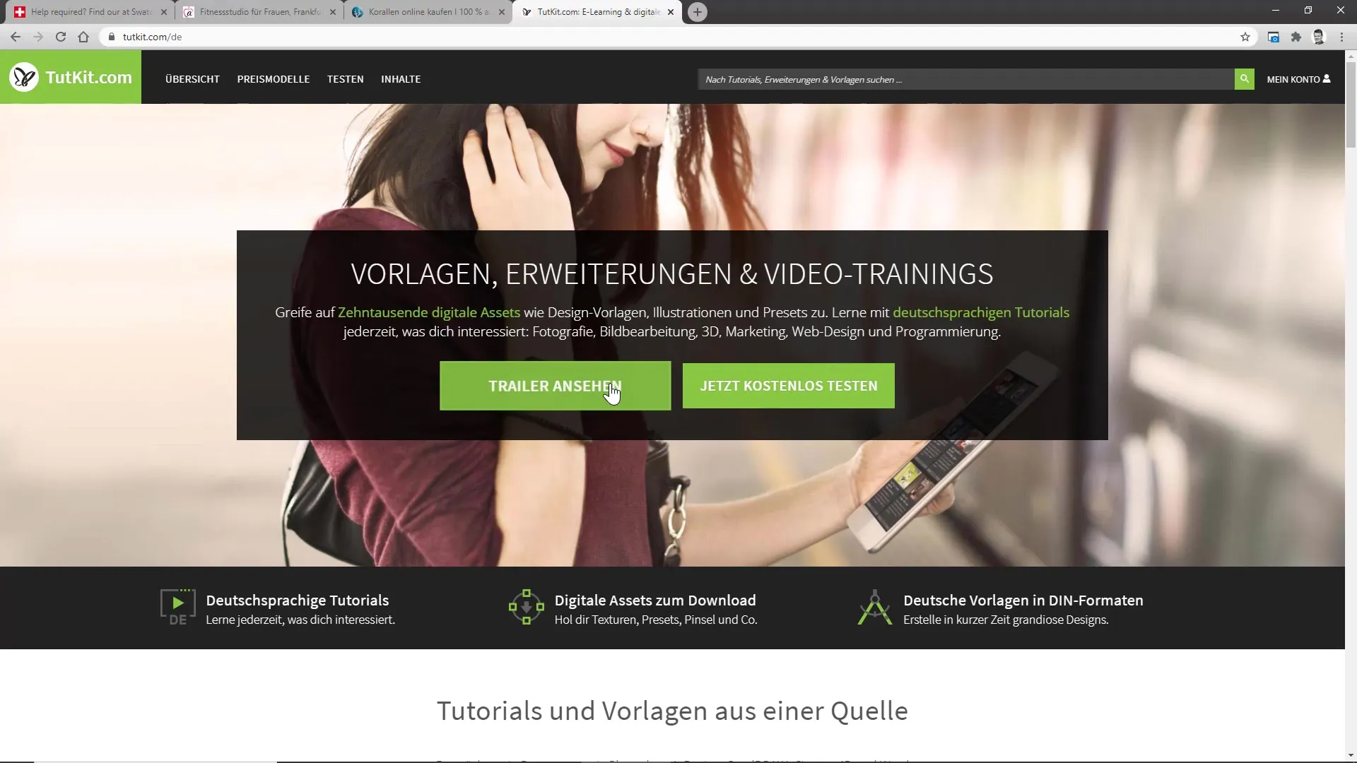
Buttons should ideally have full coverage and vibrant colors. Avoid "Ghost Buttons" that only have an outline surface. Such designs can be easily overlooked and are less click-friendly. Clear differentiation through full colors makes action buttons more inviting.
3. Consistency in terminology
Consistency is key to a positive user experience. Ensure that the words used in similar contexts have the same meaning. For example, if you have a "shopping cart," this word should be used consistently everywhere and describe a uniform action.
4. Implement system feedback
It is important to provide users with appropriate feedback after their action. This can be done, for example, by changing the button color or by visually enlarging the button. Such feedback makes it clear that the action was successful and reinforces the user's trust.
5. Visualize active and inactive states
Graphically differentiate the active and inactive states of elements. For example, a mouse pointer should change to a hand pointer when the user hovers over a link. Such visual distinctions help users with orientation.
6. Communicate user needs
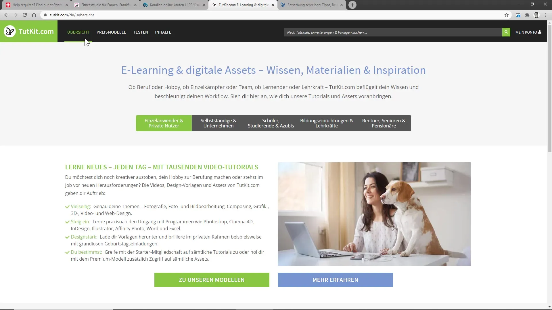
Your target audience is looking for specific benefits. When designing your content, focus on what users can gain from your product or service. Inform them not only about features but also about their benefits. Ideally, place this information in the "Above the Fold" area of your site.
7. Design Call-to-Action clearly and descriptively
Your Call-to-Action must always be clear and easy to find, preferably in the upper area of your website. Use concise and action-oriented phrases such as "Start your free trial now." The wording should be unambiguous for the user and directly convey the benefit.
8. Consider different resolutions
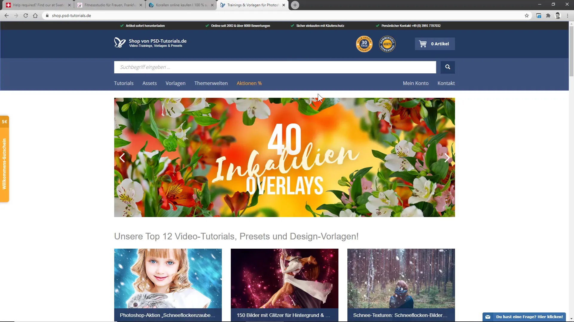
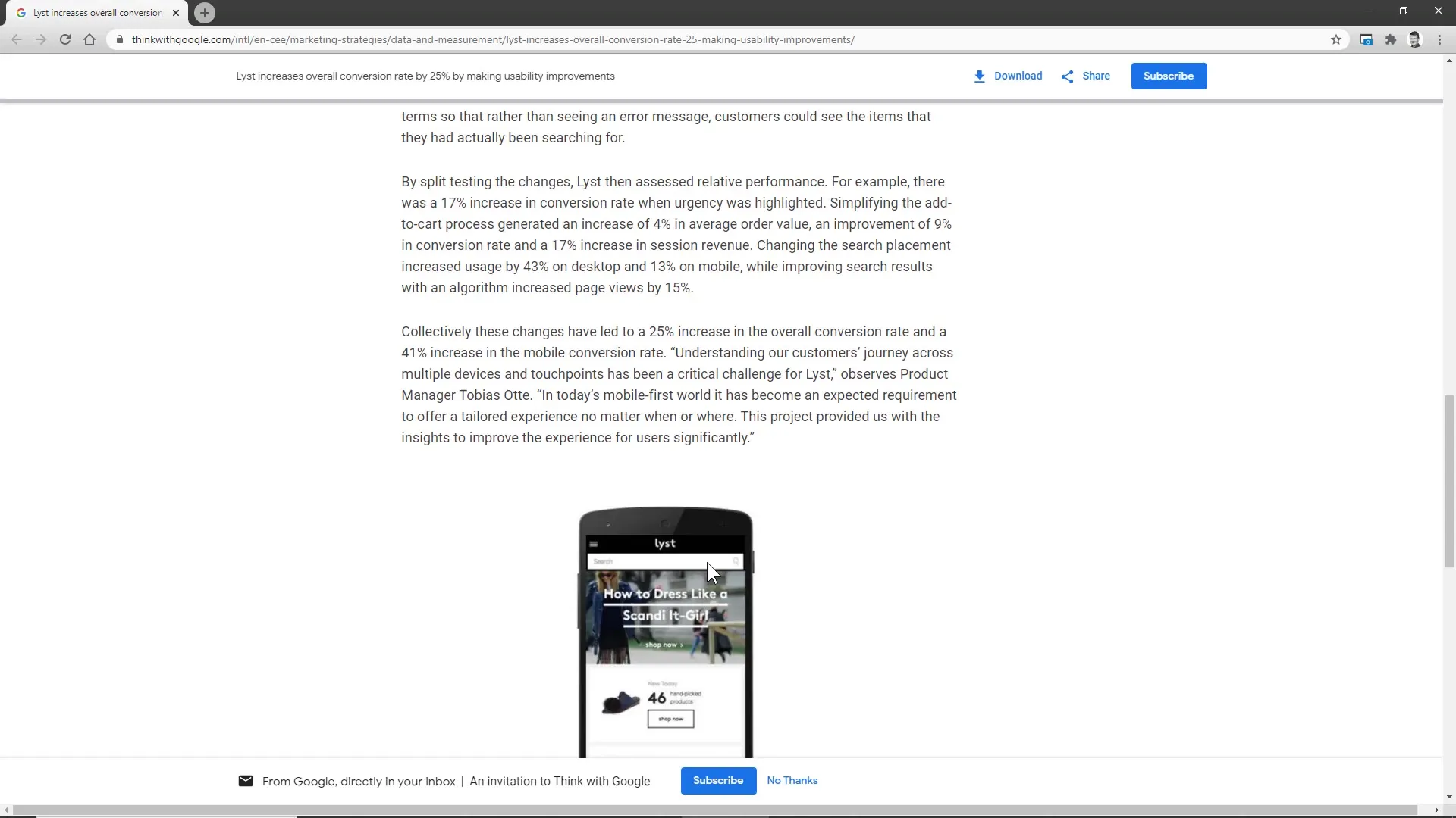
Remember that your Call-to-Action must be clearly visible on both desktop and mobile devices. Present the buttons in a way that they can be optimally used on all devices. An example in online shops is the search field, which should be prominently placed in the same width as the content.
9. Conduct A/B tests
Try out various designs and behaviors of your buttons and CTAs in A/B tests. Improvement can be achieved through simple changes, such as adding a search field that is immediately visible rather than requiring an additional click. Such tests show you which changes increase the conversion rate.
Create clear clarity
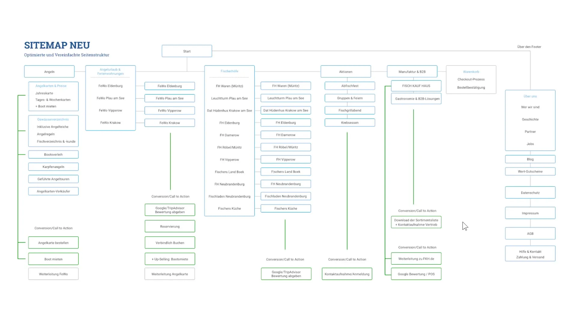
Create clarity on your page and make sure that users can immediately see which actions they can take. A sitemap can help to present the structure and the individual call-to-actions more clearly, so you have a clear idea of what user behavior you want to promote.
Summary
These steps show you how important the correct design of buttons and CTAs is for the user experience. Clear communication, consistency in design, and thoughtful feedback are key factors to turn your visitors into active users.
Frequently Asked Questions
How should I choose the font size for buttons?Make sure the font size is easily readable and not too small.
What are ghost buttons and why should I avoid them?Ghost buttons are outline-based buttons that are less noticeable. Solid buttons are more inviting and increase the click-through rate.
How can I give users feedback on their actions?Change the color or size of buttons to signal to the user that their action was successful.
Why is consistency in terminology important?Consistency helps avoid confusion so users know exactly what to expect.
How can I ensure that my call-to-action is mobile-friendly?Test your site on different devices to ensure the visibility and user-friendliness of your CTAs.
