The design of your website can determine whether users stay or leave the site immediately. When designing, it is crucial how you utilize visual elements such as slideshows and full-page banners. In this tutorial, you particularly focus on these two aspects to improve the user experience. The goal is to provide you with clear insights and practical steps on how to avoid potential negative effects of moving images and intrusive banners.
Key Insights
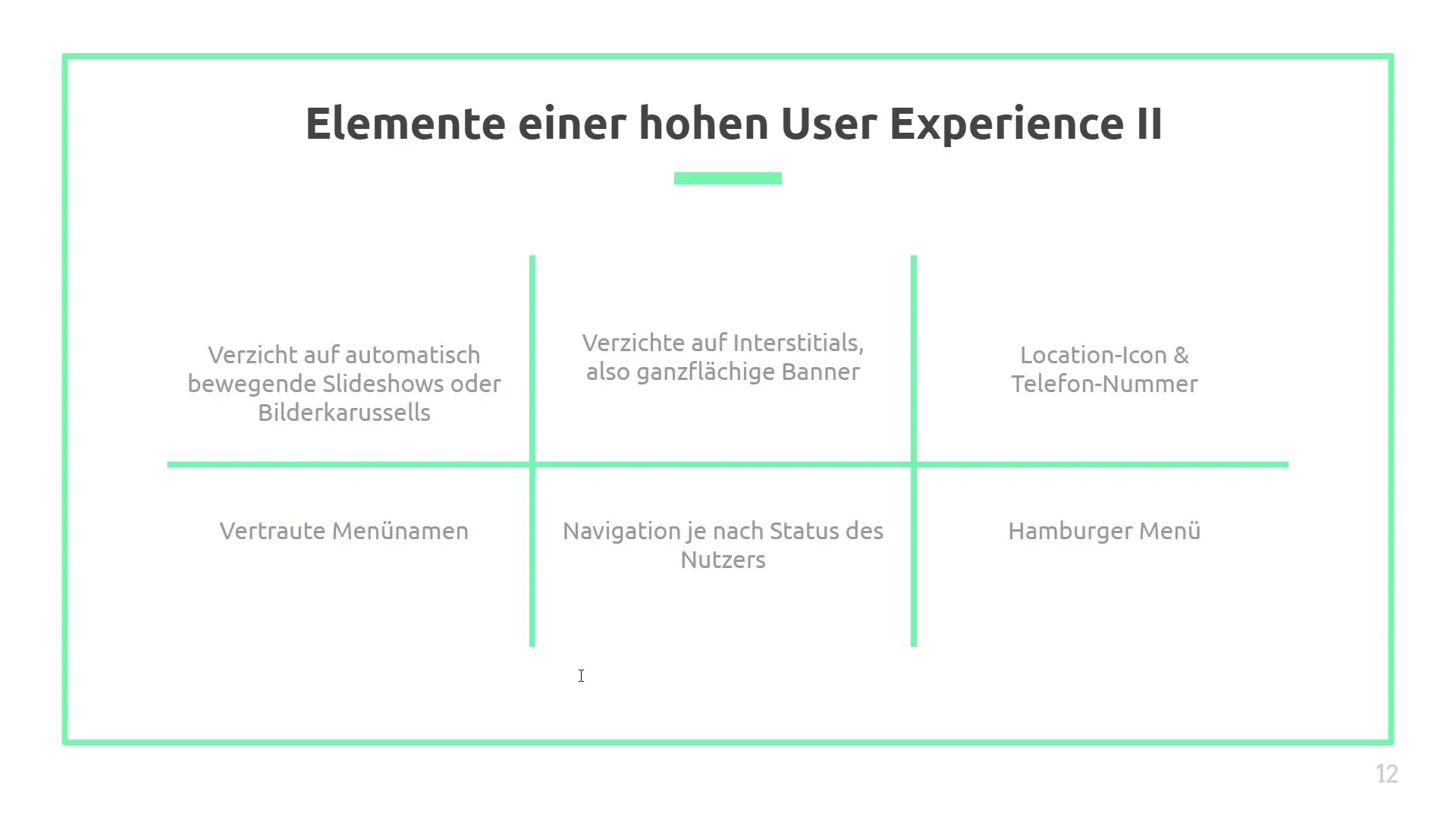
- Automatically moving slideshows should be avoided, as they are often associated with advertising and can compromise the user experience.
- When using slideshows, the transition between images should be made longer term to minimize the advertising nature.
- Interstitials, full-page banners, can be frustrating for users and should only be used under certain conditions.
- Negative user experiences can impact your SEO ranking negatively.
- Testing and data analysis are essential to check whether specific design decisions provide real benefits.
Step-by-step guide
Avoid automatically moving slideshows
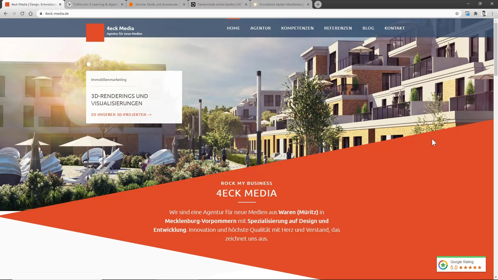
If you want to keep users on your website, it is advisable to avoid automatically moving slideshows or image carousels. Users often immediately associate it with an advertisement banner, leading to so-called banner blindness. This type of movement often distracts attention more than it conveys information. Therefore, you should refrain from using slideshows unless you can control how often they switch. A longer change of images, for example, after 10 seconds, can help reduce the impression of advertising.

Limit the number of images
The data size of your website can have a significant impact on loading times. A large file size slows down your site, which is particularly hindering on mobile devices. Instead of including many moving images, it is better to reduce the number of slides to a minimum. Always keep in mind that too much information in the form of images can not only be unnecessary but also confusing. Often less is more.
Conduct A/B tests
It is important to conduct A/B tests to find out if slideshows provide actual benefits for your site. Data analysis has shown that slideshows are rarely used to their full extent. Do not lose sight of the fact that users often prefer static images. Therefore, test carefully to identify the best approach for your specific audience.

Consider user experience
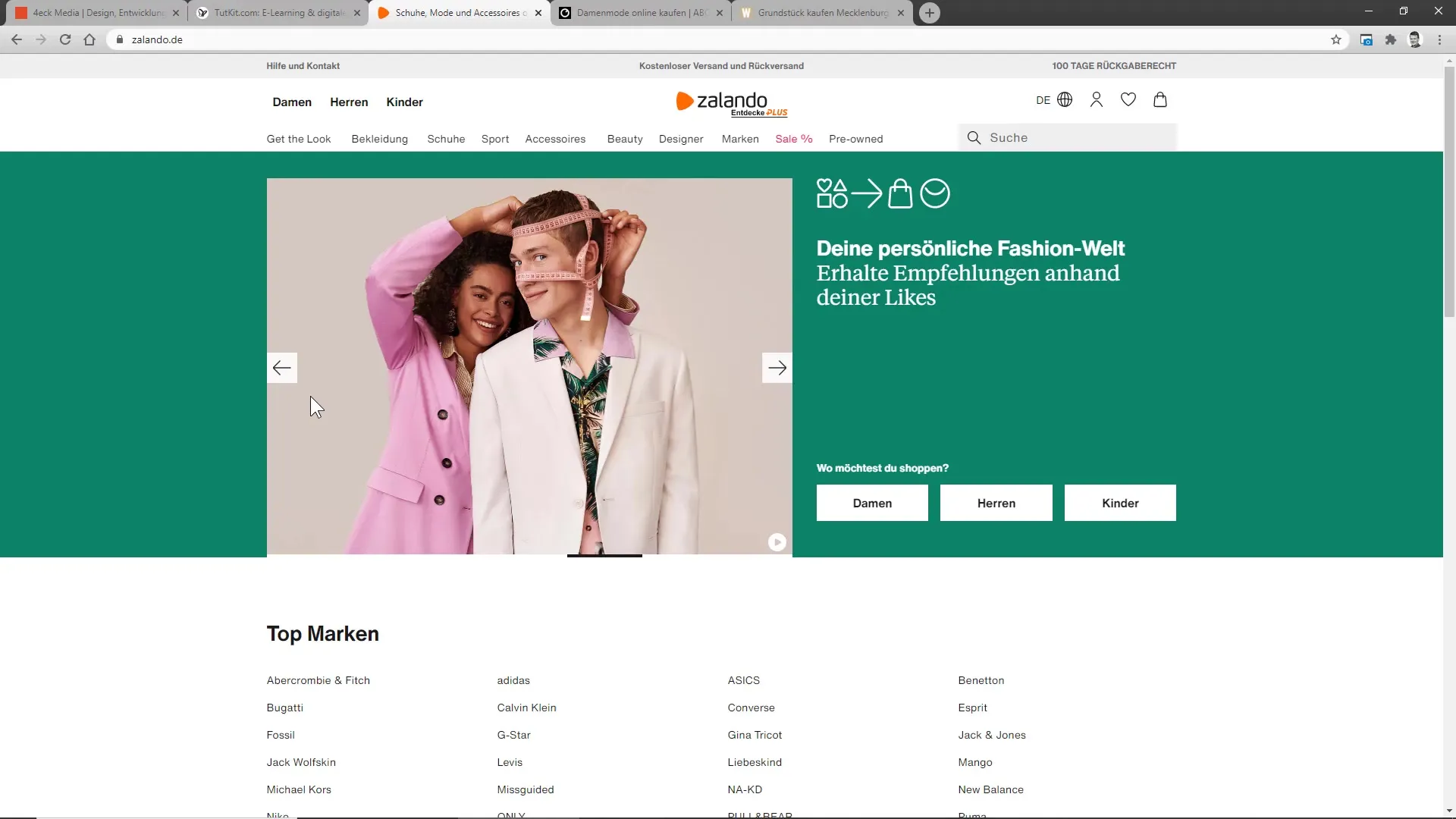
Especially on e-commerce sites, it can be useful to use slideshows. Some platforms, such as Salando, have integrated them thoughtfully. Instead of automatically playing them, users should be able to decide when they want to change the images. It is advisable to introduce interactive elements for this purpose.

Avoid Interstitials
Full-page banners or interstitials are often known to be annoying and can massively impact the user experience. They increase user frustration as they are immediately clicked away without effectively conveying information. Even if you want to use this type of advertising, the benefit should be clear. One way to achieve this is to direct users to a landing page for newsletters where they can sign up intentionally.
Measure and optimize
It is crucial to track user interaction with banners. Analyze how many users bounce off or actually show interest in your content. Only then can you estimate whether your use of banners is justified. An example could be using a popup window on your website that leads users to a specific offer.

Avoid negative user signals
Ensure that unnecessary pop-ups or aggressive advertising send negative signals to Google. These signals affect your ranking in search engines and can lead to a long-term decrease in visibility. Positive user signals are crucial, which is why you should strive to achieve the highest possible dwell time on your site.
Summary
You are now familiar with the most important aspects of how slideshows and full-page banners should be designed to ensure an optimal user experience. Avoid unnecessary distractions and make sure to always keep the user at the center of your design.
Frequently Asked Questions
What disadvantages do automatically moving slideshows have?Automatically moving slideshows are often associated with advertising and can lead to banner blindness.
How long should the transition between images in a slideshow be?Ideally, the transition should occur every 10 seconds to minimize the advertising aspect.
How many images should I use in a slideshow?It is advisable to limit the number of images to optimize your website's loading times.
Are interstitials effective?They can be frustrating and require extensive testing to ensure they do not negatively impact the user experience.
How can I avoid negative user signals?Provide an engaging user experience and avoid intrusive advertising that drives users away.


