Every website must help users quickly and effectively find what they are looking for right from the start. A well-thought-out navigation is crucial to ensure that visitors to your site can access the information and content that is of interest to them. Here you will learn the key criteria for navigation, the role of the hamburger menu for the mobile view, and why responsive logos are essential for a good user experience.
Key Insights
- Menu names should be familiar and tailored to the target audience.
- Navigation can change depending on the user's status (guests vs. logged-in users).
- The hamburger menu must be user-friendly and clearly structured.
- Responsive logos should effectively support the user interface and take up less space.
Step-by-Step Guide
1. Use Familiar Menu Names
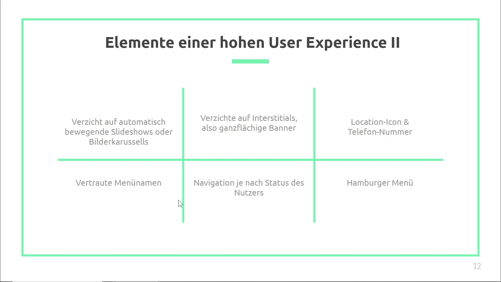
When creating your navigation, it's important to choose menu names that are familiar to your target audience. Design them to be immediately understood. For example, "job listings" should be clearly labeled as "jobs," "careers," or "open positions." This helps users quickly find what they are looking for.
2. Consider User Status
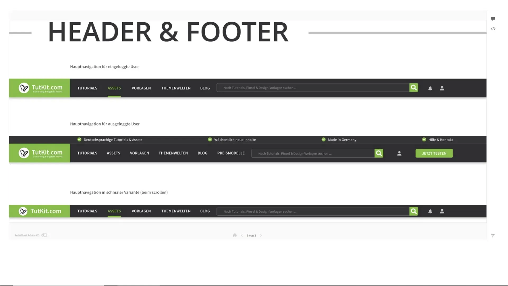
Another way to optimize navigation is to consider the visitor's status. You can tailor the navigation to be different for guests and logged-in users. Guests may have a less complex navigation, while logged-in users could see specific options tailored to their needs, such as frequently accessed content or advanced search features.
3. Effectively Use the Hamburger Menu
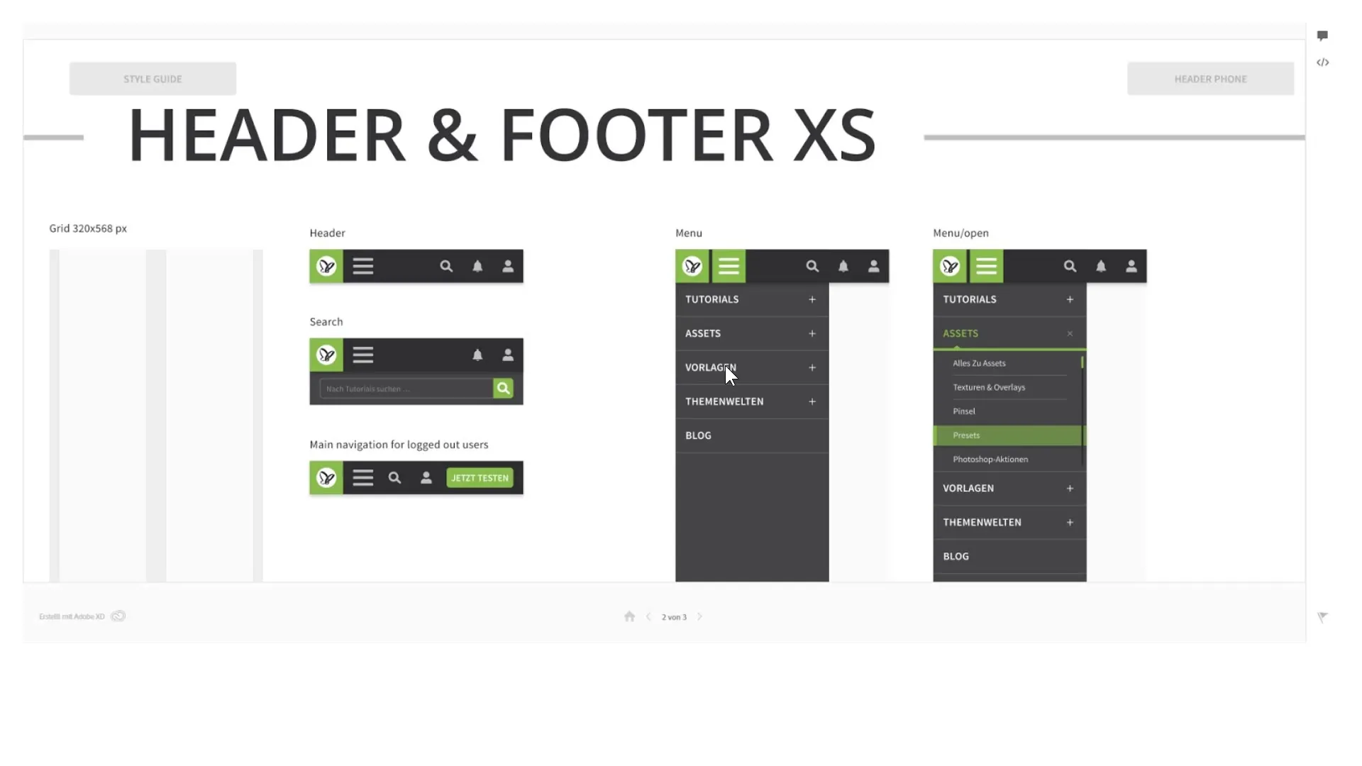
In mobile design, the hamburger menu is a crucial element. It should be clear and easily accessible. Ensure that key functions such as the shopping cart and search field remain visible, especially on e-commerce sites. Statistics show that an integrated search bar significantly improves user experience and can increase the conversion rate.
4. Placement of the Hamburger Menu
The position of the hamburger menu should be intuitive. Most users expect it to be either on the left or right side of the screen. Large websites like Amazon often place it on the left side, while Facebook and eBay position the menu on the right. Conduct an A/B test to determine where it works best for your users.
5. User-Friendly Menu Design
Ensure that the hamburger menu can be easily closed when opened. It should be able to close with a single click or by sliding away. This user-friendliness promotes interaction and can significantly increase user engagement.
6. Design Responsive Logos
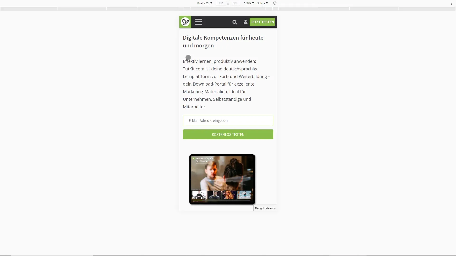
A responsive logo automatically adapts to the size and medium and should not overwhelm users with unnecessary information. On mobile devices, it is recommended to display only the logo without a slogan or domain to create more space for other important options.
7. Use Animations for User Guidance
Animations can make navigation more dynamic and improve the user experience. For example, menus can retract as the user scrolls and reappear when scrolling back up. These effects create a seamless and intuitive user interaction.
8. Gather Inspiration for UI Interactions
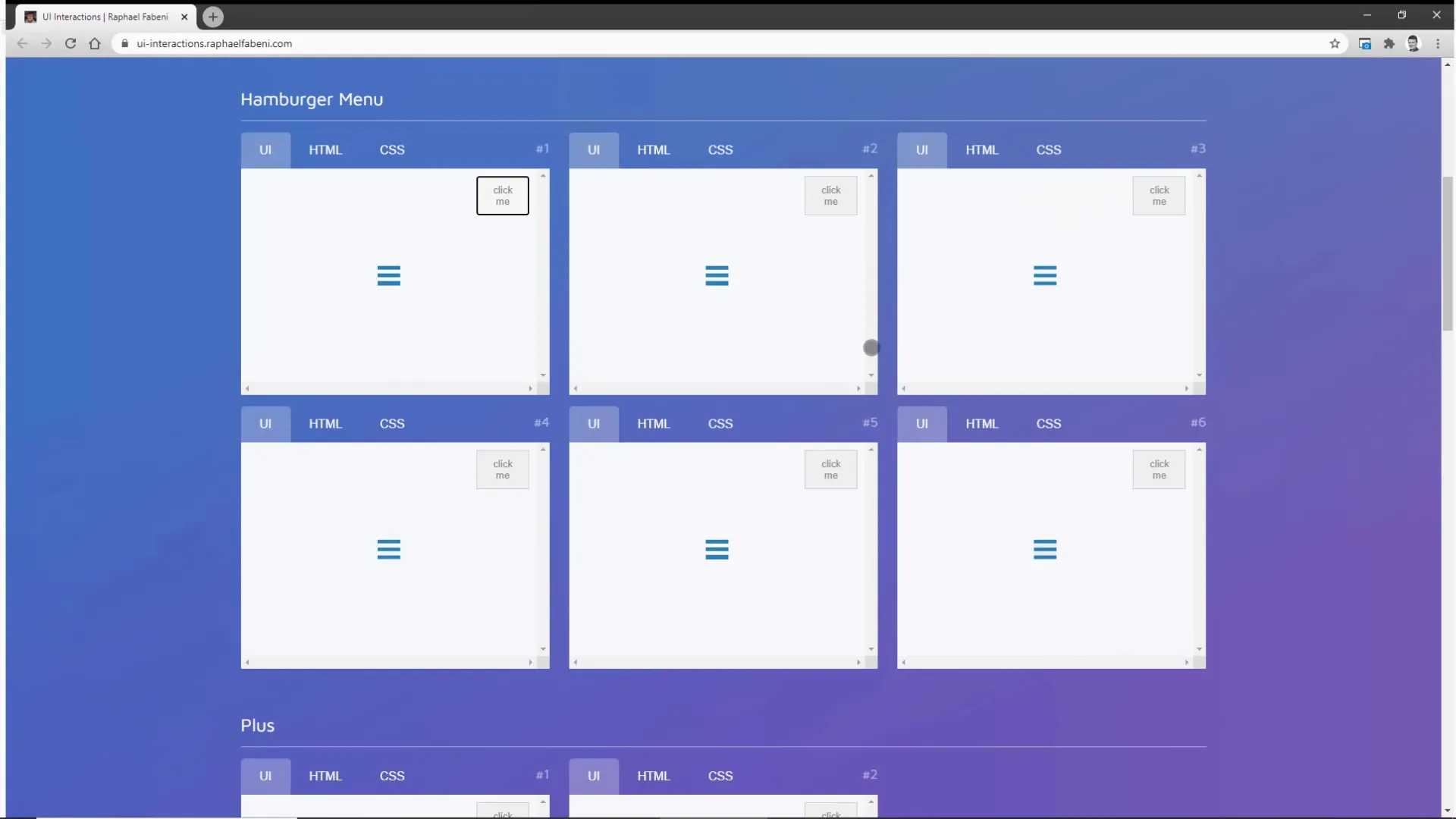
Use platforms like UI Interactions to find inspiration for cool user interface animations. There you will find numerous examples that can help you optimize the design of your menu and improve user interaction.
Summary
A well-designed navigation that caters to the needs of your users and is optimized for mobile devices is crucial for a positive user experience. By using familiar menu names, adapting to user status, skillfully integrating the hamburger menu, and utilizing responsive logos, you can ensure that your website remains user-friendly.
Frequently Asked Questions
Why are familiar menu names important?Familiar menu names allow users to quickly find what they are looking for.
How does user status affect navigation?Navigation can be customized to show different information for guests and logged-in users.
What are the advantages of a hamburger menu?The hamburger menu saves space in the layout and changes the user experience in the mobile view.
How should a responsive logo be designed?A responsive logo adapts to the screen size and only displays the essential elements to optimize the available space.
What role do animations play in navigation?Animations make navigation more dynamic and enhance user guidance through visual cues.


