Do you want to highlight your headline with a really cool effect? Then this workshop is for you, because I'm going to show you how to format your headline as shown here.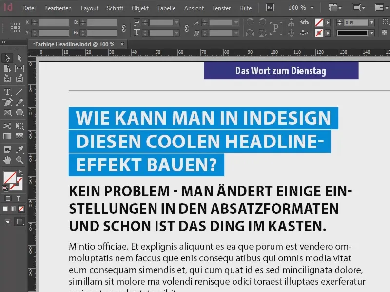
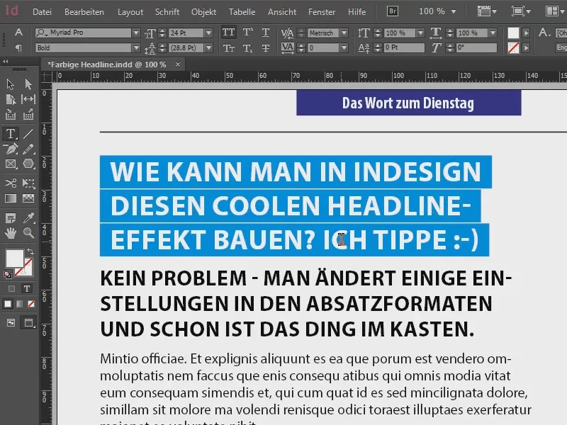
The best thing about it: If I continue typing here, you'll see that the formatting continues automatically.
Let's start by taking a look at the paragraph formats (1), because that's where everything happens. There are three individual paragraph formats here: "Heading", which is the text highlighted in blue, our core topic that we will be dealing with. Then comes the lead, the "introductory text". This is followed by a dummy text, formatted as "body text".
The bottom two are not rocket science, you can probably do it all yourself, but the headline will now be our construction site, where we will do a bit of tinkering.
Let's take a closer look at the "Heading" paragraph format (2): We have five lines full of formatting (3), as you can see, and these are the settings that define that this heading is highlighted in blue and then continues automatically. We are now going to recreate these settings.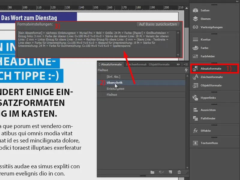
To do this, I'm going to create a new text field (2) using the text tool (1). Here is a fictitious headline. For the paragraph format, we start with the simple paragraph format [Single Paragraph] (3).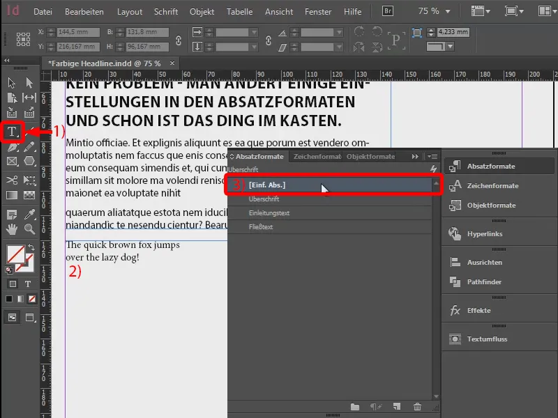
Now I create a new paragraph format (1): "Our headline" (2). I confirm this first.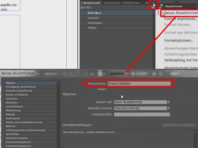
I now apply the paragraph format to our text field (select 1, click on 2) and go back to the paragraph options (double-click on 2).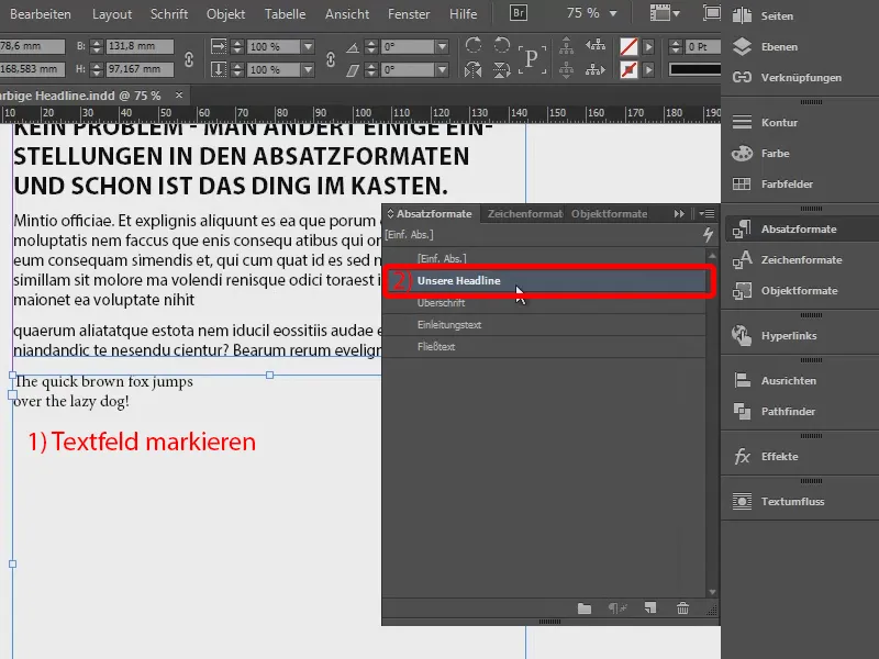
The basic character formats need to be adjusted. I choose my favorite Myriad Pro. I set the font style to Bold, the size to 24 pt. For the letter type, we select the capital letters so that they are really nice, large letters.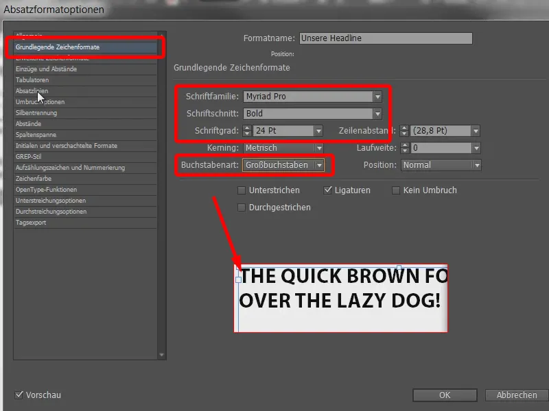
And now we come to the really exciting part, namely the paragraph lines (1): These are lines that are drawn horizontally through the paragraph. You can define lines above or below them. I activate the line above using this checkbox (2) and enter a thickness of 28 pt (3). It's all black now, so let's quickly change the color to red.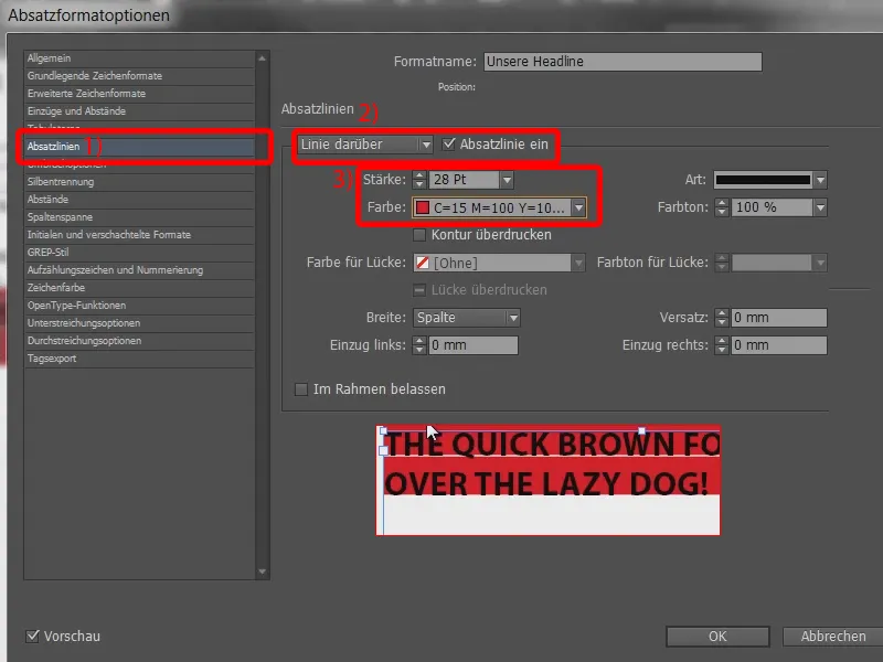
And now we can already see what has happened: In principle, we're getting pretty close to the desired result, but of course we also need a bit of fine-tuning. For example, the top line of the red area slides way too far up, while we are sitting on dry land at the bottom. That doesn't have to be the case.
So we're going to set up an offset. You can do that here (1). At 7 mm, the surface slides further up (2). The value -2 mm is already quite good (3). Of course, this always depends on the font size you are using.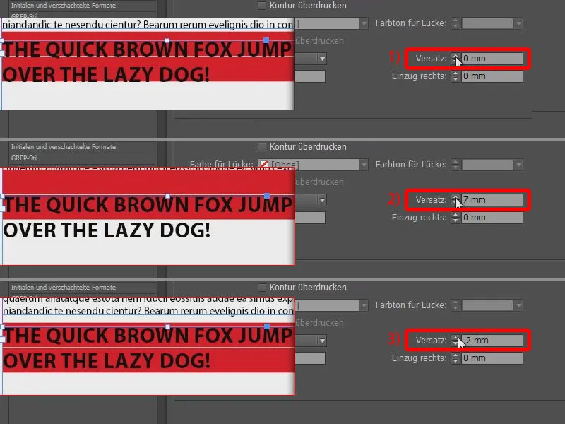
Now, of course, we want to have a small indent here (1), because the aim is to have a bit of flesh around the letters. So we simply add -3 mm to the indent on the left (2) and the same for the indent on the right (3). And then I'll just confirm the whole thing so that you can see what it looks like in total.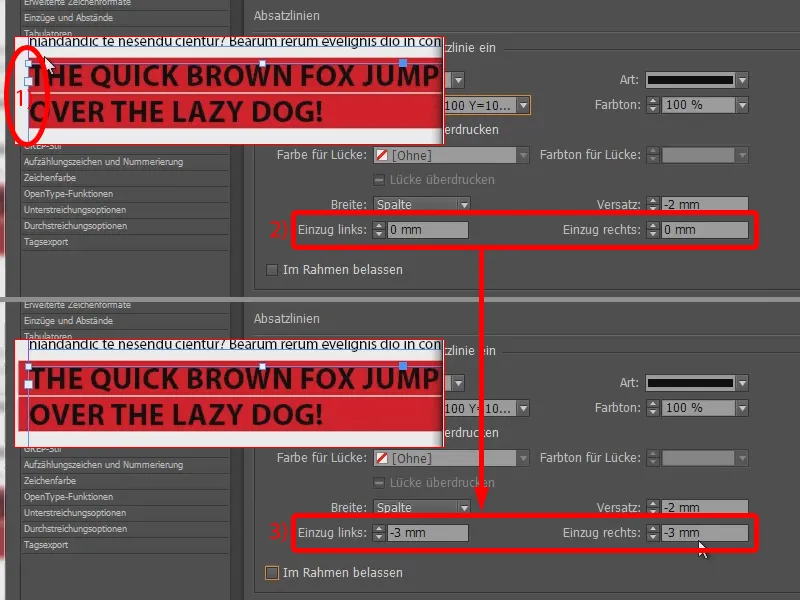
Let's compare it with our headline above: It looks a bit better there too, because we can see that the blue line automatically adjusts to the text. This means that if the text is a little shorter, the lines are also shorter. We have pushed the whole thing to the limit and even beyond.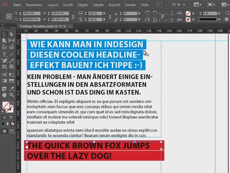
So what setting do we need to make? It's simple: you don't select the column for the width of the line above, but the text (1). And now we have exactly this result: the length of the red line is based on the written text.
If we didn't have our indentation on the right, it would simply be too close (2). I'll take that back to -3 mm right away.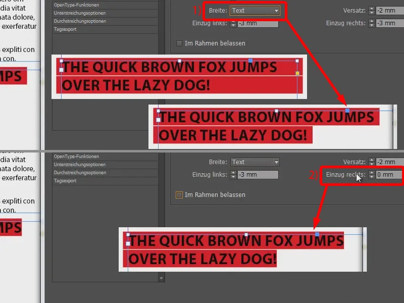
And to make it a little easier on the eyes, it might be advisable to change the text color to white. So select [Paper] in the drawing color. That's better.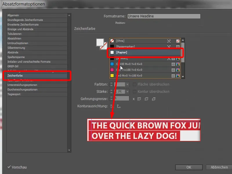
Finally, we simply go over it again with the plane and remove this unsightly, protruding piece (1): You can do this under indents and spacing (2) by specifying an indent of 3 mm on the left (3).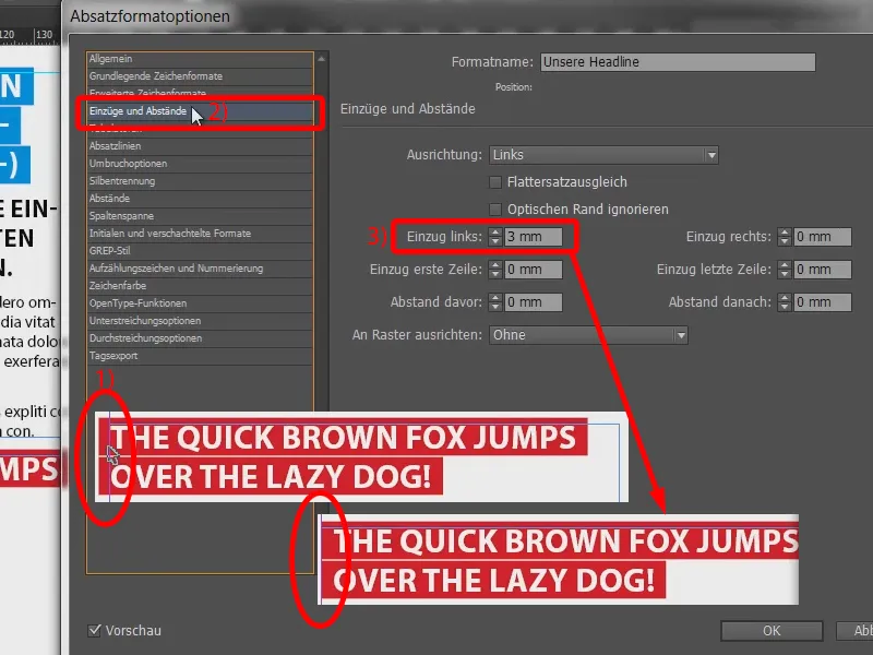
The rest is really just a matter of playing around: you could, for example, easily change the type of underlining or strikethrough in the paragraph lines. This is not quite as useful here.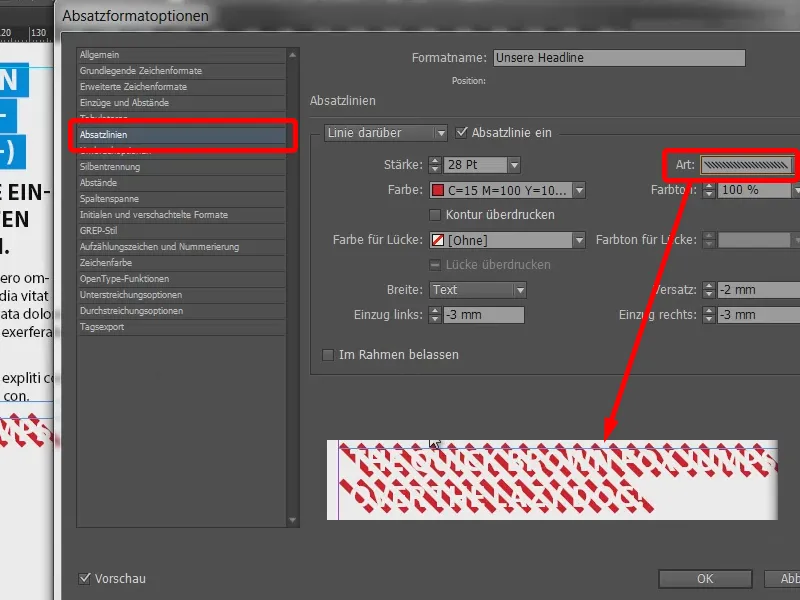
If we change the character color back to black, we can see that the type of paragraph line has a huge influence on the overall effect.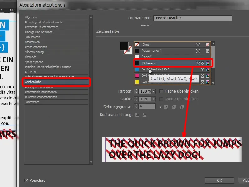
Like this, for example.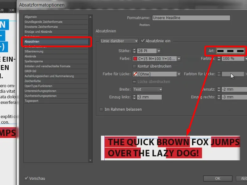
Or dotted.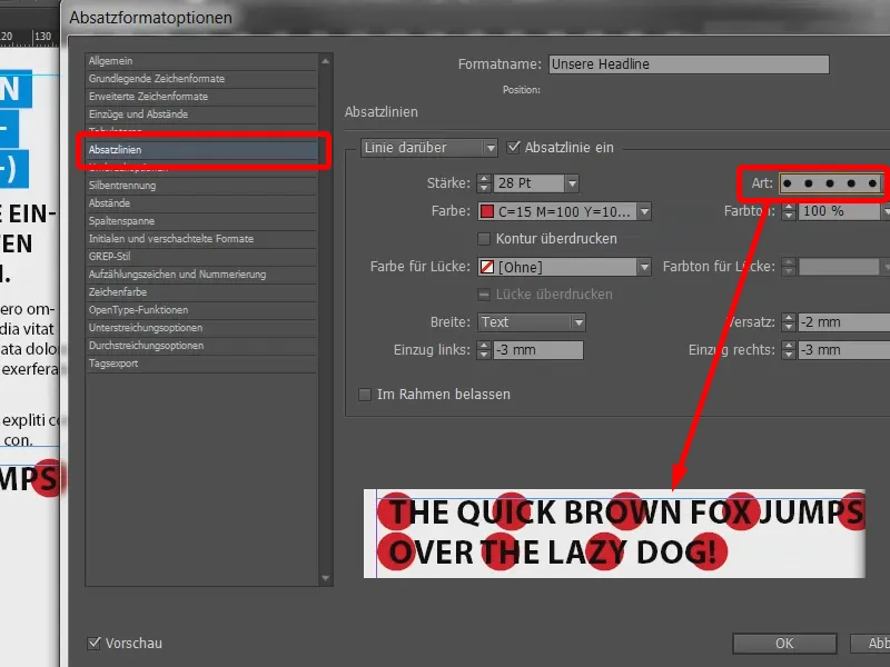
And now I'm going to test writing on again: "I love this effect!!! That's great!" So it adapts very variably.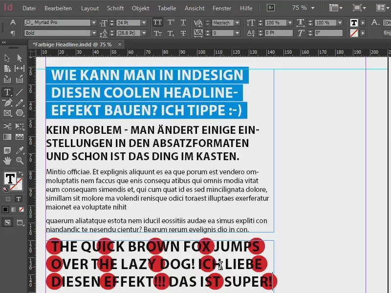
And you can play around with it as much as you like. You can change colors, you can use yellow, ...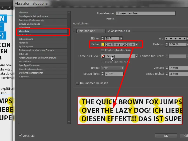
... use diamonds and, and, and.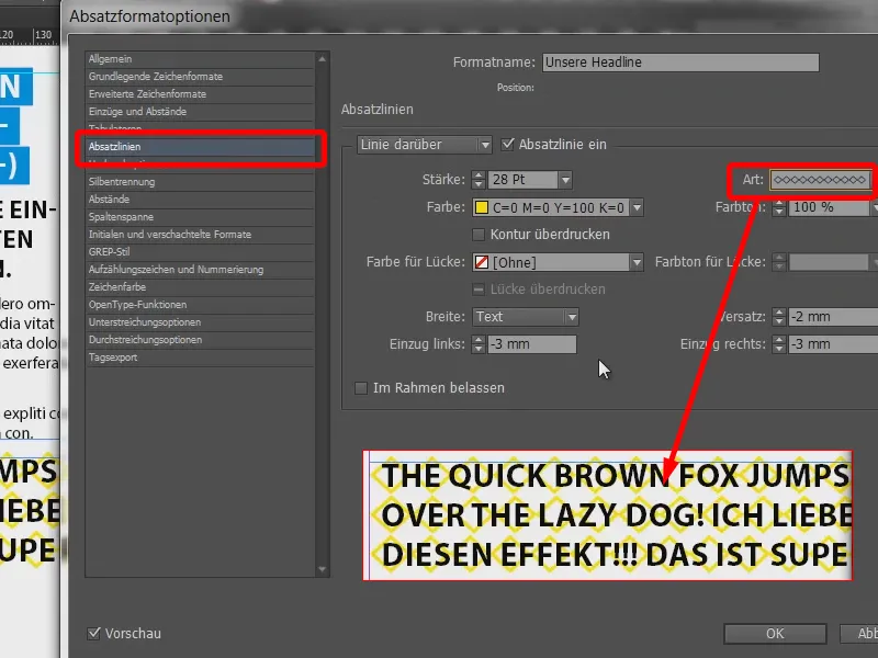
In principle, however, it was designed like this: thick, white text and solid lines behind it.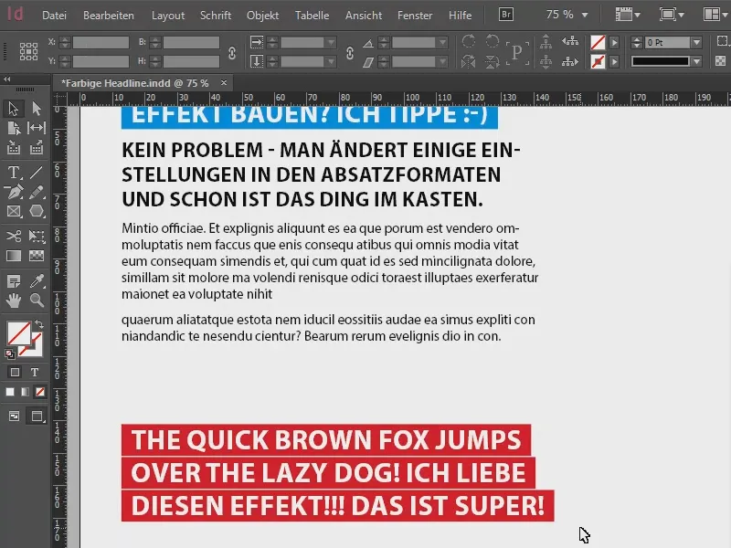
So you can create cool headlines that always resonate.
Your Stefan


