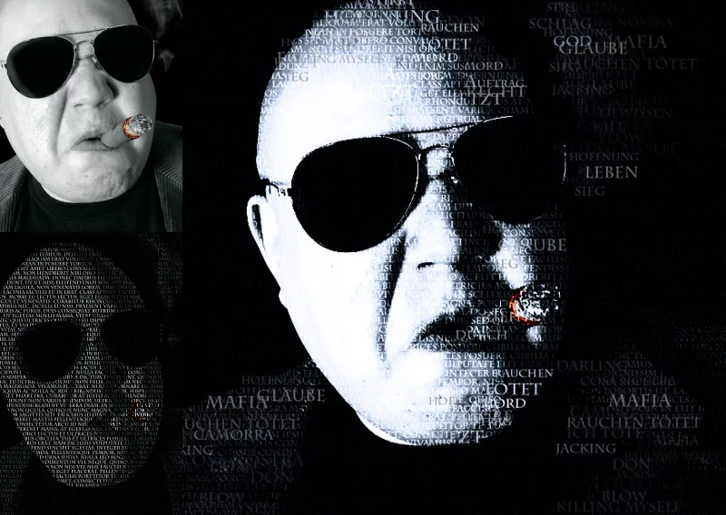
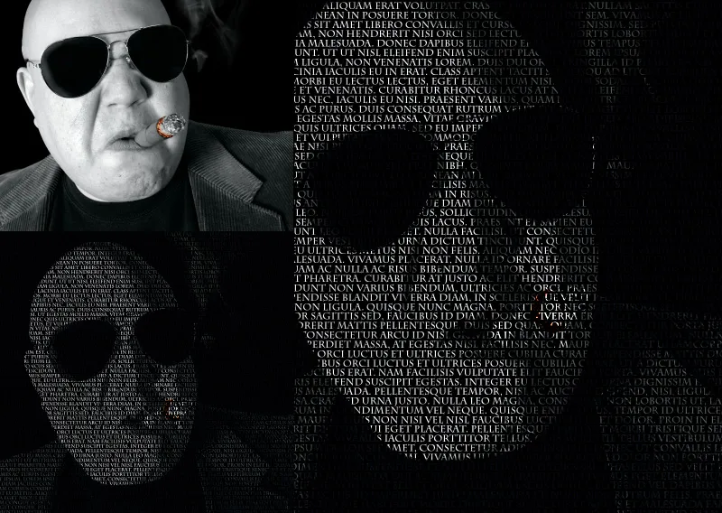
The typo portrait effect is a creative technique where text and portrait merge to create a unique and impressive design. This effect is perfect for posters, book covers, or digital artworks. With Photoshop, you can easily achieve this look by combining layer masks, text elements, and adjustments. In this tutorial, I will show you step by step how to create a typo portrait that harmoniously blends text and image. Let's get started and take your designs to a new level!
1. Generating a portrait from lines of text
Preliminary note: A prerequisite for successfully creating an appealing text line portrait is a high contrast in the image. Not every image is suitable for the typo portrait effect. However, in many cases, the contrast can be adjusted beforehand to match the desired result. Contrast enhancement should also include black and white correction. This can be efficiently done using the Channel Mixer, which can convert the image to monochrome while enhancing contrast using the sliders.
Step 1: Contrast enhancement using adjustment layer
The first step would usually involve converting the color image to grayscale using an adjustment layer like Channel Mixer or Black & White. Since my image (Image source: sumnersgraphicsinc - Fotolia.com) is already almost entirely in grayscale, I can proceed directly to contrast enhancement. To do this, I access the Brightness/Contrast adjustment layer and increase
- the Brightness to 34
- the Contrast to 40
The image now exhibits stronger contrasts, and the highlights in the skin areas may appear partially blown out.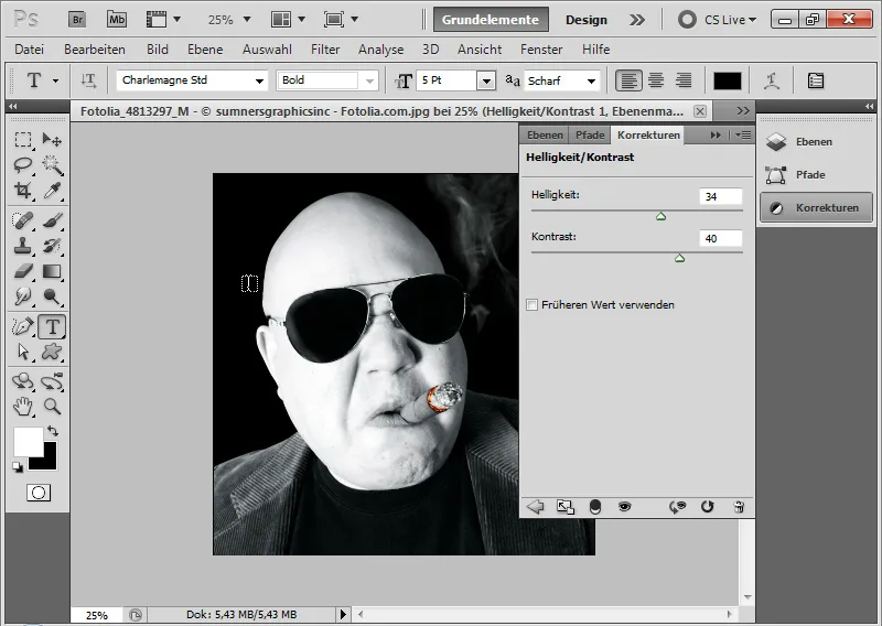
Step 2: Placing text
Using the Text tool, I draw a text frame over the entire document. I fill the text frame with arbitrary text using a 5-point Charlemagne Std font. The text color is white, and the line spacing is also set to 5pt.
To assist in this, I can use a Lorem Ipsum generator: http://www.loremipsum.de/.
It is important that the text is pure flowing text without paragraphs. Paragraphs need to be removed from the text frame! When it comes to fonts, it's a matter of trial and error to find one that provides good coverage and matches the motif to some extent.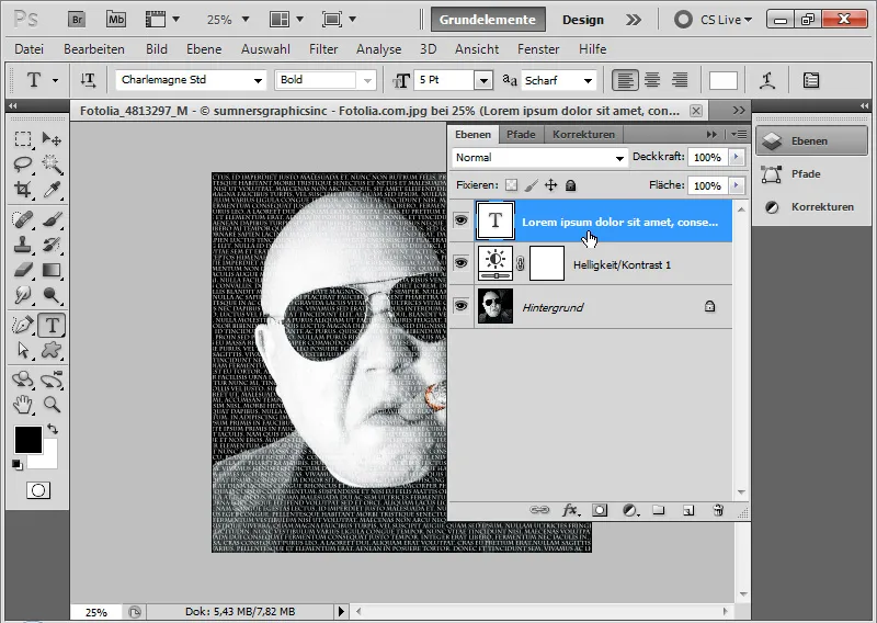
Step 3: Duplicating and hiding text layers
I duplicate the text layer twice using the shortcut Ctrl+J. Then, I hide all three text layers.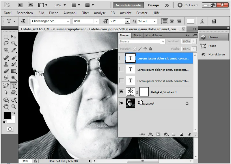
Step 4: Defining the first text area in the highlights via color range selection
I bring up the Color Range Selection dialog through the menu Select>Color Range.
With a tolerance of about 100, I first pick a point in the bright facial area using the eyedropper. If the Selection checkbox is activated, I can immediately see which area is being selected. I can confirm by hitting OK.
Alternatively, instead of selecting Sampled Colors under Selection, choose Highlights.

I apply this selection as a layer mask to my bottom text layer by simply clicking on the Add New Layer Mask icon.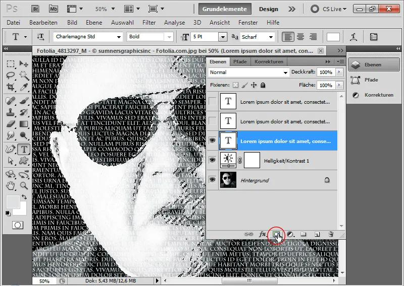
In this case, I can keep the text color white. The text layer is hidden for now.
To evaluate the effect, I can easily place a black layer at the bottom of the layer hierarchy and hide the image layer.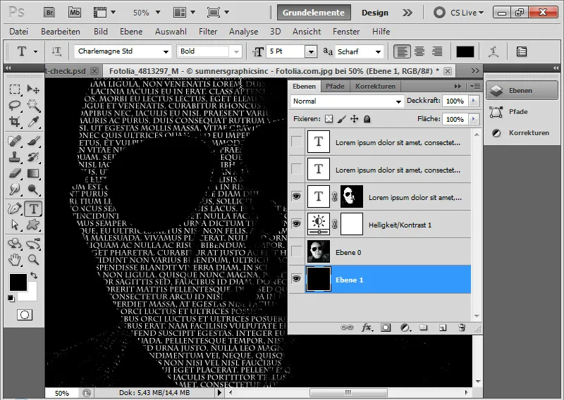
Step 5: Defining the second text area in the shadows via color range selection
I continue by bringing up the Color Range Selection tool again. This time, I select the shadows of the image either with the eyedropper or alternatively by choosing Shadows instead of Sampled Colors under Selection.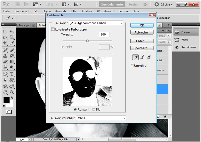
I add this selection as a layer mask to my second text layer. However, this time, I change the text color to a deep dark gray or alternatively a deep dark blue hue.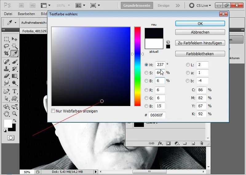
Step 6: Defining the third text area in the midtones via color range selection
I repeat the process and this time choose the midtones in the Color Range Selection. If I don't capture all at once, I can add more midtones to the existing selection with Shift. The eyedropper will then show a small plus sign. Similarly, I can choose Midtones under Selection as an alternative to Sampled Colors.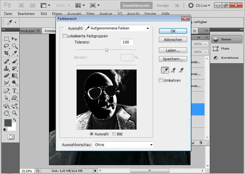
I add the selection as a layer mask to my third layer of text. I am changing the text color to a dark gray tone now.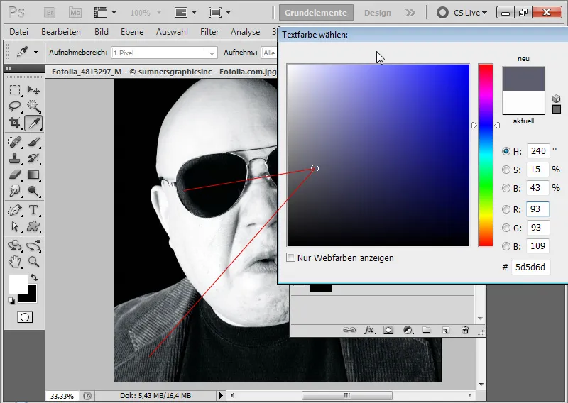
Step 7: Emphasize the Cigar
The cigar is only noticed upon closer inspection. It is recommended to emphasize it a bit more.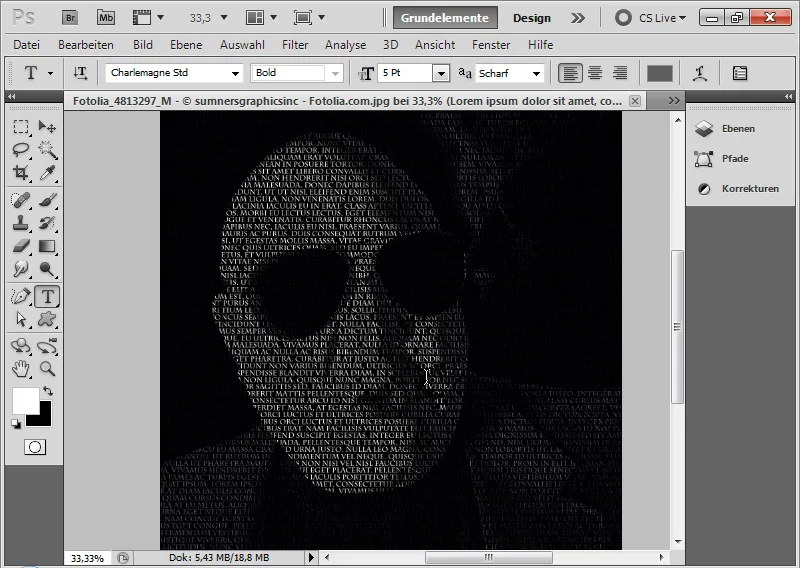
Therefore, I duplicate one of the three text layers and delete the layer mask.
Using the Quick Selection Tool, I select the cigar in the main image and add the selection as a layer mask to the duplicated text layer.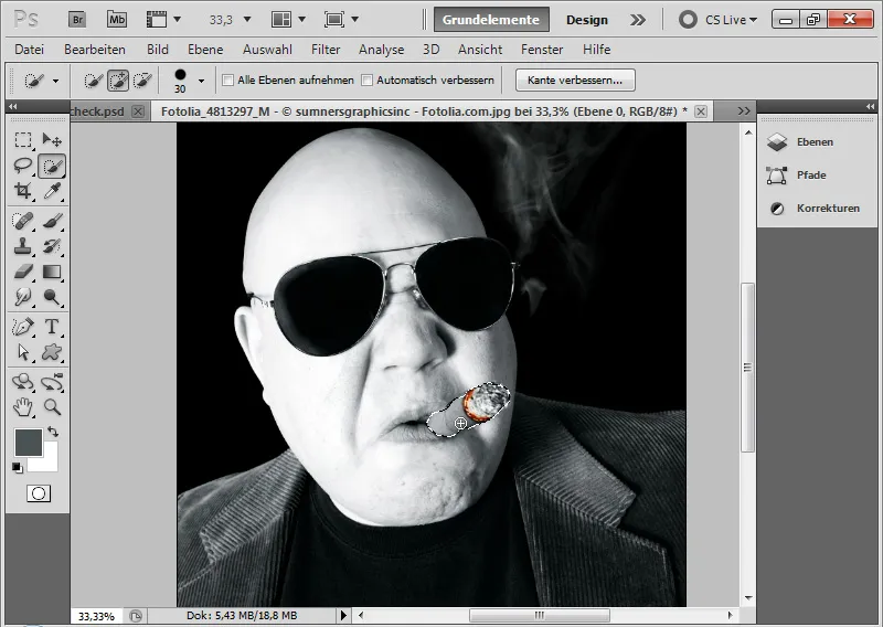
The text color is a medium gray.
I set the layer mode to Color Dodge. The Color Dodge mode is important so that the cigar does not receive a uniform gray color, but instead is calculated with the original brightness structure of the underlying layers while simultaneously increasing the brightness.
Background: Color Dodge as a blending mode reduces the contrast of the color channels and increases saturation. The original colors are brightened.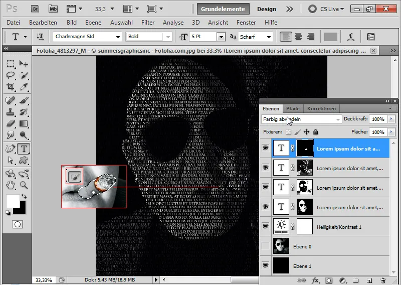
Step 8: Accentuate Glowing Cigar
If I hide the image layer and display all text layers, my effect is revealed. If I want to colorfully highlight the glowing cigar as a small eye-catcher, I simply duplicate the image layer and position it at the top of the Layers panel.
I set the layer mode to Color. This blending mode ensures that the hue and saturation of the layer are adopted in the image. Now the cigar glows in the text portrait.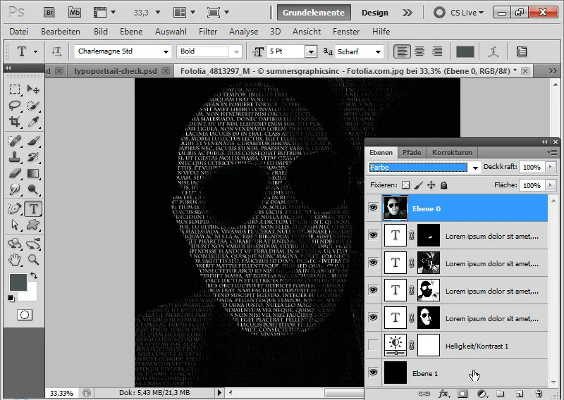
With an adjustment layer Hue/Saturation as a Clipping Mask, I further increase the saturation of the yellow/red range of the glowing stem by about 80%.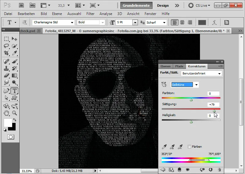
The simple and classic text line image is finished.
Create a Typoportrait Effect
The classic text line image is a good starting point to further develop the result towards a creative typo portrait look.
Step 9: Set Layer Mode to Hard Light/Delete Adjustment Layer
I can delete the Hue/Saturation adjustment layer now.
I set the blending mode of the top image layer from Color to Hard Light. The Hard Light mode provides strong tonal separation, i.e., significantly more contrast. The blending mode processes the image content similar to the Multiply and Screen modes. The boundary between both is marked by 50% gray.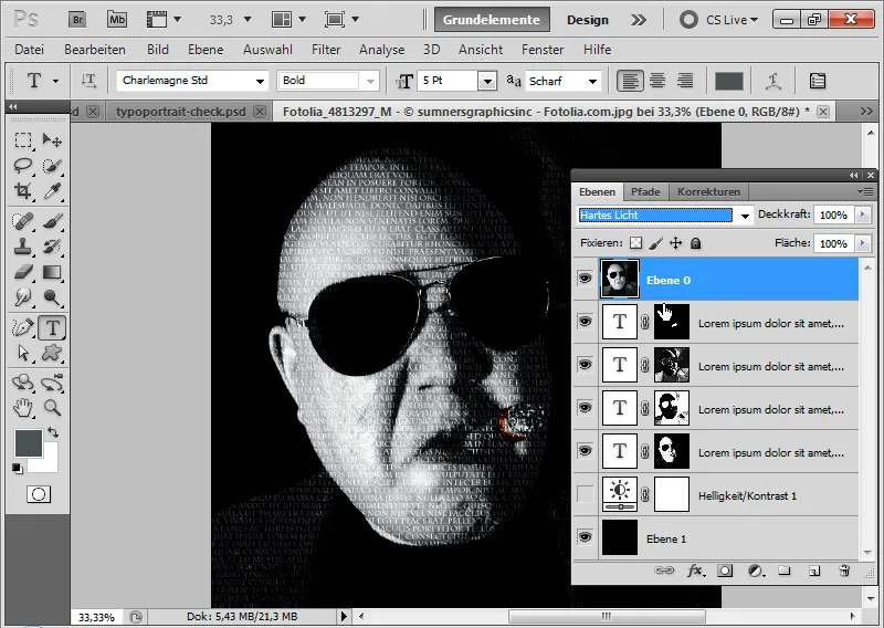
Step 10: Duplicate Image Layer
I duplicate the image layer using Cmnd+J and set it to the Lighten blend mode. This will result in sharper highlights and shadows in this example.
Unfortunately, the midtones are merging with the shadows in the right part of the image. Hence, I create a layer mask and paint black on the areas where the layer should not be displayed.
Step 11: Brightness/Contrast Adjustment Layer
To further separate the highlights and shadows in contrast, I create a Brightness/Contrast adjustment layer as a Clipping Mask to the top image layer (set to Lighten!).
The settings are:
• Brightness: 32
• Contrast: 40
Now the face appears angular and sharp as intended.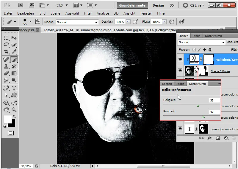
Step 12: Move Text Layer Up
Due to the increased contrast in the image, the dark text areas have been lost. I can easily retrieve them by placing the text layer with the text for the shadows at the top of the Layers panel.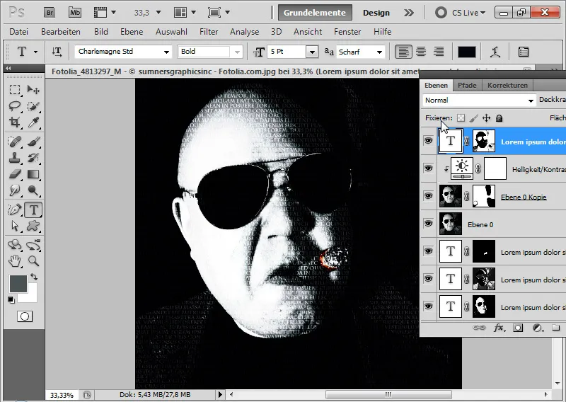
Step 13: Insert Text Overlays
The previous steps aimed to give the image a certain hardness with high contrasts. Now the focus is on concentrating short, crisp text passages with different brightness levels and sizes at some spots in the image. It is ideal to create a group in which these text overlays will be inserted.
It is advisable to consider beforehand which texts best suit the image theme to avoid any nonsense. Because these texts will stand out and creatively emphasize the typo effect.
I start by placing several text blocks on the right collar side. Using the Type panel, I can quickly format the text.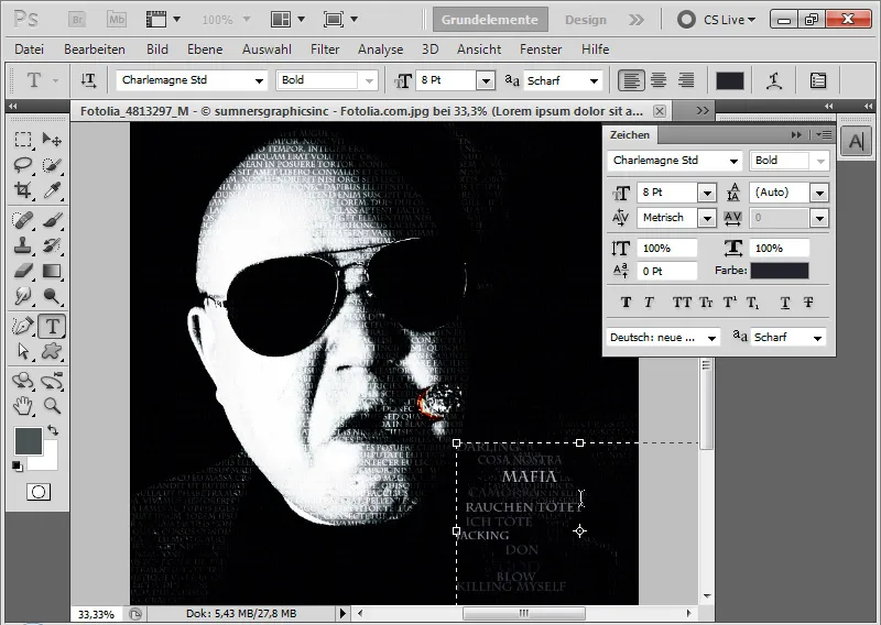
Next, I will tackle the smoke clouds. It is important to always choose different text sizes, text colors, and arrangements.
Tip: I can easily duplicate existing text blocks by pressing the Alt key and moving them. This speeds up the work a little. If I want to completely change the size of a text block, I simply scale the text layers using the Move Tool (Ctrl+T). Important: Always press the Shift key for proportional scaling.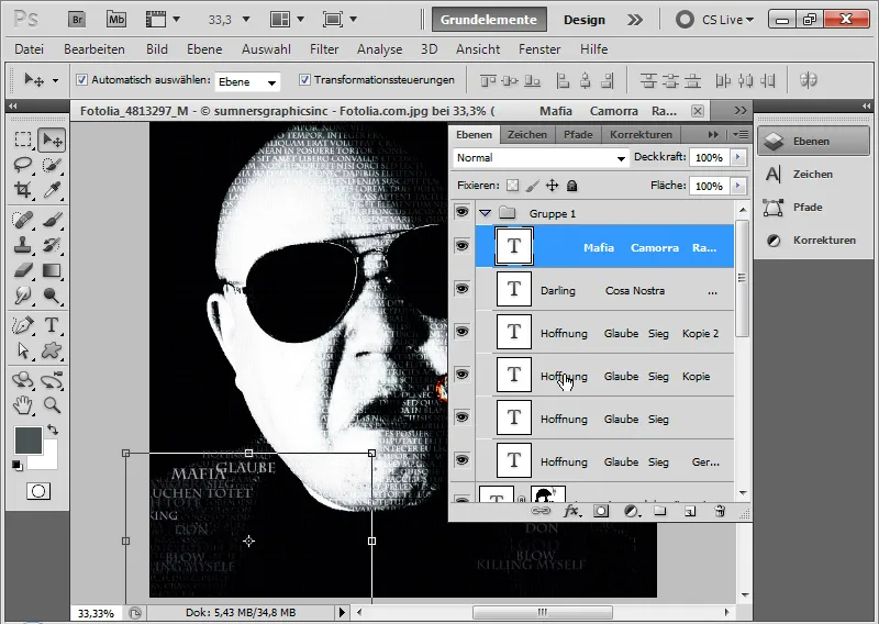
Step 14: Text overlays
Now I can duplicate the existing text blocks again and place them slightly offset under the existing text blocks. In this case, I significantly reduce the opacity to about 30 percent. The text layer should then be positioned below the existing text layers in the Layers panel.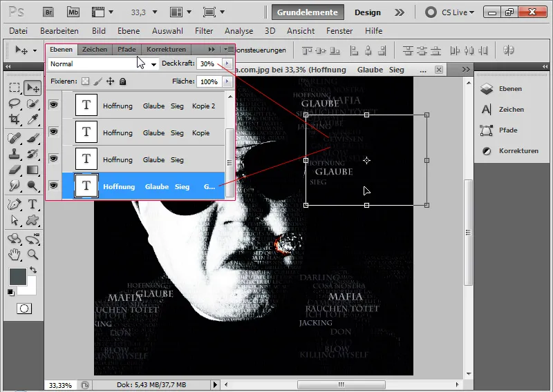
Afterwards, I can overlay the forehead, cigar, and chin with text blocks and enrich them with additional text layers with low opacity.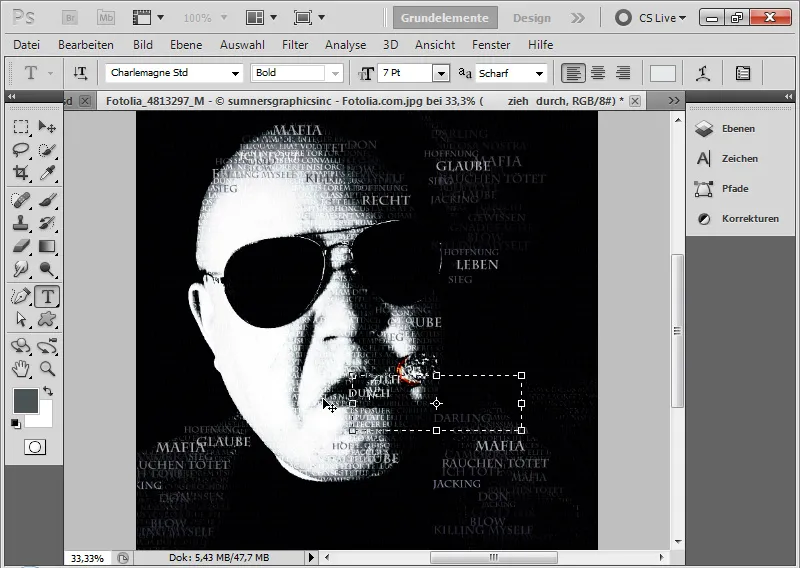
Step 15: Adding toning effect
If I want to add a toning effect, I simply create an adjustment layer Photo Filter and choose any photo filter for the image.
Cold and warm filters both look beautiful.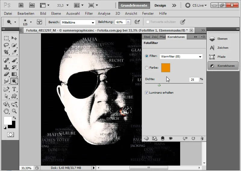
Final image with a cold filter: