In this tutorial I would like to show you how to create a text with multiple contours and a small neon effect.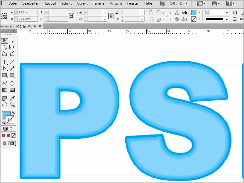
Step 1
First, I create a new text layer and write "PSD tutorials".
I can enlarge the font in increments of ten by holding down the Shift key, and if I double-click on the frame, it will take on exactly the right size.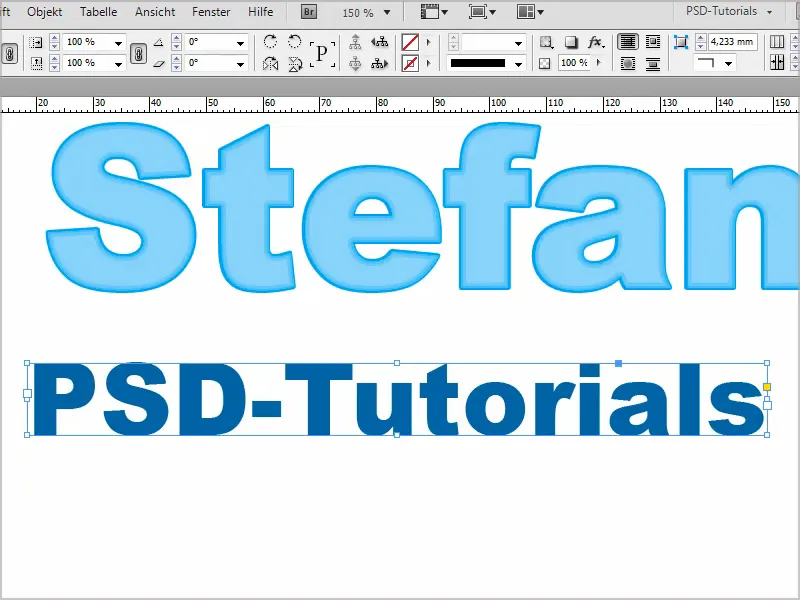
Step 2
Now I go into the color fields to create the colors I want for the effect. I want different shades of red.
So I double-click on the existing red and set the values for my "Red 1". I confirm with OK.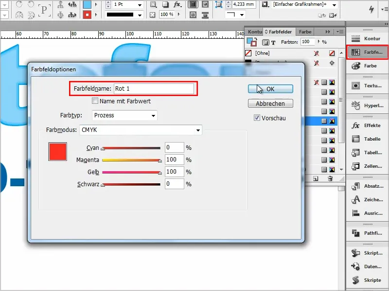
Step 3
I then drag "Red 1" onto the New icon (1) and create a copy (2).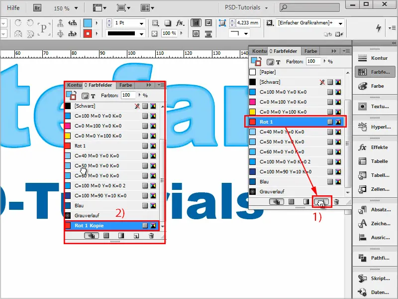
Step 4
I set the color of this copy to 20% darker and rename it "Red 2".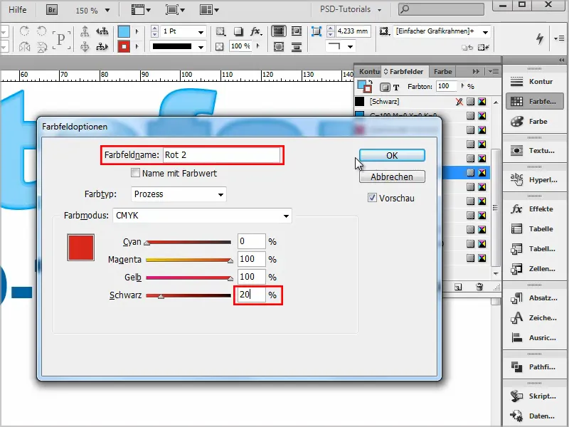
Step 5
This now continues several times:
I copy the new shade of red each time, add 20% more black and then rename the colors to "Red 3" to "Red 5".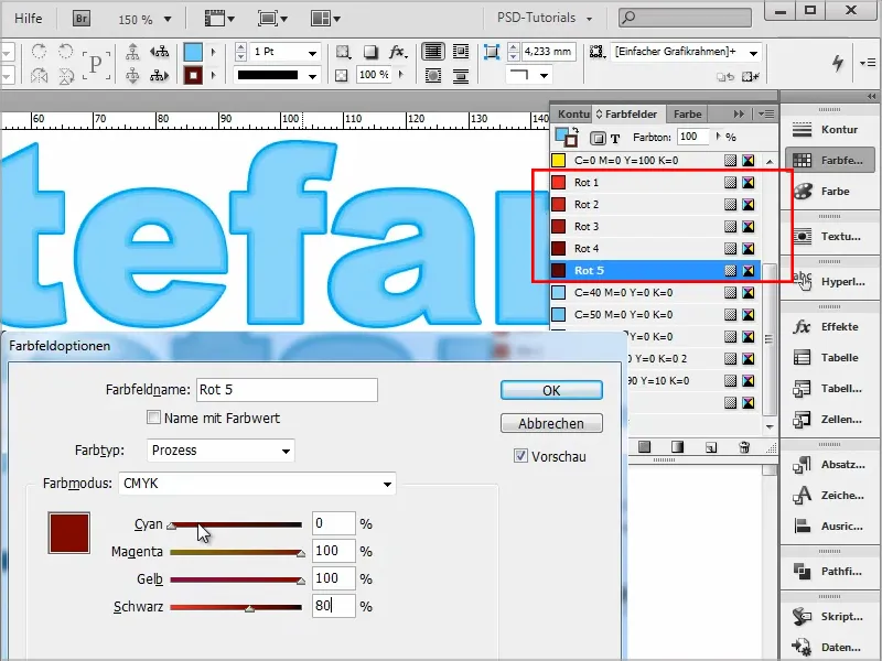
Step 6
Then I select the text and color it in the lightest shade of red ("Red 1") without an outline.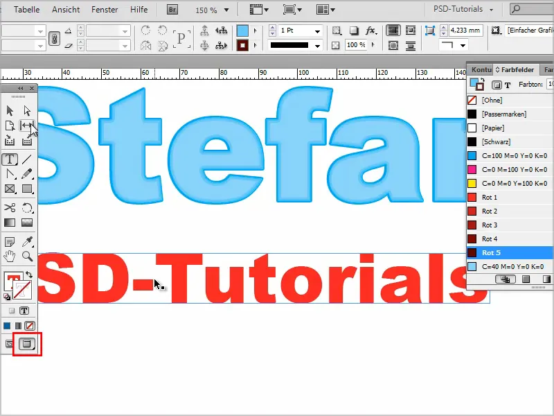
Step 7
I then go to the effects control panel. Double-click on Text to go to the settings panel.
There I create a drop shadow in Normal mode and select the darkest red color, "Red 5".
I set the opacity to 100%, the distance to 0 mm and the size should be 0.5 mm.
I set the overlap to 100%. And confirm with OK.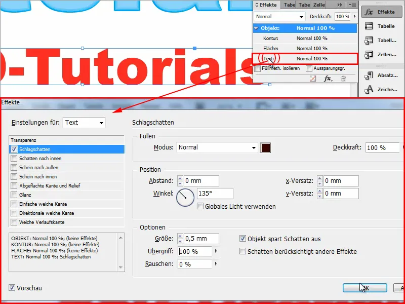
That's the first contour.
And I continue by double-clicking on Text.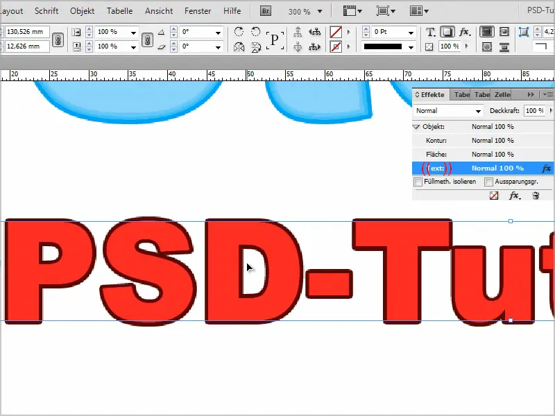
Step 8
For the second outline, we move the shadow inwards and make it lighter by selecting "Red 4" for Color fields.
Set the mode to Normal again , the opacity to 100%, the distance to 0 mm and the size to 0.5 mm.
Attenuate at 100%.
I confirm this with OK and we now have two contours.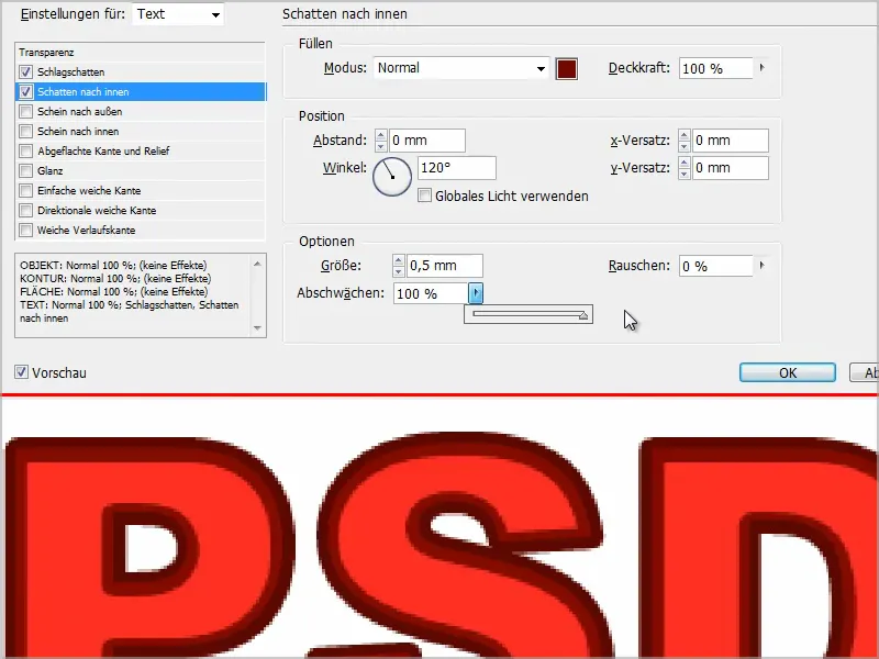
Step 9
Continue as before by double-clicking on Text.
This time we'll use outward glow in Normal mode and with "Red 3".
The opacity is set to 100%, the size to 0.25 mm and the overlap to 100%.
For technique, I can use Soft or Precise, it makes no difference.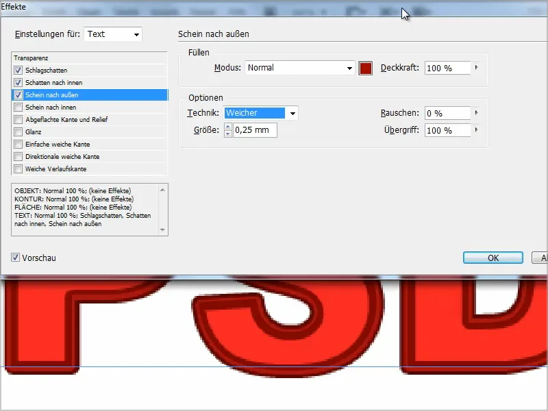
Step 10
And next we have an inward glow, "Red 2", opacity 100%, technique: Precise, source: Edge and the size is set to 1 mm.
We need 100% attenuation and then confirm with OK.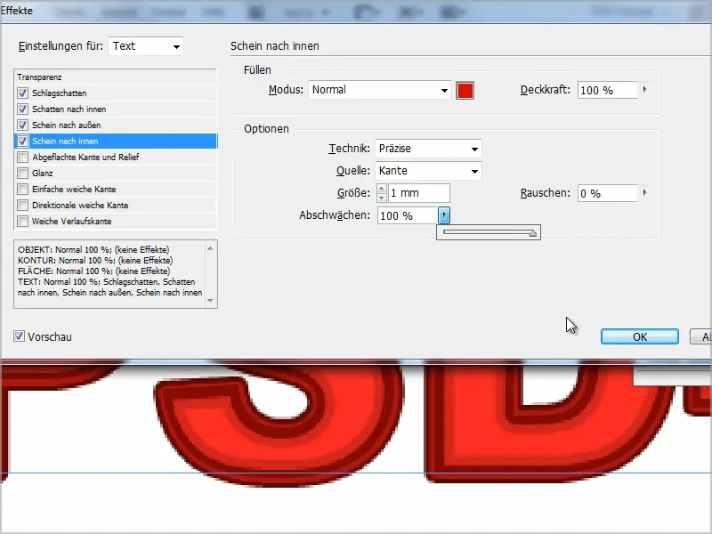
Step 11
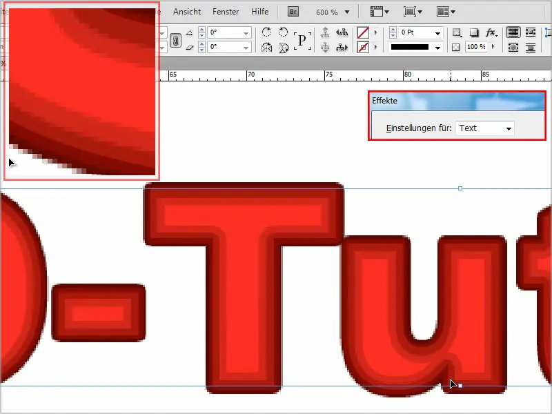
As you can see, we now have very nice contours. From very light on the inside to darker and darker red on the outside.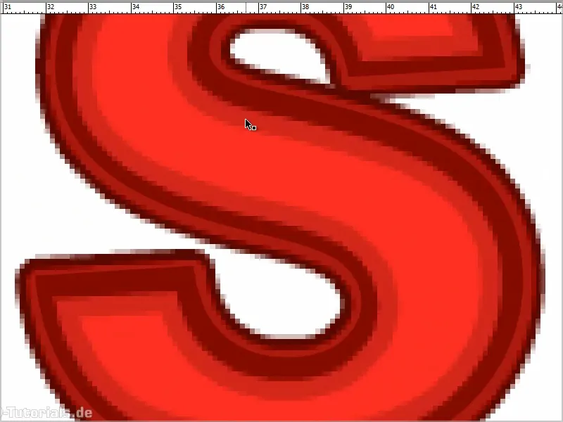
If I wanted a gradient, ...
... then I would have to change the colors so that I use "Red 3" for shadows towards the inside and "Red 4" for shadows towards the outside..webp?tutkfid=90284)
And then I have a perfect transition from light to dark.
This is a really great thing, especially as the text can be edited at any time.
Just always make sure that you really have the settings for text in the effects control paneland don't accidentally select Object.