A professional layout doesn't end with the design – the final check for print quality and compatibility is crucial. Features such as Softproof, Output Preview and the Overprint Preview in Adobe InDesign help you to check colors, transparencies, and print details. Additionally, by reducing transparencies, you can ensure that your document is ready for printing. In this guide, I will show you step by step how to effectively use these tools to achieve perfect results. Let's get started and optimize your layout!
Softproof and Output Preview
To get a realistic impression of the final print result, especially when using uncoated papers, on a previously calibrated monitor, InDesign offers a so-called Softproof. An active color management with the correctly assigned color profiles is a prerequisite for this.
Images on the monitor are mostly displayed in the much larger RGB color space created by additive color mixing, while the print output is on a reduced CMYK color space, which is further distorted by ink on paper through subtractive color mixing.
To illustrate this difference, InDesign converts the screen view using a suitable output profile to simulate these conditions. To do this, open the menu View>Proof Setup>Custom.
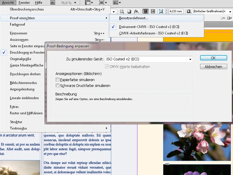
Choose the suitable profile for the output medium (ISO Coated v2 ECI for printing on coated art paper) and activate the checkbox Simulate Paper Color.
After clicking OK, you will receive a view of the document converted for this type of output. Even when printing on coated paper, you will notice a somewhat muted reproduction of images and colors.
If you are printing on uncoated paper with a slight color cast (e.g. publication paper for a book) or even newspaper print paper (e.g. for an advertisement), the difference will be much more pronounced.
To illustrate this, you can display the current page in two windows side by side with different output profiles. To do this, open the Window menu and select Arrange>New Window.
The document will now be displayed in two windows arranged as tabbed tabs side by side. Press the Tab key to hide all elements not currently needed, such as Palettes, Tools bar and Rulers, to make more space for the display.
Now, for the active window, select a different output profile through View>Proof Setup>Custom, e.g., ISO uncoated Yellowish for slightly yellowish publication paper or US Newsprint (SNAP 2007) for the drastic example of printing on newspaper print paper.
In this case, to approach reality and avoid discrepancies, it is advisable to inquire with the printer beforehand about the relevant output profile for the planned paper.
Either way, by using this method during the layout phase, you can preview with the client the output result, which heavily depends on the paper used, and make any necessary color and image adjustments.
Reducing Transparencies
A significant challenge in the final print output are the many beautiful effects based on transparencies such as drop shadows, which look great on the screen.
However, when fonts are partially overlapped by such objects, unwanted results can occur during the conversion of the file in the RIP (Raster Image Processor) of the plate setter, which in the current predominant cases converts the file into raster dots using the PostScript page description language, and if not recognized and corrected beforehand (e.g., through a proof print of the file converted in the RIP known as a form proof before the plate setter output), can lead to customer complaints about the printed job.
However, controlling these relationships is possible directly in the InDesign document through the Flattener Preview. Open the panel via the menu Window>Output. Now, from the dropdown menu of the Highlight field, select Transparent Objects.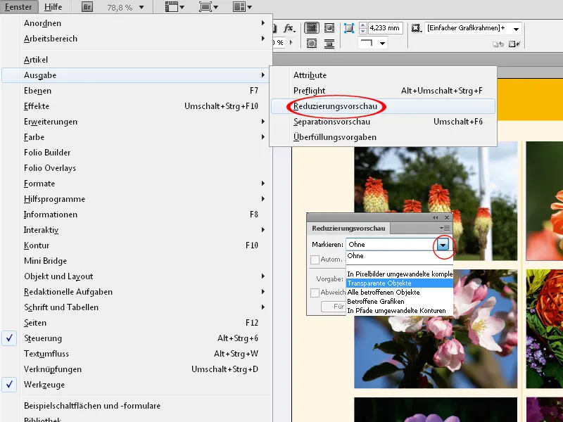
Objects containing transparencies are now highlighted with a red marker, precisely indicating the affected area.
Elements that overlap adjacent text partially deserve special attention. Even if the object frames of adjacent elements do not touch, the effect (e.g., a drop shadow) of an object may extend over the neighboring text.
By choosing Text and Contours with Image Fill in the Highlight field of the Flattener Preview panel, you get a preview of the expected result after the print output.
If the object with the transparency effect is in front of the text (Object>Arrange), the overlapped part is converted to pixels, while the rest retains its vector properties. Black text will then be pixelated from all four color channels in the upper part, while the lower part will remain sharp, outputting only in the black channel.
The tricky part is that a PDF file exported for printing looks great on the screen, and the shock sets in only upon delivery of the printed material. The user then tries to blame the printer and conflict with the customer is almost inevitable.
To resolve this issue in InDesign, bring the text to the front (Shift+Ctrl+]). The object's effect will no longer affect it, visible in the same view in the Flattener Preview. Further valuable insights on problem areas can be obtained by selecting Text Converted to Outlines in the Flattener Preview panel.
Check Overprinting
Another exciting surprise awaits you if you have accidentally set light text on overprinting on a dark background. The light color of the text will then mix with the darkness of the background, causing palpitations during the delivery of the printed material.
Fortunately, you can already see this result in the exported PDF file (not in InDesign) – but only with the overprint preview activated.
To do this, you need to check the box simulate overprinting in the output preview of Acrobat.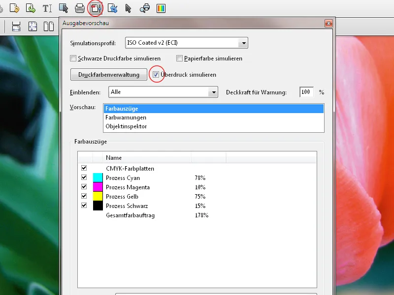
And this is how the exported PDF file (and later the print) looks like:
In InDesign, in this case, the Attributes window is your friend (Menu Window>Output). Here, uncheck the box for overprint fill of the light text, and all will be well.