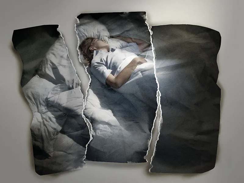
When a photo has been torn and put back together, it already gains meaning. If the torn edge is in a specific place, the significance of the image grows. If in addition, the color and light emphasize the core message, then we are approaching an image with a situational context, with a context.
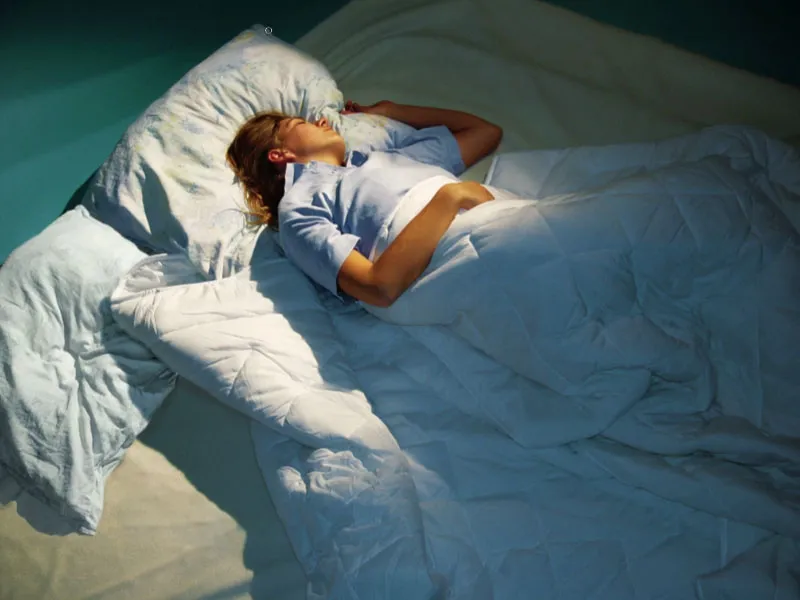
Step 1: The Original Image
This image was photographed with continuous light. The model was lying on the floor, and a spotlight shone from the upper right onto the scene. A blue foil slightly bathed the scene in cooler light. As a photographer, I was standing on a ladder about 1.50m high. The working surface was also extended by about 5 cm with a white border around Image>Working surface all around.
Step 2: Cohesive Image?
To determine if the original image is suitable, there is a little trick: Look for prominent diagonals in the image and draw them on separate layers. This process should be quick and spontaneous.
Then hide the image layer and look at the diagonals. They should lead towards or accentuate a (or multiple, depending) significantly important area of the image. In this case, it's the woman's upper body.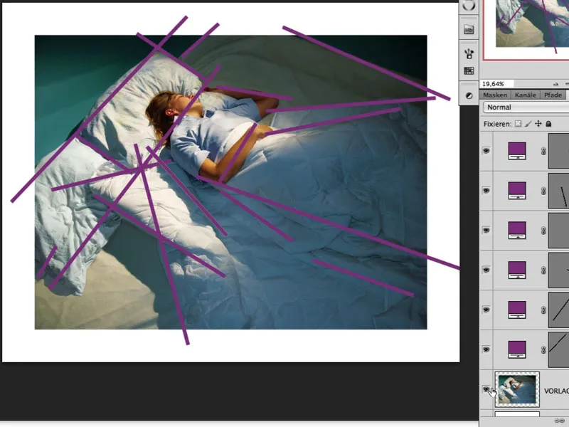
Image Adjustments
Step 3: Brightening the Hair
After thorough observation of the image, I notice that, among other things, the hair in the shadowed area is a bit too dark. A good way to brighten it is by optimizing it in the dialog Image>Adjustments>Shadows/Highlights.
Beforehand, the layer is edited under Filter>Convert for Smart Filters so that we still have the option to access this dialog later and ideally adjust the values. The current values can be seen in the image. The automatically generated mask of the Smart Filter is now filled with black, and the effect is painted in with white.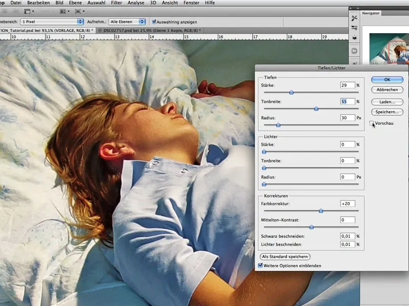
Step 4: Immersing in Moonlight
The goal is to illuminate the scene as if under moonlight. For this, the colors need to be desaturated and shifted slightly, and the contrasts need to be lifted.
A good way is to create an Hue/Saturation adjustment layer in the Soft Light fill method. The Saturation can be reduced while ensuring the Colorize box is checked; as shown in the image. By moving the hue (top slider), the desired effect can now be chosen: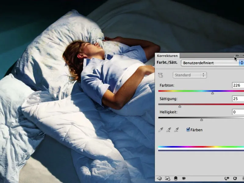
Step 5: Lights Off - Spotlight On
The just created Adjustment Layer is duplicated and set to the Multiply fill method. The Layer Opacity is about 67%. In the corresponding mask, the area that should not be darkened is excluded: the area of the upper body.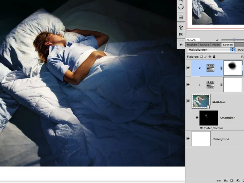
Step 6: Light Glow
Light can also be accentuated by darkening areas. The "TEMPLATE" layer with the two created adjustment layers is duplicated and merged into one layer.
The fill method of this new layer is set to Multiply, and in the corresponding white mask, the effect can now be reversed with black and the Gradient Tool>Reflective Gradient (4th type of gradient) tool. This creates the impression of directed light, and the overall color in the image already effectively suggests the impression of night and moonlight: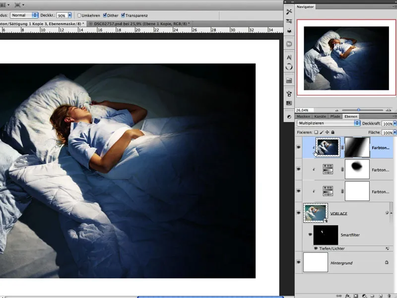
Step 7: Aligning Effects
As we are working with a Smart Object (see Step 03), slight corrections should be made in the Shadows/Highlights dialog at this point. In the image here, you can see the mask of the Smart Filter and can clearly identify where the highlights (white) are being emphasized. The idea is that some wrinkles in the darker areas are brightened again to prevent the image from uniformly transitioning into darkness.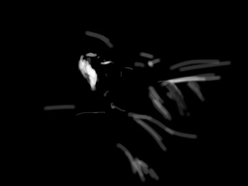
Step 8: Manually Adding Drop Shadows
It's always useful to let an image "rest" for a while. All it takes is a short break to see and perceive it anew. After a short break, I decided that a drop shadow cast by the woman with her blanket would enhance the scene. To achieve this, I invoke a Levels Adjustment layer and reduce the white areas. Then, the shadow is painted in the black-filled mask using a brush: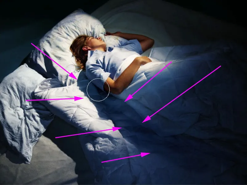
Step 9: The Dream-Look
To give the image a touch of a dream world and to keep the lighting situation a little softer, the top layer is activated, the background layer is deactivated, and the key combination Shift+Alt+Ctrl+E is pressed. This merges all visible layers into a new layer. Pressing Ctrl+I inverts the image.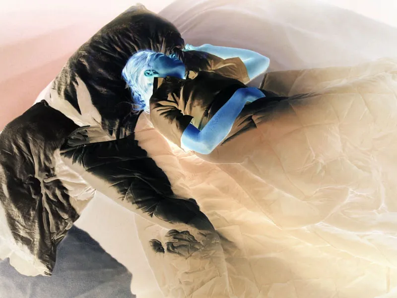
Next, the layer is set to the Soft Light blending mode. The effect of softness can now be adjusted under Filter>Other Filters>High Pass.
In our example, the value is approximately 13.5. The layer's opacity should be around 80%. The result is a slight softness, particularly affecting the small creases of the ceiling.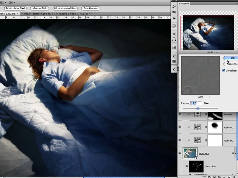
Step 10: Torn Paper
Now torn paper is photographed. Different types of paper create different tears and edges. Some experimentation may be necessary. It was important that the torn and crumpled paper pieces were photographed during the day on a sunny day in the shadow area on a black cardboard. Each piece of paper should now be cut out and placed on a separate layer. This can be easily achieved using the Magic Wand Tool: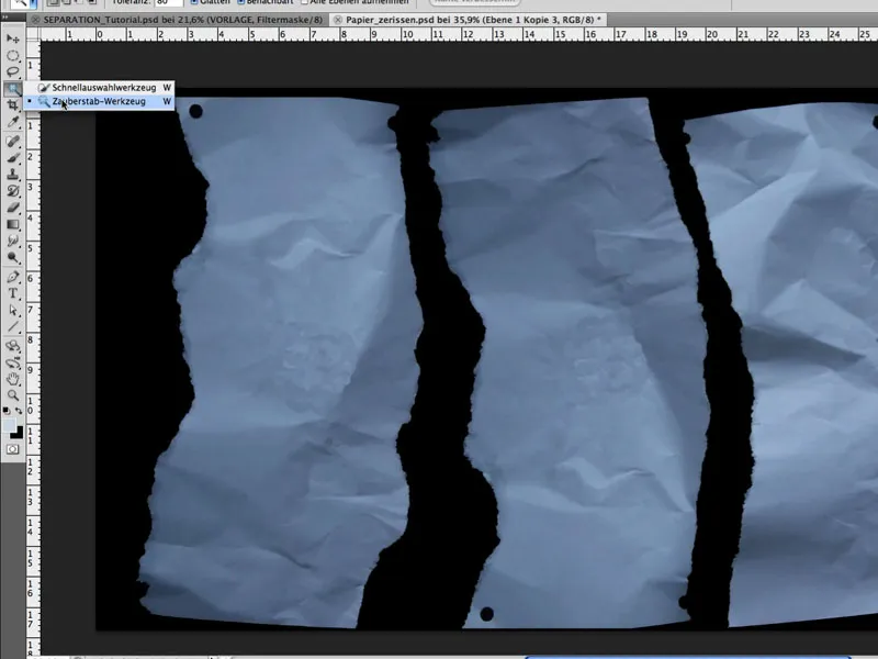
Step 11: Optimize Shapes
Under Edit>Shape Grid, each piece can now be easily and individually adjusted. For example, by placing a pin, pressing the Alt key, and leaving the cursor over the pin, the shape can be rotated around the pin. This is crucial for a realistic appearance. The goal is to shape 3 pieces of paper to make them appear as if they came from one image.
Step 12: Position Paper
The individual paper pieces are dragged into the image and positioned accordingly using Edit>Free Transform. Special attention should be paid to the middle piece by ensuring that the woman's head is positioned at the left edge.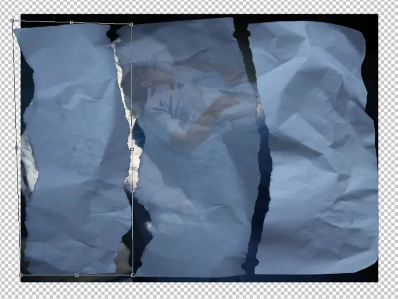
Step 13: Align Shapes
The paper pieces should be further aligned in shape, so that the left piece has an outer edge on the left side and not a torn edge, and each hole has a corresponding counterpart. The original image is then merged back into one layer using Shift+Alt+Ctrl+E. By selecting each paper piece (left, middle, right), our main image is now 'cut up' onto separate layers; see image. The paper layer is above the image layer.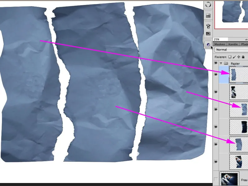
Aligning the hole in the mask: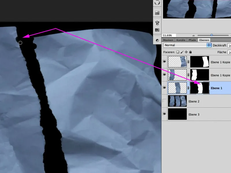
Step 14: Enhance Folds
To add more contrast to the folds and creases, each paper layer can be duplicated, set to the Soft Light blending mode, and the Saturation reduced.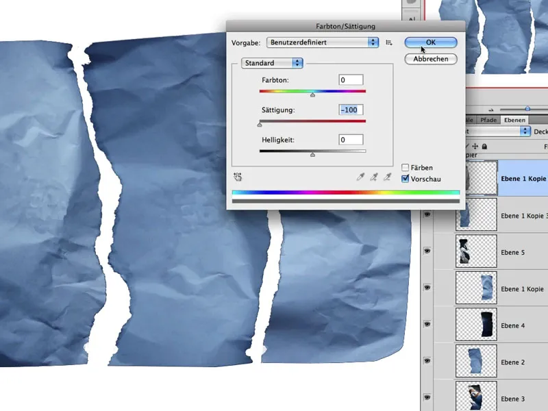
Step 15: Bright Folds
The next steps involve ensuring that the light and dark folds and creases affect the underlying image separately. This is done by selecting the paper piece on the corresponding layer and using Select>Color Range with the Eyedropper to select the brightest area. Here is an example with the middle piece: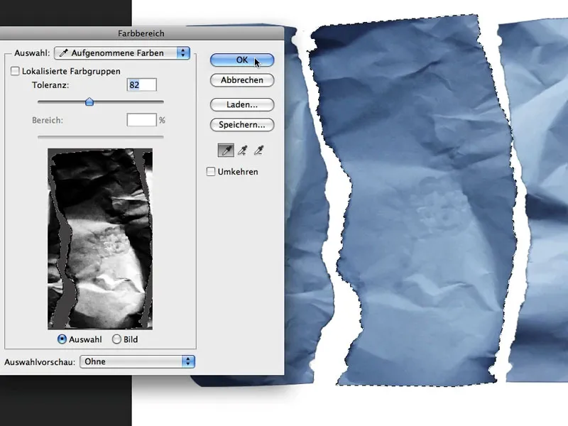
With this selection (marching ants), clicking on the Layer mask icon at the bottom of the Layers panel automatically creates the appropriate mask that only reveals the bright areas. The blending mode of this layer is Negative Multiply.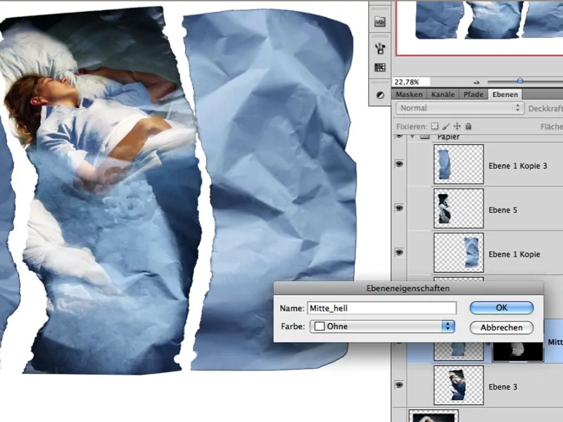
Step 16: Dark Folds
The same principle is applied to the dark areas of the individual paper pieces. After duplicating the layer, only the dark areas are followed and loaded back into the mask as a selection. The blending mode here is Multiply.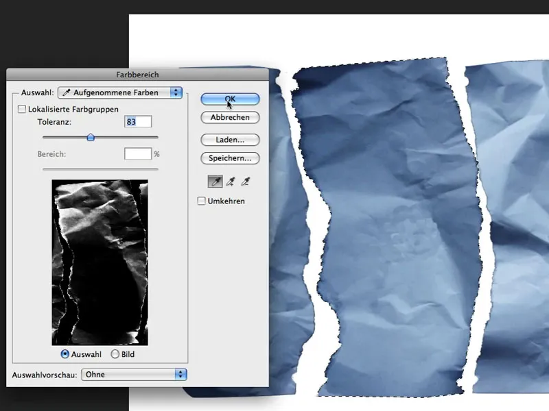
The interim result looks like this: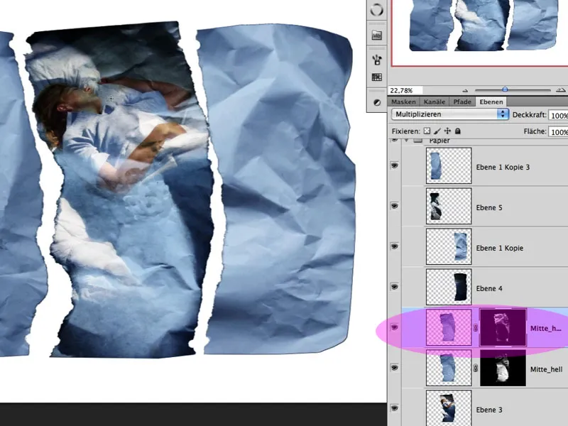
Step 17: Light+Dark
Of course, both layers still require appropriate post-processing in the mask to make the image shine optimally and ensure that no folds run through the face, for example. The result of this symbiosis then looks like this: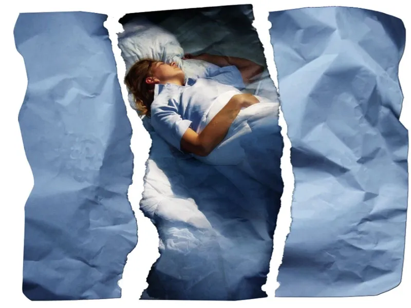
Step 18: Organization
I now apply the technique mentioned above to the other levels and organize my levels into corresponding groups; see image: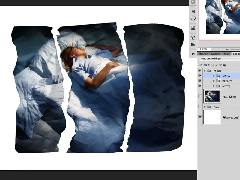
Step 19: Optimizing Folds
If one observes during this phase that certain areas of the image require more fold structure, the selection and layers of the other pieces of paper can be used and further transformed as needed, as seen in the left example below: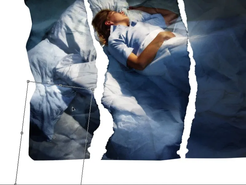
An adjustment layer that brings back some brightness, created as a curves adjustment with a clipping mask above the photo.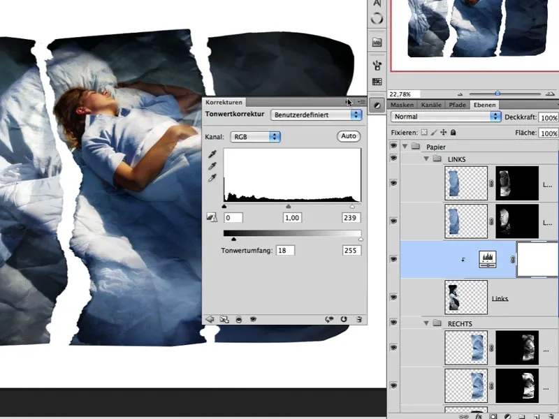
The suitable mask (light creases) from another piece of paper is now dragged onto the mask of the adjustment layer through Drag&Drop. The mask is then placed in a suitable position and transformed accordingly.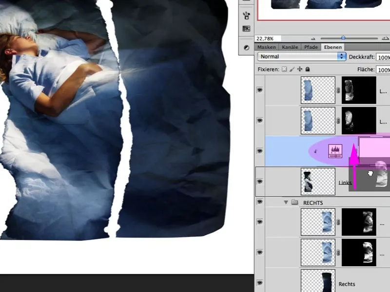
Step 20: Shifting
The individual groups are now tilted and shifted as needed, creating overlays here too. My main focus is on the middle piece with the woman's upper body. To better assess the subsequent steps, the background layer is toned down slightly so that pure white is not visible: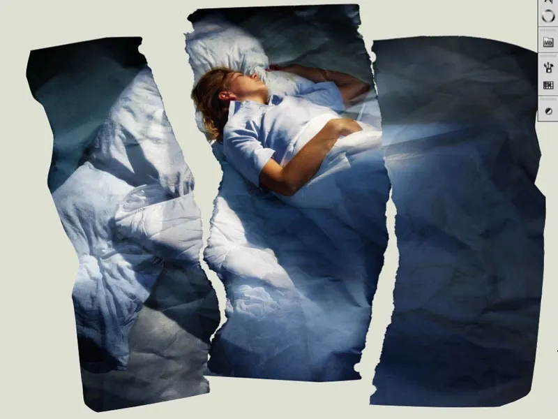
Step 21: Torn Edge
A real photo consists of several layers: the backing board, the adhesive, the photographic paper, etc. If such a photo is torn apart, a specific tearing pattern is created, depending on the factors mentioned above. In each group, a new white-filled layer is created. The respective mask of the specific piece of paper is assigned to it. The activated mask can now be moved to the left using the arrow keys. The result of this shifted mask is the initial torn edge: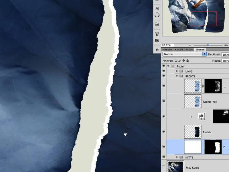
Step 22: Optimizing Edge
Using the smudge tool, the torn edge in the mask can be made slightly more irregular and individual fibers can be made visible by carefully smudging certain areas.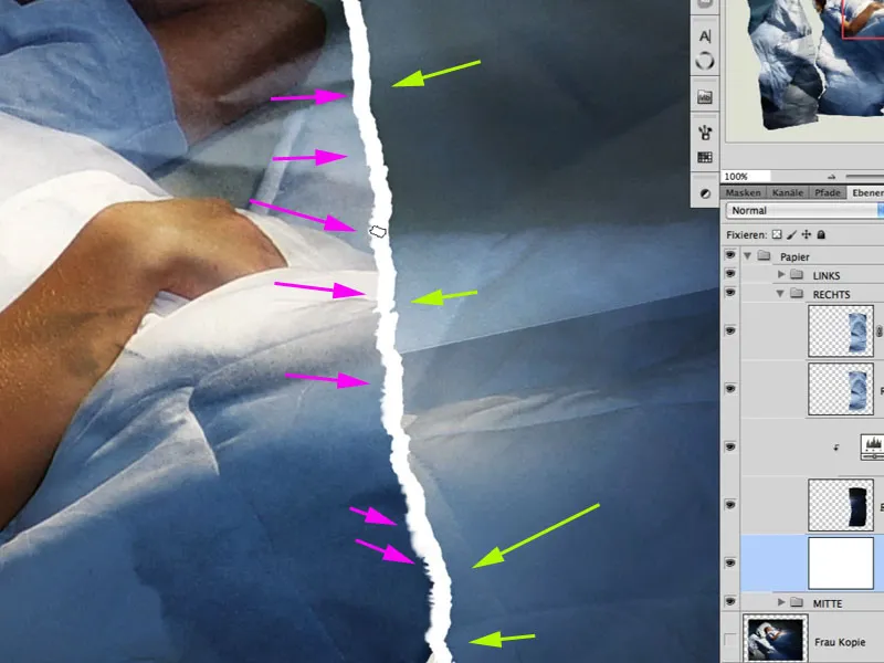
Step 23: Treating Paper Surface
Torn photo paper appears even more realistic when the surface has also been affected. A brush tip can be adjusted accordingly in the brush presets...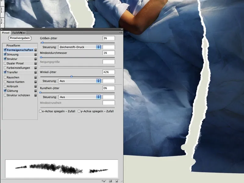
... and in a white-filled mask on the photo layer with low opacity, a lightly interrupted structure is painted.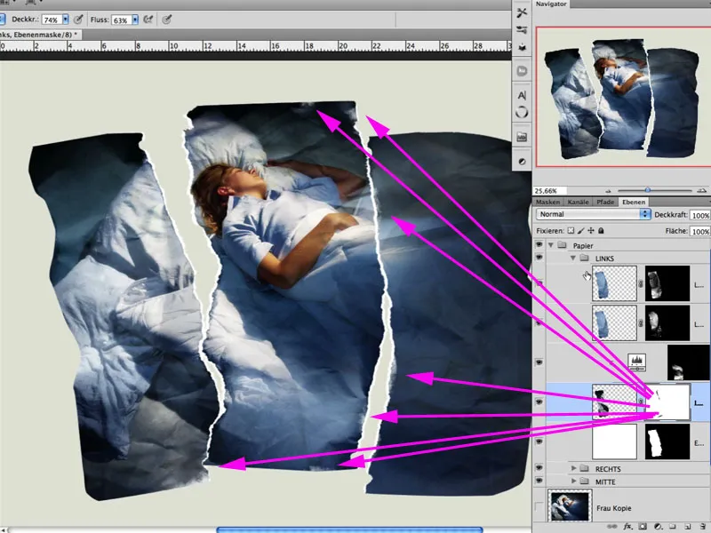
Here is a detailed excerpt: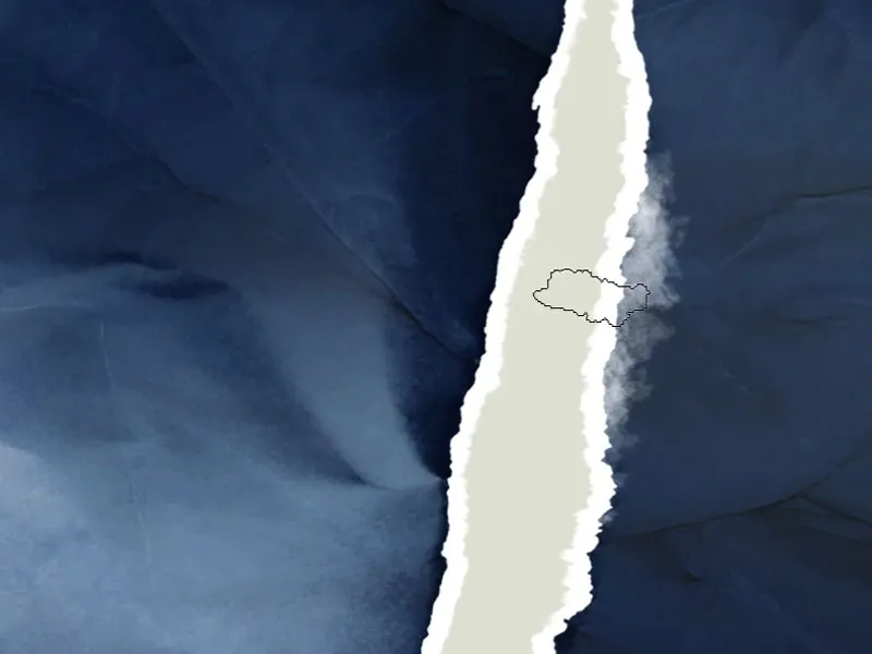
Step 24: The Drop Shadow
Wavy paper only looks believable when it also creates an appropriate drop shadow. I opt for a slightly diffuse light. A new fill layer solid color is created using the multiply blending mode and made invisible again with a black-filled mask.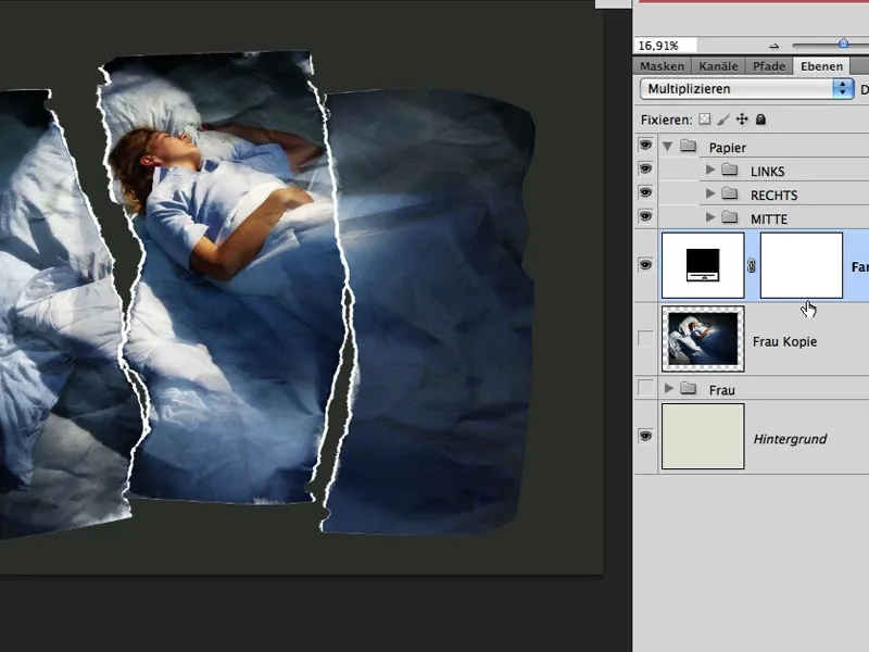
Using a soft and white large brush, the shadow effect is painted in with low opacity. The brush tip diameter can be varied at some points and even take on a more precise shape, making the proximity to the surface more visible.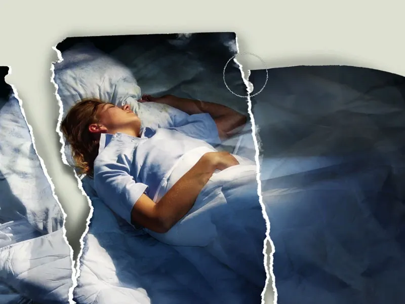
Step 25: Farewell to Color
To give the image more significance, I opt for a look that simulates the night light/moonlight even more strongly. For this purpose, I create an hue/saturation adjustment layer with the color blending mode. The saturation is not fully reduced; see image: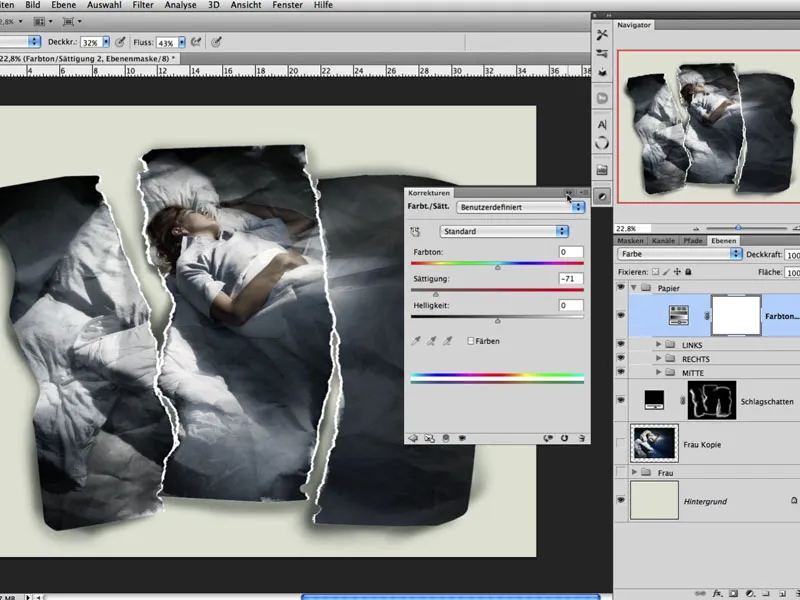
Step 26: Bringing Back Folds
In these almost final steps, I like to merge all lower layers together again with Shift+Alt+Ctrl+E and then duplicate them. The top layer is then edited with Image>Adjustments>Shadows/Highlights so that folds become more visible again through the settings. The blending mode of this layer is Luminosity, and I create a mask filled with black. Now I have the opportunity to paint in the shadow/highlight effect with white where I want to enhance the folds and creases.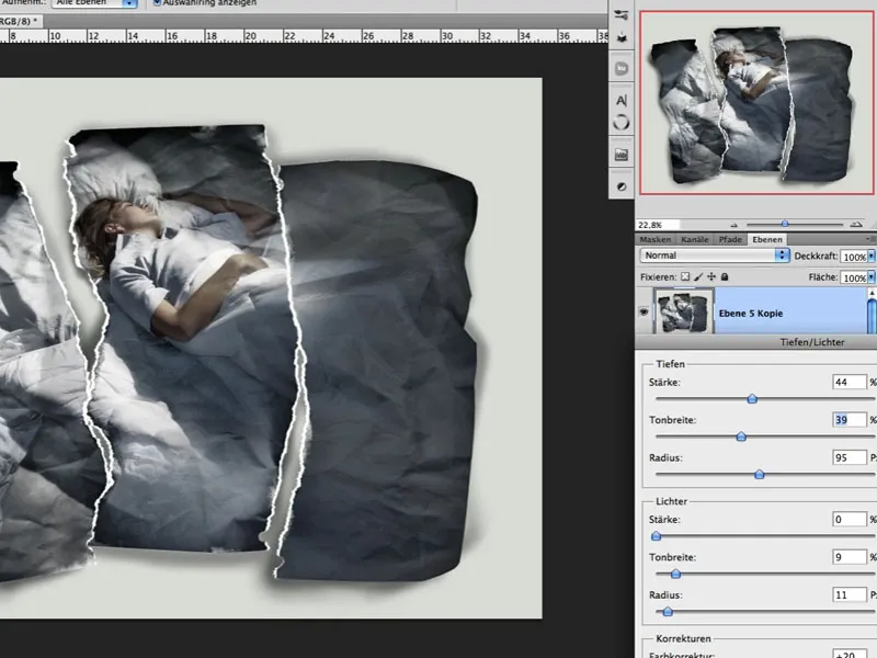
Step 27: Toning
If the color intensity of the image still needs to be adjusted further, a color fill can be applied here using the blending mode Blend and low Opacity.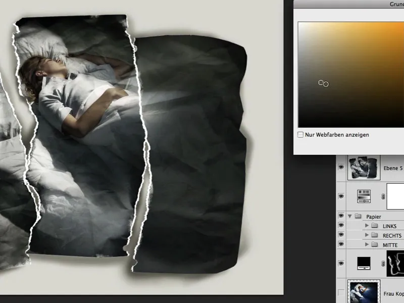
Step 28: Grain and Sharpness
Almost final, the image still requires a slight graininess, which I achieve through a layer filled with 50% gray and finding a suitable value using the Add Noise filter. Afterward, this graininess is slightly blurred with the Blur filter; the blending mode is Soft Light with low Opacity. Sharpness is achieved through the Sharpen filter>Unsharp Mask. Here is a detailed section with grain and sharpness.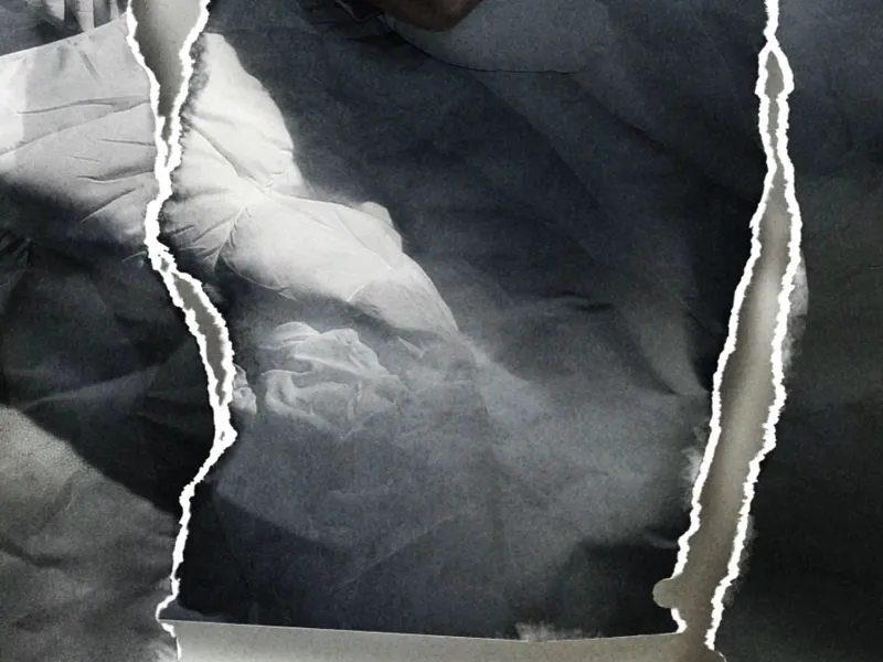
Step 29: Final Touches
Final accents are always a matter of taste. I opt for slightly darkened outer areas and the resulting slight creation of a light cone with 2 color fills in the blending mode Multiply with corresponding low Opacity: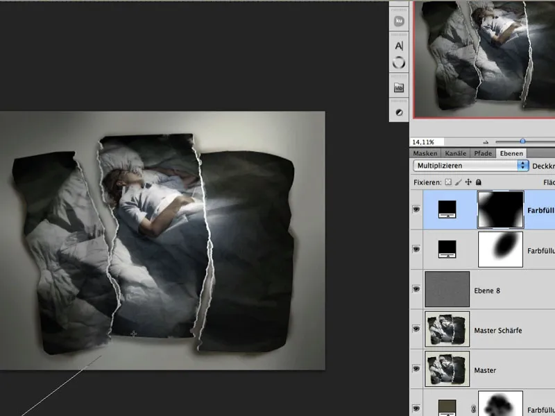
The finished image:
