Let's start with a question: why are some layouts just super pretty to look at and some make you think: "Has the designer been drinking or what's going on?" I want to get to the bottom of this here, because it makes a difference whether the layout designer is a really smart fox and works with a design grid or not. And that will be the core topic of this training: the design grid.
To begin with, I will go over the theoretical basics, then I will assume that we are allowed to create a four-page folder on behalf of a customer. And we'll go one step further: from the idea in our heads to the decision on which design grid we will use, right through to the final step, in which we naturally want to fill our layout with the design grid accordingly.
So that there's something interesting for you to see right at the start, I'll show you where we want to go. Here is the four-page folder, which I have on a separate layer. The front, the back ...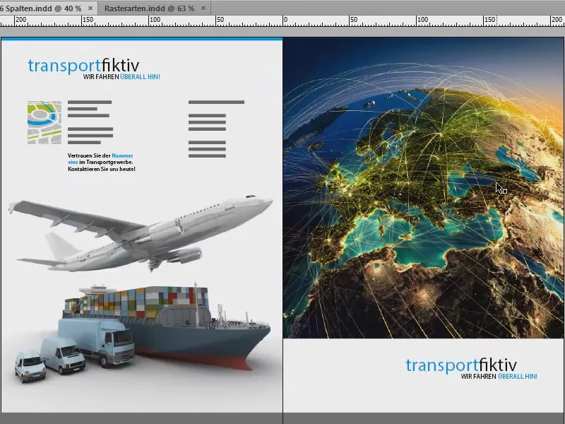
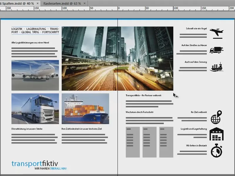
... and two inside pages for a fictitious transport company: "transportfiktiv, wir fahren überall hin", that's the motto. This is exactly what we want to create together.
Basics: type area, bars, baseline grid, grid columns
But first let's look at the somewhat dry theories: When we work on pages, we always have certain building blocks that inevitably belong to it, and that is of course first and foremost our type area, this blue box here.
The type area marks the printable area on our page, i.e. this is basically where the core of our work takes place, and this is surrounded and encircled by the individual bars. They are simply there to mark the boundaries.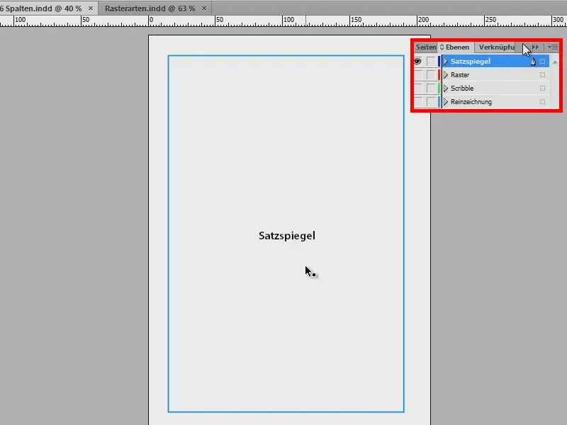
They also have names: the head bar, the outer bar, the foot bar and the collar bar. The waistband bar is aptly named because it is always aligned with the waistband, which is why it is facing inwards on the left-hand side.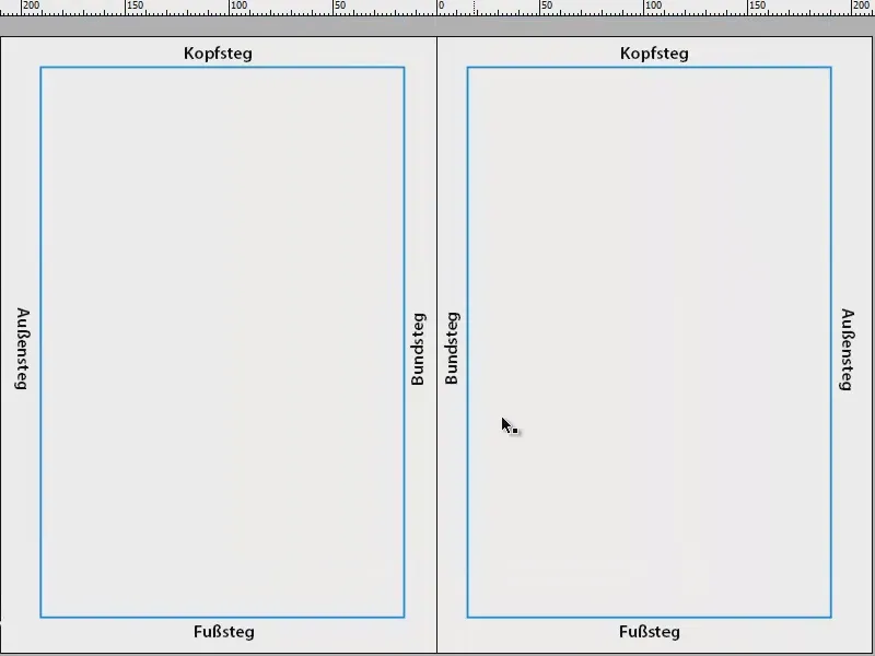
You always have to be a little careful with waistband stays like this: If you have to process really thick brochures or catalogs, for example, you should make sure that the type area is reduced a little and the gutter is widened a little in the case of perfect binding.
Why? If we have a perfect binding in the middle and many pages are pressed into it, then the sheet of paper curves at this point. And so that no words, letters or other elements are swallowed up, we reduce the type area slightly so that the resulting curvature does not affect the text that we place on the type area.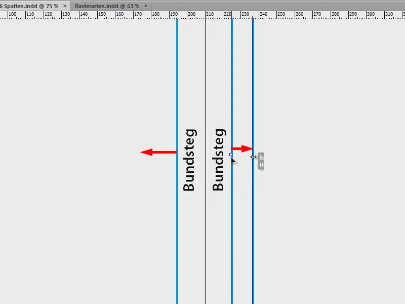
Our third companion on board a clean layout is the baseline grid. Let me change the view (click on the red framed icon in the image), which can also be done with the shortcut W.
The baseline grid refers to the horizontal lines that extend across the entire document. And for a clean design, this is definitely the first essential and also a correspondingly important component for a nice horizontal alignment.
The top and bottom edges of texts, elements and images can also be perfectly aligned with these lines. Basically, you can say that the baseline grid is definitely a component that you should not do without.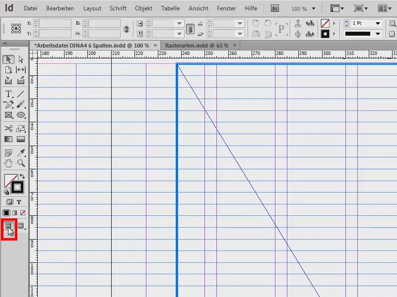
The last of the bunch that I would like to introduce to you: the grid columns, which I will show you in more detail in a separate document. The example is not really pretty, but it's also about something else: I want to make it clear to you again what types of grids we can work with.
On the left, for example, you can see the classic, single-column type area. We often find this in novels. There we also have very, very wide bars, the text should be about 50 to 70 characters in a line.
On the right-hand side, we have a classic type area with two grids. The text starts at the top left, goes down, jumps over to the next field, up and goes down again.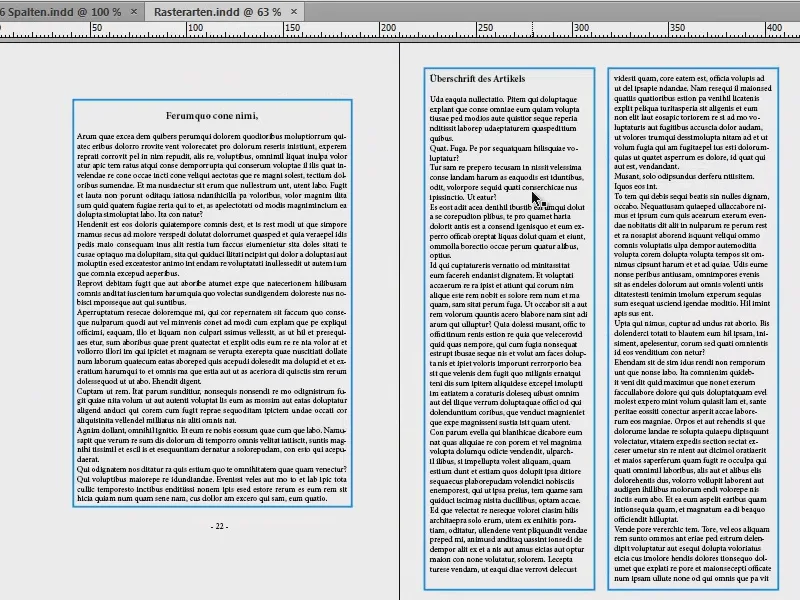
On the next page: On the left, I have brought you a three-column type area. The difference to the previous one is that we have a so-called margin column here. You may have heard of this before: this is the column that can be found on the outside of the book. It provides the opportunity for additional information. You often find this in specialist books. On the right, the text takes up both columns (1). As you can see, you don't have to stick to the grid columns, you can also break through and skip to the next limit. So the music plays on the right, while on the left in the margin column you have the option of placing images, tables, fact boxes or additional notes, references, summaries, whatever.
In the example image on the right, we have a six-column grid. Here, too, we have recognized the same thing as on the left: The text always breaks through the column dimension once and takes up two of these grid columns (2). This is very practical if you want to use just one column, for example if you want to place images or be more flexible with the design. There is also an exception to this rule, which I have placed at the bottom right (3): You don't always have to stick to this grid when placing images. It is also very much the trend to drag images beyond the grid columns and then position them as a kind of bleed (3). It's a total trend, looks really good and definitely makes a layout more dynamic, exciting and interesting.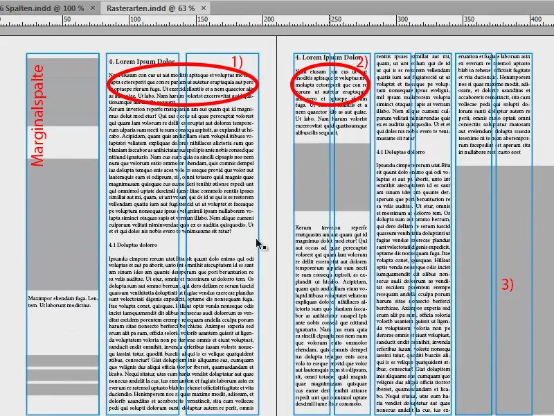
Tip: Delimit columns with lines
I'll Blender out the grid, I've put it on a second layer.
You may be familiar with this from daily newspapers, where there is a chronic lack of space and the columns are kept to a minimum. And if this is also the case for you, then you can use a little trick:
You take the line tool (1), draw a line (2), use a soft gray (3) and 0.5 pt line width so that it doesn't stand out quite so much. This will give you boundary lines (4) between the columns that suggest to the reader: "Careful, new column, new words, the text on the right doesn't necessarily have anything to do with the text on the left, so it's better to read from top to bottom." This prevents the reader from simply slipping down the column.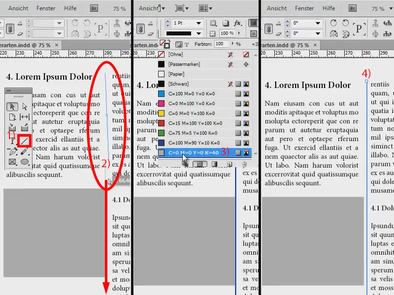
Exception: illustrated book
Another special feature of grids: There is one exception where the rule of the grid is overridden. If you are working with an illustrated book, you must never crop images simply because they do not fit into this grid. The photographer won't be very happy when he realizes that you have simply destroyed his great harmony, his composition, which he has painstakingly created, with a cut. So please do not crop any images in an illustrated book due to the various photo formats (1: inserted without cropping; 2: inserted with cropping, the image is "subjected" to the layout).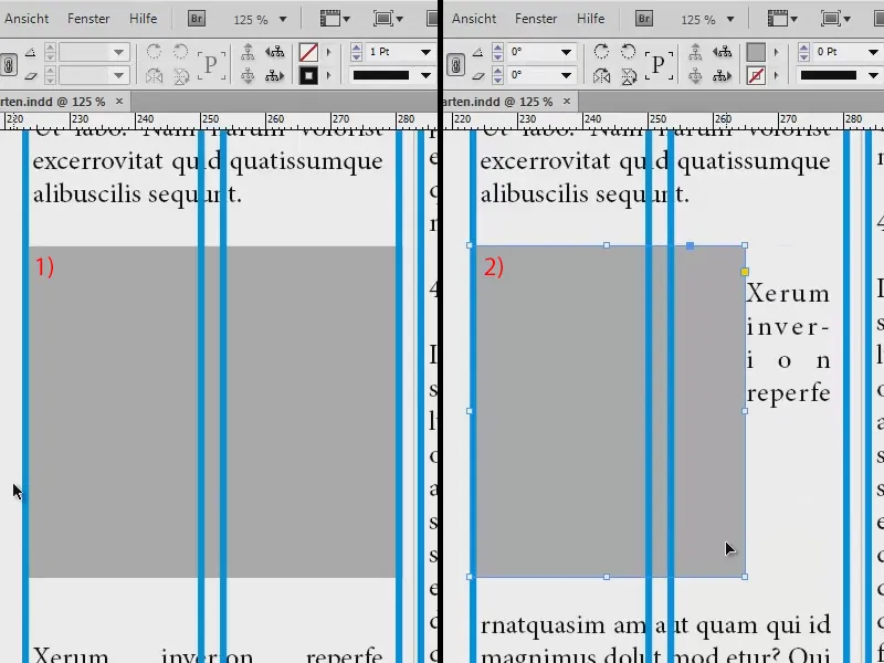
New document: Define dimensions
Now that we have covered the basics, let's move on to the question of which grid to use. To answer this, you first have to think about what you want to build in the first place. I have brought you my scribble for this: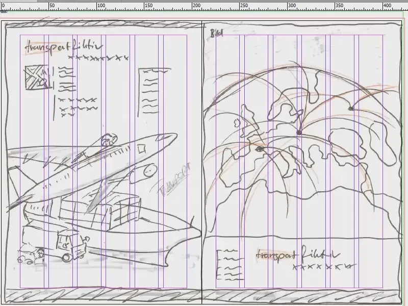
I drew the scribble on paper, my idea of what it should look like in the end. And you know: creativity begins in the mind and is then realized. Only after I had created the scribble did I realize that I wanted to use a six-column grid to have maximum flexibility within the document to place images and text so that everything is symmetrically aligned with the axes. This is what we will do in the next step.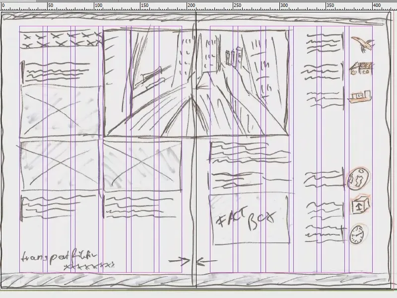
Create a new document: To do this, go to File>New>Document... Here I set the target medium to print, one page is okay for now, ticking double page is important, A4 format, portrait format. For the columns , however, I enter that I want six columns, and I decide on a column spacing of 5 mm. This will also be the same spacing that I will have between my rows of the baseline grid. But more on that later. So those are the settings for the new document - but now for the margins ...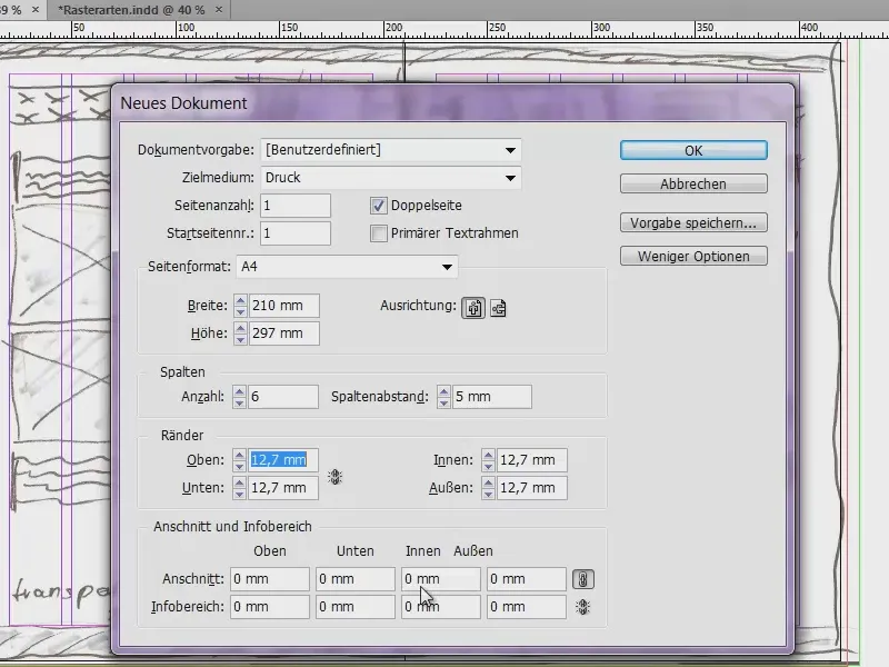
Actually, we have no idea what we should enter at the end. That's why it's important that we take the document apart a little bit, because we have to define the margins, those pink lines in the background, somehow.
I have provided a somewhat confusing, but nevertheless effective calculation for this. Calculate dimensions for InDesign:
- DIN A4 has a width of 210 mm. There must be 6 columns, each 5 mm apart. In addition, a margin and outer margin.
- Column width is defined as 25 mm: 6 columns x 25 mm = 150 mm.
- Plus 5 column spacings of 5 mm each: 5 x 5 mm = 25 mm.
- Addition: 150 mm + 25 mm = 175 mm.
- 210 mm (A4 width) - 175 mm (the sum of our calculations) = 35 mm. These can now be used for the bars.
- The collar bar is given 15 mm and the outer bar 20 mm.
Then the top and bottom are still missing. The small calculation also helps us here:
- DIN A4 has a height of 297 mm. The same division of 25 mm results in a height of 9 cells.
- 9 cells with a cell height of 25 mm each result in 225 mm.
- Plus 8 cell spacings of 5 mm each: 8 x 5 mm = 40 mm.
- Addition: 225 mm + 40 mm = 265 mm.
- 297 mm (A4 height) - 265 mm (the sum of our calculations) = 32 mm. We can now use this for the bars.
- The head bar is 15 mm and the foot bar 17 mm.
That looked a bit tricky, but it's really worth it: do it once for a six-column grid, maybe do it for a five-column grid, save the whole thing at the end, and you'll have created a good basic framework to react flexibly to your requirements.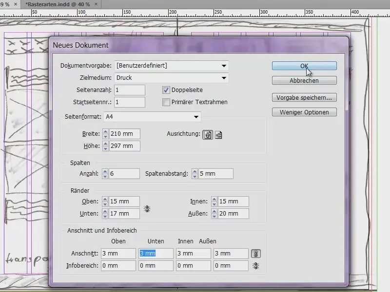
The margins are defined, now we add a bleed of 3 mm (see image on previous page), because we want to print the whole thing at the end. Confirm with OK - and we have a new document.
At the top we have our bleed of 3 mm (red line at the edge of the document), this is the border of our page, i.e. the DIN A4 format (black outer edge). Here we have our top edge, which we have defined, the header (pink line in the red framed area).
But what has happened here? It doesn't fit at all: the first blue line of the basic line grid is at the top and is in the wrong place. We correct this via Edit>Preferences>Grid...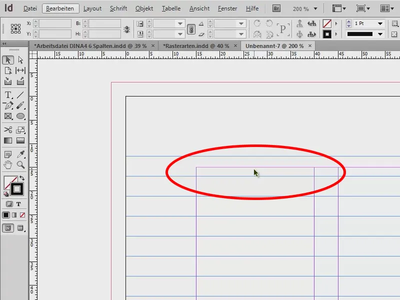
The beginning is at 12.7 mm. But we want to use the 15 mm, so we change this (1). We also change the division to every 5 mm. When I press Tab , this is converted to Pt, i.e. 14.173 Pt (2). If I confirm this, it looks good (3).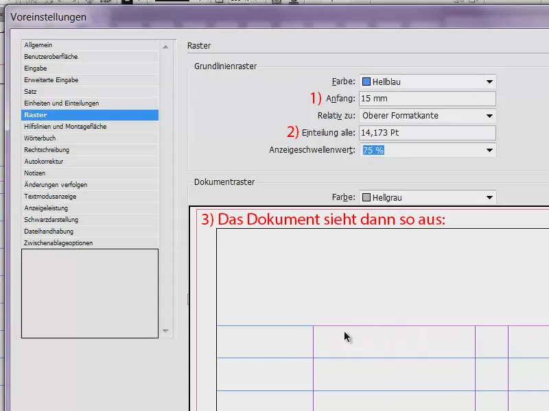
On the sample page (1), I create the guide lines. We need them for the horizontal division, because so far we only have the six grid columns.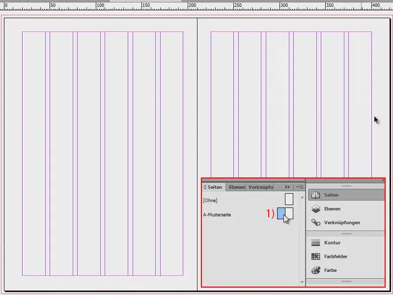
To do this, I go to Layout>Create Guides... Here I enter the nine guides that we want. I press Tab and we now have 5 mm column spacing. This fills the whole document.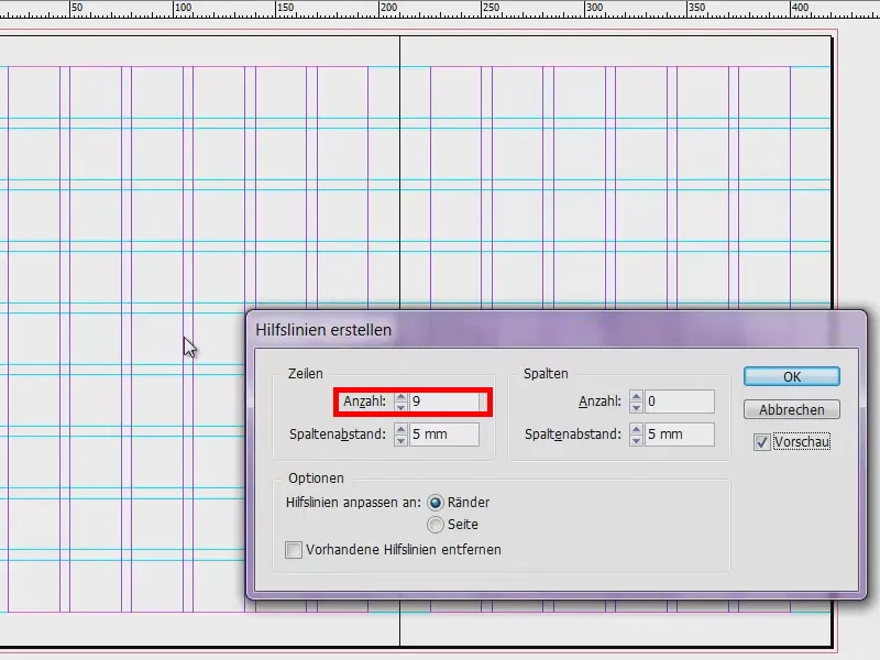
If you have forgotten the vertical columns when creating the document, you can also do that here. I could go to 6, then it would also add them. But I have them, so I go back to 0 and confirm this.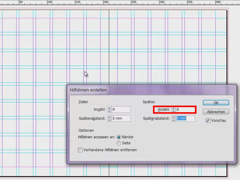
My template is now complete. I save it once so that we have the whole thing saved and can access it again. File>Save as..., as an InDesign CS6 template.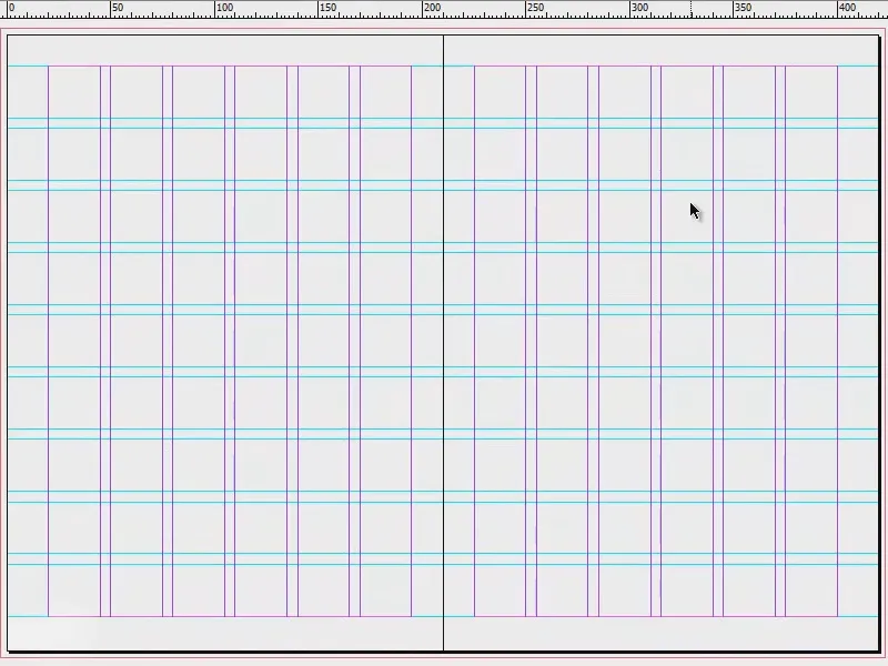
Fill the layout with content (front page)
Now we can start filling the document. To do this, we create new pages.
To do this, proceed as shown in the picture: click on 1), click on 2) and click twice on 3). As we have created the guides on the master page (4), we will also see them on every other page of our document and do not have to create them again.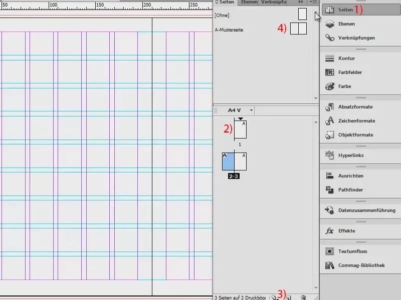
A little tip: Go to View and check whether the Align to guides and Smart guides options are activated under Grid and Guides. This gives us the advantage that elements that are placed automatically dock magnetically to these guides when we move close to them.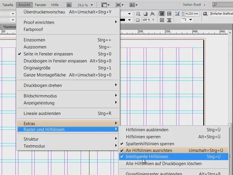
I'm going to press Ctrl + D, which is for placing images. I'm going to take this great eye-catching image up here.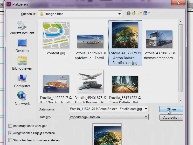
I'll drag that up to the waistband. At the bottom, I'll make the field a little bigger (red arrow in the picture). If you do this, you'll notice how the edge of the field jumps to the guide lines, which is super practical.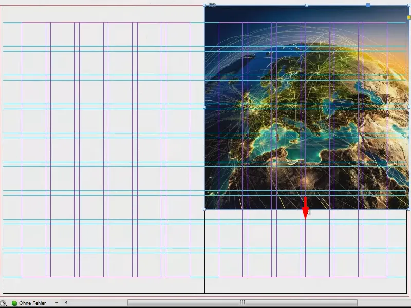
Now right-click on the image and go to Customize>Fill frame proportionally.
We have also included the bleed at the top and right. That's okay.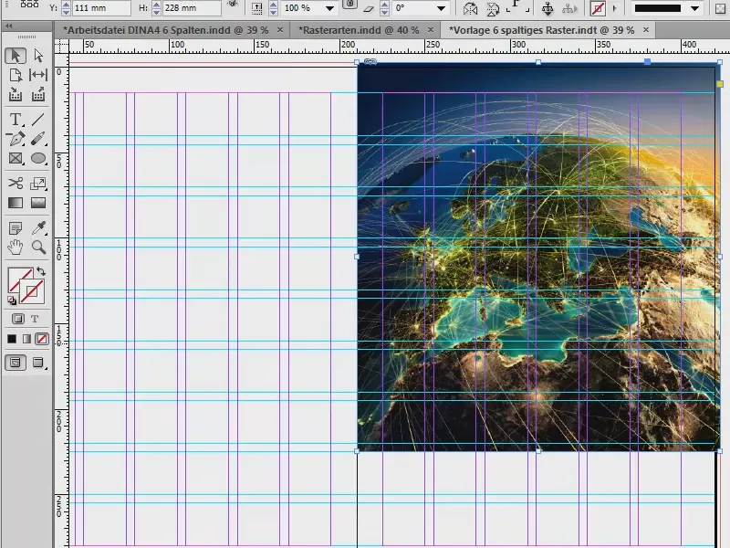
Then I would like to have a kind of base at the bottom. To do this, I take my tool (1) and drag it to (2). I'll fill it with a color that is not currently stored in our system. I therefore create a new color field (3, 4, 5) with a 70 percent black (6). Confirm (7).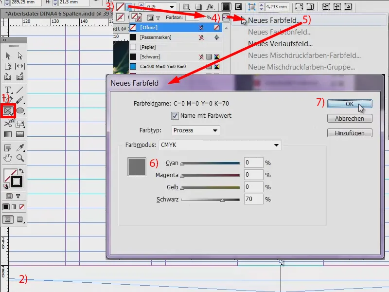
This gives me the bar on the bottom edge (1). And for the front, I definitely thought that the name had to go in there. I have stored this in my library (2). I simply pull it out (3 to 4).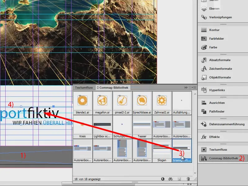
Filling the layout with content (back)
Left-hand side: We want to have a great, large image here too. Ctrl + D ... I start at the bottom, take the bleed with me ... Okay, it's placed.
The great thing about this image is the gradient. We have soft shades of gray and then it goes into white. This means we don't have any hard edges above the image.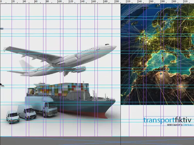
And again, I'll add the company name at the top left.
I also want to add the address on the left and a small note on the right: "Your benefits at a glance", so that you naturally also have a call to action.
So I pull up a text field (1), take two fields with (2) ...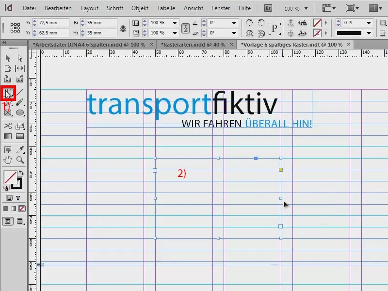
... and insert the text. What I want to show you here is that the text rests on the base lines - like books on a bookshelf, so to speak (1). The line spacing basically has no direct effect here, because each line lies individually on the base line, and these have a spacing of 5 mm.
How can you do this? Via Font>Paragraph and click on this symbol (1). If, on the other hand, I want the text not to lie on the baselines, then I simply click here (2). Then the usual spacing applies, in our example of 12 pt. I set this back again (1) and close the paragraph window.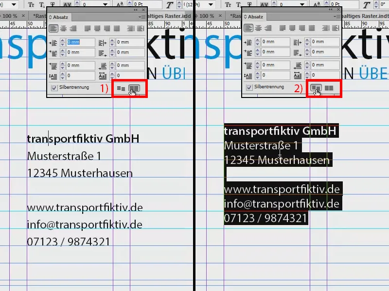
Below this, I now place a slogan that I have already prepared in the library.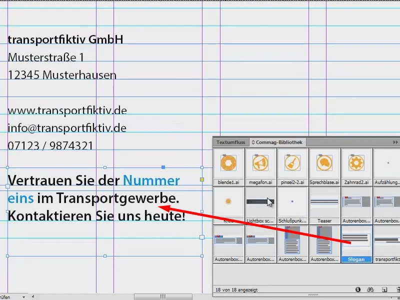
Next to it on the left is another card. It starts at the bottom of the closing line with the telephone number.
In this case, I'm not sticking to the grid, because it's also a bit about the look: since the first line with "transportfiktiv GmbH" doesn't end at the top of the baseline, but a little lower, I'll also align the frame for the card roughly there.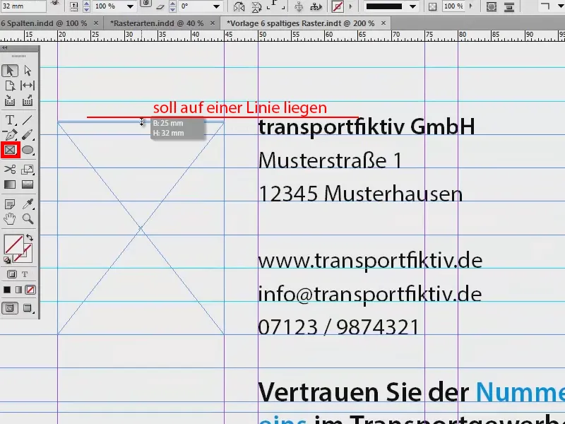
Ctrl + D again , that's where this map will go.
Why can't we see anything of the picture now? The frame is like a picture frame that is much too small for the picture that has been placed in it.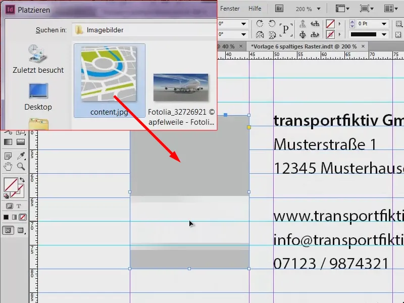
When you take your hand, the actual picture opens and you can already see that the picture is much too big (1, brown frame). We can easily fix this by right-clicking again and then clicking on Customize>Fill frame proportionally.
Now there's just a bit of cropping on the left and right (2), but that's absolutely acceptable to me. And the top edge of the image also fits the text well (3).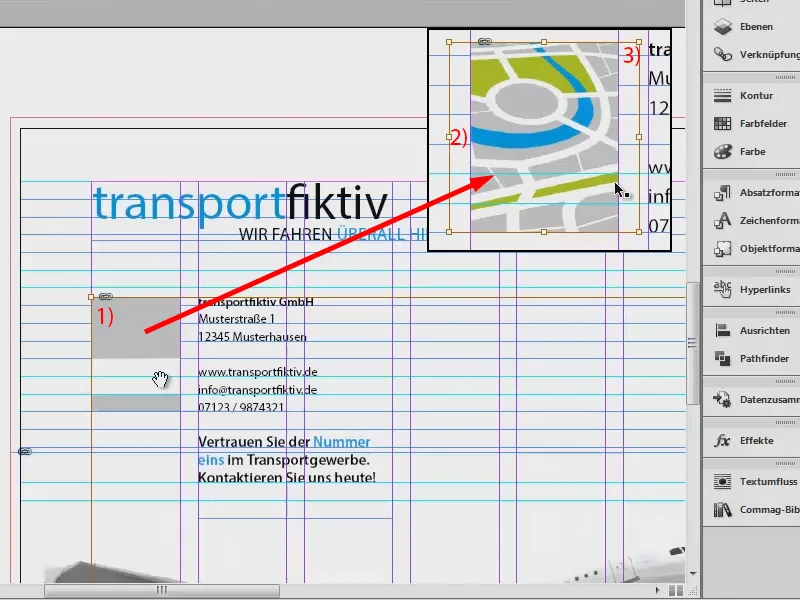
Now another text field next to the address. I copy the heading "transportfiktiv GmbH", put it in there, then change the text: "Your advantages at a glance". And then: "Advantage 1" to "Advantage 6" (1).
And I don't want that in semibold now. It's perfectly fine for the headline, but I want the individual listings in regular. So I select that and set it to Regular (2). Incidentally, this is Myriad Pro, which is a very well developed font with lots of weights, and that's why I like it, because you can work really flexibly with it. Mark the whole thing once again and then align via Object>Paragraph (3).
Of course, you could also do all this using paragraph styles, but that's not the point of this tutorial, so I'll just leave that out and do it manually.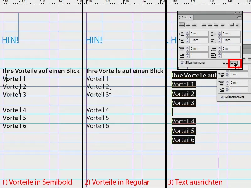
The overview now looks like this. I notice that: The second text field is perhaps a little too close, so I'll move it to the right. And in the list of benefits, I can add these bullet points.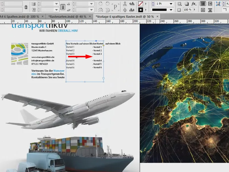
With that, we've actually designed our front and back. By the way - in case you're wondering why I made this a double page spread: You're right, of course. Normally, the front page should be on the first (1), but I've done it this way for visualization purposes so that I can show you better what I'm getting at.
Let's go to the inside pages. To do this, create two new pages (2) and then press W again.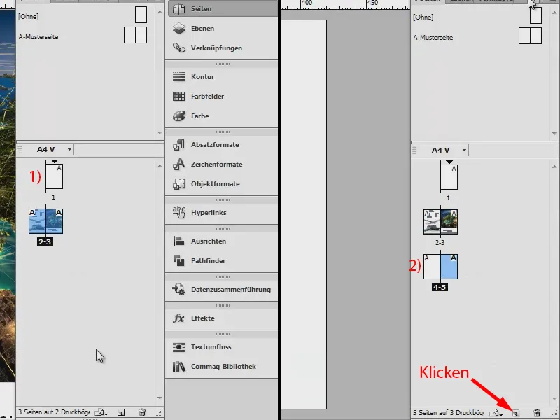
Fill the layout with content (inner page on the left)
I already have my specific idea here, so let's take a quick look at my scribble: we have images, text, a small list with pictograms and our logo at the bottom. This is what it should look like.
Ctrl + D again and this image. I place it here at the edge of my top column (1). I crop the whole thing a little (see arrow in the image), up to that point, so that the distance is maintained, also to other elements (2).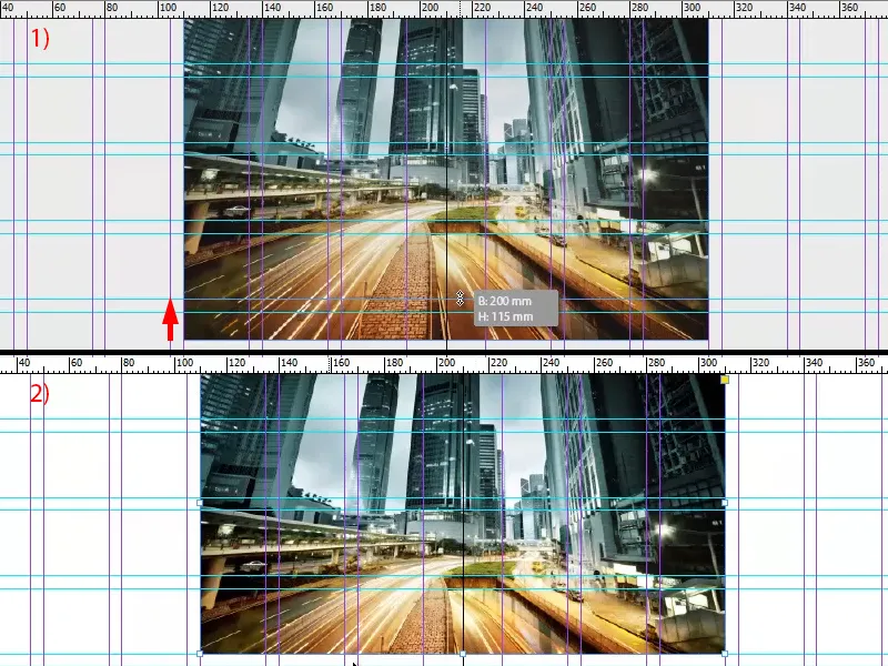
At the top left, we add a teaser, which is also in the library.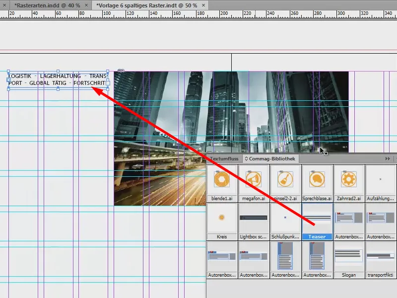
Then images are placed. This time I use the rectangle tool (1) and draw three images. The green guides already tell me: "Aha, you want to draw something that is the same size as the others, don't you?" So I create the three pictures (3, 4, 5).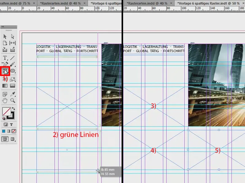
I want to have the same base at the bottom as at the top. So I copy the one from the first page with Ctrl + C (1) and paste it by right-clicking: Edit>Paste to original position (2). Then it fits like a glove down there (3).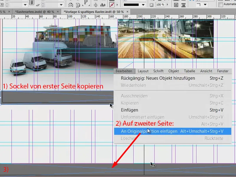
I would like to have something similar on the top edge of the second page, but not quite as thick. I'll also include the bleed again. And here the corporate color is once again placed in the foreground to create a bit of contrast and also to do justice to the corporate design claim.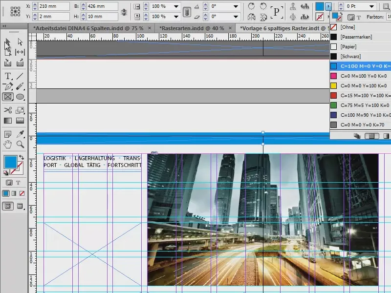
Now back to the frames I just created: Ctrl + D. I take the jet, the truck and the ship and click on Open (1).
Now I have all three images in one loaded mouse pointer (2). The small number also tells me that there are three images in the loaded mouse pointer. If the image I want to use is not in the first position, I can switch using the arrow keys.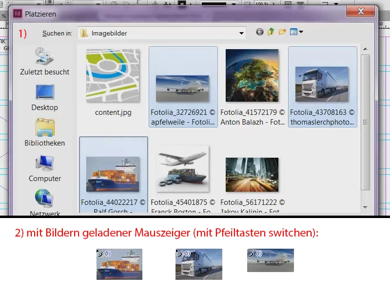
I want the jet here, the truck here and the ship there. Again, the problem is that the images are too large (1). So: Select all, Adjust>Fill frame proportionally (2).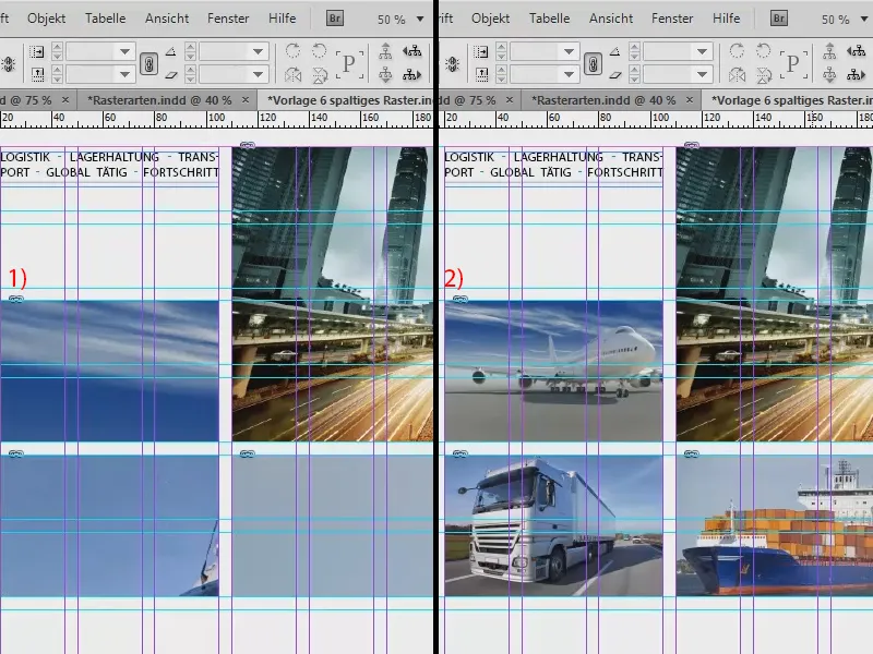
And I'm going to flip the truck horizontally again (Object>Transform>Flip Horizontal), because I don't like it when elements move out of the layout - there's nothing interesting there and we also want to direct the reader's gaze. That's why we make sure that everything looks nicely into the design. The ship is also mirrored horizontally.
At the bottom left, we add the logo from the library (not shown in the image).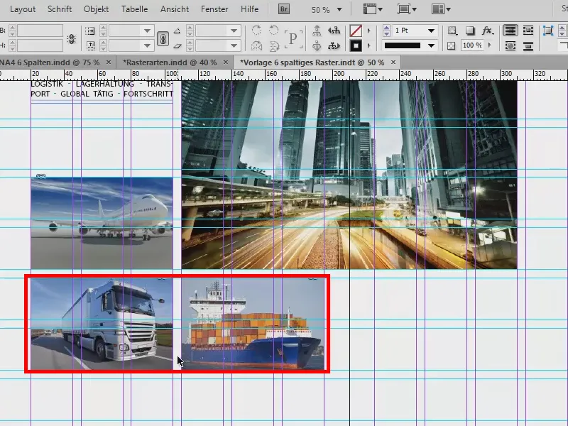
Now I set texts (1). So I draw a text field at this point below the teaser, take the Myriad Pro again and write: "All logistics services from a single source".
We can see that the line is not on the baseline grid (2). So I select the whole thing and align it again via Font>Paragraph by clicking on this symbol (3).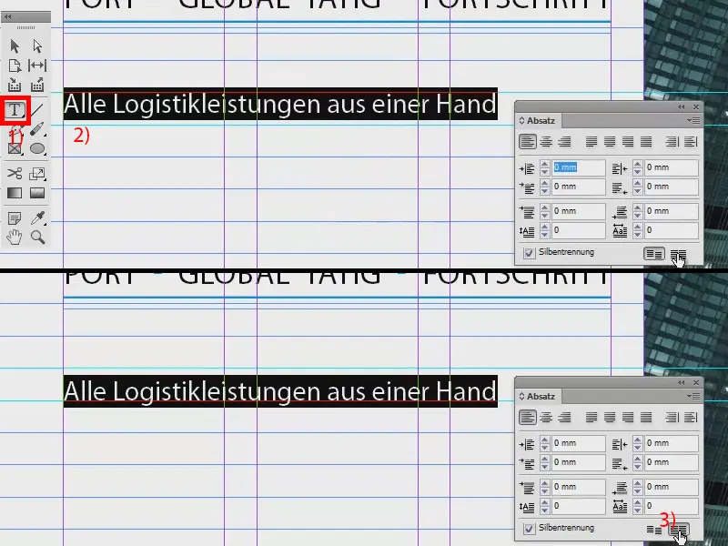
Now I press Enter once in the text field. It leaves out one line (1). This is because we have 14.4 pt line spacing at the top here (2) and the lines are 5 mm apart. This means that the line spacing is too large. I'll show the hidden characters (Font>Show hidden characters) . I now press Enter again and it skips a line (1).
To get around this, I simply reduce the line spacing to 12 pt (3).
Font>Fill with placeholder text (4). And I set the heading to Semibold (5). The whole thing looks good, this is supposed to be the description of the air freight.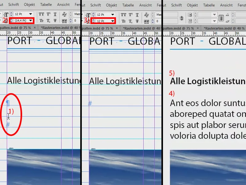
I copy the text field (Ctrl + C) and paste it again under the truck. With Alt and the Shift keypressed, I create a duplicate and move it to the right under the ship. As I keep Shift pressed, the text field cannot slip.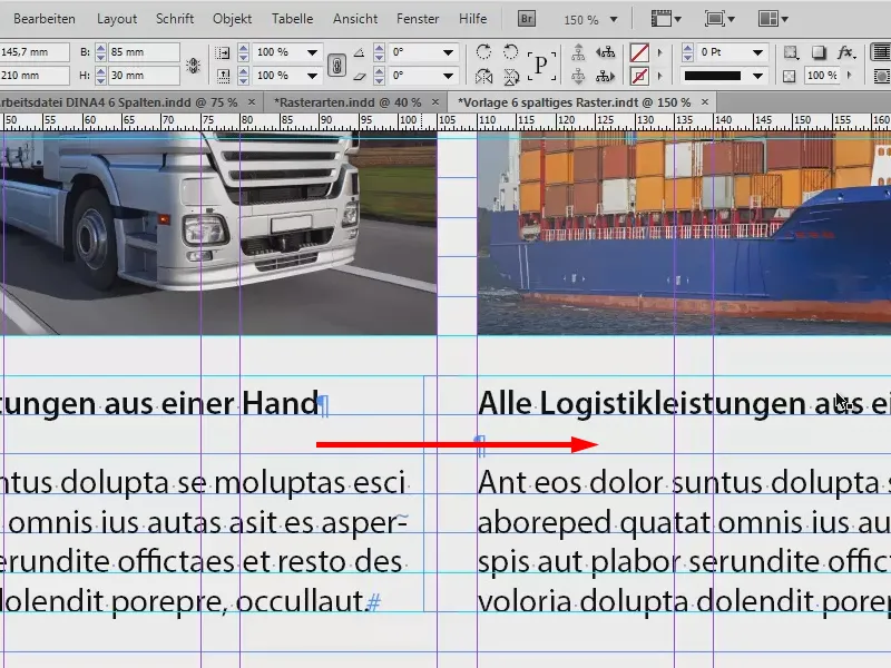
The left-hand side is now finished.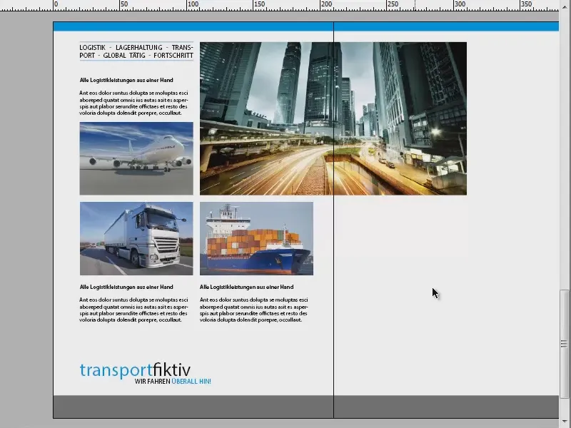
Filling the layout with content (inside right)
I continue on the right-hand side. It actually looks similar there: Holding down the Alt key, I create a duplicate of the text again, move it to this position (1), not to the margin, but there (2), and drag the field a little larger (3).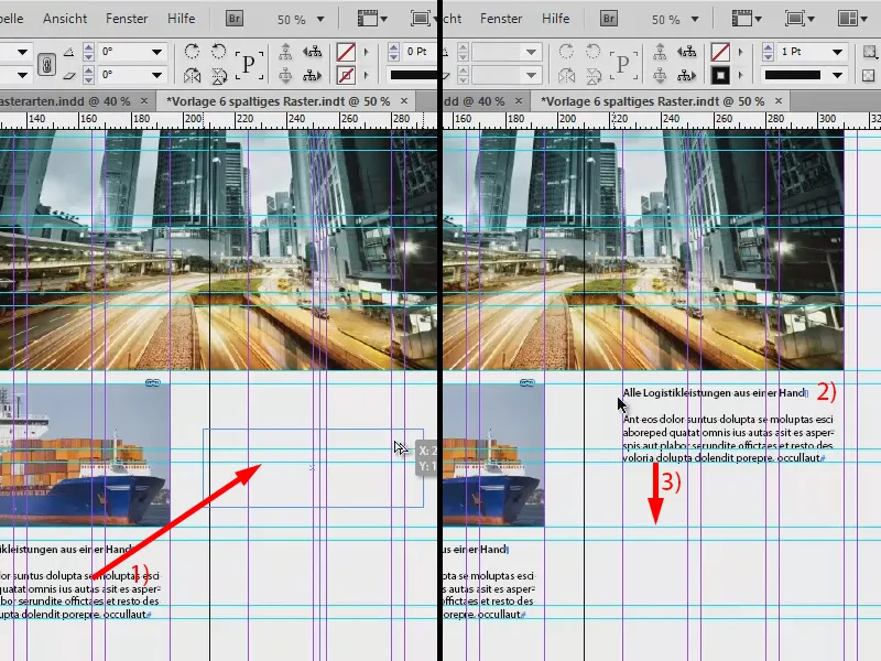
Fact boxes should go at the bottom here. I draw one (1) and fill it with a color (2). Then I make two copies of it again (3).
You can use these boxes to describe growth, for example, by entering annual figures or turnover figures or how many ships were sunk by this shipping company last year ... I add a little more text to the text field (4).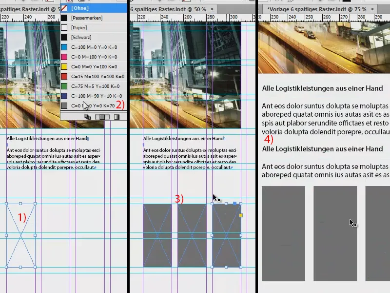
I'm going to add pictograms on the right, so the first thing I do is draw three frames (1). I select them and move the duplicates downwards by holding down the Alt and Shift keys(2). I leave two fields free in between (3).
I use Ctrl + D to get the AI files (4). These are vector-based pictograms.
The difference to pixel graphics is that vector graphics are based on mathematical formulas and can therefore be scaled to any size, which is not possible with pixel graphics. I then use the arrow keys to select the correct image again and place it in the prepared frame (5).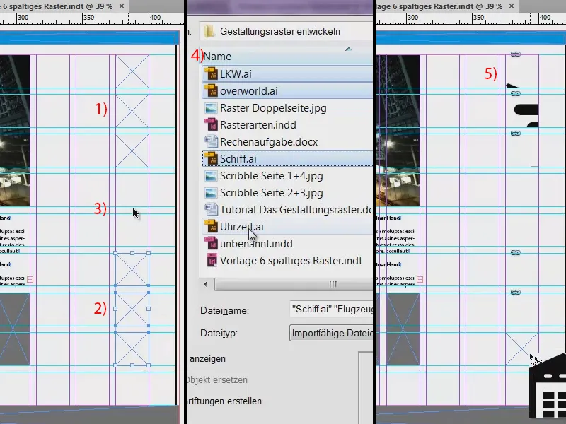
The pictograms are again much too large for the frames, so I select all of them and choose Adjust and this time Adjust content proportionally. Looks great.
These three look out of the layout (1), so they are mirrored horizontally so that they look into the layout (2). Always pay attention to this, you just have to be careful if there is text on the images - it will become illegible when mirrored and your mirroring will stand out.
Then we add small descriptive texts (3), always taking two cells of the design grid with us.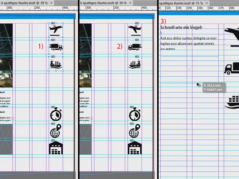
Now I have changed the alignment of the text to right-aligned to emphasize that it belongs to the pictograms.
The final result looks like this. We have the color again at the top, the images are all placed, texts too, and the base appears again at the bottom, and there are also fact boxes ...
And you can see that: This is the ease of a design grid. It all went really quickly because we simply did the work of designing such a design grid in advance.
It even makes "transportfiktiv" look good, no matter how many containers they lost on the crossing from New Zealand to America. It doesn't matter. As you can see, design grids are definitely worthwhile. I would really like to recommend them to you.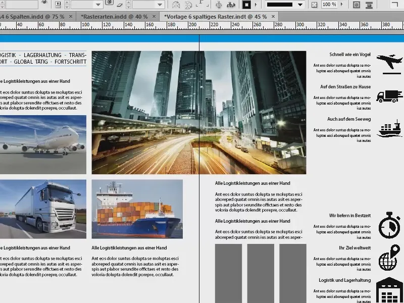
And if we now place our scribble on a new layer and reduce the opacity at the end, you can see that we were very close to the finished design when we were brainstorming and that the design grid helped us with this.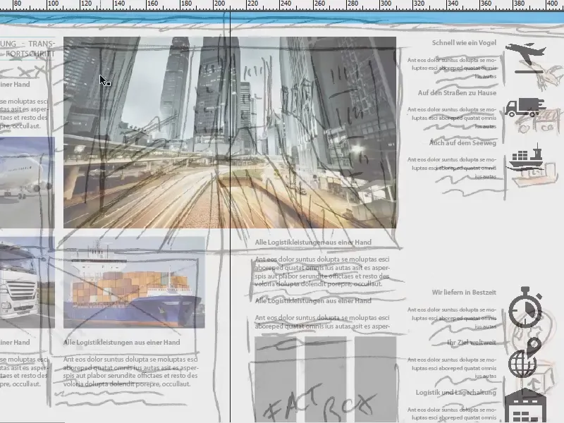
With this in mind: I look forward to your comments, write something in if you like something, if you don't like something, praise or criticism - I'm looking forward to your feedback and hope you were able to take something away with you. Just try it out for yourself.
Your Stefan
