A few glimpses of the flyer
Hello and welcome, my name is Stefan and today I would like to take you on a journey in this video training. We want to design this 2-break flyer in the form of a spiral fold together in InDesign.
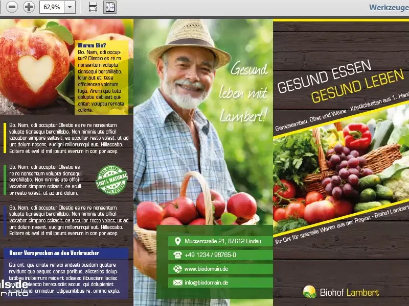
We also see various elements here, very static elements, lots of rectangles, which give the whole thing a very tidy character.
But there's also a bit of dynamism, because I've slanted the text on page one, which we can see here on the right.
Our journey will take us to the Lambert organic farm. So a very interesting topic, healthy food, healthy living. Incidentally, our fictitious and fictitious organic farm is located in Lindau with a zip code that I hope is not correct so that we don't get into trouble.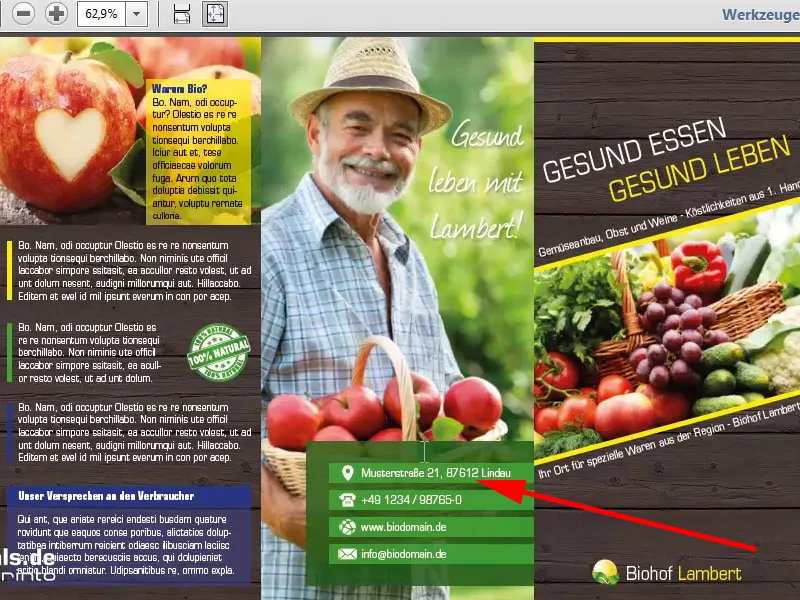
If I go down to page two, we can also clearly see our folded edge here, which is where the photo is cut off, the inside pages and the charming, smiling gentleman who is grinning at us with such humor and joy.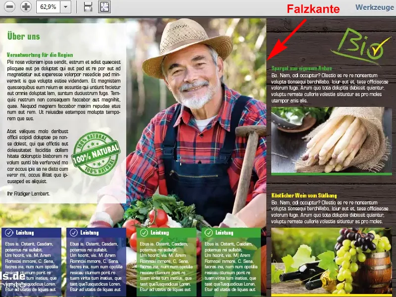
Select a template
That is also the aim of this flyer. It should motivate, it should create trust, it should appear serious, but also light and not so heavy. That's why I completely avoided shadows, hard contours and strong contrasts. I wanted to have a harmonious overall concept and in this video training we will answer the key questions together until we have finally designed exactly this flyer ourselves, so that we can then export it together from InDesign with the specifications of the print shop you trust. In my example, viaprinto and I hope you're ready for a little excursion into the world of design with InDesign.
First of all, I open the viaprinto website so that we can get an idea of the templates we need. I enter www.viaprinto.de in the command line and this takes us to the start page.
Here we find the product we are looking for, namely the Flyer 2-Bruch, in a very tidy and clearly arranged way.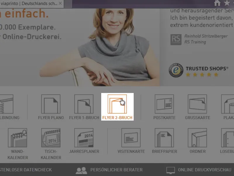
This is what it looks like, but now it's a zigzag fold.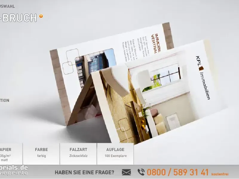
We opt for the spiral fold, which is why you can select the format that applies to us in this case. DIN long high.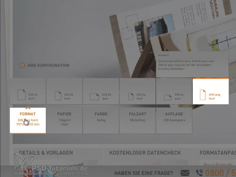
The grammage of 135g/m2 is very important, because it's also about the feel to a certain extent. None of us want to hold a piece of paper in our hands that almost slides off our fingers, which is why viaprinto made the perfect choice for our flyer at this point.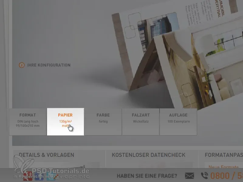
And of course the fold type, a spiral fold.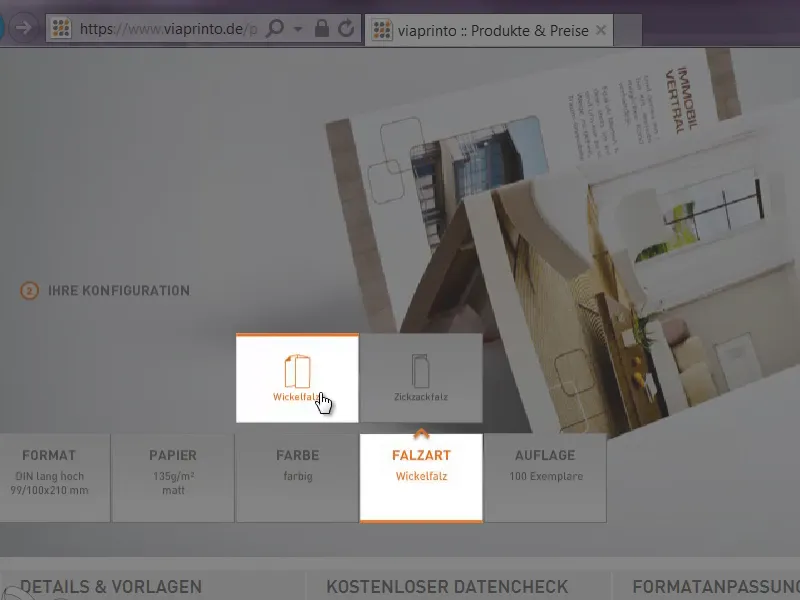
100 copies, that's a moot point at this point, because what we need, if we scroll down, is a link to the details and templates.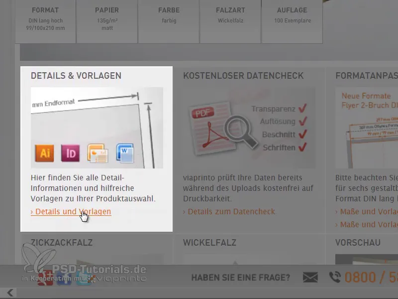
By clicking on it, we can get an overview of what the core facts of our product will be, what the format must be, two-sided four-color printing and the type of fold.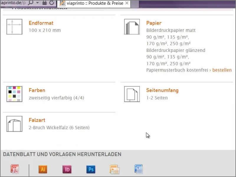
What's really handy is that we can download our template for the program we want to work with directly below, which in my case is InDesign. This also works for Photoshop and Illustrator, as we can see.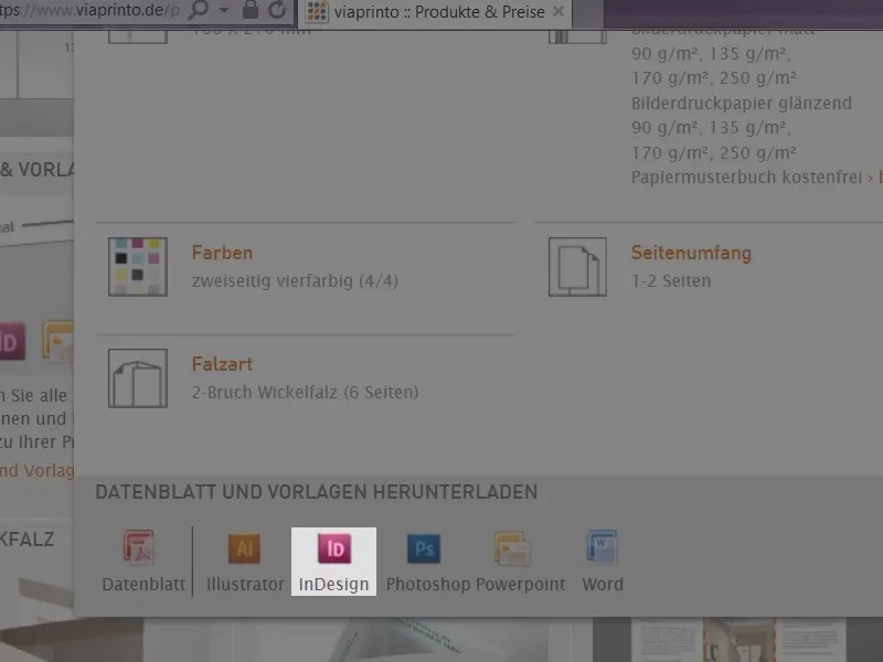
Save once under Downloads and that's it.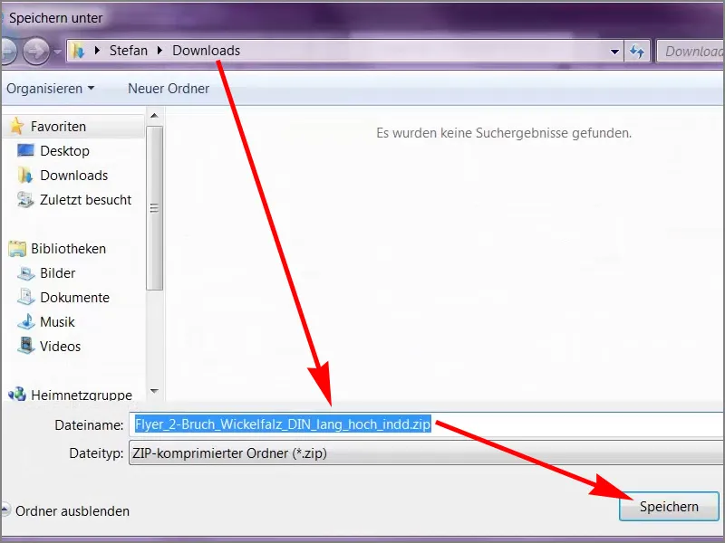
Get an overview of the template
When I open this, we have two files and with a double click...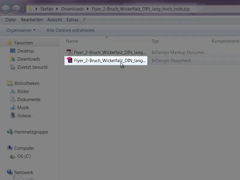
... we already have our template.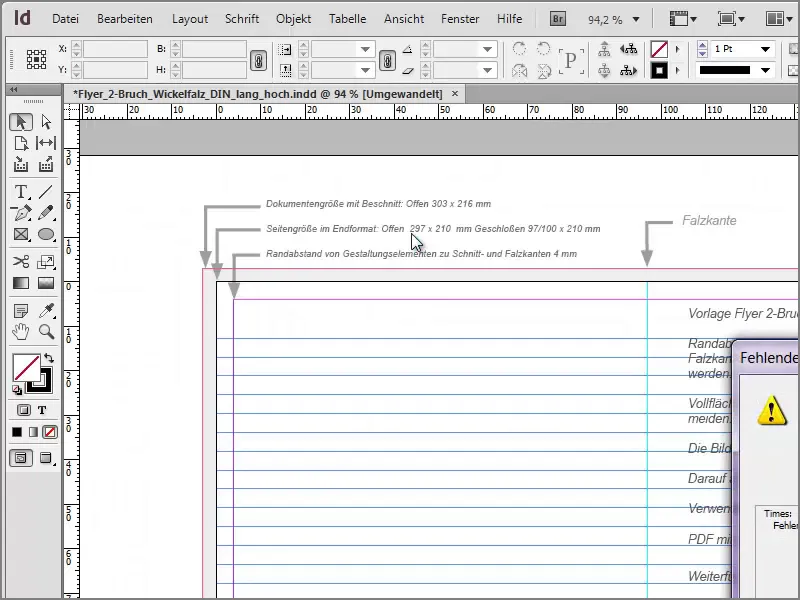
InDesign now tells me that the font is missing, ....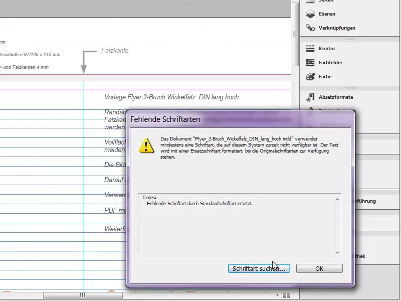
... that's not too bad, because that's just the font that was used here as an aid by viaprinto, because you can clearly see that we have some visual support. The pages are clearly highlighted, as are our folded edges.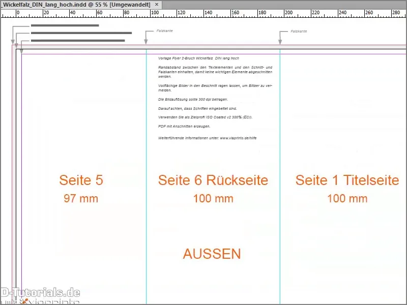
And if I zoom into the center, we are once again reminded of the points that we need to take into account.
We can see that the margins need to be maintained. We also need full-surface images that extend beyond the bleed, into the bleed so to speak, in order to avoid bleed. Incidentally, bleeds are white unprinted areas that then stand out unattractively. An image resolution of 300 dpi is recommended in any case so that the image can develop its full brilliance in the subsequent print. Then we have our target profile, ISO Coated v2 300% from the ECI, and a small note that we can find further information at www.viaprinto.de/hilfe.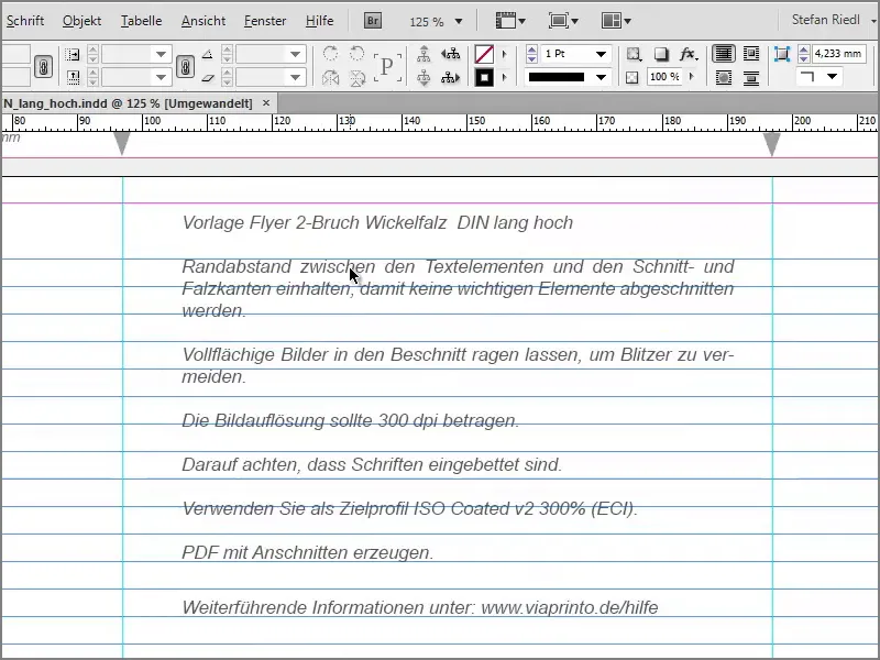
This template has already done a lot for us, because we have already created the format completely. That's a great thing, because it saves us a lot of work. If we look at the layers, we can see that the information we can read is on a separate layer (data creation information), and if I click on the eye, I can show and hide it. That's perfectly fine, because I don't want it to interfere with my design. That's why I'm going to work on "design layer 1" and only show this information layer when I really need it.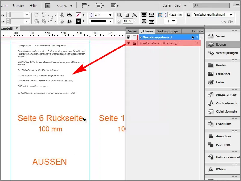
Let's get started with the editing
The very first thing I'm going to do when I hide it is to drag the guidelines into the document again. To do this, we can just click on the ruler, drag it out and I need the first fold at 97mm.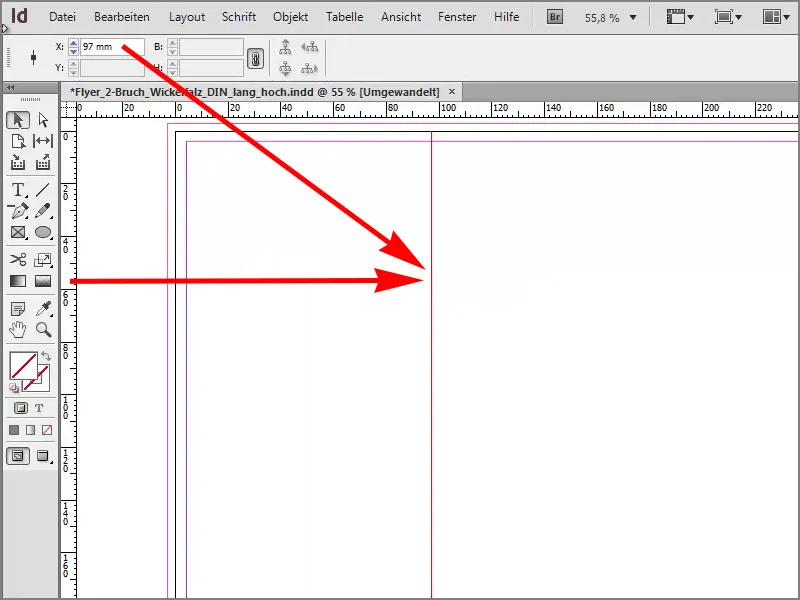
The second fold: I can also simply release the line in the middle of the document and enter 197mm manually.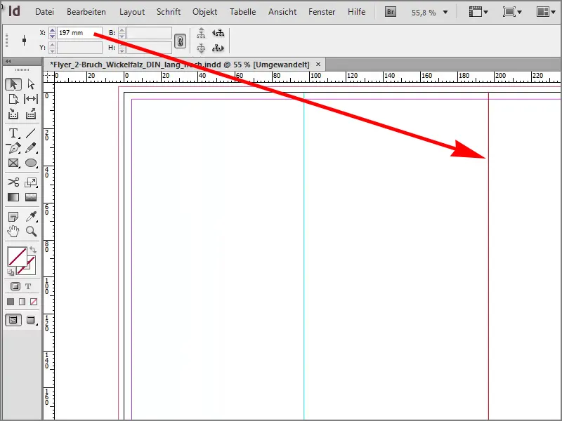
As a comparison, I'll show the layer below again and we'll see: We are exactly identical and that's a good thing.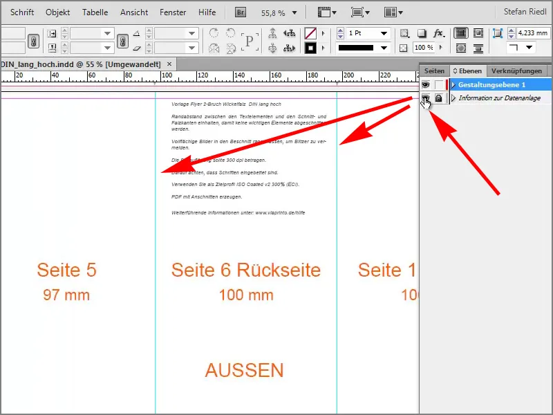
Next, however, I want to get a little distance from these folded edges. This means that we will draw additional guides around our guides, namely one at 8mm.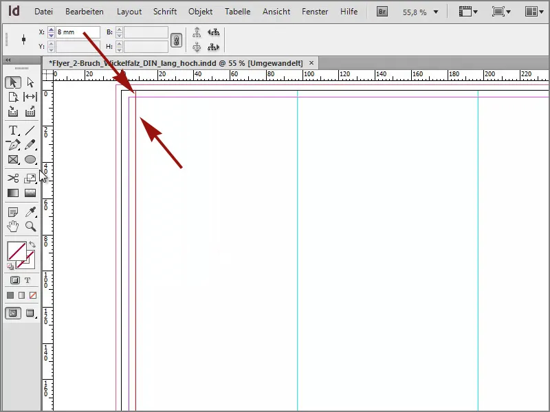
Another one should be 4mm to the left of the fold. We can now calculate 97-4 or we can let InDesign do the math, that works too. I simply type this in at the top ...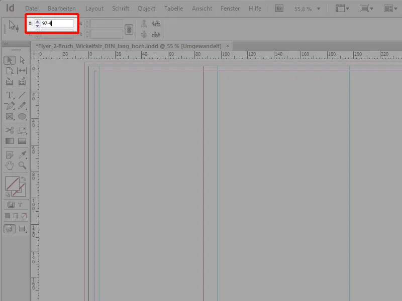
... and it defines it for me automatically.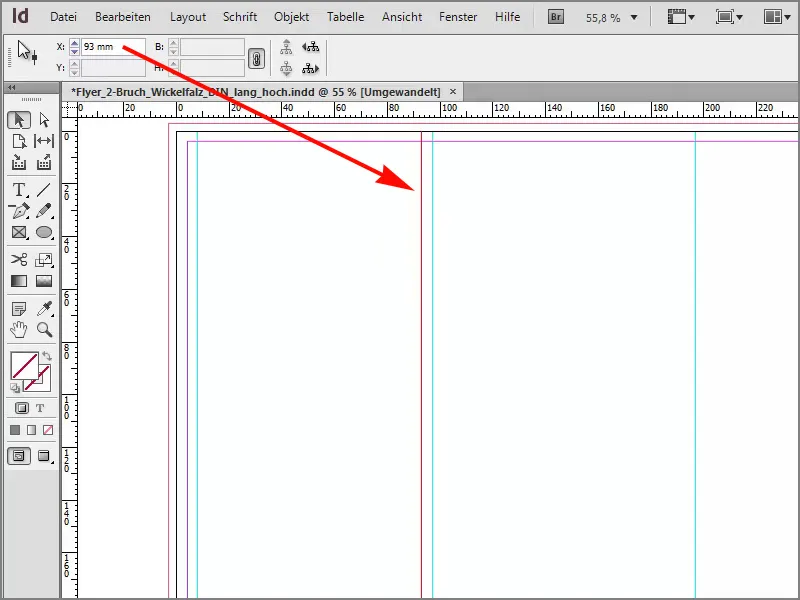
The next one to the right is 97+4, then we're at 101mm.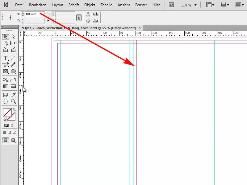
The same game over here, we have 197-4 = 193mm.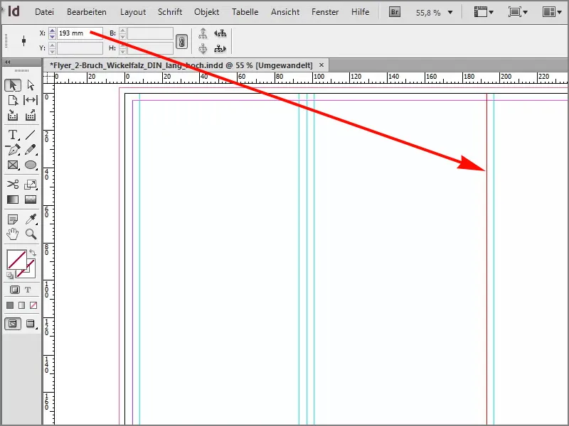
I pull out another one, 197+4 = 201mm.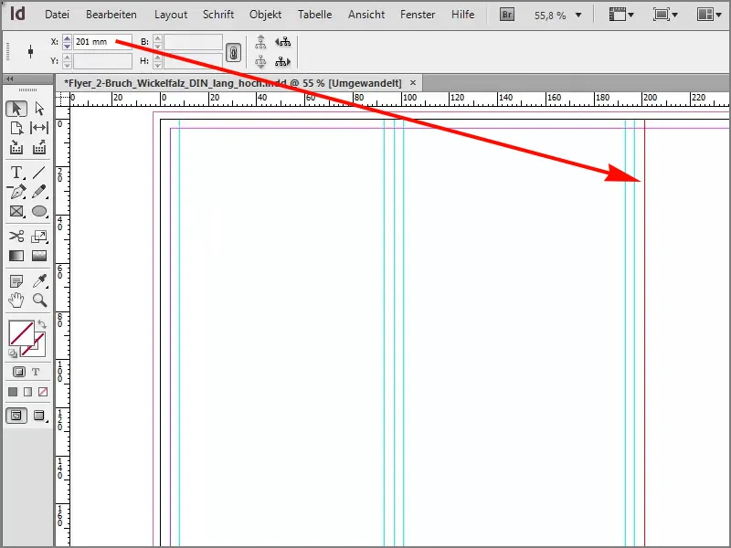
The last one I want to pull out is 4mm to the right of 293mm. That means 293-4mm = 289mm.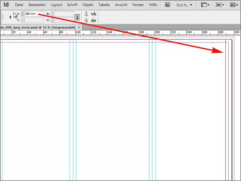
Let's get down to designing the flyer
Now I've already taken the first step for the future alignment and I'm going to do the whole thing horizontally, at 70mm.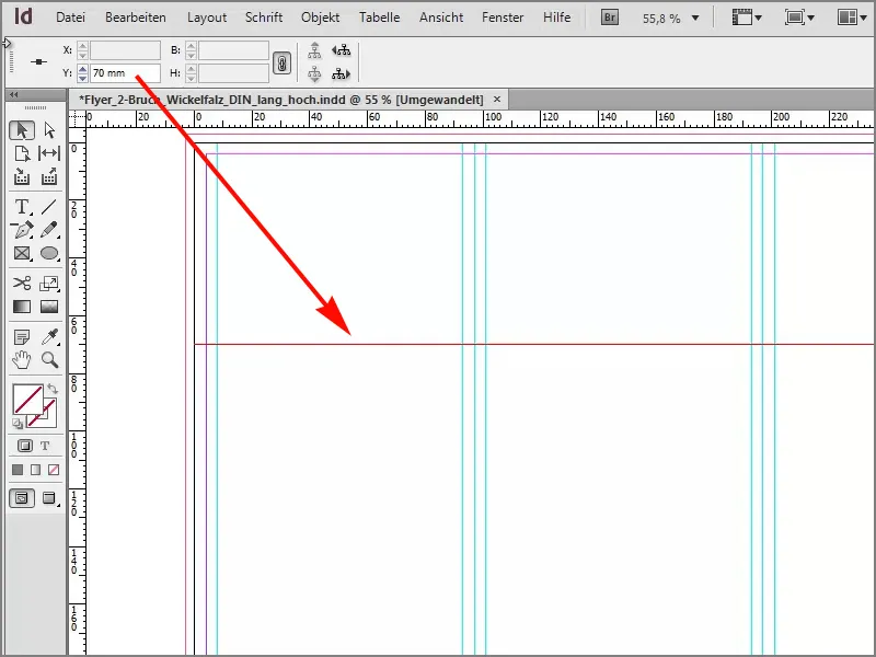
If we now turn to page one, which is this one on the right, ...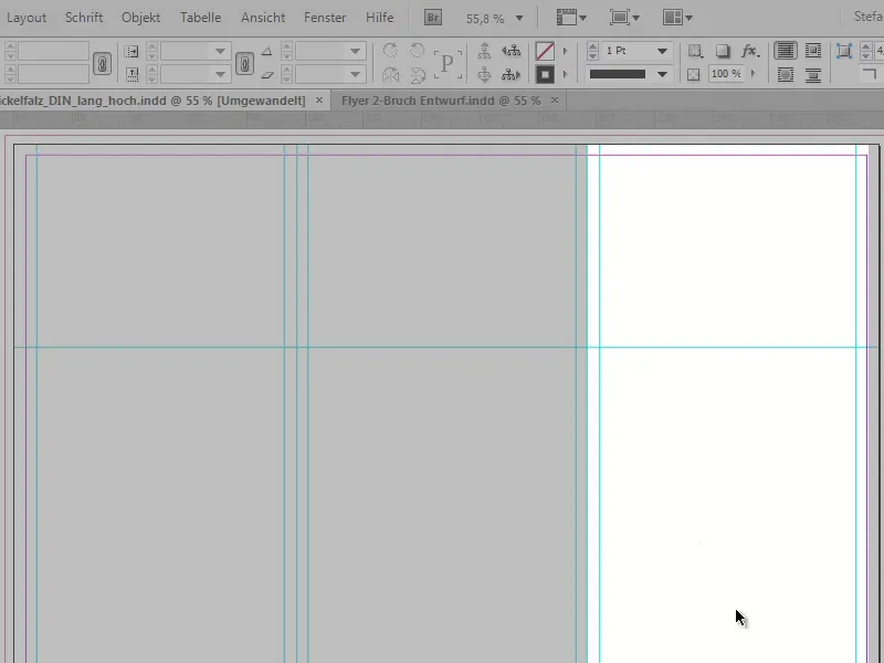
... let's take another look at our template, which I've opened, and we can see that we have a delicate wood texture in the background. In this beautiful dark brown, originally this texture was once black, but with Photoshop that's no longer a problem, so I simply recolored it a little, and that's exactly what we want on our page one.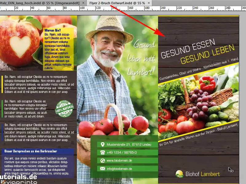
I draw a rectangle for this. Now you have to be careful, when you place something, you always have to include the bleed, which is the marked area between the black border, which actually indicates the limit of our printed document, and the red bleed. This means that this area will be cut by machine, and to avoid white bleed, we always pull a printed element out to the red border to avoid this.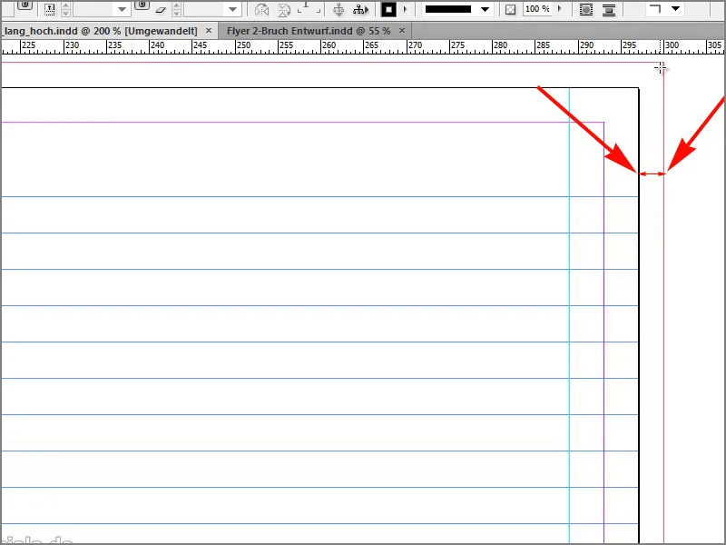
I start at the top and have now drawn a rectangle.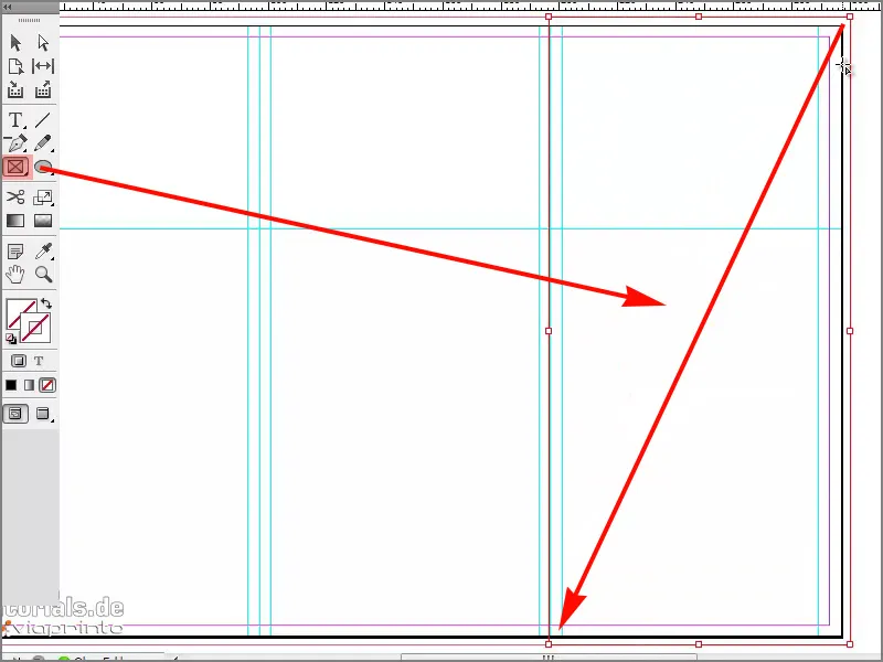
With Ctrl+D I open the Place dialogand here I already find our texture. I'll open it.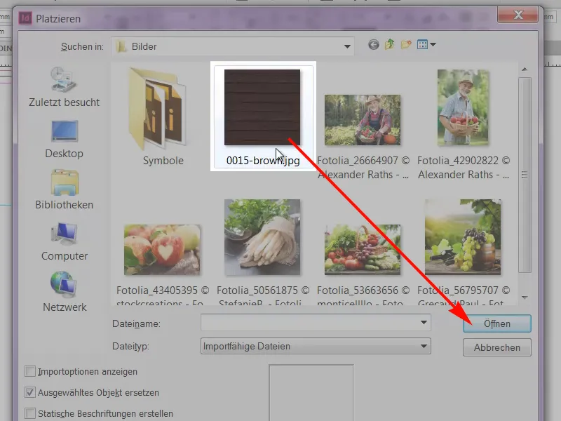
Next, we'll add an image to the center of this texture.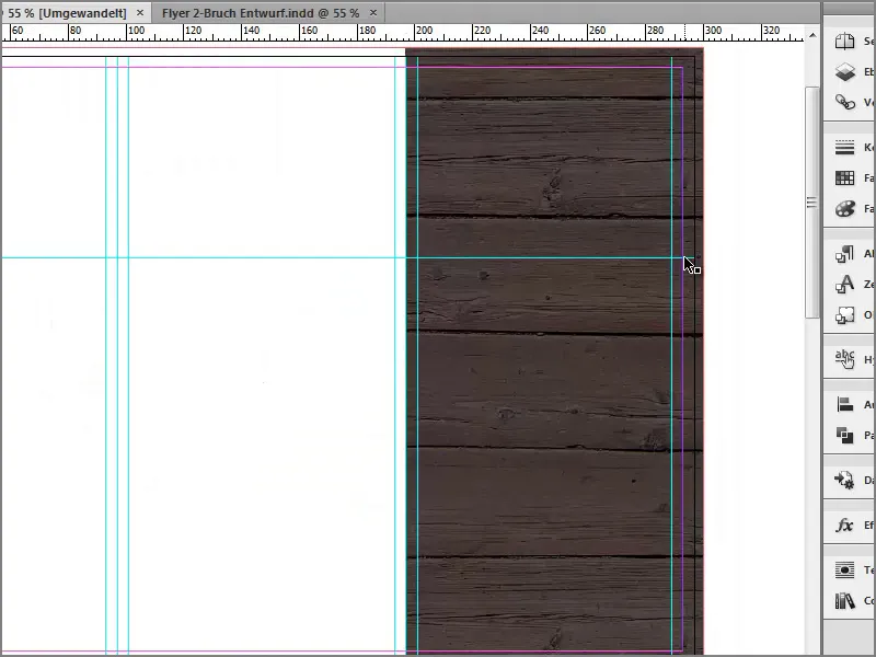
We had our slightly dynamically slanted image at the front, now I'm looking at it, do you see this?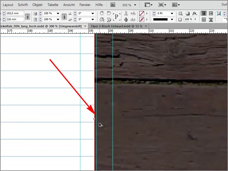
You have to watch out for something like this: The folded edge is where the blue line is.
The picture is a bit too big now, so I'll just move it back. This doesn't damage or affect anything, but it now fits like a glove.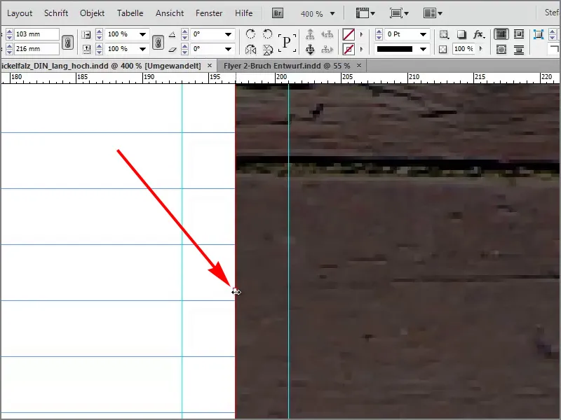
A new picture frame, also attach and pull up.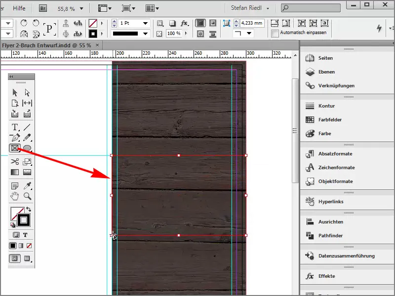
With Ctrl+D I will select an image picture, this beautiful colored fruit basket, and click on Open.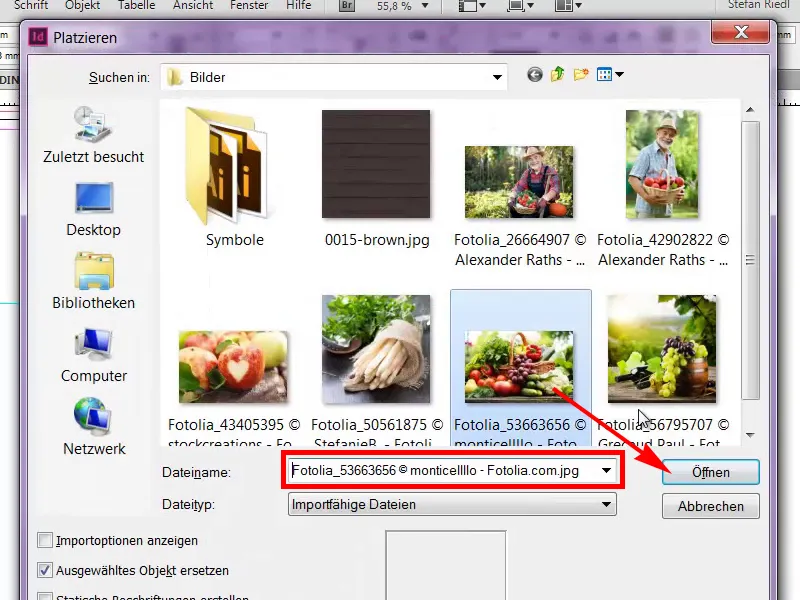
It is now much too big.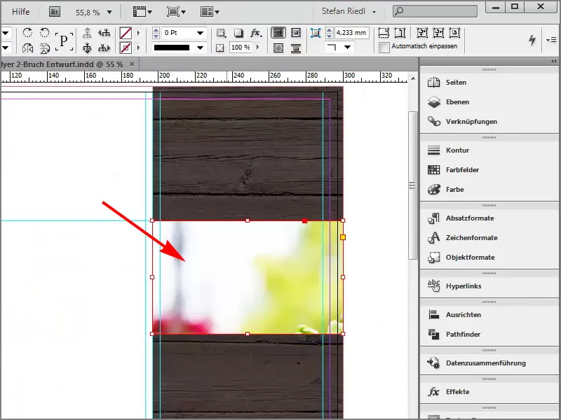
If I zoom out once and click in the middle, you can see that the image is actually the size of this turquoise line.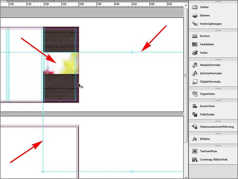
Of course it's much too big, I can also move it around, it looks like a kind of window.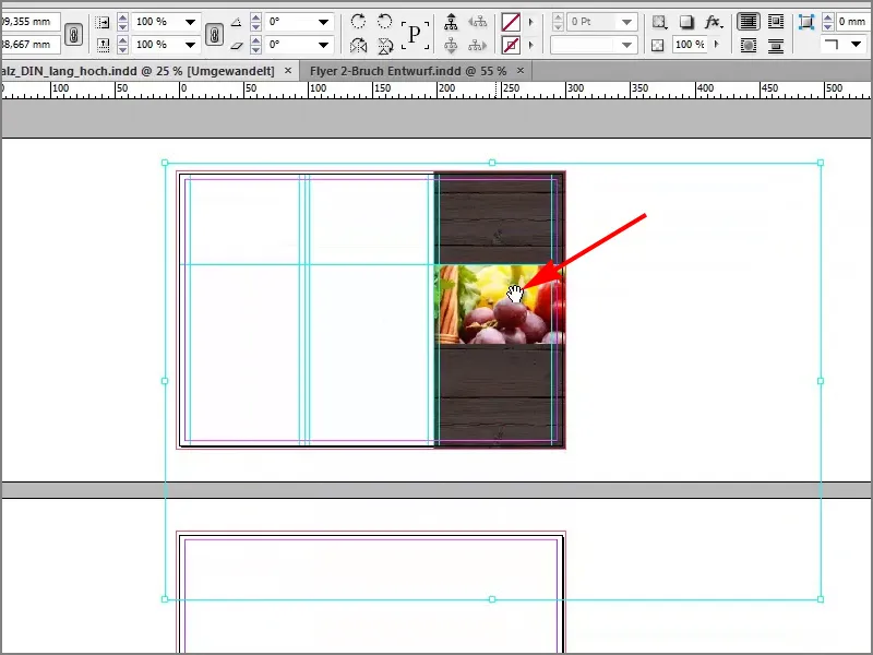
But before I scale it down and try to make it accurate by working in millimeters, I just let InDesign do it by right-clicking>Customize>Fill Frame Proportionally.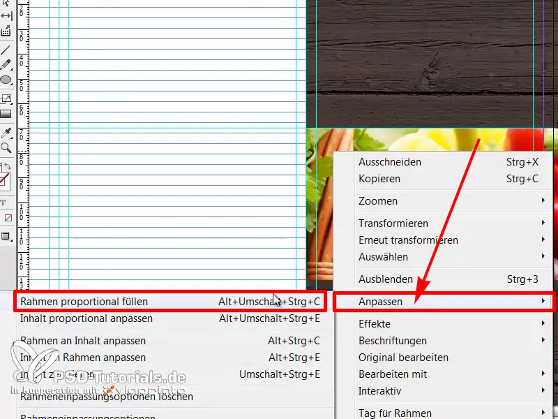
Voilà, the image is cropped to the right size.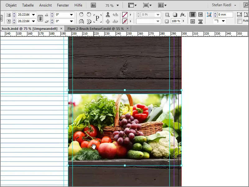
What I still want to add is a small yellow outline, but for this I have to select the frame again ...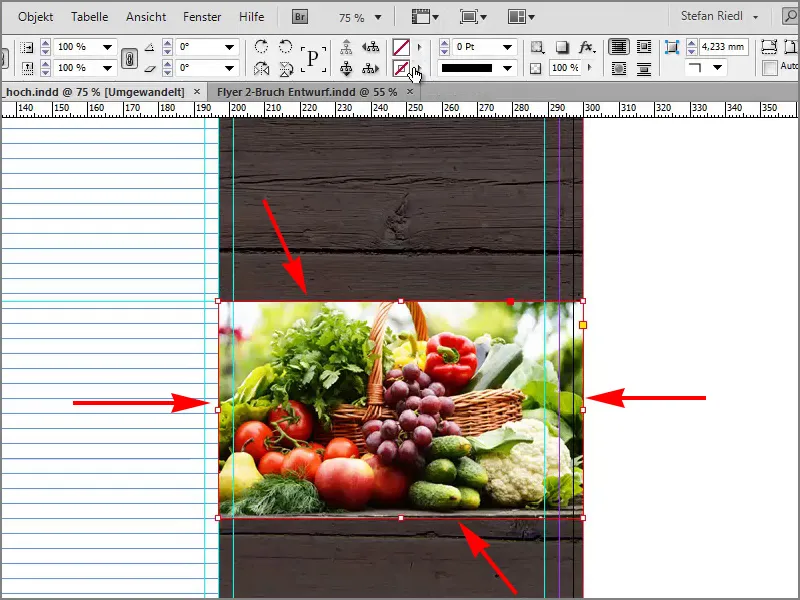
... in yellow ...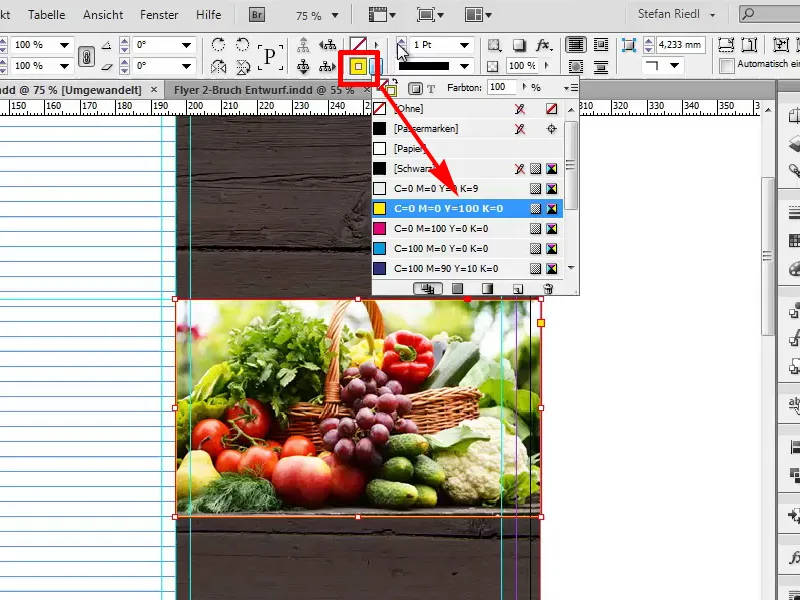
... with 4Pt approximately.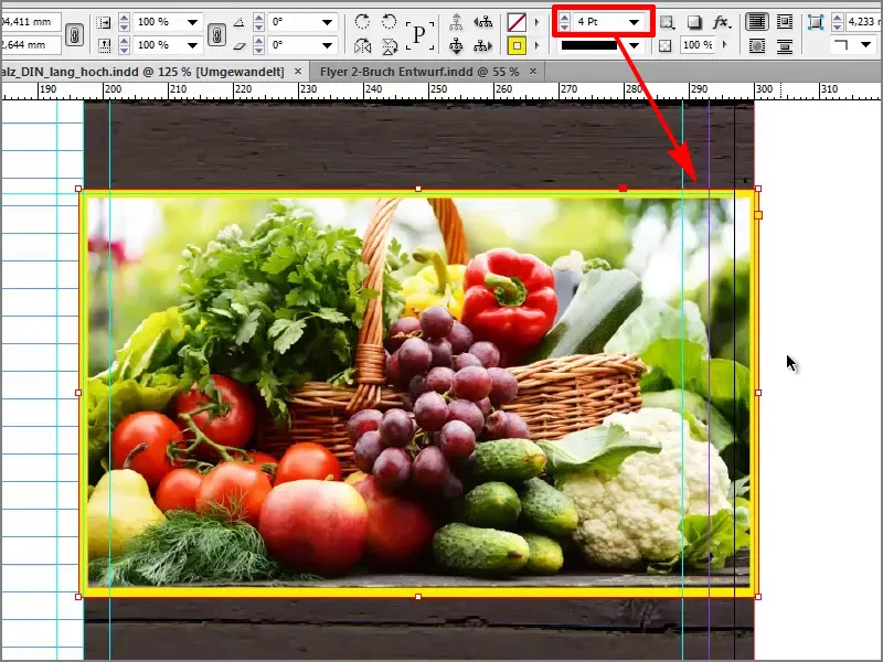
Then we'll add our dynamic in a 15-degree slant.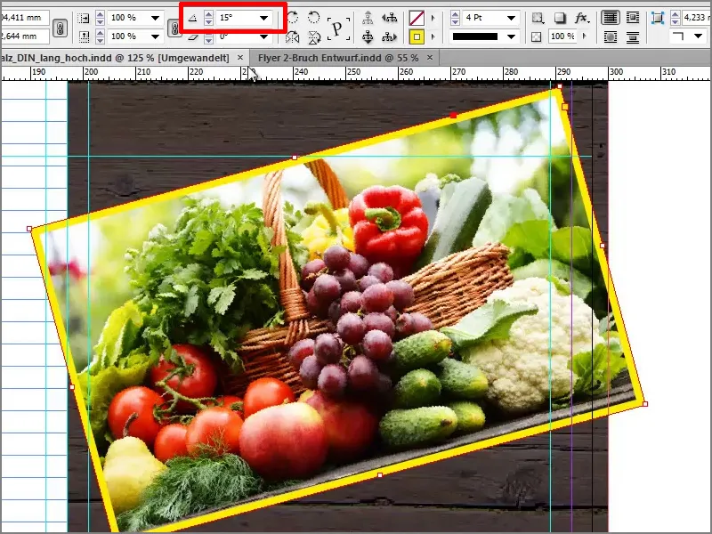
Now I'll drag out this edge. Preferably so far that we no longer have our corner on the printable area.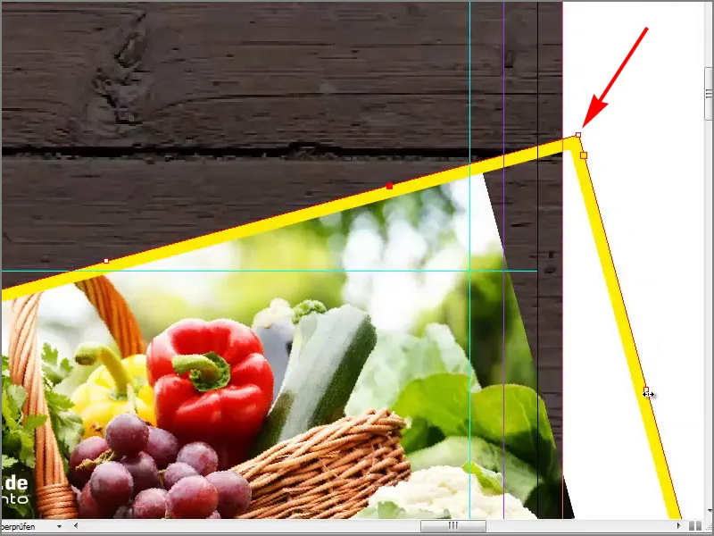
Do the same here at the bottom, pull it out once ...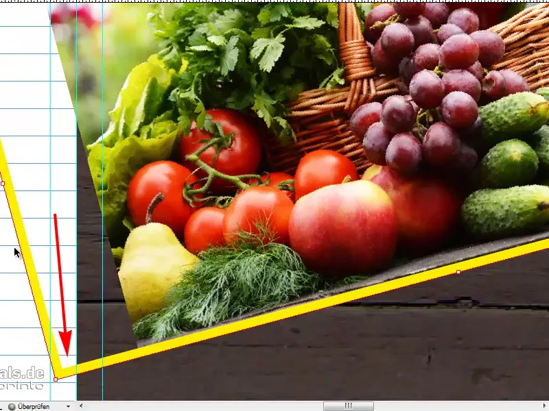
... and fill proportionally with Customize>Frame.
If I now change the view via W, then we have a clean cut on the right-hand side without any annoying corners still in it, and on the left-hand side you don't need to worry, because we'll put an image over it.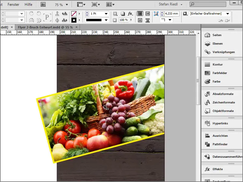
Now let's give the whole thing a name. To do this, I'll select the text tool, draw a text box ...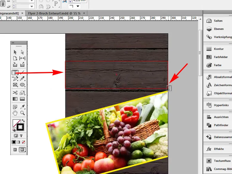
... and select Eurostile LT Std as the font to start with, which is the font I have chosen for this flyer.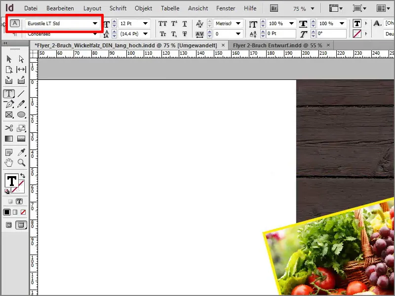
I will provisionally change the color to white ...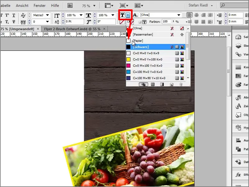
... and the font size to 30 pt.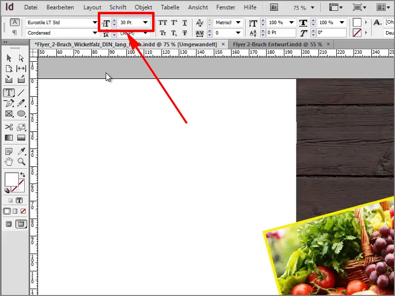
Now I'll write "Eat healthy", a paragraph and "Live healthy". I want the "Healthy living" to be right-aligned.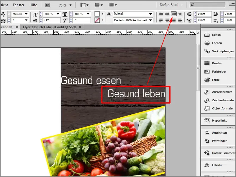
Here we will also set 15 degrees and ...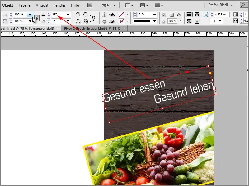
... make the text field a little smaller. I showed you at the beginning that we have guidelines here that we also want to take into account, so I'll just make the field a little smaller.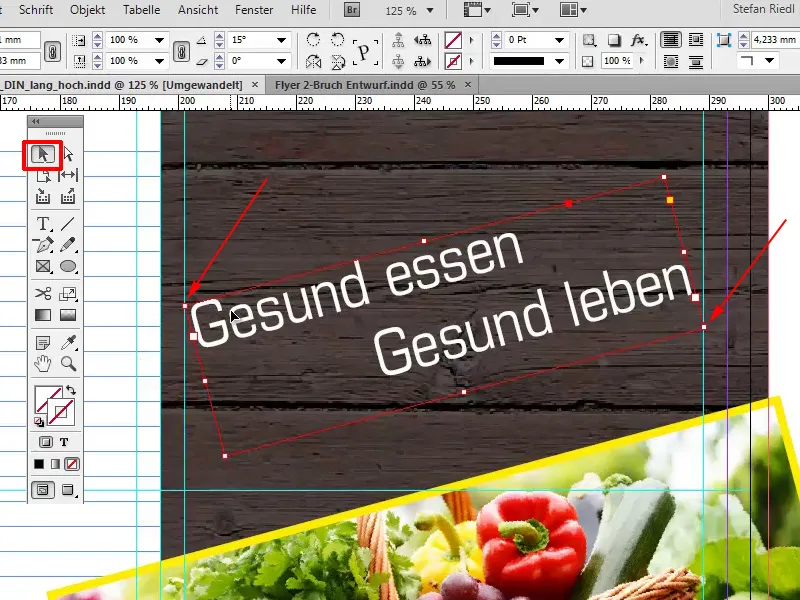
We'll set the whole thing in capitals again and format the bottom line in yellow.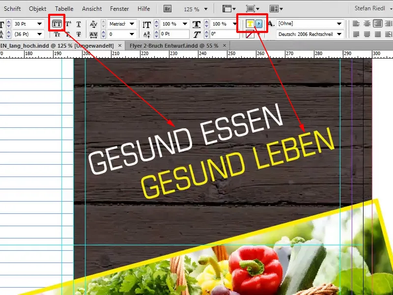
All we need now is a line above the image to explain the highlights of the organic farm. To do this, I'll select a text field again and copy the text I have in my clipboard into the Eurostile LT Std Condensed with the color white and the font size 10 Pt.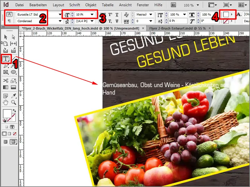
Then I will also enter 15 degrees here and center the whole thing.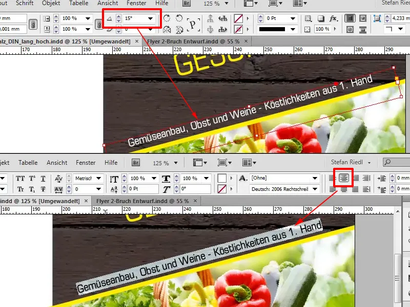
We can then press and hold the Alt key, now we get a double arrow, and this creates a duplicate. If I now also press the Shift key at the same time, the text always remains the same on this axis and I can move it directly downwards.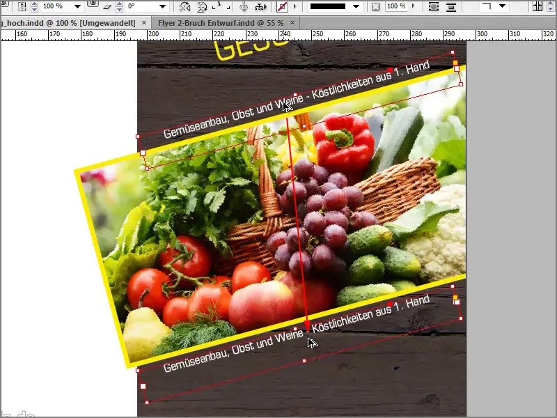
Then we add another text, namely "Your farm for special goods from the region - Biohof Lambert".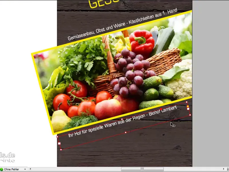
Of course, our logo and the name of the farm must not be missing, and I'll put it at the bottom. That's why I add another text field: "Biohof Lambert". I select the text with Ctrl+A and again use Eurostyle LT Std Condensed with a font size of 20 pt. But Mr. Lambert wants to see his name in yellow and the organic farm in white.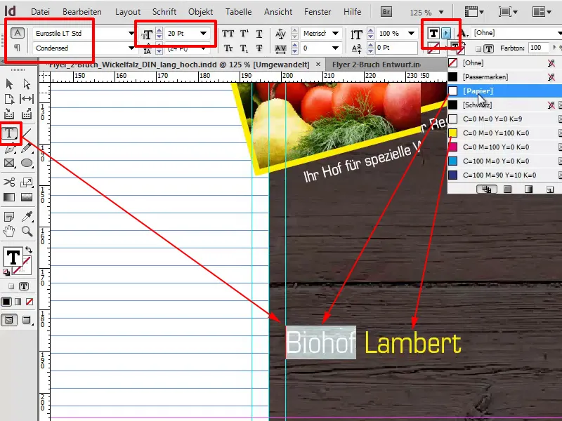
Now I'll move the whole thing a little to the right, and by double-clicking on this handle below you can reduce the text field to the size of the letters.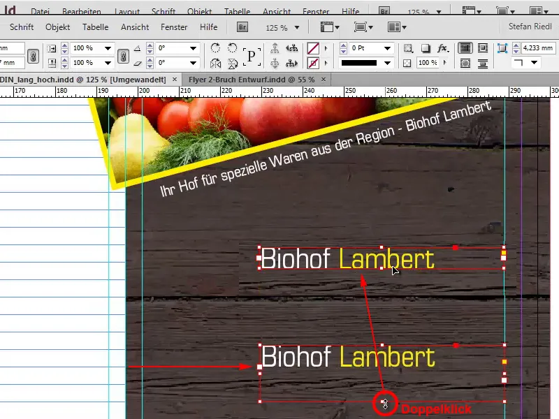
The logo
With Ctrl+D I'll now select our logo and simply drag it to this position.
It's very helpful if we draw an auxiliary line at the bottom of the base, which I simply drag out of the ruler with 201mm.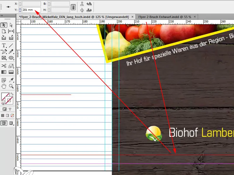
We can then align ourselves on this line, which is why I will place the text directly on this line and also our symbol/icon, which I will reduce to roughly the size of the text box by holding down the Shift+Ctrl key.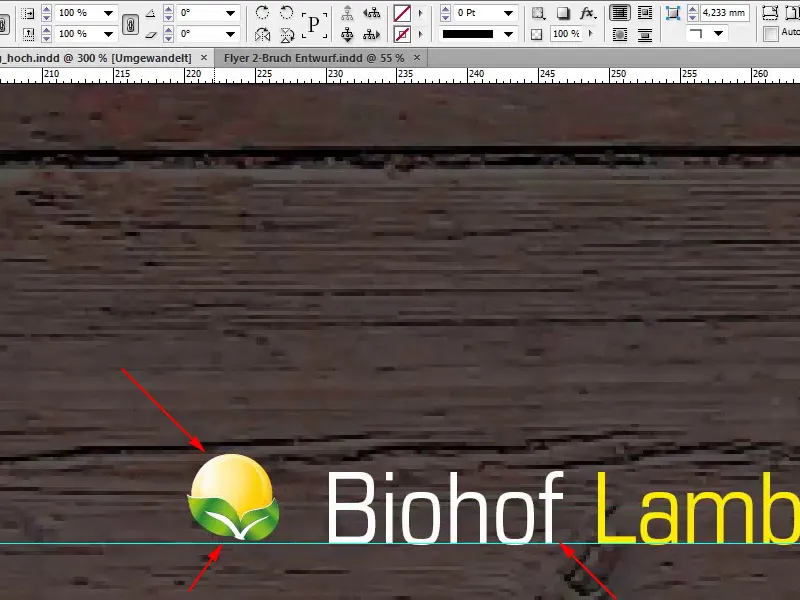
We want to have a small yellow base at the top here, so I'll draw another rectangle at this point and color it yellow. I'll change the view again with W.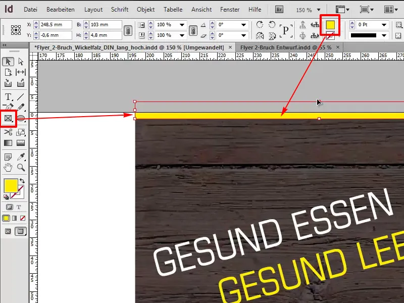
I'll now copy the rectangle down using the Alt-Shift key and the first page is finished.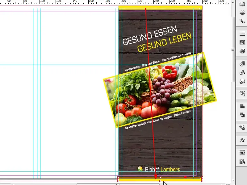
On to the reverse side
Let's turn our attention to the reverse side. This is the middle area, and there we have an image that I want to draw. Again, we have to make sure that we drag the image to the light blue marker.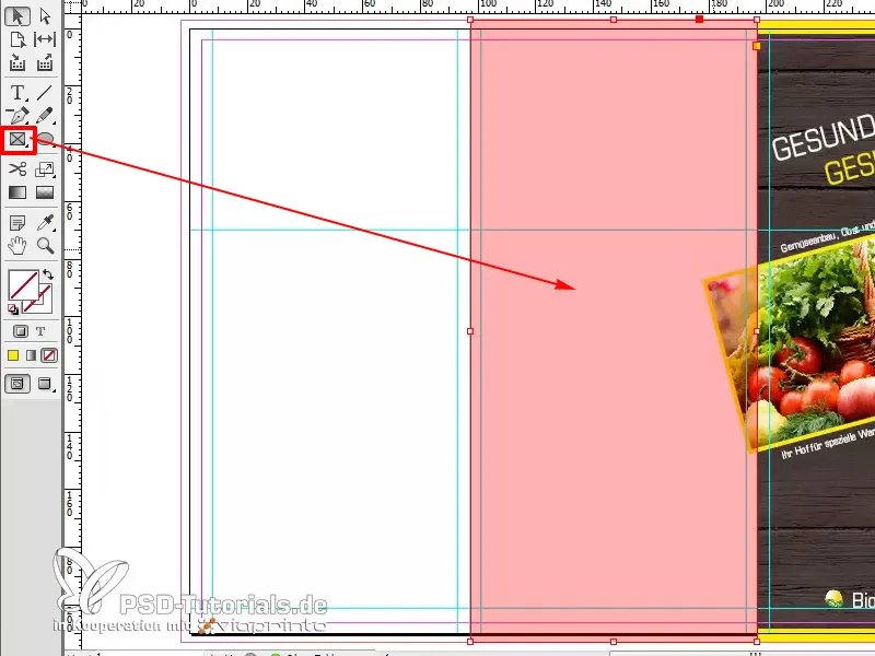
With Ctrl+D we select our good Mr. Lambert.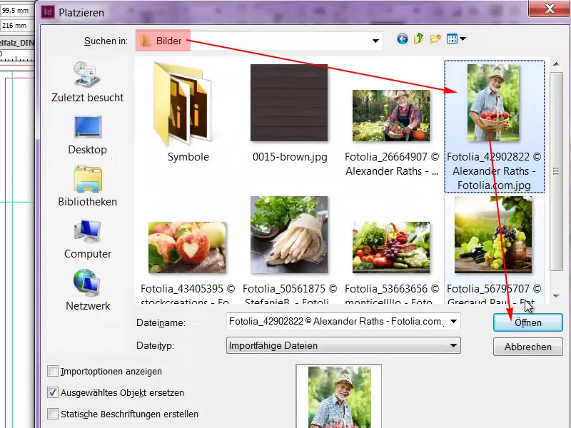
It's still too big now, so Customize>Fill frame proportionally.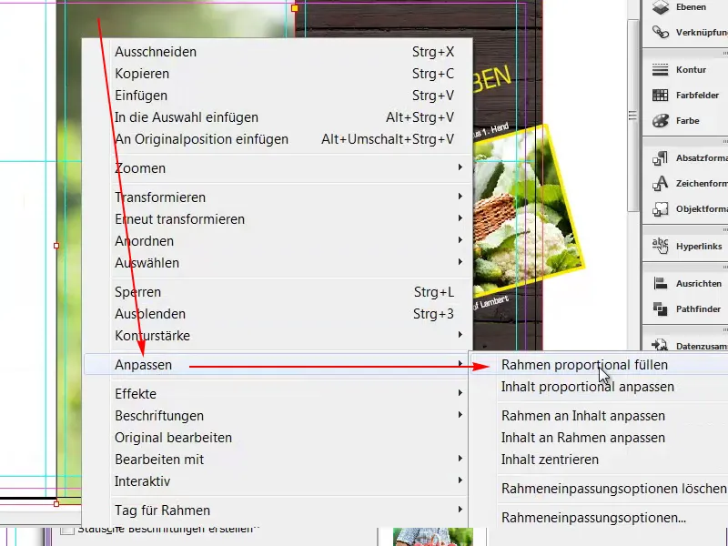
What I don't like here is that he hangs a little crooked in our frame.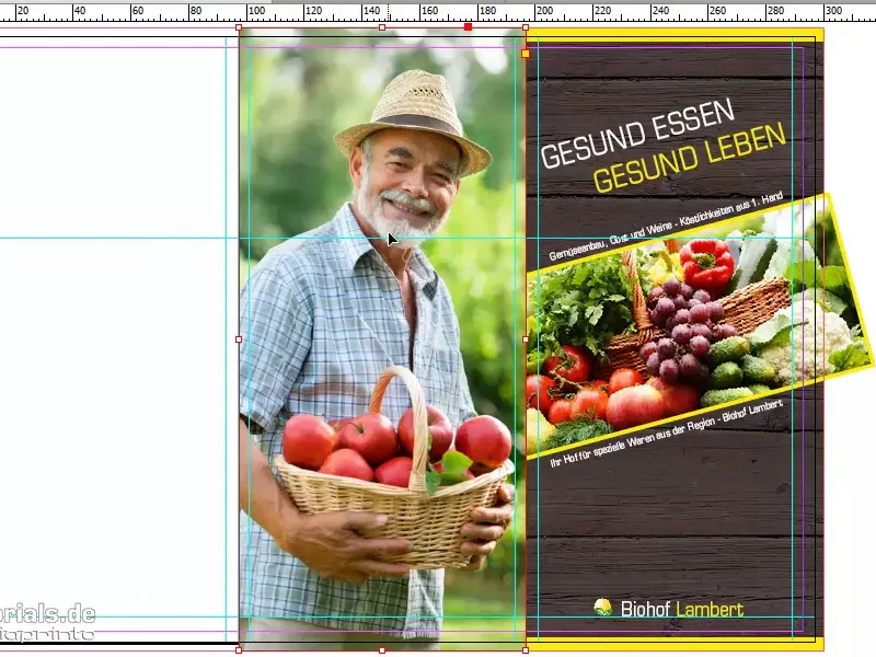
That's why I'm going to double-click on the picture behind it and rotate it slightly. I like it better this way, with a straighter back.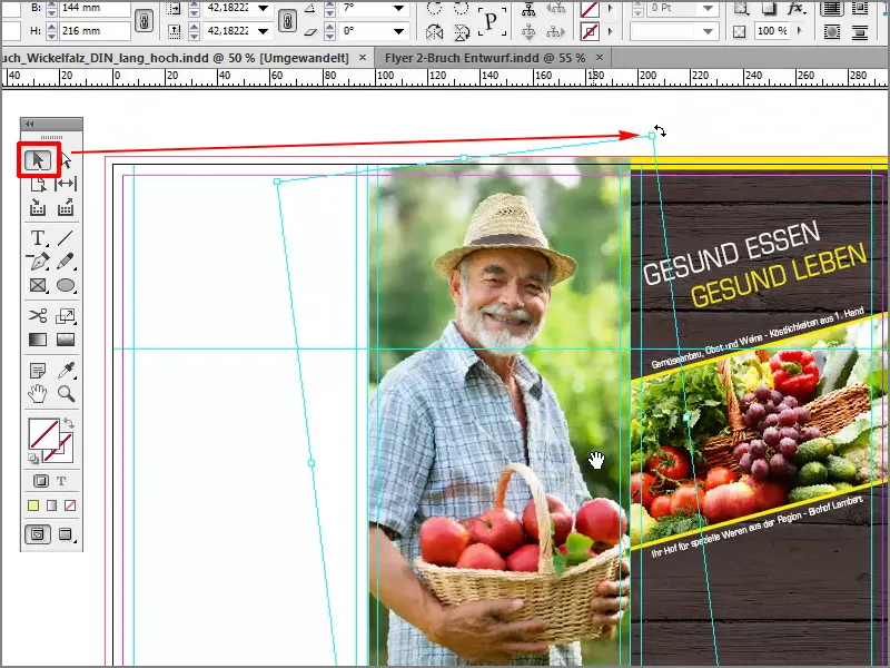
What you have to watch out for: Down here the picture has rotated. Now we have a white unprinted area here and the same thing has happened at the top left.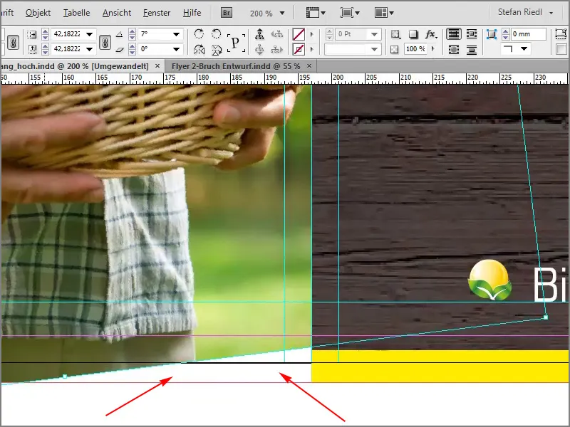
To avoid this, we will make the picture frame a little larger by holding down the Shift key so that it is proportional and holding down the Alt key so that it selects the center point as the starting point.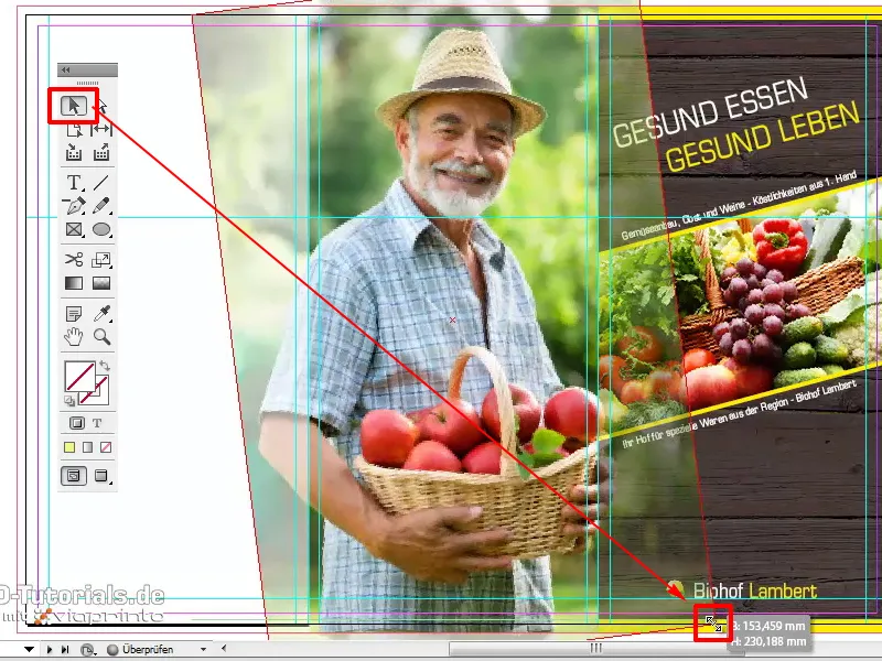
Here, too, we have to go right up to the fold.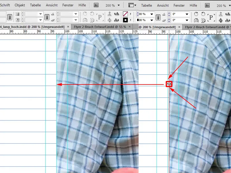
The whole thing looks better this way.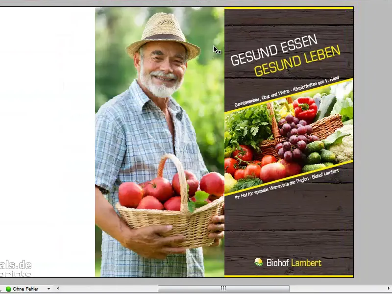
Of course, Mr. Lambert also has a motto, which we will choose with a text field. In this case, the font is Journal with 44 pt in white.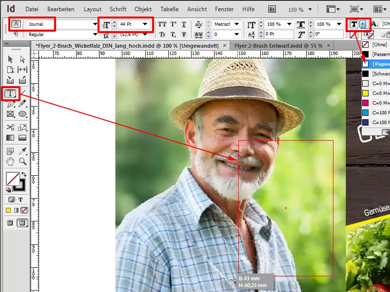
Then I'll write in: "Healthy living with Lambert". I'll select the whole thing with Ctrl+A and align it right. The line spacing is a little too large for me and I'll reduce it to 47 pt so that it's a little closer together.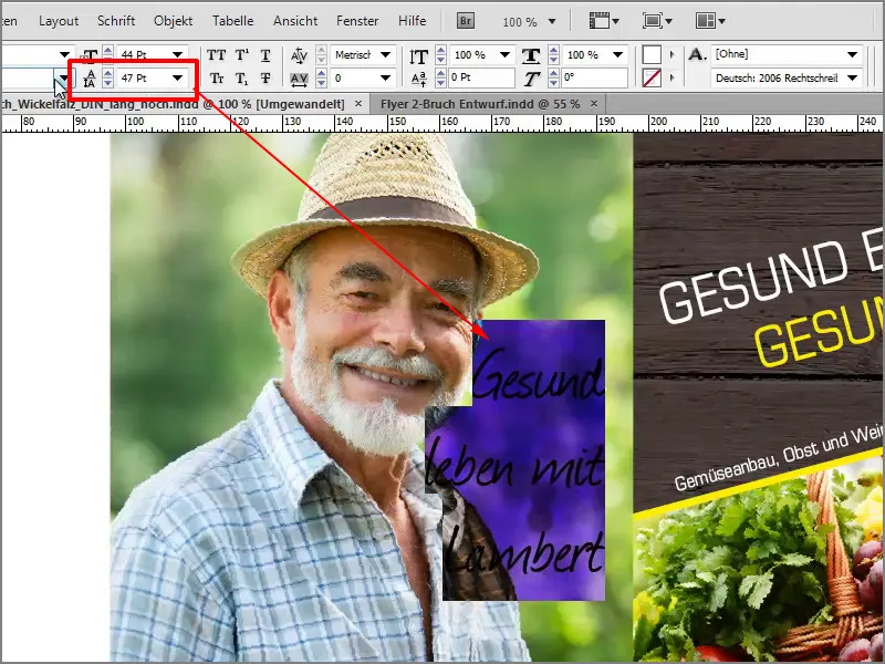
And to emphasize the whole thing a little more, as the contrast is very low, I'll make a very light drop shadow. I can set up a drop shadow using these visual effects.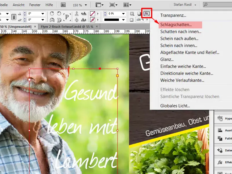
1mm in distance, 1mm in size and the opacity set to 30%.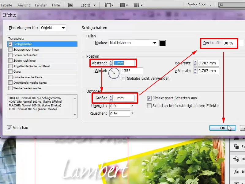
Now we have a very soft shadow and that's enough.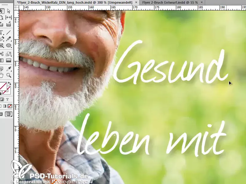
In the next step, we'll work on our address data and I'll draw another text box for this. I'll start here at the bottom, I already have the exact dimensions in my head, so I can simply enter the dimensions above, 83mm in width and 53mm in height.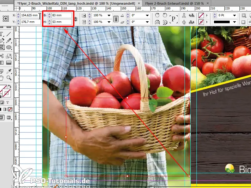
Fill with a color, this green, but I don't quite like it yet, I want it a little darker, so I can click on the menu at the top here: New color field.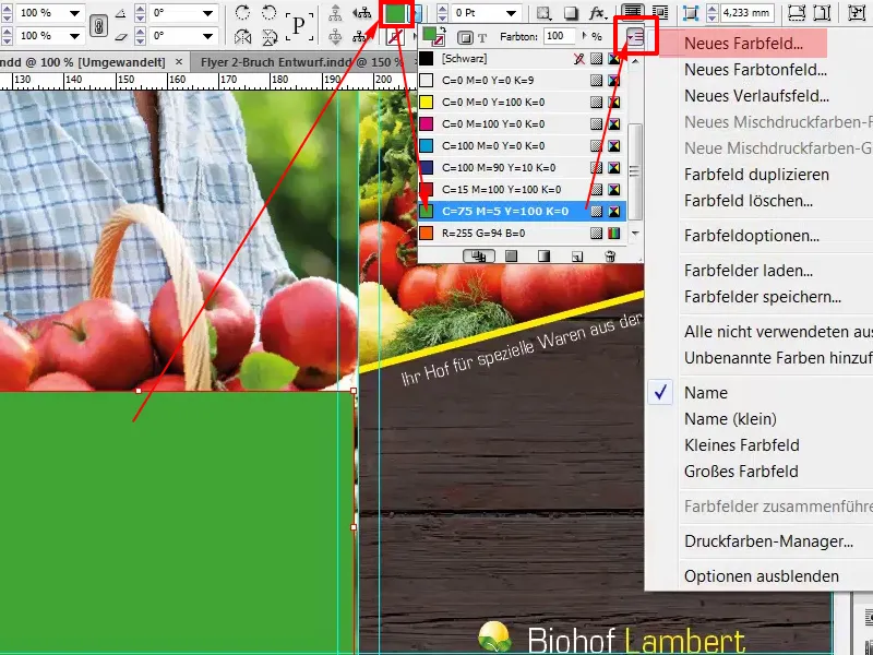
I'm going to give it a slightly darker touch, black: 64%. About Add and then done.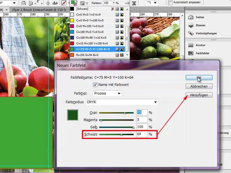
Now the color has been added to our color palette. If you are wondering why there are also RGB colors here, it is prepared for printing: This is the color for viaprinto's help pages.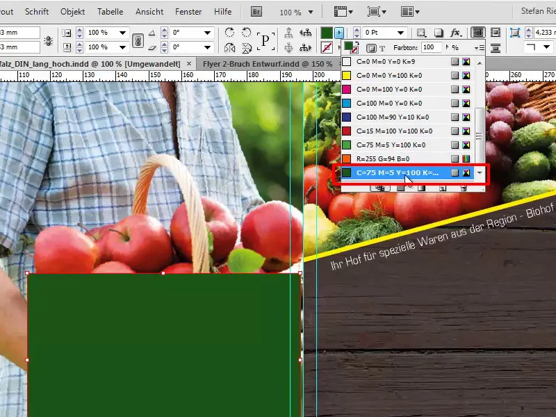
Of course, we still have to align the whole thing properly, so we place it directly on the edge and reduce the opacity to 80%.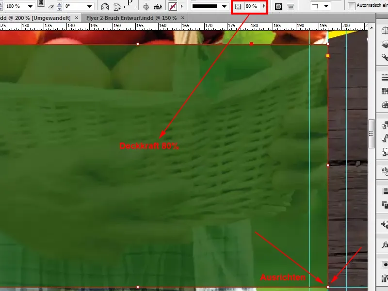
In the next step, we will focus on the lines of text, which we will also highlight with a graphic frame. You can simply click to do this. InDesign then offers you a predefined choice, but I want 75mm in width and 7mm in height.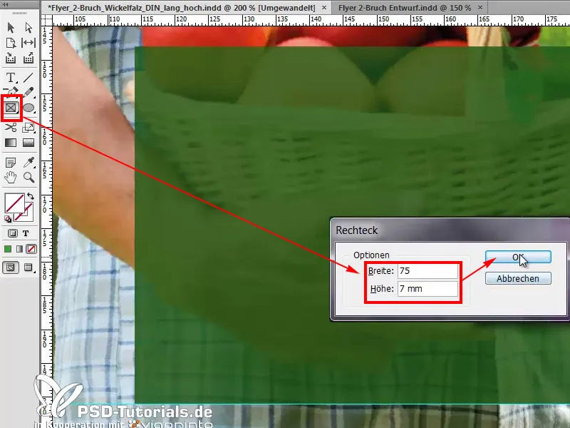
I will fill this graphic frame with the color green and dock it once at the bottom.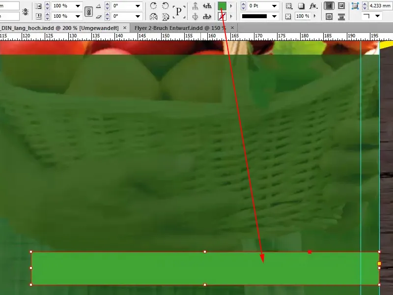
If we need four of these, I can give you a little tip that I really like to use. I draw a small rectangle, for example with a height of 3mm, fill it with white and then use that as a spacing guide.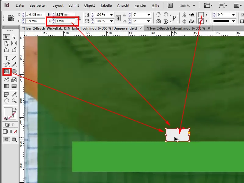
I select both with Alt-Shift and make four duplicates.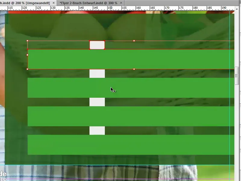
Now I can remove these placeholders, select all four again and align the whole thing in the middle. You can see that now by this guide line, which is drawn automatically, this green one.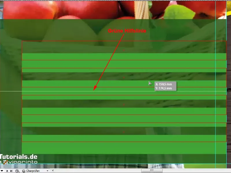
We have now centered it vertically.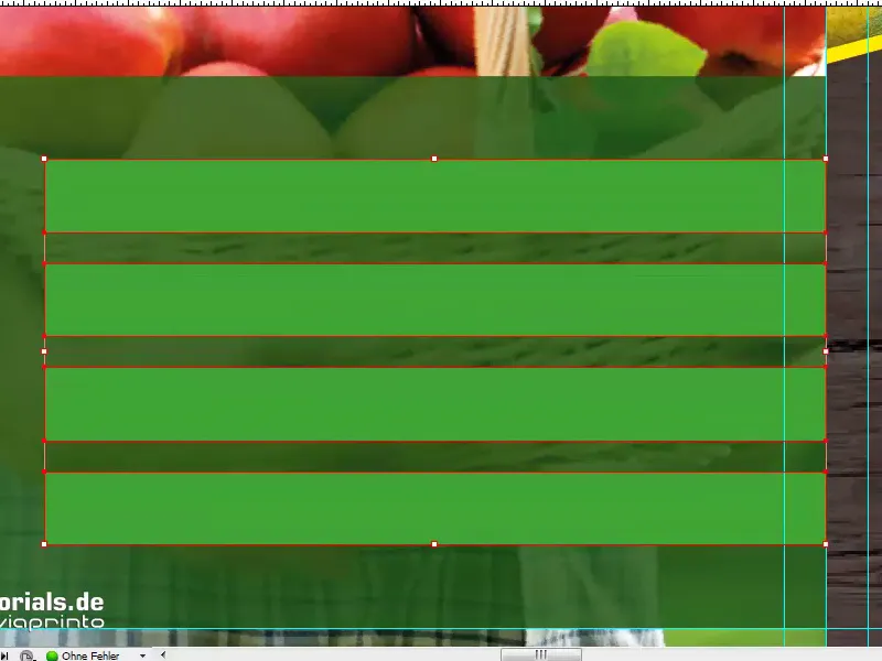
All that's missing now is a text field, which I'll also draw and write in. In our Eurostile LT Std, with white color, namely Musterstraße 12 in 12345 Lindau. The whole thing is aligned to the size of the green graphic frame.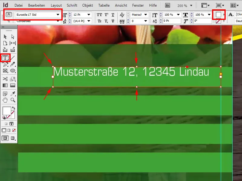
Now I'll show you a little hint: If you now right-click on the text frame options,...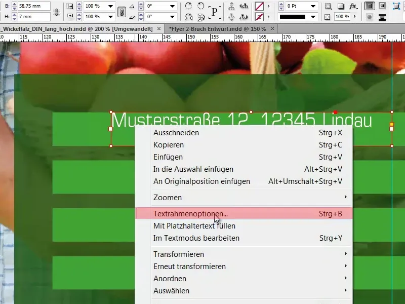
... you can define the text within the text frame in the Vertical alignment option and select Center here.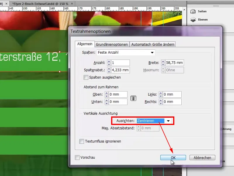
We create four duplicates of this and we can enter any telephone number, a web address and the e-mail.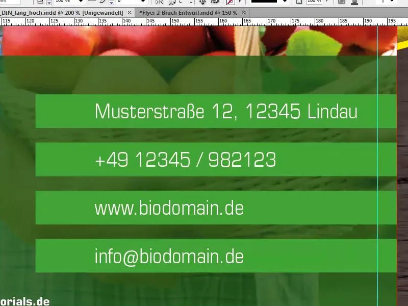
Then all that's missing are our icons; again, I'll draw a frame with a height of 7mm.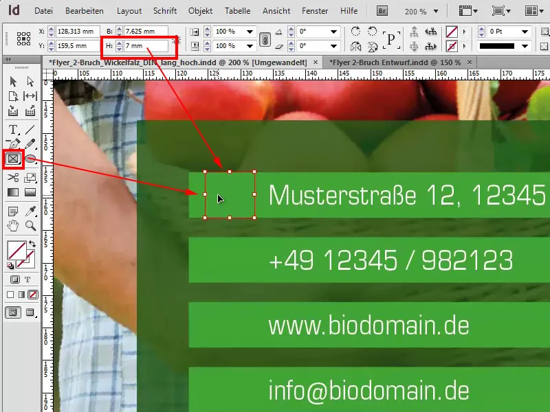
With Ctrl+D I select the icon, namely Location.png.
And I'll go to Customize>Fill Frame Proportionally.
It's a bit too big, so I'll now select the image (caution: not the frame, but the image) and reduce it to 3% within its size. Please make sure that the chain symbol is activated so that it changes proportionally.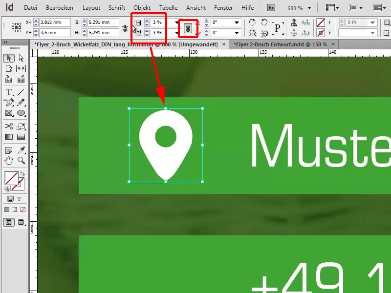
Now we will duplicate this box and then we can easily select the phone, the domain and the e-mail address with Ctrl+D.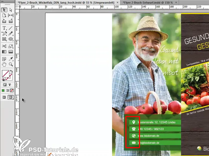
We can use W to change the view, by the way, to jump back and forth between the menu items if we select the W shortcut. Then we have almost finished this page. I would perhaps move it a little to the left, something like that.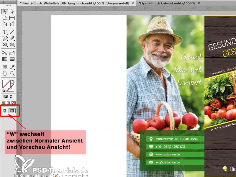
Editing the left-hand side
Back in the overview, we can see that there is still a completely white page on the left-hand side and we now want to remedy this. We draw a graphic frame, take the bleed with us and select our texture again with Ctrl+D.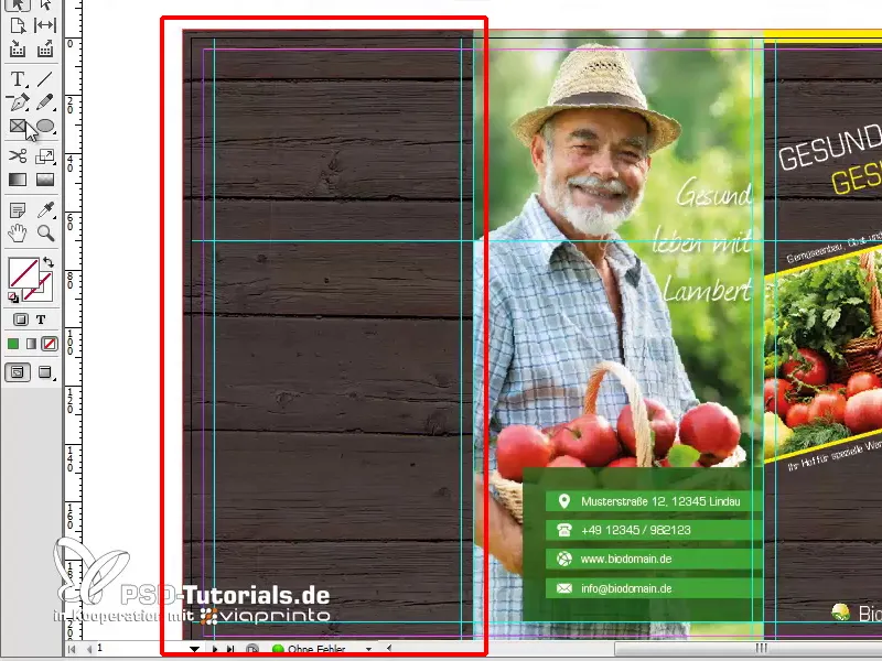
Another graphic frame should then contain a nice picture, and I have imagined the apple here.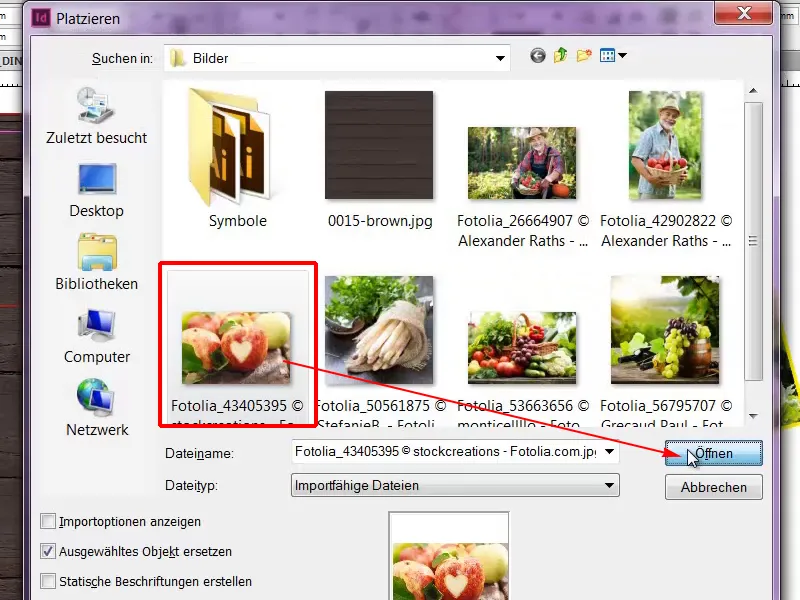
Customize>Fill frame proportionally. What strikes me here is that the image should be mirrored for my taste.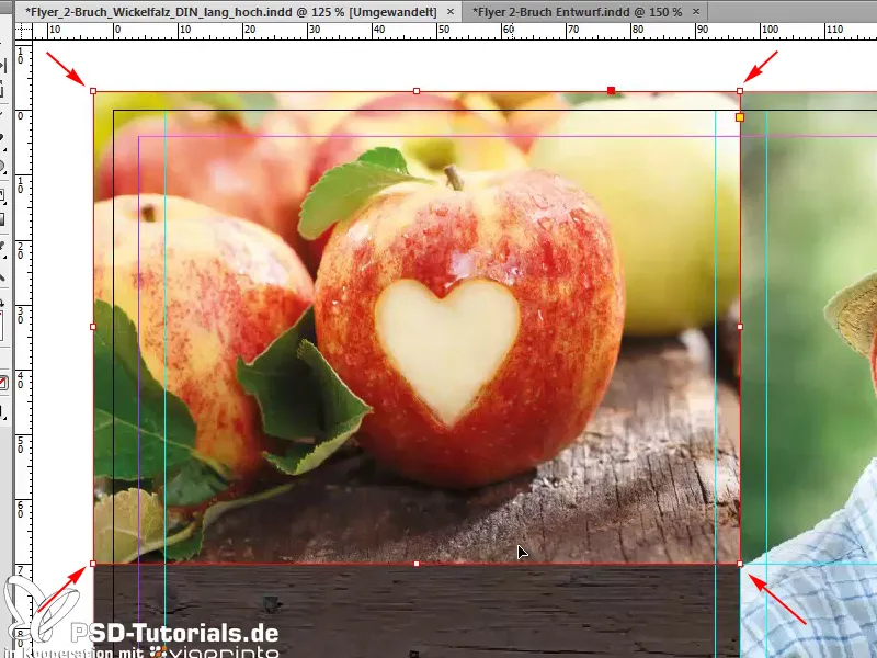
Because we want to have a light box that I can draw in straight away. I'll draw it with a graphic frame, give it the color yellow and reduce the opacity to 65%.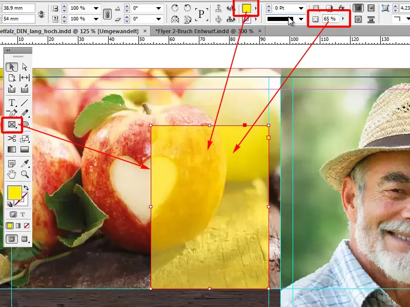
And because the beautiful heart doesn't harmonize so well with the yellow box, I'll select the image and use Object>Transform>Mirror Horizontal to mirror the image.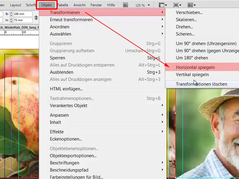
Now I move the image to the bleed, because cropped images always look a bit more dynamic and create a bit more tension, and by holding down the Shift key I will make it proportionally larger.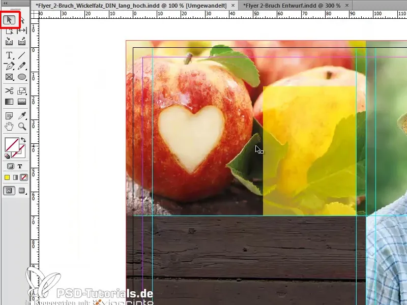
Now I also want to put some text in the yellow box, so I'll draw a text frame and write: "Heading ABC". Font size 12 pt, in Bold Condensed and the color is dark blue.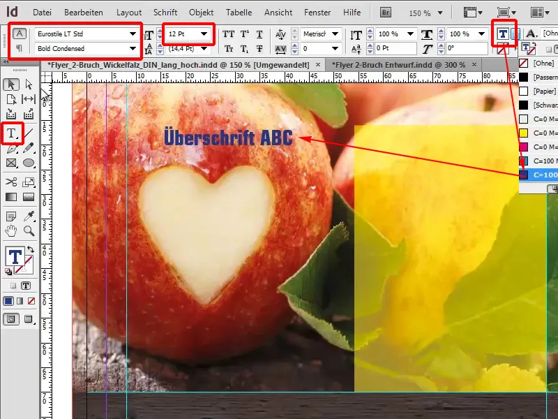
Now I'll move the text into the yellow frame, then I'll use the font size of 11 pt ...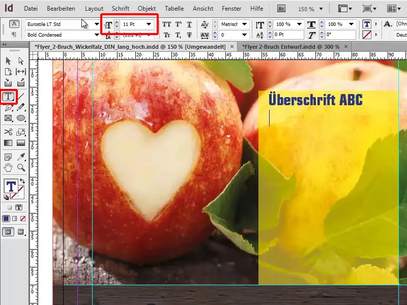
... fill the whole thing representatively with a placeholder text via Font>Fill with placeholder text.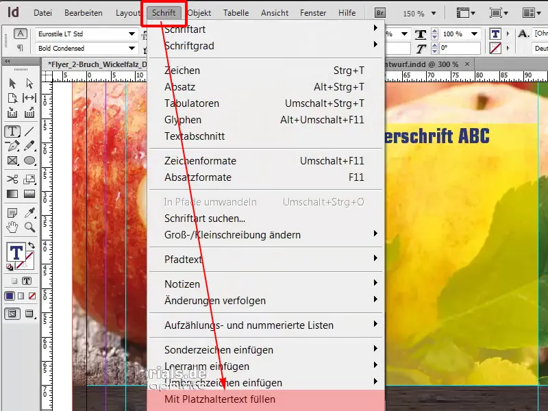
We set the font style to Condensed and in black.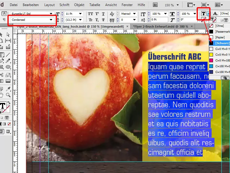
The whole thing can be aligned more precisely in detail, but I'll leave that to you so that the spacing matches perfectly, because here, for example, we can see that the left spacing is not identical to the top spacing. However, this should be the case in order to make the whole thing look more harmonious.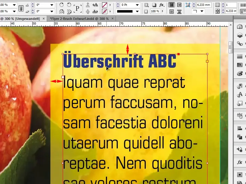
As we know, everything starts with trust. Not only Deutsche Bank has found this out, but also Mr. Lambert, and he doesn't want to miss the opportunity to also point out a promise to his consumers. So I select the rectangular frame, click in once and select a width of 89mm and a height of 30mm in this dialog.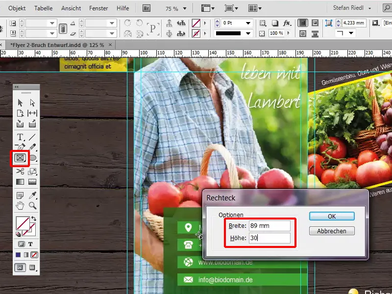
I fill it with our blue and also with our characteristic transparency of 60%. I'll move this field to the right place.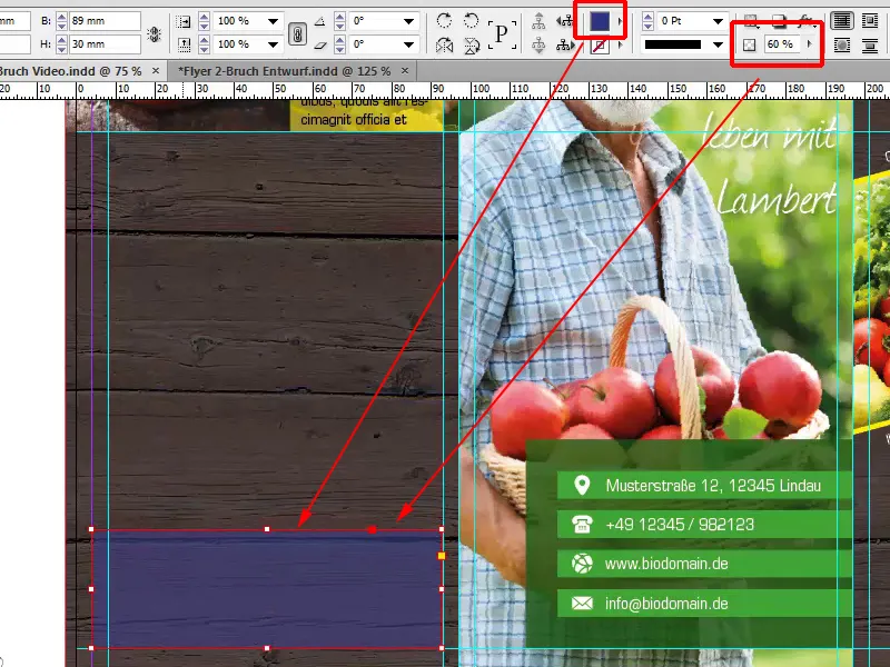
I'll repeat this step with 7mm in height.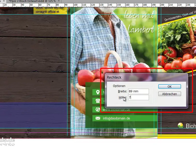
This will be a solid color without transparency, and this will form the space for the heading.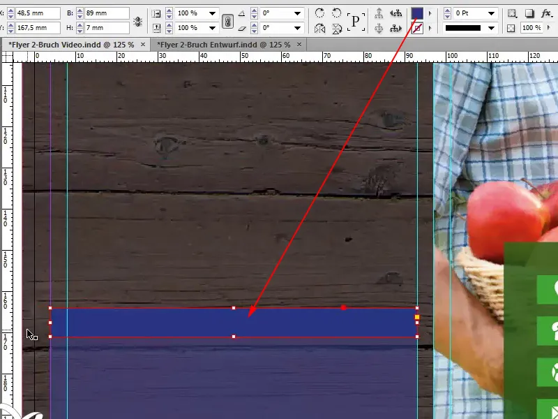
At this point, we are actually repeating the same thing that we did above with the yellow box. So I'll show you again how it looked on the original, and I'll select both text boxes by holding down the Shift key and pressing Ctrl+C for a copy ...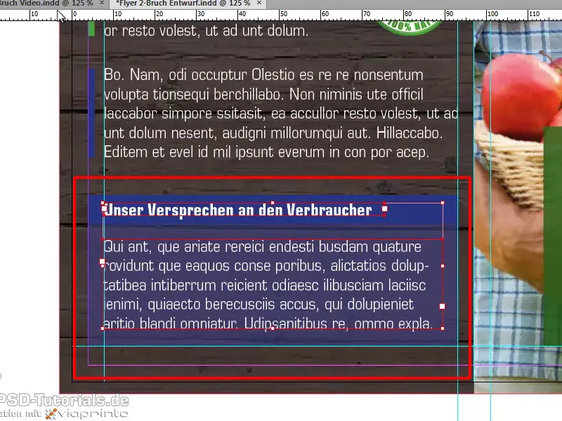
... I'll go back to my document, which I'm currently editing, and select Edit>Paste to original position. That's really great, because if I've done everything right now, it should be almost identical to the template.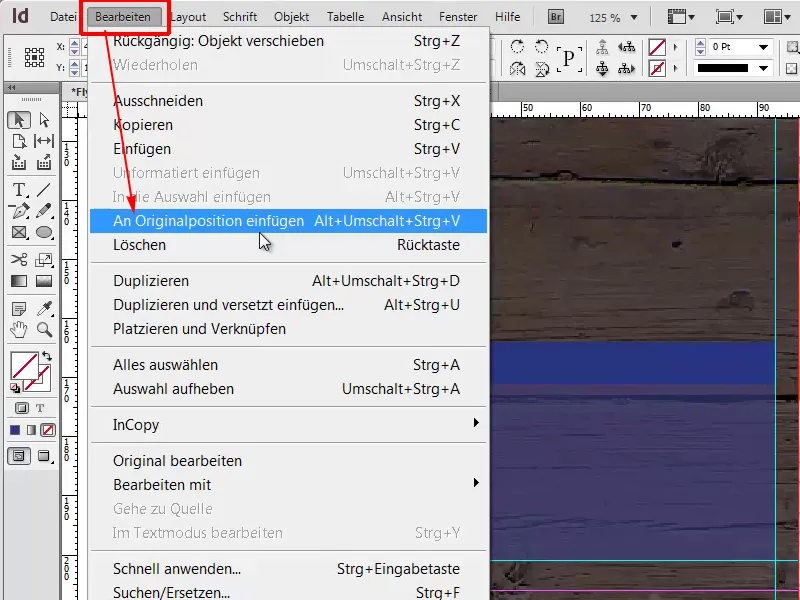
And we can see that it's almost right. We only need to make a few tweaks to the auxiliary line. This means that we have also placed the important box - with a dummy text at the moment, but you can then fill this with detailed text in your example.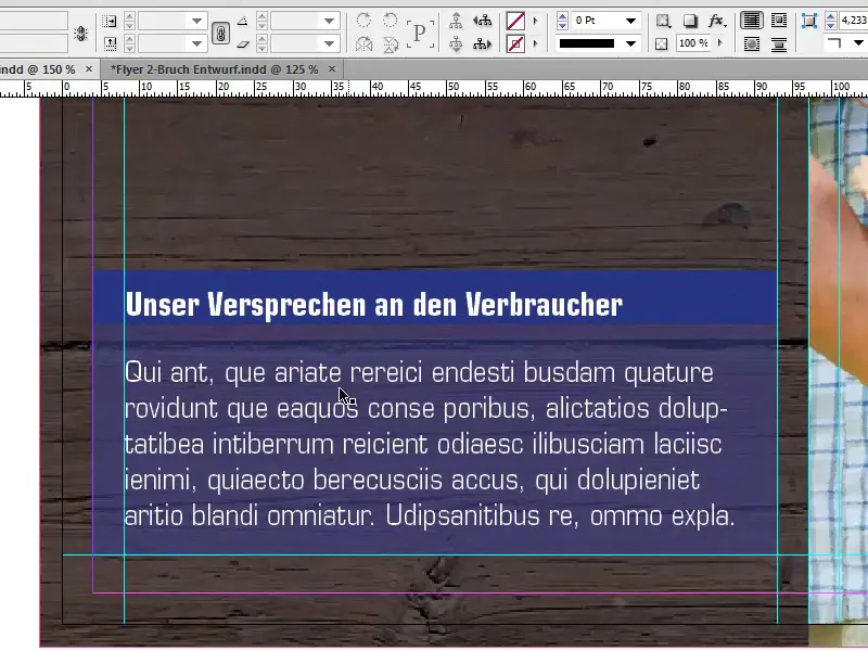
There should also be an opportunity in the middle to pass on relevant information to the consumer, which is why I will also draw a text field here, up to the help lines of course, and fill it once with any dummy text.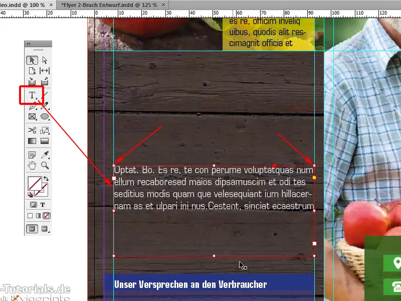
What I would also like to recommend to you is: Don't make the text fields bigger than they are. You can click on the handles of the text box to crop the size directly to the text. And now we have a customized frame.
This is very helpful, because if you ever work with lots of text boxes, it can easily happen that you misclick or click on the wrong box, so this is definitely a good idea.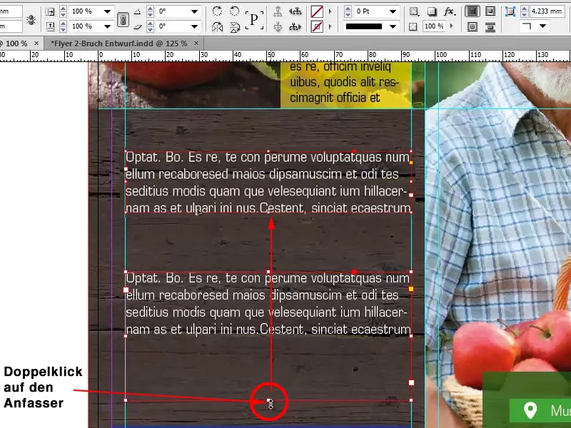
As a kind of enumeration, we would like to let the three core colors of the flyer come to the fore on the left, so you can draw a box here again. The intelligent help lines already suggest how high the box can be in order to align with the text, which we gratefully accept.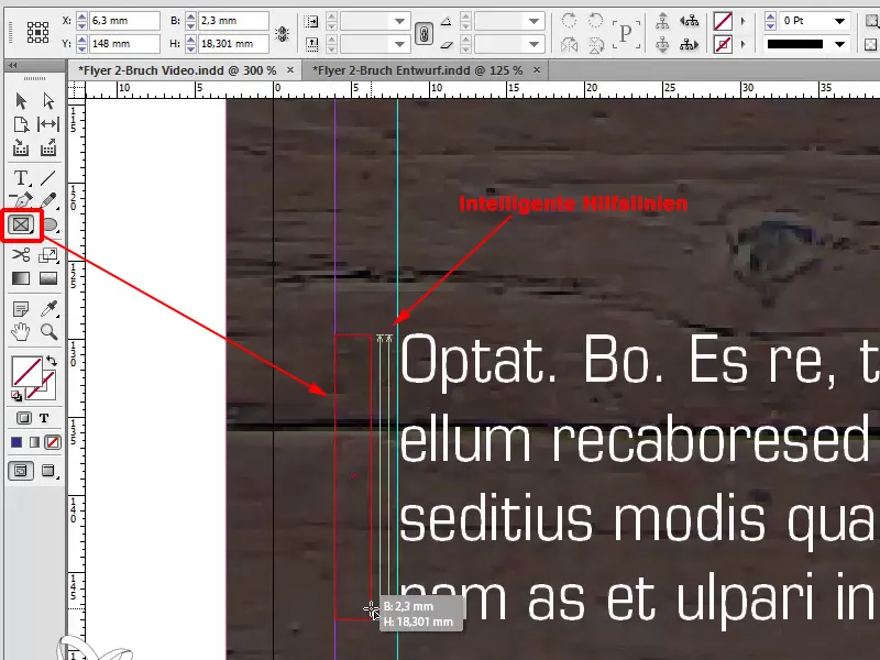
The only thing that doesn't fit at this point is the size of 2.3 mm. I now change this value to our 1.5mm, as I want it to look a little slimmer, then I will have the problem that it takes the center as a reference point and subtracts the difference from the left and right sides. This means that I have to move it again afterwards.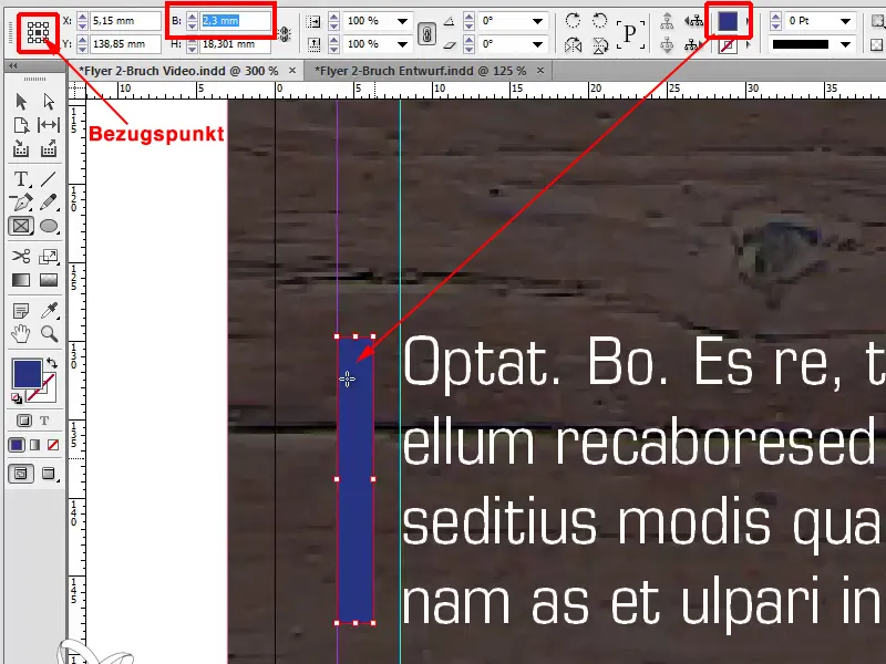
However, if I select the reference point on the left, then it will select 1.5mm from this left side and we won't have to move anything afterwards. This is incredibly practical; you should always keep an eye on where the reference point of your measurement is. You can work much more effectively and much faster this way.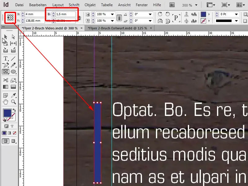
I will also duplicate this with Shift+Alt and duplicate it again; now the intelligent guides come into play again. Change the color once more, to yellow and green, our core colors.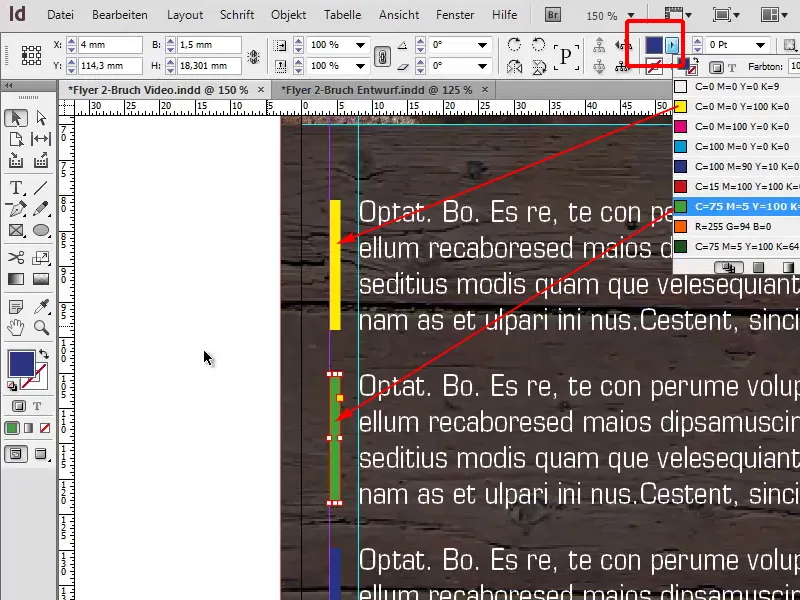
I'm going to make this text field a little smaller, and so that we don't have any indication of the overset text when we export it afterwards, I'll remove this overset that has been created at this point.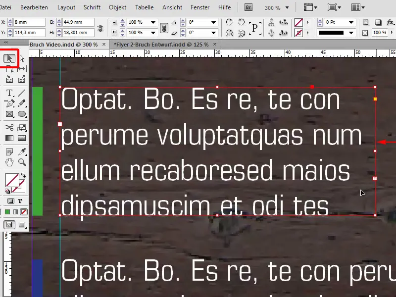
What is the easiest way to do this? You could click into the text field and simply press Remove.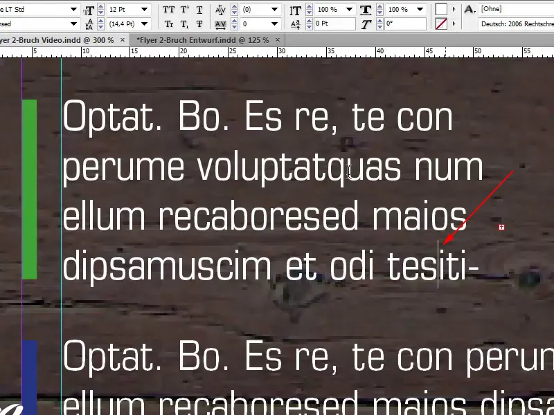
But it's also really easy via Edit>Edit in text mode.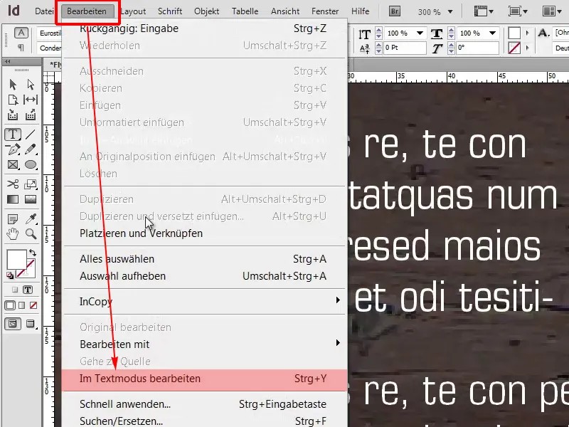
And there we can see exactly where the translation text was created. I can select this text ...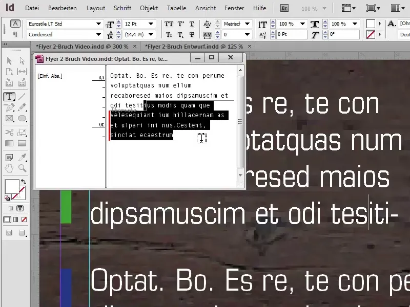
I'll just delete it and put a dot after it and that way I'll avoid the problem with this limited text field.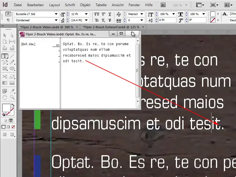
I made the text smaller because I wanted to break this rule a little for the overall appearance, otherwise it would be too static for me, and I thought I could really point out something specific here. With Ctrl+D I can select the logo from 100% Natural and position it there as well. Again, it's important to pay attention to the axes so that everything is aligned symmetrically, because that's what really matters in the end.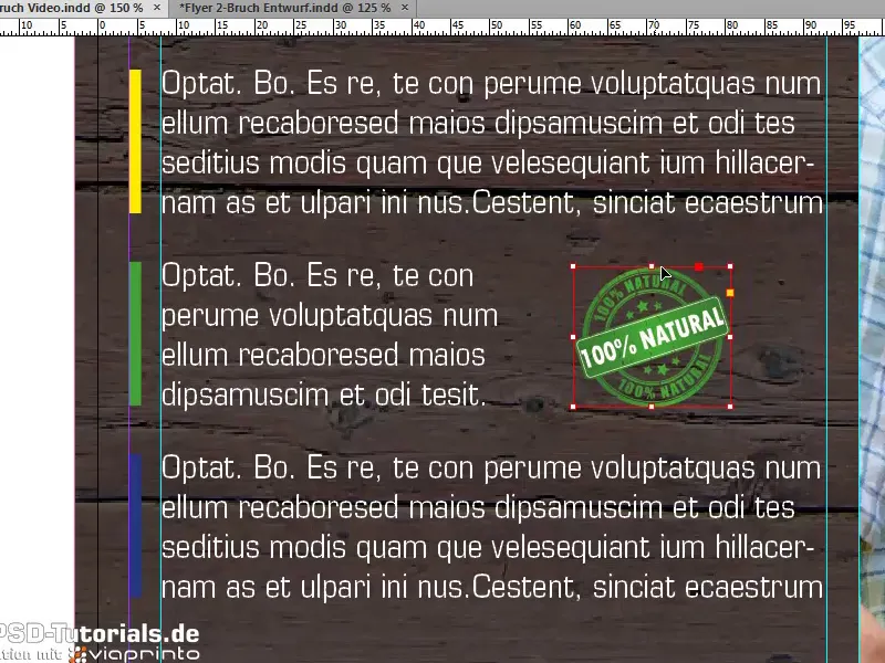
Overall view
Ctrl+0, the bird's eye view of our flyer, and I would say we are almost at the end of the first page.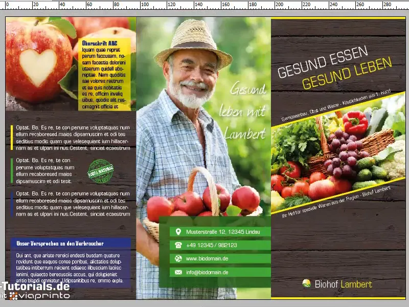
What is still a little annoying for my taste at this point is the following: There is too little space between the individual elements. If I wanted to select and move them all now, I would have the problem that it would select the texture in the background.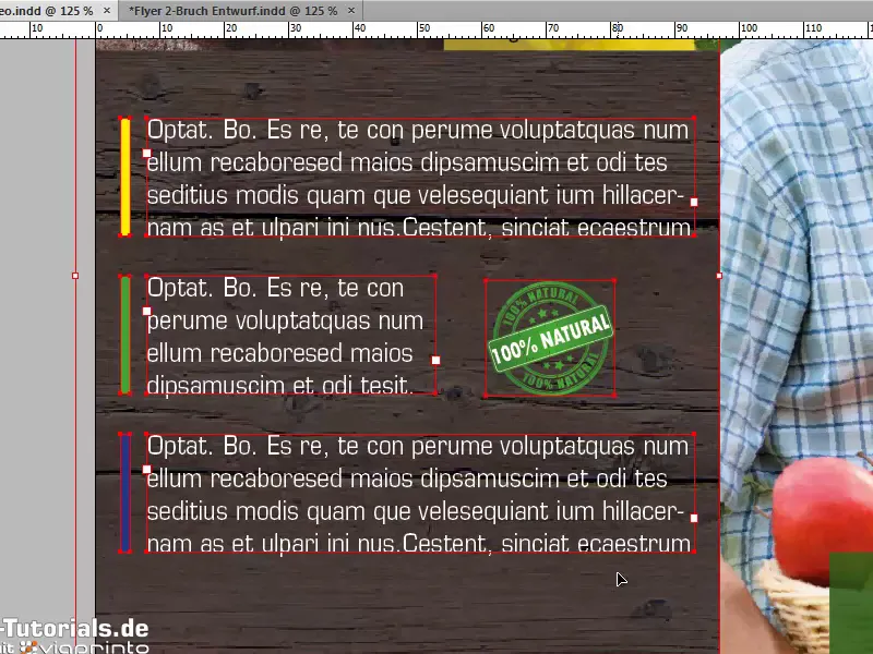
This can be avoided by clicking on the texture in the background and right-clicking on Lock.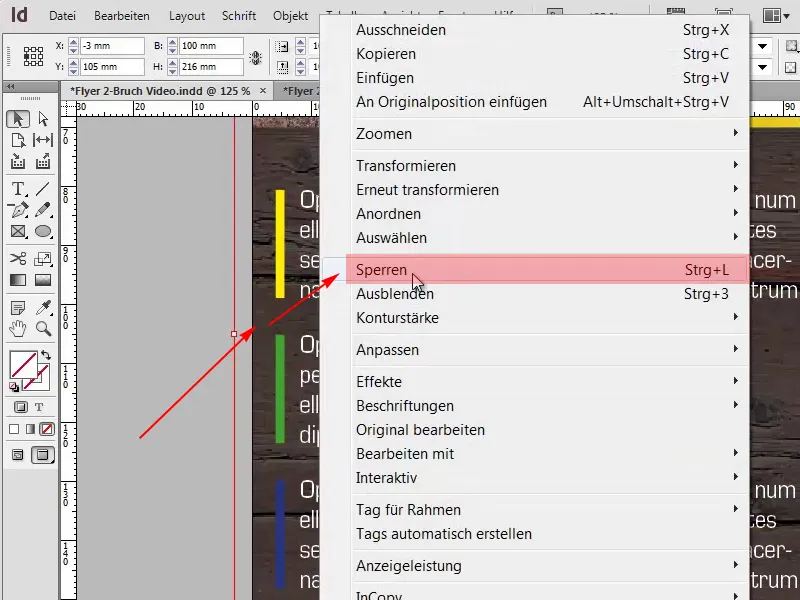
If we now draw a frame, the texture remains unaffected.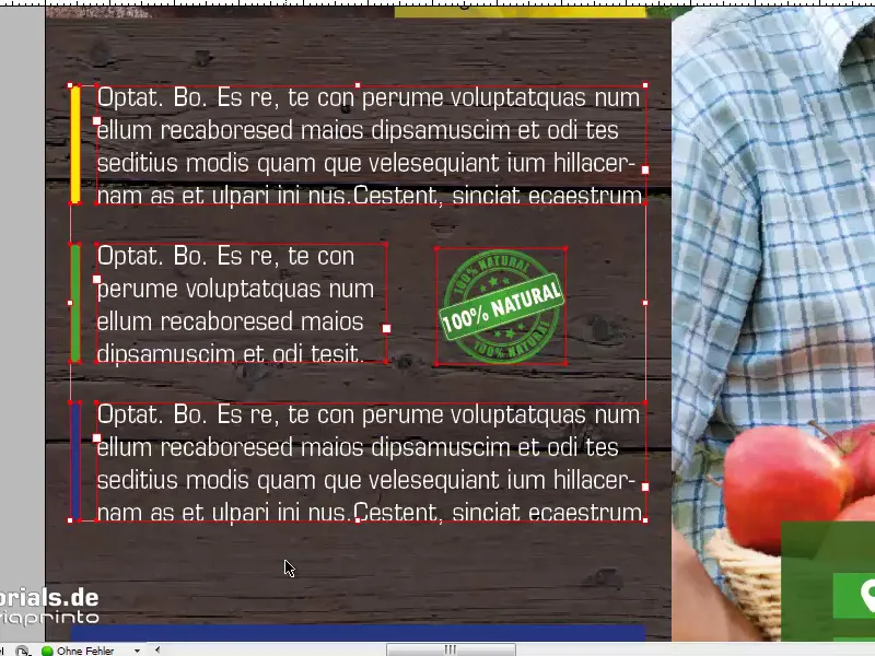
We can now easily move this lower text block and we've done it together.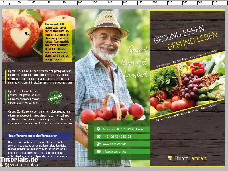
Inner area of the flyer
We have now reached the interior of our flyer. I have shown the viaprinto help again on the second separate layer and created the guidelines for our training at this point in advance.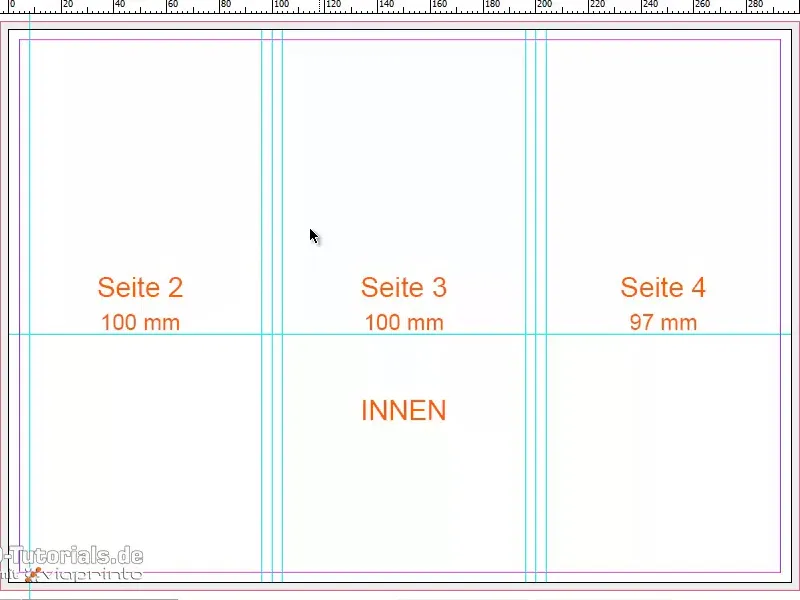
However, I would like to point out that these are not the same values as for the outside area. This is because the rebate edge is 97 mm and 197 mm on the outside. Whereas on the inside we have the rebate edges at 100mm and at 200mm.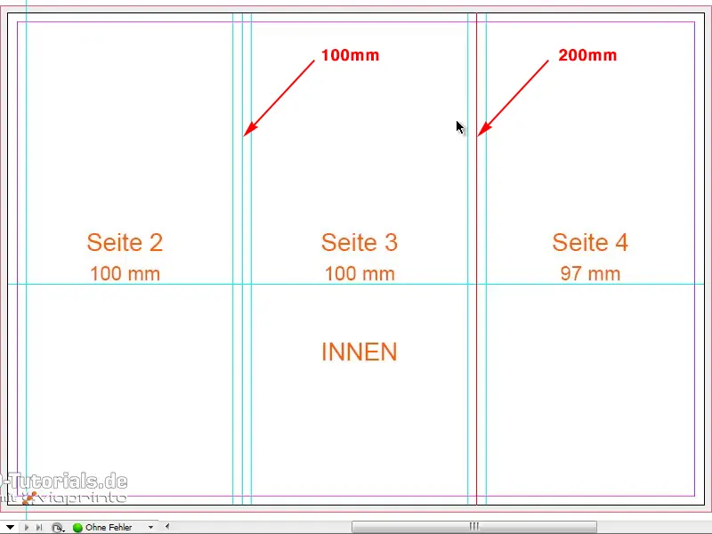
Apart from that, I have again set 4mm before and 4mm after and a horizontal auxiliary line at 116mm.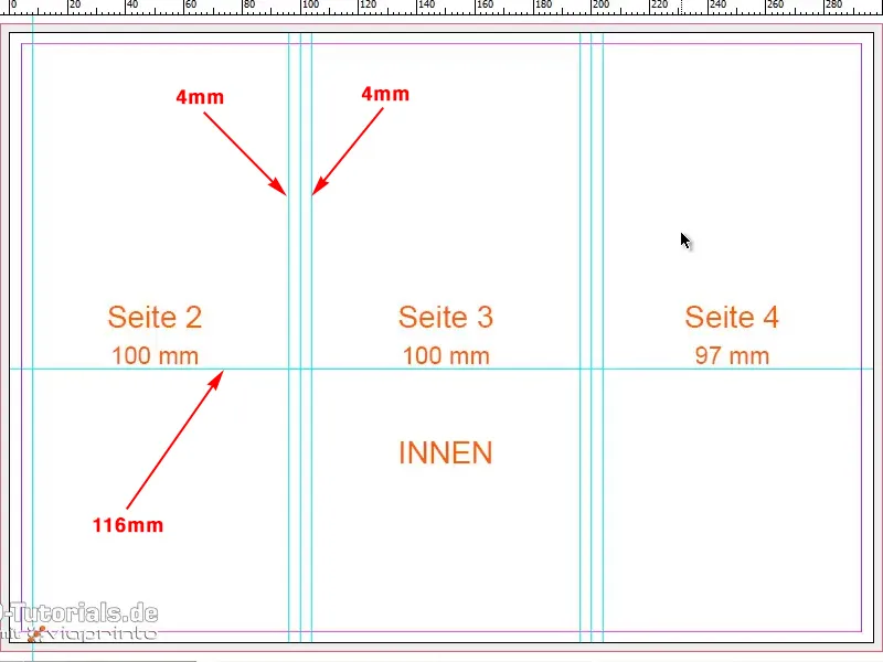
One thing is still missing, there is also an auxiliary line over here at 289mm.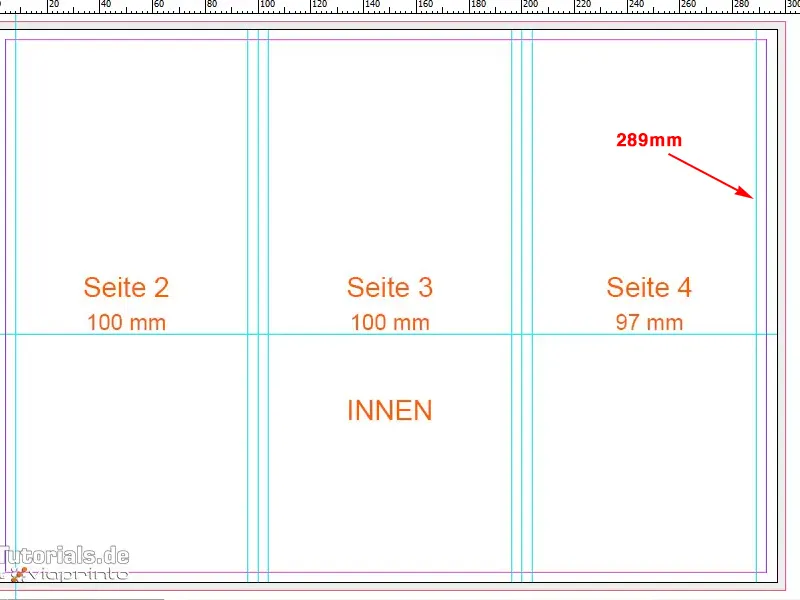
Now we can also start working. You've already seen most of the techniques I'm using for this flyer in the previous minutes, and basically this procedure now also applies to the inner part.
To give the snow-white background a color, I'll draw another rectangular frame, this time for the texture. I use Ctrl+D to select my texture again.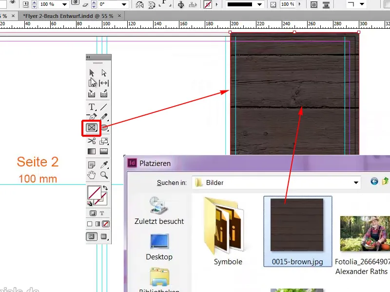
Another frame in which we place our background image in a very large and prominent position, Ctrl+D. With Customize>Fill frame proportionally we adjust the image to the frame.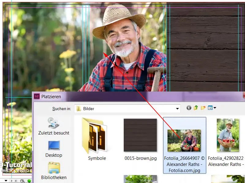
On the left-hand side, we've seen that we have an "About us" box, which I'll conveniently drag from the bleed and fill with white. Of course, we'll also add our transparency; I've opted for 85% at this point.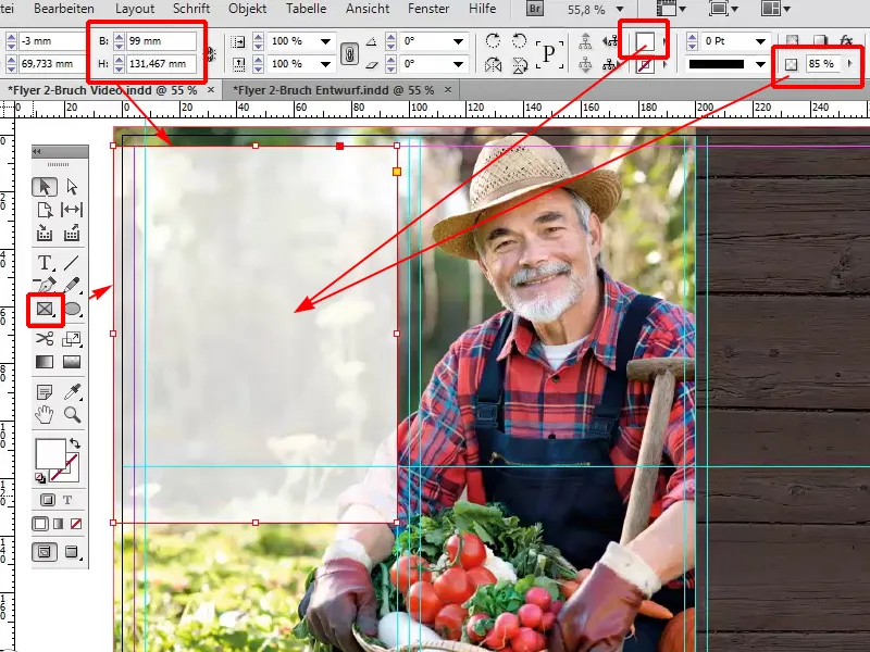
Now we can already observe a very interesting effect, because the background image still comes to the fore. Although we have our "About us" box, which covers exactly the non-essential part of the image, our charming Mr. Lambert is transported from the background to the foreground because this is an absolutely free area. You can really show the courage to use free space when designing. You don't always have to plaster everything over with colorful elements, so we'll leave the middle section exactly as it is.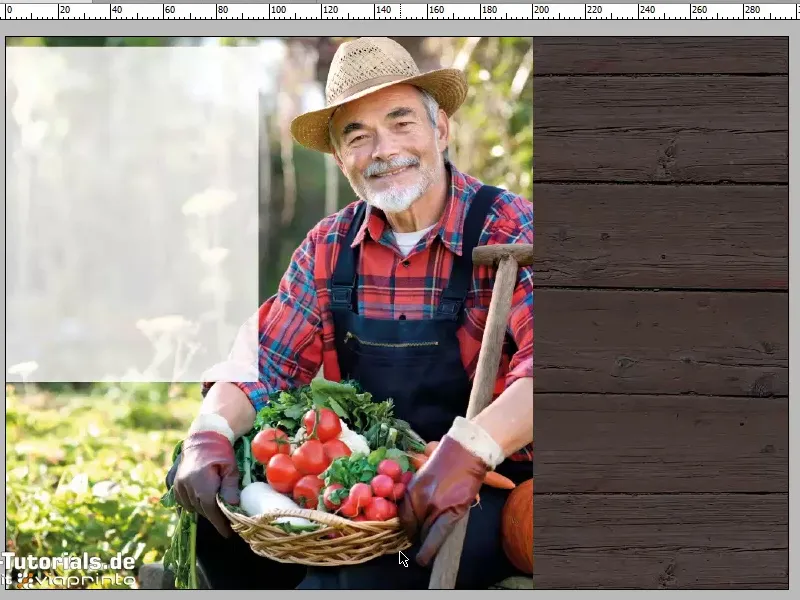
Now we will place a service overview in the lower area and this is also very easy, because we simply take our existing blue box from above, scroll down and drag it into place with Ctrl+V.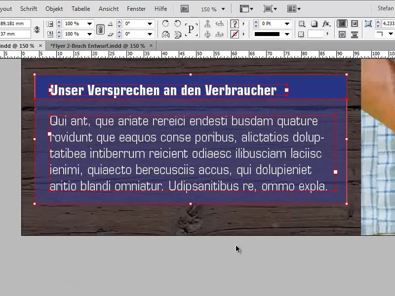
Here we have to be a little careful that we are also flush with the edge, and the size must of course still be adjusted, 44mm to 44mm. With the heading centered, we rename it Benefits. The text is also brought into shape. The font size is reduced to 10 pt and the overset text is simply removed, Edit>Edit in text mode.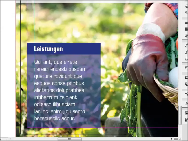
What should not be missing in such a box is a small icon, so I move the heading to the right by holding down the Shift key on the axis. Select the Place dialog with Ctrl+D and choose my checkbox, in this case a PSD file.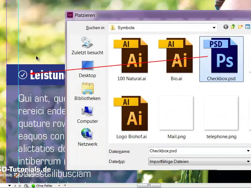
It also makes sense to lock the background image so that I can select the box without any problems. I right-click on the background image and then click on Lock...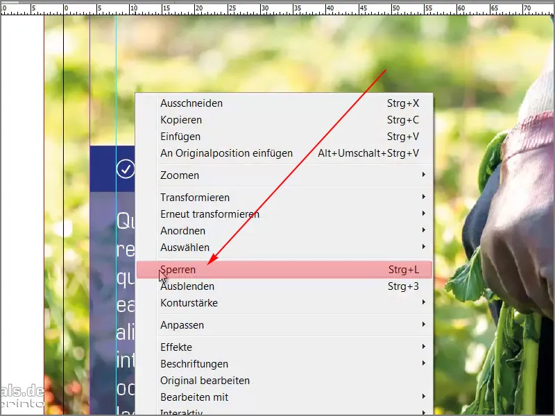
... now select the box and create a copy. We do this again to the right and once more. Here, only the colors are changed: lush green. So that we encounter this core color again.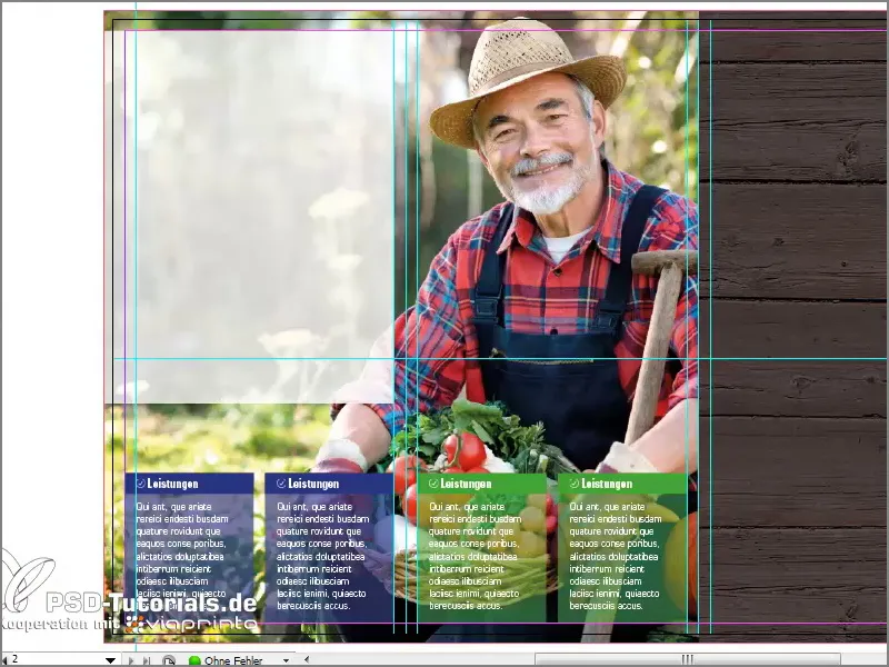
Now comes our description text for our farm. I can easily draw up a text field for this: "About us". We will use the heading in Bold Condensed. Condensed means, by the way, that the font is a little closer together. You can compare this with Medium, where the character width is much wider. But Condensed works very well in our example.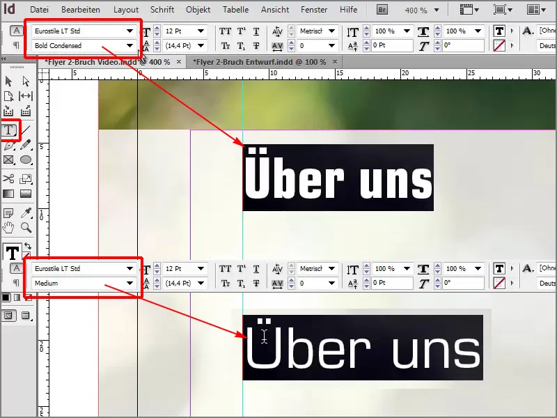
The color is green, the font size is 20 pt, and the text field is reduced in size.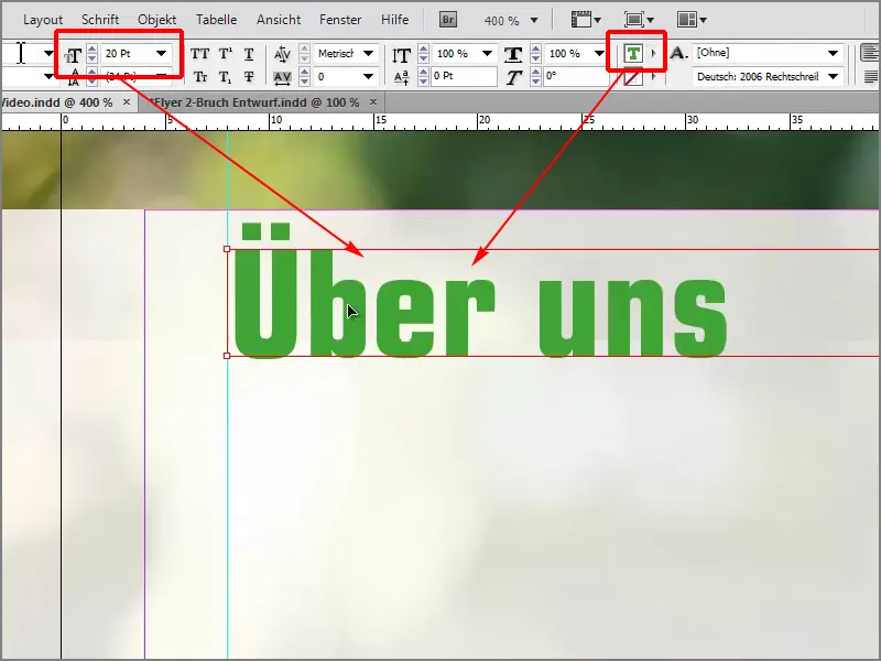
Now I've made it easy for myself for the rest of the text, which I've already copied to my clipboard. I can paste it with Ctrl+V, and what I particularly like is that the text is always nicely aligned throughout the flyer. Even in the boxes at the bottom, which simply makes for a tidy look.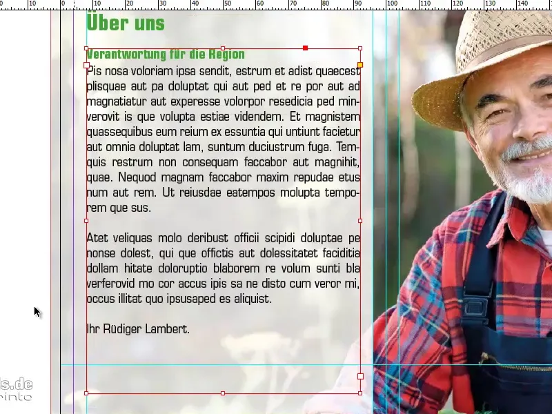
With Ctrl+D I select the 100% Natural logo again and can also place it in this position.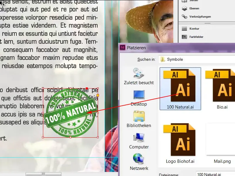
I will now activate a text wrap via Window>Text Wrap.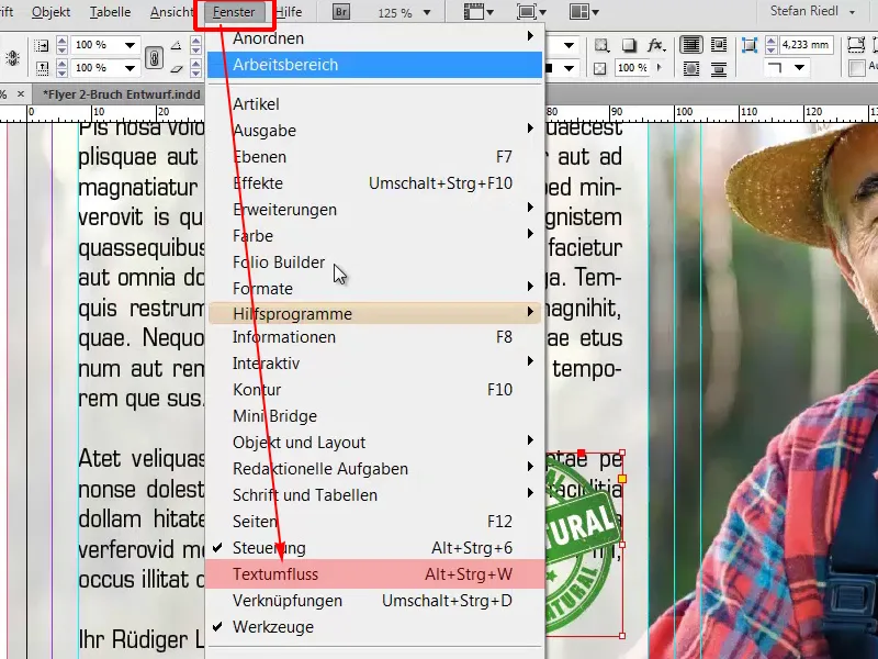
The distance between the logo and the text is still a little too little, but we can also define this precisely without further ado and I think 3mm is definitely a good choice.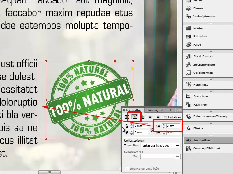
Back in the bird's eye view, we have already finished designing the left-hand side.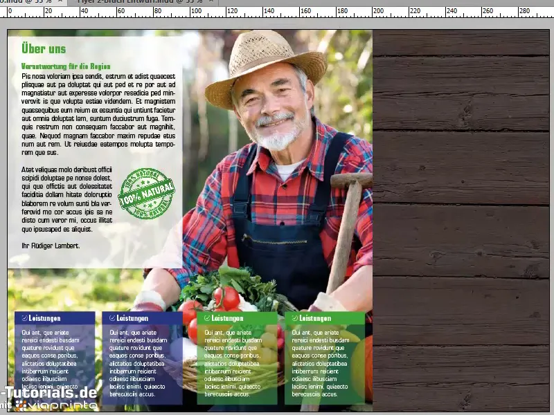
All that's missing now is side four with the wood texture. We continue quickly with our pictures, File>Place. There comes our wine, Adjust>Fill frame proportionally, and at the bottom we will create a colored border, in yellow with a height of 1.5mm.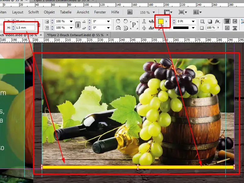
The only thing missing is the text, which I also have in my clipboard, simply copied in. Lock the wood texture in the background, select both with the Alt+Shift key held down , move up to our guide line, change the color to green.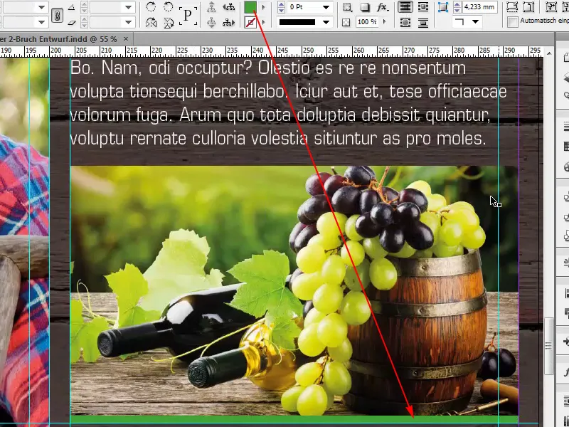
Also change the heading to green, while we write here: "Asparagus from our own cultivation", then of course a picture of the asparagus must also be included.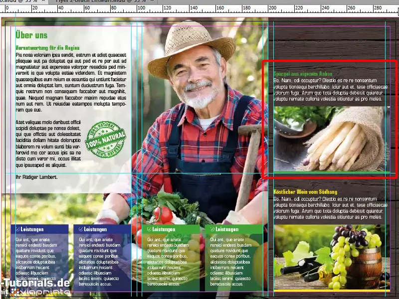
At the top there is a small "Organic" logo, which is also an .ai graphic. Simply draw it on, rotate it a little so that it fits nicely in the corner. Always make sure that the spacing is maintained and the layout is clean.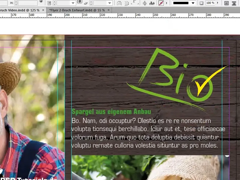
That's it!
Finally, there's just one word left to say: finished. We've done it together, and if you're still wondering how to export it correctly, I'll tell you: Don't despair, ask your print shop, and we'll do that next by visiting viaprinto again.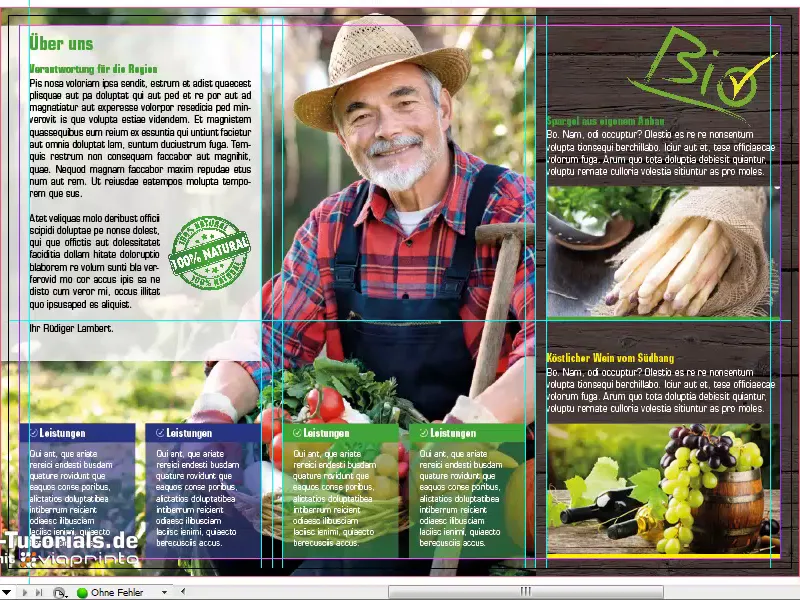
On the website www.viaprinto.de under Help.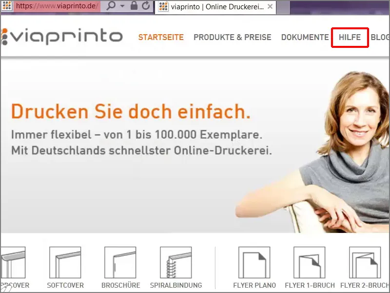
Instructions: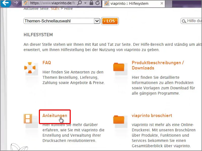
Create source documents: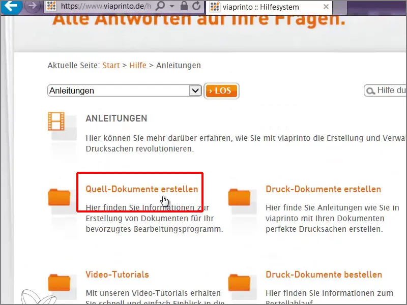
Working with a PC.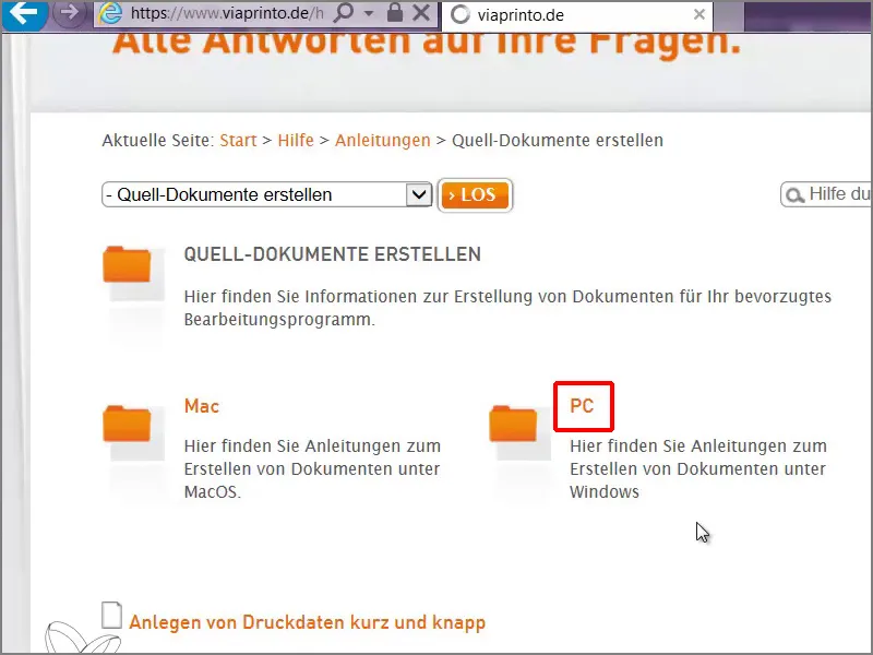
Adobe InDesign for PC: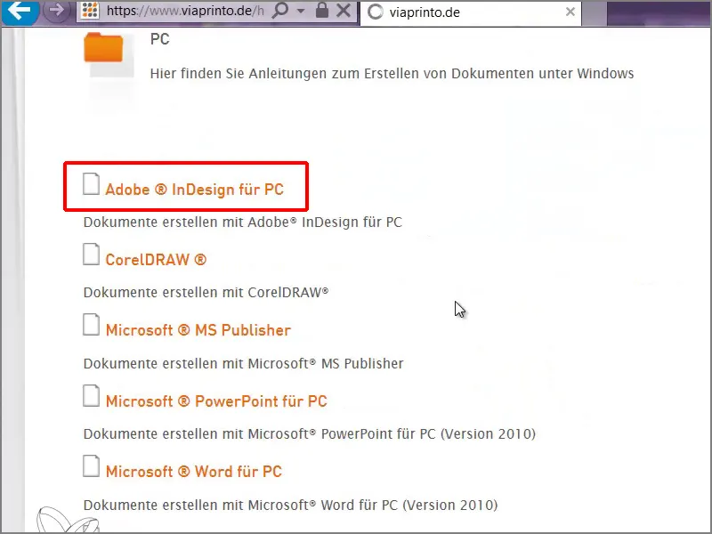
There we get insight into a comprehensive text on what we have to consider when exporting, and if we just scroll down a bit, we come to the help for the export dialog, which we will now tackle together.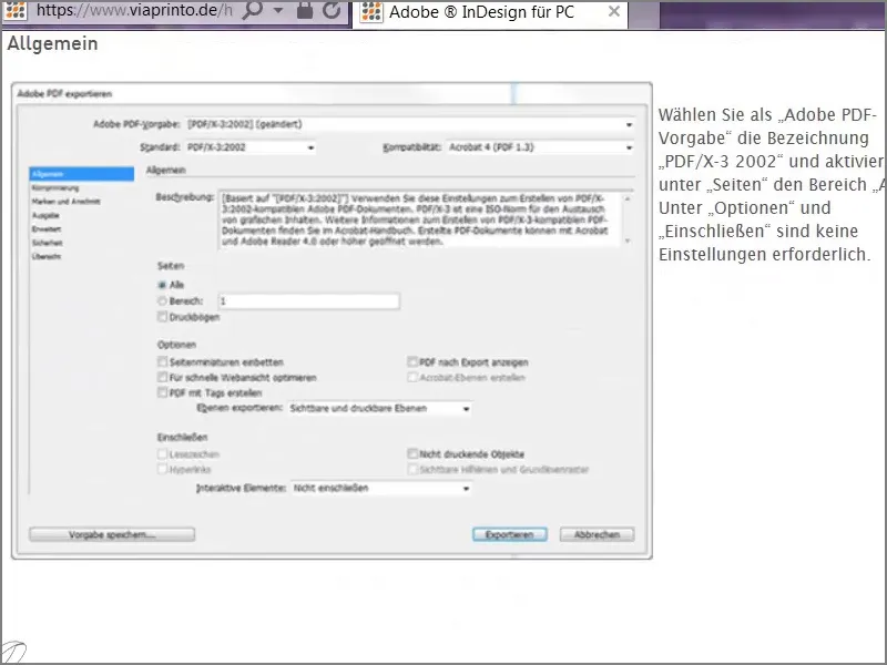
File>Export: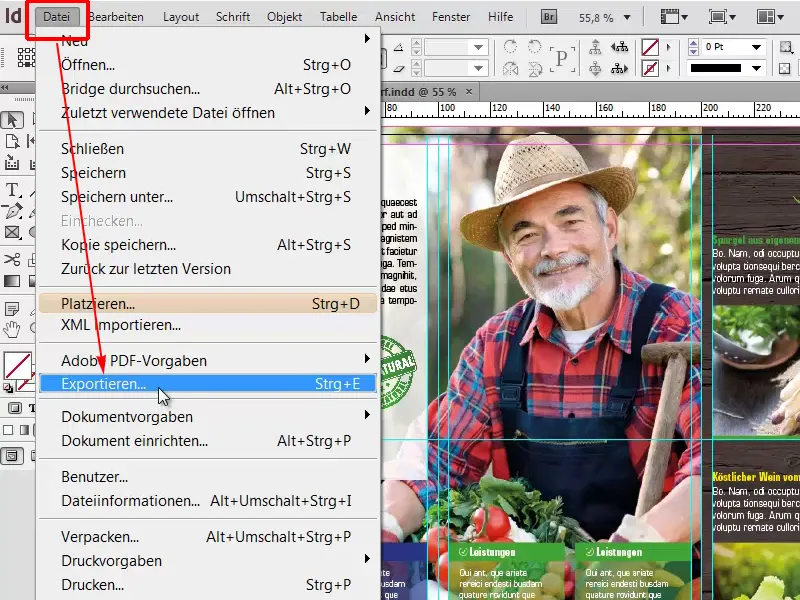
Then I'll go to Save.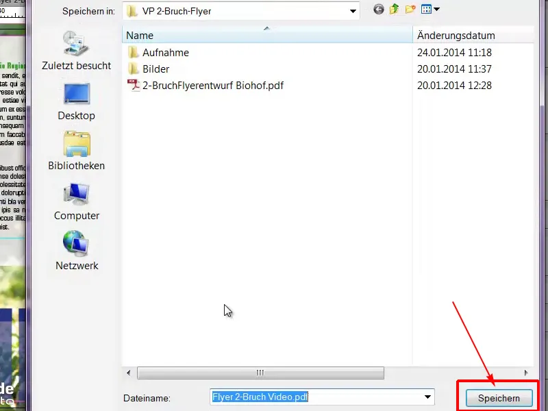
In this dialog, we select the PDF default PDF/X-3:2002, all pages.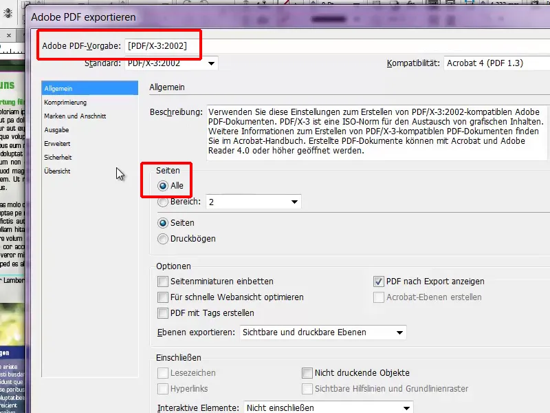
In the compression dialog, we then go to the next step. For Bicubic recalculation we select 356 and one line below 534.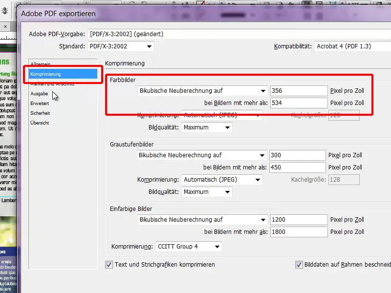
Marks and bleed: Here it is very important to check the box Use document bleed settings. As you remember, we used the viaprinto template, where a 3mm bleed is already preset, which we can simply confirm at this point.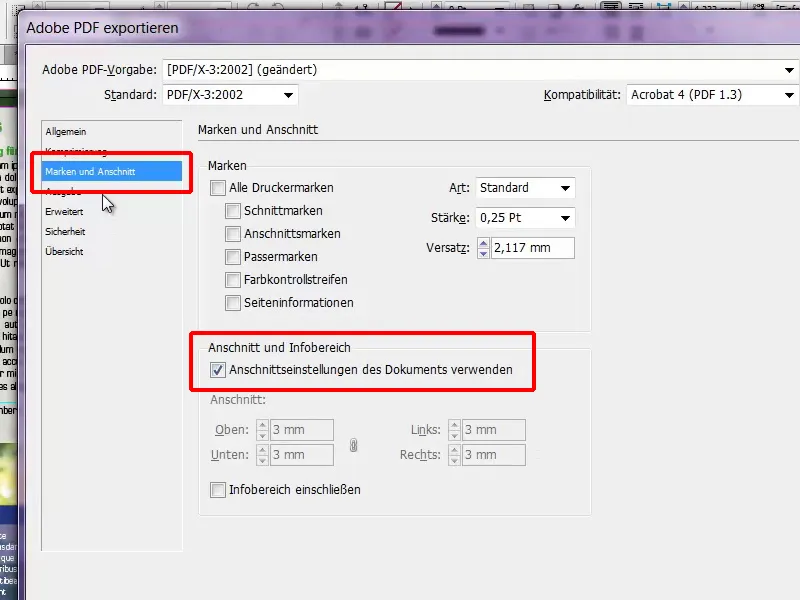
It is now very important to select the correct color space for the output: Convert to target profile (keep values), and ours is the correct working color space, ISO Coated v2 300% (ECI).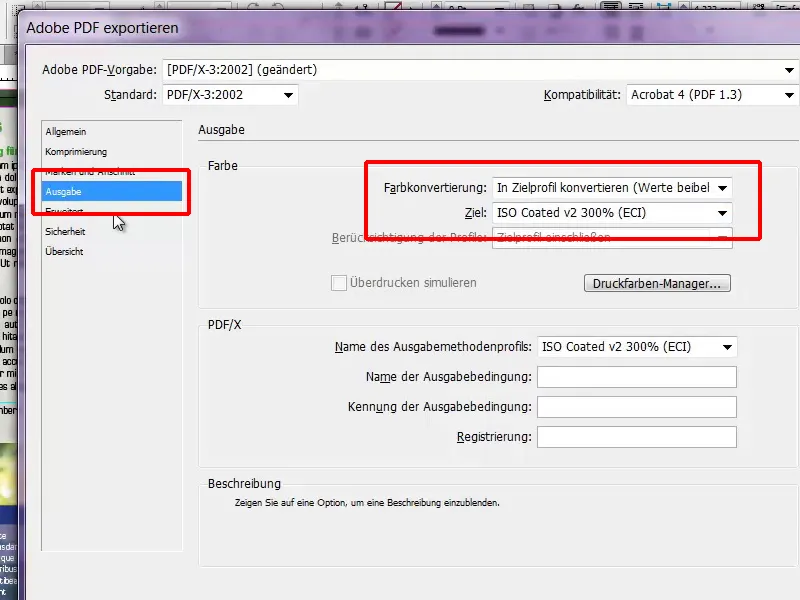
Under Advanced, Default>High resolution must be set and the checkbox Ignore different settings on print sheets below must be activated.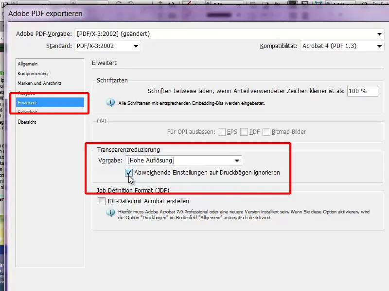
Nothing needs to be set in the Security area and we select the Export button.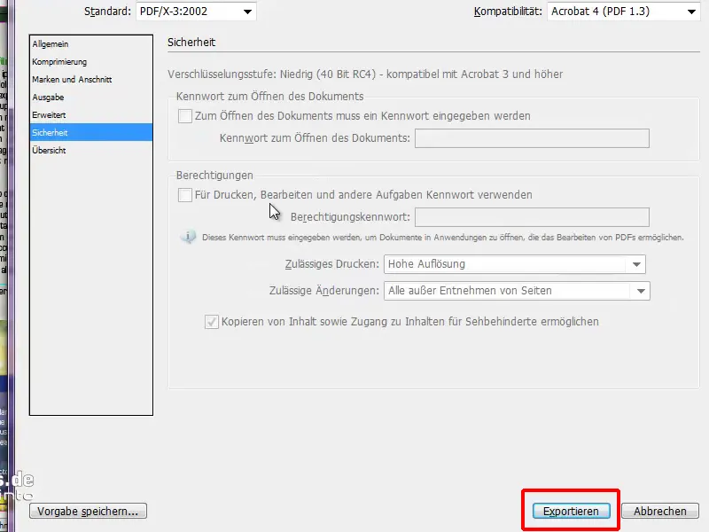
Our PDF file has now been prepared for printing and is ready to be uploaded to viaprinto.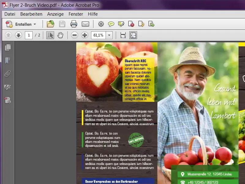
And I want to show you something really great there, so let's visit the website again and check all the settings. The format fits, the grammage is OK, the color, the fold - very important - and then we can click on Upload document.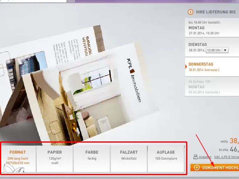
One click on Upload documents...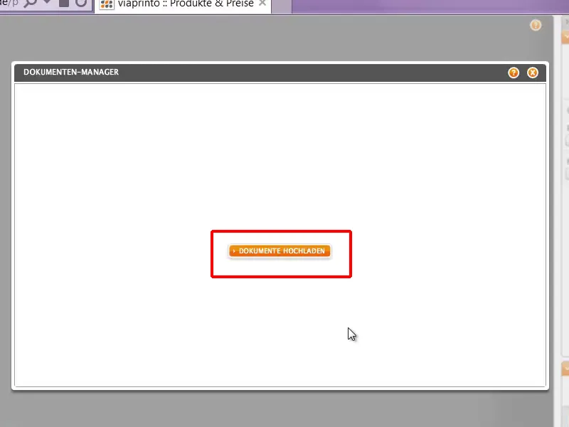
... and I select the Flyer 2-Bruch Video.pdf file that I created for this video training.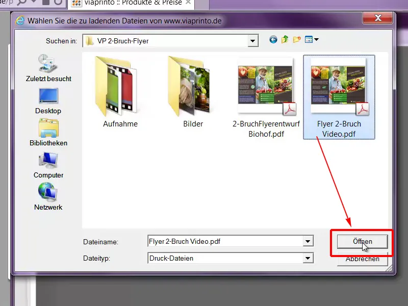
That's pretty quick, and now comes the best part, because we can now virtually click through our flyer here. It's a really great way to check the whole thing again to see if it's really as we imagined it, and I think it definitely is.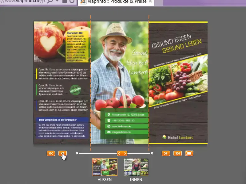
We can now add the flyer to the shopping cart and then it's on to the order.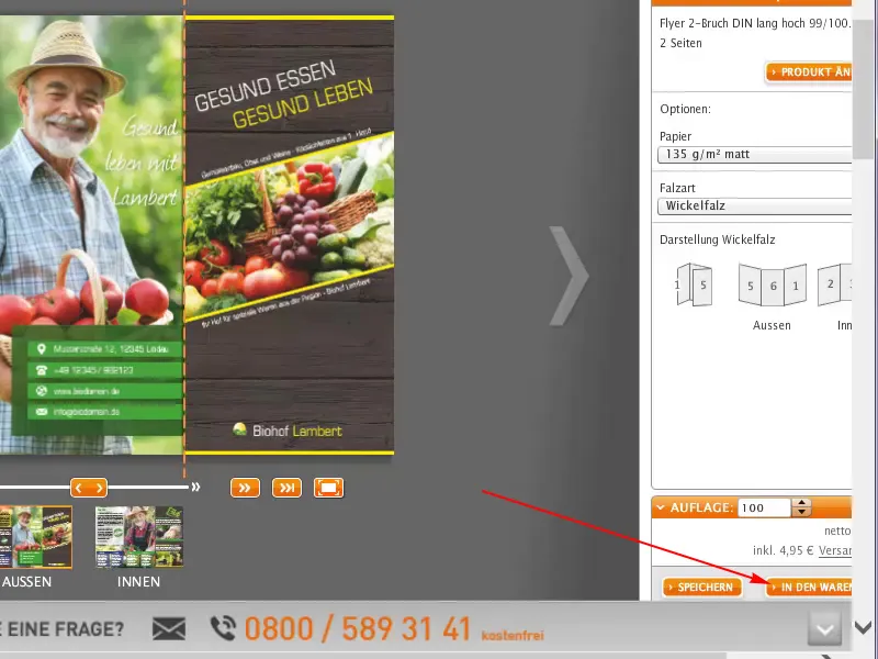
Then we get another overview; log in with your customer account, click on Continue and off we go.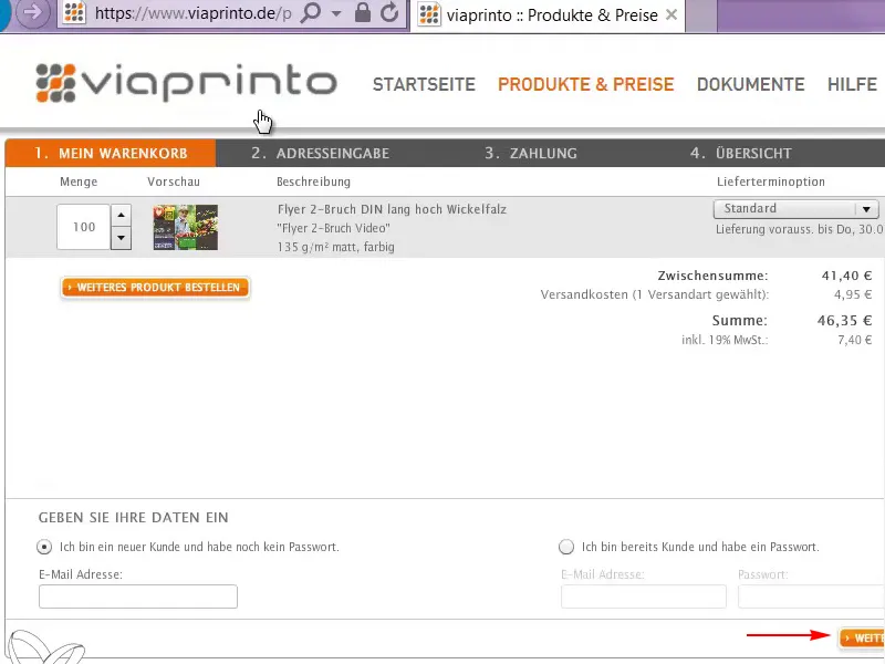
Conclusion
Thank you very much for your interest in designing this flyer and I hope you had fun and learned something new. Perhaps you were able to pick up a tip or two for your private project, and I would like to take this opportunity to bid you a warm farewell.
Your Stefan
