In this training course, we will take on a classic challenge of everyday agency life, but don't worry: it's not the diary of daily madness that I want to write now, it's simply the modern design of a business card for a fictitious architecture firm. And apart from the design process, it's of course also about creating such a business card for an entire company's workforce.
InDesign is a super powerful program and offers numerous automation aids for this, which speeds up the workflow many times over. And it is precisely these automation aids that we make use of - specifically, the merging of data for business cards. This makes it possible to create business cards on a large scale with just one click, whether for 10 people, 20 people, 50, 100 or even a thousand or more - no problem at all.
In the last part of the training, I will then go into how to prepare something like this so that we can send it to our trusted print shop in a compliant manner. In my case, I will refer to viaprinto and explain in detail what is important when exporting: Which settings must be taken into account in any case and how must the final product be prepared so that we can then upload it?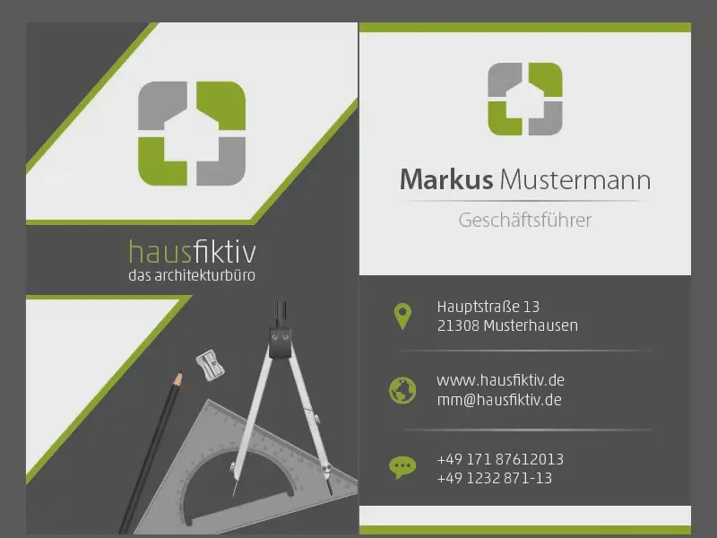
Create document - pay attention to the printer's specifications!
Before we get started, we need to find out what specifications our print shop has in place. We therefore visit the viaprinto website (1). Here we go to the business card (2) and select the portrait format (3). Here we look at the details and templates (4) and open the data sheet (5).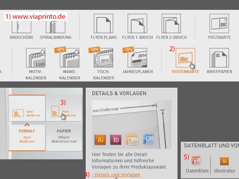
These are the specifications: The final format is 55 mm by 85 mm. In addition, viaprinto requires a bleed of 3 mm, which is the gray-shaded area, a kind of addition to the final product, because in the cutting process this ensures that there are no flashes or other unpleasant surprises waiting for us. Therefore, add 3 mm bleed.
Otherwise, viaprinto draws our attention to the fact that we create design elements in such a way that, as already mentioned, no flashes occur, but also that we keep a safe distance from cut and folded edges, here they want 4 mm. "Allow full-surface images to protrude into the bleed", also in order to avoid flashes. As you can see, speed cameras are not only unwelcome guests on the road, they are also a nuisance in the print area and should be avoided.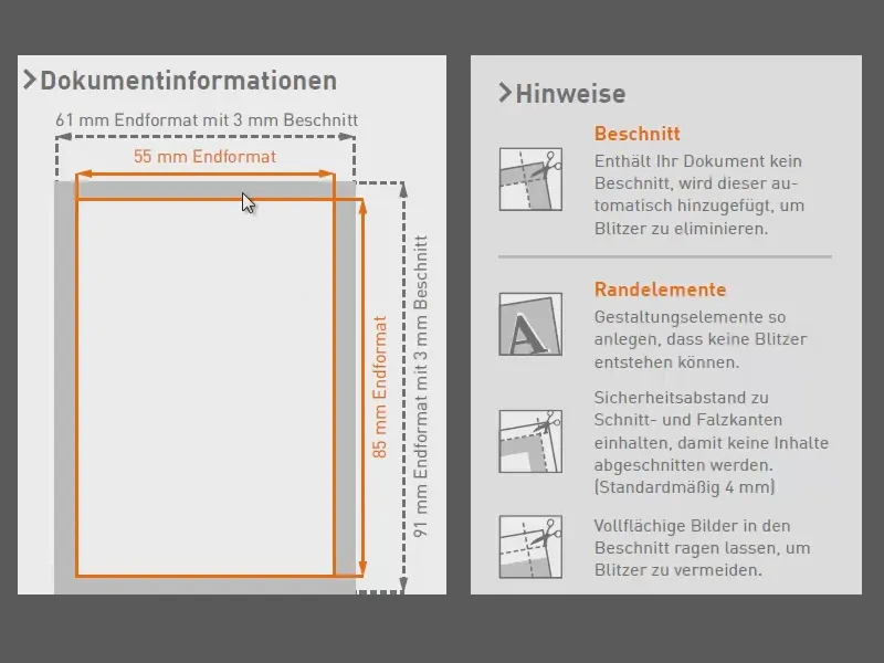
Otherwise, we can take a closer look at the product specifications and we should also take the 300 dpi into account if we want to use images.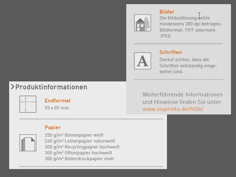
So let's go to InDesign and create the document. File>New>Document... The target medium is intended for printing (1), we don't need a double page (2). We redefine the page format: 55 mm in width and 85 mm in height (3). One column is okay (4). We use the chain symbol to make the margins all the same (5). Here we enter 4 mm at each edge, as suggested by viaprinto. And then we add a 3 mm bleed on all sides (6). You could do it this way now, then everything would be correct in any case, but I would like to show you an alternative way at this point ...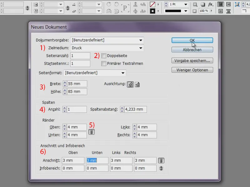
This again leads to the printer's website (1), because there we have the option of downloading such templates very easily. I find this quite practical if you don't want to deal with how, what and where to create them: Just click on InDesign (2), save the file and extract it. I open the IDML file ...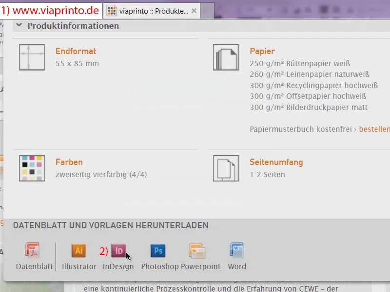
... and lo and behold: viaprinto has taken the trouble to do everything for us. This is also quite practical, because it saves you the whole creation process. Of course, you don't have to delete all the information you see here now - viaprinto has taken it to another level. We can unlock the whole thing and simply show ...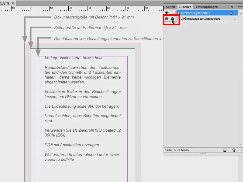
... and hide it. This way we have the specifications at hand again. It's quite practical, I'll leave it that way. And with this blank, the design can begin.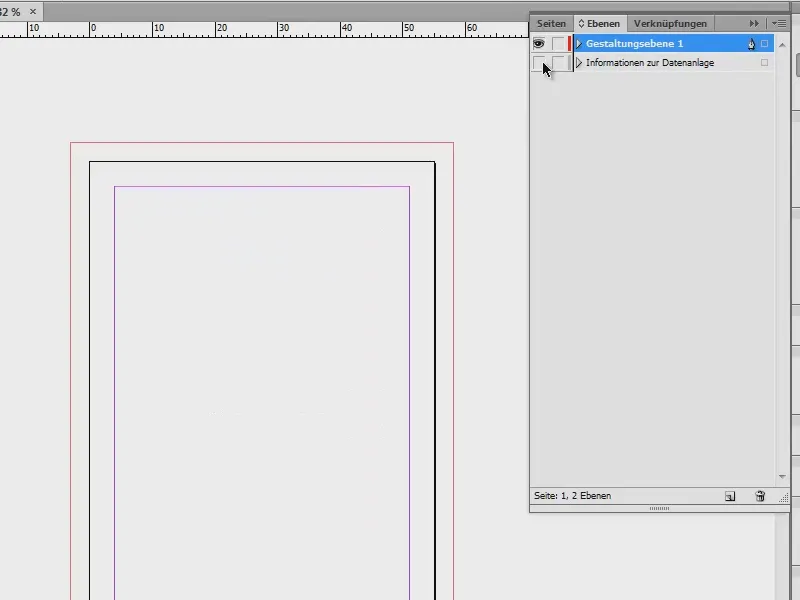
Define colors
Of course, the house colors are a must: To do this, we create three new color fields via the color palette. New color field menu...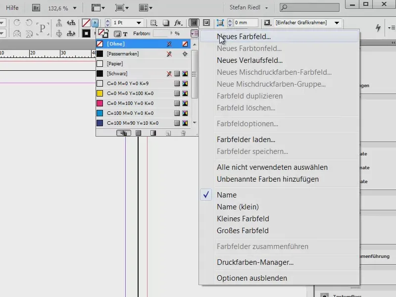
We are working in the CMYK color spacehere because we have prepared the whole thing for printing. First, we define two shades of gray: For black, we go to 85% and add that (1). Then I take a slightly softer gray with 50% black and add that too (2). Next, a juicy apple green: cyan at 53 %, magenta at 5 %, yellow at 100 % and black at 0 % (3). Add. And then we have our colors.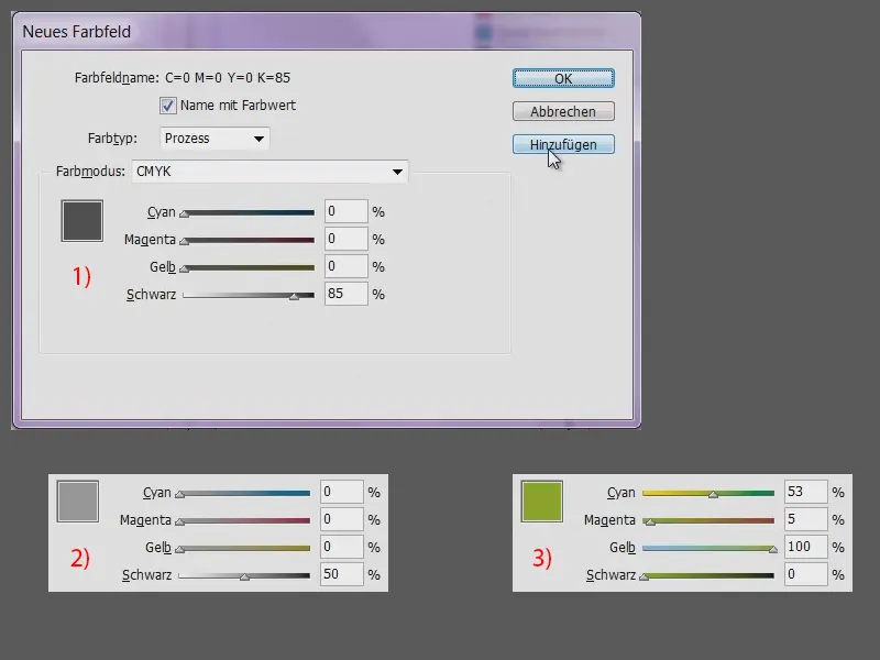
Create guides
Next, it's important that we also work with guides. On the front, I only want to have two guides to help me define the core point or the exact center. To do this, I can place my cursor on the ruler, hold down the mouse button and drag out the guide line (1). I drop it first (2) and here at the top of the menu (3) I define the x-axisexactly to the center by simply entering "55/2". We have now hit the exact center vertically (4).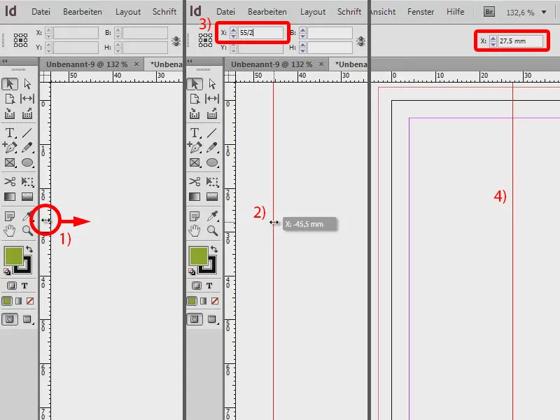
I now do the same horizontally: click on the ruler, drag out an auxiliary line (1) and enter "85/2" for the Y-axis(2).
We now have two auxiliary lines that cross in the center of the page (3).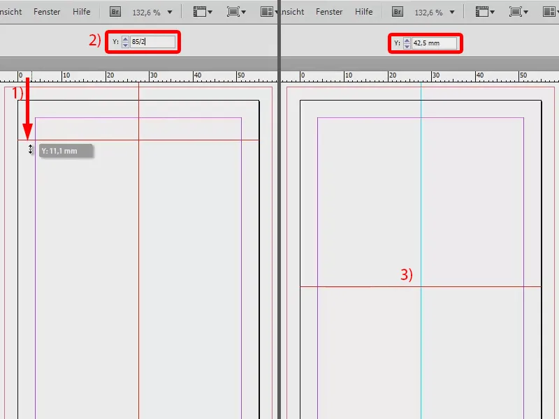
Creating sloping surfaces
Now, of course, we need elements to fill the layout. Let's take another quick look at the design: there are areas with diagonal edges on the front, but also straight areas, the logo ... Let's focus on the areas first.
To do this, I'll zoom out a little - by the way, you can do this with Alt and the mouse wheel, so you can always zoom to the position where the mouse pointer is. I select my rectangular frame tool(1) and draw a large area (2), which I fill with the color anthracite (3).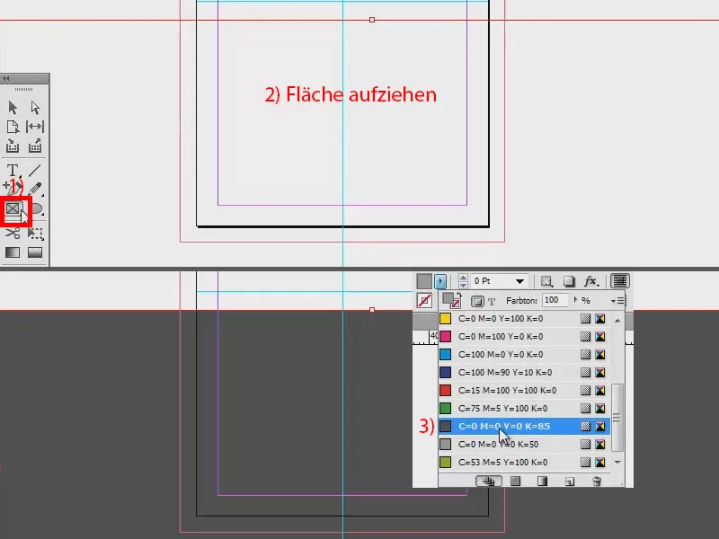
Add an outline in apple green (1) with 3 pt (2).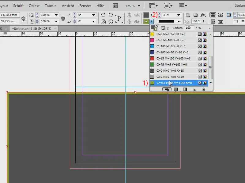
Now we just have to set the whole thing at an angle and you can define an angle of inclination at the top here: 49° (1). Then I'll move it a little more precisely.
If I press W, I also change this view (2) and can also judge it better without seeing the rest, which is not printed at all.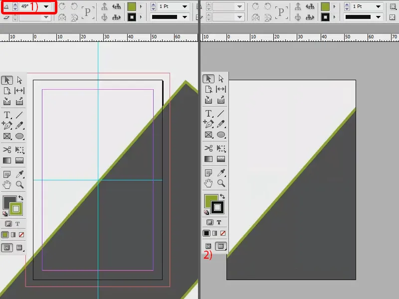
We need the same thing here at the top, so I create a duplicate of it. I select the object and hold down the Alt key. Now I have a double arrow and this double arrow tells me that it will create a copy. Now I hold down the mouse button and drag the object once to the top left-hand corner.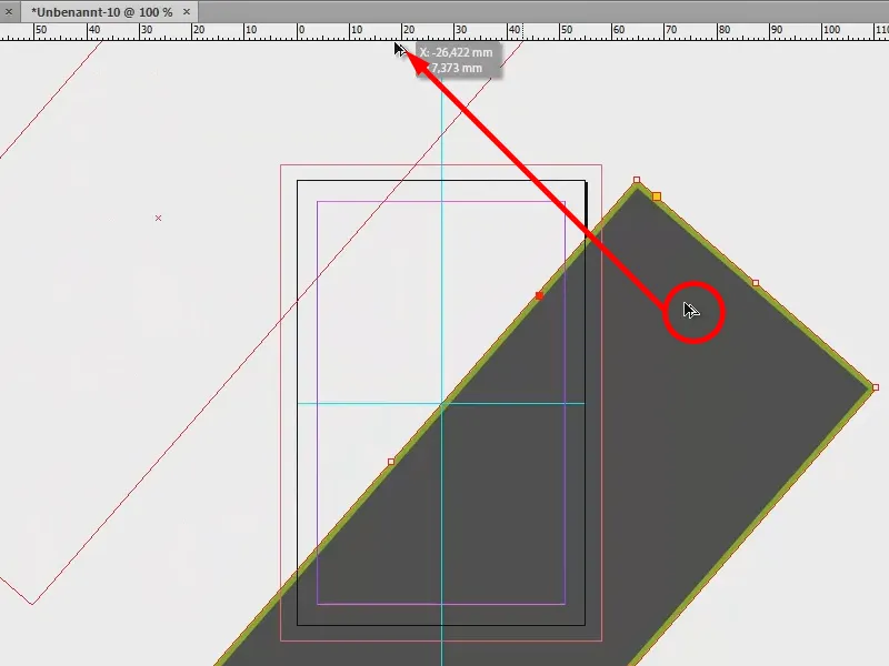
Now we have our beautiful diagonal lines.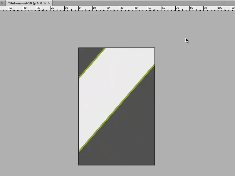
Create a bar
Now let's take a look at the middle bar. To do this, I create another rectangle with the rectangular frame tool(1), drag it to (2) and enter 12 mm for the height (3). Add the color, the dark grey (4). Now we still need an outline, namely the same one that we have for the other areas (5). However, if I now simply apply the outline to the rectangle, we will have the unsightly effect that the outline is broken here (6). We don't want that.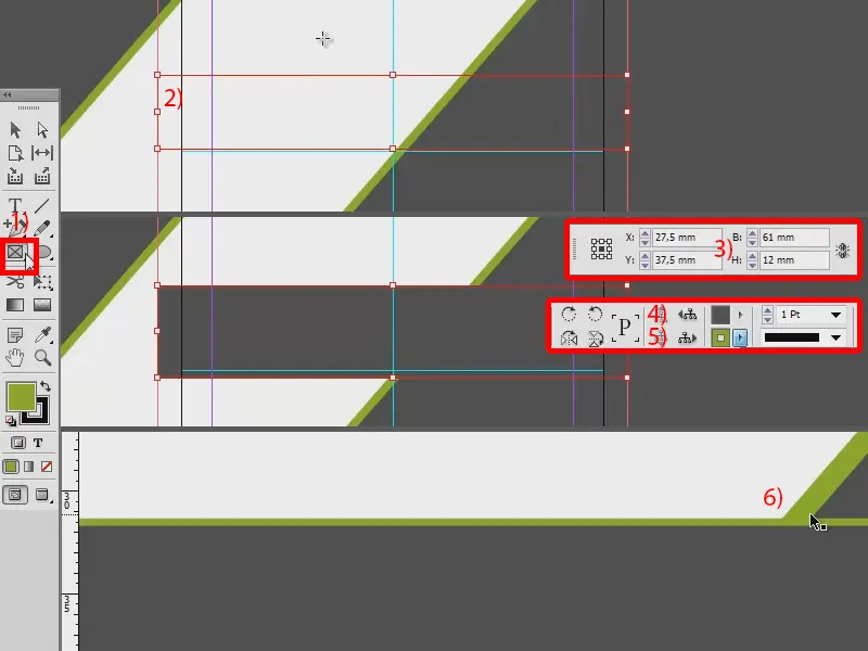
So here's a trick: I remove the outline again (1), copy the rectangle to the clipboard with Ctrl + C and paste it back to the original position (2, Edit>Paste to original position).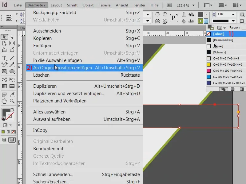
Now we have a duplicate, i.e. the object lies directly on top of each other twice. I can observe this exactly on the layers (1): This is the front rectangle (2), this is the back rectangle (3). And I now change the color to green (4).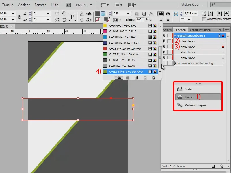
I set the height to 115% (1). The result: It breaks through the triangle again.
But now we have the advantage of being able to change the layer hierarchy again. I select the rectangle at the back and move it to the background (2).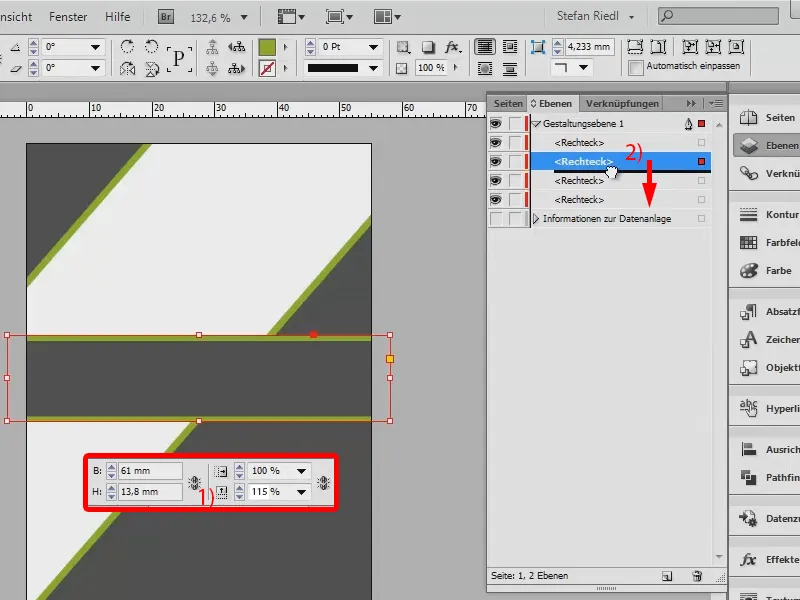
And now we have clean, beautiful edges, just as we had imagined.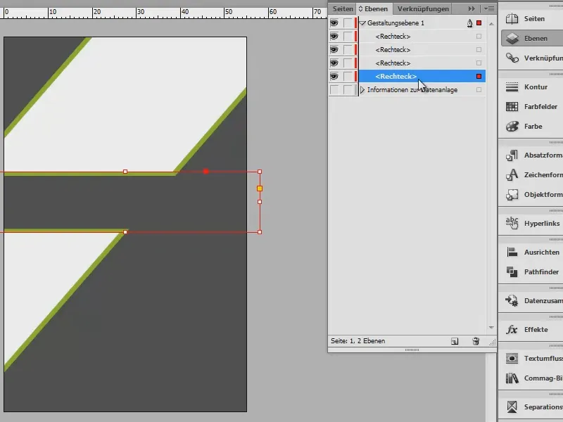
Create logo: Basic elements
Now, of course, we need to give the whole thing an identity. To do this, we create a logo. It's not as difficult as it looks. Here is the design again.
We start with a rectangle (1 and 2). I assign a color to it (3). I use the polygon tool (4) to create a triangle. To do this, click once in the document and the Polygon window opens (5). The number of sides is 3, confirm with OK. Remove the outline and set the color to gray (6). Then set this to left-aligned and drag it to (7).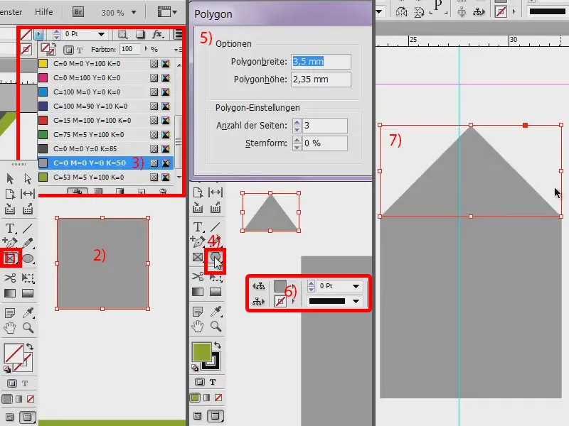
The rectangle is too big for me, so I make the triangle a little narrower (1).
Now the Pathfinder comes into play. It's quite practical when it comes to connecting two objects together completely. I have the Pathfinder here in the palette (2), but you can also find it via Window>Object and Layout>Pathfinder.
I select both objects (3). And now I click on this symbol (4) in the pathfinder, which indicates that both objects should merge into one sum, which is basically an addition of both elements. Our house is already finished (5). I'll move it to the side for now.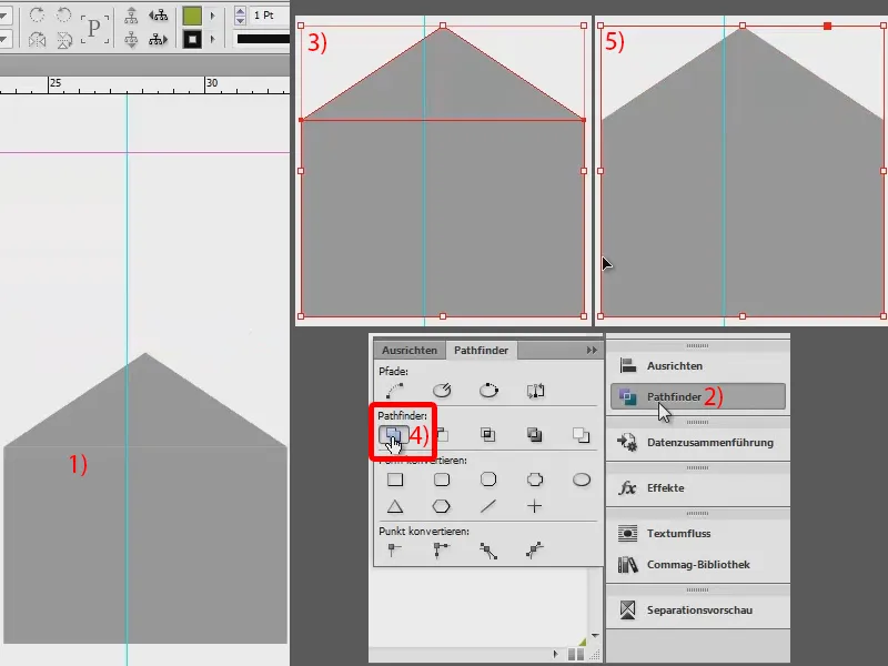
And now let's create the background. To do this, I use the rectangular frame tool(1) to draw a rectangle (2), also holding down the Shift key, so that the edge lengths are identical. I give the rectangle the color green (3). I create a duplicate of this (4) and then a duplicate of both (5).
And to this "Windows window" (6), as it almost looks, I now assign corner options (Object>Corner options...). We are now at the top left of the rectangle (7). Make sure that the chain symbol is deactivated (8). Here we simply select a rounded corner (9) and it is already there (10).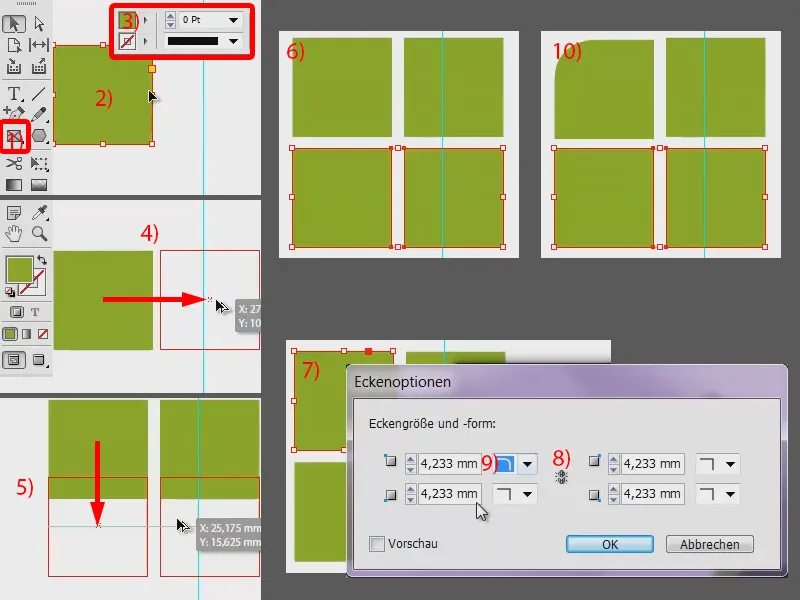
We do the same at the top right (1), bottom right (2) and bottom left (not shown in the picture).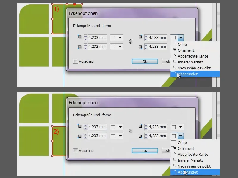
This gives us the four rounded rectangles (1). They can be a little larger (2). I align the rectangles in the middle with the blue auxiliary line (2). The house is placed on top (2) and in the foreground (3 and 4).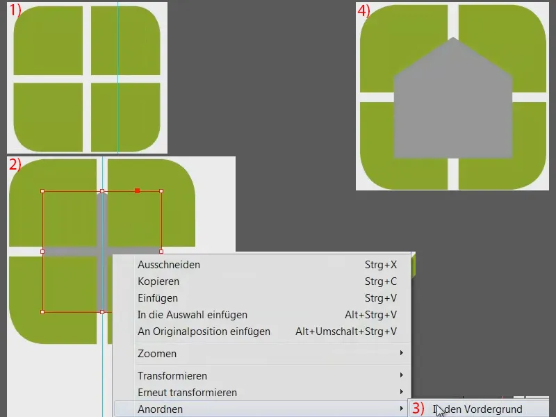
Create logo: Using Pathfinder
Now we cut the whole thing up. To do this, we need the Pathfinder again and we need to start combining individual groups once more, namely: top left and bottom right (mark as in 1) should merge into one unit using the Pathfinder (2). Similarly, top right and bottom left (select as in 3 and then press 2).
If you move this now, you can see that it has become a separate object (4) and also this (5). With Ctrl + Z I move everything back to the correct position.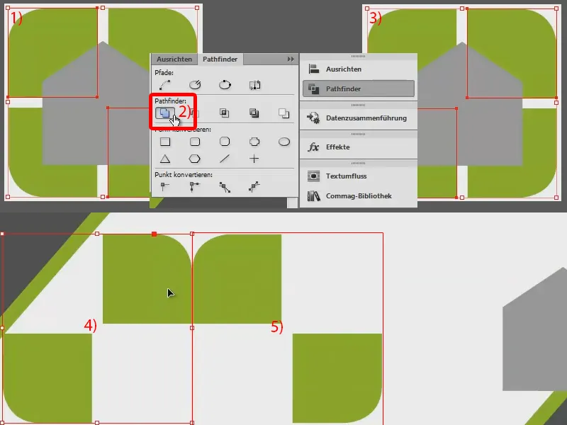
And why two background elements now? This is because we want to use two different colors: Top left and bottom right should appear in a soft gray (1). The other two will remain green. I'll change the color of the house (2), otherwise it will be a bit confusing.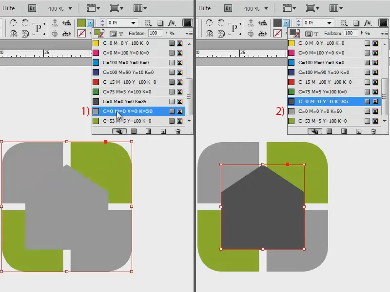
I select both objects in the background and group them together. This makes them a closed unit, only the house is still separate.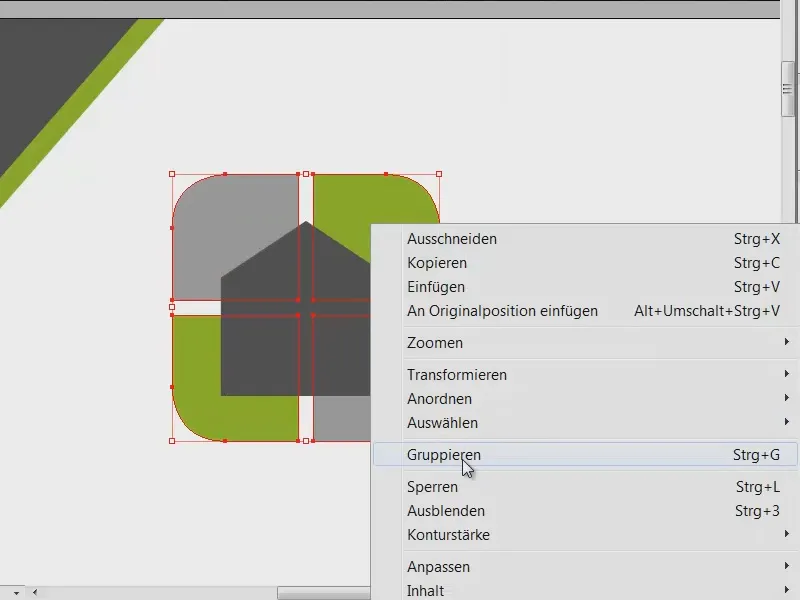
And now we align it in the middle: Select both objects with Shift (1), then click on Align and center with these two buttons (2). The house was already almost centered, but now I want it to be a little smaller. So: Ctrl + Shift + Alt shrinks the whole thing aligned to the center point when I drag it smaller in the corner (3).
I create a copy of this: Ctrl + C, then Edit>Paste to original position (4). Now we have two houses.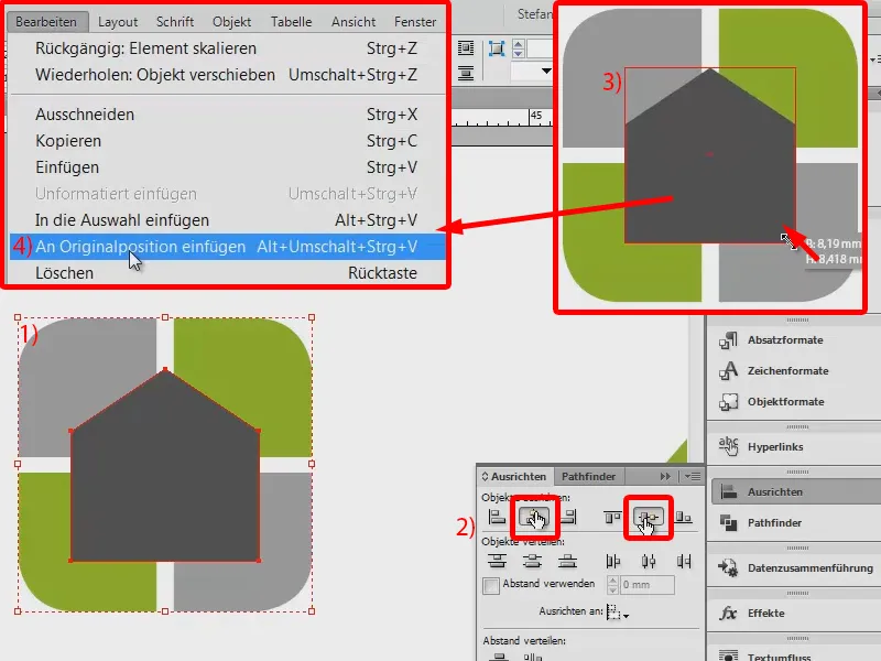
I save the group once again (1), because now I can simply drag the house from the green area using the Pathfinder (select the house and green areas, then press 2).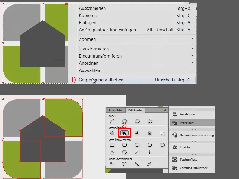
And I can subtract the house below from the gray area (1). Now we have our beautiful logo as we imagined it (2). I mark the whole thing again and combine it as a group (3).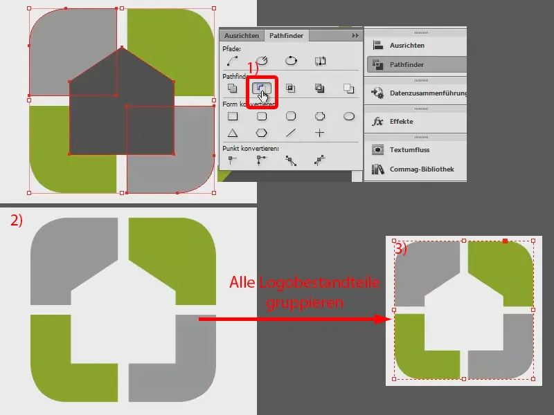
That's what it all looks like. And we now have the logo as a group and can duplicate, scale or copy it as required.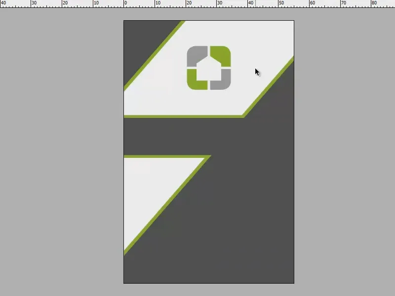
Add text
Now let's give the child a name. To do this, I simply draw up a text field, nice and large. I use the Akko Rounded Pro font and write: "hausfiktiv das architekturbüro". The proper name is displayed in a nice size, namely at 15 pt. and the text below at 7.3 pt. I deliberately chose this so that the second line is roughly the same width as the first line.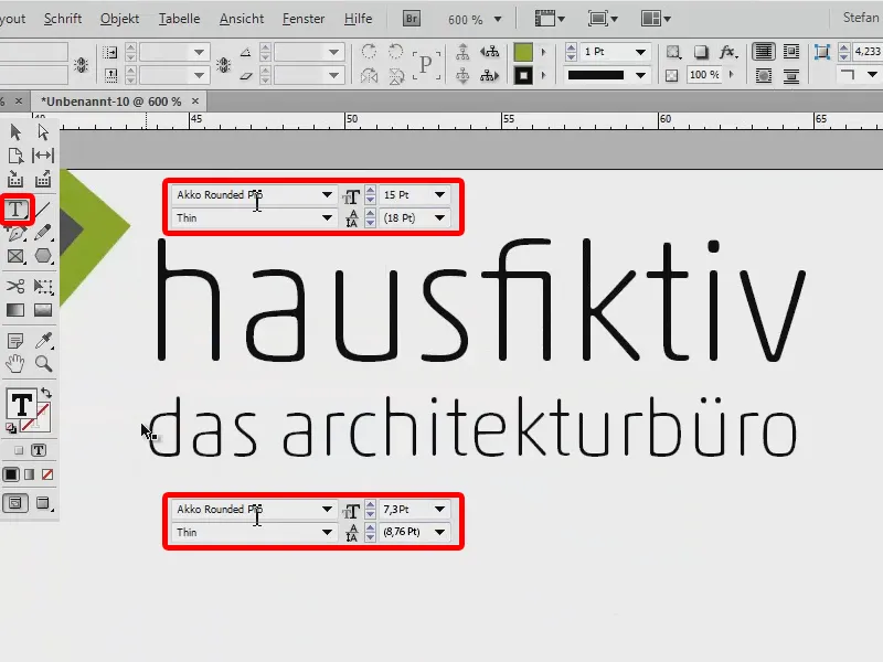
I'll move the whole thing down here. In this example, I am aligning myself with the blue line (1). Double-click on the handle at the bottom here (2) to transform it to the correct size. I select the text with Ctrl + A and center it (3).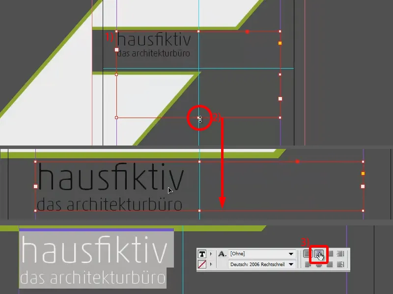
Now I align the whole thing in the middle: I have selected my text field (1) and the bar behind it (2). I can use Align to place it nicely in the middle (3). And now I just set the "house" in a lush green and the rest in a bright snow-white (4).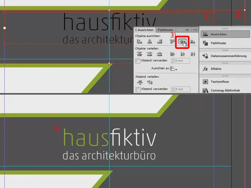
Placing the graphics
This is what the result looks like at the moment. Finally, all that's missing are our illustrative elements. Via File>Place...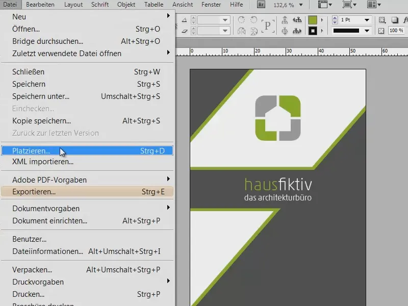
... I select the graphics: The "pencil", the "sharpener", the "ruler" and the "compass" (1). I now have all the elements in the loaded mouse pointer. I use the arrow keys to switch through the elements (2).
I place the ruler at the bottom, the sharpener above it, the pencil next to it and the compass in this position. I trim the pencil a little. Incidentally, these are all vector files, so you can scale them as you wish. This completes the first page (3). Let's save the whole thing for now.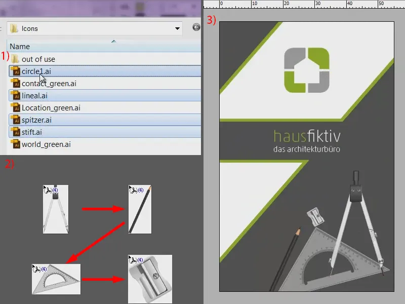
Creating the back
Now let's get to work on the reverse side. viaprinto has already created a second page for this too. We'll work with this in the next step.
I'll create guidelines again. A little more here, because on the front page we wanted the extroverted dynamics to emphasize the appearance somewhere, but on the second page we'll be a little more static, as we have a lot of text. So let's go to Layout>Create Guides... (1). I want eleven guidelines with a column spacing of 0 mm (2). You can already see this in the background if you have activated the preview function(3). Confirm (4). We can now use this as a guide.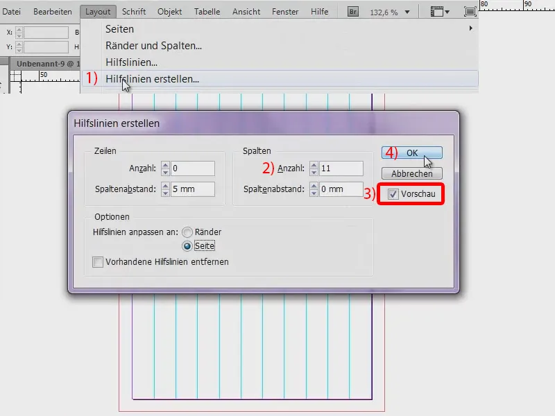
Here is the template that we want to recreate.
We start with the large green bars at the top and bottom. To do this, I'll simply use the rectangular frame toolagain (1), place it at the top of the bleed edge, draw a rectangle (2) and fill it with the color green (3). Using Alt and Shift, I drag a duplicate of it to the bottom edge (4).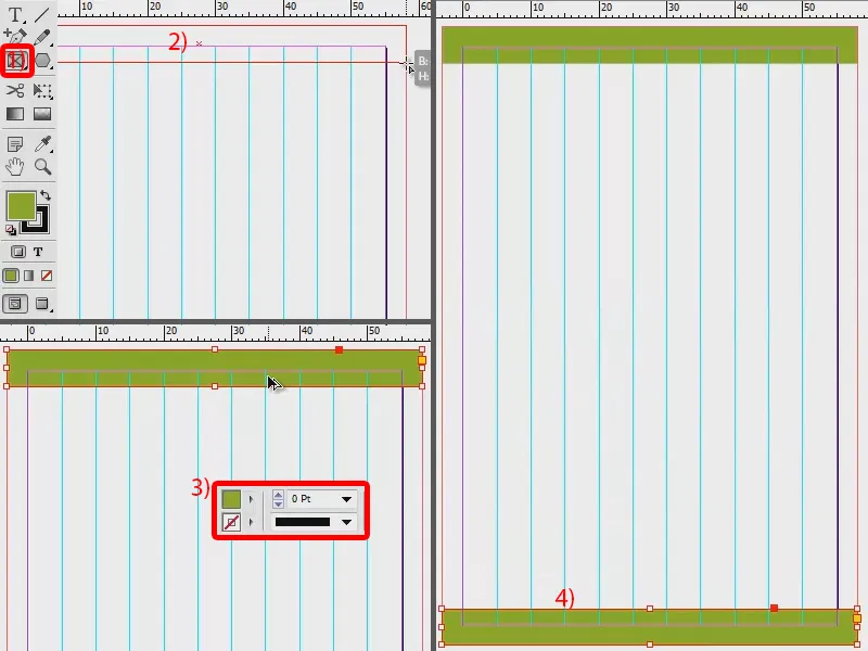
Next, of course, we need our dark gray box, which I draw by hand. Dip it in paint once and that's it (1).
Let's steal the logo from the first page. Ctrl + C, and then paste it on page two (Edit>Paste to original position). I scale it a little larger so that we can use the guidelines as a guide (2). I align the top edge to 5 mm (3).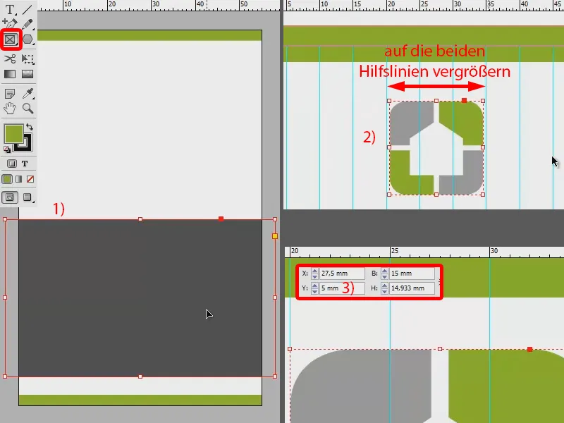
With the name, we're getting pretty close to the final result. I draw up a text field and change the font to Myriad Pro, as Akko Rounded Pro was only used for the proper name and Myriad Pro is intended for the correspondence. I center the "Markus Mustermann" and increase the font size to 14 pt. I set the first name in Semibold and the last name in Light. I set the line spacing to 18 pt. And in the next line, I set the "Managing Director" in 10 pt.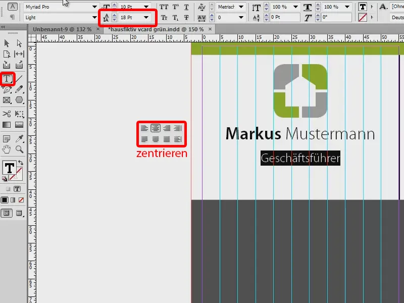
Then there is also a small color highlight here. The "Managing Director" is light gray. I set the name in dark gray.
I continue with the remaining address data, which is still planned. I'll do this in quick succession, because I've already prepared everything in my library. I don't want to bore you with how I create this thing. It's basically nothing more than text fields and a few pictograms. You can do that on your own in any case. Once it's centered, the thing is already in place.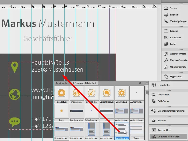
In our template, we still have these delicate lines, which then really flare out to the left and right towards the end. Let's recreate that now: We take the line drawing tool (1) and hold down the Shift keywhile drawing the line, creating a straight line (2). I set the thickness to 0.6 pt (3). We don't need any color, it's all about the outline, which we will apply to the soft gray (4).
And now watch out: We call up the Effects palette(5) and apply a Soft gradient edge (6). The only thing we need to change here is that we change the type to Radial (7). Confirm.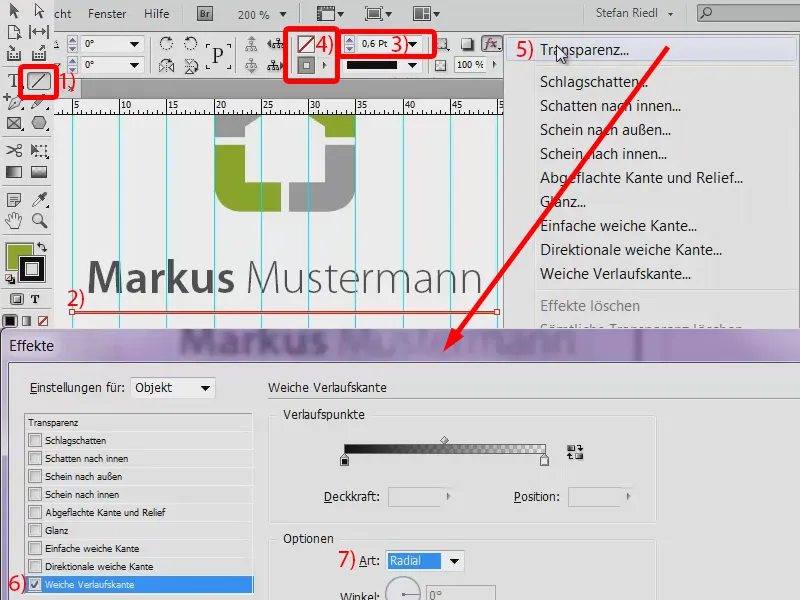
And now we have the effect. I make a copy of the line by holding down the Alt and Shift keysand move it down to the position. And then make a second copy further down.
And now we're done with this page and our two pages are created.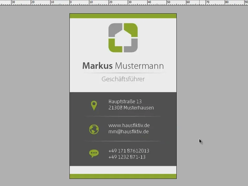
Merging data
How do we now ensure that we don't always have to create new business cards for a workforce of ten people, but can simply let InDesign do it with one click?
It's actually not that tricky. The only thing you need is a TXT file with all the employee master data. I have it here (1): There are various employees with a surname and first name, a function, street, zip code, city, e-mail and extension. The only thing that is special here is that the words are separated from each other with tab stops and then simply listed consecutively downwards.
In InDesign, I now use the data merge (2). If it doesn't appear on the right-hand side of the page, you can easily open it via Window>Utilities. And there we can then select the data source (3 and 4): "Employee master data sheet hausfiktiv.txt" (5).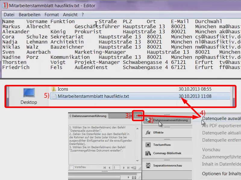
Now it recognizes: The first line is the source line and from there it takes all the designations (1), "Last name", "First name", "Street" and so on.
Now we have to do the following: We mark the "Mustermann" and store the tag "Name" here. And for "Markus" we enter the tag "First name".
That's a bit big now, it shows us an overset text. For demonstration purposes, I'll set the text to 13 pt, so it fits nicely in one line (2).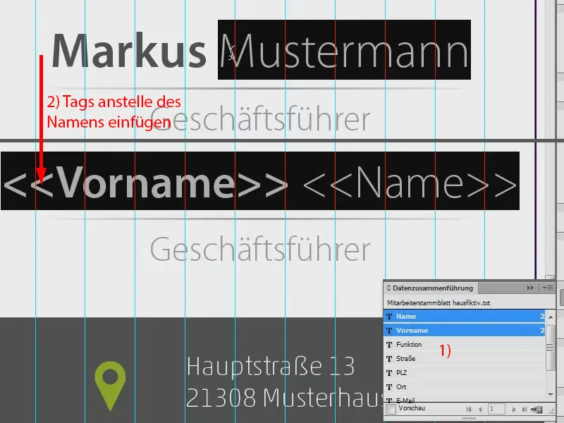
We also get the "Managing Director". This is the "function". And so it goes on with the street, zip code and city. The website remains the same, we swap the e-mail with the "e-mail" tag. For the telephone number, we only add the extension at the end. We have now added everything relevant.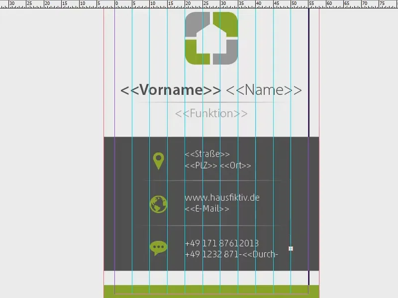
So we have entered all the tags. Now we can start merging the data. To do this, I click once on the data merge (1) and select Create merged document (2 and 3).
Then there is a nice dialog box (4) in which you can say what should happen in case of overset etcetera. I simply confirm the whole thing (5) and InDesign rattles through. Here I am told (6): "No overset text was created when the data records were merged." I confirm this.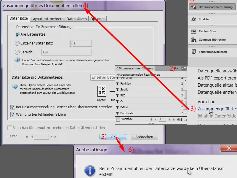
We can now see what InDesign has done via the page view: It has created the business cards for all our employees. We can have a look through: "Albrecht Markus", the managing director. "ma" is his abbreviation for the e-mail address and he has the extension number "11".
Let's have a look at the others. Okay, I think the only thing I've done wrong here is that the name is now the other way around, but that's no big deal, because you've probably understood the principle that you can create everything quickly with just a few clicks. That's how I wanted it.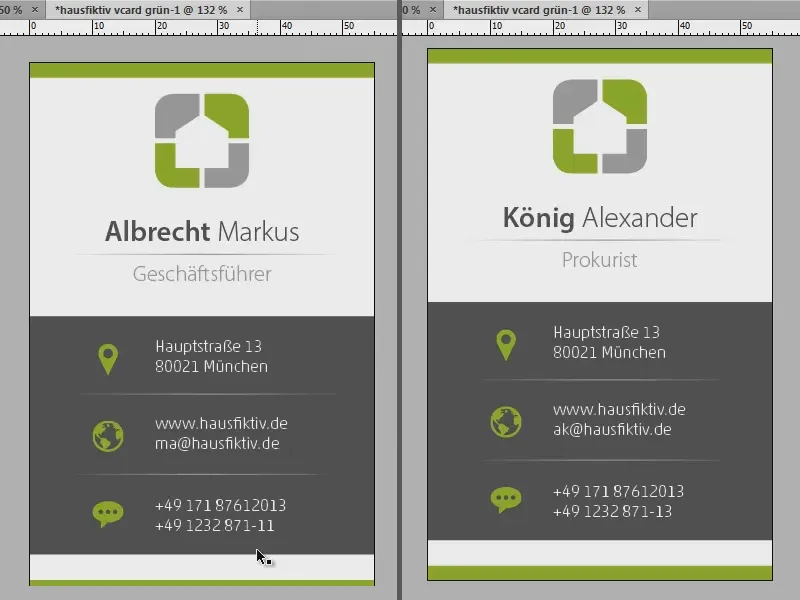
Preparing for the print shop (exporting and splitting)
How do we now have to prepare the whole thing so that viaprinto can also process it? There are a few little things you have to pay attention to. The devil is in the detail here too. So let's go back to the viaprinto website and take a look at the help section:
Under Instructions (1), then Create source documents (2) and then PC (3, or perhaps 4 for the Mac) you will find the item Adobe InDesgin for PC (5). Here we can see all the provisions we need to take into account, from creation to export (6). And what is so beautifully illustrated here, I will implement step by step.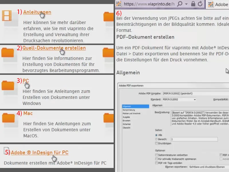
In InDesign, I first open the export dialog (File>Export...). I call this "vcard.pdf" and save it in a new folder "Export". This opens the export dialog ...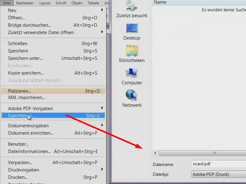
The print shop viaprinto has now written that they would like PDF/X-3:2002. I set this under Standard. We still don't have to do anything in General.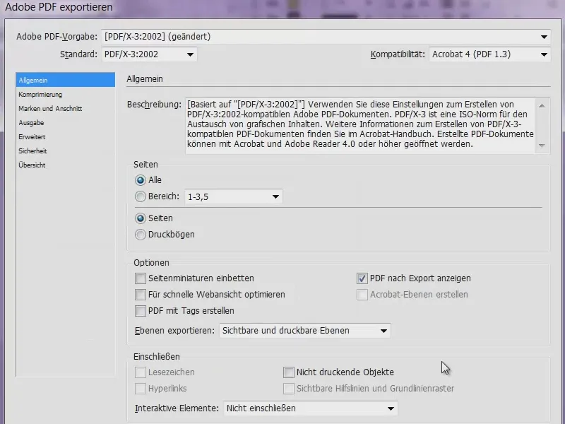
In Compression, viaprinto says that we should set the bicubic recalculation to the values 356 and 534. Then we should specify Automatic (JPEG).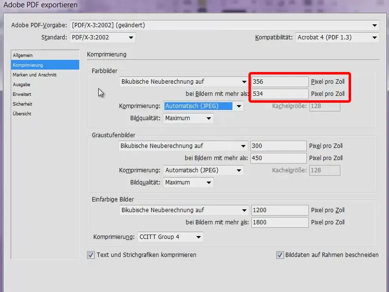
In Marks and Bleed we have to specify that we want to use the bleed settings of the document. We have already entered 3 mm there and we will now display this when exporting.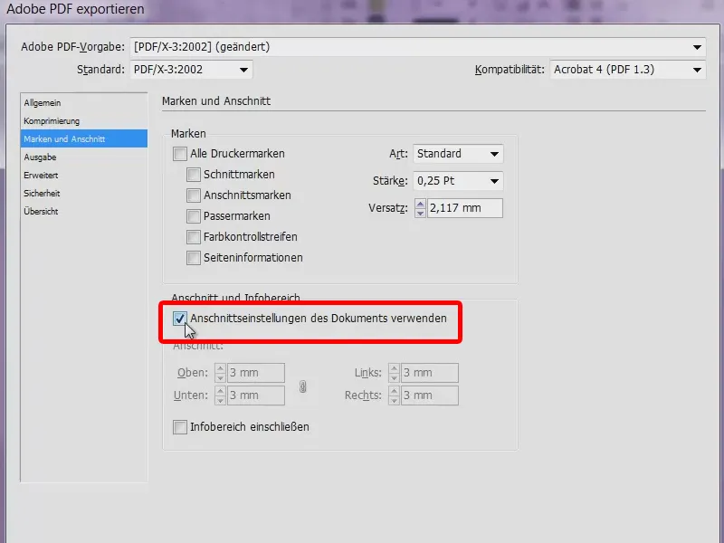
It is very important that you make the right choice in the output, because you have to take a few things into account here so that it is actually converted to the correct target color space. Viaprinto suggests at this point: Convert to target profile (keep values). ISO Coated v2 300% (ECI) is required as the target. In this case, "Coated" stands for coated paper. This is virtually the opposite of uncoated paper, which you may know from newspapers, which has such coarse pores.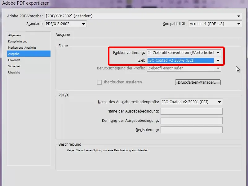
Then we just have to go to the Advanced tab, select [High resolution] for transparency reduction and activate the checkbox for Ignore different settings on printed sheets. That's actually all there is to it. Let's start with the export.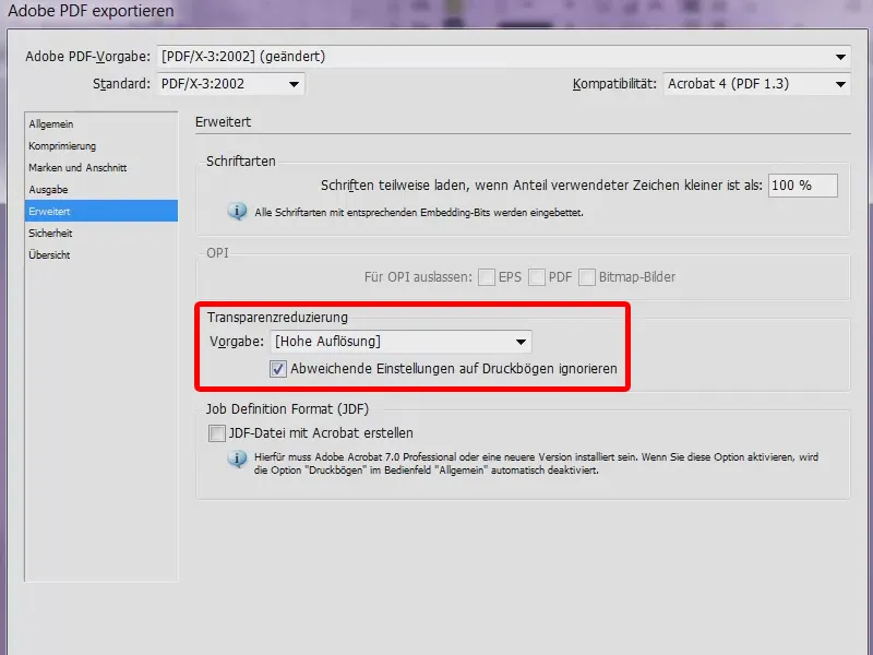
We now have 18 pages (1). The green bar at the top here (2) is now so high because the bleed has also been exported. This looks very wide, but the cut is made further down.
So now I have all the business cards, there should also be two colleagues who are not based in Munich ... One is "Fels Friedrich" (3) ...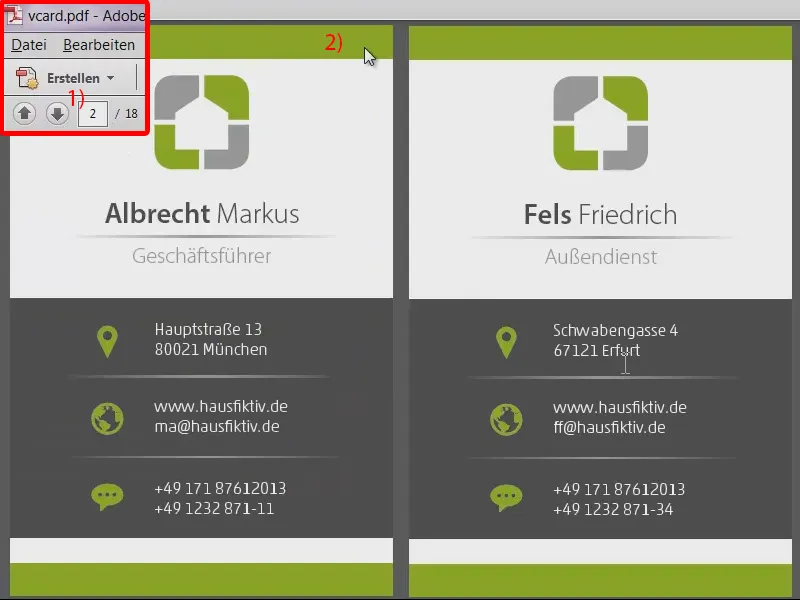
... and "Voigt Thorsten", who are both based in Erfurt. And what's really great is that viaprinto gives you the option of submitting a multi-shipment, which means - in this example, 90 percent of the staff are based in Munich, but the remaining 10 percent are based in Erfurt - you can easily specify this during the ordering process: I would like the last two to go to Erfurt.
To implement this, all we have to do in Acrobat is split this document once. Via Display>Tools>Pages (1) you can split the document (2).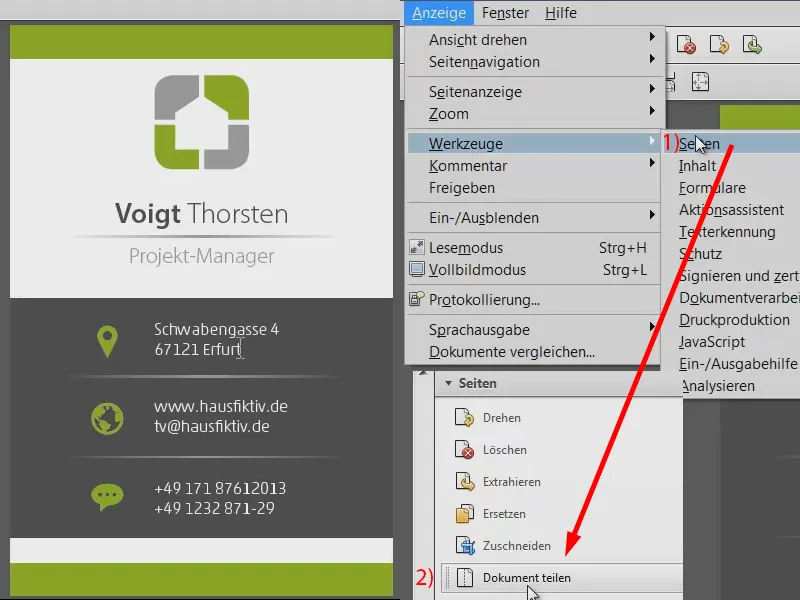
Number of pages: I would like to have 2 pages each (1) and confirm this (2). This splits the document into nine documents (3). This means that we now have one PDF for each set of business cards.
In the "Export" folder there is now a file with all our pages and then we have the files with the individual business cards (4). The one with all pages can be deleted.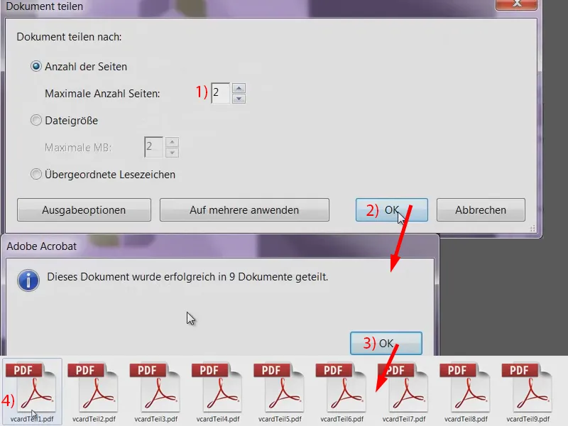
Set up upload and dispatch
Now back to the viaprinto page. There we select the business card again (1), the portrait format (2) and click on Upload document (3). There is then a document manager (4), which I simply tell to upload all these documents one after the other. This takes a little while (5).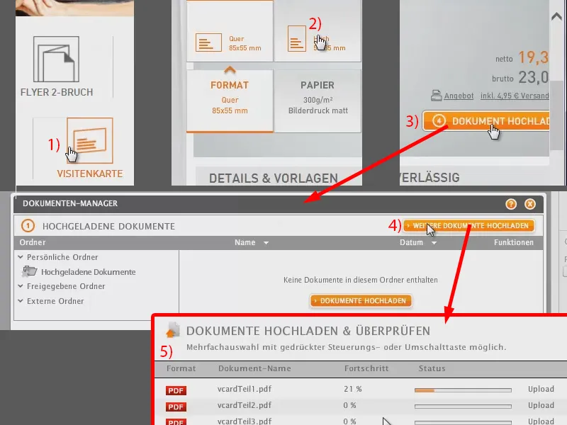
I have now added everything to the shopping cart. Here's the last card, the "vcardTeil9", which I'll add. In the preview function we can already see ...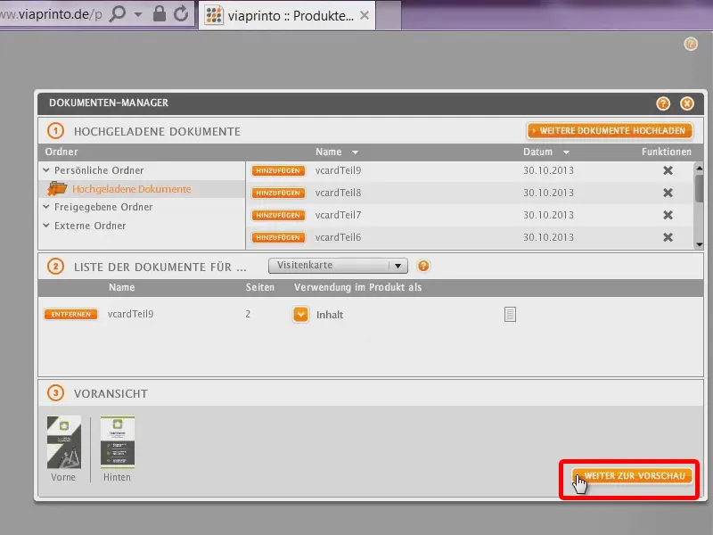
... the "Fels Friedrich", that's the one that's stationed in Erfurt, and we'll add it to the shopping cart now too, it will also get 250 pieces.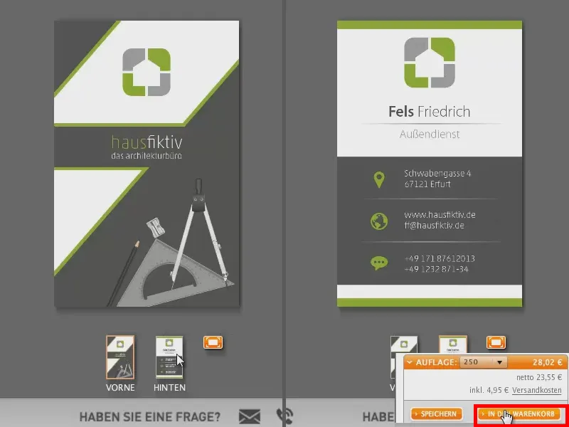
Now I have an overview of the shopping cart, the last two are going to Erfurt and the first two are all going to Munich. I go to Next.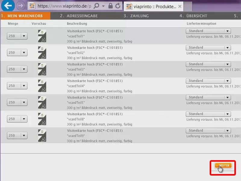
Here we can now select several addresses: Send to one or more addresses (1). Here we select "Markus Albrecht" and "Friedrich Fels" (2). And you can now also specify the positions. So "Friedrich" only ever gets "0", even for the other positions (3). Positions 6 and 7, however, are now to be sent to Erfurt, so he gets his 250 pieces in each case. For the Munich address, however, I set this to "0" (4). Then the shipping is calculated (5).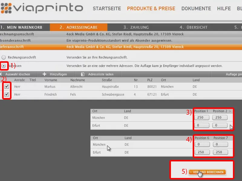
Of course, this is now charged twice, but that's clear, as it's going to two different addresses, each for 4.95 euros (1). Next (2).
"Deliveries (Germany)" for 9.90 euros. Then click on Next again (3) ...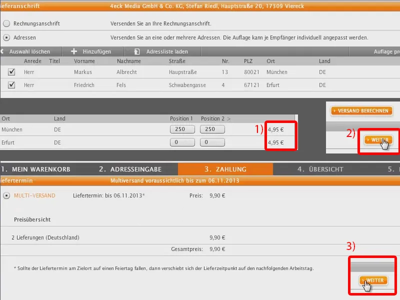
... and we already have a summary of how the whole thing should look. So now everything is set up so that the Erfurt customers get their business cards and the Munich customers get theirs.
Then you can confirm the whole thing, but I'm not going to do that, otherwise business cards will be sent to some people from a dubious architecture firm that doesn't even exist.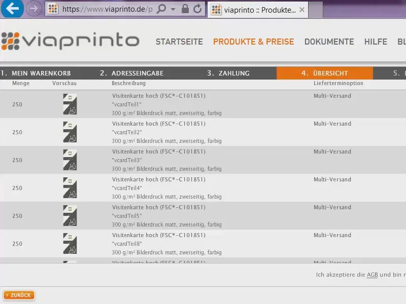
So you've learned a lot here and I hope you enjoyed the design, but also the data merge and this upload window. Good luck with the implementation at home! Just give it a try.
Yours, Stefan
